What is 2001 — A Space Odyssey?什么是 2001 — A Space Odyssey?

Kubrick's 1968 masterpiece gave science fiction its most austere visual grammar: pure black void, a white rectangular monolith, and a single saturated red eye that became the century's most unsettling signal.库布里克1968年的这部杰作赋予了科幻电影最克制的视觉语法:纯粹的黑色虚空、白色矩形巨石,以及那只成为世纪最不安信号的单一饱和红色眼睛。
2001 — A Space Odyssey in brief2001 — A Space Odyssey 速览
The visual aesthetic of 2001: A Space Odyssey is the cinematic realization of modernist discipline applied to the cosmos. Where other science-fiction films of the 1960s reached for the spectacular — bold lettering, busy consoles, flashing lights — Kubrick and his collaborators chose restraint. The result is a visual system built on three tones — deep black, pure white, and one saturated red — deployed with almost ceremonial precision. Every frame is composed as if it might be a poster: symmetric, weighted, and stripped of any element that does not earn its place.《2001太空漫游》的视觉美学,是现代主义纪律应用于宇宙场景的银幕实现。同时代其他科幻电影倾向于奇观——粗重文字、繁忙控制台、闪烁指示灯——库布里克与他的合作者却选择了克制。最终呈现的是一套建立在三种色调之上的视觉系统:深沉的黑、纯粹的白、以及唯一一种饱和的红,以近乎仪式的精度加以调度。每一帧画面都像是一张海报的构图:对称、有重量、剔除一切没有理由存在的元素。
At the core of the aesthetic is what might be called a three-tone discipline. The black of outer space is not merely a background; it is an active, absorbing presence. The white of the Discovery One's interior and the monolith's surface is not merely illuminated — it is geometrically uncompromising, smooth to the point of unreality. And HAL-9000's red eye is not decorative: it is the only warm tone in a world of cold neutrals, which is precisely why it reads as menacing. The three tones never compete; each occupies its own register of meaning.这套美学的核心,是一种三色调纪律。宇宙的黑色不仅仅是背景,而是一种主动的、吸纳一切的存在。「发现一号」内舱与巨石表面的白色不仅仅是受光照亮——它在几何上毫不妥协,光滑到近乎超现实的程度。而HAL-9000的红色眼睛并非装饰:它是一个由冷中性色构成的世界里唯一的暖色,这正是它让人感到威胁的原因。三种色调从不相互竞争,每一种都占据属于自己的意义频段。
The style draws its deeper logic from two streams: the Bauhaus modernism that shaped mid-century graphic and industrial design, and the traditions of wide-screen symmetric cinematography that Kubrick refined across his career. The result is a visual language that feels simultaneously ancient — monolithic, ritual, architectural — and futuristic, because it has stripped away every convention that dates a designed object and retained only what geometry and contrast alone can carry.这种风格的更深层逻辑来自两个源头:塑造了二十世纪中叶平面与工业设计的包豪斯现代主义,以及库布里克在整个职业生涯中精炼的宽银幕对称摄影传统。最终形成的视觉语言同时带有古老感——巨石般的、仪式性的、建筑性的——以及未来感,因为它剥去了所有会令设计物显得陈旧的惯例,只保留了几何与对比度单独能承载的东西。
See the 2001 — A Space Odyssey design system查看 2001 — A Space Odyssey 完整设计系统
Where does 2001 — A Space Odyssey come from?2001 — A Space Odyssey 从何而来?
Stanley Kubrick began developing 2001: A Space Odyssey in 1964, in close collaboration with science-fiction author Arthur C. Clarke. Their source material was Clarke's short story 'The Sentinel' (1951), which introduced the idea of an alien artifact — a precisely shaped object of inexplicable origin — found on the moon. From this premise, Kubrick built a film that would refuse the conventions of the genre: no alien monsters, no heroic action sequences, no expository dialogue to explain the inexplicable. The visual design was required to carry meaning that language would not be allowed to speak.斯坦利·库布里克于1964年开始与科幻作家亚瑟·克拉克密切合作,着手开发《2001太空漫游》。他们的素材来源是克拉克1951年的短篇小说《哨兵》,该故事引入了一个核心意象:在月球上发现的一件外星人工制品——一个来历不明、形状精确的物体。库布里克以此为起点,建构了一部拒绝类型惯例的电影:没有外星怪物,没有英雄式动作段落,没有用来解释不可解释之物的说明性对话。视觉设计需要承载语言被禁止言说的意义。
Production design for the film was led by Tony Masters, Harry Lange, and Ernie Archer, working under Kubrick's obsessive supervision at MGM's Borehamwood studios in England. Kubrick spent months consulting with aerospace engineers, scientists at NASA and the aerospace industry, and industrial designers to ensure that the spacecraft and space-station interiors looked operationally plausible rather than fantastical. The result was an aesthetic grounded in the actual design language of 1960s aerospace and industrial production: clean molded surfaces, modular components, a palette dictated by function rather than drama.影片的美术设计由托尼·马斯特斯、哈利·兰格与厄尼·阿彻共同主持,在库布里克于英国博尔汉姆伍德MGM制片厂近乎偏执的监督下完成。库布里克花了数月时间咨询航天工程师、NASA科学家、航空航天工业人士以及工业设计师,以确保飞船与空间站内部看起来在操作上合乎情理,而非充满奇幻色彩。最终呈现的美学扎根于1960年代航空航天与工业生产的真实设计语言:干净的模压表面、模块化构件、一套由功能而非戏剧性决定的色板。
The film's title sequence and graphic identity had input from Saul Bass, whose poster and title work for major Hollywood films of the 1950s and 1960s had established a visual standard of geometric reductivism in American commercial design. The influence is visible in the film's on-screen graphics, instrumentation displays, and the clean sans-serif typography used throughout. Cinematography was handled by Geoffrey Unsworth, whose wide-angle lenses and precise lighting schemes gave interiors their characteristic even, shadowless illumination — a quality that reads simultaneously as clinical and transcendent.影片的片头字幕序列与平面标识得到了索尔·巴斯的参与,他为1950至60年代好莱坞主要影片设计的海报与字幕序列,已在美国商业设计领域确立了几何简约主义的视觉标准。这种影响在影片的屏幕图形、仪器显示界面以及贯穿全片的简洁无衬线字体中清晰可见。摄影工作由杰弗里·昂斯沃斯负责,他的广角镜头与精确布光方案赋予内景那种标志性的均匀、无阴影照明——这种品质同时带有临床感与超然感。
Kubrick was deeply engaged with the music of the film, ultimately choosing pre-existing classical compositions — Johann Strauss II's 'The Blue Danube,' György Ligeti's choral works, Richard Strauss's 'Also sprach Zarathustra' — over the original score composed by Alex North. This decision reinforced the film's aesthetic philosophy: the music, like the visuals, had been stripped of novelty and sensation, and what remained was structure, pattern, and an almost geological sense of duration. The film was released by MGM in April 1968, received mixed initial reviews from critics expecting conventional narrative, and went on to become one of the most influential works in cinema history.库布里克对影片音乐高度投入,最终选择了已有的古典音乐作品——小约翰·施特劳斯的《蓝色多瑙河》、捷尔吉·利盖蒂的合唱作品、理查·施特劳斯的《查拉图斯特拉如是说》——而非亚历克斯·诺斯创作的原创配乐。这一决定强化了影片的美学哲学:音乐与画面一样,被剥去了新奇感与感官刺激,留下的是结构、模式,以及一种近乎地质时间尺度的持续感。影片于1968年4月由米高梅发行,最初收到的影评人评价褒贬不一——他们期待的是常规叙事——但此后成为电影史上最具影响力的作品之一。
What defines the 2001 — A Space Odyssey look?2001 — A Space Odyssey 的视觉特征是什么?
Three-Tone Palette三色调色板
The entire visual system resolves into three tones: an absolute, light-absorbing black that stands in for the void of space; an almost aggressive, shadowless white that coats the spacecraft interiors and the monolith's surface; and a single saturated red used exclusively for HAL-9000's eye and its associated displays. Secondary colors appear only as ambient glow or instrument readouts and carry no compositional weight. The discipline is total — mixing in additional hues would dissolve the system's symbolic clarity immediately.整个视觉系统归结为三种色调:一种吸光的、绝对的黑色,代表宇宙虚空;一种几乎带有攻击性的、无阴影的白色,覆盖飞船内舱与巨石表面;以及唯一一种饱和红色,专门用于HAL-9000的眼睛及其关联显示屏。次级色彩仅以环境光晕或仪器读数的形式出现,不承担任何构图重量。这种纪律是彻底的——引入额外色调会立即瓦解这套系统的象征清晰度。
Monolithic Geometry巨石几何
The monolith — a perfect black rectangle whose proportions remain constant across all its appearances — is the film's central visual argument: that pure geometric form, stripped of any surface markings or materiality cues, can carry enormous psychological weight. This principle extends throughout the film's design. Doorways, corridors, control panels, and furniture all tend toward simple rectangular and circular forms. Curved surfaces appear as continuous, uninterrupted arcs. Nothing is ornamented; every edge is a decision.巨石——一块比例在全片中始终如一的完美黑色矩形——是影片的核心视觉论断:纯粹的几何形态,剥去一切表面标记与材质线索,能够承载巨大的心理重量。这一原则贯穿全片的设计。门洞、走廊、控制面板与家具均趋向简洁的矩形与圆形。曲面呈现为连续、无中断的弧线。没有任何装饰;每一条边都是一个决定。
Symmetric Framing对称构图
Kubrick's camera consistently seeks and holds perfect bilateral symmetry — corridors recede to a central vanishing point, circular rooms are shot from their geometric center, the Discovery One's pod bay presents itself as a balanced architectural elevation. This symmetry is not merely compositional preference; it functions as a signal of inhuman precision. Human scenes in earthbound settings are shot with more conventional asymmetry, making the spacecraft's symmetry feel alien and totalizing. The style holds this framing as a defining characteristic rather than a technique.库布里克的镜头始终寻求并保持完美的双侧对称——走廊向中央消失点延伸,圆形房间从几何中心取景,「发现一号」的飞行舱呈现为一种均衡的建筑立面。这种对称不仅仅是构图偏好;它作为一种非人类精确性的信号发挥作用。地球场景中的人类场景采用更为传统的非对称构图,使飞船的对称感显得陌生而全面。这种风格将这种构图作为定义性特征而非单纯技法。
Shadowless Interior Light无影室内光
The spacecraft interiors in the film are lit from all directions simultaneously, producing an even, almost directionless illumination that eliminates cast shadows from surfaces and faces alike. This lighting condition — technically difficult to achieve, instantly recognizable once seen — gives white surfaces their particular quality of glowing from within rather than reflecting a source. The effect strips the interior spaces of any sense of natural time or human warmth. Applied to design, it means that surfaces should appear to be self-luminous rather than lit, and that depth is communicated through geometry rather than shadow.影片中飞船内舱从四面八方同时受光,产生一种均匀、几乎没有方向感的照明,消除了表面与人脸上的投射阴影。这种照明状态——技术上难以实现,一旦见过便立刻辨认——赋予白色表面那种从内部发光而非反射光源的特质。这种效果剥去了内部空间任何自然时间感或人类温度。应用于设计时,这意味着表面应当呈现为自发光而非被照亮,深度通过几何而非阴影传达。
Typographic Clarity字体排印清晰度
All on-screen text in the film — from flight-path displays to food-machine interfaces to HAL's status readouts — uses clean, geometric sans-serif letterforms set without decorative flourish. Labels are functional: they identify, they quantify, they direct. There is no hierarchy expressed through weight variation within a single screen; all text elements carry equal visual authority. This approach treats type as instrument rather than as graphic expression, which is precisely why it reads as technological rather than designed.影片中所有屏幕文字——从航线显示到食品机界面,从HAL的状态读数——均使用干净的几何无衬线字体,不带任何装饰性笔画。标签是功能性的:识别、量化、指引。单一屏幕内部没有通过字重变化表达的层级;所有文字元素承担同等视觉权重。这种方式将字体视为仪器而非图形表达,这正是它读起来像是技术性的而非被设计过的原因。
Ritual Pacing and Negative Space仪式性节奏与负空间
The film's visual rhythm is defined by held compositions and generous negative space — the camera does not cut away from an empty corridor until the emptiness itself has been fully registered. Applied to design, this principle means that white or black space is not waste to be filled but the primary means of directing attention. A design derived from this aesthetic should be able to remove half its visual elements and retain its communicative effectiveness, because the remaining elements have been positioned with such deliberateness that the surrounding space amplifies rather than diminishes their presence.影片的视觉节奏由固定构图与慷慨的负空间定义——镜头不会在空走廊的空旷感被充分注册之前切走。应用于设计,这一原则意味着白色或黑色空间不是需要填充的浪费,而是引导注意力的主要手段。源于这种美学的设计应当能够移除一半的视觉元素并保持其传达有效性,因为剩余元素的摆放是如此刻意,以至于周围的空间放大而非削弱了它们的存在感。
Zero Surface Decoration零表面装饰
No surface in the film's designed world carries decorative marking: the monolith has no inscription, the Discovery One's hull has no livery beyond functional labeling, the pod bay has no graphics beyond instrumentation. This principle — that a surface should be what it is and nothing more — is the film's most transferable design lesson. In contemporary application, it means rejecting textures that simulate materials, patterns applied for visual interest alone, and any graphic element whose removal would not diminish the design's communicative function.影片设计世界中没有任何表面承载装饰性标记:巨石上没有铭文,「发现一号」的船体除功能性标识外没有涂装,飞行舱除仪器设备外没有图形。这一原则——表面应当就是它本身,不多也不少——是影片最可移植的设计课。在当代应用中,它意味着拒绝模拟材质的纹理、仅为视觉趣味而添加的图案,以及任何移除后不会削弱设计传达功能的图形元素。
See the 2001 — A Space Odyssey design system查看 2001 — A Space Odyssey 完整设计系统
Who shaped 2001 — A Space Odyssey?谁塑造了 2001 — A Space Odyssey?
Kubrick directed, produced, and co-wrote 2001: A Space Odyssey, maintaining creative control over every aspect of its production including production design, lighting, and the final selection of musical accompaniment. His insistence on consulting actual aerospace engineers and scientists grounded the film's visual language in genuine technological aesthetics rather than science-fiction convention. Kubrick's broader filmography — from The Shining to Barry Lyndon — demonstrates a consistent approach to visual design as a system of controlled meaning, and his influence on the relationship between cinema and designed environments is without parallel.库布里克导演、制作并联合编写了《2001太空漫游》,对制作设计、灯光以及最终音乐选择等各方面保持创作控制。他坚持咨询真实的航空航天工程师与科学家,使影片的视觉语言扎根于真实的技术美学,而非科幻惯例。库布里克更广泛的电影作品——从《闪灵》到《巴里·林登》——展现了将视觉设计作为受控意义系统的一贯方法,他对电影与设计环境之间关系的影响是无与伦比的。
Clarke co-wrote the screenplay of 2001 with Kubrick simultaneously with the novel, so that neither adaptation preceded the other — an unusual creative arrangement that meant the visual and literary versions were developed in parallel dialogue. Clarke's influence is most visible in the film's commitment to scientific plausibility: the silence of space, the physics of zero-gravity movement, the operational logic of the spacecraft. His conviction that humanity's encounter with genuine alien intelligence would be utterly incomprehensible to human frameworks gave the film its refusal of resolution and its embrace of visual abstraction as the only adequate language.克拉克与库布里克同步共同创作了《2001太空漫游》的剧本与小说,两者互不以对方为蓝本——这种不寻常的创作安排意味着视觉版本与文学版本在平行对话中共同发展。克拉克的影响最清晰地体现在影片对科学合理性的坚守:宇宙的寂静、零重力运动的物理学、飞船的运作逻辑。他关于人类与真正外星智慧相遇将对人类框架完全不可理解的信念,赋予了影片那种拒绝解答的姿态,以及对视觉抽象作为唯一恰当语言的拥抱。
Unsworth served as director of photography for 2001 and developed the specific lighting approach that defines the film's aesthetic. His solution to lighting the spacecraft interiors — building light sources directly into the sets and using large diffusion panels to eliminate directional shadows — created the film's characteristic even, omnidirectional interior illumination. This approach required extraordinary technical ingenuity given the state of film equipment in the mid-1960s. Unsworth later received Academy Awards for his work on Cabaret (1972) and Tess (1979), but 2001 remains the most distinctive demonstration of his contribution to the relationship between light and designed space.昂斯沃斯担任《2001太空漫游》的摄影指导,并发展出定义影片美学的特定照明方式。他对飞船内舱的照明解决方案——将光源直接内置于布景并使用大型散光板消除方向性阴影——创造了影片标志性的均匀、全向性室内照明。考虑到1960年代中期的电影器材水平,这种方法需要非凡的技术创造力。昂斯沃斯后来凭借《歌厅》(1972年)与《苔丝》(1979年)获得奥斯卡金像奖,但《2001太空漫游》仍是他对光与设计空间关系之贡献的最独特展示。
Bass contributed to the graphic identity of 2001, bringing to the film the same philosophy of geometric reductivism that had defined his poster and title-sequence work for films including Vertigo, Anatomy of a Murder, and North by Northwest. His influence on the film's on-screen graphics — the clean, functional displays and typographic treatments — is consistent with his broader conviction that visual communication should be reducible to its most essential symbolic form. Bass's work across the 1950s and 1960s established geometric simplicity as the dominant mode of serious American graphic design, and his collaboration with Kubrick represents a convergence of two of the period's most rigorous visual minds.巴斯为《2001太空漫游》的平面标识做出贡献,将他为《迷魂记》《解剖谋杀案》《西北偏北》等影片设计海报与片头序列时所体现的几何简约主义哲学带入了这部电影。他对影片屏幕图形的影响——干净、功能性的显示界面与字体处理——与他更广泛的信念一致:视觉传达应当可以被还原为其最本质的象征形式。巴斯在1950至60年代的作品将几何简洁性确立为严肃美国平面设计的主导模式,他与库布里克的合作代表了那个时代两位最严格的视觉心灵的汇合。
Masters served as production designer for 2001 and was responsible for translating Kubrick's visual principles into buildable sets. His challenge was to design spacecraft interiors that felt simultaneously functional and eerie — spaces where every component had a plausible operational purpose but the totality produced an atmosphere of uncanny precision. Masters worked with industrial designers and aerospace consultants to develop the film's modular, white-surface aesthetic, and his sets for the Discovery One's centrifuge — which was built as an actual rotating wheel — remain among the most technically ambitious production design achievements in film history.马斯特斯担任《2001太空漫游》的制作设计师,负责将库布里克的视觉原则转化为可建造的布景。他的挑战是设计出既有功能感又令人感到诡异的飞船内舱——那些每个构件都有合乎情理的操作目的,但整体却产生出一种不可思议的精确氛围的空间。马斯特斯与工业设计师和航空航天顾问合作,发展出影片的模块化白色表面美学,他为「发现一号」离心环设计的布景——作为实际旋转的轮子建造——至今仍是电影史上技术上最具野心的制作设计成就之一。
How do you use 2001 — A Space Odyssey today?今天怎么用 2001 — A Space Odyssey?
The visual language of 2001: A Space Odyssey is one of the most disciplined and transferable dark-mode aesthetics in design history, because it is built on a logic — not a mood. Applying it correctly means understanding the three-tone system as a structural argument: black is void and context, white is form and precision, red is the single point of agency or warning. Decoration is not merely discouraged; it is conceptually incompatible with the system. Any element you add that cannot be assigned to one of those three roles will immediately read as a violation.《2001太空漫游》的视觉语言是设计史上最有纪律、最可移植的深色模式美学之一,因为它建立在一套逻辑之上——而非一种情绪。正确应用它意味着将三色调系统理解为一种结构性论断:黑色是虚空与背景,白色是形体与精确,红色是唯一的能动性或警示点。装饰不仅仅是被劝阻的,它在概念上与这套系统不相容。任何你添加的、无法被归入这三种角色之一的元素,都会立刻被读作一种违规。
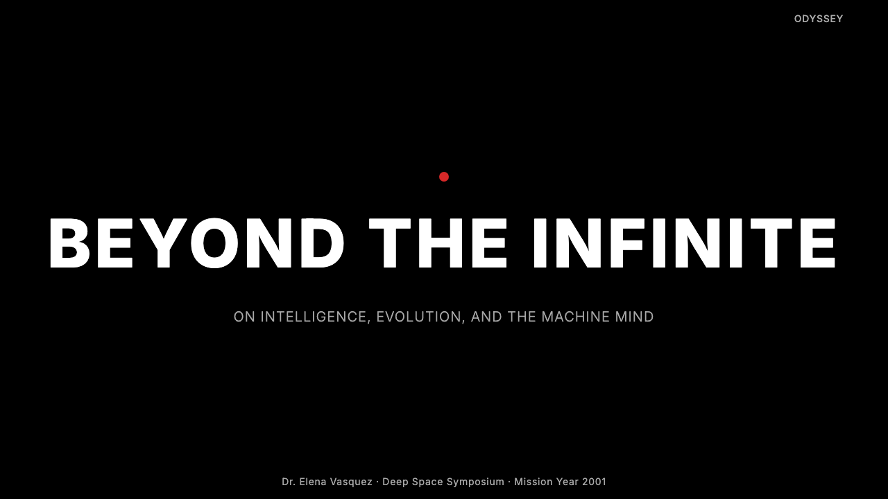
For presentation slides, the style performs best on covers and section dividers. A cover in this aesthetic should be predominantly black, with a single geometric element — a white rectangle, a circular form — centered or placed with deliberate asymmetry, and the title set in clean, widely-spaced sans-serif type. The single permitted accent color should appear only if there is a genuine hierarchy point to make — a subtitle, a date, a key number — and should be used for that element and no other. Content slides should follow the same economy: white or light-value type on a deep background, with spacious margins that treat negative space as a structural element rather than wasted area. Data visualizations in this mode work best when charts and graphs are rendered in white on black, with a single accent-color series used only for the most important data set.在演示文稿中,这种风格在封面与章节分隔页上表现最佳。这种美学的封面应以黑色为主调,配以一个单一的几何元素——白色矩形、圆形——居中或以刻意的非对称方式放置,标题使用干净、宽字距的无衬线字体排印。唯一允许的强调色只应在有真正层级需要表达时出现——副标题、日期、关键数字——并且只用于该元素,不用于其他。内容页应遵循同样的节制:深色背景上的白色或浅色调文字,宽裕的留白将负空间作为结构性元素而非浪费的区域对待。这种模式下的数据可视化效果最佳时,图表以黑底白色渲染,只用单一强调色系列标示最重要的数据集。
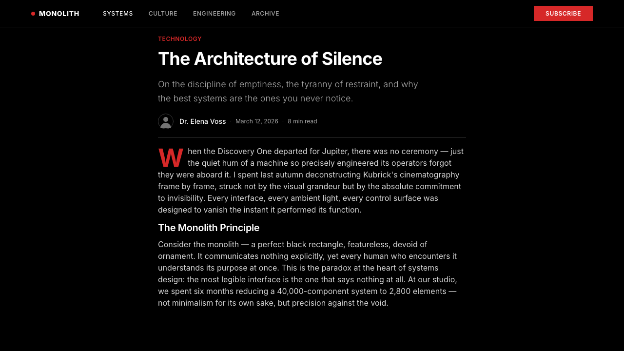
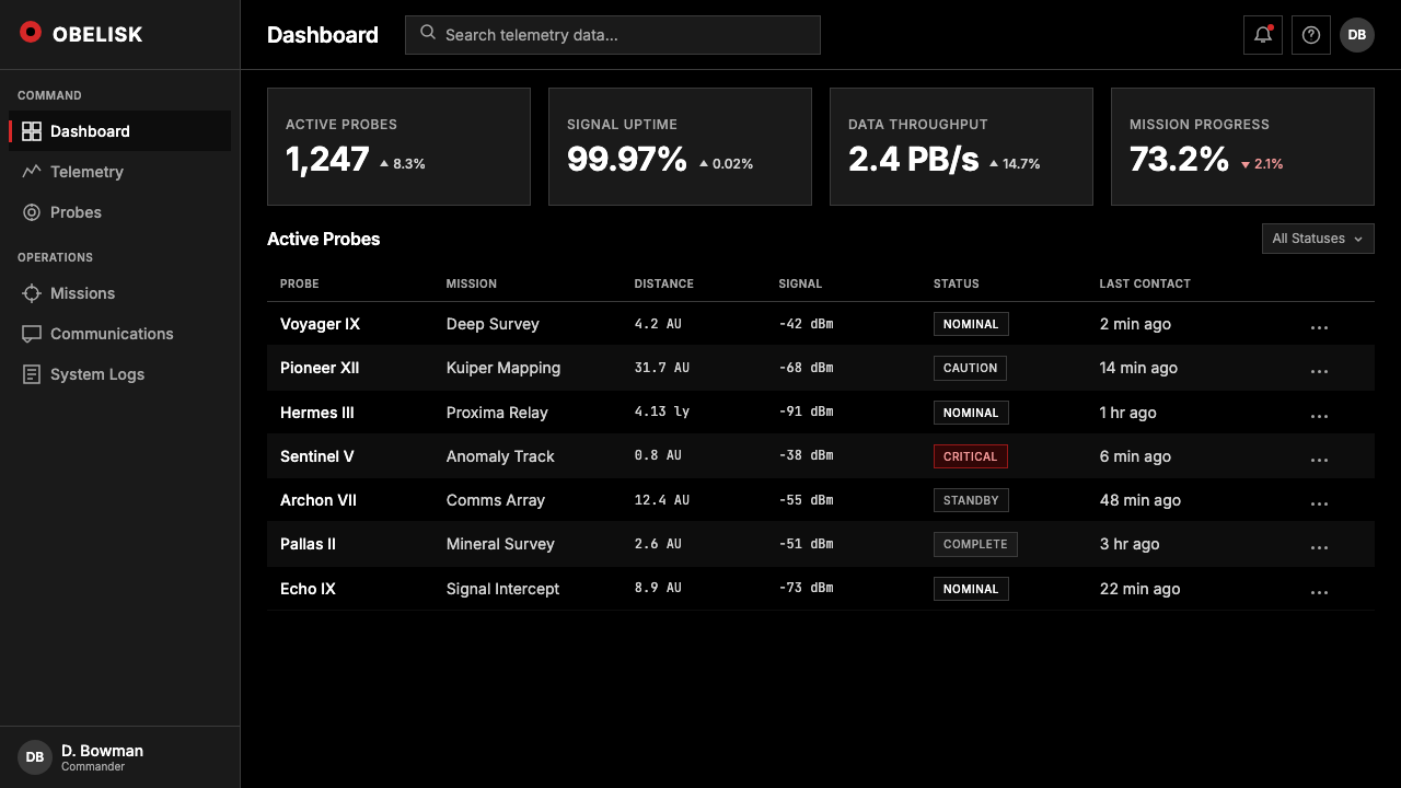
For web interfaces — particularly dashboards, analytics platforms, and developer tools — the aesthetic translates into a dark-mode design language built around high contrast and deliberate scarcity of color. The background should be a deep, near-black tone; primary content surfaces a step lighter; interactive elements and alerts in white or the single accent color. Navigation should be typographic and minimal, with geometric icon-forms used only where a text label would be impractically long. The cardinal rule is color conservation: if the accent color appears in more than one or two roles on a given screen, it has lost its signal value and become decorative.对于网页界面——尤其是仪表板、数据分析平台与开发者工具——这种美学转化为一套建立在高对比度与刻意色彩稀缺性之上的深色模式设计语言。背景应为深沉、近乎纯黑的色调;主要内容表面亮一个层级;交互元素与警示以白色或单一强调色呈现。导航应当是字体性的、极简的,只在文字标签会不切实际地过长时才使用几何图标形式。最高原则是色彩守恒:如果强调色在给定页面上出现于两个以上的角色,它就已经失去了信号价值,变成了装饰。
For editorial and marketing applications — film posters, event graphics, technology brand identity — the style's poster-like boldness is its most useful quality. A marketing application in this mode should commit fully to the dark ground: resist the temptation to soften it with gradients, textures, or color bleeds. Typography should be set with generous letter-spacing at large scale and tight margins at body scale, creating two distinct zones of visual intensity. The single accent color should appear at most once per composition, and only at a scale that justifies its visual weight — a single word, a single numeral, a single geometric mark.对于编辑与营销应用——电影海报、活动图形、科技品牌视觉识别——这种风格的海报式大胆感是其最有用的品质。这种模式下的营销应用应当对深色底面做出完全承诺:抵制用渐变、纹理或色彩渗出来软化它的诱惑。字体应在大尺寸时设置宽松字距,在正文尺寸时设置紧凑边距,创造两个截然不同的视觉强度区域。单一强调色在每个构图中最多出现一次,且只出现在能证明其视觉重量合理的尺度上——一个单词、一个数字、一个几何标记。
The most common mistake when working with this aesthetic is treating the red accent as an invitation to apply color liberally — using multiple accent tones, introducing colored backgrounds, or allowing the accent to appear so frequently that it becomes ambient. The second most common mistake is softening the contrast: adding mid-gray surfaces, softening type weights, or introducing subtle gradients that reduce the stark opposition between black and white. The system's power comes entirely from the severity of its constraints. Relaxing any of them produces not a gentler version of the style but a different style entirely — one that lacks the original's sense of controlled inevitability.使用这种美学时最常见的错误,是将红色强调色视为可以自由运用色彩的邀请——使用多种强调色调、引入彩色背景,或让强调色频繁出现到成为环境色的程度。第二常见的错误是软化对比度:添加中灰色表面,降低字重对比,或引入减弱黑白强烈对立的微妙渐变。这套系统的力量完全来自其约束的严酷程度。放松其中任何一条,产生的不是这种风格更温和的版本,而是一种完全不同的风格——一种缺乏原作那种受控必然感的风格。
See the 2001 — A Space Odyssey design system查看 2001 — A Space Odyssey 完整设计系统
2001 — A Space Odyssey — FAQ2001 — A Space Odyssey · 常见问题
Is this aesthetic the same as general dark-mode design?这种美学和一般的深色模式设计是一回事吗?
No — they share a dark background but operate on entirely different logic. Generic dark-mode design typically uses a range of gray surfaces to create depth hierarchy, multiple accent colors for different interactive states, and soft shadows to distinguish layers. The 2001 aesthetic uses only two surface values — deep black and near-white — with a single accent color that does not vary. It is a much stricter constraint than dark mode as a pattern. The easiest way to distinguish them: generic dark mode wants the interface to recede and feel comfortable; the 2001 aesthetic wants the interface to feel precise and slightly inhuman.不——它们共享深色背景,但运行在完全不同的逻辑之上。通用深色模式设计通常使用一系列灰色表面创建深度层级,为不同交互状态使用多种强调色,并通过柔和阴影区分图层。《2001太空漫游》美学只使用两种表面值——深黑与近白——以及一种不变化的单一强调色。这比深色模式作为一种设计模式要严格得多。区分两者最简单的方法:通用深色模式希望界面退隐、感觉舒适;《2001太空漫游》美学希望界面感觉精确、略带非人类感。
Can I use this style with images and photography?我可以在这种风格中使用图像和摄影吗?
Yes, but with strict handling. Photographs should be converted to high-contrast treatments — deep shadows crushed to black, highlights held to near-white — so that they read as graphic objects rather than naturalistic windows. Full-color photography works against the three-tone discipline and should be avoided. Images work best when they are simple in composition: a single subject, strong geometric framing, minimal background complexity. The film's own visual reference — star fields, clean industrial surfaces, geometric forms in space — gives the clearest template for what imagery is compatible with the aesthetic.可以,但需要严格处理。照片应转换为高对比度处理——深阴影压至黑色,高光保持在近白——使其作为图形对象而非自然主义窗口被阅读。全彩摄影与三色调纪律相悖,应当避免。图像在构图简单时效果最佳:单一主体、强烈的几何取景、最小的背景复杂度。影片自身的视觉参照——星空、干净的工业表面、宇宙中的几何形态——为哪类图像与这种美学相容提供了最清晰的模板。
How do I handle brand colors that are not black, white, or red?如果品牌色不是黑、白、红,我该如何处理?
The three-tone system is the style's core. If a brand's primary color is blue, deep green, or gold, it can substitute for red in the accent role — but only one color can occupy that role. The key is that the accent must be genuinely saturated and must appear in a field of near-neutral tones (black and white or their close equivalents) in order to carry the same signal weight. A desaturated or muted accent color will not read as a HAL-eye — it will read as a generic dark-mode interface. The system needs the contrast between the accent's saturation and the ground's neutrality to function.三色调系统是这种风格的核心。如果品牌主色是蓝色、深绿色或金色,它可以替代红色占据强调色的角色——但只有一种颜色可以占据这个角色。关键在于,强调色必须是真正饱和的,并且必须出现在近中性色调(黑白或其近似色)的底面上,才能承载同等的信号重量。低饱和度或哑光的强调色不会被读作HAL之眼——它会被读作一个普通的深色模式界面。这套系统需要强调色的饱和度与底面的中性之间的对比才能运作。
Does this style work for consumer-facing products, or is it better suited to technical tools?这种风格适合面向消费者的产品吗,还是更适合技术工具?
The style is strongest in contexts where precision, authority, and a degree of emotional distance are appropriate values: developer tools, data platforms, scientific visualization, premium technology hardware branding, and film or event identities. It is less well-suited to products where warmth, approachability, or sensory delight are the primary emotional targets — consumer wellness apps, food brands, children's products, or any context where users should feel welcomed rather than impressed. The aesthetic's association with the cold rationality of HAL-9000 is not accidental; it is intrinsic to the visual system. Using it in an emotional or nurturing context creates cognitive dissonance that undermines trust rather than building it.这种风格在精确性、权威性与一定程度的情感距离是适当价值观的场景中最为强大:开发者工具、数据平台、科学可视化、高端科技硬件品牌,以及电影或活动视觉识别。它较不适合温暖感、亲切感或感官愉悦是主要情感目标的产品——消费者健康应用、食品品牌、儿童产品,或任何用户应当感到被欢迎而非被震慑的场景。这种美学与HAL-9000冷理性的关联并非偶然;它内在于这套视觉系统。在情感性或关怀性语境中使用它,会产生认知失调,削弱而非建立信任。
How does this aesthetic relate to the Bauhaus movement it draws on?这种美学与它所借鉴的包豪斯运动有何关系?
Both share the foundational commitments: geometric form, zero surface decoration, typographic clarity, and the principle that every visual element must justify its presence. The key differences are tone and palette. Bauhaus is primarily a light-ground aesthetic — white or cream backgrounds, primary colors deployed at full saturation against light fields — and carries an activist, utopian energy. The 2001 aesthetic inverts the ground to black, reduces the color system to a single accent, and shifts the emotional register from energetic to austere. Where Bauhaus says 'nothing wasted,' 2001 says 'nothing permitted.' They are related by descent but diverge sharply in mood and application domain.两者共享基础承诺:几何形态、零表面装饰、字体排印清晰度,以及每个视觉元素必须证明其存在合理性的原则。关键差异在于色调与色板。包豪斯主要是浅色底面美学——白色或奶油色背景,三原色在浅色底面上以完全饱和度部署——并带有一种积极进取的乌托邦能量。《2001太空漫游》美学将底面反转为黑色,将色彩系统缩减为单一强调色,并将情感频率从充满活力转变为严峻克制。包豪斯说「没有浪费」,《2001太空漫游》说「没有被允许」。两者在血脉上有关联,但在情绪与应用领域上截然分歧。
Related design styles相关设计风格
 Pantone Ultra VioletCosmic authority. Ultra Violet glows through chip blocks, Montserrat, and dee…宇宙感权威。紫色卡片、Montserrat 与深靛星云托起光感。
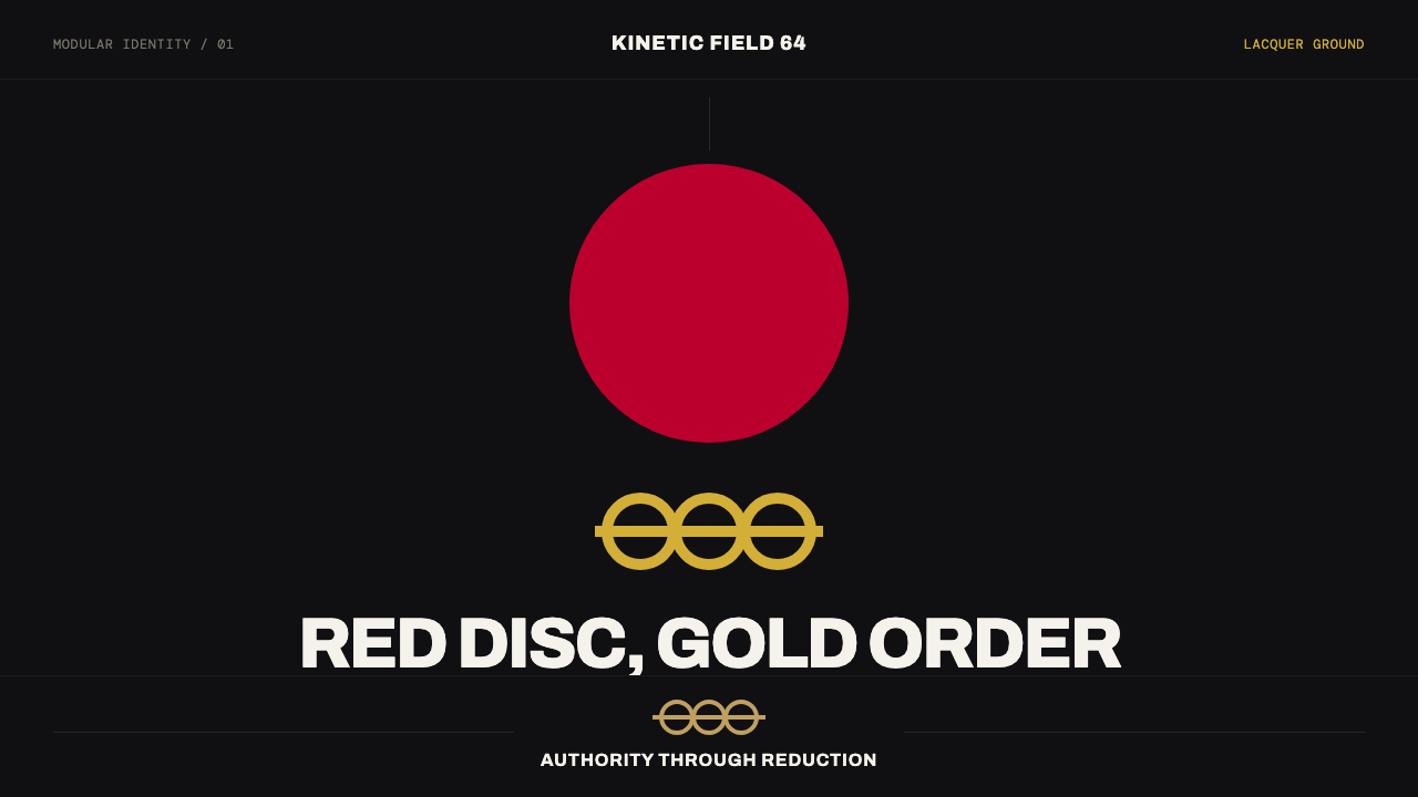 Tokyo 1964 (Kamekura)Ceremony reduced to a mark. Crimson disc and gold rings lock to a black axial…庄重被压缩成标记:黑色轴线网格锁定红日与金环。
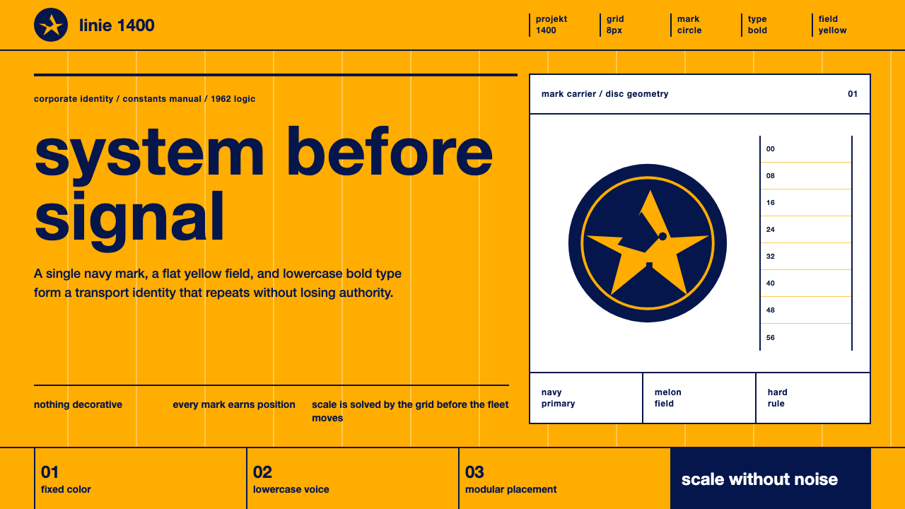 Lufthansa (Aicher)Systems speak first. Melon yellow, navy disc mark, lowercase Helvetica on a h…系统先发声:蜜瓜黄、海军蓝圆标与小写Helvetica钉在硬网格上。
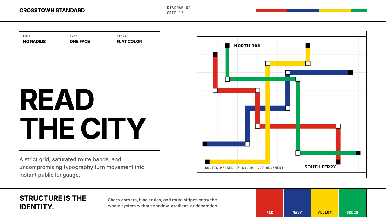 Massimo Vignelli NYCClarity becomes infrastructure. Black rules and route stripes lock the white…清晰即基础设施。白底黑线与路线色带锁定网格。
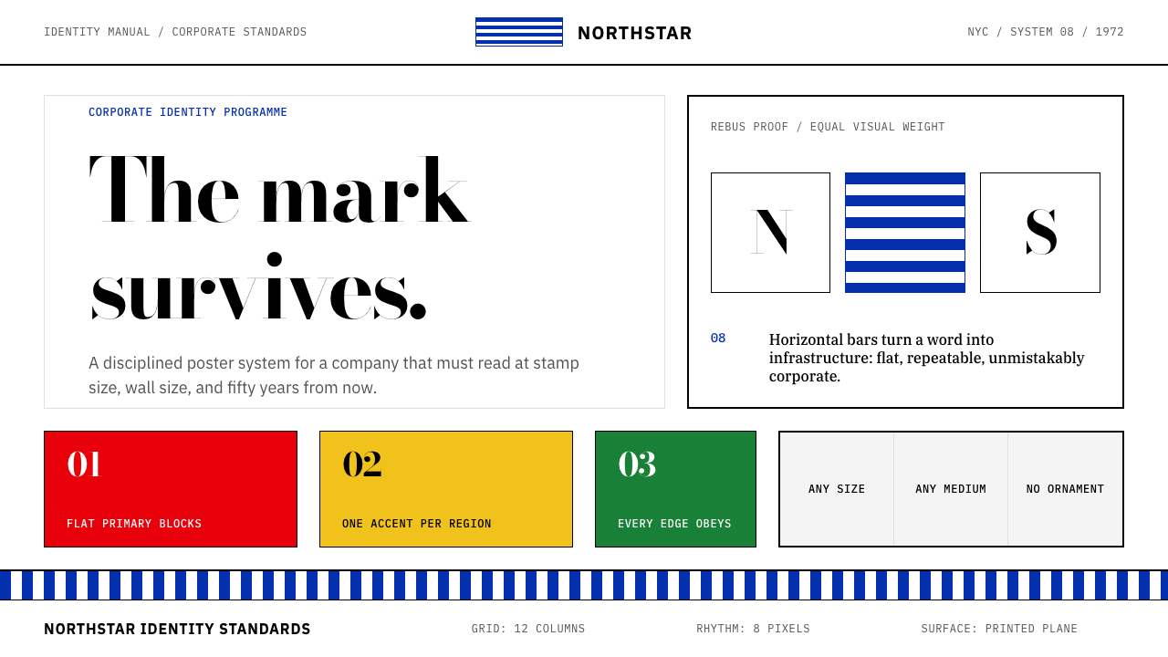 Paul Rand / IBM Corporate IdentityCorporate modernism stays exact. Blue 8-bar stripes, high-contrast serif, har…企业现代主义保持精确:蓝色八条纹、高反差衬线与硬网格色块。
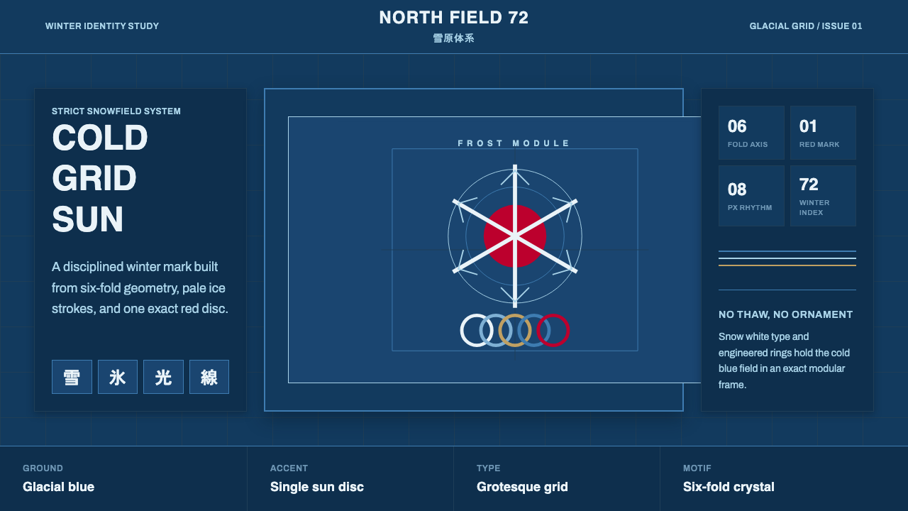 Sapporo Winter 1972Icy order, exact and calm. Glacial blue grid, snow-white type, one red sun di…冰冷秩序:冰川蓝网格、雪白字体与唯一红日圆。