What is Lufthansa (Aicher)?
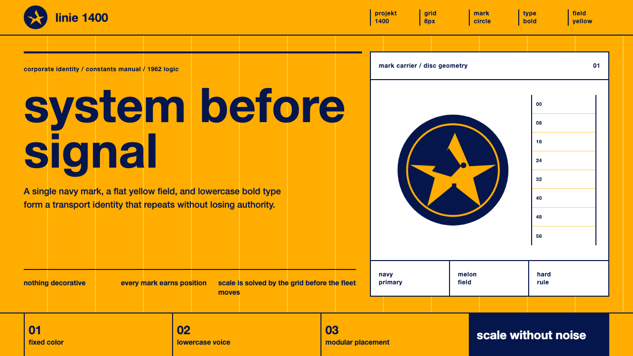
Lufthansa's 1962 identity treated an airline not as a logo to be drawn but as a system to be engineered — one crane, one grid, one voice, repeatable across an entire fleet.
Lufthansa (Aicher) in brief
The Lufthansa identity, designed in 1962 by Otl Aicher and the Gruppe E5 team at the Ulm School of Design (Hochschule für Gestaltung Ulm, or HfG Ulm), is one of the founding texts of systematic corporate identity — the idea that a company's visual presence should be governed by a rulebook rather than a single memorable mark. Its visual language is immediately legible: a saturated, warm yellow field often called melon yellow, a navy-blue crane symbol reduced to a near-geometric silhouette inside a disc, and lowercase Helvetica Bold set with the discipline of an engineering drawing.
What distinguishes this style from a conventional 'logo plus brand colors' approach is that nothing in it was designed to be looked at twice. The crane mark, the typography, and the grid were built to disappear into function — onto the tail of an aircraft, the spine of a ticket folder, the door of a check-in counter — and to look identical no matter who applied them or where. The aesthetic is the residue of a design process obsessed with consistency at industrial scale, not a decorative scheme applied after the fact.
Visually, the style reads as calm and almost administrative: large flat panels of one strong color, a single dark mark placed with mathematical precision, and type that refuses capital letters or embellishment. It is confident without being loud — the opposite of a mascot or a hand-drawn emblem. Where many airline identities of the era leaned on romance (speed, wings, the exoticism of flight), this one leans on order, and that order is precisely what has kept it legible and functional across six decades of livery, signage, and print.
Where does Lufthansa (Aicher) come from?
The identity emerged from the Hochschule für Gestaltung Ulm, a design school founded in the postwar period as a spiritual successor to the Bauhaus, and often considered even more doctrinaire in its commitment to rational, systematic design. Where the Bauhaus mixed idealism with craft romance, Ulm pushed toward something closer to design as applied science: semiotics, cybernetics, and industrial method were treated as legitimate design tools, not foreign imports. Otl Aicher, one of the school's co-founders, led the assembled team — internally referred to as Gruppe E5 — that took on Lufthansa's 1962 relaunch, officially known internally as 'Projekt 1400.'
Lufthansa itself had been refounded in 1955, a decade after the postwar Allied ban on German civil aviation was lifted, and by the early 1960s the airline needed an identity equal to its ambitions as a reconstituted national flag carrier operating an increasingly international, increasingly jet-powered fleet. The brief was not cosmetic. An airline's visual identity has to survive translation onto hundreds of physical surfaces — aircraft fuselages, ground vehicles, uniforms, ticket stock, timetables, signage in dozens of airports — each produced by different vendors, in different materials, at different scales. A hand-drawn mark simply could not survive that many reproductions without drifting.
Aicher and Gruppe E5 answered with a total design system: a strict manual specifying exact placement, spacing, and proportion for every application, so that a sign painter in one city and a printer in another would produce visually identical results without ever consulting each other. The crane symbol itself was inherited from Lufthansa's earlier history (the airline had used a stylized crane mark since the 1920s) but Aicher's team subjected it to the same reductive geometric discipline as everything else, refining it into a form that could be described almost entirely by compass and ruler.
This work became a canonical case study in the history of corporate identity design, taught alongside contemporaneous programs like Massimo Vignelli's for American transit systems and Paul Rand's for American corporations. What set the Ulm approach apart was its intellectual rigor: the identity was not treated as an art project but as an engineering deliverable, complete with a rulebook, produced by a design school that saw itself as training practitioners for industrial society rather than for the gallery.
What defines the Lufthansa (Aicher) look?
Color
The palette is built around one dominant warm yellow — the so-called melon yellow — used in large, flat, unbroken fields rather than as an accent. Navy blue and black carry the mark and the type, appearing only where meaning needs to be communicated: the crane symbol, headline text, structural rules. There is no gradient, no tint variation within a field, and no tertiary color; a field of yellow is one exact yellow from edge to edge. This restraint is what makes the color read as identity rather than decoration — you recognize the airline by the color alone, at a distance, before you can read a single letter.
Typography
Type is set almost exclusively in a bold grotesque sans-serif in the Helvetica family, and — in a choice that was radical for a national carrier in 1962 — set in lowercase wherever possible, including in the wordmark itself. Lowercase-only setting was itself an Ulm-school position: capital letters were treated as an inherited convention with no functional justification, since spoken German (like spoken language generally) makes no audible distinction between cases. The letterforms are heavy, geometric, and without personality by design — legibility and reproducibility across scales and materials outrank any expressive quality.
The Crane Mark
The crane — Kranich in German, and Lufthansa's symbol since the 1920s — was reduced by Gruppe E5 to a nearly abstract silhouette: wings spread in a shape closer to a geometric diagram than a naturalistic bird, enclosed within a perfect circle. The disc functions as a module in its own right, not merely a frame; its diameter and the crane's proportions within it were fixed by rule so the mark could be reproduced at any scale, on any surface, by any vendor, and remain exactly itself. The mark communicates through silhouette and containment rather than through illustrative detail.
Grid and Layout
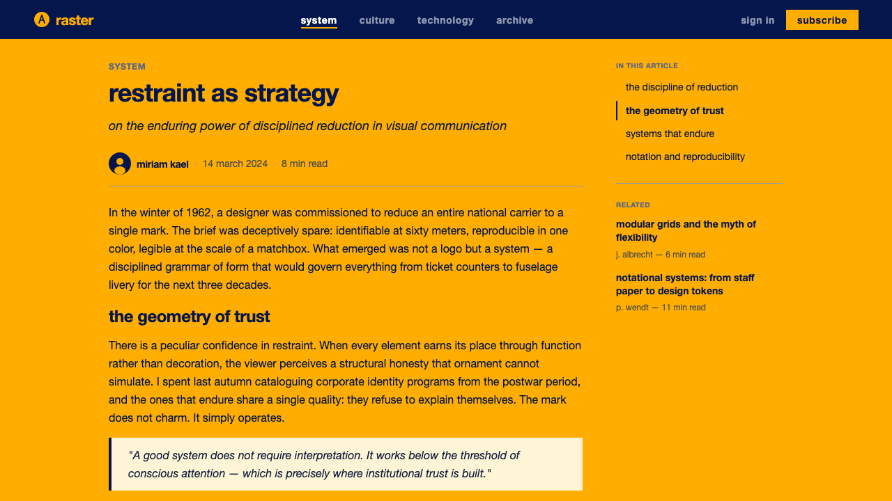
Every application — ticket, timetable, signage panel, aircraft livery — was governed by a modular grid specifying exact placement of the crane mark, the wordmark, and any supporting text, with generous, non-negotiable clear space around each element. The grid is hard rather than fluid: elements sit at fixed positions rather than flowing to fill available space, which produces the identity's characteristic sense of restraint. Nothing is centered for symmetry's own sake; alignment follows the grid's logic, and margins are treated as part of the design rather than leftover space.
Surface and Material Discipline
Because the identity had to be produced across paint, print, fabric, and metal by many different vendors, every element was specified in a way that survived translation between materials: flat color rather than tonal blending, hard edges rather than soft transitions, a mark defined by clean geometric description rather than freehand drawing. This is not a stylistic preference so much as an engineering constraint that became a visual signature — the identity looks the way it does partly because it had to be reproducible by a sign painter with a stencil as reliably as by an offset press.
Restraint as Authority
The overall visual effect projects institutional confidence precisely through the absence of flourish: no illustrative flourishes, no varied color moods per application, no seasonal or promotional deviation from the system. Where a less disciplined airline identity might vary its presentation by market or by campaign, this one insists on total consistency as the source of authority — the same yellow, the same crane, the same lowercase type, whether on a boarding pass in Frankfurt or a hangar door in a foreign hub.
Who shaped Lufthansa (Aicher)?
Aicher co-founded the Hochschule für Gestaltung Ulm and led Gruppe E5's redesign of Lufthansa's identity in 1962, one of the most influential works of postwar corporate identity design. He went on to design the visual identity for the 1972 Munich Olympics — including its pictogram system — cementing his reputation as one of the twentieth century's foremost practitioners of systematic, rule-based visual identity applied at national and institutional scale.
Gruppe E5 was the internal team designation at HfG Ulm assembled for the Lufthansa project (officially 'Projekt 1400'). Working under Aicher's direction, the group treated the identity as a total system rather than a single mark, producing the manual of rules that governed the crane symbol, the lowercase Helvetica typography, and the modular grid across every physical application the airline required.
Founded in the postwar period as a successor institution in spirit to the Bauhaus, HfG Ulm pushed design education toward a more explicitly rational, almost scientific footing — incorporating semiotics, systems theory, and industrial method into its curriculum. Lufthansa's 1962 identity is frequently cited as the school's most complete real-world demonstration of design as engineered system rather than individual artistic expression.
How do you use Lufthansa (Aicher) today?
This style is a natural fit for any context where the goal is to project institutional trust through consistency rather than personality, because its underlying logic — one strong color, one precise mark, one disciplined typeface, applied without variation — is a system, not a mood board.
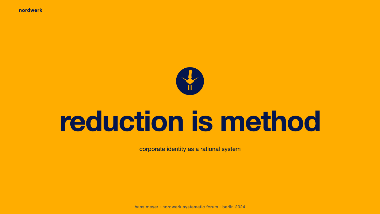
For presentation cover slides, the approach works best when a single large field of the warm accent yellow anchors the composition and the wordmark-equivalent sits in lowercase, heavy sans-serif type with generous surrounding space — resist the temptation to add a photograph or secondary graphic. For content and data slides, treat every slide as an application of the same fixed grid: consistent margins, a single hierarchy of heavy-to-light type sizes, and charts rendered as flat geometric shapes in navy or black against the pale ground, never as shaded or gradient-filled visualizations.
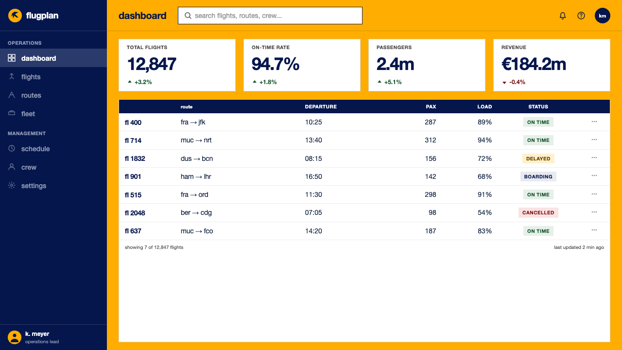
For web UI, the style suits dashboards and pricing pages where the goal is to communicate authority and precision rather than warmth. A dashboard should use the accent yellow sparingly — for a single primary action or a status highlight — while the bulk of the interface stays on a light, neutral ground with dark, lowercase-leaning sans-serif labels. Pricing pages benefit from the grid discipline: tiers laid out with identical internal spacing, a single accent color reserved for the recommended plan, and no illustrative embellishment competing with the type.
For editorial and marketing work, the style favors bold, poster-like full-bleed color fields interrupted only by heavy sans-serif headlines and a restrained mark. A magazine spread or landing page in this register should commit to one dominant color field per section rather than mixing several, and should let generous whitespace do the work that a decorative border would do in a less disciplined system.
A common mistake when applying this style is treating the yellow as merely 'a bold accent color' and pairing it with a conventional logo and mixed typefaces — this reintroduces exactly the inconsistency the original system was built to eliminate. The style only works when it is applied as a system: one color used at full commitment, one mark reduced to its simplest legible geometry, and one typeface carrying every layer of hierarchy through size and weight alone.
Lufthansa (Aicher) — FAQ
Is this the same as generic 'Swiss Style' or International Typographic Style?
They share a common ancestor but are not identical. Swiss/International Typographic Style is a broader typographic movement built around mathematical grids and sans-serif type, generally applied to posters and editorial work. The Lufthansa identity, designed at Ulm rather than in Switzerland, is a corporate identity system specifically — it extends the same grid-and-sans-serif logic to a symbol (the crane), a strict color rule, and a manual for reproducing both across dozens of physical media. Think of it as Swiss typographic discipline applied to the specific engineering problem of a national airline's total visual system.
Why lowercase type for a national airline in 1962 — wasn't that unusual?
It was unusual, and deliberately so. The Ulm school's position was that capitalization is an inherited typographic convention, not a functional necessity — spoken language carries no audible distinction between upper and lower case, so a rational design system had no obligation to preserve one visually. Choosing all-lowercase for a flag carrier's identity was a quiet but pointed statement that the system's logic, not tradition or ceremony, would govern every decision.
Why is the crane symbol so geometrically simplified compared to earlier versions?
Reproducibility. Lufthansa had used crane imagery since the 1920s, but earlier versions carried illustrative detail — feathers, naturalistic proportion — that could not survive being redrawn accurately at wildly different scales, by different vendors, in different materials. Gruppe E5 reduced the mark to a silhouette describable almost entirely with basic geometric construction, which meant a sign painter and an aircraft-paint crew, working thousands of miles apart with no direct contact, would still produce an identical result.
Does this style work with imagery and photography, or is it purely graphic?
The historic system was built almost entirely without photographic imagery — its authority comes from flat color, precise geometry, and disciplined type standing on their own. When photography is introduced into a contemporary application of this style, it works best treated the same way the crane mark is treated: high-contrast, cropped hard against a flat color field, never softened with gradients or naturalistic lighting that would undercut the system's engineered precision.
What kinds of products or brands does this style struggle to suit?
It struggles wherever warmth, playfulness, or individual craft expression is the desired impression — artisanal food brands, children's products, or anything positioning itself around handmade or personal character. The style's entire value proposition is depersonalized consistency at scale; applied to a product that wants to feel intimate or one-of-a-kind, the same rigor that makes it authoritative for an airline or an institution can instead read as cold or bureaucratic.
Related design styles
 2001 — A Space OdysseyAbsolute restraint. Black void, white monolith geometry, one HAL-red signal.
 Akzidenz-Grotesk BertholdObjectivity in black ink. White grotesque type, hard grid, one rationed red b…
 Helsinki Metro OrangeOne orange does the work. Archivo signage cuts across an 8px concrete tile gr…
 Israeli Bezalel ModernismForm follows the state. Hard Bauhaus discs and ochre bars on absolute blue, H…
 Nelly Rudin ConcreteFlat planes gain force. Archivo grids stage four industrial colours with hard…
 Olivetti Pintori (1955)Industry becomes poetry. Cream paper, machine red, and hard geometry abstract…