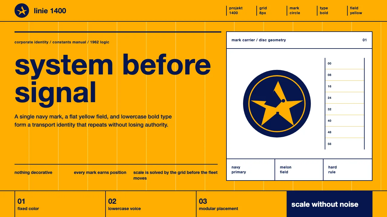
About Lufthansa (Aicher)
In 1962 Otl Aicher and the Gruppe E5 team at the Ulm School of Design rebuilt Lufthansa's identity as a system, not a logo. The Kranich — the crane — was reduced to pure geometry inside a defined circle, then deployed across a strict modular grid in lowercase Helvetica-Bold. Large flat fields of saturated melon yellow carry navy and black marks. Nothing is decorative; every element earns its position. This is the textbook of systematic corporate identity — rigorous, confident, and built to scale across a fleet.
- Origin
- Germany (Western Europe)
- Era
- 1950–1990; 'Projekt 1400' identity 1962
- Key figures
- Otl Aicher · Gruppe E5 · HfG Ulm
- Movements
- Ulm School systematic corporate identity · Swiss/International Typographic Style
Lufthansa (Aicher) design spec
Colors
Typography
The other 11 sections — buttons, cards, spacing, motion, techniques and more — open once you unlock. Download the DESIGN.md or send it to your AI in one click. Unlock once, yours forever.
Sign up nowStyles similar to Lufthansa (Aicher)
Also inspired by brands & products, with a close feel.
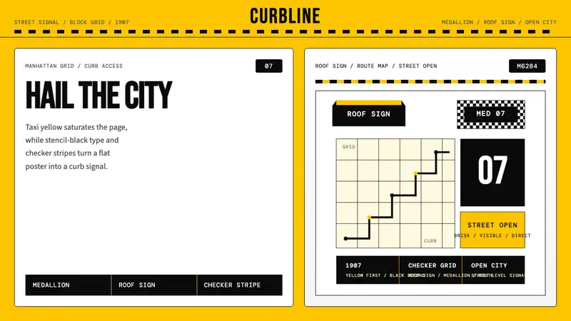 New York Yellow Cab (1907)Visibility is the brand. Taxi yellow, stencil type, checker stripes.
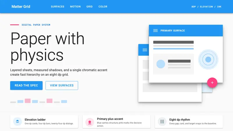 Material Design 1.0Depth made flat usable. Blue app bars, pink FABs, 8dp grids, and crisp paper shadows.
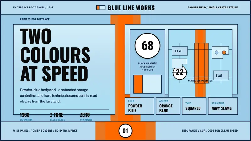 Gulf Racing LiverySpeed made disciplined. Powder blue, orange stripe, black roundel, strict grid.
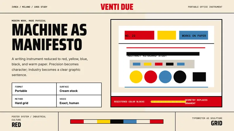 Olivetti Pintori (1955)Industry becomes poetry. Cream paper, machine red, and hard geometry abstract the typewriter.