What is Olivetti Pintori (1955)?什么是 Olivetti Pintori (1955)?
Giovanni Pintori turned a typewriter company into a manifesto — warm cream grounds, machine red, and hard geometry made Italian industry feel like art.乔瓦尼·平托里将一家打字机公司变成了一份宣言——温暖的奶油底色、机器红与硬朗几何,让意大利工业散发出艺术的气息。
Olivetti Pintori (1955) in briefOlivetti Pintori (1955) 速览
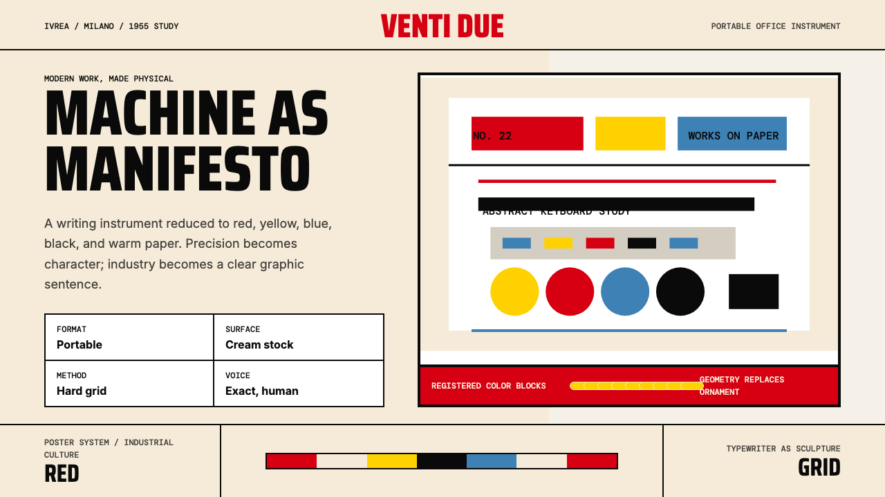
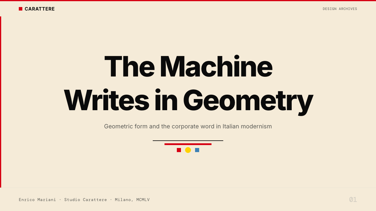
Olivetti Pintori (1955) names the visual language that Giovanni Pintori distilled for Olivetti across three decades, with the iconic Lettera 22 poster of 1955 standing as its purest expression. The system rests on a warm cream paper ground, a decisive Olivetti red, and geometric machine-forms abstracted to the edge of pure composition. It replaced decorative illustration with intellectual clarity — every surface treated as a modernist poster, every form earned by function.奥利维蒂·平托里(1955)指的是乔瓦尼·平托里在三十余年间为奥利维蒂提炼出的视觉语言,以1955年标志性的Lettera 22海报为最纯粹的表达。这套系统建立在温暖的奶油色纸张底色、果断的奥利维蒂红,以及被抽象至纯粹构图边缘的机械几何形之上。它以知性的清晰取代了装饰性插图——每一个界面都被视为现代主义海报,每一种形态都以功能为正当依据。
The palette is restrained but never cold. Cream grounds give warmth that stark white cannot; the characteristic red is neither fire-engine nor brick but a confident industrial tone that reads as both authority and vitality. Sun-yellow and sky-blue appear as counterpoints — used sparingly to punctuate hierarchy or signal contrast, never as background noise. Black anchors type and structural divisions with absolute decisiveness.色板克制却绝不冰冷。奶油色底面赋予了纯白所无法给予的温度;那种标志性的红,既非消防车红也非砖红,而是一种自信的工业色调,同时传递出权威与活力。日光黄与天空蓝作为对位色出现——被克制地用于标点层级或标示对比,绝不作为背景噪声。黑色则以绝对的果断锚定文字与结构分划。
Unlike purely rationalist corporate systems, Pintori's work carries a poetic charge. Machine parts — typewriter keys, typebars, mechanical linkages — are abstracted into floating geometric symbols that suggest function without depicting it literally. The result is a rare balance: rigorous enough to project corporate credibility, warm and inventive enough to feel human. It is this tension between industrial order and artistic sensibility that distinguishes Olivetti's design culture from all its contemporaries.与纯粹理性主义的企业系统不同,平托里的作品带有诗意的张力。打字机按键、活字杆、机械联动装置等机器零件被抽象为漂浮的几何符号,暗示功能却不做字面描绘。结果是一种罕见的平衡:足够严谨以彰显企业公信力,又足够温暖而富有创意以让人感受到人的存在。正是这种工业秩序与艺术感性之间的张力,让奥利维蒂的设计文化区别于同时代的所有竞争者。
See the Olivetti Pintori (1955) design system查看 Olivetti Pintori (1955) 完整设计系统
Where does Olivetti Pintori (1955) come from?Olivetti Pintori (1955) 从何而来?
Olivetti was founded in 1908 in Ivrea, a small Piedmontese town at the foot of the Alps, by Camillo Olivetti. From its earliest years the company was unusual: Camillo believed that a well-designed factory producing well-designed machines would be both more productive and more humane than the industrial norm. This philosophy — that beauty and efficiency were allied rather than opposed — would become the organizing conviction of Italian industrial modernism and the foundation upon which his son Adriano would build one of the world's most influential design programs.奥利维蒂公司由卡米洛·奥利维蒂于1908年创立于伊夫雷亚——阿尔卑斯山麓一座小小的皮埃蒙特城镇。公司从创立之初便与众不同:卡米洛相信,一座设计精良的工厂生产设计精良的机器,既能比工业常态更富生产力,也能更合乎人道。这一信念——美与效率是同盟而非对立——将成为意大利工业现代主义的核心主张,也是他的儿子阿德里亚诺构建世界上最具影响力设计项目之一的基础。
Adriano Olivetti, who took control of the company in 1938, expanded his father's instincts into a comprehensive cultural program. He hired architects to design factories and worker housing, commissioned artists to make posters, brought in designers to shape the machines themselves, and established a publishing house. Into this environment came Giovanni Pintori, who joined Olivetti in 1936 as a young Sardinian-born graphic designer trained at the Institute for Higher Industrial Arts in Monza. Pintori would remain at Olivetti until 1967, serving as head of the advertising office and producing the visual identity that made the company famous worldwide.1938年接掌公司的阿德里亚诺·奥利维蒂,将父亲的直觉扩展为一套全面的文化项目。他聘请建筑师设计工厂与工人住宅,委托艺术家制作海报,引进设计师塑造机器本身的形态,并创立了一家出版社。正是在这样的环境中,乔瓦尼·平托里来到了奥利维蒂。这位萨丁岛出生的年轻平面设计师毕业于蒙扎高等工业艺术学院,1936年加入公司,担任广告部门主任直至1967年,创作了令公司举世闻名的视觉识别系统。
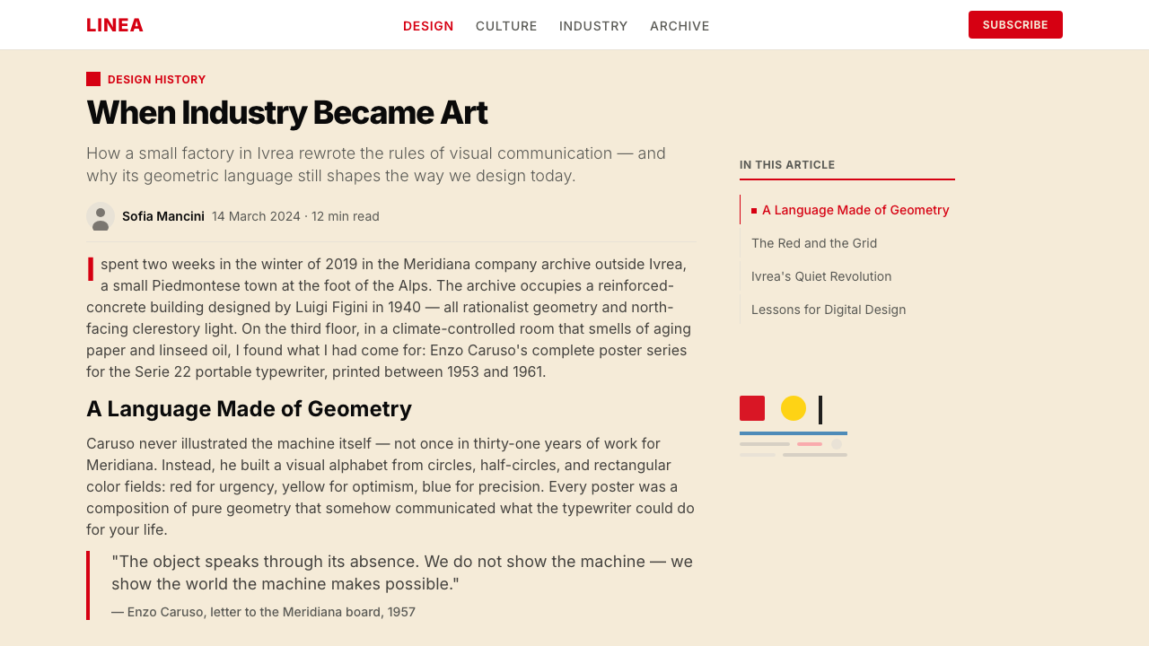
The year 1955 was pivotal. Marcello Nizzoli had already designed the Lettera 22 portable typewriter — one of the most celebrated industrial design objects of the twentieth century — and Pintori's poster campaign for it became the canonical image of Italian corporate modernism. The poster abstracted the typewriter's mechanical innards into floating geometric fragments on a cream field, anchored by a block of Olivetti red and spare sans-serif type. It was reproduced globally and entered the permanent collections of major design museums, cementing Pintori's and Olivetti's reputations simultaneously.1955年是关键的一年。马尔切洛·尼佐利已经设计出Lettera 22便携式打字机——二十世纪最受推崇的工业设计作品之一——而平托里为其创作的海报系列成为意大利企业现代主义的标志性图像。那张海报将打字机的机械内部结构抽象为漂浮在奶油色底面上的几何碎片,由一块奥利维蒂红色块与简约的无衬线字体锚定。海报在全球广泛传播,进入各大设计博物馆的永久馆藏,同时奠定了平托里与奥利维蒂的历史地位。
The movement that produced this work sits at the intersection of several forces: post-war Italian optimism about industry and reconstruction, the influence of Swiss and Central European modernism filtering through design schools like Monza, and the particular Olivetti belief — unusual for a corporation — that design was a social and cultural responsibility rather than mere marketing. Adriano Olivetti corresponded with architects, philosophers, and urbanists; he saw the factory town of Ivrea as a laboratory for a better relationship between capital, labor, and civic life. Pintori's posters were not advertisements in the conventional sense: they were cultural propositions.产生这一作品的运动交汇于数股力量之上:战后意大利对工业与重建的乐观精神,经由蒙扎等设计学校渗入的瑞士与中欧现代主义影响,以及奥利维蒂独特的企业信念——设计是一种社会与文化责任,而非单纯的市场营销。阿德里亚诺·奥利维蒂与建筑师、哲学家、城市规划者通信往来;他将伊夫雷亚工厂城视为探索资本、劳动与公民生活之间更好关系的实验室。平托里的海报从非常规意义上说并不是广告——它们是文化主张。
What defines the Olivetti Pintori (1955) look?Olivetti Pintori (1955) 的视觉特征是什么?
Color色彩
The palette centers on warm cream as ground, with a confident industrial red as the dominant accent — neither decorative nor aggressive, but declarative. Sun-yellow and sky-blue serve as secondary counterpoints, used to create visual hierarchy or punctuate a composition rather than to fill backgrounds. Black is reserved for type and hard structural lines. The system avoids both the austerity of pure white and the softness of pastels; its warmth is the warmth of good paper and physical craft.色板以温暖的奶油色为底面,以自信的工业红作为主要强调色——既不装饰,也不咄咄逼人,而是一种宣告性的存在。日光黄与天空蓝作为次级对位色,用于建立视觉层级或为构图画上句点,而非填充背景。黑色保留给文字与硬朗的结构线条。这套系统既回避纯白的严峻,也回避粉彩的柔软;它的温度,是好纸张与手工技艺的温度。
Geometric Abstraction几何抽象
Machine forms — typewriter keys, type bars, mechanical linkages, spools — are extracted from their functional context and recomposed as pure geometric elements: circles, rectangles, diagonals, and regular grids floating against open ground. The abstraction is never total; a careful eye can always recover the mechanical origin. This suspended legibility is the system's signature: it rewards close looking without demanding it.打字机按键、活字杆、机械联动装置、线轴等机器形态,被从其功能语境中提取出来,重新组合为纯粹的几何元素:圆形、矩形、斜线与规则网格,漂浮于开阔的底面之上。这种抽象从来不是彻底的;仔细凝视,总能找回其机械来源。这种悬置的可读性正是本系统的标志:它回馈细心的观看,却不强迫它。
Typography字体排印
Type is clean, upright, and sans-serif — selected for legibility and neutrality rather than personality. Headlines are set at generous scale to claim visual authority, while body text or supporting copy remains compact and secondary. Spacing between elements is deliberate and open: the white or cream ground is treated as a positive design element rather than empty margin. All-caps settings are used sparingly, for labels and product names, not as a general tone.字体干净、直立、无衬线——以可读性与中性为选择标准,而非个性表达。标题以充裕的尺度设置以彰显视觉权威,而正文或辅助文字则保持紧凑而从属的状态。元素间距经过刻意考量,保持开阔:白色或奶油色底面被视为正面的设计元素,而非空白边距。全大写设置被克制地用于标签与产品名称,而非作为普遍的语调。
Composition构图
Layouts are structured by an invisible but strongly felt grid. Compositions tend toward asymmetry — a large geometric cluster in one quadrant balanced by generous open space in another, or a dominant color block offset by a slender column of type. This asymmetric balance is not accidental but calculated: the eye is led through the page rather than arriving at a static center. The overall effect is of controlled tension, like a well-balanced but not obviously symmetrical piece of typography.版面由一条隐形但强烈存在的网格支撑。构图倾向非对称——一个大型几何聚落占据某一象限,被另一侧充裕的留白所平衡,或者一块主导性色块被一列纤细的文字栏所对位。这种非对称的平衡并非偶然,而是经过计算的:目光被引导着穿越页面,而不是停在一个静止的中心点。整体效果是一种受控的张力,如同一件均衡但并非显而易见对称的字体设计作品。
Flatness and Material Clarity平面性与材料清晰度
Every element is flat: color areas are solid without gradients, shapes have clean edges without soft shadows, and there is no simulation of three-dimensional depth through lighting effects. Where a sense of depth exists, it comes from compositional layering — one flat shape placed over another — not from illusionistic rendering. This flatness is not a technical limitation but a deliberate visual argument: the designed surface is its own reality, not a window onto another world.每个元素都是平面的:色彩区域实心无渐变,形态拥有干净的边缘而无柔和阴影,不以光照效果模拟三维深度。若有深度感,它来自构图式的层叠——一个平面形置于另一个之上——而非幻觉性的渲染。这种平面性不是技术上的限制,而是刻意的视觉主张:被设计的表面是其自身的现实,而非通往另一个世界的窗口。
Industrial Warmth工业温度
What distinguishes this system from colder rationalist modernism is a persistent warmth in material and spirit. The cream ground evokes paper, printing, and the physical act of writing; the red has a handcrafted quality — one thinks of sealing wax, of ink, of the precision object held in the hand rather than the institutional color field on a corporate wall. Even the geometric abstraction carries a sense of craft: these shapes feel drawn and placed with care, not generated by formula.使这套系统区别于更冰冷的理性主义现代主义的,是材料与精神上持续存在的温度。奶油色底面唤起纸张、印刷与书写这一身体性行为;那种红色带有手工艺的质感——让人联想到封蜡、墨水、握在手中的精密物件,而非企业墙面上的机构色块。即便是几何抽象也带有一种工艺感:这些形态感觉是被用心绘制与摆放的,而非由公式生成的。
Cultural Proposition文化主张
Pintori's work for Olivetti was conceived not as advertising in the conventional sense but as cultural communication — closer to the poster tradition of exhibition and public art than to the product brochure. This origin gives the system a certain boldness that purely commercial graphic systems lack: the compositions are willing to be abstract, to leave space empty, to foreground aesthetic intelligence over product information. Applied today, this cultural register elevates any communication that adopts it.平托里为奥利维蒂创作的作品,从构想之初便不是传统意义上的广告,而是文化传播——更接近展览与公共艺术的海报传统,而非产品手册。这一起源赋予这套系统某种纯粹商业平面系统所欠缺的大胆气质:构图愿意走向抽象,愿意留下空白,愿意将美学智性置于产品信息之上。在今天的应用中,这种文化气质能够提升任何采用它的传播内容。
See the Olivetti Pintori (1955) design system查看 Olivetti Pintori (1955) 完整设计系统
Who shaped Olivetti Pintori (1955)?谁塑造了 Olivetti Pintori (1955)?
Born in Sardinia in 1912 and trained at the Institute for Higher Industrial Arts in Monza, Pintori joined Olivetti in 1936 and remained until 1967, serving as head of the advertising office for most of that time. He was not a single-campaign designer but a sustained visual intelligence: over three decades he produced posters, brochures, exhibition graphics, and advertisements that maintained a coherent identity while never repeating themselves. His Lettera 22 poster of 1955 — geometric machine-fragments on cream, anchored by Olivetti red — became the defining image of Italian corporate modernism and entered the permanent collections of MoMA and other major museums. After leaving Olivetti he continued as an independent designer, but the Olivetti years remain the defining chapter of his career.1912年生于萨丁岛的平托里毕业于蒙扎高等工业艺术学院,1936年加入奥利维蒂,工作至1967年,在此期间大部分时间担任广告部门主任。他不是一个单一战役的设计师,而是一种持续的视觉智性:在三十余年间,他创作了海报、手册、展览图形和广告,在保持连贯识别性的同时从不重复自己。他1955年的Lettera 22海报——奶油色底面上的几何机器碎片,以奥利维蒂红锚定——成为意大利企业现代主义的决定性图像,进入了纽约现代艺术博物馆及其他主要博物馆的永久馆藏。离开奥利维蒂后他继续作为独立设计师工作,但奥利维蒂时期仍是他职业生涯的决定性篇章。
Adriano Olivetti (1901–1960) took control of the family company in 1938 and transformed it from a successful typewriter manufacturer into one of the twentieth century's most ambitious experiments in corporate culture. He believed that the corporation had social responsibilities extending far beyond profit: he built worker housing, schools, libraries, and cultural centers in Ivrea; he corresponded with architects, urbanists, and philosophers; he ran for political office. His hiring of Pintori, Nizzoli, and later Ettore Sottsass was not a marketing decision but a cultural one — he wanted Olivetti's objects and communications to embody a set of human values, not merely to sell machines. His death in 1960 left a void that the company never entirely filled.阿德里亚诺·奥利维蒂(1901—1960年)于1938年接掌家族企业,将其从一家成功的打字机制造商转变为二十世纪最具雄心的企业文化实验之一。他相信企业承担着远超盈利的社会责任:他在伊夫雷亚建设工人住宅、学校、图书馆与文化中心;他与建筑师、城市规划者和哲学家通信;他参选政治职位。他聘用平托里、尼佐利,以及后来的埃托雷·索特萨斯,不是出于市场营销的考量,而是文化上的——他希望奥利维蒂的产品与传播能体现一套人文价值观,而不仅仅是销售机器。他1960年的辞世留下了一道公司从未完全填补的空缺。
Nizzoli joined Olivetti in 1938 and became the industrial designer most responsible for the physical objects that Pintori's graphics celebrated. His Lexikon 80 typewriter (1948) and the Lettera 22 portable (1950) — the latter considered one of the most beautiful machines ever made — gave Pintori the sculptural subject matter that his poster campaigns abstracted and elevated. The collaboration between Nizzoli's three-dimensional industrial design and Pintori's two-dimensional graphic language is the core of what the world recognizes as the Olivetti aesthetic: an unusual unity between the object and its representation.尼佐利于1938年加入奥利维蒂,成为平托里平面图像所颂扬的物理对象背后最重要的工业设计师。他的Lexikon 80打字机(1948年)与Lettera 22便携式打字机(1950年)——后者被认为是有史以来最美丽的机器之一——为平托里的海报活动提供了被抽象和升华的雕塑性主题。尼佐利的三维工业设计与平托里的二维平面语言之间的协作,正是世界所认知的奥利维蒂美学的核心:物件与其表达之间罕见的统一性。
Sottsass joined Olivetti in 1958 as a consultant designer and over the following decades designed some of the company's most iconic products, including the Valentine typewriter (1969) and early mainframe computers. His sensibility — warmer, more color-saturated, and more culturally eclectic than either Nizzoli or Pintori — represents a next chapter in the Olivetti story that absorbed the 1955 visual language and began to transform it. His later founding of the Memphis design group drew explicitly on the Olivetti experience of treating industrial objects as cultural artifacts, though in a deliberately more ironic and maximalist register.索特萨斯于1958年以顾问设计师身份加入奥利维蒂,在此后数十年间设计了公司最具标志性的一些产品,包括情人节打字机(1969年)与早期大型计算机。他的感性——比尼佐利或平托里更温暖、色彩更饱和、文化上更兼容并蓄——代表了奥利维蒂故事的下一个篇章:它吸收了1955年的视觉语言并开始转化它。他后来创立的孟菲斯设计集团,明确借鉴了奥利维蒂将工业对象视为文化人工制品的经验,尽管采用了一种刻意更具反讽性与极大主义色彩的方式。
How do you use Olivetti Pintori (1955) today?今天怎么用 Olivetti Pintori (1955)?
Olivetti Pintori (1955) is among the most practically useful historical design systems for contemporary work, because its visual principles are simultaneously strong and warm — capable of projecting intelligence and authority without the severity that colder modernist systems can carry. Applying it well means understanding what it is actually doing: using the cream ground to establish a material presence, using the red as a decisive accent that commits to a statement, and using geometric abstraction to suggest that the work has been composed rather than merely assembled.奥利维蒂·平托里(1955)是当代设计工作中实际可用性最强的历史设计系统之一,因为它的视觉原则既强劲又温暖——能够传递智性与权威,却不带更冷酷的现代主义系统可能携带的那种严肃性。正确应用它意味着理解它实际上在做什么:用奶油色底面建立一种材质存在感,用红色作为做出明确陈述的果断强调,用几何抽象暗示作品是经过构思的,而非仅仅是被拼凑起来的。
For presentation slides, this system performs exceptionally well on both cover and content formats. A cover slide should be treated as a poster: one bold geometric form or abstracted mechanical element in the foreground, a clean product or concept name in a generous sans-serif, and the characteristic color combination — cream and red, or cream and deep black — doing the structural work. Content slides benefit from an open grid with wide breathing room; hierarchy is established through scale and color, not through decorative dividers or background fills. Data visualization slides are particularly well-suited to this system — charts and graphs become geometric objects in their own right, with bar charts reading as architectural elements and the palette lending consistency across multiple data series.在演示文稿中,这套系统在封面与内容格式上都表现出色。封面页应当被当作海报对待:一个大胆的几何形或抽象机械元素置于前景,一个干净的产品或概念名称以充裕的无衬线字体呈现,奶油与红色或奶油与深黑的标志性色彩组合承担结构性工作。内容页受益于开阔的网格与充裕的呼吸空间;层级通过尺度与色彩建立,而非借助装饰性分割线或背景填色。数据可视化页面尤其适合这套系统——图表本身成为几何对象,柱状图读来如同建筑元素,色板在多个数据系列间赋予一致性。
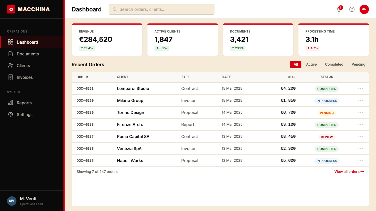
For web user interfaces, the system is well-suited to dashboards, product pages, and any context where clarity and considered visual intelligence are primary values. A practical approach: establish the cream or near-white ground as the default surface, reserve the red for the single most important interactive or status element per view, and use black with confidence for all typographic hierarchy. Card components should have clean, hard borders rather than soft diffuse shadows; interactive states should be communicated through color change and geometric indicators rather than animation-heavy affordances. The flat, bold quality of the system scales reliably from desktop to mobile without loss of character.对于网页用户界面,这套系统非常适合仪表板、产品页面,以及任何清晰度与审慎视觉智性是首要价值的场景。一种实用的方法:以奶油色或近白色底面作为默认界面,将红色保留给每个视图中唯一最重要的交互或状态元素,以黑色自信地处理所有字体层级。卡片组件应有干净的硬边框而非柔和漫射的阴影;交互状态应通过色彩变化与几何指示符传达,而非依赖动效繁重的视觉反馈。这套系统的平面而大胆的品质,在从桌面到移动端的缩放过程中能可靠地保持其特质。
For editorial and marketing applications, the Pintori language supports ambitious layouts that reward sustained attention. A long-form article or report can use the style's poster logic at a section level: major section breaks treated as compositional moments, with a color field or a large geometric element marking the transition. Marketing pages can adopt the system's cultural register directly — rather than leading with product specifications, lead with an abstracted image that suggests the product's world, then resolve into information. The Olivetti precedent is instructive here: the most celebrated posters did not depict the typewriter photographically but translated its mechanical logic into pure visual form, trusting the audience's intelligence.对于编辑与营销应用,平托里语言支持值得细细品味的雄心版面。一篇长文章或报告可以在章节层面运用这套风格的海报逻辑:重要的章节转换被视为构图性时刻,以色彩块或大型几何元素标记过渡。营销页面可以直接采用这套系统的文化语调——与其以产品规格开场,不如以一幅暗示产品所在世界的抽象图像引导,再逐步展开为具体信息。奥利维蒂的先例在此颇具启发:最受称道的那些海报并不通过摄影描绘打字机,而是将其机械逻辑转译为纯粹的视觉形式,相信观者的智识判断。
A common mistake when applying this system is treating the Olivetti red as a general highlight color to be used liberally throughout a composition. In authentic Pintori work, the red is used decisively and sparingly — it marks a specific statement, not a general decorative impulse. Overusing it dilutes the authority it provides. Similarly, the geometric abstraction should feel composed and considered, not randomly scattered: each shape should have a reason to be where it is, whether that reason is structural, hierarchical, or symbolic. The difference between Pintori-derived work and work that merely borrows the surface is precisely this quality of considered placement — the sense that every element was put there for a reason.应用这套系统时最常见的错误,是将奥利维蒂红当作可以在构图中自由大量使用的普通高亮色。在真实的平托里作品中,红色被果断而克制地使用——它标记一个特定的陈述,而非普遍的装饰冲动。过度使用会稀释它所提供的权威感。同样,几何抽象应当感觉是经过构思与考量的,而非随意散布:每一个形态都应有其所在位置的理由,无论这理由是结构性的、层级性的还是象征性的。平托里衍生作品与仅仅借用表面的作品之间的区别,正在于这种经过考量的摆放品质——每个元素都因某种理由而在那里的感觉。
See the Olivetti Pintori (1955) design system查看 Olivetti Pintori (1955) 完整设计系统
Olivetti Pintori (1955) — FAQOlivetti Pintori (1955) · 常见问题
How is Olivetti Pintori different from Swiss International Style, which also uses geometric forms and sans-serif type?奥利维蒂·平托里与同样使用几何形态和无衬线字体的瑞士国际主义风格有何不同?
The two systems share formal tools — geometric forms, sans-serif type, grid-based composition — but differ fundamentally in temperature and intent. Swiss International Style, as it developed in the 1950s and 1960s, was driven by a commitment to neutral, universal communication: the system should work for any client, any message, any culture. Pintori's work was the opposite of universal; it was intensely specific to Olivetti, to Italy, to a particular moment when industry felt like culture. The cream ground and the warm red are not neutral; they carry a material warmth that Swiss grids rarely do. Pintori also allowed himself compositional poetry — floating geometric fragments, deliberate ambiguity — that a strict Swiss functionalist would have edited out as insufficiently purposeful.两套系统共享形式工具——几何形态、无衬线字体、网格化构图——但在温度与意图上有根本性的不同。瑞士国际主义风格在1950至60年代的发展,受到对中性、普遍传播之承诺的驱动:这套系统应当适用于任何客户、任何信息、任何文化。平托里的作品则与普遍性背道而驰;它高度特定于奥利维蒂、特定于意大利、特定于工业感觉像文化的那个特殊时刻。奶油色底面与温暖的红色并非中性;它们携带着瑞士网格极少具备的材质温度。平托里也允许自己进行构图上的诗意表达——漂浮的几何碎片、刻意的模糊性——这些东西,严格的瑞士功能主义者会将其作为目的性不足的内容剪掉。
Can this system work for digital products, or does it feel too rooted in print and poster history?这套系统能用于数字产品吗,还是它感觉过于植根于印刷与海报历史?
It translates to digital contexts very naturally, partly because its core principles — flat color, clean geometry, open space, decisive typographic hierarchy — were already structurally suited to screen environments long before digital design existed as a discipline. The absence of gradients and soft shadows means the system does not rely on rendering effects that strain at small sizes or on lower-resolution displays. The challenge in digital application is resisting the temptation to add motion, hover effects, and interaction states that contradict the system's composed stillness. Used well in a dashboard or data product, the Pintori language communicates that the interface has been thought about — that intelligence, not just engineering, has been brought to bear.它非常自然地迁移到数字语境中,部分原因在于其核心原则——平面色彩、干净几何、开阔空间、果断的字体层级——在数字设计作为一个学科存在之前,便已在结构上适合屏幕环境。没有渐变与柔和阴影,意味着这套系统不依赖在小尺寸或低分辨率屏幕上表现吃力的渲染效果。数字应用中的挑战在于抵制添加动效、悬停效果与交互状态的诱惑——这些东西会与系统经过构思的静止感相矛盾。在仪表板或数据产品中得当运用,平托里语言能够传达出:这个界面是经过深思熟虑的——不仅仅是工程,还有智性的介入。
Is the warm cream ground essential, or can the system work on a pure white or dark background?温暖的奶油色底面是必不可少的吗,还是这套系统可以在纯白或深色背景上使用?
The cream ground is not strictly essential, but replacing it changes the emotional register meaningfully. On pure white, the system becomes crisper and more clinical — closer to rationalist modernism and further from the warmth that distinguishes Pintori's work. The red reads more aggressively against white than against cream, and the overall feel shifts from material toward digital. This is not necessarily wrong — a contemporary application might deliberately want that crisper quality — but it is a different statement. On a dark background, the system requires rebalancing: the red tends to dominate, the cream moves to serve as a primary type and accent color, and the sky-blue and sun-yellow become more prominent counterpoints. The dark inversion works best when committed to fully rather than attempted as a partial reversal.奶油色底面在严格意义上并非不可替代,但替换它会有意义地改变情感调性。在纯白背景上,这套系统变得更清脆、更临床——更接近理性主义现代主义,更远离平托里作品的标志性温度。红色在白色底面上比在奶油色底面上显得更有攻击性,整体感觉从材质性向数字性偏移。这未必是错的——当代应用可能刻意需要那种更清脆的品质——但这是一种不同的陈述。在深色背景上,这套系统需要重新平衡:红色倾向于主导整体,奶油色转而充当主要的文字与强调色,天空蓝与日光黄作为更突出的对位色。深色反转版本在完全投入而非部分反转的情况下效果最佳。
How do I handle photography or illustration within this design system?如何在这套设计系统中处理摄影图像或插图?
Photography, when used, should be treated as a flat compositional element rather than a naturalistic scene-setter. The Olivetti tradition — influenced by mid-century Italian photography and design photography — favored close-cropped details, unusual angles, and high contrast that emphasized geometric qualities in objects over narrative or atmospheric qualities. A photograph of a product detail, cropped to isolate a geometric form and treated at high contrast, integrates naturally into the system. Full-bleed lifestyle photography with soft natural light is fundamentally at odds with the system's logic. Illustration, if used, should tend toward the diagrammatic — line-based, flat, precise — rather than toward organic, expressive, or decorative forms.摄影图像在使用时,应被当作平面构图元素而非自然主义的场景营造手段来处理。奥利维蒂传统——受二十世纪中叶意大利摄影与设计摄影影响——偏好紧密裁切的细节、非常规角度以及高对比度,这些处理强调对象的几何品质,而非叙事性或氛围性品质。一张被裁切以隔离几何形态、经过高对比度处理的产品细节照片,能够自然地融入这套系统。带有柔和自然光线的全幅生活方式摄影则与这套系统的逻辑根本对立。插图若使用,应趋向示意图式——线条为基础、平面、精确——而非有机的、表现性的或装饰性的形式。
Where does this style work poorly, and what contexts should designers avoid?这种风格在哪里表现欠佳?设计师应避免将其用于哪些场景?
The system struggles wherever softness, organic warmth, or sensory richness are primary emotional values. Food and beverage brands, wellness and health applications, children's products, fashion and beauty, and any context where the user experience depends on organic texture and human intimacy will find the system's geometric decisiveness working against rather than for the communication. The style also tends to read as masculine in cultural contexts where gender-coded warmth is expected — a limitation worth acknowledging rather than fighting. Additionally, the system is poorly suited to highly photographic or illustrative contexts: it was built around abstraction, and forcing it to coexist with realistic imagery creates a tonal conflict rather than a productive tension. Knowing these limits is as important as knowing the style's strengths.这套系统在柔软感、有机温度或感官丰富性是首要情感价值的场景中表现欠佳。食品与饮料品牌、健康与养生应用、儿童产品、时尚与美妆,以及任何用户体验依赖有机质感与人文亲密感的场景,都会发现这套系统的几何果断性适得其反。在文化语境中,这种风格也往往被解读为男性化——在期待性别化温度的场景下,这是一个值得承认而非抗争的局限。此外,这套系统不适合高度依赖摄影或插图的场景:它建立在抽象之上,强迫它与写实图像共存会产生音调上的冲突,而非富有成效的张力。了解这些局限与了解这种风格的优势同样重要。
Related design styles相关设计风格
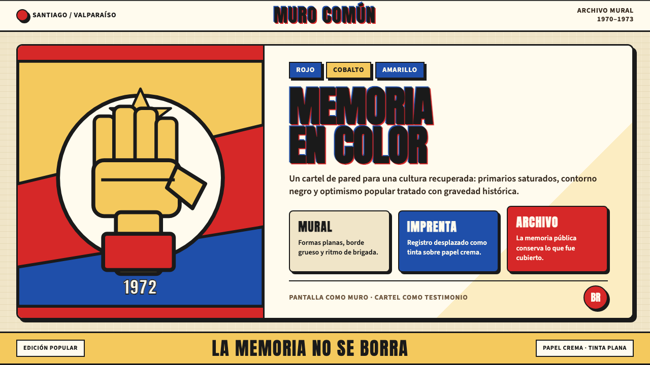 Chilean Allende-Era Propaganda (1972)Solemn revolution. Red, cobalt and yellow lock into thick black mural geometr…庄重的革命感:红、钴蓝与黄被黑色粗线锁进壁画几何。
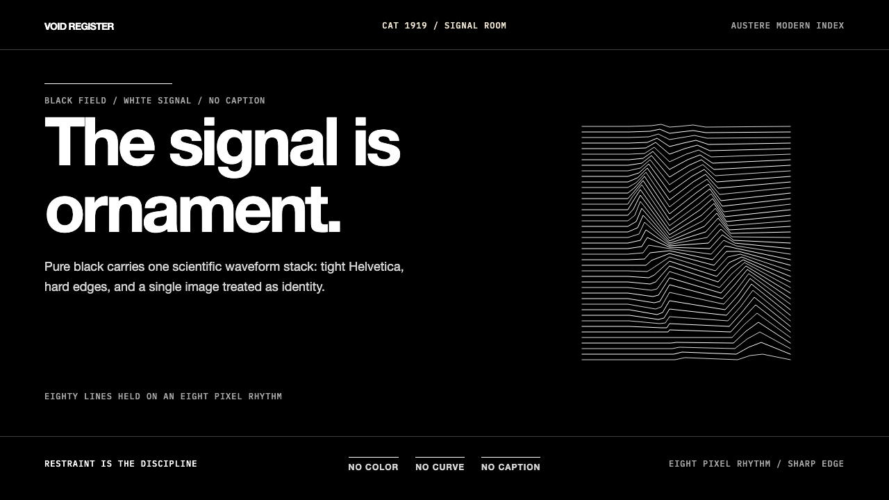 Joy Division — Unknown PleasuresRestraint becomes signal. Black field, tight Helvetica, and white pulsar line…克制成为信号。黑场、紧排Helvetica与白色脉冲线完成全部表达。
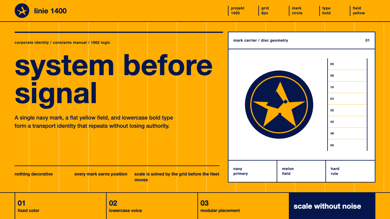 Lufthansa (Aicher)Systems speak first. Melon yellow, navy disc mark, lowercase Helvetica on a h…系统先发声:蜜瓜黄、海军蓝圆标与小写Helvetica钉在硬网格上。
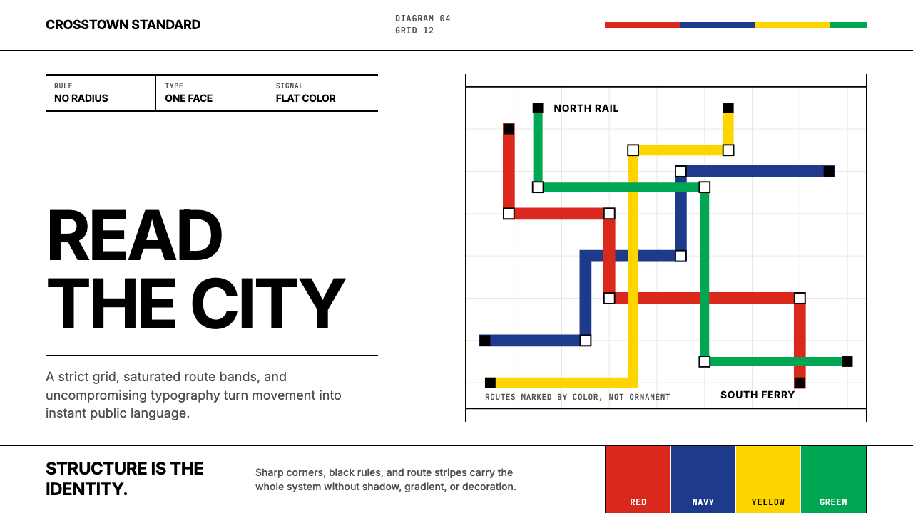 Massimo Vignelli NYCClarity becomes infrastructure. Black rules and route stripes lock the white…清晰即基础设施。白底黑线与路线色带锁定网格。
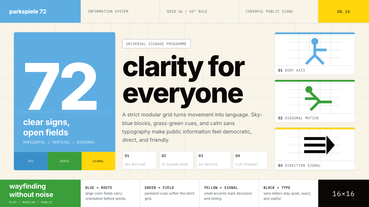 Otl Aicher Munich OlympicsFriendly rigor. Sky-blue grids and straight-line pictograms make public infor…友好的严谨:天蓝网格与直线图标,让公共信息普世清晰。
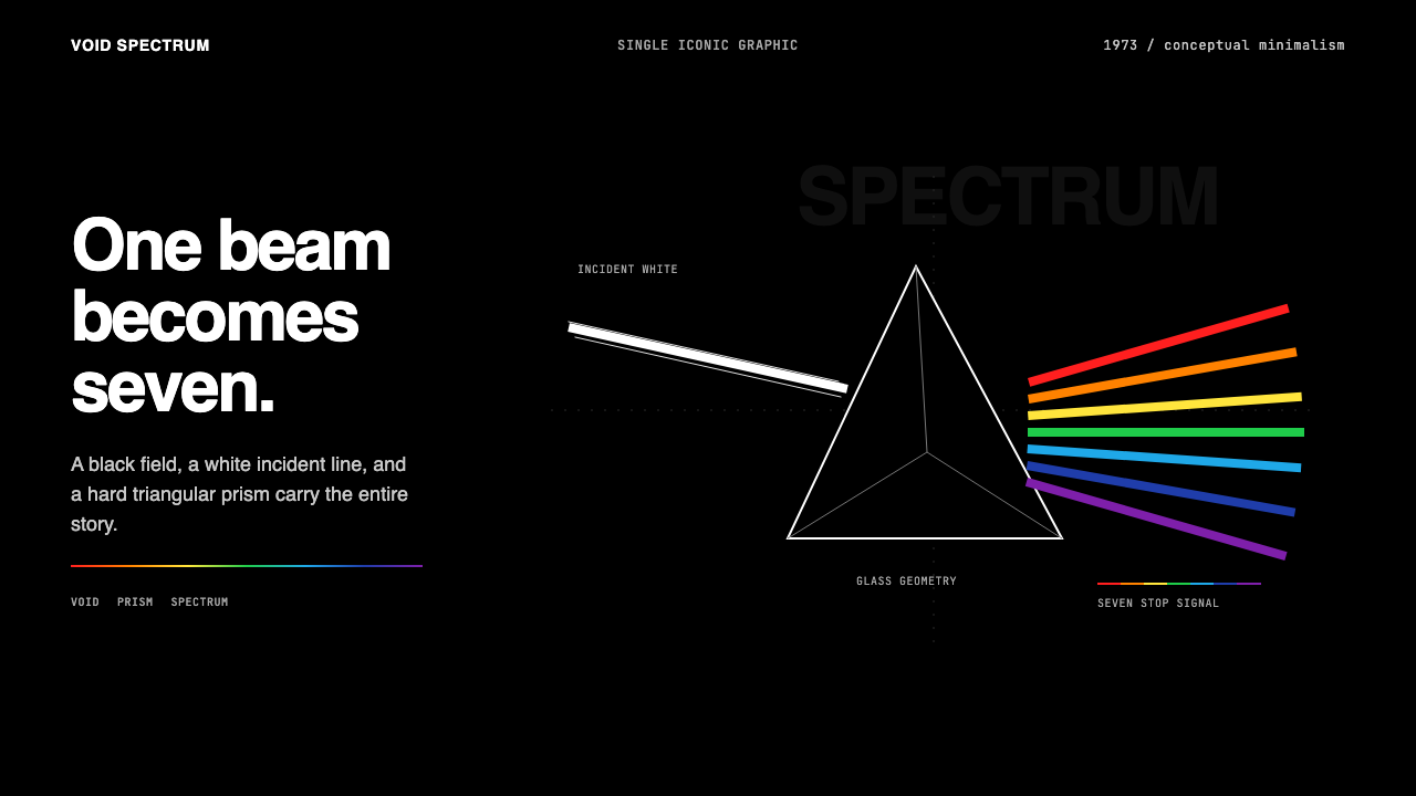 Pink Floyd — Dark Side of the MoonOne image does everything. Black void, white beam, hard prism, seven exact co…一个图像完成全部:黑色虚空、白光、硬棱镜与七色光谱。