About Tokyo 1964 (Kamekura)
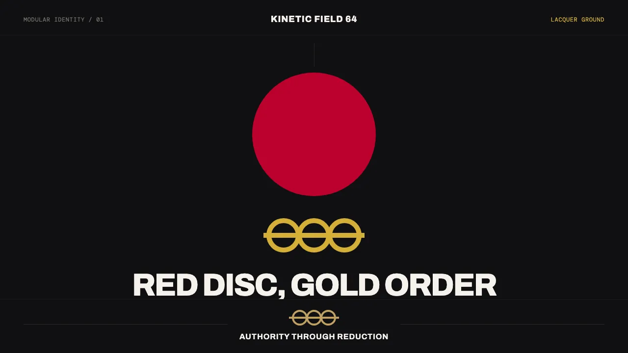
Yusaku Kamekura's identity for the 1964 Tokyo Olympic Games was the first fully systematized Olympic visual program — a solid Hinomaru red sun disc above gold Olympic rings and a clean grotesque "TOKYO 1964." Kamekura set the mark on a deep black lacquer field as readily as on white, fusing Swiss typographic order with the radical minimalism of the Japanese flag. This system carries that authority into interface: one perfect red circle, a gold ring system, and a strict modular grid on near-black ground.
- Origin
- Tokyo, Japan
- Era
- 1950s–1990s; the 1964 Tokyo Summer Games identity
- Key figures
- Yusaku Kamekura · Masaru Katzumie · Yoshiro Yamashita
- Movements
- Japanese postwar graphic design · Swiss International Typographic Style · systematized Olympic identity
Tokyo 1964 (Kamekura) design spec
Colors
Background
Surface
Primary
Secondary
Accent
Text
Typography
ArchivoHeadings
InterBody
DM MonoMono
Unlock for 1 credit
The other 11 sections — buttons, cards, spacing, motion, techniques and more — open once you unlock. Download the DESIGN.md or send it to your AI in one click. Unlock once, yours forever.
Sign up nowHave an account? Sign in
Styles similar to Tokyo 1964 (Kamekura)
Also inspired by brands & products, with a close feel.
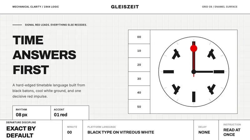 Swiss Railway ClockPrecision refuses decoration. Black batons and one red hand cut through enamel white.
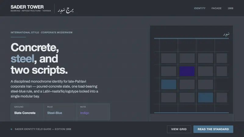 Tehran Bank ModernismLate-Pahlavi corporate cool. Slate concrete ground, one steel-blue rule, a Latin–nasta'liq lockup.
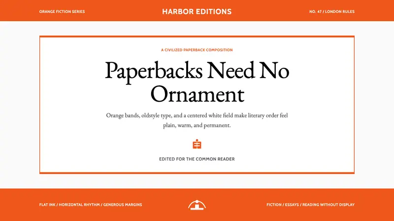 Penguin Classics OrangePaperback authority. Orange tri-bands, serif title panel, and flat ink enforce calm order.
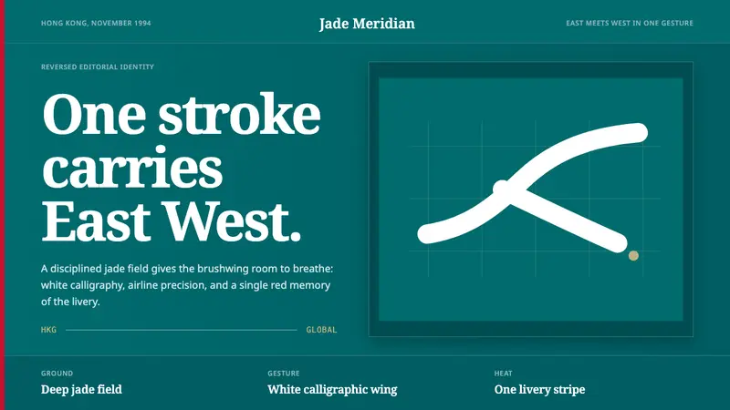 Cathay BrushwingCalm carries the gesture. Deep jade, white brushwing, one red stripe on an editorial grid.