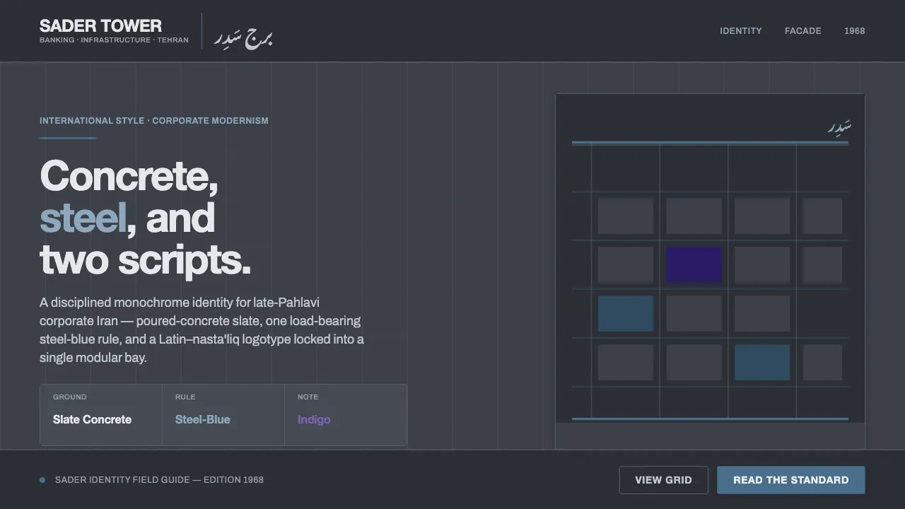
About Tehran Bank Modernism
Tehran Bank Modernism distills the corporate identity of late-Pahlavi Iran — Bank Saderat and the National Iranian Oil Company, whose poured-concrete towers, restrained steel-blue accents, and bilingual logotypes defined a confident International-Style aesthetic around 1968.
The system is built on a cool slate-grey concrete ground, thin steel-blue rules, and clean modernist sans paired with flowing nasta'liq script — a disciplined, monochrome corporate voice that blends Latin and Persian letterforms.
- Origin
- Middle East — Tehran, Pahlavi Iran
- Era
- 1950–1990 (Bank Saderat est. 1952; late-Pahlavi modernism, c. 1968)
- Key figures
- Bank Saderat Iran · National Iranian Oil Company (NIOC) · Late-Pahlavi corporate identity designers
- Movements
- Late-Pahlavi corporate modernism · International-Style concrete architecture · Bilingual Latin + nasta'liq logo design
Tehran Bank Modernism design spec
Colors
Background
Surface
Primary
Secondary
Accent
Text
Typography
Helvetica NeueHeadings
ArchivoBody
Noto Nastaliq UrduMono
Unlock for 1 credit
The other 11 sections — buttons, cards, spacing, motion, techniques and more — open once you unlock. Download the DESIGN.md or send it to your AI in one click. Unlock once, yours forever.
Sign up nowHave an account? Sign in
Styles similar to Tehran Bank Modernism
Also inspired by brands & products, with a close feel.
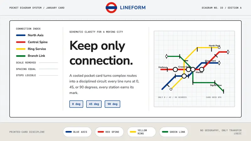 Tube Map (Beck)Connection beats geography. Blue-red-yellow routes snap to a cool card grid.
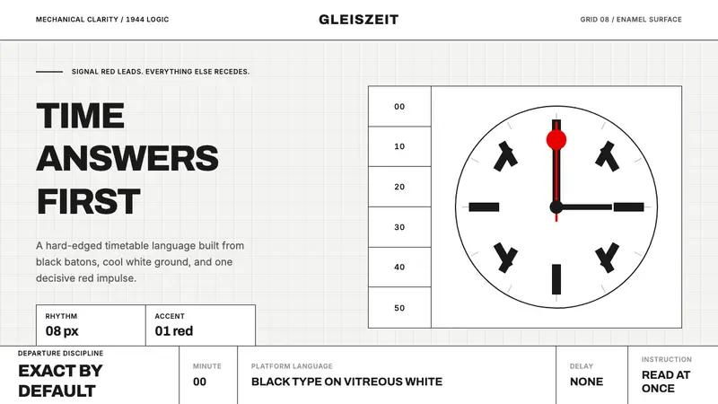 Swiss Railway ClockPrecision refuses decoration. Black batons and one red hand cut through enamel white.
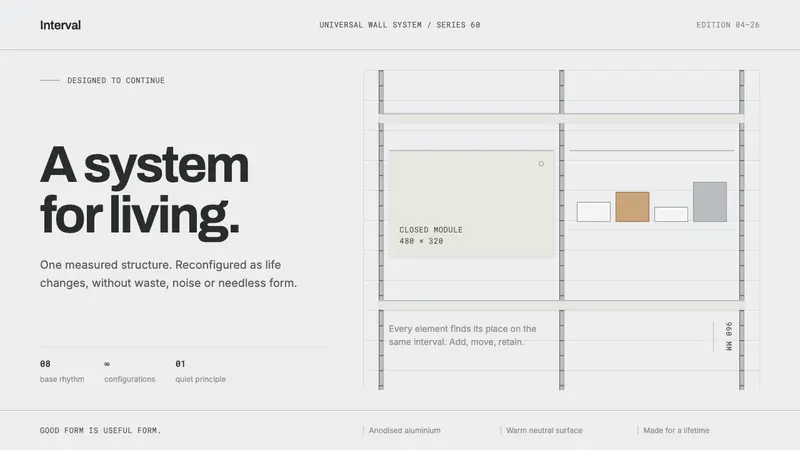 Vitsœ 606 ShelvingQuiet form, built to endure. Brushed silver rails impose rhythm on cool plaster and open space.
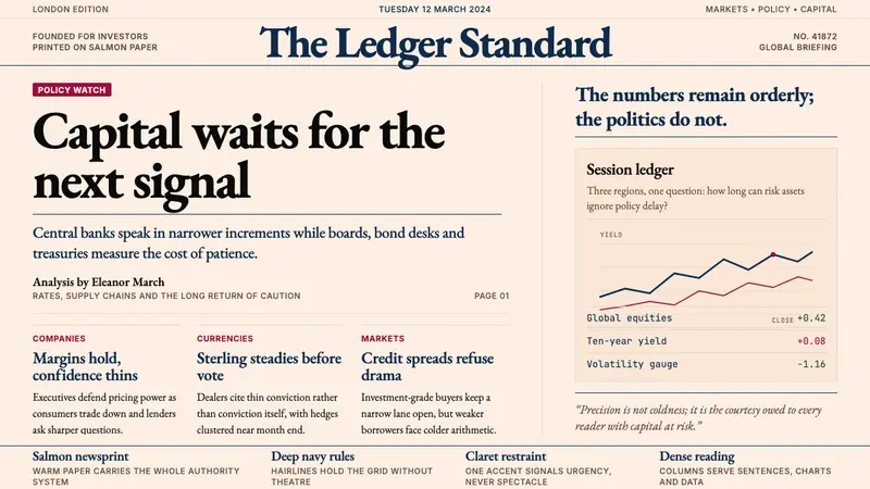 Financial Times (Pink Paper)Authority on salmon paper. Deep navy rules and claret accents discipline dense serif columns.