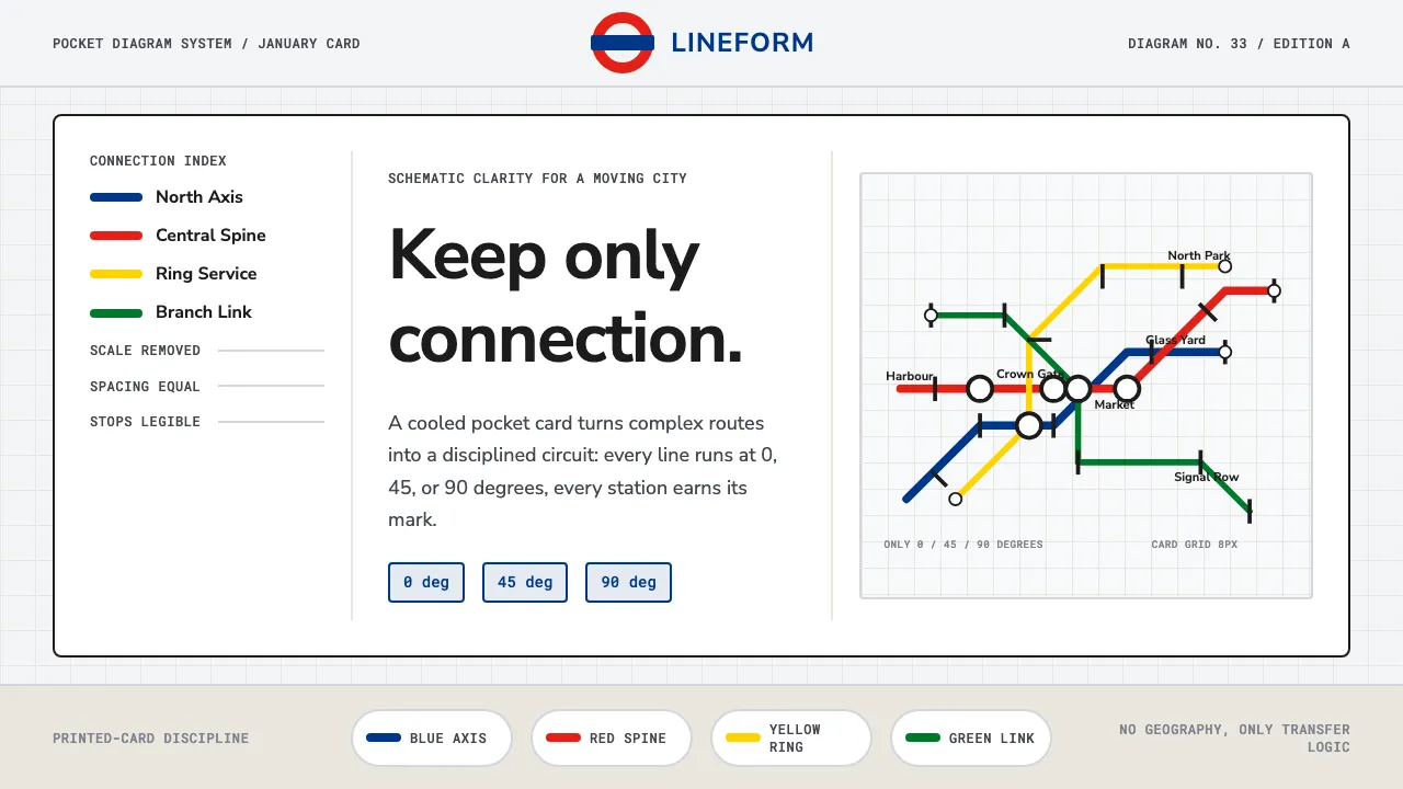
About Tube Map (Beck)
In January 1933 a London Transport engineering draughtsman named Harry Beck redrew the Underground not as geography but as a circuit board: coloured lines running only at 0°, 45° and 90°, stations spaced evenly, interchanges marked by blobs and ticks. It threw away scale and kept only connection — and it worked so well it became the template for transit maps worldwide.
The system pairs that diagrammatic discipline with Edward Johnston's 1916 sans-serif and the red-ring, blue-bar roundel. The result is calm, exact, and unmistakably London: nothing decorative, every element load-bearing, every line legible at a glance on a pale pocket card.
- Origin
- London, United Kingdom
- Era
- 1900–1950 (diagram first published January 1933; visual system maintained to present)
- Key figures
- Harry Beck · Edward Johnston · London Transport / TfL
- Movements
- Information design · Modernist diagrammatic abstraction · Schematic cartography
Tube Map (Beck) design spec
Colors
Typography
The other 11 sections — buttons, cards, spacing, motion, techniques and more — open once you unlock. Download the DESIGN.md or send it to your AI in one click. Unlock once, yours forever.
Sign up nowStyles similar to Tube Map (Beck)
Also inspired by brands & products, with a close feel.
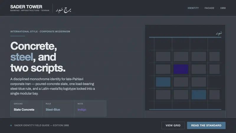 Tehran Bank ModernismLate-Pahlavi corporate cool. Slate concrete ground, one steel-blue rule, a Latin–nasta'liq lockup.
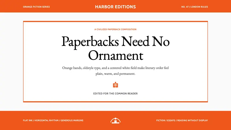 Penguin Classics OrangePaperback authority. Orange tri-bands, serif title panel, and flat ink enforce calm order.
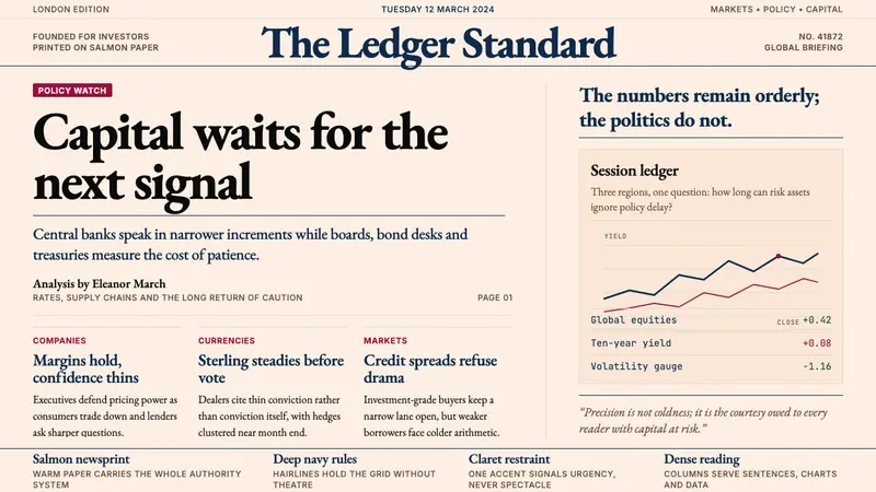 Financial Times (Pink Paper)Authority on salmon paper. Deep navy rules and claret accents discipline dense serif columns.
 JAL Crane MarkReduction carries authority. One red circle mark breathes on cool off-white.