What is Tube Map (Beck)?
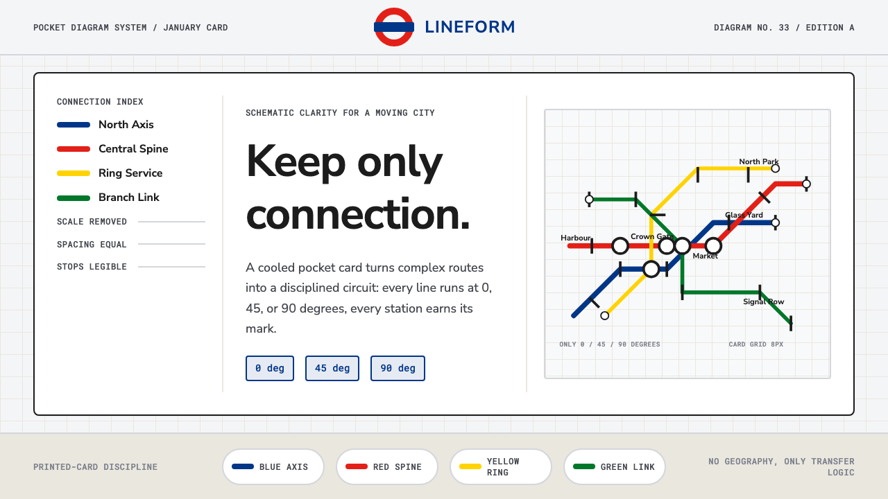
The Tube map threw away real geography and kept only one thing — how to get from here to there — and in doing so invented the visual language every transit map on Earth still speaks.
Tube Map (Beck) in brief
The London Underground diagram, drawn by engineering draughtsman Harry Beck and first published in January 1933, is not a map in the cartographic sense at all. It is a circuit diagram wearing a map's clothes: colored lines running only at horizontal, vertical, or 45-degree angles, stations spaced at even intervals regardless of their true distance apart, interchanges marked with plain geometric ticks and blobs. Central London, in reality a dense knot of stations a few minutes' walk apart, is stretched out for legibility; the outer suburbs, sprawling for miles, are compressed inward. None of it is true to scale, and that is the entire point.
The system pairs this diagrammatic honesty with two older pieces of London Transport identity: Edward Johnston's 1916 sans-serif letterforms, designed specifically for legibility on station signage at a distance and in motion, and the roundel — a solid red ring crossed by a horizontal blue bar bearing the station name — which had already been in use for two decades before Beck's map gave it a new job as an interchange marker. Together, diagram, typeface, and roundel form a single closed system: nothing in it is decorative, nothing is optional, and every mark on the page exists to answer one question a rider is asking under pressure — where do I get off, and where do I change.
The visual result is calm rather than busy, despite carrying an enormous amount of information. A pale, cool background holds saturated line colors that read instantly as distinct routes. Text sits close to the lines it labels, always horizontal, never fighting for space with the geometry beneath it. It is one of the most influential pieces of information design ever produced, and it did that job by refusing to be a picture of London at all.
Where does Tube Map (Beck) come from?
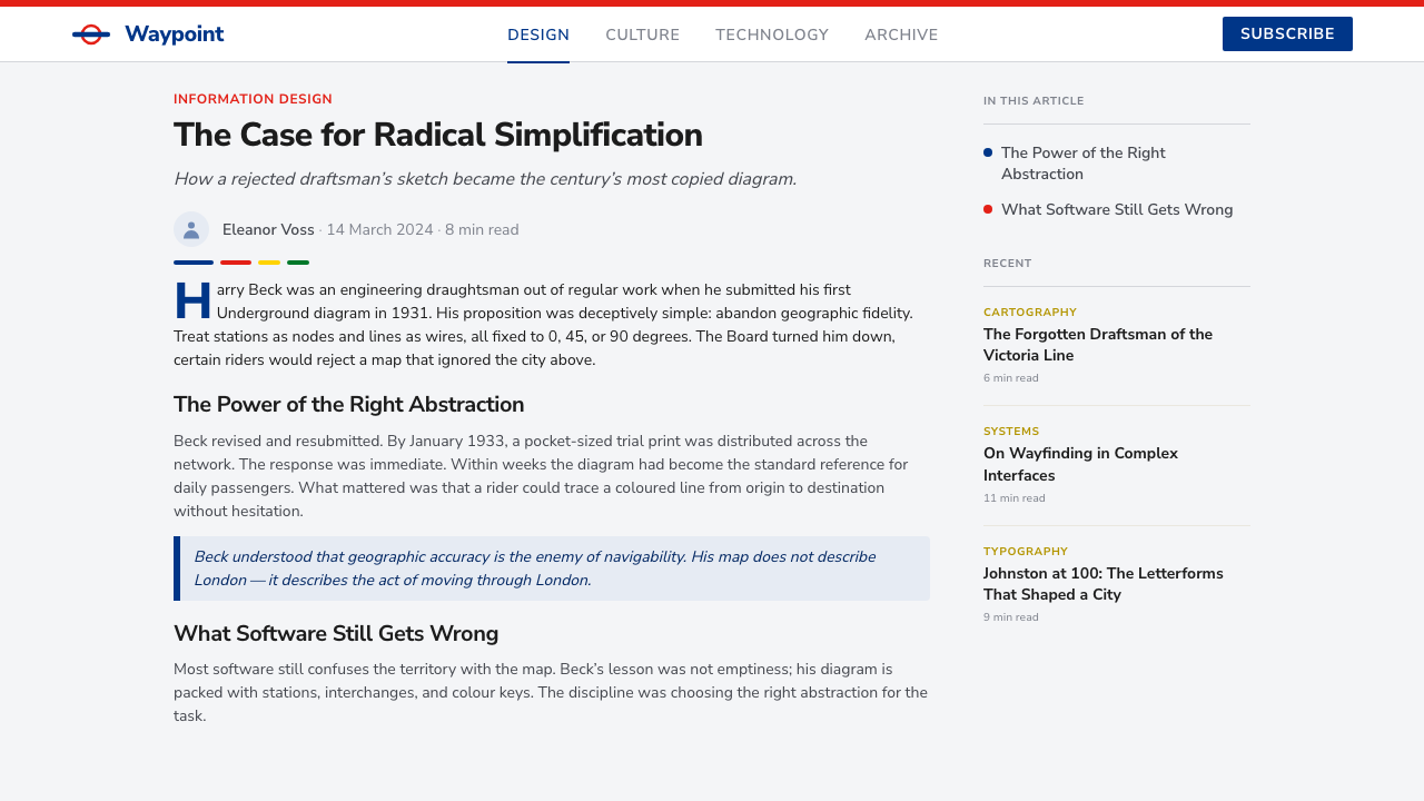
Harry Beck was not a cartographer and had no formal training in graphic design. He was a 29-year-old engineering draughtsman employed by London Underground's Signals Engineering department, drawing wiring diagrams for the network's electrical systems in his day job. In 1931, on his own time, he sketched an alternative to the Underground's official map — by then a tangled, geographically accurate mess whose lines radiated outward from the crowded center in a way that made central London nearly unreadable while wasting space on the sparse outer suburbs.
Beck's insight was that a rider changing trains does not care about compass directions or true distances between stations; a rider cares about sequence and connection. He redrew the network the way he drew electrical circuits: straight lines at only three permitted angles, evenly spaced stations, and interchanges as the only features needing special emphasis. He pitched the idea to his employer twice before it was accepted, and the publicity department was reportedly cautious, printing an initial 1933 trial run as a small pocket card rather than the large station-poster format. Riders took to it immediately, and the pocket-card edition sold out within weeks, forcing a swift, much larger reprint.
The diagram's success owed as much to what already existed at London Underground as to Beck's own idea. The organization had spent the 1910s and 1920s, under managing director Frank Pick, building one of the most disciplined design programs of any transport operator anywhere. Pick had commissioned Edward Johnston to design a dedicated typeface in 1916 so that signage would be instantly recognizable at a glance, and had standardized the roundel as the system's universal mark across stations, vehicles, and publicity. Beck's diagram slotted into a visual identity that was already rigorous and system-wide; it did not have to invent legibility from nothing, only apply diagrammatic logic to the network map itself.
Beck continued revising the map for roughly three decades as new lines opened, and his approach was gradually recognized well beyond London. Transit authorities worldwide — from Paris and New York to Tokyo and Sydney — adopted schematic, connection-first diagrams modeled directly on his 1933 solution, to the point that the diagrammatic transit map is now the default assumption for how a subway system ought to be shown, rather than one designer's particular invention. Transport for London has refined the visual system since, but its structural logic — straight lines, even spacing, connection over geography — remains unchanged from Beck's original circuit-board thinking.
What defines the Tube Map (Beck) look?
Color
Each line is assigned one saturated, fully distinguishable hue — a strong red, a deep blue, a bright yellow, a cool green, and so on — and that color is used consistently and exclusively for that line across every version of the map. Color here is not decorative choice but a coding system: it lets a rider's eye follow a single route through a dense tangle of intersecting lines without reading a single label. The background stays pale and neutral, cool rather than warm, so that the line colors read at full strength and never compete with the page itself.
Line Geometry
Every route is drawn using only three angles: horizontal, vertical, and 45 degrees. There are no curves, no free-hand bends, no organic wandering to match a river or a road. A line that in reality sweeps gently through the city is redrawn as a short sequence of straight segments meeting at clean angles. This constraint is what gives the whole system its circuit-board character — it looks engineered rather than surveyed, designed rather than traced from a landscape.
Even Spacing over True Scale
Stations are placed at regular intervals along a line regardless of the true distance between them. Two stations a few hundred meters apart in the crowded center and two stations several miles apart in the outer suburbs can occupy visually similar spans on the diagram. This deliberate distortion is what makes the busy central zone readable at all — stretching it out gives every station room to carry its own label — while quietly compressing the sprawling outskirts into a manageable frame.
Interchange Marking
Ordinary stations are marked with a small, unobtrusive tick; stations where a rider can change between lines are marked with a distinct, larger blob or a linked ring shape that visually interrupts the line. This hierarchy is strict and consistent — the eye is trained to scan for the larger marks first, because those are the decision points, while ordinary stations recede into the background rhythm of the line.
Typography
Station names are set in a purpose-built sans-serif designed for signage legibility rather than for editorial reading — clean, geometric, with no calligraphic flourish. Labels sit close to their station marks, oriented horizontally wherever possible even when the line beneath them runs at an angle, so that the eye never has to tilt to read a name. Nothing is italicized or decoratively varied; consistency of the letterform across hundreds of station names is itself part of the system's calm.
Layout and Negative Space
The overall page favors generous breathing room between lines even in the densest interchange clusters. Nothing is crammed to save space; instead, the whole diagram is redrawn — angles adjusted, spacing renegotiated — until it fits comfortably. This willingness to distort the underlying reality in service of clean negative space is the single habit that most separates a true diagram from a merely simplified map.
The Roundel as System Mark
The red ring crossed by a horizontal bar functions as the system's signature — a single, endlessly repeatable mark that identifies a station, a vehicle, or a piece of official signage as belonging to the network at a glance, independent of any text it might carry. Its geometry is plain almost to the point of austerity: a ring, a bar, nothing added. That plainness is what allows it to scale from a tiny map icon to a full station facade without ever needing to be redrawn or reinterpreted.
Who shaped Tube Map (Beck)?
An engineering draughtsman by trade, not a designer, Beck applied the visual logic of electrical circuit diagrams to the Underground network in 1931, producing the map that would be published in 1933. He continued to revise and extend the diagram for roughly three decades as the network grew, defending its core principle — connection over geography — against periodic pressure to make it more literally accurate. His outsider's background is central to the design's history: it took someone unburdened by cartographic convention to see that a transit map did not need to be a map at all.
A calligrapher and type designer, Johnston was commissioned by London Underground in 1916 to design a typeface exclusively for the organization's signage. His letterforms were built for legibility at a distance and in motion — for someone walking briskly through a station, not sitting and reading a page — and they gave the Underground a consistent visual voice more than a decade before Beck's diagram existed. Beck's map inherited this typeface ready-made, which is part of why the diagram feels like a coherent system rather than an isolated graphic.
As managing director (and later chief executive) of London Underground, Pick spent the 1910s and 1920s building one of the most disciplined corporate design programs of his era, commissioning Johnston's typeface, standardizing the roundel, and insisting on quality control across posters, signage, and station architecture. Beck's 1933 diagram succeeded in large part because it dropped into an organization that already understood design as a system rather than a series of one-off decisions — Pick's infrastructure of consistency is what let one draughtsman's sketch become permanent policy.
The organization (under its various names across the twentieth and twenty-first centuries) has maintained, extended, and periodically redesigned the diagram since Beck's original, adding new lines, river crossings, and accessibility markers while preserving the founding grammar of straight lines, even spacing, and interchange emphasis. Its ongoing stewardship is why the diagram reads today as an institutional artifact rather than a single historical document — a living system still governed by rules laid down in 1933.
How do you use Tube Map (Beck) today?
The Tube map's real lesson for anyone applying it to a new surface is that its power comes from radical selectivity — it decides in advance what information matters (sequence, connection) and discards what does not (true distance, true direction) — and that discipline, not the specific color palette, is what should transfer.
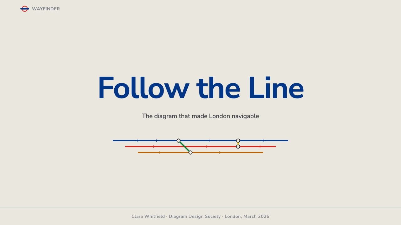
For presentation slides, the style suits cover pages that need to signal system and clarity rather than warmth: a title sits against a pale, cool field with a few straight, angled accent lines suggesting routes converging toward it, using two or three saturated accent colors at most. Content and data slides are where the logic pays off most directly — a process flow, a roadmap, or a set of dependencies can be redrawn exactly the way Beck redrew the Underground: straighten every connector to a small set of fixed angles, space the steps evenly regardless of how much real-world time separates them, and mark only genuine decision points or handoffs with a heavier interchange-style mark. The temptation to also show true proportions should be resisted — that is precisely the impulse the original diagram overcame.
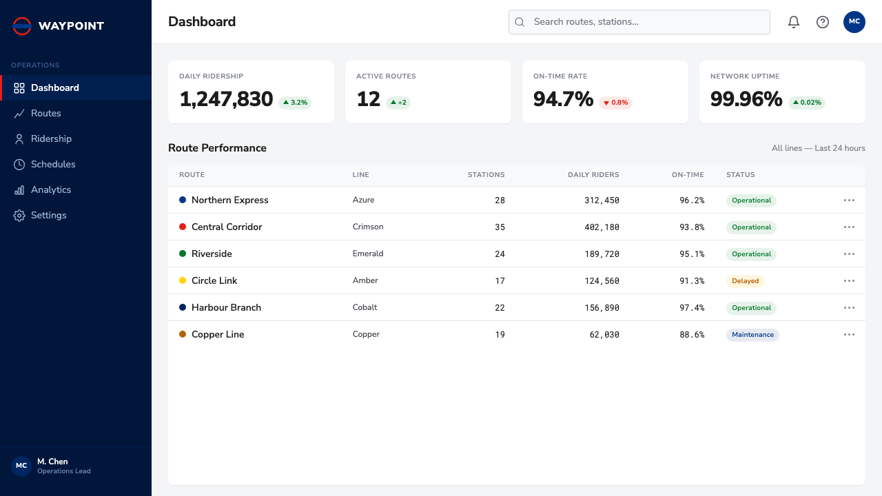
For web interfaces, the style suits dashboards and pricing pages built around comparison and pathway rather than volume of content. A pricing table can borrow the interchange logic directly: plan tiers as stops along a line, with the recommended upgrade path marked the way a transfer station is marked, larger and more insistent than the rest. Dashboards benefit from the same even-spacing discipline applied to navigation — a fixed set of destinations at consistent intervals, in consistent type, with color reserved strictly for status or category rather than decoration. Interactive elements should snap to clean angles and grid lines rather than free-floating placement, echoing the diagram's refusal of anything organic or hand-drawn.
For editorial and marketing work, the style reads as confident and institutional rather than playful, suiting infrastructure, transit, logistics, civic, and systems-oriented subject matter especially well. A route-style graphic — a sequence of milestones, a customer journey, a supply chain — can use the line-and-interchange vocabulary literally, with named stops along a colored line standing in for stages, campaigns, or products. Marketing pages benefit from the same restraint the diagram shows with color: pick a small fixed set of saturated hues, assign each one a fixed meaning, and never introduce a new hue without a new meaning to justify it.
The most common mistake is treating the style as merely 'colorful straight lines on a pale background' while ignoring the harder discipline underneath — that every visual distortion in the original serves legibility, not decoration. A diagram that keeps the bright lines and geometric ticks but still tries to preserve true proportions or true relative importance has kept the costume and lost the idea. The style only works when the designer is willing to do what Beck did: decide what actually matters to the reader, and discard everything else without apology.
Tube Map (Beck) — FAQ
Is the Tube map style the same thing as a generic 'flat design' or 'line art' style?
No. Flat design is primarily about surface treatment — no gradients, no drop shadows, solid fills. The Tube map style is about a specific structural discipline layered on top of any flat surface: routes constrained to a small set of fixed angles, stations spaced evenly rather than to true scale, and a strict two-tier hierarchy between ordinary points and interchange points. You can build a flat design that has none of this structural logic, and you can (in principle) build a Tube-map-style diagram with more surface texture than the original. The angle constraint and the geography-versus-connection tradeoff are what actually define the style, not the absence of gradients.
Why does the style insist on only three line angles instead of allowing smoother curves?
Because the constraint is what produces the circuit-board clarity the style depends on. Curved, free-form lines invite the eye to read them as a picture of a place — an implicit promise of geographic accuracy the diagram has no intention of keeping. Restricting every line to horizontal, vertical, or 45-degree segments signals immediately that the object in front of you is a diagram, not a landscape, and frees the reader from trying to reconcile it with a mental map of the actual city. The restriction is also what makes the diagram redrawable and extensible over decades — a strict angle system is far easier to revise consistently than a set of hand-tuned curves.
Does distorting true distance and direction count as dishonest design?
It is a deliberate distortion, but not a deceptive one, because the diagram never claims to be geographically accurate in the first place — its entire visual grammar announces that it is a schematic. The distortion serves the reader's actual need (how do I connect from A to B) rather than misleading them about anything they are likely to rely on the map for. This is the same logic behind bar charts that start at zero or clocks with evenly spaced hour marks despite the sun moving unevenly across the sky: a representation can simplify reality substantially and still be entirely honest, as long as it simplifies in service of the question the reader is actually asking.
How does this style handle imagery, icons, or illustration?
Sparingly, and only in service of the diagram's function. The original Tube map carries almost no illustrative imagery at all — its vocabulary is limited to lines, ticks, blobs, the roundel, and typeset labels. Where icons appear in Tube-map-derived work today, such as accessibility symbols on modern transit maps, they follow the same geometric discipline as everything else: simple, flat, built from the same restrained shape vocabulary, and placed only at points that genuinely need the extra information. Decorative illustration that has no functional role has no place in this style; anything added should answer a real question a reader has, the same test the diagram applies to every line and label.
What kinds of products or content does this style struggle to suit?
It struggles wherever the true relationships between things — actual proportions, actual timing, actual magnitude — are exactly what the audience needs to understand accurately. A financial chart where investors need to judge real scale, a scientific figure where spatial relationships carry the meaning, or a map where a tourist genuinely needs to judge walking distance, are all contexts where this style's core move — discard scale, keep only connection — actively works against the content's purpose. It also tends to feel impersonal and severe in contexts calling for warmth or intimacy, such as personal storytelling or lifestyle content, where the total absence of ornament can read as cold rather than confident.
Related design styles
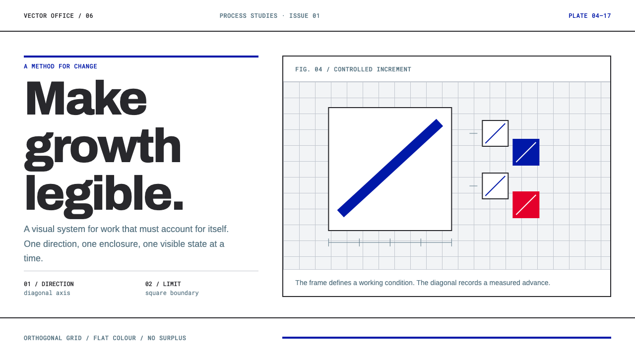 Anton Stankowski ConstructiveProcess becomes visible. Flat blue diagonals and hard square rules make chang…
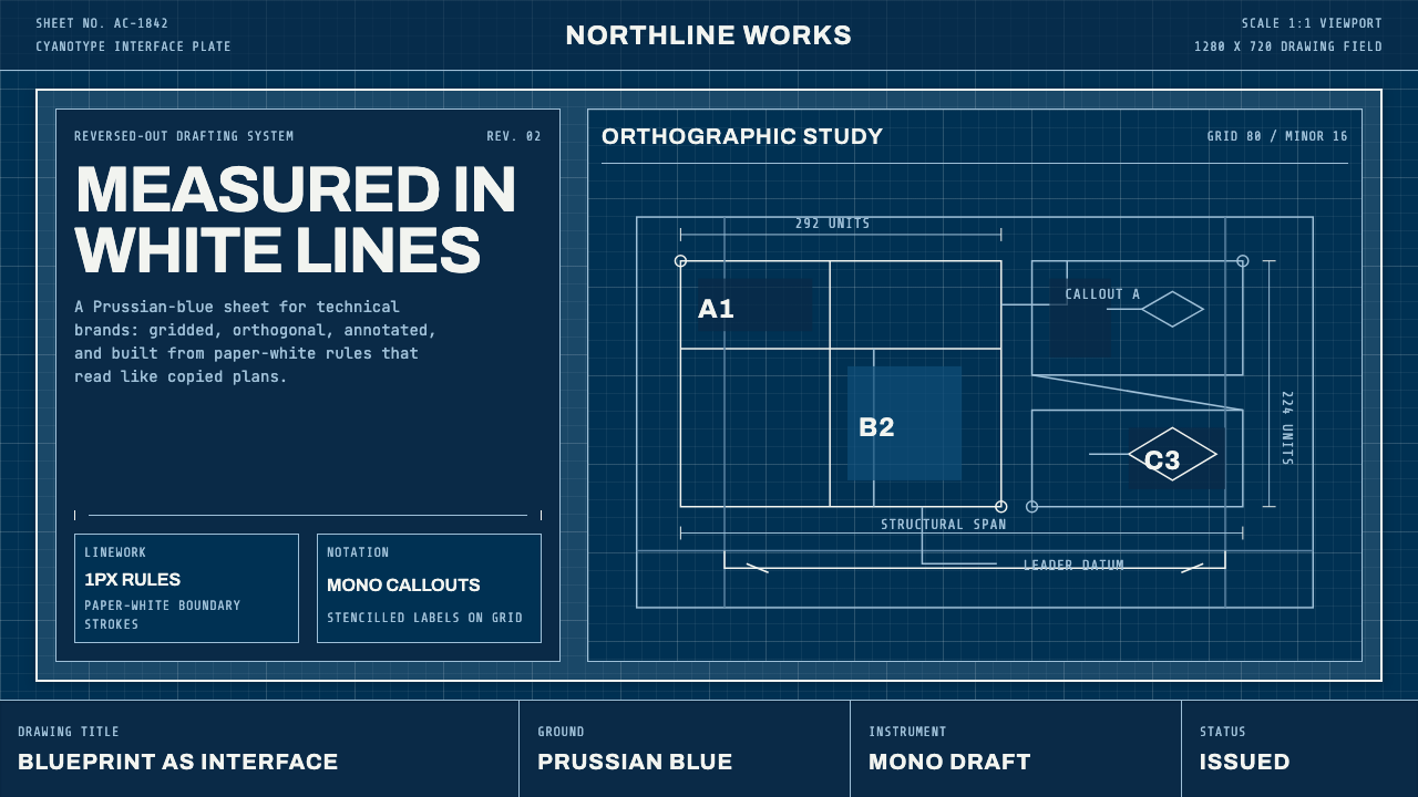 Architect CyanotypePrecision in negative. Prussian blue ground, paper-white grid, mono dimension…
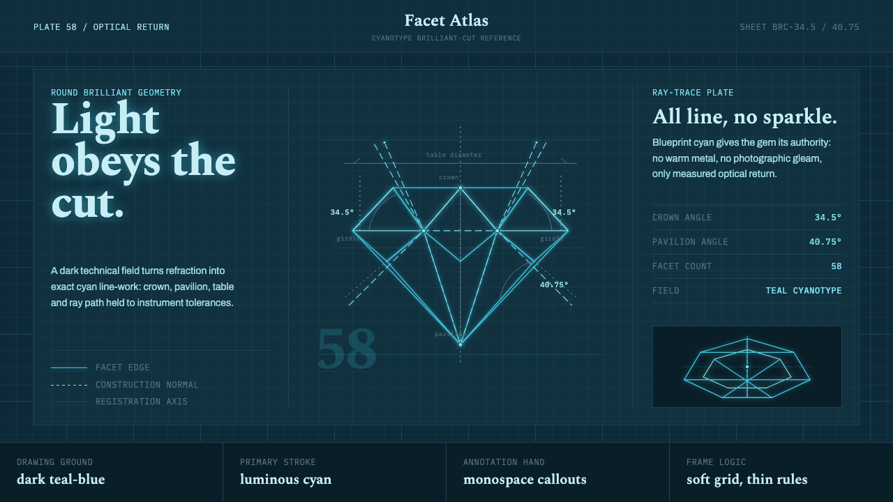 Brilliant Cut Facet DiagramOptics becomes blueprint. Cyan facet lines and ray paths glow on dark teal.
 Icelandic Basalt VolcanoCold geology, engineered. Basalt black, Sora type, and one magma fissure hold…
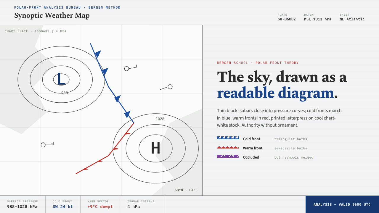 Synoptic Weather MapThe sky as a readable diagram. Black isobars, blue cold fronts, red warm fron…
 Airport Baggage TagBuilt to be read in motion. Burned-black codes, hard rules and functional cha…