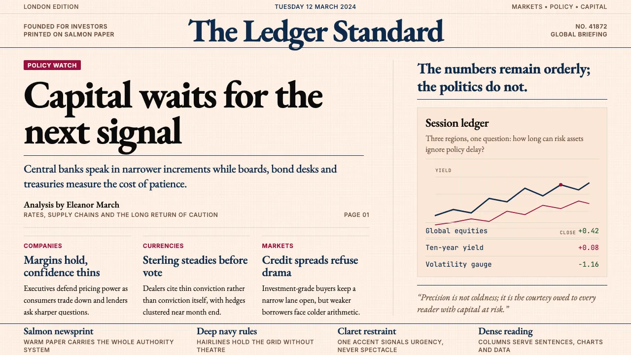
About Financial Times (Pink Paper)
The Financial Times has dressed in salmon-pink newsprint since 1893 — a paper-stock choice that became, over a century, the most recognizable color in business journalism. The pink ground, paired with Kris Sowersby's bespoke Financier serif (commissioned from Klim Type Foundry in 2014), deep navy headers, and FT-claret accents, encodes a singular promise: precision, restraint, and global financial authority.
The visual language is built for dense reading. Tight column grids, hairline rules, Financier Display for headlines and Financier Text for body — no decorative flourishes, no saturated chrome. Everything serves the sentence, the chart, the data point. This is journalism as fiduciary craft.
- Origin
- London, United Kingdom
- Era
- Founded 1888 London; current visual identity ~2014–2024 (Financier typeface era)
- Key figures
- Horatio Bottomley · Kris Sowersby · Roula Khalaf · Klim Type Foundry
- Movements
- financial-business journalism canon · modernist editorial typography · British broadsheet tradition
Financial Times (Pink Paper) design spec
Colors
Typography
The other 11 sections — buttons, cards, spacing, motion, techniques and more — open once you unlock. Download the DESIGN.md or send it to your AI in one click. Unlock once, yours forever.
Sign up nowStyles similar to Financial Times (Pink Paper)
Also inspired by brands & products, with a close feel.
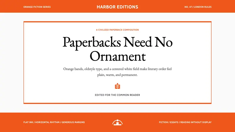 Penguin Classics OrangePaperback authority. Orange tri-bands, serif title panel, and flat ink enforce calm order.
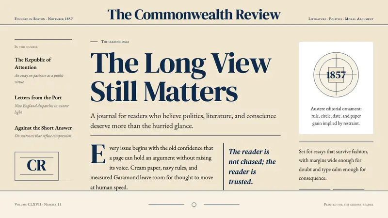 The Atlantic MonthlyAuthority slows down. Navy Garamond on warm cream, ruled like an essay page.
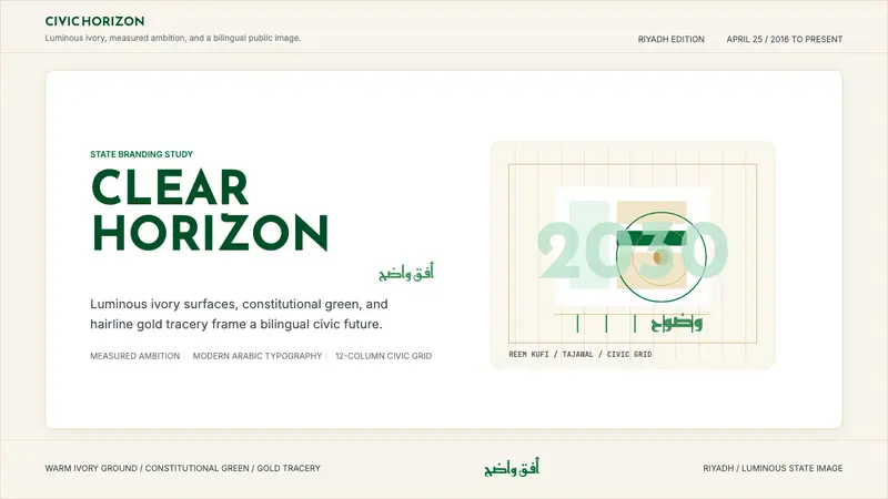 Saudi Vision 2030Measured ambition, made luminous. Ivory, green, and gold tracery on a civic grid.
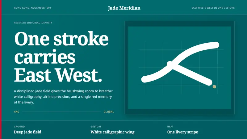 Cathay BrushwingCalm carries the gesture. Deep jade, white brushwing, one red stripe on an editorial grid.