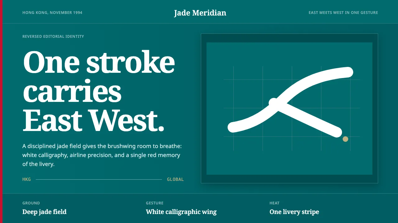
About Cathay Brushwing
When Landor Associates unveiled Cathay Pacific's "brushwing" in November 1994, they distilled a flag carrier into a single gesture: one fluid calligraphic stroke that reads at once as a bird's wing and a sweep of Chinese brush ink. Rendered white on a deep jade-green tailfin, it announced a Hong Kong airline fluent in both East and West.
The system pairs that organic stroke with disciplined editorial structure — generous jade fields, reversed white type, an occasional red livery stripe. Brush energy meets the grid; nothing competes with the wing.
- Origin
- Hong Kong
- Era
- 1990–2010; brushwing introduced November 1994
- Key figures
- Landor Associates
- Movements
- 1990s airline rebranding · East-West fusion identity · calligraphic logomark design
Cathay Brushwing design spec
Colors
Typography
The other 11 sections — buttons, cards, spacing, motion, techniques and more — open once you unlock. Download the DESIGN.md or send it to your AI in one click. Unlock once, yours forever.
Sign up nowStyles similar to Cathay Brushwing
Also inspired by brands & products, with a close feel.
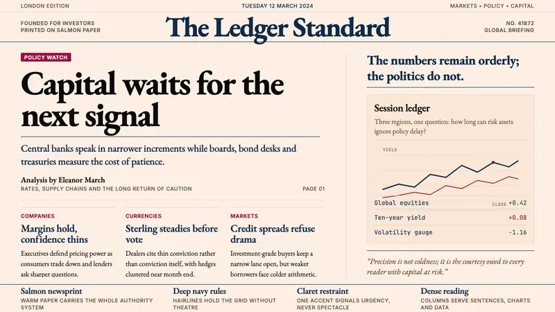 Financial Times (Pink Paper)Authority on salmon paper. Deep navy rules and claret accents discipline dense serif columns.
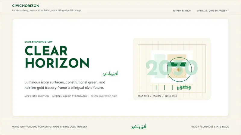 Saudi Vision 2030Measured ambition, made luminous. Ivory, green, and gold tracery on a civic grid.
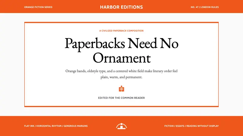 Penguin Classics OrangePaperback authority. Orange tri-bands, serif title panel, and flat ink enforce calm order.
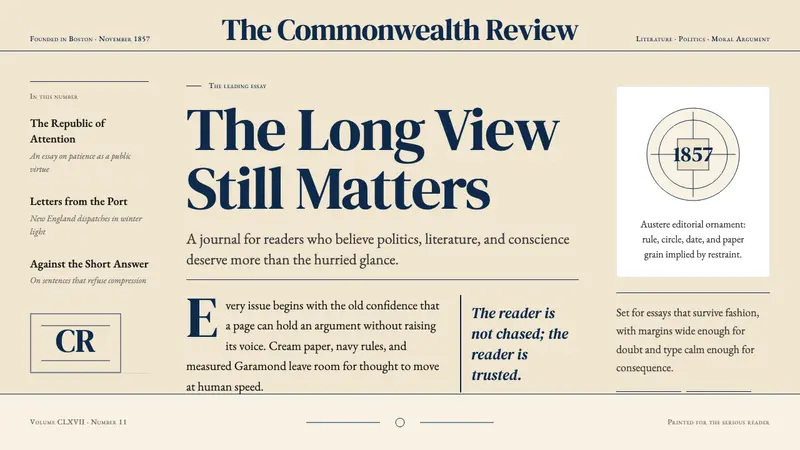 The Atlantic MonthlyAuthority slows down. Navy Garamond on warm cream, ruled like an essay page.