What is Cathay Brushwing?
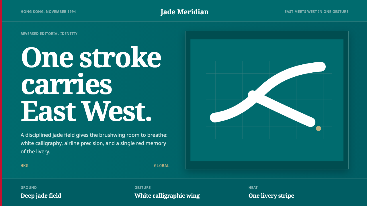
Cathay Pacific's 1994 brushwing is one of the most quietly powerful acts of corporate identity in aviation history — a single calligraphic stroke that holds a bird's wing, a sweep of Chinese ink, and the confidence of a global carrier inside a deep jade field.
Cathay Brushwing in brief
Cathay Brushwing is the visual identity system built around Cathay Pacific Airways' 1994 rebrand, designed by Landor Associates and introduced in November of that year. Its defining element is a single fluid calligraphic stroke — the 'brushwing' — rendered in white on a deep jade-green tailfin. The stroke reads simultaneously as a bird's wing in flight and as a sweep of Chinese ink calligraphy, a duality that anchors the airline's identity in both Eastern cultural tradition and Western typographic discipline.
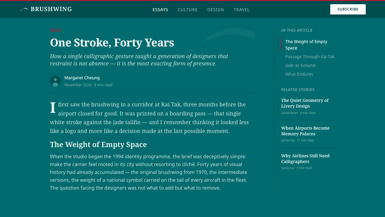
The system is built on restraint. Around the brushwing mark, all other visual elements — deep jade green as the dominant ground, reversed white type, an occasional red livery stripe — exist to serve rather than compete with that single gesture. Generous negative space, editorial-weight grids, and the absence of decorative ornament give the identity its atmosphere of calm authority. The visual logic is East-meets-West at an organizational level: the expressive energy of calligraphy held in check by the structured discipline of the grid.
What makes the Cathay Brushwing system distinctive among airline identities of its era is that it does not attempt to fill every available surface. Where competitors crowded liveries with gradients, emblems, and competing typographic palettes, Cathay Pacific in 1994 chose one mark, one deep color, and one principle: nothing competes with the wing. That decision gave the identity unusual longevity and legibility across formats — from a tailfin seen through fog at a distance to a business card held in a conference room.
Where does Cathay Brushwing come from?
Cathay Pacific was founded in Hong Kong in 1946 by American Roy Farrell and Australian Sydney de Kantzow, flying ex-military Douglas DC-3s on regional routes. Through the following decades it grew into one of Asia's major flag carriers, with its identity evolving through several livery iterations. By the early 1990s, the airline was competing at the highest level of long-haul international aviation — routes to London, Frankfurt, New York, Sydney — and its visual identity needed to reflect that ambition while remaining clearly rooted in its Hong Kong heritage.
Landor Associates, the San Francisco-based brand consultancy that had previously rebranded Singapore Airlines and several other carriers, was engaged to develop a new identity system. The brief required something that could communicate at scale — across a fleet of aircraft, across global airports, across print and environmental applications — while avoiding the generic internationalism that had begun to homogenize airline branding in the late twentieth century. The solution centered on the brushwing mark: a single calligraphic stroke that required no language, no tagline, and no supporting iconography to communicate its meaning.
The brushwing was conceived as a direct reference to Chinese ink calligraphy — specifically the single expressive gesture at the heart of the tradition, in which the character of the brushstroke reveals the character of the hand that made it. Rendered at scale on a tailfin, the white stroke against jade green carries the warmth and energy of a handmade mark while remaining reproducible across formats with total precision. The jade green itself — neither the emerald of competitors nor a generic corporate teal — was chosen for its depth and its associations with refinement, patience, and enduring value in Chinese cultural tradition.
The red livery stripe that accompanies the brushwing on aircraft draws from the red of the Hong Kong flag and the red-and-white color logic of Cathay Pacific's pre-1994 livery, providing visual continuity with the airline's history while remaining clearly subordinate to the new identity. The entire system was designed during a period of extraordinary significance for Hong Kong — three years before the 1997 handover — and the identity's balance of Eastern calligraphic gesture with Western editorial structure carried an implicit cultural statement about Hong Kong's position as a city fluent in both traditions.
What defines the Cathay Brushwing look?
The Brushwing Mark
The central element is a single calligraphic stroke that requires no translation: it reads as a bird's wing in flight and as a sweep of Chinese brush ink simultaneously. The stroke has the gestural quality of a handmade mark — slight variations in width along its length, a sense of direction and momentum — while remaining precise enough to reproduce at any scale without loss of character. It is one of the most successful logomarks in aviation history precisely because it does not try to represent the airline literally; it represents a quality of movement and refinement that the airline aspires to embody.
Deep Jade Green
The dominant ground color is a deep, saturated jade green — not the bright emerald used by carriers seeking sportiness, nor a generic corporate teal, but a specific depth of green that carries cultural resonance. In Chinese tradition, jade has long been associated with refinement, moral character, patience, and enduring value. At the scale of a wide-body aircraft tailfin, the deep jade creates a visual field generous enough to let the white brushwing breathe while maintaining the authority of a carrier that knows where it is going.
Editorial Restraint
Away from the logomark, the system exercises severe restraint. Reversed white type on jade, a single weight of a neutral sans-serif typeface, generous margins, and the near-total absence of decorative elements define the supporting identity materials. The logic is that of a quality editorial publication rather than an advertising campaign: information is organized, not dramatized. This restraint is not timidity — it is confidence, a visual argument that the brushwing mark is sufficient and that everything else exists to serve it.
The Red Stripe
A single narrow red livery stripe provides the system's third color and its point of visual warmth. Used with deliberate sparingness — on aircraft it appears as a single horizontal band near the base of the fuselage — it functions as an accent rather than a partner element. The red references both the Hong Kong flag and the airline's pre-1994 livery history, threading continuity through change. Its subordinate position is as important as its presence: by keeping red small and linear, the system ensures that the jade-and-white relationship remains primary.
East-West Structural Balance
The system's deepest characteristic is not a color or a form but a structural principle: the energy of the handmade calligraphic gesture held within the discipline of Western editorial organization. The brushwing mark is entirely Eastern in its expressive logic — calligraphy values the quality of the gesture above the precision of the letterform. But the grid that governs where it sits, the white space that surrounds it, and the typographic hierarchy that flanks it are entirely Western in their approach. The identity does not blend these two traditions into a hybrid; it places them in productive tension.
Negative Space as Presence
One of the most important visual decisions in the system is how much space surrounds the brushwing mark in every application. On the tailfin, on print collateral, on signage — the mark is never crowded. The generous negative space is not emptiness but the condition that makes the stroke legible as a gesture rather than a graphic element. This use of negative space is consistent with the calligraphic tradition from which the mark derives: in Chinese ink work, the unpainted ground is an active participant in the composition, not a background.
Scale and Legibility
A decisive test of any identity system is whether it works at extreme scales: the tailfin seen at a kilometer's distance through airport haze, and the ticket jacket held in a hand. The brushwing mark passes this test because its form is simple enough to read at distance and detailed enough to reward close inspection. The calligraphic quality — the slight variance in stroke width, the sense of directed energy — is visible when you hold the card and disappears appropriately when you are looking at the aircraft from a gate window. Very few airline marks have this range.
Who shaped Cathay Brushwing?
The San Francisco-based brand consultancy founded by Walter Landor in 1941 designed the Cathay Pacific brushwing identity in 1994. By that point Landor had become one of the world's most influential brand consultancies, with major airline identity work including Singapore Airlines and British Airways in its portfolio. The Cathay Pacific project demonstrated the firm's capacity to develop identities that navigated cultural specificity without resorting to pastiche — a challenge that would become a recurring brief as global corporations sought to communicate across cultural contexts in the 1990s.
The German-British designer who founded Landor Associates brought a deep knowledge of European typographic tradition and an interest in semiotics — the study of signs and symbols — to his practice. His method involved extensive consumer research at a time when such research was not standard in brand design, and the firm he built continued this approach long after his death in 1995. The Cathay Pacific brushwing was completed just months before he died, representing a late summation of the consultancy's philosophy: that the most durable identities are built on a single, irreducible visual idea.
The airline itself is not simply the client of this identity — it is a participant in its meaning. Founded in 1946 in Hong Kong, the carrier built its reputation on the long-haul routes connecting Asia to Europe and North America, and its staff and culture became known for a particular quality of service rooted in Hong Kong's position as a city at the intersection of Eastern and Western commerce. The brushwing identity gave visual form to that cultural position at a moment — three years before the 1997 handover — when Hong Kong's identity as a place was itself a subject of intense international attention.
The brushwing livery remained Cathay Pacific's primary visual identity for over two decades, from its introduction in November 1994 until a 2015 refresh that maintained the mark but adjusted the surrounding system. This longevity is unusual in the airline industry, where livery changes are often driven by ownership shifts, mergers, or rebranding initiatives on decade-long cycles. The brushwing endured because it had been designed with enough structural clarity to adapt across format changes without losing its essential character — new aircraft types, new digital contexts, new uniform programs — while the core mark remained constant.
The brushwing identity emerged from a specific design culture: Hong Kong in the early 1990s was one of the most graphically sophisticated cities in Asia, with a strong tradition of bilingual publication design, advertising, and corporate communication that had developed through the British colonial period and accelerated through the economic boom of the 1970s and 1980s. Designers working in Hong Kong at this period were navigating the same East-West balance that the brushwing makes visible — producing work for audiences that were simultaneously fluent in Chinese cultural references and in Western commercial design conventions.
How do you use Cathay Brushwing today?
Applying the Cathay Brushwing aesthetic in contemporary design work requires understanding its core principle before approaching any specific format: the system is built around a single gestural element of extraordinary authority, and every other decision exists to protect that element's ability to breathe and be seen. This means that before choosing a color, a typeface, or a layout, the designer must identify the single visual gesture that will do the primary work — then commit to serving it rather than competing with it.
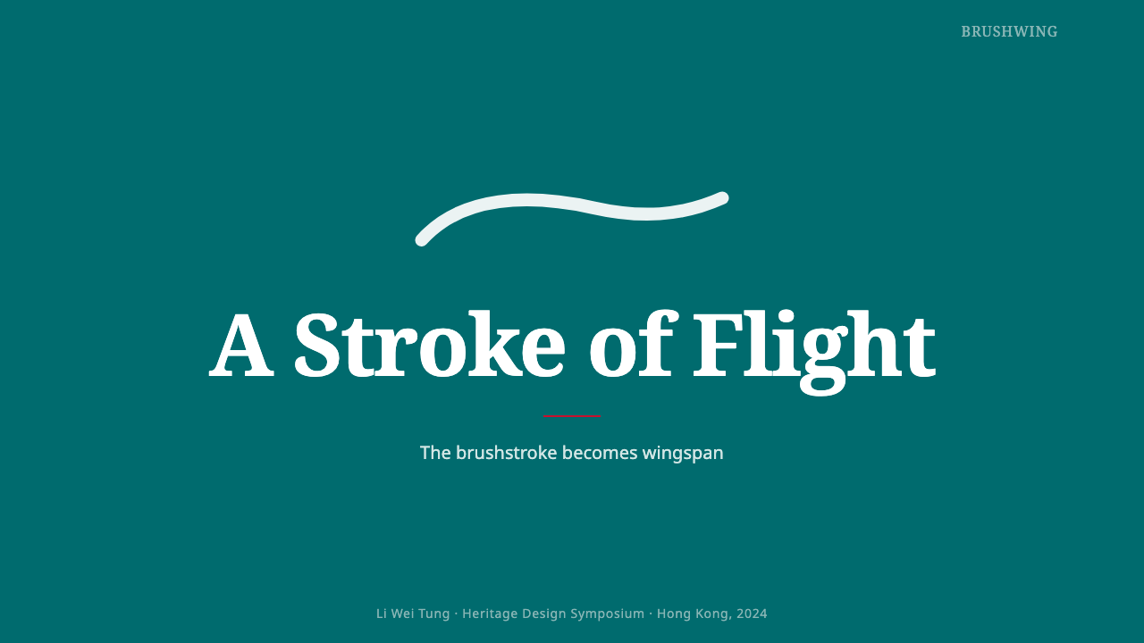
For presentation slides, the Cathay Brushwing approach translates into deep-ground, high-contrast compositions where one calligraphic or gestural element anchors the cover page against a field of a single dominant color. Content slides should be spare: generous margins, a single weight of a clean sans-serif typeface, white on dark or dark on a near-white ground, and no decorative elements that are not load-bearing. The discipline of the system means that a data slide should present its chart as the single object of focus on the page — not embedded in a grid of competing labels and caption boxes.
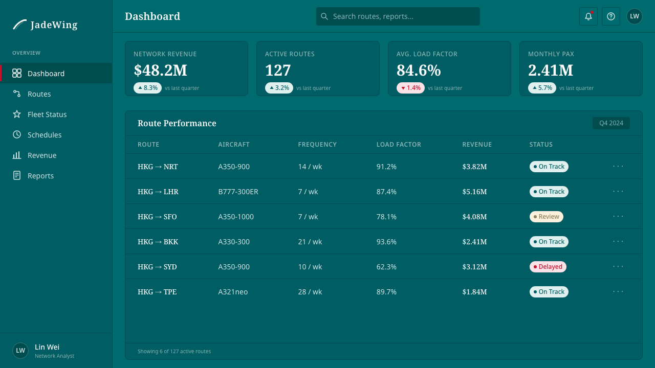
For web and interface design, the system's editorial sensibility is most legible in landing pages, premium service tiers, and contexts where the communication of quality and calm authority is a primary goal. The approach favors dark, saturated grounds with reversed-out white type and a single high-chroma accent color. Navigation and information architecture should be clean and typographic; decorative iconography competes with the system's core logic. Interactive elements — buttons, links, hover states — should carry the same spare confidence as the overall palette.
For editorial and marketing work, the Cathay Brushwing system lends itself to contexts where the mark of the maker — the human gesture behind the organization — is part of the value being communicated. Calligraphic or gestural headline treatments, generous white space, and a deliberate avoidance of photography that documents rather than suggests all serve this logic. The system works particularly well in materials that need to communicate across language boundaries: the brushwing mark itself requires no translation, and layouts built around its logic tend to translate across cultural contexts without losing their essential character.
The most common mistake when working with this aesthetic is importing too many competing elements — a secondary color system, multiple type families, photography alongside calligraphy, pattern in the background. The Cathay Brushwing system is not sparse because it lacks richness; it is spare because every element added diminishes the authority of the one element that matters. If you find yourself adding a second accent color, ask whether it is serving the gestural element or competing with it. Almost always, the answer is that it competes. The discipline required is not minimalism as a style but commitment to a hierarchy where one element is genuinely primary.
Cathay Brushwing — FAQ
Is the brushwing a Chinese character, and does it need to mean something specific?
The brushwing is not a legible Chinese character — it does not spell a word in any writing system. It is a calligraphic gesture that references the quality and movement of Chinese brush ink without encoding a specific linguistic meaning. This is an important distinction: the mark works across languages precisely because it is not a word. It communicates through the visual logic of calligraphy — the sense of directed energy, the relationship between the thick and thin parts of the stroke, the quality of the beginning and end — without requiring any particular linguistic knowledge to read it.
How does this system relate to other airline identities that use calligraphy or Asian cultural references?
Several Asian carriers developed identities in the late twentieth century that incorporated calligraphic or brush-derived elements, and the results vary considerably in how successfully they navigate the line between genuine cultural reference and decorative borrowing. The Cathay brushwing succeeds where others are less convincing because the calligraphic element is not applied to a pre-existing Western identity structure — it is the identity structure. The entire system is organized around the mark rather than the mark being inserted into a system organized on other principles. When cultural reference becomes decoration rather than architecture, it tends to read as pastiche.
The system is built on a dark ground — what are the specific challenges of working with dark, saturated backgrounds?
Dark saturated grounds create several technical and visual challenges that the Cathay system navigates with particular care. The first is that type on dark grounds requires more generous spacing than type on light grounds — the optical weight of white type on dark tends to feel heavier, and tighter tracking makes it read as cramped. The second is that in print, deep saturated colors like jade green require careful ink management to avoid muddiness or visible registration shifts across large fields. The third — most relevant to contemporary digital work — is that dark grounds shift apparent color relationships: a red that reads as a warm accent on white may read as aggressive or alarming on deep green. Testing accent colors against the actual ground, not against white, is essential.
Can the Cathay Brushwing aesthetic work for brands that have no connection to East Asia or aviation?
The visual system is transferable; the cultural specificity of the brushwing mark itself is not — or not without modification. The structural principles that make the Cathay identity work — building a system around a single gestural primary element, using a deep saturated ground, applying extreme restraint in every supporting element, giving the mark generous negative space — are applicable to any brand context where the communication of calm authority and Eastern-influenced refinement is appropriate. What cannot be directly borrowed is the calligraphic brushwing mark itself, which carries specific cultural weight that would read as appropriation if applied without authentic connection. The lesson of the system is not 'use calligraphy' but 'find the one irreducible gesture that your brand can own, then organize everything else around it.'
How did the brushwing identity hold up through format changes — aircraft types, digital, uniforms?
The brushwing mark's longevity across format changes is one of its most instructive qualities. When Cathay Pacific introduced new wide-body aircraft types over the decades following 1994, the mark scaled to each tailfin without modification because its form was simple enough at distance and resolved enough up close. When digital contexts emerged — websites, mobile apps, digital boarding passes — the mark worked at small sizes because its essential gesture was readable even when fine details compressed. Uniforms and environmental applications from lounges to baggage tags maintained the identity's integrity because the system gave clear rules: one dominant ground color, the mark in white, one supporting accent, nothing decorative. A system built on structural principles rather than ornamental ones tends to be format-agnostic.
Related design styles
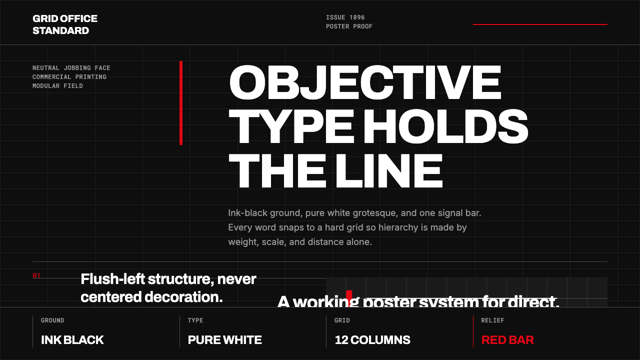 Akzidenz-Grotesk BertholdObjectivity in black ink. White grotesque type, hard grid, one rationed red b…
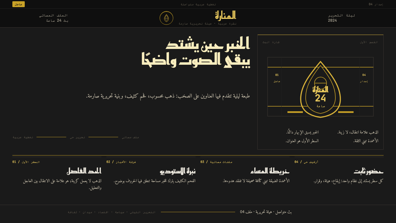 Al Jazeera Arabic NewsAuthority, stripped bare. Gold seal, dense Arabic type, matte charcoal.
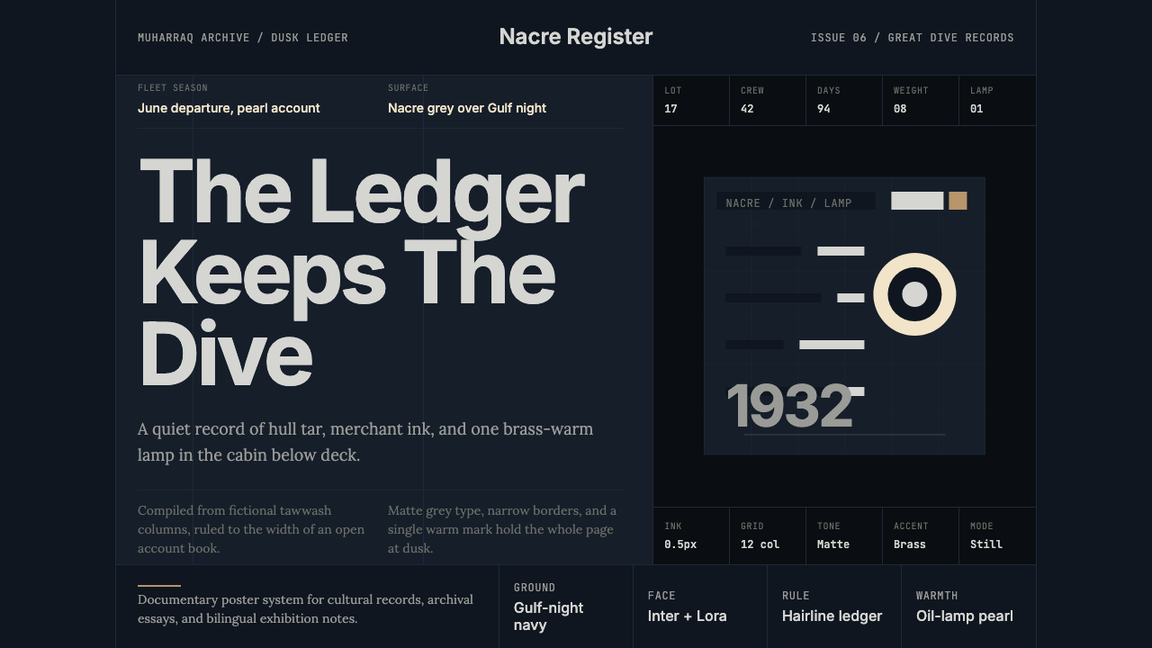 Bahraini Pearl Diving GreyQuiet authority at dusk. Nacre grey type and hairline grids hold one brass-wa…
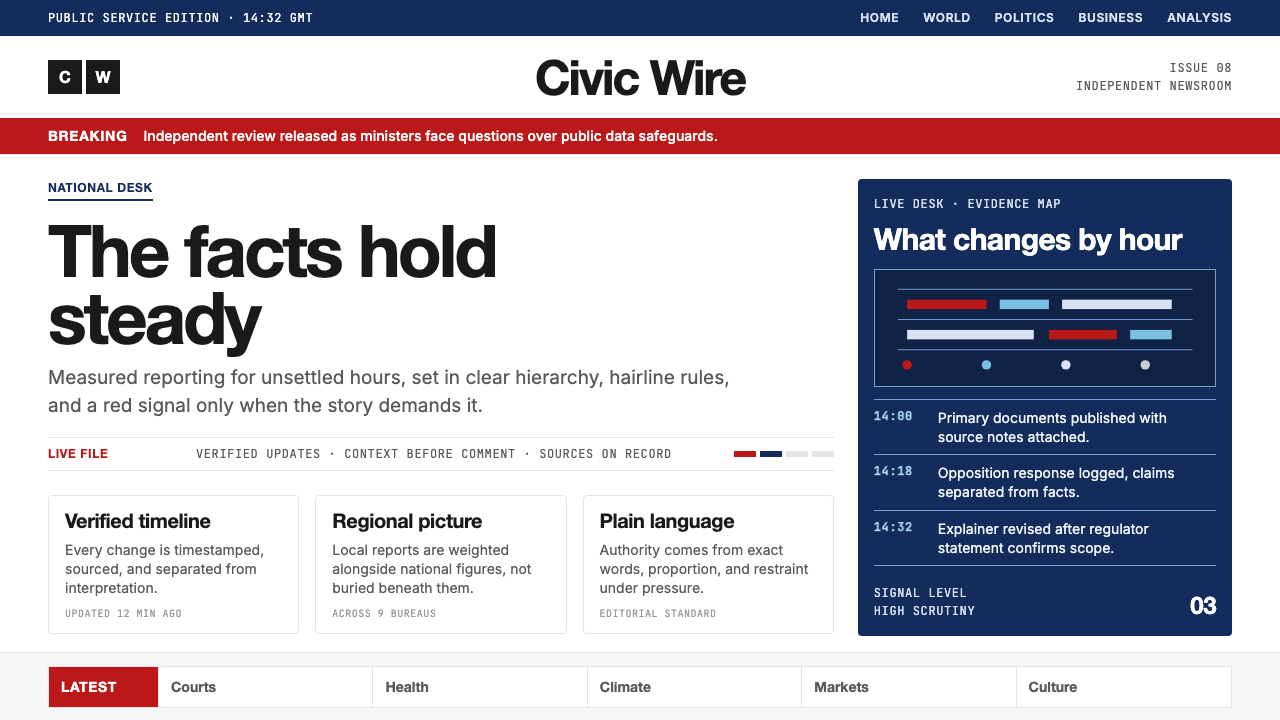 BBC NewsPublic trust, stripped bare. Red alerts, deep navy and hairline grids make ur…
 Buenos Aires Branding StudioRigour with nerve. Black grotesque on warm grey, pierced by one vermillion ma…
 Cartier-Bresson Decisive MomentNever cropped. Silver-gray tonality is locked by a dead-black film rebate.