Design style guide设计风格指南
What is Hong Kong Handover 1997 Poster?什么是 Hong Kong Handover 1997 Poster?
A city holding its breath printed that breath in vermilion and screaming yellow — the Hong Kong Handover poster school turned constitutional anxiety into one of the most distinctive bilingual graphic languages ever produced.一座城市屏住的那口气,被印在朱红与刺目黄色之上——香港回归海报流派将宪制过渡的焦虑,转化为有史以来最独特的双语平面设计语言之一。
Hong Kong Handover 1997 Poster in briefHong Kong Handover 1997 Poster 速览
The Hong Kong Handover 1997 Poster style is the civic visual language that emerged from Hong Kong's design studios during the period bracketed by the 1984 Sino-British Joint Declaration and the years immediately following the 1997 transfer of sovereignty. It is a distinct idiom: government information posters, MTR station graphics, public ceremony collateral, and cultural institution materials all bearing the angular bilingual precision of what became known as the Henry Steiner and Kan Tai-keung school of Hong Kong graphic design.香港回归1997海报风格,是香港设计工作室在1984年《中英联合声明》签署至1997年主权移交后数年间所形成的市政视觉语言。这是一套独特的设计方言:政府资讯海报、港铁站台图形、公共典礼印刷品以及文化机构宣传物,全部承载着石汉瑞与靳埭强一脉相承的双语精准棱角美学。
At its core, the style is defined by the productive tension between two typographic traditions forced to coexist on the same printed surface. Traditional Chinese characters — set vertically, dense with strokes, carrying centuries of calligraphic memory — are placed in direct dialogue with Latin letterforms from the modernist European tradition. The result is not a compromise but a negotiation: each script occupies its own grid logic while the overall composition holds them in balance through shared structural elements, color, and geometric anchoring.这种风格的核心,是两种印刷传统被迫共存于同一印刷版面时所产生的富有创造力的张力。繁体中文字符——竖排、笔画繁密、承载着数百年书法记忆——与欧洲现代主义传统的拉丁字母体系直接对话。结果并非妥协,而是一种协商:每种文字在版面上遵循各自的网格逻辑,而整体构图则通过共享的结构元素、色彩与几何锚点,将两者维持于一种平衡之中。
The palette is deliberate and charged with symbolic weight. Vermilion on black — a combination borrowed from ceremonial lacquer and official seals — conveys authority and occasion. A sharp, saturated yellow signals urgency and public information, functioning as a visual alarm rather than a decorative choice. These are not decorative colors applied for aesthetic pleasure; they are civic signals, inherited from a print culture that had to communicate clearly across language barriers and under political pressure.色板是刻意的,充满象征重量。黑底朱红——借自典礼漆器与官方印章的组合——传递权威与庄重。犀利而高饱和的黄色发出紧迫信号,充当视觉警报而非装饰性选择。这些不是为了美学愉悦而施加的装饰色彩,而是市政信号,继承自一套印刷文化——这套文化必须在语言壁垒与政治压力之下清晰地传达信息。
See the Hong Kong Handover 1997 Poster design system →查看 Hong Kong Handover 1997 Poster 完整设计系统 →
Where does Hong Kong Handover 1997 Poster come from?Hong Kong Handover 1997 Poster 从何而来?
The story begins not in 1997 but in 1984, when the Joint Declaration formalized what residents had long suspected: that the territory's constitutional status would change within living memory. The design response to this knowledge was gradual but cumulative. Hong Kong's commercial print culture — already sophisticated from decades of serving both British colonial administration and a dense Chinese-speaking population — began to develop a distinctive hybrid register that was neither purely Western modernist nor purely traditional Chinese.这段历史的起点不在1997年,而在1984年——《联合声明》正式确认了居民长期以来的隐忧:这片土地的宪制地位将在他们有生之年发生改变。设计界对这一认知的回应是渐进但持续积累的。香港的商业印刷文化——经过数十年同时服务于英国殖民地政府与密集华语人口的锤炼,早已相当成熟——开始发展出一套独特的混合语汇,既非纯粹的西方现代主义,也非纯粹的中国传统风格。
Henry Steiner, an American-trained graphic designer who arrived in Hong Kong in 1961, is often credited as the foundational figure of the professional design scene. Steiner's approach — rigorously modernist in structure but deeply attentive to Chinese visual culture — established a template that later designers would inherit and adapt. His corporate identity work for institutions like the Hongkong and Shanghai Banking Corporation demonstrated that Traditional Chinese letterforms could be integrated into a global modernist graphic system without being reduced to decoration or exoticized.1961年抵港的美国训练平面设计师石汉瑞,常被视为香港专业设计界的奠基人物。石汉瑞的方法——在结构上严格遵循现代主义,但对中国视觉文化保持深度敏感——确立了一套模板,供后继设计师继承与发展。他为汇丰银行等机构所做的企业视觉识别工作证明:繁体中文字形可以被整合进全球现代主义平面系统,而无需沦为装饰或被猎奇化处理。
Kan Tai-keung, who began practicing in the 1960s and rose to international recognition in the 1970s and 1980s, brought a different emphasis: a sustained engagement with ink painting, seal-carving traditions, and the expressive potential of the brush stroke within a modernist compositional framework. His work did not merely coexist with Western graphic conventions — it engaged them dialectically, using the visual weight of Chinese calligraphic forms to anchor compositions that also contained ruled lines and geometric type arrangements. Freeman Lau and Alan Chan, working in the decades surrounding the Handover, extended this vocabulary into advertising, packaging, and cultural event graphics.靳埭强自1960年代开始执业,在1970至80年代跻身国际认可,他带来了不同的侧重:对水墨画、篆刻传统以及笔触在现代主义构图框架内的表现潜力的持续探索。他的作品不仅仅与西方平面惯例共存,而是与之进行辩证式对话——运用中国书法形态的视觉重量,来锚定同时包含直尺线条与几何字体排列的构图。刘小康与陈幼坚在回归前后数十年间的创作,将这套语汇延伸至广告、包装与文化活动图形领域。
The 1997 Handover ceremony itself generated an enormous quantity of printed matter — stamps, programs, signage, commemorative publications — and the aesthetic pressure of that single event crystallized the style's characteristic elements. The bilingual mandate was absolute: every piece of public communication required both Chinese and English of equal standing. The solution that evolved was not to simply run two parallel versions but to build compositions in which the two scripts were structurally interdependent, with the visual weight of Chinese characters balanced against the column density of Latin type through shared color fields and geometric framing devices.1997年回归典礼本身产生了大量印刷品——邮票、典礼手册、标识、纪念出版物——而这一单一事件的美学压力,将这种风格的特征性元素推向结晶。双语强制要求是绝对的:每件公共传播物都必须以中英文以同等地位呈现。由此演化出的解决方案,不是简单地并排两套版本,而是构建中英文两套文字在结构上相互依存的版面——通过共享的色彩区域与几何框架装置,让中文字符的视觉重量与拉丁字体的栏宽密度达到平衡。
What defines the Hong Kong Handover 1997 Poster look?Hong Kong Handover 1997 Poster 的视觉特征是什么?
Bilingual Grid Architecture双语网格结构
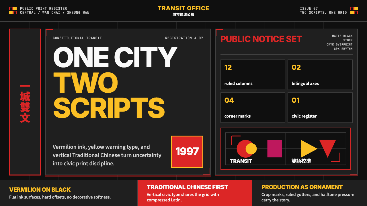
The fundamental organizational principle of this style is a grid system designed to hold two typographic traditions simultaneously. Rather than treating Chinese and English as separate layers stacked in sequence, the grid integrates them through shared horizontal baselines and vertical axis alignments. Chinese characters set in a column may align to the same baseline as a Latin headline set horizontally; the two scripts create visual rhythm together, not in isolation. This bilingual grid architecture is the technical heart of what makes this style legible across language communities.这种风格的根本组织原则,是一套专为同时容纳两种排印传统而设计的网格系统。它不把中英文当作依次堆叠的独立图层,而是通过共享的水平基线与垂直轴线将两者整合。竖排中文字栏与横排拉丁文标题可能对齐于同一基线;两种文字共同创造视觉韵律,而非各自孤立运作。这套双语网格结构,是这种风格得以跨越语言社群保持可读性的技术核心。
Vermilion and Black Ground朱红与黑色底面
The dominant color relationship in this style is vermilion applied to a coated black surface. The black ground draws from both ink culture and the printing conventions of official announcement — notice boards, government gazettes, public signage. Vermilion carries ceremonial authority: it is the color of official seals, of lucky envelopes, of inscriptions on temple tablets. Applied to a printed surface, the combination reads simultaneously as festive and official, which is precisely the emotional register required for a political transition that was both celebratory and weighted with uncertainty.这种风格最主要的色彩关系,是将朱红施于黑色涂布底面。黑色底面同时呼应了书写文化与官方公告的印刷惯例——布告栏、政府公报、公共标识。朱红承载典礼权威:这是官方印章的颜色,是红包的颜色,是庙宇石碑题刻的颜色。印制在版面上,这种组合同时传递喜庆与官方两种气质——而这恰恰是一场既具庆典意味、又承载不确定性的政治过渡所需要的情感调性。
High-Tension Yellow Accent高张力黄色强调
Where vermilion carries ceremony, a sharp, saturated yellow carries urgency and public information. In MTR wayfinding, government announcements, and civic posters of this era, yellow functions as a visual alert register — the color that demands immediate reading. It is applied to display type, to critical information lines, and to the most urgent directional elements. The yellow used here is not warm or approachable but sharp and demanding; it has the visual character of a public address system rendered in color.朱红承载典礼,而犀利的高饱和黄色则承载紧迫与公共信息。在这一时期的港铁导视、政府公告与市政海报中,黄色发挥着视觉警示的功能——它是要求立即被阅读的颜色。它被施于展示字体、关键信息行以及最紧迫的方向性元素。这里使用的黄色,不是温暖或平易近人的,而是犀利而咄咄逼人的;它具有用色彩呈现的公共广播系统的视觉性格。
Traditional Chinese Verticality繁体中文纵向气质
Traditional Chinese characters bring an inherent vertical reading orientation to compositions that the style uses as an organizing principle rather than a constraint. Column-set Chinese type creates strong vertical anchors within horizontal Western-format layouts, and the visual density of traditional characters — with their complex stroke counts compared to simplified variants — adds weight precisely where the designer wishes to create emphasis. The style does not simplify or reduce the characters to geometric forms; it honors their calligraphic origins while constraining them within precise grid measurements.繁体中文字符为构图带来固有的纵向阅读取向,这种风格将其作为组织原则加以运用,而非视之为约束。竖排中文字体在横向西式版面格式中创造出强有力的垂直锚点;与简体字相比,繁体字笔画繁复,其视觉密度恰好在设计师希望制造强调的位置增添了分量。这种风格既不简化字符,也不将其简化为几何形态,而是尊重其书法起源,同时将其约束于精确的网格尺度之内。
Geometric Structural Framing几何结构框架
The compositional framework that holds the bilingual type system together is built from ruled lines, rectangular color fields, and geometric dividers. These are not decorative additions but structural load-bearing elements: a thick horizontal rule separates Chinese and English register, a colored rectangle creates a field that assigns meaning to everything it contains, a fine ruling grid establishes the underlying measure that both scripts respect. The geometric framing is inherited from the European modernist tradition — particularly the Swiss International Style — but adapted to serve a communicative necessity that has no European equivalent.将双语排印系统凝聚为整体的构图框架,由直线、矩形色块与几何分割元素构成。这些不是装饰性附加,而是承重的结构性元素:粗水平线分隔中英文区域,色彩矩形建立一个赋予其内含所有内容以意义的色域,细网格线确立两种文字共同遵守的基础量度。这种几何框架继承自欧洲现代主义传统——尤其是瑞士国际主义风格——但被改造以服务于一种欧洲没有先例的传达必要性。
Angular Display Typography棱角展示字体
Display type in this style — both the Chinese and Latin letterforms selected for headlines and prominent information — tends toward angularity and structural crispness rather than warmth or organic curvature. The Chinese display typefaces favored are those with strong horizontal stroke emphasis and sharp angle terminations. The Latin typefaces are drawn from the grotesque and geometric sans-serif tradition, with tight spacing and high x-heights that match the visual density of the accompanying Chinese characters. Together they read as authoritative and precise.这种风格的展示字体——无论是用于标题与醒目信息的中文还是拉丁字母——均倾向于棱角感与结构清晰度,而非温润感或有机曲线。所偏好的中文展示字体,是那些横向笔画强势、角部终止尖锐的款式。拉丁字体则来自怪诞体与几何无衬线传统,字距紧凑,字母高度与同行中文字符的视觉密度相匹配。两者并置,读来权威而精确。
Civic Restraint市政克制
Despite the visual intensity of the color palette and the complexity of the bilingual grid, the overall register of this style is restrained rather than expressionistic. Decoration is minimal to zero. No illustrative flourishes, no ornamental borders, no atmospheric gradients. Every element is justifiable by its function: this line separates these two registers of information; this color field establishes authority; this character size hierarchy communicates priority. The restraint is not aesthetic minimalism but civic discipline — the discipline of a design tradition that serves public information systems and cannot afford ambiguity.尽管色板视觉强度高、双语网格复杂,这种风格的整体调性仍是克制而非表现主义的。装饰极少乃至于无。没有插图花饰,没有装饰性边框,没有渲染氛围的渐变。每个元素都因其功能而存在:这条线分隔这两个信息区域;这片色域建立权威;这个字号层级传递优先顺序。这种克制不是美学极简主义,而是市政纪律——一套服务于公共信息系统、负担不起歧义的设计传统的纪律。
See the Hong Kong Handover 1997 Poster design system →查看 Hong Kong Handover 1997 Poster 完整设计系统 →
Who shaped Hong Kong Handover 1997 Poster?谁塑造了 Hong Kong Handover 1997 Poster?
Steiner arrived in Hong Kong in 1961 after training in New York and Vienna, and over the following decades built a practice that became the foundational model for professional graphic design in the territory. His work for major financial institutions, airlines, and cultural organizations demonstrated that Western modernist grid structures could be enriched — not compromised — by the integration of Chinese visual thinking. Steiner's particular contribution was the bilingual identity system: communication materials in which Chinese and English were not parallel translations but co-constitutive elements of a single visual argument. His influence on the generation of designers who produced the Handover visual environment is difficult to overstate.石汉瑞1961年在纽约与维也纳接受训练后抵港,此后数十年间建立起一套成为香港专业平面设计奠基模型的实践体系。他为主要金融机构、航空公司与文化组织所做的工作证明,西方现代主义网格结构可以因中国视觉思维的融入而得到丰富——而非损害。石汉瑞的独特贡献在于双语视觉识别系统:传播材料中的中英文不是平行翻译,而是同一视觉论点的共同构成元素。他对亲历回归视觉环境创作的那一代设计师的影响,实难高估。
Kan's practice was rooted in a sustained engagement with the classical Chinese visual tradition — ink painting, seal carving, bronze vessel motifs — that he brought into dialogue with contemporary Western graphic conventions. Unlike designers who treated Chinese visual culture as a motif to be borrowed and applied, Kan treated it as a structural resource: the weight distribution of a seal carving, the spatial logic of a landscape composition, the expressive range of a brush stroke loaded with ink. His international recognition — including a fellowship from the Alliance Graphique Internationale — helped establish Hong Kong as a site of genuine graphic innovation rather than mere commercial production.靳埭强的实践植根于对中国古典视觉传统的持续探索——水墨画、篆刻、青铜器纹样——并将其引入与当代西方平面惯例的对话。与那些把中国视觉文化当作可借取施用的母题的设计师不同,靳埭强将其视为结构性资源:篆刻的重量分布,山水构图的空间逻辑,蘸墨饱满的笔触的表现幅度。他所获得的国际认可——包括国际平面设计师联盟院士荣衔——有助于确立香港作为真正平面设计创新地点的地位,而非仅仅是商业生产的场所。
Lau studied under Kan Tai-keung and became a significant figure in extending the Hong Kong design vocabulary into cultural events, exhibition design, and the commemorative visual materials surrounding the Handover period. His work is notable for maintaining the structural principles of the bilingual grid while pushing the color intensity and compositional drama further than his predecessors. Lau also played an important role in professional design education and the formation of design advocacy organizations in Hong Kong, helping institutionalize the design culture that produced the Handover visual identity.刘小康师从靳埭强,并成为将香港设计语汇延伸至文化活动、展览设计以及回归时期纪念视觉材料的重要人物。他的作品以在双语网格结构原则的坚守之上,将色彩强度与构图张力推向比前辈更远的程度而著称。刘小康在香港专业设计教育与设计倡导组织的创立中也扮演了重要角色,有助于将产生回归视觉识别系统的设计文化加以制度化。
Chan brought the Handover-era design vocabulary into the commercial and cultural sphere with a distinctive sensibility that drew on both art deco geometry and Chinese decorative traditions. His work for cultural institutions, hospitality brands, and public campaigns demonstrated the commercial viability of the bilingual precision aesthetic and helped carry it beyond government and civic contexts into broader visual culture. Chan's output during the transition years represented the style at its most polished and internationally legible.陈幼坚将回归时期的设计语汇带入商业与文化领域,带着一种同时汲取装饰艺术几何与中国装饰传统的独特感性。他为文化机构、酒店品牌与公共活动所做的工作,证明了双语精准美学的商业可行性,并有助于将其从政府与市政语境扩展至更广泛的视觉文化。陈幼坚在过渡时期的创作,代表了这种风格最为精致、最具国际可读性的面貌。
How do you use Hong Kong Handover 1997 Poster today?今天怎么用 Hong Kong Handover 1997 Poster?
The Hong Kong Handover 1997 Poster style is highly specific in its cultural and historical referents, which means it rewards deliberate and contextually appropriate application rather than casual deployment. Its primary contemporary use cases are those where bilingual precision, civic authority, and a charged balance between tradition and modernity are desired values: cultural institution materials, retrospective or commemorative publications, diplomatic and ceremonial communications, and any context where the East-West interface is itself part of the message.香港回归1997海报风格在文化与历史指涉上具有高度特殊性,这意味着它适合刻意而情境恰当的应用,而非随意部署。其主要当代用例是那些期望传递双语精准性、市政权威感以及传统与现代之间带电张力的场合:文化机构材料、回顾性或纪念性出版物、外交与典礼传播,以及任何东西方交汇本身就是信息组成部分的语境。
For presentation slides, the style's bilingual grid logic translates directly into a two-register approach to information hierarchy. A cover slide might position a large Chinese display character as a structural anchor on one side, balanced by an angular Latin title treatment on the other, with a vermilion horizontal rule as the dividing and connecting element. Content slides benefit from the style's discipline around color: limit strong color to one or two elements per slide — a highlighted data point, a section identifier — and let the structural lines do the organizational work. The style's angular, high-contrast approach to type makes it particularly well-suited to conference-scale presentations where legibility at distance is paramount.在演示文稿中,这种风格的双语网格逻辑可以直接转化为一种双区域信息层级方法。封面页面可以将一个大型中文展示字符作为结构锚点置于一侧,以棱角感十足的拉丁文标题处理置于另一侧加以平衡,以朱红色水平线作为分隔与连接元素。内容页面从这种风格对色彩的纪律中获益:每张幻灯片将强色限制在一两个元素上——一个高亮数据点,一个区块标识符——让结构线条完成组织工作。这种风格对字体的棱角感、高对比度处理方式,使其特别适合需要在远距离保持可读性的会议规模演示。
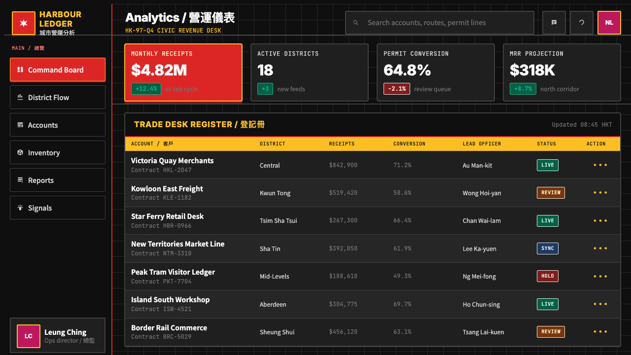
For web interfaces and digital dashboards, the style offers a strong visual hierarchy model. The key is translating the print-derived grid logic into a digital column system without losing the compositional tension that makes the style distinctive. Use deep-toned backgrounds with high-contrast display type for hero sections and navigation; reserve vermilion or sharp yellow for interactive states, badges, and critical alerts. Avoid soft shadows and ambient depth effects — the style's authority comes from flatness, edge precision, and deliberate color deployment. Typography should feel monumental, not conversational.对于网页界面与数字仪表板,这种风格提供了一种强大的视觉层级模型。关键在于将源自印刷的网格逻辑转化为数字栏系统,同时不失去使这种风格独特的构图张力。在主视觉区域与导航中使用深色调背景配高对比度展示字体;将朱红色或犀利黄色保留给交互状态、徽章与关键警报。避免柔和阴影与环境深度效果——这种风格的权威感来自平面性、边缘精确度与刻意的色彩部署。字体应当给人以纪念碑式而非对话式的感受。
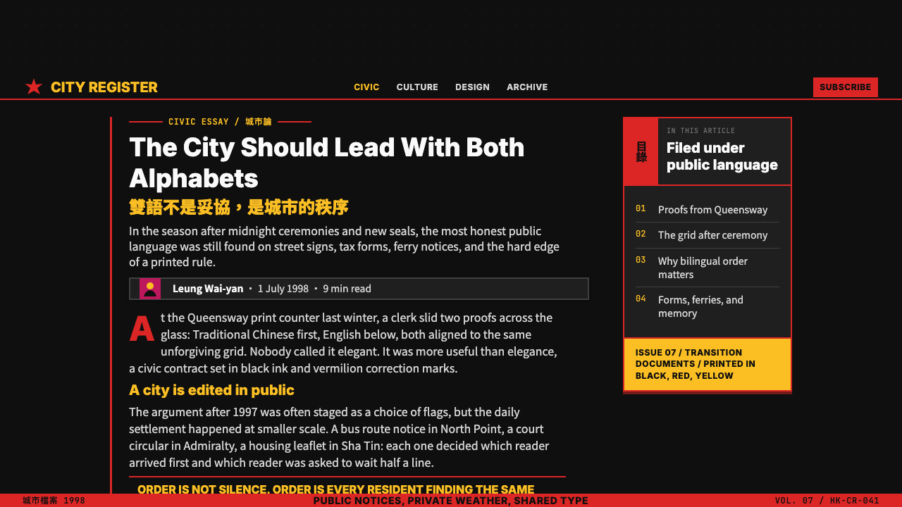
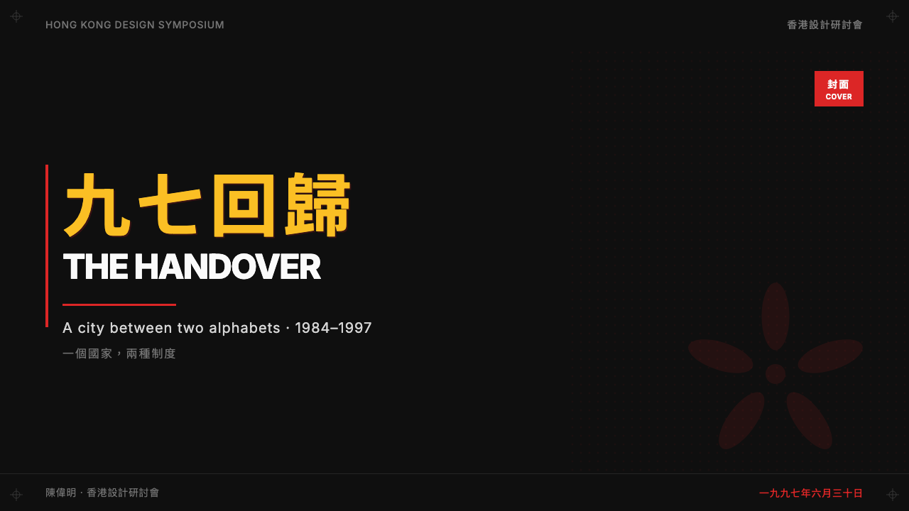
For editorial and marketing work — event posters, cultural publications, commemorative printed materials — the style is at its most natural. A full-bleed black ground with a vermilion color field housing Chinese vertical type, balanced by a white or cream area for Latin text and supplementary information, is the canonical compositional approach. The geometric framing devices — rules, color blocks, axis alignments — should be visible and structural rather than subtle. Marketing materials for events and institutions concerned with Chinese cultural heritage, cross-cultural exchange, or historical commemoration are particularly well-served by this visual language.对于编辑与营销工作——活动海报、文化出版物、纪念印刷品——这种风格最为自如。满版黑色底面上设置一片容纳中文竖排的朱红色域,以白色或奶油色区域容纳拉丁文正文与辅助信息加以平衡,这是经典的构图方式。几何框架装置——直线、色块、轴线对齐——应当可见且具结构性,而非隐微。与中国文化遗产、跨文化交流或历史纪念相关的活动与机构营销材料,尤其适合这套视觉语言。
A common mistake when applying this style is treating the bilingual element as optional or ornamental — placing one language in a secondary, smaller, or visually diminished position. The style's defining quality is the equal structural integration of Chinese and Latin type, and reducing either to a caption or subtitle destroys the compositional logic. Similarly, substituting a simplified Chinese typeface for a traditional one changes the visual register significantly: simplified characters carry different stroke weight distributions and different cultural associations, and the result will read as contemporary mainland rather than the specific Hong Kong transitional aesthetic this style encodes.应用这种风格时最常见的错误,是将双语元素视为可选项或装饰性的——将一种语言置于次要、更小或视觉上被弱化的位置。这种风格的决定性特质是中文与拉丁文的平等结构整合,将任何一方降为图注或副标题都会破坏构图逻辑。同样,用简体字替代繁体字会显著改变视觉调性:简体字承载着不同的笔画重量分布与不同的文化联想,结果将被解读为当代内地风格,而非这种风格所编码的特定香港过渡时期美学。
See the Hong Kong Handover 1997 Poster design system →查看 Hong Kong Handover 1997 Poster 完整设计系统 →
Hong Kong Handover 1997 Poster — FAQHong Kong Handover 1997 Poster · 常见问题
Is this style specific to Hong Kong, or can it represent any Chinese-English bilingual context?这种风格是香港特有的,还是可以代表任何中英双语语境?
It is specific to Hong Kong, and using it to represent other Chinese-English bilingual contexts would be a category error. The style encodes particular conditions: the coexistence of British colonial administrative culture and Cantonese-speaking civic life, the specific print and signage conventions of the MTR and government information systems, the distinctive visual culture of Central and Wan Chai in the 1980s and 1990s, and the charged political atmosphere of the transition period. Mainland Chinese design of the same era has entirely different visual conventions, as does Taiwanese design and Singapore design. The style's cultural specificity is part of its meaning.这是香港特有的,将其用于代表其他中英双语语境将是一种分类错误。这种风格编码了特定条件:英国殖民地行政文化与粤语市民生活的共存,港铁与政府信息系统特有的印刷与标识惯例,1980至1990年代中环与湾仔的独特视觉文化,以及过渡时期带电的政治氛围。同时期的中国内地设计有完全不同的视觉惯例,台湾设计与新加坡设计亦然。这种风格的文化特殊性是其意义的组成部分。
How does this style differ from Swiss International Style, which also uses grids and sans-serif type?这种风格与同样使用网格和无衬线字体的瑞士国际主义风格有何不同?
Swiss International Style operates within a single typographic tradition — Latin letterforms — and achieves its precision through mathematical grid systems and strictly rationalized type hierarchies. The Hong Kong Handover style inherits the Swiss grid logic but uses it to manage a genuinely different problem: holding two scripts with different structural properties, different reading directions, and different cultural weights in productive tension within the same composition. The color language is also fundamentally different: where Swiss Style uses color sparingly and often functionally, the Hong Kong style uses vermilion and high-intensity yellow as charged symbolic elements carrying ceremonial and civic meaning that has no equivalent in the Swiss tradition.瑞士国际主义风格在单一排印传统——拉丁字母体系——内运作,通过数学网格系统与严格理性化的字体层级实现其精确性。香港回归风格继承了瑞士网格逻辑,但将其用于处理一个本质上不同的问题:在同一构图中,将具有不同结构属性、不同阅读方向与不同文化分量的两套文字维持于富有创造力的张力之中。色彩语言也根本不同:瑞士风格色彩使用克制而多为功能性,香港风格则将朱红与高强度黄色作为充满典礼与市政意义的象征性元素——这些意义在瑞士传统中没有对应物。
Can this style work in contexts that are not politically charged or historically commemorative?这种风格能在不具政治性或历史纪念意义的语境中发挥作用吗?
Yes, but with an important caveat. The civic authority register — the combination of black ground, vermilion, and geometric structure — reads as official and serious in almost any context, which can be an asset or a liability depending on the application. Cultural institutions, museums, architectural firms, and technology companies presenting themselves as authoritative and historically grounded can use this visual language effectively. It works poorly for products or services that want to project warmth, approachability, or playfulness. The bilingual dimension is optional in contexts where only one language is needed, but removing it eliminates the most distinctive structural logic of the style.可以,但有一个重要前提。市政权威调性——黑色底面、朱红与几何结构的组合——在几乎任何语境中都被解读为官方与严肃,这可以是优势,也可以是负担,取决于具体应用。文化机构、博物馆、建筑事务所以及希望呈现权威感与历史根基的科技公司,可以有效地运用这套视觉语言。对于希望传递温暖、平易近人或趣味性的产品与服务,它则表现欠佳。在只需要一种语言的语境中,双语维度是可选的,但去除它会消除这种风格最独特的结构逻辑。
What is the relationship between this style and contemporary Hong Kong design?这种风格与当代香港设计之间是什么关系?
Contemporary Hong Kong design has largely moved on from the Handover-era visual language, engaging with global digital design trends much as designers elsewhere do. The Handover style is now a period aesthetic — associated specifically with the late colonial and early post-handover decades — rather than an ongoing active tradition. However, it retains strong cultural resonance as a marker of a particular historical moment, and designers working with themes of Hong Kong cultural identity, historical memory, or the complexity of the transition period frequently return to its conventions as deliberate cultural citations. It occupies a position somewhat analogous to the Stile Liberty in Italian design or the Arts and Crafts movement in British design: a historically specific moment whose visual language has achieved canonical status.当代香港设计已在很大程度上超越了回归时期的视觉语言,与全球各地设计师一样融入全球数字设计潮流。回归风格现在是一种时代美学——专门与晚期殖民地及回归初期数十年相关联——而非持续活跃的传统。然而,作为特定历史时刻的标记,它保留着强烈的文化共鸣,那些探讨香港文化认同、历史记忆或过渡期复杂性的设计师,常将回归时期的视觉惯例作为刻意的文化引用加以援引。它所处的位置,有些类似于意大利设计中的自由风格,或英国设计中的工艺美术运动:一个在历史上特定的时刻,其视觉语言已获得经典地位。
Does this style require actual bilingual content, or can it be applied monolingually?这种风格是否需要真正的双语内容,还是可以单语言应用?
The style can be applied monolingually, but the bilingual grid architecture is its most distinctive feature, and a monolingual application will read as an echo of the style rather than a full expression of it. If you are working in a single-language context, the elements that remain fully transferable are the color language — vermilion on black, high-intensity yellow accents — the geometric structural framing, the angular display typography, and the overall civic restraint. What you will lose is the productive tension between two scripts that gives the style its characteristic visual energy. A monolingual version is a useful reference but should be understood as a derived form, not the original.这种风格可以单语言应用,但双语网格结构是其最独特的特征,单语言应用将被解读为对这种风格的回响,而非其完整表达。如果你工作于单语言语境,仍可完整转移的元素包括:色彩语言——黑底朱红、高强度黄色强调——几何结构框架、棱角展示字体,以及整体的市政克制感。你将失去的,是赋予这种风格其特征性视觉能量的两套文字之间的创造性张力。单语言版本是有用的参照,但应被理解为衍生形式,而非原版。
Related design styles相关设计风格
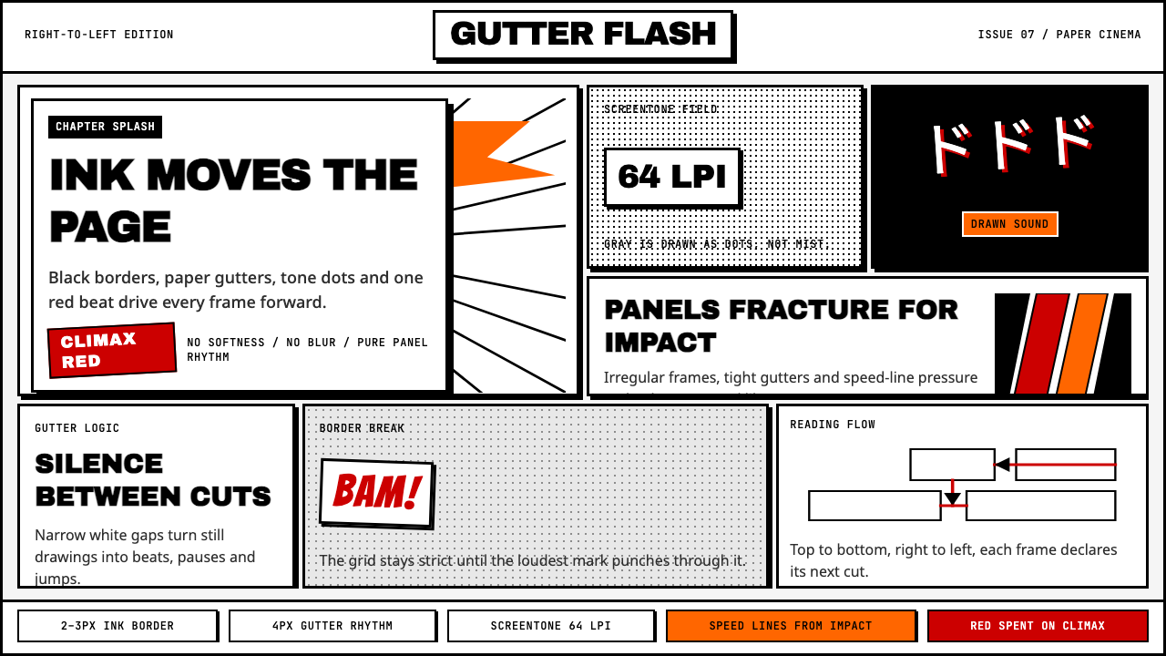 Manga Panel LayoutCinema in ink. Black panels, screentone dots, speed lines, and one red strike.墨线即电影:黑框、网点、速度线与一记少年红。
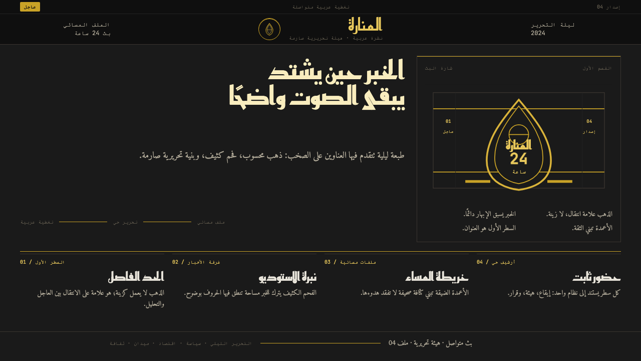 Al Jazeera Arabic NewsAuthority, stripped bare. Gold seal, dense Arabic type, matte charcoal.权威感被提纯。金色印章、密集阿文、炭黑底面构成画面。
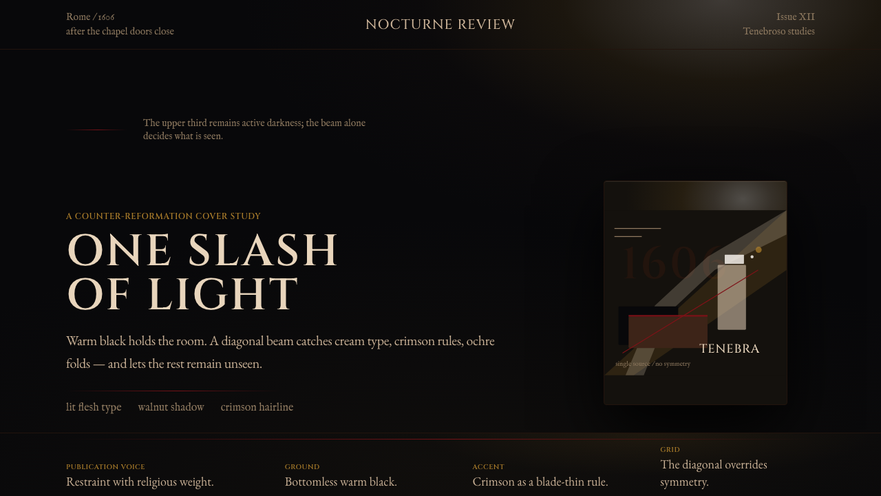 Caravaggio TenebrismDarkness acts first. Warm-black voids, Cinzel capitals, and one ochre raking…黑暗先发声:暖黑空场、Cinzel 大写与赭石斜光。
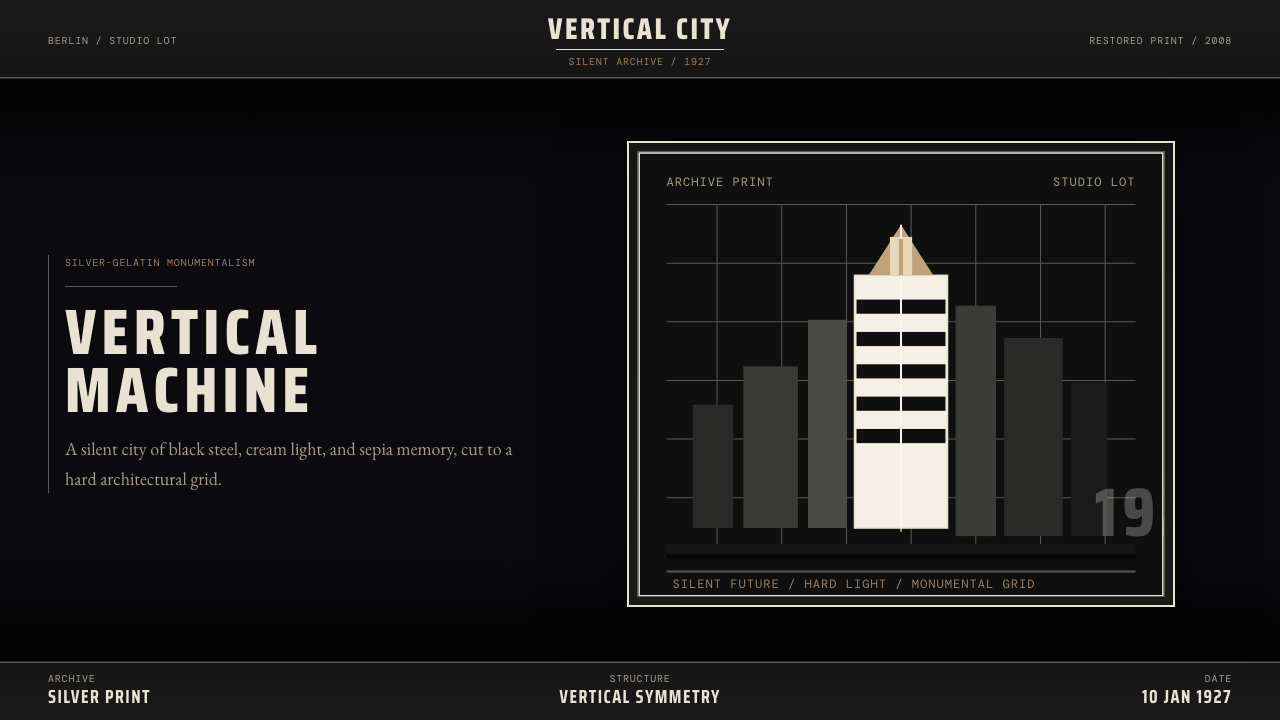 Metropolis (Fritz Lang, 1927)Monumental and severe. Black grid, cream type, sepia shadows.庄严而冷峻。黑底网格、奶白字与赭色阴影。
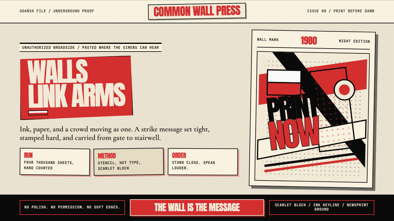 Solidarność Poland 1980Urgency becomes type. Scarlet blocks, ink keylines, and halftone cream hit li…急迫化为文字:猩红色块、黑色描边与半调米纸像墙上海报。
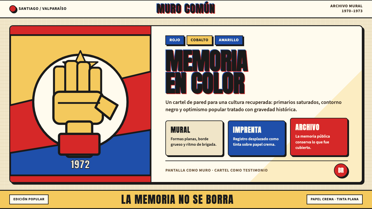 Chilean Allende-Era Propaganda (1972)Solemn revolution. Red, cobalt and yellow lock into thick black mural geometr…庄重的革命感:红、钴蓝与黄被黑色粗线锁进壁画几何。