What is Metropolis (Fritz Lang, 1927)?什么是 Metropolis (Fritz Lang, 1927)?
Fritz Lang's Metropolis gave cinema its first visual grammar of the machine city — monumental shadow, vertical megastructure, and the silver-gelatin warmth of nitrate film compressed into a design vocabulary that still defines cinematic dystopia.弗里茨·朗的《大都会》赋予电影史上第一套机器城市的视觉语法——纪念碑式阴影、垂直巨构与硝酸银底片的银盐温度,凝结成一套至今仍定义着银幕反乌托邦的设计词汇。
Metropolis (Fritz Lang, 1927) in briefMetropolis (Fritz Lang, 1927) 速览
Metropolis is a design language rooted in the visual world of Fritz Lang's 1927 silent film — the same name — produced at UFA Babelsberg Studios in Berlin during the final years of the Weimar Republic. Its palette is the tonal world of the silver-nitrate print: absolute black grounds, warm cream and bone highlights, and sepia-tinted mid-tones that evoke the aged warmth of archival photographic paper. Nothing about this aesthetic is accidental; every visual choice recalls the specific material reality of early cinema and its monumental, shadow-saturated imagery.《大都会》设计语言植根于弗里茨·朗同名1927年无声电影的视觉世界——该片于魏玛共和国末年在柏林巴贝尔斯贝格制片厂摄制完成。其色调属于硝酸银印相的世界:绝对黑色的底面、温暖的奶白与骨白高光,以及泛赭的中间调——令人联想到档案摄影纸的岁月暖意。这套美学中没有任何偶然;每一个视觉选择都召回了早期电影特定的物质现实与其纪念碑式、阴影饱和的意象。
The core compositional logic derives from Erich Kettelhut's colossal set designs and Karl Freund's cinematography: towering vertical forms dominate the frame, architectural symmetry gives way to expressionist diagonal shadow-play, and human figures appear dwarfed against machine-scale structures. Typography follows the compressed, high-contrast tradition of Weimar-era film posters — tall, narrow letterforms that echo the soaring verticals of the fictional city's towers. The overall effect is one of controlled grandeur: severe, monumental, and unmistakably of its historical moment.核心构图逻辑源自埃里希·凯特尔胡特的巨型布景设计与卡尔·弗罗因德的摄影:高耸的垂直形态统治画面,建筑对称让位于表现主义斜线投影,人物身影在机器尺度的构筑物前显得渺小。字体排印沿袭魏玛时代电影海报的压缩、高对比传统——高窄字形呼应着虚构都市塔楼的直冲云霄。整体效果是一种受控的宏大:严峻、纪念性,且不可误认地属于那个历史时刻。
What distinguishes Metropolis as a design system from mere film-inspired pastiche is its structural coherence. The color restraint, the compositional hierarchy built on vertical thrust, the hard geometric borders functioning as architectural drafting lines — these are not decorative choices but a system with internal logic. Applied thoughtfully, the vocabulary communicates weight, authority, and a particular kind of dark optimism: the conviction, shared by Lang's film, that the future is large, demanding, and worth facing.使《大都会》作为设计系统有别于单纯电影灵感拼贴的,是它的结构连贯性。色彩的克制、以垂直冲力构建的构图层级、充当建筑制图线的硬朗几何边框——这些不是装饰选择,而是一套具有内在逻辑的系统。审慎运用之下,这套词汇传达重量、权威,以及一种特殊的暗色乐观主义:朗的电影所共享的那种信念——未来是宏大的、严苛的,也是值得直面的。
See the Metropolis (Fritz Lang, 1927) design system查看 Metropolis (Fritz Lang, 1927) 完整设计系统
Where does Metropolis (Fritz Lang, 1927) come from?Metropolis (Fritz Lang, 1927) 从何而来?
Fritz Lang began developing Metropolis in 1924 after a visit to New York City, where the illuminated Manhattan skyline — viewed from an ocean liner at night — struck him as a vision of a city of the future. Production commenced in earnest in 1925 at the UFA Babelsberg Studios near Berlin, then the largest and most technically sophisticated film studio complex in the world. The screenplay was written by Lang's wife Thea von Harbou, based on her own novel, and the film premiered on January 10, 1927, at the Ufa-Palast am Zoo in Berlin — running at a length that would be drastically cut by American distributors within months.弗里茨·朗于1924年访问纽约后开始构思《大都会》——夜晚从远洋班轮上望见灯火辉煌的曼哈顿天际线,令他感受到一座未来之城的预兆。1925年,制作在柏林郊外的巴贝尔斯贝格制片厂正式展开,彼时那里是世界上规模最大、技术最精密的制片基地。剧本由朗的妻子特雅·冯·哈尔布据其同名小说改编,影片于1927年1月10日在柏林的Ufa-Palast am Zoo首映——但其长度在数月内即遭美国发行商大幅删减。
The visual language of the film was shaped principally by production designer Erich Kettelhut, whose architectural drawings for the upper and lower city of Metropolis drew simultaneously on German Expressionism and emerging Art Deco monumentalism. Kettelhut's designs feature soaring vertical towers, elevated highways threading between skyscrapers, and the dark subterranean world of the workers — a visual opposition between light and shadow, above and below, that became the film's defining formal tension. Sculptor Walter Schulze-Mittendorff created the iconic robot figure, Maria's mechanical double, whose geometric, jointed form is one of cinema's most enduring character designs. Karl Freund served as principal cinematographer, developing lighting strategies that used extreme contrast — brilliant top-lighting against absolute dark — to model the architecture as a character in itself.影片的视觉语言主要由美术设计埃里希·凯特尔胡特塑造。他为《大都会》上层与下层城市所绘制的建筑图纸同时汲取了德国表现主义与新兴装饰艺术的纪念碑风格。凯特尔胡特的设计以高耸的垂直塔楼、穿行于摩天楼间的架空公路以及黑暗的工人地下世界为特征——光明与阴影、高处与低处的视觉对立,成为影片的决定性形式张力。雕塑家瓦尔特·舒尔策-米滕道夫创造了标志性的机器人形象——玛利亚的机械分身——其几何化、关节式的造型是电影史上最持久的角色设计之一。卡尔·弗罗因德担任主摄影师,发展出以极端对比为手段的布光策略——强烈的顶光对抗绝对的黑暗——将建筑本身塑造成一个角色。
The Weimar Republic context is inseparable from the film's aesthetics. Germany in the mid-1920s was simultaneously experiencing intense industrialization, political instability, and a cultural ferment that produced Expressionism, Neue Sachlichkeit, and the Bauhaus in close proximity. The visual grammar of German Expressionist cinema — exaggerated shadow, diagonal composition, architectural distortion — had been established by films like The Cabinet of Dr. Caligari (1920) and Nosferatu (1922). Lang took this grammar and combined it with the ambitions of epic-scale architectural filmmaking, constructing sets that required the largest miniature-work and in-camera compositing that the industry had yet attempted. The Schüfftan process, used extensively in Metropolis, allowed actors to appear integrated into miniature architectural models using mirror reflections — a technical innovation that itself contributed to the seamless, overwhelming scale of the imagery.魏玛共和国的语境与影片美学不可分割。二十世纪二十年代中期的德国同时经历着高强度工业化、政治动荡,以及催生了表现主义、新即物主义与包豪斯的文化激荡。德国表现主义电影的视觉语法——夸张的阴影、斜线构图、建筑变形——已由《卡里加里博士的小屋》(1920年)与《诺斯费拉图》(1922年)等影片奠定。朗将这套语法与史诗级建筑电影的抱负相结合,搭建了当时电影工业从未尝试过的最大规模微缩模型与机内合成。影片大量使用的舒夫坦工艺,通过镜面反射将演员融入微缩建筑模型之中——这一技术革新本身也为那种无缝、压倒性的影像尺度作出了贡献。
The film's immediate reception was complicated. German critics recognized its visual ambition; the narrative's politics were contested from the start, with Siegfried Kracauer famously arguing in From Caligari to Hitler that Metropolis represented a capitulation to authoritarian spectacle. H. G. Wells dismissed the story's logic while acknowledging the imagery. The American distributors at Paramount and Channing Pollock cut approximately a quarter of the film's length before its US release, removing subplots and altering the narrative. For decades, Metropolis existed only in incomplete form. A 2008 discovery in the Museo del Cine in Buenos Aires recovered a near-complete print from a 16mm reduction copy, and the subsequent restoration — premiered at the Berlin Film Festival — finally allowed audiences to encounter something close to Lang's original vision. That restoration also fixed the film's canonical length and restored sequences whose visual logic was essential to understanding the design system as a whole.影片的即时接受颇为复杂。德国评论界承认其视觉雄心;叙事政治却从一开始就饱受争议,齐格弗里德·克拉考尔在《从卡里加里到希特勒》中著名地论断《大都会》是对威权奇观的屈服。H·G·威尔斯在批评故事逻辑的同时承认影像的震撼。派拉蒙公司的美国发行商删去约四分之一的片长,移除了副线情节并改动了叙事。数十年间,《大都会》只以残缺形式存世。2008年,布宜诺斯艾利斯电影博物馆发现了一份近乎完整的16毫米缩版拷贝,随后的修复版在柏林电影节首映,终于让观众得以接触接近朗原初构想的影片。那次修复同时确定了影片的权威片长,并还原了若干对于理解整套设计系统的视觉逻辑不可或缺的段落。
What defines the Metropolis (Fritz Lang, 1927) look?Metropolis (Fritz Lang, 1927) 的视觉特征是什么?
Tonal Palette色调色板
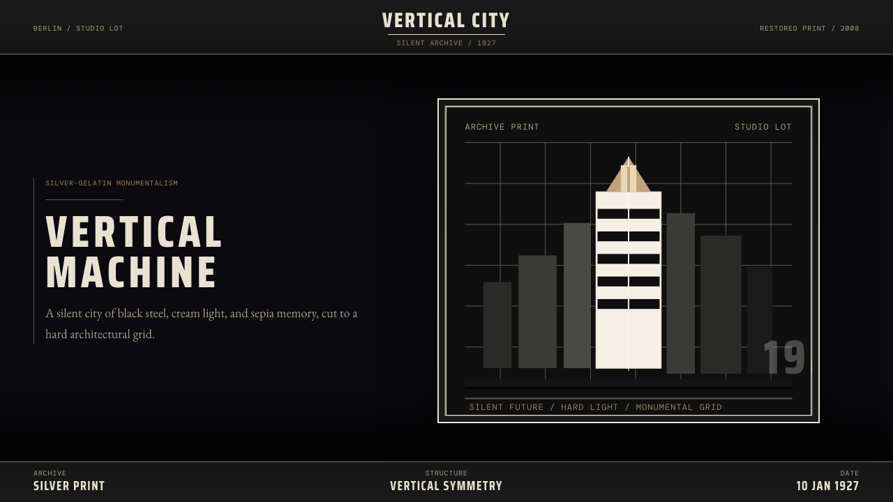
The Metropolis palette is built from the tonal range of a silver-nitrate photographic print rather than from hue. Absolute black functions as the primary ground — the void from which architectural forms and typographic elements emerge. Warm cream and aged bone serve as the principal highlight tones, giving text and bright architectural surfaces the quality of light on developed photographic paper. Sepia-range mid-tones bridge the two extremes, providing the visual warmth that distinguishes this palette from cold modern monochrome. Accent tones, when introduced, remain within the amber-ochre-rust family, never veering toward blue or green. The result is a palette that feels simultaneously archival, severe, and warm — the warmth of something old being examined in shadow.《大都会》色板建立在硝酸银摄影印相的色调范围上,而非色相。绝对黑是主要底面——建筑形态与字体元素从中涌现的虚空。温暖的奶白与陈旧的骨白作为主要高光色调,赋予文字与明亮建筑表面以显影摄影纸上光线的质感。赭褐范围内的中间调连接两个极端,提供使这套色板有别于冷峻现代单色调的视觉温度。当引入强调色时,它们始终停留在琥珀-赭黄-铁锈的色族内,绝不偏向蓝色或绿色。结果是一套同时具有档案感、严肃感与温暖感的色板——那是某种古老之物在阴影中被审视的温度。
Vertical Monumentalism垂直纪念性
Composition in the Metropolis style is organized around the vertical axis. Elements stack and tower rather than spread horizontally; negative space accumulates at the sides while height is exploited to its maximum. This orientation mirrors the film's defining architectural imagery — the soaring towers of the upper city, the vertical shafts of the worker elevators, the Tower of Babel sequence's oppressive upward gaze. In layout terms, this means portrait orientations are preferred, type is set in tall narrow columns rather than wide measures, and heroic single elements — a title, a numeral, an architectural silhouette — are scaled to dominate the full height of the composition. Horizontal elements, when they appear, function as groundlines or architectural sills rather than compositional protagonists.《大都会》风格的构图围绕垂直轴组织。元素向上堆叠、高耸,而非水平铺展;留白在两侧积聚,高度被最大程度利用。这种取向映照着影片的决定性建筑意象——上层城市的直冲云霄、工人升降机的垂直井道、巴别塔段落那令人窒息的仰望视角。在版面语言中,这意味着竖向版式优先,字体排入高窄的列而非宽行,英雄式的单一元素——一个标题、一个数字、一个建筑轮廓——被放大到统领构图全高。水平元素若出现,充当地平线或建筑台基,而非构图的主角。
Expressionist Shadow表现主义投影
Shadow in this system is not a lighting effect but an architectural fact. Hard-edged shadows fall at dramatic angles — steep diagonals that cut across compositions the way theatrical top-lighting cuts across a stage — and are rendered as solid dark shapes rather than graduated tones. These shadows carry the expressive weight that soft shadows cannot: they impose, they divide, they create zones of concealment and zones of revelation. The contrast between lit surface and shadow in Metropolis-style work is rarely intermediate; transitions are abrupt, mimicking the extreme lighting ratios of silent-film cinematography. This commitment to shadow as form — rather than shadow as atmosphere — is the single quality that most separates this system from other dark-palette design languages.在这套系统中,阴影不是光照效果,而是建筑事实。硬边阴影以戏剧性角度投落——如剧场顶光切过舞台的陡峭斜线切过构图——以实心暗色形渲染,而非渐变色调。这些阴影承载着柔和阴影所无法具备的表现力:它们施压、它们分割、它们制造遮蔽区与显现区。《大都会》风格作品中被照明表面与阴影之间的对比极少处于中间状态;过渡是骤然的,模仿着无声电影摄影的极端光比。将阴影视为形态——而非将阴影视为氛围——正是这套系统与其他深色板设计语言区别最显著的单一品质。
Compressed Weimar Typography压缩魏玛字体排印
Display type in the Metropolis system follows the visual logic of Weimar-era film poster lettering: letterforms are tall, narrow, and tightly tracked, with stroke contrast that emphasizes the vertical. Headlines carry the same visual weight as architectural elements — they are structures, not descriptions. Body text, by contrast, is set small and tight, concentrated in dense column blocks that function as textured masses within the composition rather than as reading material to be scanned. The hierarchy between display type and text is extreme and unapologetic. Letter-spacing in headlines may be slightly opened to increase the architectural, inscription-like quality; in body text it remains tight, compressing the type into solid rectangles.《大都会》系统中的展示字体遵循魏玛时代电影海报字体的视觉逻辑:字形高、窄、字距紧密,笔画对比强调垂直走向。标题与建筑元素具有同等视觉分量——它们是构筑物,而非描述。正文则以小而紧凑的形式排入密集的列块,在构图中作为纹理化的质量块发挥作用,而非供人扫读的阅读材料。展示字体与正文之间的层级极端而毫不妥协。标题中的字距可以略微打开,以增强建筑性、铭文式品质;正文字距保持紧凑,将文字压缩成实心矩形。
Geometric Structure and Borderwork几何结构与边框语言
The Metropolis design system uses thin, precise geometric lines as structural armature — hairline borders, ruled frames, and rectilinear grid overlays that recall both architectural drafting and the intertitle cards of silent film. These lines are never decorative flourishes; they define the edges of information zones the way load-bearing walls define a building's structure. Circles appear as mechanical motifs — gear references, iris references, the circular portal windows of the film's underground — and are used as containing shapes for isolated graphic elements rather than as background decoration. The overall geometry is hard, Cartesian, and industrial: no curves that are not structural, no organic forms, no softened corners.《大都会》设计系统以细而精确的几何线条作为结构骨架——发丝边框、直线框格与矩形网格叠层,令人联想到建筑制图与无声电影字幕卡片。这些线条绝非装饰性花饰;它们如承重墙界定建筑结构那样界定信息区域的边缘。圆形作为机械母题出现——齿轮的参照、虹膜快门的参照、影片地下世界圆形舷窗的参照——用作孤立图形元素的容纳形状,而非背景装饰。整体几何是硬朗的、笛卡尔式的、工业的:无非结构性曲线,无有机形态,无柔化转角。
Archival Texture and Grain档案质感与颗粒
Where texture enters the Metropolis system, it is always the texture of age and photographic process rather than of natural materials. A faint silver-halide grain suggests the emulsion of a nitrate print; a subtle paper tone beneath type suggests archival stock; vignetting toward the edges of a composition recalls the uneven exposure characteristics of early lenses. These textural cues are applied with restraint — the underlying geometric clarity is never compromised — but they are what prevent the system from reading as coldly digital. The aesthetic registers as something that has been preserved rather than manufactured, something that carries the weight of recorded time.当质感进入《大都会》系统时,它始终是岁月与摄影工艺的质感,而非自然材料的质感。隐约的卤化银颗粒暗示硝酸银底片的乳剂;字体下方微妙的纸张色调暗示档案纸张;构图边缘的暗角令人联想到早期镜头不均匀的曝光特性。这些质感线索以克制的方式施加——底层几何的清晰度从不受损——但正是它们防止了这套系统被解读为冷漠的数字产物。这套美学感觉上像是被保存下来的某物,而非被制造出来的,某种承载着被记录的时间之重的存在。
Bilateral Symmetry and Axial Tension双侧对称与轴线张力
Unlike the deliberate asymmetry of Bauhaus or Swiss International Style, Metropolis-derived design allows and often favors formal symmetry — the bilateral balance of a cathedral facade or a film's title card, with a single dominant axis running through the center of the composition. This symmetry is never passive; it is loaded with tension by placing heavy elements at the extremities, using shadow to break the mirror, or introducing a single off-center disruption — a diagonal line, an asymmetric mechanical form — that the symmetry must contain. The result is monumental equilibrium rather than dynamic imbalance: compositions that feel ceremonial, processional, and weighted with implied significance.与包豪斯或瑞士国际主义风格的刻意非对称不同,源自《大都会》的设计允许甚至常常偏爱正式对称——如大教堂立面或电影字幕卡片的双侧平衡,以一条主轴贯穿构图中心。这种对称从不是消极的;它通过在两端置放重量元素、用阴影打破镜像,或引入单一偏心扰动——一条斜线、一个非对称机械形态——来充满张力,而这种对称必须将其容纳。结果是纪念碑式的均衡而非动态的失衡:构图感觉庄严、列队式,承载着隐含的重大意义。

See the Metropolis (Fritz Lang, 1927) design system查看 Metropolis (Fritz Lang, 1927) 完整设计系统
Who shaped Metropolis (Fritz Lang, 1927)?谁塑造了 Metropolis (Fritz Lang, 1927)?
The film's director, Lang had trained as an architect before turning to cinema, and his spatial imagination — the sense that every frame should be designed as a three-dimensional space with defined zones of light and dark — shaped Metropolis from concept to final edit. His visit to New York in 1924 provided the initial visual inspiration; his meticulous control over every aspect of production ensured that inspiration was realized at colossal scale. Lang fled Germany in 1933 when the Nazi government — ironically, great admirers of Metropolis — attempted to recruit him, eventually reaching Hollywood where he directed a further two decades of films. His architectural sensibility never left his work.影片导演。朗在转向电影之前曾受过建筑师训练,他的空间想象力——将每一帧画面设计为具有明确光明与黑暗区域的三维空间的感知——从构思到最终剪辑塑造了《大都会》。1924年对纽约的访问提供了最初的视觉灵感;他对制作每个环节的一丝不苟的掌控确保了这一灵感以巨大规模得以实现。1933年,当纳粹政府——讽刺地,《大都会》的热情仰慕者——试图招募他时,朗逃离德国,最终抵达好莱坞,在那里又执导了二十年的影片。他的建筑感性从未离开他的作品。
Production designer and art director for Metropolis, Kettelhut was responsible for the architectural conception of the film's dual city — the gleaming towers of the ruling class and the subterranean darkness of the workers' underworld. His detailed architectural drawings, many of which survive, demonstrate the extraordinary precision and ambition of the film's visual planning. Kettelhut synthesized influences from Expressionist painting, emerging Art Deco skyscraper culture, and his own spatial imagination to create designs that remained influential in science fiction production design for the remainder of the twentieth century. His Tower of Babel sequence designs are among the most recognized single images in film history.《大都会》的美术设计师与艺术指导,凯特尔胡特负责影片双重城市的建筑构想——统治阶级闪耀的塔楼与工人地下世界的幽暗深渊。他详尽的建筑图纸至今多有留存,展示了影片视觉规划的非凡精密与雄心。凯特尔胡特综合了表现主义绘画、新兴装饰艺术摩天楼文化以及他自身的空间想象,创造出在二十世纪余下岁月持续影响科幻类型美术设计的方案。他的巴别塔段落设计是电影史上辨识度最高的单一影像之一。
The sculptor responsible for designing and constructing the iconic robot figure — officially referred to as the Maschinenmensch or Machine-Human — that has since become one of the most widely referenced character designs in the history of popular culture. Schulze-Mittendorff built the costume from a wood and metal armature covered in sculpted plastic wood material, fitted directly onto actress Brigitte Helm. The figure's geometric, jointed, distinctly non-anthropomorphic proportions established a visual language for artificial life that subsequent robot and android character design has never entirely escaped. C-3PO, among many others, is directly descended from Schulze-Mittendorff's design.负责设计和制作标志性机器人形象——官方称作「机器人」(Maschinenmensch)——的雕塑家,该形象此后成为流行文化史上被引用最广泛的角色设计之一。舒尔策-米滕道夫用木材与金属骨架覆以塑形木质材料制作服装,直接套在女演员布里吉特·赫尔姆身上。该形象几何化、关节式、明确非拟人的比例确立了一套人工生命的视觉语言,后来的机器人与仿生人角色设计从未完全逃脱。C-3PO等众多形象都直接传承自舒尔策-米滕道夫的设计。
Screenwriter and Lang's collaborator and wife during the making of Metropolis, von Harbou wrote both the source novel and the film's screenplay. Her narrative sensibility — drawn to mythological structures, class allegory, and the redemptive power of mediation — gave the film's visual ambition its thematic scaffolding. The industrial dystopia, the messianic worker-hero, the mechanical double of the saintly Maria: these were von Harbou's inventions, and they provided the design system with its essential dramaturgy of opposition — light against dark, machine against flesh, order against chaos. Her contributions to the film's enduring cultural resonance are often understated relative to Lang's directorial vision.编剧,《大都会》制作期间的合作者与朗的妻子。冯·哈尔布既写了原著小说,也写了影片剧本。她的叙事感性——对神话结构、阶级寓言与调解救赎力量的迷恋——为影片的视觉雄心提供了主题脚手架。工业反乌托邦、弥赛亚式的工人英雄、圣洁玛利亚的机械分身:这些都是冯·哈尔布的发明,它们为设计系统提供了本质的对立戏剧结构——光明对抗黑暗,机器对抗血肉,秩序对抗混沌。相比朗的导演视野,她对影片持久文化共鸣的贡献常常被低估。
Chief cinematographer on Metropolis, Freund brought to the project a mastery of extreme lighting contrast and mobile camera technique developed across a distinguished career in German silent cinema that included The Last Laugh (1924) and Variety (1925). His approach to lighting the Metropolis sets — using arc lights to create hard, directional top-lighting against near-total darkness — was technically demanding and visually decisive. The resulting imagery defined the tonal language of the film: that quality of forms emerging from black, of light as privilege and shadow as oppression, which became the most cited visual characteristic of the Metropolis aesthetic.《大都会》的首席摄影师,弗罗因德将在德国无声电影杰出职业生涯中磨练的极端光比与运动摄影技术带入这个项目,此前作品包括《最卑贱的人》(1924年)与《综艺》(1925年)。他对《大都会》布景的照明处理方式——以弧光灯在近乎全黑环境中制造硬朗、方向性的顶光——技术要求极高,视觉效果决定性。由此产生的影像定义了影片的色调语言:形态从黑暗中涌现的那种品质,光明作为特权、阴影作为压迫,成为《大都会》美学中被引用最多的视觉特征。
How do you use Metropolis (Fritz Lang, 1927) today?今天怎么用 Metropolis (Fritz Lang, 1927)?
The Metropolis visual system is one of the strongest historical design languages available for contexts where monumentality, authority, and a sense of historical weight are desired qualities. Because its principles are tonal and compositional rather than purely ornamental, it translates effectively across media — from presentation decks to web interfaces to printed editorial — provided the designer understands what the system is communicating and why. The key discipline is restraint: the vocabulary is powerful precisely because it is sparing, and overuse of any element — too many hairline borders, too aggressive a grain texture, too many competing typographic scales — quickly undermines the monumental dignity the style depends on.《大都会》视觉系统是在需要纪念性、权威感与历史分量作为期望品质的场景中可用的最强历史设计语言之一。因为它的原则是色调性与构图性的,而非纯粹装饰性的,它能有效地在媒介间转译——从演示文稿到网页界面到纸质编辑——前提是设计师理解这套系统在传达什么,以及为什么。关键的自律是克制:这套词汇之所以有力量,恰恰是因为它的吝啬——过度使用任何元素——过多的发丝边框、过于激进的颗粒质感、过多竞争性的字体层级——都会迅速削弱这种风格所依赖的纪念碑式庄严。
For presentation slides, Metropolis works with particular force on cover pages and section dividers. A cover built in this system places the title in compressed, tall type against an absolute black ground, with a single architectural silhouette or geometric form providing the visual anchor — the composition should feel like a film title card, not a corporate deck. Content slides should be treated as information architecture: a strict column structure, black or near-black grounds, cream or bone type, and data elements rendered as geometric objects in the amber-ochre palette. Section dividers benefit from full-bleed imagery — preferably high-contrast architectural or industrial photography treated in tonal duotone — with title type overlaid at large scale. Data visualization takes on a diagrammatic, technical-drawing quality: axes are hairline, bars are solid and architectural in proportion, and no chart decoration appears beyond what the data itself requires.在演示文稿中,《大都会》在封面页与章节分割页上发挥着特别强大的作用。以这套系统构建的封面,将标题以压缩、高耸的字形置于绝对黑色底面上,以单一建筑轮廓或几何形提供视觉锚点——构图应感觉像电影字幕卡片,而非企业文稿。内容页应被当作信息架构来处理:严格的列结构,黑色或近黑色底面,奶白或骨白字体,以及以琥珀-赭黄色板呈现为几何对象的数据元素。章节分割页得益于全出血图像——最好是以色调双色调处理的高对比度建筑或工业摄影——配以大尺度叠印的标题字。数据可视化呈现出示意图、技术制图的品质:坐标轴是发丝线,柱条是实心的、在比例上具有建筑感的,图表中不出现数据本身之外所需要的任何装饰。
For web interfaces, the Metropolis system suits dashboards, analytics platforms, financial tools, and any interface where precision and authority are primary values. The approach: a near-black or absolute-black base, cream or warm-white type for all primary content, a strict column grid with hairline dividers, and amber or ochre used exclusively for interactive states, alerts, or primary calls to action. Card components should use hard geometric borders rather than soft shadows; inputs should be bordered and rectilinear. Navigation benefits from tall, compressed letterforms — the typographic logic of the film's intertitles applied to wayfinding — with no icon decoration beyond simple geometric indicators. The palette's inherent darkness makes it naturally suited to low-ambient-light contexts: trading terminals, monitoring dashboards, and data-heavy tools where screen glare is a real concern.在网页界面中,《大都会》系统适合仪表板、分析平台、金融工具,以及任何精密与权威是主要价值的界面。方法如下:近黑或绝对黑的基础底色,所有主要内容使用奶白或暖白字体,带发丝分割线的严格列网格,琥珀或赭黄色专用于交互状态、警示或主要行动召唤。卡片组件应使用硬朗几何边框而非柔和阴影;输入框应有边框且是矩形的。导航得益于高窄字形——影片字幕卡片的排印逻辑应用于路径标识——除简单几何指示符外无图标装饰。这套色板固有的深暗特性使其天然适合低环境光场景:交易终端、监控仪表板,以及屏幕眩光是真实考量的数据密集工具。
For editorial and marketing applications, the style delivers maximum impact in contexts where the content itself warrants gravitas — technology launches, institutional publications, cultural events, architecture and film. A Metropolis-derived editorial layout places body text in tight, narrow columns against a dark ground, uses the sepia tonal range for pull-quote backgrounds or callout panels, and reserves the cream highlight for headlines and critical information. Marketing pages work best with full-width compositional blocks that alternate between dark-ground and cream-ground treatments, the vertical axis exploited for scroll-driven impact. Film posters, event materials, and book covers are perhaps the most natural home for this system: the tall format, the monumental single image, the compressed headline at the top or bottom, the hairline border as frame — all are native to the vocabulary.对于编辑与营销应用,这种风格在内容本身配得上庄重感的场景中产生最大冲击力——科技发布、机构出版、文化活动、建筑与电影。《大都会》衍生的编辑版面将正文以紧凑、窄列的形式置于深色底面,将赭褐色调范围用于引言背景或标注面板,将奶白高光保留给标题与关键信息。营销页面在全宽构图块之间交替深色底面与奶白底面处理时效果最佳,垂直轴被用于滚动驱动的冲击。电影海报、活动材料与书籍封面可能是这套系统最自然的归宿:竖向版式、纪念碑式单一影像、顶部或底部的压缩标题、作为画框的发丝边框——所有这些都原生于这套词汇。
A common mistake when applying the Metropolis system is mistaking darkness for depth. The system's power comes not from its dark palette alone but from the specific quality of light emerging from that darkness — cream and bone highlights that feel found rather than imposed. Designs that simply set dark backgrounds with white text, without attending to the warm tonal range, the vertical compositional bias, the geometric rigor, and the archival texture that give the system its character, produce something that reads as merely gloomy rather than monumental. Similarly, adding soft glows, gradient backgrounds, or diffuse shadows introduces a digital-era naturalism that is fundamentally at odds with the hard-edged, photographic-process vocabulary of the original system. Authenticity here means committing to edge, contrast, and restraint — not depth-of-field and ambient occlusion.应用《大都会》系统时最常见的错误是将黑暗误认为深度。这套系统的力量不仅来自深色色板,更来自从黑暗中涌现的光线的特殊品质——感觉像被发现而非被强加的奶白与骨白高光。仅仅以深色背景配白色文字、而不关注暖色色调范围、垂直构图偏向、几何严谨,以及赋予这套系统其性格的档案质感的设计,产生的结果读起来只是阴郁,而非纪念碑式的。同样,添加柔和光晕、渐变背景或漫射阴影,引入了一种从根本上与这套系统原始词汇——硬边的、摄影工艺的——相悖的数字时代自然主义。这里的真实性意味着对边缘、对比与克制的承诺——而非景深与环境光遮蔽。
See the Metropolis (Fritz Lang, 1927) design system查看 Metropolis (Fritz Lang, 1927) 完整设计系统
Metropolis (Fritz Lang, 1927) — FAQMetropolis (Fritz Lang, 1927) · 常见问题
How is Metropolis different from other dark-palette design systems like noir or cyberpunk?《大都会》与黑色电影或赛博朋克等其他深色板设计系统有何不同?
The critical distinction is warmth and monumentality. Noir visual languages — as developed in 1940s and 1950s American film — are cool and intimate: low-key lighting, angled venetian-blind shadows, a sense of constriction and moral ambiguity. Cyberpunk palettes tend toward neon-saturated electric color against near-black, emphasizing technological luminescence and urban density. Metropolis sits apart from both: its tonal palette is warm, anchored in the sepia-amber range of silver-gelatin photography rather than in cool blue-grey or neon color. Its compositional logic is monumental rather than intimate — forms are large, symmetrical, and architectural. Where noir is claustrophobic and cyberpunk is electric, Metropolis is ceremonial and weighty. The comparison to use internally: Metropolis is to dark palettes what Art Deco is to ornamentation — it uses the dark register to express authority and scale, not anxiety or energy.关键区别在于温度与纪念性。黑色电影视觉语言——如二十世纪四五十年代美国电影中形成的——是冷调而亲密的:低调布光、斜角百叶窗投影、束缚感与道德模糊感。赛博朋克色板倾向于在近黑底面上的霓虹饱和电子色,强调技术发光性与都市密度。《大都会》与两者都不同:它的色调色板是温暖的,根植于银盐摄影的赭褐-琥珀范围,而非冷调的蓝灰或霓虹色彩。它的构图逻辑是纪念碑式的而非亲密的——形态大、对称,具有建筑感。黑色电影是幽闭性的,赛博朋克是电光性的,《大都会》是庄典性的、厚重的。内部类比:《大都会》之于深色板,犹如装饰艺术之于装饰——它用深色调域表达权威与尺度,而非焦虑或能量。
Can the Metropolis system work effectively in a light or white-background context?《大都会》系统能在浅色或白色背景下有效运作吗?
A fully light-ground Metropolis is possible but uncommon, and it requires significant adaptation. The system's essential qualities — the sense of forms emerging from darkness, the drama of extreme tonal contrast, the archival warmth of sepia mid-tones — are all structured around the dark ground. On a white or cream background, the system reduces to its typographic and compositional logic: compressed tall type, strict vertical organization, geometric borderwork, and the amber-ochre accent palette. This lighter variant works well for printed editorial contexts — institutional publications, program booklets, architectural monographs — where the full dark palette might feel too heavy for sustained reading. The key is retaining the vertical orientation, the hairline geometric borders, and the compressed typographic hierarchy; without these, the design loses its connection to the system entirely.完全浅色底面的《大都会》是可能的,但不常见,且需要大幅调适。这套系统的本质品质——形态从黑暗中涌现的感觉、极端色调对比的戏剧性、赭褐中间调的档案温度——都围绕深色底面构建。在白色或奶白背景上,这套系统简化为其排印与构图逻辑:压缩高耸的字体,严格的垂直组织,几何边框,以及琥珀-赭黄强调色板。这种较浅的变体在印刷编辑场景中——机构出版物、节目手册、建筑专著——效果良好,在这些场合完整的深色板可能对持续阅读而言过于沉重。关键在于保留垂直取向、发丝几何边框与压缩的字体层级;没有这些,设计就完全失去了与这套系统的连接。
What makes the Metropolis system distinct from Bauhaus, which was produced in the same historical period and place?《大都会》系统与同一历史时期和地区产生的包豪斯有何不同?
Metropolis and Bauhaus share a Weimar German cultural context, but their visual philosophies diverge significantly. Bauhaus is rationalist — it pursues clarity, function, and the elimination of everything that does not serve a structural or communicative purpose. Its palette is light, its geometry is purely abstract, and its commitment to asymmetry is ideologically grounded in opposition to classical authority. Metropolis is expressionist — it pursues emotional impact, drama, and the communication of power through visual means. Its palette is dark and warm, its geometry serves narrative rather than function, and its use of symmetry is explicitly monumental and ceremonial. Bauhaus removes ornament on principle; Metropolis uses everything — shadow, texture, grain, border, architectural silhouette — as expressive material in the service of a totalizing effect. They are, in a sense, opposites: one built on restraint and the other built on controlled excess.《大都会》与包豪斯共享魏玛德国的文化语境,但它们的视觉哲学大相径庭。包豪斯是理性主义的——它追求清晰、功能,以及消除一切不服务于结构或传达目的的东西。它的色板是浅亮的,几何是纯粹抽象的,对非对称的承诺在意识形态上根植于对古典权威的对抗。《大都会》是表现主义的——它追求情感冲击、戏剧性,以及通过视觉手段传达权力。它的色板是深暗而温暖的,几何服务于叙事而非功能,对对称的使用是明确地纪念碑式与庄典式的。包豪斯基于原则消除装饰;《大都会》将一切——阴影、质感、颗粒、边框、建筑轮廓——用作服务于整体效果的表现性材料。从某种意义上说,它们是对立面:一个建立在克制之上,另一个建立在受控的过剩之上。
Is the Metropolis system appropriate for consumer-facing products or should it be limited to B2B and institutional contexts?《大都会》系统适合面向消费者的产品,还是应该限于B2B与机构场景?
The system's inherent severity means it is not universally appropriate for consumer contexts, but the distinction is more nuanced than B2B versus B2C. The relevant question is what emotional register the product needs to occupy. Consumer products that benefit from authority, prestige, or a sense of exclusive gravitas — premium hardware, luxury technology, collector editions, high-end audio equipment — can carry the Metropolis vocabulary very effectively. Cultural and entertainment contexts — film, music, architecture, fashion — are particularly well-suited because the system's cinematic origins give it cultural legitimacy in those domains. The system struggles in contexts that require approachability, warmth, playfulness, or sensory comfort: food and beverage, children's products, health and wellness, and social applications where human connection is the primary value. In those contexts, the monumental severity reads as cold or alienating rather than authoritative.这套系统固有的严肃性意味着它并非普遍适合消费者场景,但区别比B2B对B2C更为细微。相关问题是产品需要占据什么情感域。从权威性、声望或一种独特庄重感中获益的消费者产品——高端硬件、豪华科技产品、收藏版、顶级音响设备——能够非常有效地承载《大都会》词汇。文化与娱乐场景——电影、音乐、建筑、时尚——尤其适合,因为这套系统的电影起源赋予了它在这些领域的文化合法性。这套系统在需要亲和力、温暖感、趣味性或感官舒适度的场景中则力不从心:食品饮料、儿童产品、健康养生,以及以人际连接为主要价值的社交应用。在这些场景中,纪念碑式的严肃感会被解读为冷漠或疏离,而非权威。
How should photographic imagery be treated when used within the Metropolis system?在《大都会》系统中使用摄影图像时应如何处理?
Photography in the Metropolis system is always treated as tonal material rather than as naturalistic representation. The standard approach is high-contrast duotone — the image rendered in two tones that fall within the system's palette, typically a near-black shadow tone and a warm cream or amber highlight tone. This treatment absorbs the photograph into the palette, ensuring that full-color imagery does not disrupt the tonal coherence. Alternatively, high-contrast black-and-white conversion works well when the image has strong geometric or architectural content — industrial structures, urban landscapes, mechanical forms — because the contrast treatment draws out the visual qualities that align with the system's vocabulary. Natural, atmospheric, or colorfully organic photography — food, portraiture with warm skin tones, landscape with green or blue — is difficult to integrate without tonal treatment and should generally be avoided. When in doubt, reduce, contrast, and warm: every photographic element should feel like it could have come from a silver-nitrate print.在《大都会》系统中,摄影始终被视为色调材料,而非自然主义再现。标准处理是高对比度双色调——图像以落在系统色板内的两种色调渲染,通常是近黑的阴影色调与温暖的奶白或琥珀高光色调。这种处理将照片吸收进色板,确保全彩图像不会破坏色调连贯性。另外,当图像具有强烈几何或建筑内容时——工业构筑物、城市景观、机械形态——高对比度黑白转换效果良好,因为对比处理提炼出与系统词汇对齐的视觉品质。自然、大气或色彩有机的摄影——食物、有温暖肤色的肖像、有绿色或蓝色的风景——不经色调处理很难融合,通常应当避免。有疑问时,减弱、增强对比、暖化:每一个摄影元素都应感觉它可能来自一张硝酸银印相。
Related design styles相关设计风格
 Picasso CubismSingle sight is shattered. Cream collage paper fractures brown-gray planes wi…单一视角被击碎:奶油拼贴纸上,褐灰棱面被一刀红色刺穿。
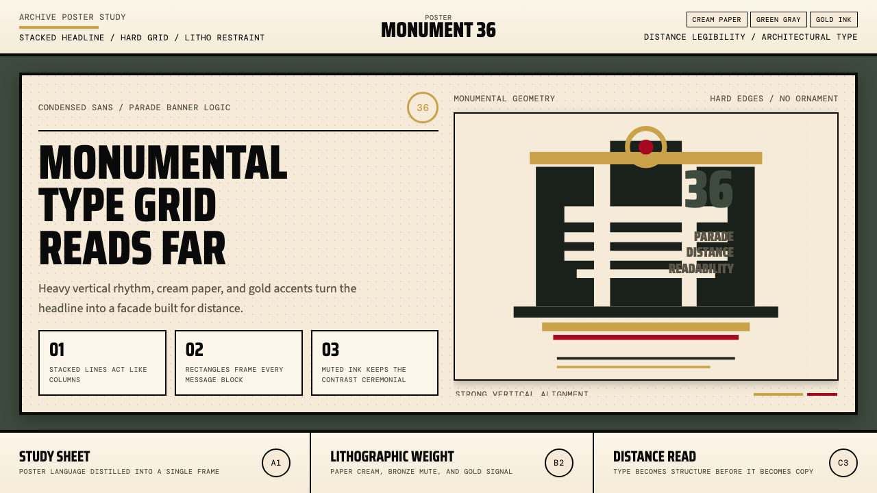 Olympic Poster Berlin (1936)Monumental and legible. Green-gray, cream, and gold turn type into architectu…纪念碑感十足。绿灰、奶油纸与金色把字体变成建筑。
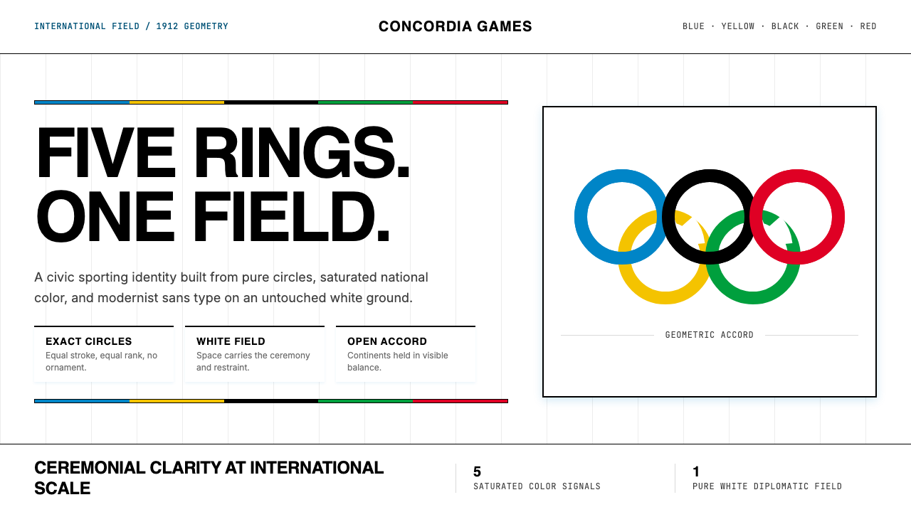 Olympics Five Rings (1912)Ceremony without noise. Saturated five-ring color on pure white, locked to a…无噪声的典礼感:纯白场域上饱和五色环,严密栅格定调。
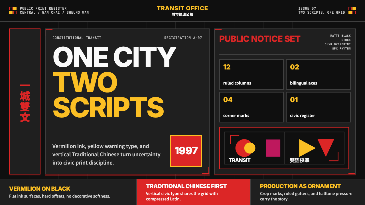 Hong Kong Handover 1997 PosterCivic pressure, printed loud. Vermilion on black, yellow type, bilingual grid…市政壓力被印得響亮:黑底朱紅、黃字與雙語網格。
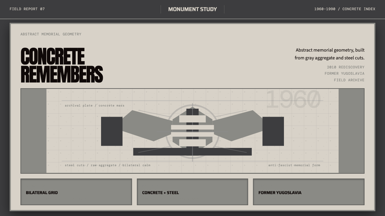 Spomenik Yugoslav Monument (1960)Memory, stripped bare. Gray symmetry and winged concrete geometry.记忆被剥到最裸。灰阶对称与翼状混凝土几何。
 Archigram Walking City (1964)Cities refuse foundations. Hot pink, cyan, and acid yellow lock a bordered co…城市拒绝地基。热粉、青蓝与酸黄压进粗黑漫画格。