What is Spomenik Yugoslav Monument (1960)?什么是 Spomenik Yugoslav Monument (1960)?
Concrete raised as conscience — the Yugoslav spomenici transformed anti-fascist grief into soaring geometric abstraction that still haunts the hillsides of the former Yugoslavia.混凝土化作良知——南斯拉夫纪念碑将反法西斯的悲恻凝结为凌空的几何抽象,至今仍在前南斯拉夫的山野间萦徊。
Spomenik Yugoslav Monument (1960) in briefSpomenik Yugoslav Monument (1960) 速览
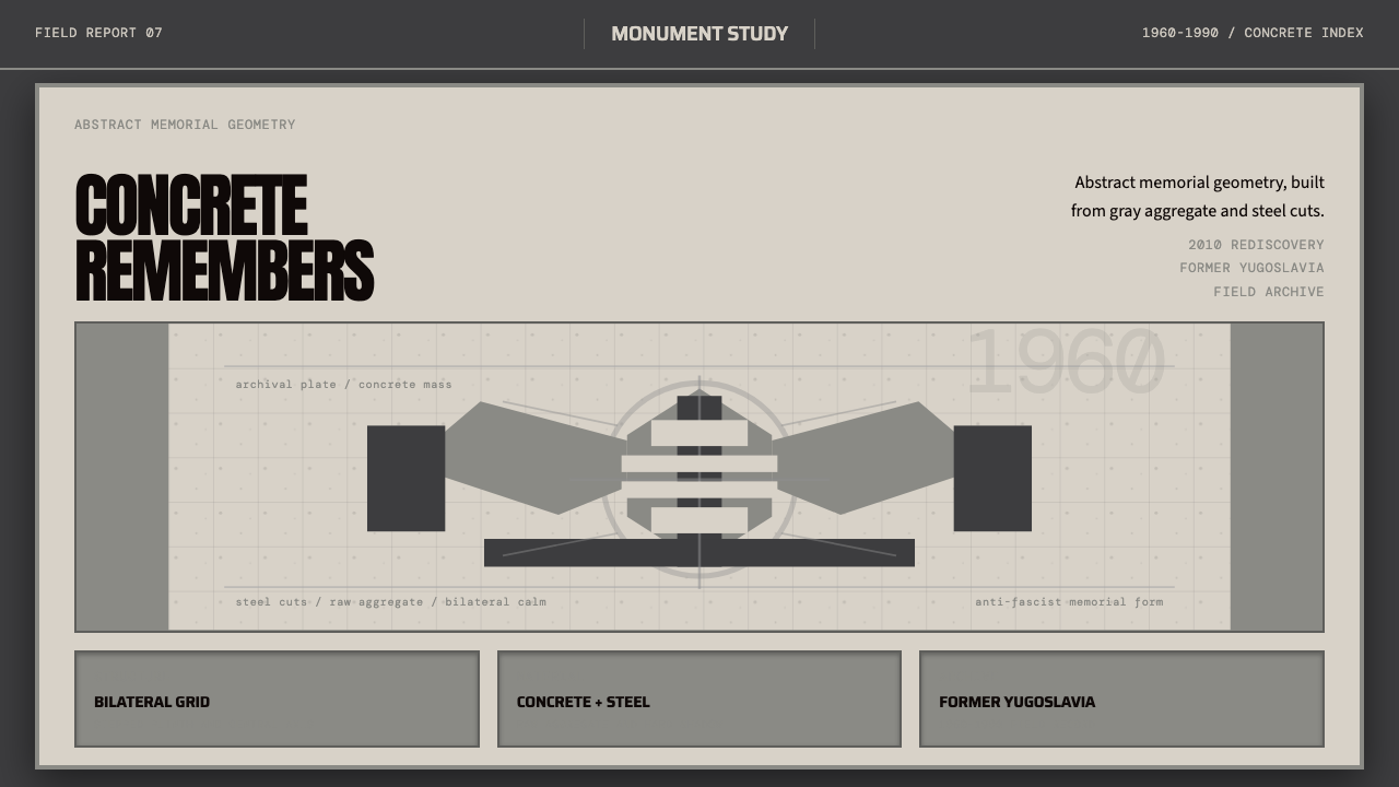
Spomenik (the Serbo-Croatian word for 'monument') refers to the extraordinary body of abstract memorial sculptures and architectural monuments commissioned by socialist Yugoslavia between 1960 and 1990. These structures were built across Croatia, Bosnia-Herzegovina, Serbia, Montenegro, Slovenia, and North Macedonia to honor Partisan fighters and the civilian victims of Nazi and collaborationist atrocities during the Second World War. Unlike conventional war memorials, the spomenici refused figurative representation entirely — no soldiers, no mothers in mourning, no heroic reliefs. In their place stood crystalline polyhedra, biomorphic concrete cantilevers, colossal star-shaped voids, and vast winged forms that seemed to reach toward the sky with something between triumph and lamentation.Spomenik(塞克罗地亚语「纪念碑」)指的是社会主义南斯拉夫于1960至1990年间委托建造的一批卓越的抽象纪念雕塑与建筑纪念物。这些建筑遍布克罗地亚、波黑、塞尔维亚、黑山、斯洛文尼亚和北马其顿,用以纪念游击队战士以及二战期间纳粹与协同势力暴行中的平民牺牲者。与传统战争纪念碑不同,这些纪念碑彻底拒绝了具象表现——没有士兵,没有哀悼的母亲,没有英雄浮雕。取而代之的是结晶多面体、悬臂生物形态混凝土、巨大的星形虚空,以及仿佛同时伸向胜利与悲悼的巨大翼状形体。
The design language of the monuments draws on a specific visual vocabulary: raw aggregate concrete surfaces whose gray tonality ranges from pale ash to near-black, monumental scale that dwarfs the human figure, geometric forms derived from natural crystals or abstracted from organic life, and a studied asymmetry that keeps the compositions from collapsing into static authority. Some structures recall the petals of a flower frozen at the moment of opening; others are more architectural, reading as gutted shells or pierced slabs. All of them share the quality of dwelling in historical weight — they do not celebrate so much as they hold.这些纪念物的设计语言建立在一套独特的视觉词汇之上:骨料混凝土的裸露表面,其灰色调从浅灰到近黑不等;将人体尺度彻底淹没的纪念碑式体量;从天然晶体或有机生命中提炼出的几何形态;以及将构图从静态权威中解放出来的刻意非对称。部分建筑令人联想到凝固在绽放瞬间的花瓣;另一些则更具建筑感,如被掏空的外壳或穿孔石板。所有这些作品共享同一种气质:居于历史的重量之中——它们与其说是庆典,不如说是守持。
The wider world largely forgot these monuments during the political upheavals of the 1990s, when Yugoslavia fragmented and many structures fell into disrepair. They were rediscovered internationally after photographer Jan Kempenaers published his 2010 photography book documenting neglected specimens across the former Yugoslav republics. Kempenaers's images — shot in wide-angle isolation against dramatic sky — made the formal qualities of the structures unmistakable and sparked a global appreciation for what was soon labeled brutalist-modernist aesthetics. Since then the monuments have influenced graphic design, fashion, video game environments, and album art, entering the visual vocabulary of contemporary design far beyond their original geographic and political context.这些纪念碑在1990年代南斯拉夫解体与政治动荡中被世界大体遗忘,许多建筑随之荒废失修。2010年,摄影师扬·肯佩纳斯出版摄影集,记录了前南斯拉夫各共和国境内那些被遗弃的纪念物,由此引发国际社会的重新关注。肯佩纳斯的影像——以广角在戏剧性天空下将建筑孤立呈现——使这些建筑的形式品质无可忽视,并点燃了全球对「粗野主义-现代主义」美学的热情。此后,这些纪念碑对平面设计、时尚、游戏场景和唱片封面均产生影响,进入了当代设计的视觉词汇,远超其原有的地理与政治语境。
See the Spomenik Yugoslav Monument (1960) design system查看 Spomenik Yugoslav Monument (1960) 完整设计系统
Where does Spomenik Yugoslav Monument (1960) come from?Spomenik Yugoslav Monument (1960) 从何而来?
The political and cultural context that produced the spomenici is inseparable from the specific character of Yugoslav socialism. Josip Broz Tito's partisan movement had liberated Yugoslavia from Nazi occupation largely through its own military effort rather than through Soviet liberation, a fact that gave the new regime a degree of national legitimacy and ideological independence unusual among Eastern Bloc states. When Tito broke with Stalin in 1948 and charted a course of 'non-aligned' socialism, Yugoslavia became a site of genuine cultural experimentation, maintaining open borders with the West, hosting international art exhibitions, and encouraging avant-garde architecture and design as demonstrations of a sophisticated, humanist socialism distinct from Soviet orthodoxy.产生这些纪念碑的政治与文化语境,与南斯拉夫社会主义的特殊性格密不可分。约瑟普·布罗兹·铁托的游击队运动主要依靠自身军事力量从纳粹占领中解放了南斯拉夫,而非依赖苏联解放——这一事实赋予了新政权罕见于东方阵营的民族合法性与意识形态独立性。1948年铁托与斯大林决裂、走上「不结盟」社会主义道路后,南斯拉夫成为真正意义上的文化实验场:对西方保持开放边界,举办国际艺术展览,鼓励先锋建筑与设计,以此彰显一种有别于苏联正统的精致、人文主义社会主义。
The monument-building program grew out of this ideological climate. Beginning in the late 1950s and accelerating through the 1960s and 1970s, municipalities, regional governments, and federal ministries commissioned memorials at the sites of mass killings, liberated towns, and Partisan strongholds. The mandate given to architects was unusually open: the monuments were to commemorate suffering and resistance without resorting to the monumental figurative sculpture associated with Stalinist socialist realism. This created an extraordinary opportunity for avant-garde architects and sculptors who were simultaneously studying developments in international modernism — from Henry Moore's biomorphic forms to the crystalline geometries of postwar German and Austrian concrete sculpture — and translating them into a distinctly Yugoslav idiom.纪念碑建设项目正是在这一意识形态氛围中生长起来的。从1950年代末开始,并在整个1960至70年代加速推进,各地市政当局、地区政府和联邦部委在大屠杀遗址、解放城镇和游击队据点委托建造纪念物。给建筑师的委托任务异常开放:这些纪念碑必须铭记苦难与抵抗,同时不得借助与斯大林式社会主义现实主义相关联的宏大具象雕塑。这为先锋建筑师和雕塑家创造了一个非凡的机遇——他们同时研究国际现代主义的最新发展(从亨利·摩尔的生物形态到战后德奥混凝土雕塑的结晶几何),并将其转化为独特的南斯拉夫表达。
Among the key figures who defined the visual language of the monuments, Bogdan Bogdanović stands out for the lyrical, almost mystical quality of his memorial landscapes. His Jasenovac memorial (1966), built at the site of the largest concentration camp in wartime Yugoslavia, takes the form of a stone flower — a colossal blossom whose petals reach skyward from a low earthwork setting. The flower motif was deliberately chosen to suggest life emerging from death rather than triumph over an enemy. Dušan Džamonja, working primarily in steel and cast concrete, produced forms of aggressive geometric tension — spiked spheres and corrugated slabs that carry a sense of compressed energy on the edge of release. Vojin Bakić brought a more architectural sensibility, his aluminum-clad forms catching and fragmenting light across their faceted surfaces. Miodrag Živković's Tjentište memorial in the Sutjeska canyon combines massive abstract stone wings with a landscape intervention, turning the entire valley into a spatial memorial.在定义这些纪念碑视觉语言的关键人物中,博格丹·博格丹诺维奇以其近乎神秘的抒情纪念景观而独树一帜。他1966年建于雅塞诺瓦茨的纪念物——建于战时南斯拉夫最大集中营的原址——呈现为一朵石质花卉:一朵巨大的花冠,花瓣从低矮的土方基座向天空伸展。花的母题被刻意选取,意在传达从死亡中生长的生命,而非对敌人的胜利。杜尚·贾莫尼亚主要以钢铁与现浇混凝土为媒介,创作出极具几何张力的形体——布满尖刺的球体与波纹石板,携带着一种即将释放的压缩能量。沃伊因·巴基奇则带来更偏建筑感的视觉语言,其铝板覆面的形体在切削面上捕捉和分裂光线。米奥德拉格·日夫科维奇在苏捷斯卡峡谷的蒂延蒂什泰纪念物,将巨大的抽象石翼与地景干预结合,将整个山谷转化为空间性的纪念场所。
The monuments also reflect the Yugoslav state's specific understanding of collective memory and national unity. Yugoslavia was a federation of multiple ethnic and religious groups whose wartime history included not only resistance to Nazi occupation but also fratricidal violence among Serbs, Croats, and Bosniaks. The abstract, non-ethnic language of the monuments was partly a political calculation: a geometric form cannot belong to one ethnicity the way a figurative heroic relief can. The decision to commission modernist abstraction was therefore simultaneously an aesthetic avant-garde move and a pragmatic effort to create shared memorial space across a fractured historical memory. When Yugoslavia dissolved, many of these structures — no longer maintained by any state or community — became ruins, returning to the landscape with an unintended second life as monuments to the fragility of political formations themselves.这些纪念碑同样折射出南斯拉夫国家对集体记忆与民族统一的特殊理解。南斯拉夫是一个多民族多宗教的联合体,其战时历史不仅包含对纳粹占领的抵抗,也包含塞族、克族与波什尼亚克族之间的兄弟相残。纪念碑抽象、非民族性的语言,部分是一种政治算计:一个几何形体不能像一块具象英雄浮雕那样属于某一民族。因此,委托现代主义抽象的决定既是一次美学上的先锋行动,也是一次务实的努力——试图在一段破碎的历史记忆之上创造共同的纪念空间。当南斯拉夫解体时,这些建筑中的许多不再由任何国家或社群维护,成为废墟,以一种无意为之的第二生命重归大地——成为政治构造物本身脆弱性的纪念碑。
What defines the Spomenik Yugoslav Monument (1960) look?Spomenik Yugoslav Monument (1960) 的视觉特征是什么?
Monochromatic Concrete Palette单色混凝土色调
The dominant material is raw aggregate concrete whose surface color spans a narrow but expressive range from pale silver-gray through mid-gray to near-black, depending on aggregate composition, weathering, and the presence of patina or lichen. This palette is essentially achromatic — color enters the system only through the natural variation of the stone itself, the oxidation of embedded steel elements, or the moss and lichen that colonize aged surfaces. Against this gray ground, the sky and surrounding landscape become the only chromatic elements, sharpening the geometric silhouettes of the forms.主导材料是裸露的骨料混凝土,其表面色彩在浅银灰、中灰至近黑之间展开,具体取决于骨料成分、风化程度以及苔藓地衣的附着情况。这套色系本质上是消色差的——色彩只通过石料自身的自然变化、嵌入钢铁构件的氧化,或占据老化表面的苔藓地衣进入系统。在这片灰色底面的衬托下,天空与周遭景观成为唯一的色彩元素,使几何轮廓愈发锐利。
Crystalline and Biomorphic Geometry结晶与生物形态几何
The formal vocabulary of the monuments oscillates between two poles: the crystalline and the biomorphic. Crystalline forms — faceted polyhedra, star-burst configurations, prismatic shards — evoke the molecular structure of minerals and the cold precision of the natural world at a sub-visible scale. Biomorphic forms — winged cantilevers, petal-like volumes, tentacle-shaped extensions — draw on the language of organic life, suggesting growth, opening, and the cycle of death and renewal. Many individual monuments inhabit both poles simultaneously, their overall mass reading as crystalline while individual components carry organic curvature.这些纪念碑的形式词汇在两极之间摆动:结晶形态与生物形态。结晶形——多面体、星爆状构型、棱柱碎片——唤起矿物的分子结构与肉眼以下尺度自然界的冷静精确。生物形态——悬臂翼状、花瓣般的体量、触须状延伸——援引有机生命的语言,暗示生长、开放以及死亡与更新的循环。许多个体纪念物同时栖居于两极之间,整体体量呈结晶形,而各构件的局部则携带有机曲率。
Monumental Scale and Landscape Integration纪念碑式体量与景观融合
The monuments are conceived at a scale that overwhelms rather than accommodates the individual visitor. Approach paths, earthwork platforms, and landscaped terraces are typically integral to the design, so that the experience of arriving at the structure is itself choreographed. The human figure, when present, registers as an accent against the massing — a device that forces confrontation with historical weight rather than offering a comfortable relationship with the memorial. This relationship between built form and natural landscape is crucial: several monuments are sited in deep gorges, on exposed hilltops, or at the edges of forests, and the relationship between the concrete form and its natural surround is compositionally deliberate.这些纪念碑以一种压倒而非容纳个体参观者的体量构思而成。通道、土方平台和景观台地通常是设计的有机组成部分,因此抵达建筑的过程本身就已被编排。人体在场时,充当体量映衬下的注脚——一种强迫与历史重量正面相遇的装置,而非提供与纪念碑的舒适关系。建造形体与自然景观的关系至关重要:数个纪念碑选址于深谷、裸露山顶或林缘,混凝土形体与其自然背景的关系是经过刻意构图的。
Textured Surface Without Ornament有质感无装饰的表面
The surfaces of the monuments are textural rather than decorative. Formwork marks, aggregate exposure, intentional roughening of the concrete skin, and the slow accretion of environmental staining all contribute to a surface condition that feels aged and material rather than applied and finished. No surface treatment exists for its own sake — the texture is a consequence of making rather than a layer added to a neutral form. Over decades, lichen and oxidation deepen this quality, so that the most weathered examples achieve a near-geological presence that was always latent in the concrete's gray palette.这些纪念碑的表面是质感性的,而非装饰性的。模板印痕、骨料外露、有意粗化的混凝土表皮,以及环境污迹的缓慢积累,共同构成一种感觉古老而物质化的表面状态,而非涂抹上去的完成层。没有任何表面处理是为自身目的而存在的——质感是制造过程的结果,而非叠加于中性形体上的图层。数十年间,地衣与氧化不断深化这一品质,使得那些最为风化的案例获得了一种近乎地质般的存在——这始终潜伏于混凝土灰色色谱之中。
Non-Hierarchical Composition无等级制的构图
Unlike classical memorial architecture — which typically establishes a clear axial approach, a dominant vertical element, and a prescribed frontal reading — the Yugoslav monuments frequently resist compositional hierarchy. Many can be read from multiple angles without any single viewpoint resolving as the 'correct' one. Some are radially symmetric and present the same face in every direction; others are intentionally asymmetric, so that the monument changes character as the visitor moves around it. This resistance to a fixed viewpoint is ideologically significant: the monuments refuse to stage their visitors as a unified crowd facing a central authority.与古典纪念建筑——通常建立清晰的轴线入径、主导的竖向元素和规定的正面读法——不同,南斯拉夫纪念碑频繁抵制构图等级制。许多建筑可以从多个角度阅读,没有任何一个视点能被判定为「正确」的。部分呈辐射对称,向每个方向呈现相同的面;另一些则刻意非对称,使纪念碑在参观者绕行时不断改变面貌。这种对固定视点的抵制具有意识形态上的重要性:纪念碑拒绝将参观者作为面向中央权威的统一人群来舞台化。
Weight and Cantilever as Emotional Language重量与悬臂作为情感语言
The monuments exploit structural extremes to generate emotional affect. Cantilevers that appear impossibly large reach into space without visible support, creating a suspended tension that reads as simultaneously defiant and vulnerable. Massive geometric solids settle into the earth with an immovable heaviness that suggests permanence and grief. The interplay between these two structural logics — the reaching and the grounding — is one of the most consistent emotional signatures of the style and accounts for much of the visceral response that even photographs of the monuments provoke in viewers unfamiliar with their historical context.这些纪念碑利用结构极限来产生情感冲击。那些看似不可能如此巨大却在没有明显支撑的情况下悬伸入空间的悬臂,制造出一种既像反抗又像脆弱的悬浮张力。巨大的几何实体以不可移动的沉重安落于大地,暗示着永恒与悲恸。这两种结构逻辑之间的交织——伸展与扎根——是这种风格最持续的情感特征之一,也解释了即便是不了解其历史背景的观看者,在面对纪念碑的照片时也会产生的强烈直觉反应。
Absence of Inscription and Figuration碑文与具象的缺席
Many of the monuments are notably free of text, names, and figurative relief — the very elements that traditional memorial practice uses to anchor meaning. Where inscriptions exist, they tend to be minimal, set flush into the concrete surface, and subordinated to the geometric form rather than dominating it. This restraint forces the formal and material qualities of the structure to carry the entire memorial burden. The absence of figuration also means the monuments cannot be read as portraits of particular victims or celebratory portraits of particular heroes — they remain open, collective, and formally abstract in a way that resists easy political appropriation.许多纪念碑明显缺乏文字、姓名和具象浮雕——恰恰是传统纪念实践用来锚定意义的那些元素。凡有铭文处,往往极为简洁,嵌入混凝土表面与之齐平,从属于几何形体而非支配它。这种克制迫使建筑的形式与材料品质承担全部的纪念重量。具象的缺席也意味着这些纪念碑无法被解读为特定受难者的肖像或特定英雄的颂扬——它们保持开放、集体性,并在形式上足够抽象,以抵御简单的政治挪用。
See the Spomenik Yugoslav Monument (1960) design system查看 Spomenik Yugoslav Monument (1960) 完整设计系统
Who shaped Spomenik Yugoslav Monument (1960)?谁塑造了 Spomenik Yugoslav Monument (1960)?
Bogdanović was the architect most closely identified with the humanist and lyrical register of the Yugoslav monument tradition. Over a career spanning several decades he created more than twenty memorial complexes, each with a distinct formal language rooted in symbolic imagery — flowers, labyrinths, abstract alphabets — drawn from pre-Slavic Mediterranean cultures. His Jasenovac Stone Flower memorial (1966) and the Partisan Memorial Cemetery in Mostar (1965) are widely regarded as the most formally accomplished works in the Yugoslav memorialist canon. After opposing Milošević's Belgrade policies in the early 1990s, Bogdanović went into exile in Vienna, where he continued writing and working until his death in 2010.博格丹诺维奇是与南斯拉夫纪念碑传统人文主义与抒情音调联系最为紧密的建筑师。在跨越数十年的职业生涯中,他创作了二十余处纪念建筑群,每一处都有独特的形式语言,其符号图像——花卉、迷宫、抽象字母——根植于前斯拉夫地中海文明。他的雅塞诺瓦茨石花纪念物(1966年)和莫斯塔尔游击队纪念公墓(1965年)被广泛认为是南斯拉夫纪念碑规范中形式成就最高的作品。1990年代初因反对米洛舍维奇的贝尔格莱德政策而流亡维也纳,此后在那里持续写作工作,直至2010年辞世。
Džamonja approached the memorial commission as a sculptor whose instincts were fundamentally materialist and tactile. Working primarily in cast iron, steel, and concrete, he developed a vocabulary of spiked, corrugated, and fractured forms that communicated violence absorbed and survived rather than transcended. His Jasenovac Spiky Ball memorial and the Kozara monument are among the most formally aggressive in the Yugoslav canon — geometrically derived but deeply physical, their surfaces implying force and resistance. Džamonja represented Yugoslavia at several Venice Biennales and maintained an active international exhibition career that extended the influence of his formal approach well beyond the monuments themselves.贾莫尼亚以一位本能上是唯物主义者与触觉艺术家的雕塑家身份接受纪念碑委托。主要以铸铁、钢铁和混凝土为媒介,他发展出一套布满尖刺、波纹与断裂的形体词汇,传达的是被吸收并幸存的暴力,而非被超越的暴力。他的雅塞诺瓦茨刺球纪念物与科扎拉纪念物是南斯拉夫规范中形式上最为激进的作品——几何衍生却高度物质化,其表面暗示着力量与抵抗。贾莫尼亚多次代表南斯拉夫参加威尼斯双年展,并维持着活跃的国际展览事业,将其形式探索的影响力延伸至纪念碑本身之外。
Bakić brought a more architecturally refined sensibility to the monument tradition, working extensively with aluminum cladding over concrete structural cores to create forms whose surfaces fragment and redirect light rather than absorbing it. His Petrova Gora monument (begun in 1971, completed in 1981), a massive stainless-steel-clad structure rising from a forested hilltop in Croatia, is among the most architecturally ambitious in the Yugoslav canon — a building-scale object that reads as monument, sculpture, and lookout tower simultaneously. Bakić was also a significant figure in Croatian fine art, and his non-memorial sculpture work, much of it exploring light and reflective surface, shows the consistent formal preoccupations that run through his memorial commissions.巴基奇为纪念碑传统带来了更具建筑精炼感的视觉语言,大量使用铝板覆面于混凝土结构芯材,创造出表面分裂并反射光线而非吸收光线的形体。他的彼得罗瓦戈拉纪念物(1971年开工,1981年竣工)——一座从克罗地亚林木山顶拔地而起的大型不锈钢覆面建筑——是南斯拉夫规范中建筑抱负最宏大的作品之一:一个建筑尺度的对象,同时作为纪念碑、雕塑和瞭望塔被阅读。巴基奇也是克罗地亚纯艺术领域的重要人物,他的非纪念性雕塑作品——大量探索光线与反射表面——展现出贯穿其纪念委托作品的一贯形式关切。
Živković is best known for the Tjentište memorial complex in the Sutjeska National Park in Bosnia-Herzegovina, completed in 1971 to commemorate the Battle of Sutjeska — one of the largest Partisan military engagements of the Second World War. The memorial comprises two massive abstract stone wings rising from a terraced platform set against the mountain landscape, their form suggesting both outstretched arms and the silhouette of a bird in flight. The siting and scale of the work make it one of the most powerful landscape integrations in the Yugoslav memorial tradition, turning the entire valley into a spatial experience of historical memory rather than a monument to be looked at from a fixed point.日夫科维奇最广为人知的是他在波黑苏捷斯卡国家公园完成于1971年的蒂延蒂什泰纪念建筑群,以纪念苏捷斯卡战役——二战中最大的游击队军事行动之一。纪念物由两座巨大的抽象石翼构成,从依山而建的台地平台升起,其形态同时令人联想到张开的双臂与飞鸟的剪影。该作品的选址与体量使其成为南斯拉夫纪念传统中最震撼人心的景观融合之一——将整座山谷转化为一场历史记忆的空间体验,而非一座从固定视点被观看的纪念碑。
Kempenaers is not an architect but a Belgian photographer whose 2010 book Spomenik — the result of multiple expeditions to document neglected monuments across the former Yugoslav republics — was directly responsible for the global rediscovery and aesthetic rehabilitation of the Yugoslav monument tradition. His approach was deliberately de-contextualizing: the photographs frame the structures in wide-angle isolation, removing surrounding urban or rural infrastructure and presenting the monuments against sky and landscape alone. This framing made the formal qualities of the structures immediately legible to audiences with no knowledge of their political or historical context, and the subsequent viral circulation of the images online drove the monuments' adoption into contemporary design vocabularies worldwide.肯佩纳斯不是建筑师,而是一位比利时摄影师。他的2010年摄影集《Spomenik》——多次前往前南斯拉夫各共和国记录被遗弃纪念碑的探索成果——直接引发了南斯拉夫纪念碑传统在全球的重新发现与美学平反。他的拍摄方式刻意去语境化:照片以广角将建筑孤立于画框之中,剥去周围的城市或乡村基础设施,仅让纪念碑与天空和景观同处画面。这种取景方式使建筑的形式品质对毫不知晓其政治或历史背景的受众也立刻可读,图像随后在网络上的病毒式传播推动了这些纪念碑进入全球当代设计词汇。
How do you use Spomenik Yugoslav Monument (1960) today?今天怎么用 Spomenik Yugoslav Monument (1960)?
The Spomenik aesthetic is among the most atmospheric and conceptually demanding historical styles available to contemporary designers. Applying it well requires understanding what it is actually doing visually: using gray as the dominant structural tone rather than a neutral background, using asymmetric geometric forms to create tension rather than balance, and treating scale and materiality as the primary expressive instruments rather than color or surface decoration. The goal is not to simulate concrete but to capture the quality of weight, gravity, and deliberate formal restraint that defines the monuments.Spomenik美学是当代设计师可取用的历史风格中氛围最强烈、概念要求最高的之一。良好的应用需要理解它在视觉上究竟在做什么:将灰色作为主导结构色调而非中性背景,用非对称几何形创造张力而非平衡,并以体量与材质感作为首要表达手段,而非色彩或表面装饰。目标不是模拟混凝土,而是捕捉定义这些纪念碑的重量感、引力感与刻意的形式克制。
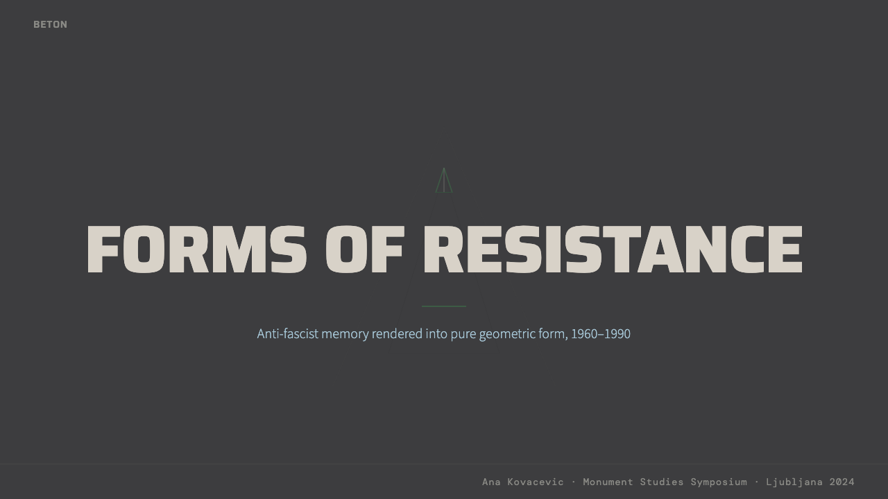
For presentation slides, the Spomenik aesthetic works most powerfully on cover and section-divider pages. A cover benefits from a single large geometric form — a fractured polygon, a radially symmetric star, or an asymmetric cantilever shape — rendered in deep gray against a near-black ground, with the title set in wide-spaced, sparse type that does not compete with the form. Content slides should lean into the achromatic palette: white text on dark gray, or very dark text on light gray, with structural lines and rules rather than color-coded dividers. Data visualizations in this style become almost architectural — bar charts read as monoliths, network diagrams as crystalline lattices.对于演示文稿,Spomenik美学在封面与章节分隔页上最具力量。封面适合以单一大型几何形——断裂多边形、辐射对称星形或非对称悬臂形——以深灰色渲染于近黑底面之上,标题采用字距宽松、稀疏的排印方式,不与主形体竞争。内容页应深度依附于消色差色板:深灰底白字,或浅灰底极深色字,以结构线条而非色彩编码来分隔内容。这种风格下的数据可视化几乎获得建筑性——柱状图读作巨石,网络图读作结晶格架。
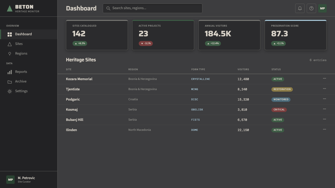
For web interfaces and dashboards, the Spomenik aesthetic lends itself to applications that need to project seriousness, permanence, and analytical depth — financial tools, geospatial platforms, security software, and enterprise data products. The approach favors a dark or deep-gray primary background with near-white or pale silver text, sparse layout with generous spacing that emphasizes the isolation of each element, and geometric components with hard edges rather than soft radii. Interactive states can introduce a single accent tone — a cool slate blue, a washed amber, or a faint warm gray — without disrupting the dominant achromatic field. Navigation should be typographic and minimal.对于网页界面和仪表板,Spomenik美学适合需要投射严肃感、永久感与分析深度的应用——金融工具、地理空间平台、安全软件与企业数据产品。方法上偏向以深色或深灰为主背景,配以近白或浅银文字,稀疏排布并保留充足间距以强调每个元素的孤立性,以及采用硬边而非软圆角的几何组件。交互状态可以引入单一强调色调——冷石板蓝、洗白的琥珀色或微暖灰色——而不破坏主导的消色差基底。导航应当是字体性的,极简处理。
For editorial, poster, and marketing contexts, the style supports a kind of stark gravitas that is unusual among historical design aesthetics. A full-page editorial spread inspired by the monuments might use a large abstract geometric bleed image in gray tones, with body text anchored in a narrow column against a white field — the contrast between the monumental image and the spare text imitating the relationship between the monument and the inscriptions it deliberately subordinates. Marketing applications work best when the product's positioning involves themes of durability, heritage, precision, or solemnity — the aesthetic struggles in contexts calling for warmth, accessibility, or playfulness.对于编辑、海报与营销场景,这种风格支持一种在历史设计美学中罕见的冷峻庄重感。受这些纪念碑启发的整页编辑展开,可以使用灰色调的大型抽象几何出血图,正文锚定于白色底面上的窄文本栏——纪念碑式图像与简朴文字之间的对比,模仿了纪念碑与那些被它刻意从属化的铭文之间的关系。营销应用在产品定位涉及耐久性、传承、精准或庄重主题时效果最佳——这种美学在需要温暖感、亲近感或趣味性的场景中则显得力不从心。
A common mistake when applying this style is confusing it with generic dark-mode minimalism or treating it as simply a monochrome version of brutalist typography. The authentic quality of the Spomenik aesthetic comes from its specific geometric character — the sense that forms are derived from crystalline or organic structure rather than from graphic design conventions — and from its material weight. Flat, clean dark interfaces with sans-serif type and subtle grid lines are not Spomenik unless they carry that quality of geological mass, asymmetric tension, and solemn intentionality. Designers who apply the palette without the formal vocabulary end up with atmospheric dark mode, not with the style's distinctive emotional register.应用这种风格时最常见的错误,是将其与泛化的深色模式极简主义混淆,或将其简单视为粗野主义排版的单色版本。Spomenik美学的真实品质来自其特定的几何性格——那种形式源于晶体或有机结构而非平面设计惯例的感觉——以及其材质上的重量感。带无衬线字体和微妙网格线的平整、干净深色界面并不是Spomenik,除非它携带那种地质般的质量感、非对称的张力与庄重的意图性。仅应用色板而不掌握形式词汇的设计师,最终获得的是氛围性深色模式,而非这种风格独特的情感音域。
See the Spomenik Yugoslav Monument (1960) design system查看 Spomenik Yugoslav Monument (1960) 完整设计系统
Spomenik Yugoslav Monument (1960) — FAQSpomenik Yugoslav Monument (1960) · 常见问题
Is the Spomenik style the same as Brutalism?Spomenik风格和粗野主义是同一回事吗?
They overlap but are not identical. Brutalism as an architectural movement — named for the French béton brut, raw concrete — refers to a global postwar approach to structure in which the materials and structural logic of a building are exposed and celebrated rather than concealed. Many Yugoslav monuments are brutalist in this technical sense: they use raw concrete, expose their structural decisions, and make no attempt to finish or disguise their surfaces. But the monuments go further than most brutalist buildings by combining concrete materiality with an ambition that is closer to abstract sculpture than to architecture. The forms are not derived from program or function; they are derived from commemoration and symbolic intent. This gives the monuments an emotional register — solemn, biomorphic, sometimes nightmarish — that is distinct from the more pragmatic character of brutalist housing blocks or civic buildings.两者有交叠,但并不相同。粗野主义作为建筑运动——得名于法语béton brut,即生混凝土——指的是一种全球性的战后建筑态度:建筑的材料与结构逻辑被暴露并加以颂扬,而非被掩盖。许多南斯拉夫纪念碑在这一技术意义上是粗野主义的:使用生混凝土,暴露结构决策,不试图对表面进行精加工或掩饰。但这些纪念碑超越了大多数粗野主义建筑,将混凝土的材质感与一种更接近抽象雕塑而非建筑的抱负相结合。这些形体不是从功能或程序衍生出来的,而是从纪念与象征意图衍生出来的。这赋予了这些纪念碑一种独特的情感音域——庄严、生物形态,有时近乎噩梦——有别于粗野主义住宅楼或市政建筑更为务实的性格。
How should I handle color if the style is essentially gray?如果这种风格本质上是灰色的,我该如何处理色彩?
The achromatic quality is a feature, not a limitation. In authentic application, the gray range itself functions as the color system: the distinction between near-black, mid-gray, and pale silver-gray provides all the contrast and hierarchy needed for most design tasks. When a single accent color is introduced — and in many applications it is better not to introduce one — it should be restrained in saturation and cool in temperature, functioning as a signal or structural marker rather than as visual warmth. Cold slate, washed steel blue, and muted olive have historical precedent in the environmental surrounds of the monuments; warm, high-saturation accent colors break the aesthetic entirely and should be avoided.消色差品质是这种风格的特征,而非局限。在真实应用中,灰色本身的范围就作为色彩系统运作:近黑、中灰与浅银灰之间的区别,为大多数设计任务提供了所需的全部对比与层级。如果要引入单一强调色——在许多应用场景中最好不引入——它应当饱和度克制、色温偏冷,作为信号或结构标记而非视觉温度使用。冷石板色、洗白的钢铁蓝与低调的橄榄色在纪念碑的环境背景中有历史依据;温暖、高饱和度的强调色会彻底打破这种美学,应当回避。
Can this aesthetic work for consumer-facing products, or is it only for institutional contexts?这种美学能用于面向消费者的产品,还是只适合机构性场景?
The style is not inherently institutional, but it carries a gravity that limits its consumer range. It works well for premium or niche products where severity and seriousness are desirable brand signals — high-end audio equipment, precision tools, architectural materials, dark-academia fashion, independent spirits brands positioning against the mainstream. It does not work well for products whose emotional pitch depends on approachability, warmth, fun, or sensory pleasure: food, children's products, health and wellness, and most mainstream e-commerce. The monuments were built to hold grief, not to sell comfort — and that emotional purpose is encoded in the style's visual language. Designers should ask honestly whether their product is in the business of holding or of inviting before reaching for this aesthetic.这种风格本身并不属于机构专用,但它携带的庄重感限制了其消费者适用范围。它适合那些严峻感与严肃性是理想品牌信号的高端或小众产品——高端音响设备、精密工具、建筑材料、暗学院风时尚、以独立姿态对抗主流的烈酒品牌。它不适合那些情感诉求依赖亲近感、温暖、趣味或感官愉悦的产品:食品、儿童产品、健康与养生,以及大多数主流电商。这些纪念碑是为承载悲悼而建造的,不是为了销售安慰——而那种情感目的被编码进了这种风格的视觉语言中。设计师在取用这种美学之前,应当诚实地问自己:自己的产品究竟是从事承载的事业,还是从事邀请的事业。
What typefaces work within this aesthetic?哪些字体适合这种美学?
The typographic vocabulary consistent with the Spomenik aesthetic tends toward the spare, architectural, and neutral rather than the expressive or calligraphic. Wide-spaced uppercase settings create the quality of inscription — as though the type were cut into or cast from a material surface rather than printed on one. Condensed grotesques in large scale create the compressed, vertical tension that echoes the monuments' structural logic. Slab serifs with low contrast can introduce a sense of material mass without the period associations of classical Roman letterforms. The key principle across all choices is weight and deliberateness: type in this aesthetic should feel selected for permanence, not for visual variety. Avoid type that reads as playful, hand-drawn, or organically variable — those qualities undercut the solemn intentionality that defines the style.与Spomenik美学相符的字体排印词汇,倾向于简朴、建筑感与中性,而非表现性或书法性。宽字距大写排版创造出一种铭文品质——仿佛文字是被刻入或铸入某种材料表面,而非印刷其上。大号窄体无衬线字体制造出那种压缩的垂直张力,呼应着纪念碑的结构逻辑。低对比度粗衬线字体可以引入一种物质量感,同时避免古典罗马字形的历史联想。贯穿所有选择的关键原则是分量与刻意:这种美学中的字体应当感觉是为永久性而选取的,而非为视觉多样性。避免读来像趣味性、手绘或有机变化的字体——这些品质会消解定义这种风格的庄严意图性。
How do I avoid making the style look like just a dark-mode UI?如何避免让这种风格看起来只是一个深色模式界面?
The difference between Spomenik and generic dark-mode lies almost entirely in the geometric formal vocabulary and the quality of compositional tension. Dark-mode UIs tend toward symmetry, rounded corners, soft gradients between near-blacks, and evenly distributed element weights. The Spomenik aesthetic requires hard edges, asymmetric or radially abstract compositions, deliberate contrast between large massed elements and sparse open ground, and the quality of geometric forms that feel derived from crystalline or structural logic rather than from UI component conventions. Texture matters too: where dark UIs are typically smooth and even, the Spomenik aesthetic can tolerate and even invite surface variation — fine grain, slight irregularity, the quality of material rather than screen. If the result looks comfortable and navigable, it has probably drifted toward dark-mode UI. The authentic style should feel austere and slightly confrontational.Spomenik与泛化深色模式界面之间的差异,几乎完全在于几何形式词汇与构图张力的品质。深色模式界面倾向于对称、圆角、近黑色之间的柔和渐变,以及均匀分布的元素分量。Spomenik美学要求硬边、非对称或辐射抽象的构图、大体量元素与稀疏开放底面之间的刻意对比,以及那种感觉源于晶体或结构逻辑而非UI组件惯例的几何形体。质感同样重要:深色模式界面通常光滑均匀,而Spomenik美学可以容纳甚至欢迎表面变化——细粒质感、轻微不规则性、材料而非屏幕的品质。如果结果看起来舒适而易于导航,它可能已经漂向了深色模式界面。真实的风格应当感觉严峻,带有一丝对抗性。
Related design styles相关设计风格
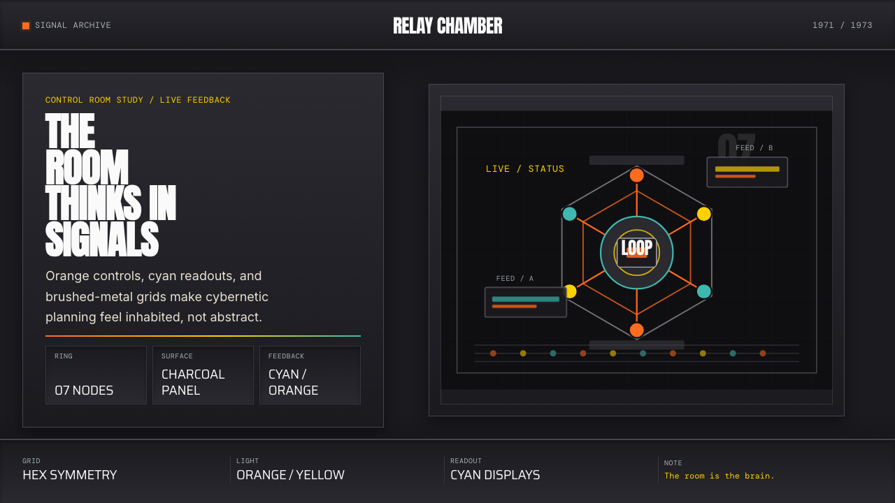 Cybernetic 1968 (Stafford Beer)Mission-control severity. Charcoal panels, orange buttons, cyan readouts, hex…控制室般冷峻。炭黑面板、橙按钮、青读数与六边环形。
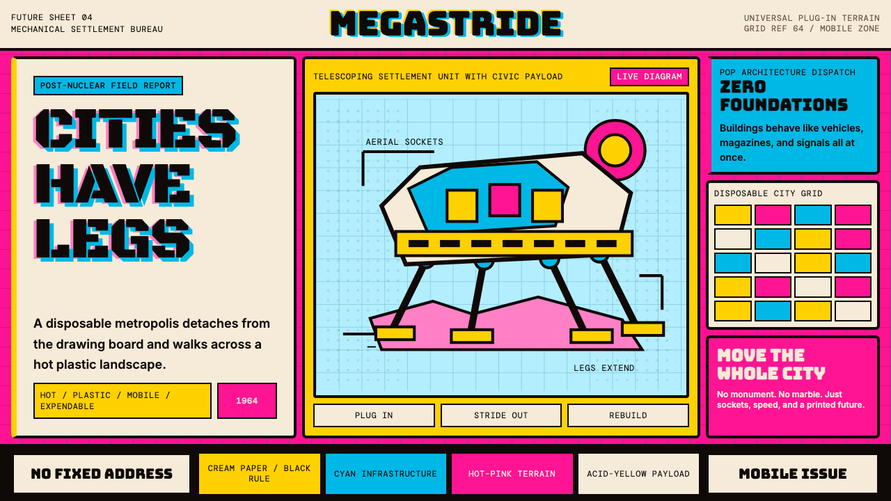 Archigram Walking City (1964)Cities refuse foundations. Hot pink, cyan, and acid yellow lock a bordered co…城市拒绝地基。热粉、青蓝与酸黄压进粗黑漫画格。
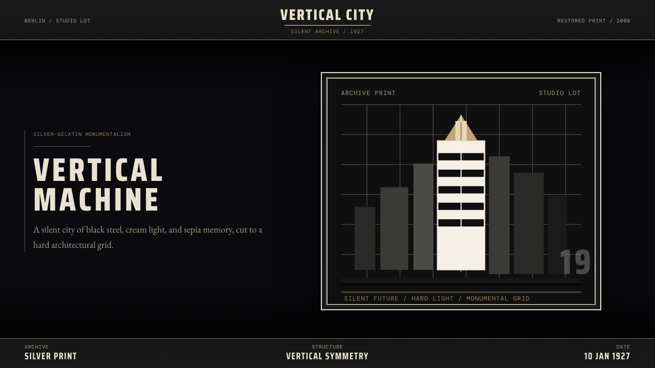 Metropolis (Fritz Lang, 1927)Monumental and severe. Black grid, cream type, sepia shadows.庄严而冷峻。黑底网格、奶白字与赭色阴影。
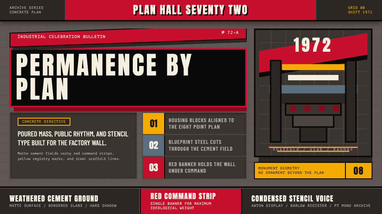 Soviet Brutalism (1972)Concrete refuses to breathe. Cement gray, Soviet red banners, and Anton stenc…混凝土拒绝呼吸:水泥灰底、苏维埃红旗与 Anton 钢模字锁住网格。
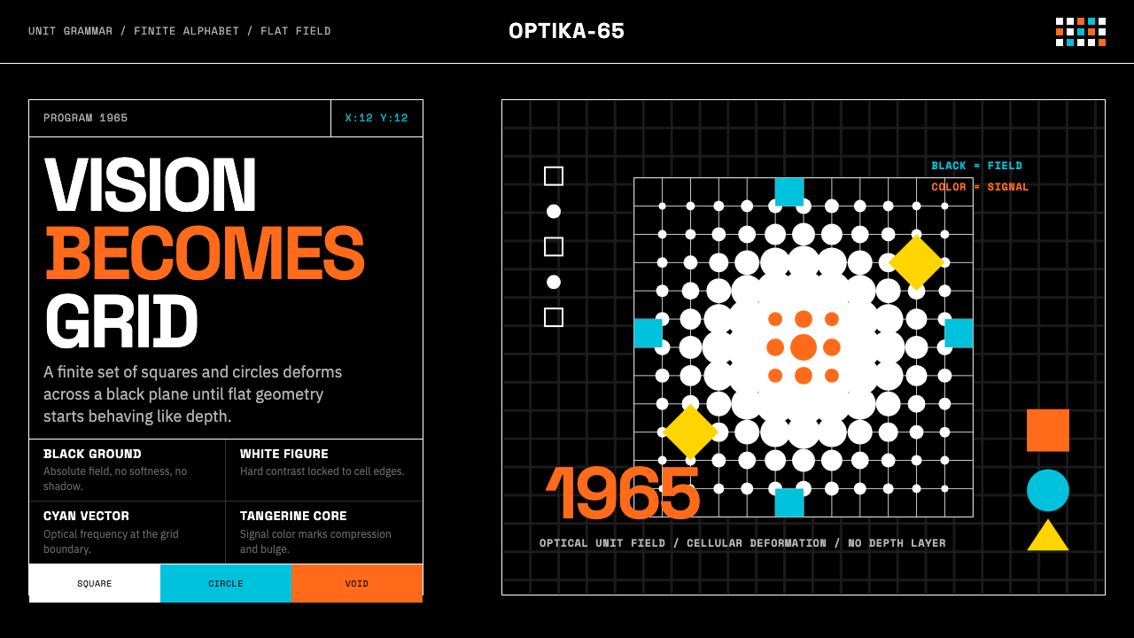 Hungarian Vasarely Op Art (1965)Mathematics makes vision pulse. Black grids, white units, cyan and tangerine…数学让视觉脉动:黑底白格与青橘单元扭曲深度。
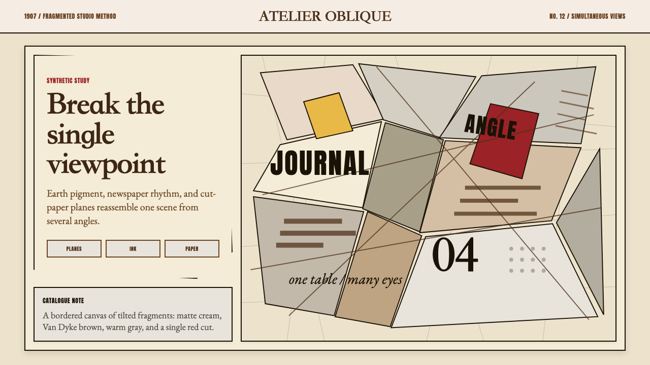 Picasso CubismSingle sight is shattered. Cream collage paper fractures brown-gray planes wi…单一视角被击碎:奶油拼贴纸上,褐灰棱面被一刀红色刺穿。