What is Cybernetic 1968 (Stafford Beer)?什么是 Cybernetic 1968 (Stafford Beer)?
Project Cybersyn turned a hexagonal room in Santiago into the nerve center of a national economy — and its mission-control aesthetic became the most haunting image of cybernetic socialism ever built.控制论项目Cybersyn将圣地亚哥一间六边形房间变成国家经济的神经中枢,其控制室美学成为控制论社会主义最摄人心魄的物质遗产。
Cybernetic 1968 (Stafford Beer) in briefCybernetic 1968 (Stafford Beer) 速览
Cybernetic 1968 (Stafford Beer) is a design language drawn from the Operations Room of Project Cybersyn — the real-time economic feedback system that Stafford Beer designed for Salvador Allende's Chile between 1971 and 1973. It is not retro-futurism for its own sake. Every element of the visual system corresponds to something functional in that room: the deep charcoal wall panels that absorbed ambient light so projection displays would read cleanly, the saturated orange that made instrument buttons identifiable under low illumination, the cyan readouts engineered for maximum contrast on early cathode-ray screens.Cybernetic 1968(斯塔福德·比尔)是一套从Cybersyn项目操作室中提炼而来的设计语言。Cybersyn是英国运筹学家斯塔福德·比尔于1971年至1973年间为萨尔瓦多·阿连德政府设计的实时经济反馈系统。这并非为复古未来主义而存在的风格——视觉系统的每个元素都对应那间操作室中某个实际功能的考量:深炭灰墙板用于吸收环境光、使投影显示屏读数清晰;饱和橙色使仪表按钮在低照度下易于辨认;青色读数经过工程设计,在早期阴极射线屏幕上实现最大对比度。
The aesthetic sits at the intersection of three traditions: British operational research and cybernetics (Beer's own field), the rigorous industrial-design pedagogy of the Ulm School (which shaped Gui Bonsiepe, the German designer who built the Operations Room), and the political urgency of a government trying to wire a nation in months rather than decades. The result is a visual language that reads simultaneously as authority and as radical experiment — the gravity of a mission-control room combined with the optimism of a system that genuinely believed feedback loops could replace bureaucratic hierarchy.这套美学处于三种传统的交汇处:英国运筹学与控制论(比尔本人的领域)、乌尔姆设计学院严谨的工业设计教学法(塑造了建造操作室的德国设计师吉·邦西佩),以及一个试图在数月而非数十年内将国家连接成网的政府所具有的政治紧迫感。结果是一套视觉语言,同时传递出权威感与激进实验精神——控制室的庄重感,与真诚相信反馈回路可以取代科层体制的那种乐观主义,合而为一。
Applied as a contemporary design system, Cybernetic 1968 communicates analytical seriousness, technological depth, and a particular kind of institutional confidence — the confidence of people who have built instruments rather than interfaces. It is a dark-ground system: backgrounds are deep charcoal or near-black, type and structural elements lift off the surface in light neutrals, and the saturated accent colors — orange, cyan, amber — are used sparingly, as signal rather than decoration.作为当代设计系统使用,Cybernetic 1968传递出分析上的严肃性、技术深度,以及一种特殊的机构自信——建造仪器而非界面的人所具有的那种自信。这是一套深色底面系统:背景为深炭灰或近乎黑色,文字与结构元素以浅中性色从表面浮起,而饱和强调色——橙色、青色、琥珀色——使用克制,作为信号而非装饰。
See the Cybernetic 1968 (Stafford Beer) design system查看 Cybernetic 1968 (Stafford Beer) 完整设计系统
Where does Cybernetic 1968 (Stafford Beer) come from?Cybernetic 1968 (Stafford Beer) 从何而来?
Project Cybersyn was born from an unlikely correspondence. In July 1971, a young Chilean government official named Fernando Flores wrote to Stafford Beer — then one of the leading theorists of management cybernetics in Britain — proposing that Beer help apply his Viable System Model to Chile's newly nationalized industrial sector. Beer accepted, flew to Santiago, and within weeks had sketched the architecture of what would become Cybersyn: a network linking factory telex machines to a central computer, feeding production data up a hierarchy of cybernetic filters toward a single room where decision-makers could see the state of the economy in near real time.Cybersyn项目诞生于一次不太可能发生的通信往来。1971年7月,一位名叫费尔南多·弗洛雷斯的年轻智利政府官员致信斯塔福德·比尔——彼时英国管理控制论领域的顶尖理论家之一——提议由比尔协助将其「可行系统模型」应用于智利新近国有化的工业部门。比尔接受邀请,飞赴圣地亚哥,数周之内便草拟出后来成为Cybersyn的系统架构:一个将工厂电传机与中央计算机相连的网络,经由控制论过滤器的层级将生产数据向上汇聚,最终在一个单一房间中让决策者能够近乎实时地观察整个经济体的状态。
The system had four components. Cybernet was the telex communication network connecting factories to Santiago. Cyberstride was the statistical software that processed the incoming data and flagged deviations from plans using Bayesian filtering. Checo (CHilean ECOnomy) was a macroeconomic simulation model. And the Operations Room — the component that has endured in cultural memory — was the physical space where all of this information converged. Gui Bonsiepe, who had studied and then taught at the Ulm School before coming to Chile, designed the room: seven molded fiberglass swivel chairs arranged in a hexagonal ring, curved-wall rear-projection displays, orange button panels, and a visual display system that presented key economic indicators as geometric dials and readouts. There were no keyboards. The interface was built for decision-making, not data entry.该系统由四个组件构成:Cybernet是连接工厂与圣地亚哥的电传通信网络;Cyberstride是处理传入数据、并使用贝叶斯滤波标记偏差的统计软件;Checo(智利经济模型)是一个宏观经济仿真模型;而操作室——那个在文化记忆中永久留存的组件——则是所有信息汇聚之处的实体空间。曾在乌尔姆设计学院学习并执教、后来来到智利的吉·邦西佩设计了这个房间:七把模压玻璃纤维旋转椅排成六边形环,弧形墙面背投显示屏,橙色按钮面板,以及将关键经济指标呈现为几何刻度盘与读数的视觉显示系统。房间里没有键盘——这套界面是为决策而建,而非为数据录入。
The Ulm School's influence on the room's design was direct and traceable. Founded in 1953 in West Germany as a spiritual successor to the Bauhaus, the Hochschule für Gestaltung Ulm (HfG Ulm) had developed a rigorous systems-based approach to industrial design that prioritized function, legibility, and what its faculty called 'Gebrauchsordnung' — a designed order of use. Bonsiepe had absorbed this methodology thoroughly. The Operations Room's visual language — its preference for geometric readout forms over pictorial displays, its strict tonal hierarchy, its use of saturated accent colors against neutral grounds — is Ulm methodology applied to the problem of governing an economy.乌尔姆设计学院对操作室设计的影响是直接且可追溯的。1953年成立于西德的乌尔姆造型学院(HfG Ulm)作为包豪斯的精神继承者,发展出一套以功能、易读性以及教职人员所称的「使用秩序」(Gebrauchsordnung)为优先的严格系统化工业设计方法。邦西佩对这套方法论了然于胸。操作室的视觉语言——偏好几何读数形式而非图示性显示,严格的明度层级,在中性底面上使用饱和强调色——正是乌尔姆方法论应用于治理一个国家经济这一问题上的产物。
Project Cybersyn ran from 1971 until September 11, 1973, when Augusto Pinochet's military coup overthrew the Allende government. The Operations Room was dismantled; the telex network was repurposed; the project's documentation was scattered. For decades, Cybersyn was known only to specialists in cybernetics and Latin American political history. Its rediscovery as a design reference began in the early 2000s, primarily through the historical research of Eden Medina, an American scholar whose 2011 book 'Cybernetic Revolutionaries' assembled the project's history from Chilean archives, interviews with surviving participants, and Beer's own papers. Medina's work transformed Cybersyn from a Cold War curiosity into a serious case study in alternative modernism — and the Operations Room's photographs began circulating widely in design and technology communities.Cybersyn项目从1971年运行至1973年9月11日——奥古斯托·皮诺切特的军事政变推翻了阿连德政府。操作室被拆除,电传网络遭挪作他用,项目文档四散流失。数十年间,Cybersyn仅为控制论专家与拉丁美洲政治史学者所知。它作为设计参照物的重新发现始于2000年代初期,主要得益于美国学者伊登·梅迪纳的历史研究——她于2011年出版的《控制论革命者》一书从智利档案、与幸存参与者的访谈以及比尔本人的文件中重构了这段历史。梅迪纳的工作将Cybersyn从一个冷战时代的奇闻逸事转化为另类现代主义的严肃案例研究,而操作室的历史照片也开始在设计与科技社群中广泛流传。
What defines the Cybernetic 1968 (Stafford Beer) look?Cybernetic 1968 (Stafford Beer) 的视觉特征是什么?
Dark Ground and Panel Structure深色底面与面板结构
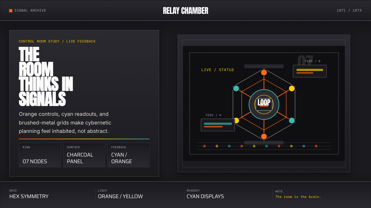
The foundational compositional logic is a deep charcoal or near-black ground from which lighter elements emerge. Layouts are organized as discrete panels — bounded rectangular zones that contain related information — separated by thin structural lines rather than open whitespace. This panel-based architecture mirrors the physical Operations Room, where distinct display surfaces were separated by the curved wall itself. The panels create a sense of density and enclosure that reads as analytical seriousness rather than decorative darkness.这套视觉系统的基础构图逻辑是深炭灰或近乎黑色的底面,较浅的元素从中浮现。版面组织为离散的面板——包含相关信息的有界矩形区域——以细结构线而非留白分隔。这种基于面板的架构镜像了实体操作室,其中各个独立显示表面由弧形墙面本身加以分隔。面板创造出一种密度感与围合感,读来像是分析的严肃性,而非装饰性的暗黑。
Saturated Instrument Accents饱和仪表强调色
Against the dark ground, a small set of saturated accent colors serve as signal rather than decoration. Orange — the color of the Operations Room's physical buttons — is the primary alert and action color, used for interactive controls, alerts, and the most critical data points. Cyan functions as the readout color, typically applied to numerical displays, live data feeds, and status indicators. Amber provides a secondary alert state. These colors are never used for background fills at large areas; their power depends entirely on being reserved for elements that carry functional meaning.在深色底面上,少量饱和强调色作为信号而非装饰使用。橙色——操作室实体按钮的颜色——是主要的警示与行动色,用于交互控件、告警和最关键的数据点。青色作为读数色,通常应用于数字显示、实时数据流与状态指示器。琥珀色提供次级警示状态。这些颜色从不大面积用于背景填充——它们的力量完全依赖于被保留给承载功能意义的元素。
Geometric Data Forms几何数据形态
Data is presented through geometric instruments — circular dials, angular gauges, segmented bar indicators — rather than conventional chart types. This is a direct inheritance from the Operations Room's display philosophy: Bonsiepe and Beer chose instrument metaphors deliberately, because instruments imply continuous monitoring and immediate actionability, whereas charts imply retrospective analysis. In contemporary application, this means treating charts as objects with weight and precision, not as decorative infographics — heavy stroke weights, minimal labels, no chart junk.数据通过几何仪器呈现——圆形刻度盘、角形量规、分段条形指示器——而非常规图表类型。这是对操作室显示哲学的直接继承:邦西佩与比尔刻意选择仪器隐喻,因为仪器暗示持续监测与立即可行动性,而图表暗示回顾性分析。在当代应用中,这意味着将图表视为具有重量与精度的对象,而非装饰性信息图——粗重线条笔触,极简标注,无图表垃圾。
Ulm-School Typography乌尔姆学派字体排印
Type is set in neutral, engineered-feeling sans-serifs that carry the functionalist spirit of the Ulm School — letterforms that are legible at small sizes, disciplined in spacing, and entirely free of expressive variation. Text hierarchy is established through weight and scale alone, with no decorative color differentiation for body content. Critical data values — numbers, status labels, system identifiers — are set at a scale that asserts their primacy, while supporting text steps back into the ground without competing. All-caps labeling for categories and system identifiers is common and appropriate.字体使用中性、具有工程感的无衬线字体,承载乌尔姆学派的功能主义精神——字形在小尺寸下清晰易读,间距严格,完全没有表现性变化。文字层级仅通过字重与尺度建立,正文内容无装饰性色彩差异。关键数据值——数字、状态标签、系统标识符——以彰显其优先性的尺度设置,而支持性文本则退入底面而不产生竞争。对类别与系统标识符使用全大写标注,是常见且恰当的做法。
Hexagonal and Radial Geometry六边形与放射状几何
The hexagonal form — the literal shape of the Operations Room's chair arrangement — is a recurring structural motif. Hexagons suggest network nodes, feedback loops, and systematic interconnection without implying hierarchy (unlike pyramids or trees). Radial compositions, in which elements are arranged around a central point, reinforce the idea of a monitoring system scanning in all directions. These forms are used architecturally — as layout scaffolds, section dividers, or diagram structures — rather than as decorative patterns repeated across surfaces.六边形——操作室座椅排列的实际形状——是反复出现的结构性母题。六边形暗示网络节点、反馈回路与系统性互联,而不像金字塔或树状结构那样暗示层级关系。放射状构图——元素围绕中心点排列——强化了一个向四面八方扫描的监测系统的意象。这些形态作为建筑性元素使用——作为版面脚手架、章节分隔符或图解结构——而非作为跨表面重复的装饰图案。
Brushed-Metal and Molded-Plastic Texture拉丝金属与模压塑料质感
The physical materials of the Operations Room — brushed aluminum control surfaces, molded fiberglass seating, matte-finish panel housings — translate into a visual language that evokes engineered surfaces without simulating them literally. In two-dimensional work, this means subtle surface treatments that suggest materiality: fine linear patterns that echo brushed metal, slightly muted mid-tones that read as anodized aluminum, or surface divisions that recall the panel seams of instrument housings. These treatments are used at low intensity and never compete with the functional accent colors.操作室的实体材料——拉丝铝控制面板、模压玻璃纤维座椅、亚光面板外壳——转化为一套唤起工程表面而不逐字模拟它们的视觉语言。在二维作品中,这意味着暗示材质感的微妙表面处理:呼应拉丝金属的细线性图案,读来像阳极氧化铝的略为沉稳的中间调,或让人联想到仪器外壳面板接缝的表面分隔。这些处理以低强度使用,从不与功能性强调色竞争。
Feedback Loop Logic反馈回路逻辑
Perhaps the most conceptually distinctive characteristic is compositional: layouts are organized to show the flow of information rather than static hierarchies. A Cybernetic 1968 layout often has a visual circuit — the eye is guided from input to process to output and back again, mirroring the cybernetic principle that every output is also an input to the next cycle. This is achieved through directional arrows, curved connector lines, and the deliberate placement of summary indicators adjacent to their source data. The goal is that reading the layout feels like reading a system.或许最具概念独特性的特征是构图层面的:版面组织为展示信息流动,而非静态层级。Cybernetic 1968的版面往往具有一条视觉回路——视线被引导从输入到过程到输出再回来,镜像控制论原则:每一个输出也是下一个循环的输入。这通过方向性箭头、曲线连接线以及摘要指示器刻意邻近其源数据的布置来实现。目标是:阅读这个版面的感觉就像阅读一个系统。
See the Cybernetic 1968 (Stafford Beer) design system查看 Cybernetic 1968 (Stafford Beer) 完整设计系统
Who shaped Cybernetic 1968 (Stafford Beer)?谁塑造了 Cybernetic 1968 (Stafford Beer)?
Beer was a British theorist and consultant who developed the Viable System Model — a framework for designing organizations that can adapt and survive in complex environments. Drawing on first- and second-order cybernetics, the model proposed that any viable system must have five interacting subsystems managing operations, coordination, control, intelligence, and identity. Beer applied this framework in industrial consulting throughout the 1960s before accepting Fernando Flores's invitation to Chile. His work on Cybersyn was his most ambitious attempt to apply cybernetic principles at the scale of a nation-state, and the project's abrupt end in 1973 left the question of what it might have achieved permanently open.比尔是英国理论家与顾问,发展出「可行系统模型」——一套设计能够在复杂环境中适应与存活的组织的框架。该模型借鉴一阶与二阶控制论,提出任何可行系统都必须有五个相互作用的子系统来管理运营、协调、控制、情报与认同。比尔在1960年代的工业咨询实践中应用了这一框架,随后接受费尔南多·弗洛雷斯的邀请来到智利。他在Cybersyn上的工作是他在民族国家规模上应用控制论原则的最雄心勃勃的尝试,而1973年项目的骤然终止,使这个问题永远悬而未决。
Bonsiepe studied at the Hochschule für Gestaltung Ulm under Tomás Maldonado and later taught there, absorbing the school's conviction that design was a rigorous discipline with theoretical foundations rather than a craft driven by intuition or taste. He arrived in Chile in 1968 to work with the government's industrial design agency INTEC, and when Cybersyn began, he led the design of the Operations Room. Bonsiepe's contribution was to translate Beer's cybernetic systems thinking into a physical environment — to make the invisible architecture of the system legible and inhabitable. His subsequent career extended through Brazil and Germany, and he remained one of the most serious theorists of design in developing-world contexts.邦西佩在乌尔姆造型学院师从托马斯·马尔多纳多求学,后在该校执教,深刻吸收了学院的信念:设计是一门有理论基础的严格学科,而非由直觉或品味驱动的手艺。1968年他来到智利,在政府工业设计机构INTEC工作,Cybersyn启动后,他主导了操作室的设计。邦西佩的贡献在于将比尔的控制论系统思维转化为一个实体环境——使系统无形的架构变得可读且可居住。他此后的职业生涯延伸至巴西和德国,始终是发展中国家语境下最严肃的设计理论家之一。
Flores served as Chile's General Secretary of Government under Allende and was the political architect of Cybersyn's creation. It was Flores who identified Beer's work, initiated the correspondence that brought Beer to Chile, and secured the governmental resources — including access to a single mainframe computer and the national telex network — that made the project possible. After the coup, Flores was imprisoned for three years before being released and going into exile. He later pursued an academic career in philosophy of language and organizational theory, and his trajectory from Cybersyn to his subsequent intellectual work makes him one of the most unusual figures at the intersection of politics, technology, and philosophy in the late twentieth century.弗洛雷斯在阿连德政府中担任智利政府总秘书长,是Cybersyn项目创立的政治设计师。正是他发现了比尔的工作,发起了将比尔带到智利的通信往来,并争取到使项目成为可能的政府资源——包括使用一台大型机和国家电传网络的权限。政变后,弗洛雷斯被监禁三年,获释后流亡海外。他后来在语言哲学与组织理论领域从事学术生涯,而他从Cybersyn到此后思想工作的轨迹,使他成为二十世纪末政治、技术与哲学交汇处最不寻常的人物之一。
Medina is an American historian of technology whose 2011 book 'Cybernetic Revolutionaries: Technology and Politics in Allende's Chile' is the definitive historical account of Project Cybersyn. Working from Chilean state archives, interviews with surviving participants including Bonsiepe and Flores, and Beer's personal papers held at Liverpool John Moores University, Medina reconstructed the project's history in full and situated it within broader debates about technology, governance, and socialist modernism. Her research is the primary reason Cybersyn became widely known outside specialist circles, and her framing of the project as a serious alternative to both Soviet central planning and Western market capitalism gave it intellectual legitimacy as a design reference.梅迪纳是美国科技史学家,她2011年的著作《控制论革命者:阿连德智利的技术与政治》是关于Cybersyn项目最权威的历史记述。她从智利国家档案、与包括邦西佩和弗洛雷斯在内的幸存参与者的访谈,以及存放于利物浦约翰摩尔斯大学的比尔个人文件中汲取资料,完整地重构了这个项目的历史,并将其置于关于技术、治理与社会主义现代主义的更广泛辩论中。她的研究是Cybersyn在专家圈子之外广为人知的主要原因,而她将这个项目框架为苏联中央计划与西方市场资本主义之外的严肃替代方案,赋予了它作为设计参照物的思想合法性。
How do you use Cybernetic 1968 (Stafford Beer) today?今天怎么用 Cybernetic 1968 (Stafford Beer)?
Cybernetic 1968 is a dark-ground system with a specific register: analytical authority, systemic thinking, and a kind of operational seriousness that signals the user is working with real instruments rather than decorative interfaces. Applying it correctly requires understanding this register — it is not simply a dark color scheme, and adding orange accents to a generic dark layout does not produce the aesthetic. The system only coheres when the structural logic (panel-based organization, geometric data forms, restrained accent use) is applied consistently.Cybernetic 1968是一套具有特定语境的深色底面系统:分析性权威、系统性思维,以及一种暗示用户正在使用真实仪器而非装饰性界面的操作严肃感。正确应用它需要理解这种语境——它绝非简单的深色配色方案,向一个普通深色版面添加橙色强调色并不能产生这种美学。只有当结构逻辑(基于面板的组织、几何数据形态、克制的强调色使用)被一致应用时,这个系统才能凝聚成形。
For presentation slides, the style is exceptionally well-suited to cover slides and data-heavy content slides. A cover benefits from the asymmetric panel composition: a deep charcoal ground divided by structural lines, a title in large neutral-toned type, and a single saturated accent element — a dial fragment, a hexagonal form, a status indicator — that signals the analytical nature of the content. Content slides should treat data as instruments: charts become gauges, progress indicators become bar meters, and comparison tables become structured readout panels. Avoid decorative backgrounds or photographic elements; the visual discipline of the system depends on flatness and structural clarity.对于演示文稿,这种风格对封面页与数据密集型内容页极为适合。封面适合非对称面板构图:深炭灰底面由结构线分隔,标题以大号中性调字体呈现,以及单一饱和强调元素——一块刻度盘碎片、一个六边形形态、一个状态指示器——信号化内容的分析性质。内容页应将数据视为仪器:图表变成量规,进度指示器变成条形计量表,对比表格变成结构化读数面板。避免装饰性背景或摄影元素;系统的视觉自律依赖于平面性与结构清晰度。
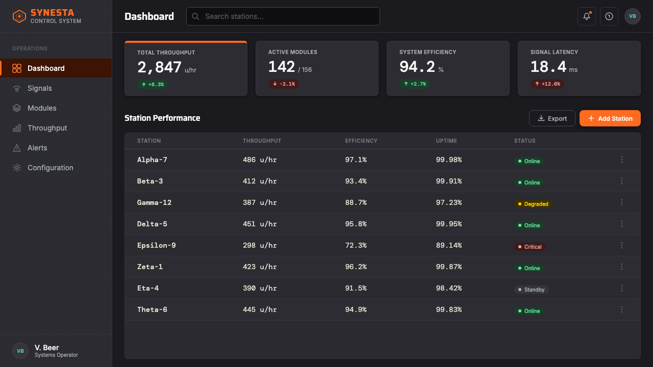
For web dashboards and monitoring interfaces, Cybernetic 1968 is among the most coherent historical precedents available. The Operations Room itself was essentially a large-format dashboard, and its design decisions — panel boundaries, accent color assignment by function, geometric readout forms — translate directly into screen design. In practice: define panel regions with subtle structural lines rather than card shadows, assign orange to alert states and primary actions, assign cyan to live data displays and status indicators, and use amber for secondary warnings. Interactive elements should feel like instrument controls — weighted, deliberate, and unambiguous — rather than soft consumer-product affordances.对于网页仪表板与监测界面,Cybernetic 1968是现有历史先例中最为连贯的风格之一。操作室本身实质上是一个大幅面仪表板,其设计决策——面板边界、按功能分配强调色、几何读数形态——直接转化为屏幕设计。在实践中:以微妙的结构线而非卡片阴影定义面板区域;将橙色分配给警示状态与主要操作,将青色分配给实时数据显示与状态指示器,将琥珀色用于次级警告。交互元素应感觉像仪器控件——有重量感、深思熟虑、毫无歧义——而非柔软的消费产品体验。
For editorial and marketing applications, the style supports a specific kind of authoritative long-form content: annual reports, data-driven editorial pieces, technology white papers, and product launches positioned around analytical capability. A Cybernetic 1968 editorial layout uses narrow justified columns against a deep ground, with pull quotes or key statistics set at high contrast in the primary accent colors. Marketing pages work well when they commit to the control-room metaphor fully: feature sections structured as instrument panels, with each capability presented as a named system with its own readout display rather than as a conventional feature card.对于编辑与营销应用,这种风格支持一种特定类型的权威长文内容:年度报告、数据驱动的编辑文章、技术白皮书,以及围绕分析能力定位的产品发布。Cybernetic 1968编辑版面在深色底面上使用窄对齐列,引用语或关键统计数据以强调色高对比度呈现。当营销页面完全投入控制室隐喻时效果最佳:特性章节结构化为仪表板面板,每项功能作为有名称的系统呈现、配有自己的读数显示,而非作为常规特性卡片。
The most common mistake is treating this as a generic dark mode with colorful accents. Authentic Cybernetic 1968 application is structurally specific: panels must have boundaries, data must be presented in geometric form, and the accent colors must be used functionally rather than decoratively. A second common error is saturating too many elements simultaneously — the orange, cyan, and amber accents derive their signal value from rarity. When all three appear at full saturation across a layout, the visual system collapses into noise. Reserve each accent color for a single semantic function and maintain it consistently throughout the composition.最常见的错误是将其视为带有彩色强调的通用深色模式。真实的Cybernetic 1968应用在结构上是具体的:面板必须有边界,数据必须以几何形式呈现,强调色必须功能性地而非装饰性地使用。第二个常见错误是同时使同样多的元素饱和——橙色、青色与琥珀色强调色的信号价值来自其稀有性。当三种颜色同时以全饱和度出现在一个版面中时,视觉系统崩溃为噪声。将每种强调色保留给单一语义功能,并在整个构图中保持一致。
See the Cybernetic 1968 (Stafford Beer) design system查看 Cybernetic 1968 (Stafford Beer) 完整设计系统
Cybernetic 1968 (Stafford Beer) — FAQCybernetic 1968 (Stafford Beer) · 常见问题
How does Cybernetic 1968 differ from generic dark-mode design?Cybernetic 1968与普通深色模式设计有何区别?
Generic dark mode is a light interface with the color values inverted — the same compositional logic, the same information hierarchy, but on a dark ground instead of a light one. Cybernetic 1968 is not an inversion of anything; it is a design language built from the ground up on dark surfaces, with a specific organizational logic (panel-based structure), a specific data-presentation approach (geometric instrument forms), and a specific accent system (orange for action, cyan for readout, amber for warning) that carry functional meaning rather than decorative intent. The most reliable diagnostic: if the layout would work equally well on a white background, it is not Cybernetic 1968 — it is dark mode with orange accents.普通深色模式是色值反转的浅色界面——相同的构图逻辑,相同的信息层级,只是置于深色底面而非浅色底面。Cybernetic 1968不是任何东西的反转;它是一套从零开始构建于深色表面的设计语言,具有特定的组织逻辑(基于面板的结构)、特定的数据呈现方式(几何仪器形态),以及承载功能意义而非装饰意图的特定强调系统(橙色用于行动,青色用于读数,琥珀色用于警告)。最可靠的诊断方式:如果这个版面在白色底面上同样有效,那它不是Cybernetic 1968——那只是带橙色强调的深色模式。
Is this style appropriate for consumer-facing products, or mainly for professional tools?这种风格适合面向消费者的产品,还是主要适用于专业工具?
The style is best suited to professional tools, analytical platforms, and products where the user's relationship to the interface is active and instrumental — dashboards, monitoring systems, data platforms, developer tools, and enterprise software where the user arrives with a task and expects the interface to make that task executable. It is poorly suited to consumer products that depend on warmth, approachability, or sensory pleasure: social applications, food and wellness brands, children's products, or any context where the user should feel relaxed rather than alert. The control-room gravity that makes the style compelling in a data context becomes alienating in a comfort context.这种风格最适合专业工具、分析平台,以及用户与界面关系是主动和工具性的产品——仪表板、监测系统、数据平台、开发者工具,以及用户带着任务到来、期望界面使该任务可执行的企业软件。它不适合依赖温暖感、亲近感或感官愉悦的消费者产品:社交应用、食品与健康品牌、儿童产品,或任何用户应感到放松而非警觉的场景。使这种风格在数据语境中引人注目的控制室庄重感,在舒适语境中则会令人疏离。
What is the relationship between Cybernetic 1968 and the Bauhaus?Cybernetic 1968与包豪斯之间有什么关系?
The relationship is direct but mediated. Gui Bonsiepe, who designed the Operations Room, studied and taught at the Hochschule für Gestaltung Ulm — a postwar design school founded in 1953 that positioned itself as the Bauhaus's systematic successor. Ulm retained the Bauhaus commitment to functionalism and the rejection of surface ornament, but replaced the Bauhaus's artistic expressiveness with a more scientific, systems-oriented methodology. Cybernetic 1968 therefore inherits Bauhaus DNA at one remove: the structural discipline, the rejection of decoration, and the belief that design is a problem-solving discipline rather than an aesthetic one are all Bauhaus-derived. But the palette (dark grounds rather than light, saturated signals rather than symbolic primaries) and the organizational metaphor (feedback systems rather than geometric forms) belong specifically to the Ulm-to-Santiago lineage.两者之间的关系是直接的,但经过了中间环节。设计操作室的邦西佩曾在乌尔姆造型学院学习与执教——这所战后设计学院成立于1953年,将自身定位为包豪斯的系统性继承者。乌尔姆保留了包豪斯对功能主义和拒绝表面装饰的承诺,但以更具科学性、系统导向的方法论取代了包豪斯的艺术表现性。因此,Cybernetic 1968继承了包豪斯的DNA,但隔了一层:结构自律、拒绝装饰,以及设计是解决问题的学科而非审美学科的信念,都源自包豪斯。但色板(深色底面而非浅色,饱和信号色而非象征性原色)和组织性隐喻(反馈系统而非几何形态)则专属于从乌尔姆到圣地亚哥这条传承线。
Can Cybernetic 1968 work on a light-colored background?Cybernetic 1968能在浅色背景上使用吗?
It can be attempted, but it requires rethinking most of the system's logic. On a light ground, the panel structure collapses — panels defined by structural lines against a dark ground become invisible or decorative against a light one. The accent colors lose their signal function because they no longer stand out against a quiet background; orange reads as cheerful rather than urgent, and cyan reads as decorative rather than informational. A light-ground adaptation works best when it commits to the Ulm-School half of the lineage rather than the control-room half: rigorous grid, functional sans-serif type, data presented in geometric form, but without the dark-ground intensity. Think of it as a daytime mode for the same underlying analytical purpose, not a direct translation.可以尝试,但这需要重新思考系统大部分的逻辑。在浅色底面上,面板结构崩溃——在深色底面上由结构线定义的面板在浅色底面上变得不可见或仅具装饰性。强调色失去其信号功能,因为它们不再从安静的背景中凸显出来;橙色读来像愉悦而非紧迫,青色读来像装饰而非信息。浅色底面的改编版本在致力于这套传承线的乌尔姆学派一半而非控制室一半时效果最佳:严格网格,功能性无衬线字体,以几何形式呈现的数据,但没有深色底面的强度。将其视为同一底层分析目的的日间模式,而非直接翻译。
What makes this style historically significant beyond its visual appeal?除视觉吸引力之外,这种风格在历史上的意义是什么?
Cybersyn was the first serious attempt to design a real-time national-scale information system for governance — predating the internet, built on 1970s telecommunications infrastructure, and operational for nearly two years before its destruction. Its significance is that it demonstrated design decisions have political consequences: the choice to put decision-makers in a room with instruments rather than reports, to visualize economic flows rather than static tables, to give workers a feedback channel to Santiago — each of these was a designed artifact that embodied a theory of power and participation. When contemporary designers work with this aesthetic, they are engaging with a design tradition that took seriously the question of what information systems do to the people who use them and the societies they govern. That question is more relevant now than it was in 1973.Cybersyn是第一次认真尝试为治理设计实时国家级信息系统——早于互联网出现,建立在1970年代电信基础设施之上,在被摧毁之前运行了将近两年。其意义在于:它证明了设计决策具有政治后果——将决策者置于一间有仪器而非报告的房间里的选择,可视化经济流动而非静态表格的选择,赋予工人一条通向圣地亚哥的反馈渠道的选择——每一个都是体现了权力与参与理论的设计成品。当当代设计师使用这种美学时,他们正在参与一个严肃对待以下问题的设计传统:信息系统对使用它们的人以及它们所治理的社会究竟产生了什么作用。这个问题在今天比1973年更具现实意义。
Related design styles相关设计风格
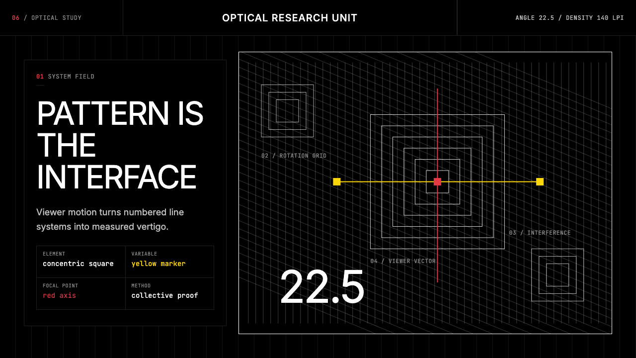 GRAV Op-Kinetic (1960)Vertigo by calculation. White line fields on black, with red and yellow as co…以计算制造眩晕。黑底白线场中,红与黄是受控变量。
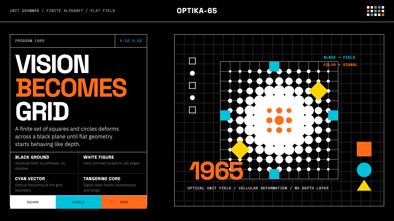 Hungarian Vasarely Op Art (1965)Mathematics makes vision pulse. Black grids, white units, cyan and tangerine…数学让视觉脉动:黑底白格与青橘单元扭曲深度。
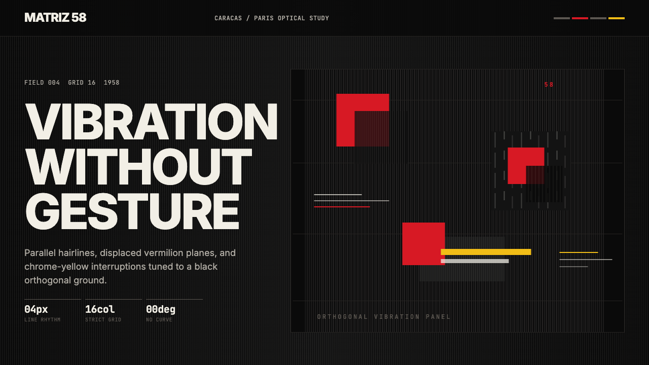 Venezuelan Cinético Soto 1958Optical tension holds still. Matte black, Inter, hairlines, and vermilion off…静止的光学张力:哑黑底、Inter、发丝线与朱红位移共同震颤。
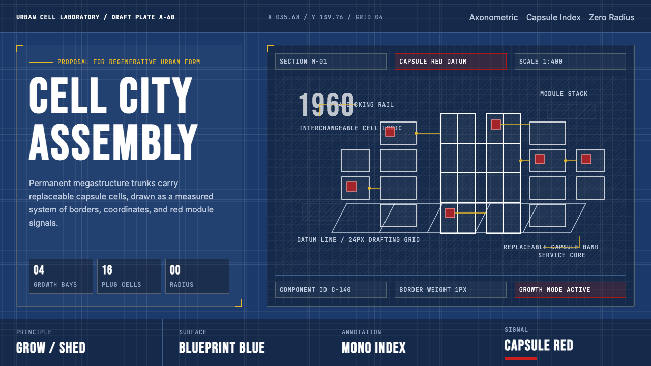 Metabolism Tokyo (1960)Cities become diagrams. Blueprint blue, mono labels, and capsule red mark mod…城市成为图纸:蓝图底、等宽标注与胶囊红,标记模块生长。
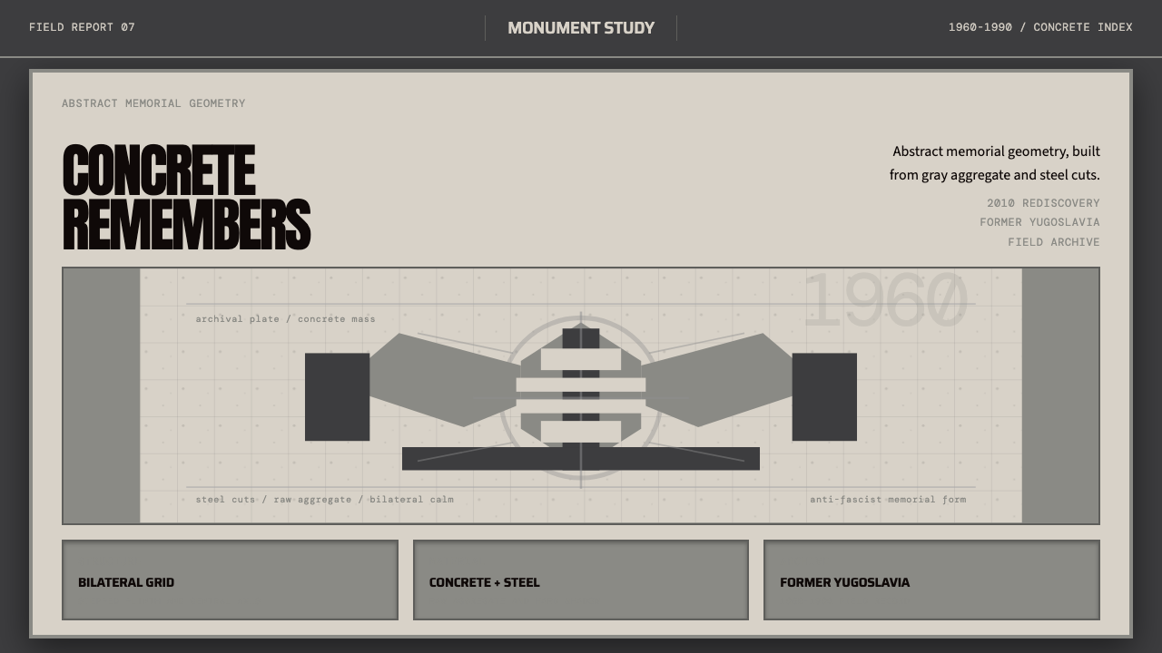 Spomenik Yugoslav Monument (1960)Memory, stripped bare. Gray symmetry and winged concrete geometry.记忆被剥到最裸。灰阶对称与翼状混凝土几何。
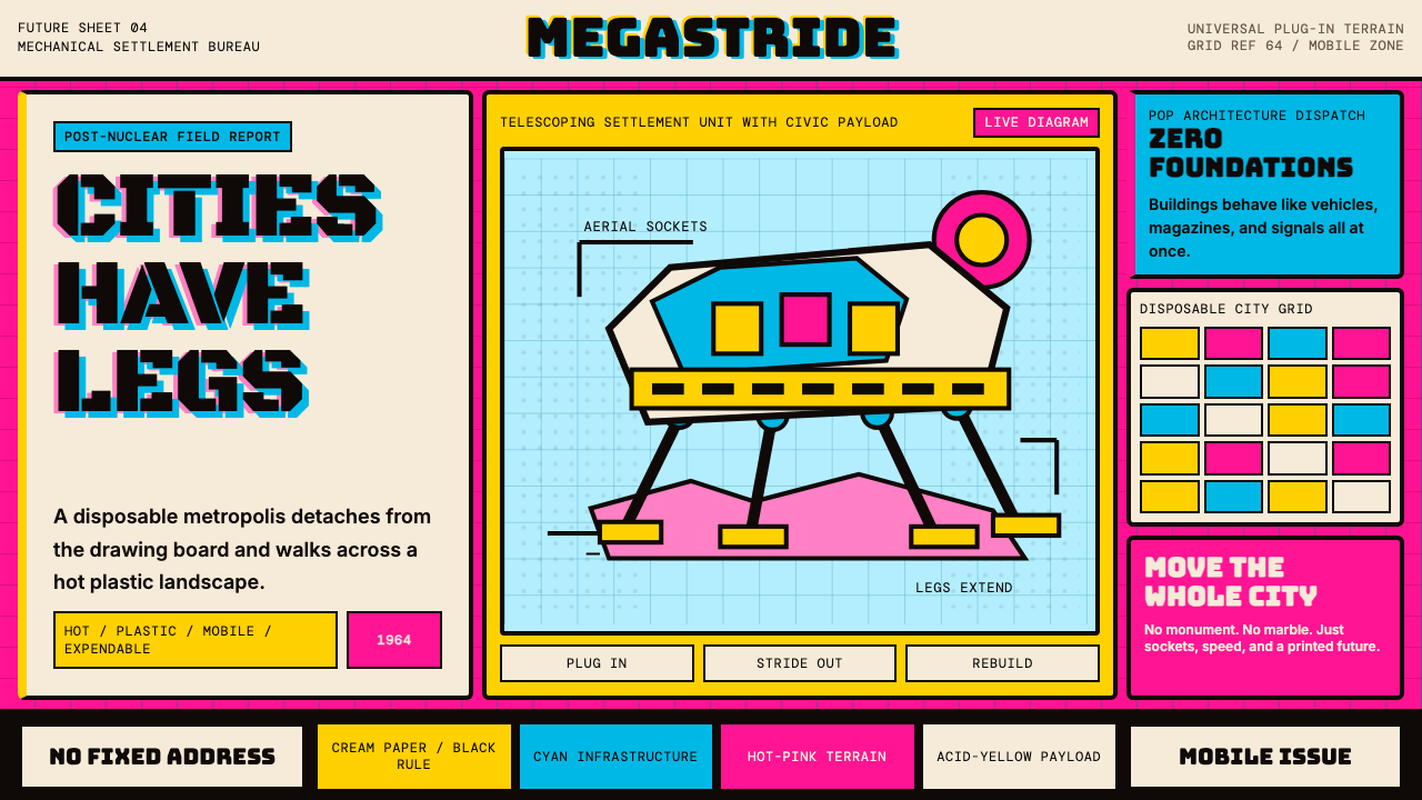 Archigram Walking City (1964)Cities refuse foundations. Hot pink, cyan, and acid yellow lock a bordered co…城市拒绝地基。热粉、青蓝与酸黄压进粗黑漫画格。