Design style guide设计风格指南
What is Venezuelan Cinético Soto 1958?什么是 Venezuelan Cinético Soto 1958?
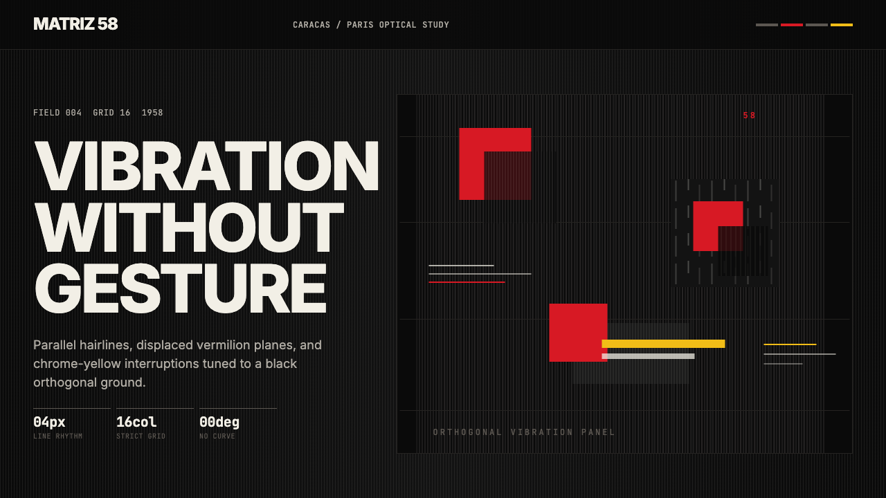
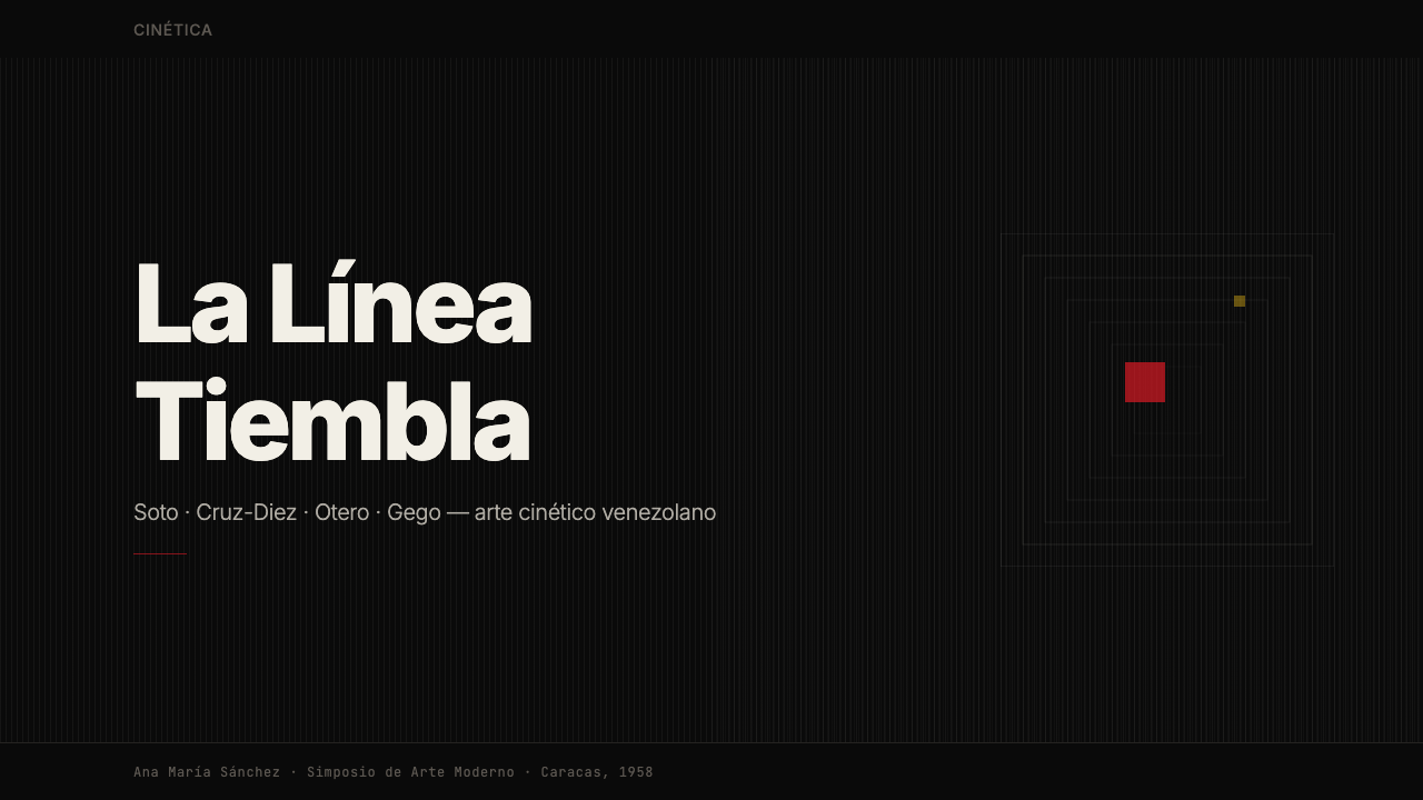
Venezuelan arte cinético transforms static surfaces into fields of optical vibration — matte black grounds, hairline grids, and vermilion displacements that hum with energy the moment your eyes move across them.委内瑞拉动力艺术将静止界面变为光学振动的力场——哑黑底面、发丝网格与朱红位移,只要你的目光扫过,它们就开始震颤。
Venezuelan Cinético Soto 1958 in briefVenezuelan Cinético Soto 1958 速览
Venezuelan arte cinético is a rigorous optical design language born from the convergence of Paris avant-garde experimentation and Venezuela's mid-century modernist ambitions. Its visual vocabulary centers on tightly spaced parallel hairlines, geometric displacement squares, and the viewer-activated illusion of movement — everything arranged on a matte-black field so that the eye perceives constant, low-level vibration even when looking at a perfectly still image.委内瑞拉动力艺术(arte cinético)是一套严谨的光学设计语言,诞生于巴黎前卫实验与委内瑞拉二十世纪中叶现代主义雄心的交汇点。它的视觉词汇以密集排列的平行发丝线、几何位移方块以及由观者激活的运动幻觉为核心——一切都布置于哑光黑底之上,使眼睛即便面对完全静止的图像,也会持续感受到低强度的视觉震颤。
The system is built on a fundamental contradiction: the artwork or interface is physically static, but it refuses to look that way. By placing thin lines or planes of contrasting tones in near-parallel arrays, the style exploits the visual cortex's edge-detection mechanisms. The result is an image that appears to shift, pulsate, or ripple with every small eye movement. Vermilion and chrome-yellow fragments punctuate these grids as points of sudden chromatic intensity — not decorations, but carefully calibrated disruptions that amplify the sensation of kinetic energy.这套系统建立在一个根本性矛盾之上:作品或界面在物理上是静止的,但它拒绝看起来静止。通过将对比色调的细线或平面排列成近乎平行的阵列,这种风格利用了视觉皮层的边缘检测机制。结果是一幅随着眼球的每一次细微移动都仿佛在偏移、脉动或涟漪的图像。朱红与铬黄碎片以突然的色彩强度点缀在网格之中——它们不是装饰,而是经过精密校准的扰动,用以放大动觉能量的感受。
Unlike op art in its broader international form, Venezuelan cinético carries a specific regional identity rooted in Caracas modernism and the country's oil-era cultural confidence. Its most celebrated works were installed in public institutions, airports, and corporate headquarters, treating optical vibration as an expression of national modernity. The design system that descends from this tradition brings that same ambition to screen-based work: every composition should feel charged, alert, and alive.与更广泛意义上的国际欧普艺术不同,委内瑞拉动力艺术承载着根植于加拉加斯现代主义与国家石油时代文化自信的特定地域身份。其最具代表性的作品被安装于公共机构、机场与企业总部,将光学振动作为国家现代性的表达。从这一传统衍生而来的设计系统,将同样的雄心带入了以屏幕为基础的工作:每一个构图都应该感觉充满张力、警觉而鲜活。
See the Venezuelan Cinético Soto 1958 design system →查看 Venezuelan Cinético Soto 1958 完整设计系统 →
Where does Venezuelan Cinético Soto 1958 come from?Venezuelan Cinético Soto 1958 从何而来?
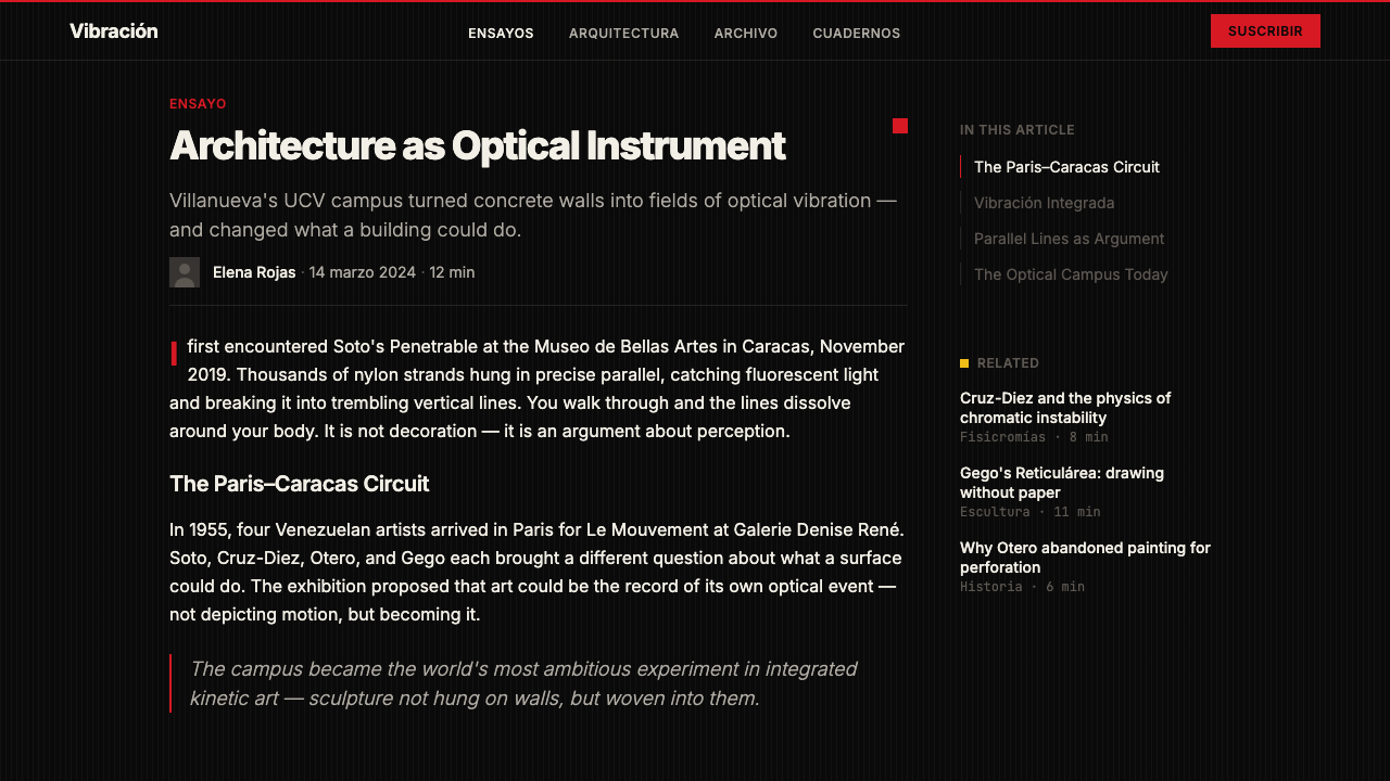
The story begins not in Caracas but in Paris. In April 1955, the Galerie Denise René hosted Le Mouvement, a group exhibition that gathered artists working with optical illusion, kinetics, and perceptual instability. Among the participants were Venezuelan artists Jesús Rafael Soto and Alejandro Otero, who had arrived in Paris in the late 1940s on government scholarships. The exhibition placed them at the center of international avant-garde discourse at a pivotal moment — when abstraction was pushing past its own boundaries into the arena of visual perception itself.故事的起点不在加拉加斯,而在巴黎。1955年4月,德尼丝·勒内画廊举办了《运动》(Le Mouvement)群展,汇聚了一批致力于光学幻觉、动力学与感知不稳定性探索的艺术家。参展者中包括委内瑞拉艺术家赫苏斯·拉斐尔·索托与亚历杭德罗·奥特罗——二人于1940年代末获政府奖学金赴巴黎深造。这次展览将他们推到了国际先锋艺术话语的中心,恰逢抽象艺术突破自身边界、进入视觉感知本身领域的关键时刻。
Jesús Rafael Soto, born in Ciudad Bolívar in 1923, had trained in Caracas before receiving a scholarship to study in Paris. There he encountered the serial logic of Mondrian and the spatial investigations of Malevich, but what galvanized him was the discovery that layering transparent planes with geometric patterns over contrasting backgrounds could produce genuine optical movement. His Vibraciones series — thin wire or rod elements suspended before painted stripe backgrounds — created the shimmering, disorienting effect of surfaces that seem to breathe. Carlos Cruz-Diez, who arrived in Paris later, pursued a related investigation through his Fisicromías: panels engineered so that the perceived color changes as the viewer moves, exploring the physiology of color perception rather than color as fixed pigment.赫苏斯·拉斐尔·索托1923年生于玻利瓦尔城,在加拉加斯受训后获奖学金赴巴黎深造。他在那里邂逅了蒙德里安的序列逻辑与马列维奇的空间探索,但真正让他豁然开朗的是这一发现:将带有几何图案的透明平面叠加于对比背景之上,能够产生真实的光学运动。他的《振动》(Vibraciones)系列——在绘有条纹的背景前悬挂细金属线或杆件——制造出界面仿佛在呼吸的那种闪烁、令人迷失方向的效果。后来抵达巴黎的卡洛斯·克鲁兹-迭斯,通过他的《物理色彩》(Fisicromías)追求着相关的探索:这些面板经过精密设计,使观者感知到的颜色随着移动而改变,探索的是色彩感知的生理学,而非作为固定颜料的色彩。
Venezuela's oil wealth in the 1950s and 1960s created an unusually receptive institutional context for this experimental aesthetic. President Marcos Pérez Jiménez and later democratic administrations commissioned major public art programs, and progressive architects like Carlos Raúl Villanueva integrated kinetic and optical art directly into the infrastructure of the Universidad Central de Venezuela — a campus now recognized as a UNESCO World Heritage Site partly for the seamless synthesis of its architecture and its commissioned artworks. Soto's Penetrables (large-scale immersive installations of hanging rods that visitors could physically enter) were exhibited at major international venues while simultaneously becoming civic symbols in Caracas, appearing in the city's museums, plazas, and airports.1950至60年代委内瑞拉的石油财富,为这种实验美学创造了异常包容的机构语境。马科斯·佩雷斯·希门内斯总统及其后的民主政府委托了大型公共艺术项目,而像卡洛斯·劳尔·比利亚努埃瓦这样的进步建筑师,将动力与光学艺术直接整合进委内瑞拉中央大学的建筑肌理——这座校园现已被联合国教科文组织列为世界遗产,部分原因正在于其建筑与委托艺术品之间无缝的综合性。索托的《可穿透》(Penetrables,观者可以身体进入的大型沉浸式杆件装置)在国际重要展馆展出的同时,也成为加拉加斯的城市象征,出现在该市的博物馆、广场与机场。
By 1958 — the year that gives this design system its historical anchor — Venezuela had transitioned back to democratic government and the kinetic artists were at the height of their international recognition. Soto had exhibited at the Venice Biennale; Cruz-Diez was developing the theoretical framework that would make Fisicromía a globally recognized form. The particular convergence of matte-black grounds, precise hairline geometries, and chromatic displacement that defines this design system crystallized in the work these artists produced in and around this period, as their Paris experiments matured into a fully realized and internationally influential visual language that was nonetheless unmistakably Venezuelan in its sensibility.到了1958年——这个赋予本设计系统历史锚点的年份——委内瑞拉已回归民主政府,动力艺术家们的国际声誉也达到顶峰。索托曾参展威尼斯双年展;克鲁兹-迭斯则在发展使《物理色彩》成为全球公认形式的理论框架。正是这一时期,哑光黑底、精密发丝几何与色彩位移的特定汇聚在这些艺术家的作品中定型——他们的巴黎实验成熟为一套完整实现、具有国际影响力的视觉语言,却在感性上无可置疑地属于委内瑞拉。
What defines the Venezuelan Cinético Soto 1958 look?Venezuelan Cinético Soto 1958 的视觉特征是什么?
Optical Vibration Fields光学振动场
The defining mark of this aesthetic is the systematic creation of visual vibration through tightly spaced parallel lines, grids, or hatching patterns. These are not decorative textures — they are perceptual machines. When rendered at sufficiently fine intervals against a contrasting ground, they trigger the eye's edge-detection systems and produce the sensation of movement. The effect is strongest at the borders between the vibrating field and areas of solid tone, where the visual cortex generates phantom edges and shimmer.这种美学的决定性标志,是通过密集排列的平行线、网格或排线图案系统性地制造视觉振动。这些不是装饰纹理——它们是感知机器。当以足够精细的间距在对比底面上渲染时,它们会触发眼睛的边缘检测系统,产生运动的感知。这种效果在振动场与实色调区域的边界处最为强烈,视觉皮层在那里会生成幻影边缘与闪烁。
Matte-Black Ground哑光黑底
The ground is almost exclusively a deep, flat, non-reflective black — the visual equivalent of silence against which every other element registers with acute clarity. This is not the rich darkness of premium consumer brands nor the cool near-black of tech minimalism; it is an absolute, matte darkness that absorbs light and makes hairlines and colored fragments appear to float and vibrate above the surface rather than rest on it.底面几乎清一色是深沉、平坦、非反光的黑色——如同沉默的视觉等价物,使其上的每个元素都以敏锐的清晰度呈现。这不是高端消费品牌那种丰富的暗色调,也不是科技极简主义的冷调近黑;而是一种绝对的、哑光的暗色,吸收光线,使发丝线与彩色碎片看起来在表面上方漂浮振动,而非安稳地落于其上。
Vermilion and Chrome-Yellow Displacement朱红与铬黄位移
Color appears selectively and purposefully: a vivid vermilion-red and a saturated chrome-yellow are the primary chromatic events in an otherwise achromatic system. They appear as small displaced squares, rectangles, or slivers — elements that seem slightly out of register with the geometry around them, as if they have shifted a fraction in space. This deliberate misalignment amplifies the optical tension and gives the composition its sense of arrested movement.色彩有选择性、有目的地出现:鲜艳的朱红与饱和的铬黄,是这个在其他方面近乎无色系统中的主要色彩事件。它们以小型位移的正方形、矩形或细条形式出现——这些元素看起来与周围的几何形略微错位,仿佛在空间中偏移了一小段距离。这种刻意的错位放大了光学张力,赋予构图一种被捕捉的运动感。
Orthogonal Precision正交精密性
Every element aligns to strict horizontal and vertical axes. There are no diagonals, no curves, no organic forms. This rigorous orthogonality is not merely a stylistic preference — it is structurally necessary to the optical illusion: diagonal or organic interruptions in the parallel field break the perceptual consistency that makes the vibration effect work. The compositions feel machined, precise, and almost industrial in their exactness.每个元素都严格对齐水平轴或垂直轴。没有斜线,没有曲线,没有有机形态。这种严苛的正交性不仅仅是风格偏好——它对光学幻觉在结构上是必要的:平行场中的斜向或有机打断会破坏使振动效果运作的感知一致性。这些构图感觉是经过机械加工的、精密的,在精确性上几乎具有工业气质。
Typographic Restraint字体排印克制
When text enters these compositions, it does so with extreme economy. Type is typically set in a clean, geometrically regular sans-serif, at a scale that either commands the entire field or recedes to near-invisibility. Intermediate sizes are avoided — the typographic logic mirrors the optical logic of the rest of the system, privileging strong contrast over gradual gradation. All-caps settings and tight letter-spacing reinforce the technical, precision-instrument quality of the overall aesthetic.当文字进入这些构图时,它以极度节制的方式出现。字体通常设置为干净、几何规律的无衬线字体,尺度上要么支配整个画面,要么隐退至近乎不可见。中间尺寸被刻意回避——字体排印的逻辑与系统其余部分的光学逻辑相呼应,优先选择强对比而非渐进过渡。全大写设置与紧缩字距强化了整体美学那种技术性、精密仪器的气质。
Flatness Without Gradients无渐变的平面性
Every tonal and chromatic area is rendered as a completely flat, uniform field. There are no gradients, no vignettes, no atmospheric fades. This absolute flatness is what makes the optical vibration effects work: the eye needs reliable, consistent reference points to generate the perceptual oscillation. Any soft transition or atmospheric depth destroys the necessary visual precision. The result is an aesthetic that reads simultaneously as hand-crafted and machined.每一个色调与色彩区域都被渲染为完全平坦、均匀的色块。没有渐变,没有晕边,没有大气消退。这种绝对的平面性正是使光学振动效果运作的原因:眼睛需要可靠、一致的参照点来产生感知振荡。任何柔和过渡或大气深度都会破坏必要的视觉精密性。其结果是一种同时读来像手工制作又像机械加工的美学。
Activated Negative Space激活的负空间
In most design systems, negative space is passive — the absence of elements. In arte cinético, the black ground and the voids within the line patterns are active participants in the optical system. The spaces between lines are as perceptually loaded as the lines themselves; the black areas against which colored fragments float create the conditions for the vibration effect. Silence here is not empty — it hums.在大多数设计系统中,负空间是被动的——是元素的缺席。在动力艺术中,黑色底面与线条图案内部的空白是光学系统的主动参与者。线条之间的间隙与线条本身承载着同等的感知负荷;彩色碎片漂浮其中的黑色区域,创造了振动效果的前提条件。这里的沉默不是空洞的——它在嗡嗡作响。
See the Venezuelan Cinético Soto 1958 design system →查看 Venezuelan Cinético Soto 1958 完整设计系统 →
Who shaped Venezuelan Cinético Soto 1958?谁塑造了 Venezuelan Cinético Soto 1958?
Born in Ciudad Bolívar in 1923, Soto is the central figure of Venezuelan arte cinético and one of the most significant kinetic artists of the twentieth century. After studying in Caracas he traveled to Paris in 1950, where his encounter with Mondrian's seriality and his own investigations into optical superposition led to the Vibraciones series — works in which thin elements suspended before striped backgrounds generated genuine optical movement. His Penetrables, large immersive installations of hanging rods through which viewers could walk, became internationally recognized icons. He established the Museo Soto in Ciudad Bolívar in 1973, and his work is central to the collections of major museums in Venezuela, France, and beyond. The hairline aesthetics and matte-black grounds of this design system are most directly descended from his practice.索托1923年生于玻利瓦尔城,是委内瑞拉动力艺术的核心人物,也是二十世纪最重要的动力艺术家之一。在加拉加斯求学后,他于1950年前往巴黎,在那里与蒙德里安序列性的邂逅,以及他自己对光学叠合的探索,催生了《振动》系列——在绘有条纹背景前悬挂细元素的作品,产生了真实的光学运动。他的《可穿透》——观者可以穿行其中的大型沉浸式杆件装置——成为具有国际认知度的图标。他于1973年在玻利瓦尔城创立了索托博物馆,其作品是委内瑞拉、法国及其他地区重要博物馆馆藏的核心。本设计系统的发丝美学与哑光黑底,最直接地承袭自他的创作实践。
Born in Caracas in 1923, Cruz-Diez developed a parallel and complementary investigation into optical color phenomena. Where Soto worked primarily with line and spatial superposition, Cruz-Diez focused on the physiology of color perception itself — specifically, how the eye generates color sensations that are not present in the pigments being viewed. His Fisicromías are engineered panels in which strips of color interact with each other and with the viewer's position to produce colors that exist only in perception. His Chromosaturation environments fill entire rooms with pure spectral light, demonstrating that color is not a property of objects but a condition of nervous-system response. The chromatic displacement logic in this design system — the way colored fragments seem to generate secondary colors at their edges — owes much to Cruz-Diez's theoretical framework.克鲁兹-迭斯1923年生于加拉加斯,发展了对光学色彩现象的平行而互补的探索。索托主要致力于线条与空间叠合,克鲁兹-迭斯则聚焦于色彩感知的生理学本身——具体而言,眼睛如何产生不存在于所观看颜料中的色彩感知。他的《物理色彩》是经过精密设计的面板,其中颜色条带与彼此及观者的位置相互作用,产生只存在于感知中的颜色。他的《色饱和》装置将整个房间充满纯粹的光谱光,证明色彩不是物体的属性,而是神经系统反应的条件。本设计系统中的色彩位移逻辑——彩色碎片在边缘仿佛生成二次色的方式——深受克鲁兹-迭斯理论框架的影响。
Otero was one of the first Venezuelan artists to arrive in Paris in the late 1940s and was among the participants of Le Mouvement in 1955. His Coloritmos series — vertical bands of alternating color on white grounds — explored rhythmic visual vibration through chromatic rather than line-based means, demonstrating that the kinetic illusion could be generated through careful color orchestration alone. His later large-scale public sculptures in aluminum and steel, installed in Caracas and in cities across the Americas, brought the precise geometry and kinetic energy of Venezuela's optical movement into three-dimensional civic space. Otero's early investigations established the theoretical groundwork on which both Soto and Cruz-Diez's more technically specific practices were built.奥特罗是1940年代末最早抵达巴黎的委内瑞拉艺术家之一,并参加了1955年的《运动》展。他的《色韵》(Coloritmos)系列——白底上交替排列的垂直色带——通过色彩而非线条手段探索节奏性视觉振动,证明动力幻觉可以仅凭精心的色彩编排产生。他后来在加拉加斯及美洲各地城市安装的铝与钢大型公共雕塑,将委内瑞拉光学运动的精密几何与动力能量带入了三维公共空间。奥特罗的早期探索为索托与克鲁兹-迭斯更具技术特殊性的实践奠定了理论基础。
Gego — the working name of Gertrud Goldschmidt, born in Hamburg in 1912 and emigrated to Venezuela in 1939 — occupies a singular position within the Venezuelan kinetic tradition. Where her contemporaries pursued optical vibration through precise geometric systems, Gego worked with handmade wire and mesh structures that created shimmering spatial environments through accumulation and touch rather than industrial precision. Her Reticuláreas — large hanging installations of irregular wire networks — produce optical effects of depth, movement, and spatial instability that are felt as much as seen. Her work demonstrates that the arte cinético aesthetic could accommodate irregularity and craft-based improvisation within its broader framework of optical activation, and her influence on designers who work with fine-line systems and mesh patterns has been profound.格戈——即格特鲁德·戈尔德施密特的工作名,1912年生于汉堡,1939年移居委内瑞拉——在委内瑞拉动力传统中占据独特位置。当她的同时代人通过精密几何系统追求光学振动时,格戈以手工制作的金属线与网状结构工作,通过积累与触感而非工业精密性创造出闪烁的空间环境。她的《网络》(Reticuláreas)——由不规则线网构成的大型悬挂装置——产生深度、运动与空间不稳定性的光学效果,令人既看见又感受到。她的作品证明,动力艺术美学能够在其更广泛的光学激活框架内容纳不规则性与基于手工的即兴创作;她对处理细线系统与网格图案的设计师所产生的影响是深远的。
How do you use Venezuelan Cinético Soto 1958 today?今天怎么用 Venezuelan Cinético Soto 1958?
Venezuelan arte cinético is among the most technically demanding historical styles to apply well in digital design, because its power depends entirely on precision. The optical vibration effects that define the aesthetic emerge from exact spacing, consistent line weights, and the absence of any softening or approximation. Applied carelessly, the style produces muddiness and visual fatigue; applied with discipline, it generates compositions of extraordinary kinetic energy that arrest attention immediately.委内瑞拉动力艺术是历史风格中在数字设计中应用难度最高的之一,因为它的力量完全依赖于精密性。定义这种美学的光学振动效果,来自精确的间距、一致的线条粗细,以及任何柔化或近似的缺席。粗心应用会产生模糊与视觉疲劳;有纪律地应用,则能生成具有非凡动觉能量、立即抓住注意力的构图。
For presentation slides, this aesthetic excels at title and section-divider contexts where maximum impact in a single glance is the goal. A cover slide built on this system should give the impression of a Soto Vibración panel: a matte-black field interrupted by a zone of dense hairline geometry, with the title appearing in clean, geometrically precise type either against the black ground or floating over the patterned zone. Data slides require restraint — introduce pattern elements only as background or structural borders, keeping the data visualization itself clean and legible. Vermilion and chrome-yellow should appear sparingly, used for a single data series or a single call-out, never as the dominant palette of a chart.在演示文稿中,这种美学在标题页与章节过渡页的语境中表现卓越——这些场景的目标是在一瞥之间产生最大冲击力。基于本系统构建的封面页应该给人留下索托振动面板的印象:哑光黑底上,一片密集发丝几何区域打断了底面,标题以干净、几何精密的字体出现——或置于黑底之上,或悬浮于图案区上方。数据页需要克制——只将图案元素引入背景或结构边框,保持数据可视化本身干净可读。朱红与铬黄应当少量出现,用于单一数据系列或单一引用标注,绝不作为图表的主导色板。
For web interfaces, the aesthetic maps most naturally onto hero sections, loading states, and feature highlight blocks where the goal is immediate visual impact rather than extended readability. Full-screen sections with hairline grid overlays and a single chromatic displacement element can establish the system's visual signature without overwhelming content-heavy areas. Navigation and body text should remain typographically minimal and high-contrast — pure white type on the matte-black ground — with the kinetic elements reserved for structural moments: hero transitions, scroll-triggered reveals, and section breaks. Avoid applying the fine-line texture to small UI components like buttons or inputs, where the detail will be invisible and the dark ground will create accessibility problems.对于网页界面,这种美学最自然地映射到英雄区块、加载状态与功能高亮块上——这些场景的目标是即时视觉冲击而非持续可读性。全屏区块叠加发丝网格与单一色彩位移元素,能够建立系统的视觉签名,而不会压倒内容密集区域。导航与正文应当保持字体排印上的极简与高对比——哑光黑底上的纯白字体——动力元素保留给结构性时刻:英雄区过渡、滚动触发揭示与章节分隔。避免将细线纹理应用于按钮或输入框等小型UI组件,那里的细节将不可见,而深色底面会造成可访问性问题。
For editorial and marketing materials, the style supports a poster-first approach where each spread or screen functions as a standalone visual statement. Think of each composition as occupying the same visual territory as a Soto work installed in a corporate lobby: it should command the space, reward close inspection, and create a slight sense of perceptual instability that keeps the viewer engaged. Marketing campaigns built on this system benefit from thematic consistency — using the same displacement color across all materials as a brand signature — rather than varying the chromatic events from piece to piece.对于编辑与营销材料,这种风格支持一种以海报为先的方法,使每个版面或屏幕作为独立的视觉陈述发挥作用。将每个构图想象为占据与安装在企业大堂中的索托作品相同的视觉领地:它应当支配空间、回馈近距离审视,并制造轻微的感知不稳定感,使观者持续投入。基于本系统构建的营销活动,受益于主题一致性——在所有材料中使用相同的位移色作为品牌签名——而非在作品间变化色彩事件。
The most common error when applying this aesthetic is substituting noise or generic texture for the precise optical geometry that actually generates the vibration effect. Blurry overlays, low-contrast texture packs, and decorative gradients are incompatible with the system's logic and produce results that feel murky rather than energetic. A second common mistake is using the matte-black ground without committing to its absolute depth — slightly warm or slightly cool near-blacks undermine the visual tension that the system depends on. The black must be absolute. Similarly, using multiple chromatic accent colors simultaneously collapses the precision that makes each displacement element register as a distinct kinetic event.应用这种美学时最常见的错误,是用噪点或通用纹理替代真正产生振动效果的精密光学几何。模糊叠加、低对比度纹理包和装饰性渐变与系统逻辑不兼容,产生的结果感觉浑浊而非充满活力。第二个常见错误是使用哑光黑底却没有承诺其绝对深度——略暖或略冷的近黑色会破坏系统所依赖的视觉张力。黑色必须是绝对的。同样,同时使用多种色彩强调色,会瓦解使每个位移元素作为独特动觉事件呈现的精密性。
See the Venezuelan Cinético Soto 1958 design system →查看 Venezuelan Cinético Soto 1958 完整设计系统 →
Venezuelan Cinético Soto 1958 — FAQVenezuelan Cinético Soto 1958 · 常见问题
Is arte cinético the same as op art?动力艺术和欧普艺术是同一回事吗?
They overlap significantly but are not identical. Op art is the broader international phenomenon, spanning work by Bridget Riley in Britain, Victor Vasarely in France, and many others throughout the 1960s and 1970s. Venezuelan arte cinético is a specific, regionally rooted strand that participated in and helped shape op art but maintained a distinctive character: a stronger emphasis on the viewer's physical movement activating the work, a preference for wire-and-rod sculpture alongside flat optical panels, and a close relationship with Venezuelan modernist architecture and civic identity. The matte-black and vermilion palette of this design system is specifically Venezuelan rather than generically op-art, reflecting the particular sensibility of Soto's Vibraciones and the Caracas modernist milieu.两者大量重叠,但并不完全相同。欧普艺术是更广泛的国际现象,涵盖英国布里奇特·莱利、法国维克托·瓦萨雷利以及1960至70年代许多其他艺术家的作品。委内瑞拉动力艺术是其中一个特定的、具有地区根源的分支——它参与并帮助塑造了欧普艺术,但保持着独特的性格:更强调观者的身体移动激活作品,偏好线杆雕塑与平面光学面板并举,以及与委内瑞拉现代主义建筑和城市身份的密切关系。本设计系统的哑光黑与朱红色板,是特定的委内瑞拉色彩,而非通用的欧普艺术色彩,反映了索托《振动》系列与加拉加斯现代主义环境的特定感性。
Can this aesthetic work for light-background interfaces?这种美学能用于浅色背景界面吗?
The system was built around a matte-black ground, and inverting it to a light background significantly changes its character. A white or light-grey ground with dark hairlines is legible and can reference the aesthetic, but it loses the sense of floating, suspended elements and the dramatic optical tension that the dark ground provides. If a light-background variant is necessary — for print contexts, accessibility requirements, or brand contexts that preclude dark interfaces — the most successful approach is to treat the light areas as carefully bounded zones rather than as the overall ground, using a predominantly dark compositional structure with light windows rather than a predominantly light layout with dark accents.本系统围绕哑光黑底构建,将其反转为浅色背景会显著改变其性格。白色或浅灰底面配以深色发丝线是可读的,也能指涉这种美学,但它失去了深色底面所提供的元素漂浮、悬置感与戏剧性光学张力。如果浅色背景版本是必要的——出于印刷语境、可访问性要求,或排除深色界面的品牌语境——最成功的方法是将浅色区域作为精心划定边界的区块处理,而非整体底面:使用以深色为主的构图结构加上浅色视窗,而非以浅色为主的版面加深色点缀。
How does this style handle animation and motion in digital contexts?这种风格在数字环境中如何处理动画与运动?
With extreme care and restraint. The optical vibration effects in the static compositions already create a powerful sense of movement — adding literal motion on top of this can easily produce visual overload or nausea. When animation is used, it should be slow, deliberate, and structural: a slow reveal of a hairline pattern, a displacement element that drifts incrementally across a field, or a subtle pulse applied to the chromatic accent. Fast transitions, parallax effects, and loop animations that compete with the static optical effects will destroy the compositional discipline that makes the aesthetic work. The principle is that the static image should already feel like it is moving; animation should deepen that quality, not announce itself separately.需要极度谨慎与克制。静态构图中的光学振动效果本身已经制造出强烈的运动感——在此之上叠加字面意义的运动,很容易产生视觉超载或眩晕感。当使用动画时,它应当是缓慢的、深思熟虑的、具有结构性的:发丝图案的缓慢揭示、位移元素在场域上的渐进漂移,或施加于色彩强调的细微脉动。与静态光学效果竞争的快速过渡、视差效果和循环动画,会破坏使这种美学运作的构图纪律。原则是:静态图像本身应当已经感觉在运动;动画应当加深这种品质,而非另立门户地宣告自身。
What kind of brands or products suit this aesthetic, and which should avoid it?哪类品牌或产品适合这种美学,哪些应当避开它?
The aesthetic is well-suited to technology companies, architecture firms, cultural institutions, and any brand whose positioning emphasizes precision, intelligence, and visual sophistication. It works particularly well in Latin American markets where the historical references carry genuine cultural weight, and in international creative contexts where the aesthetic reads as both art-historically aware and visually distinctive. Brands that should approach it cautiously include those in health and wellness (the dark, optically intense environment can feel clinical or unsettling), children's and family products (the severity is age-inappropriate), and any product category where warmth and approachability are primary values. The aesthetic does not soften — it challenges. That is its strength in the right context and its liability in the wrong one.这种美学非常适合科技公司、建筑事务所、文化机构,以及任何定位强调精密性、智识深度与视觉精致感的品牌。它在拉丁美洲市场表现尤为出色——历史指涉在那里承载着真实的文化分量——也适合国际创意语境,其中这种美学读来既具艺术史意识又视觉上卓尔不群。应当谨慎靠近它的品牌包括:健康与养生领域(深色、光学强烈的环境可能感觉冰冷或令人不安)、儿童与家庭产品(这种严肃性不适合相应年龄),以及任何以温暖感和亲近性为首要价值的产品品类。这种美学不会软化——它提出挑战。在正确的语境中,这是它的力量;在错误的语境中,则是它的负债。
Why does the system include vermilion specifically rather than a different red?为什么系统特别使用朱红而非其他红色?
Vermilion — a red that leans toward orange and carries a sense of warmth and intensity — was the chromatic signature of Soto's displacement elements and appears consistently in the work of the Venezuelan kinetic artists. It differs meaningfully from a cooler crimson or a bluer primary red: against a matte-black ground, vermilion advances aggressively and creates a sense of thermal contrast — as if a hot element has been displaced onto a cold surface. This thermal quality amplifies the sense of kinetic energy. A cooler red in the same position tends to read as more controlled and less disruptive, which works against the aesthetic's fundamental intention of creating optical agitation. The chrome-yellow accent works by a similar logic: against black, it is the most luminous warm tone possible, giving the chromatic events maximum visual weight relative to their small area.朱红——一种偏向橙色、带有温暖感与强度感的红色——是索托位移元素的色彩签名,在委内瑞拉动力艺术家的作品中持续出现。它与较冷的深红或偏蓝的原色红有着本质区别:在哑光黑底上,朱红极具攻击性地向前推进,制造出一种温度对比的感受——仿佛一个炽热的元素被位移到了冰冷的表面上。这种温度品质放大了动觉能量的感受。同一位置的较冷红色往往读来更受控、破坏性更小,这与美学制造光学骚动的根本意图相悖。铬黄强调色遵循类似的逻辑:在黑底上,它是可能存在的最明亮的暖色调,使色彩事件相对于其小面积产生最大的视觉重量。
Related design styles相关设计风格
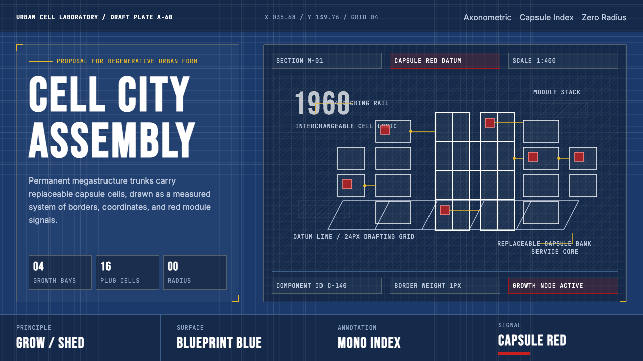 Metabolism Tokyo (1960)Cities become diagrams. Blueprint blue, mono labels, and capsule red mark mod…城市成为图纸:蓝图底、等宽标注与胶囊红,标记模块生长。
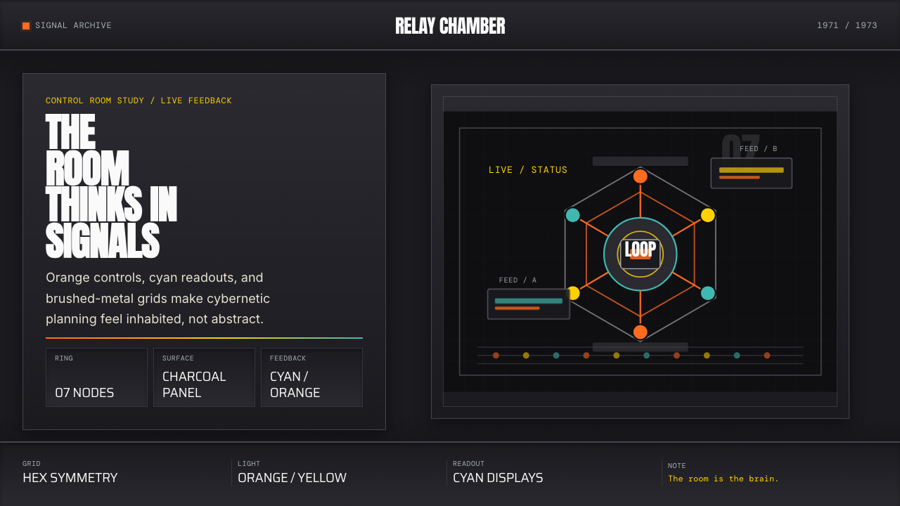 Cybernetic 1968 (Stafford Beer)Mission-control severity. Charcoal panels, orange buttons, cyan readouts, hex…控制室般冷峻。炭黑面板、橙按钮、青读数与六边环形。
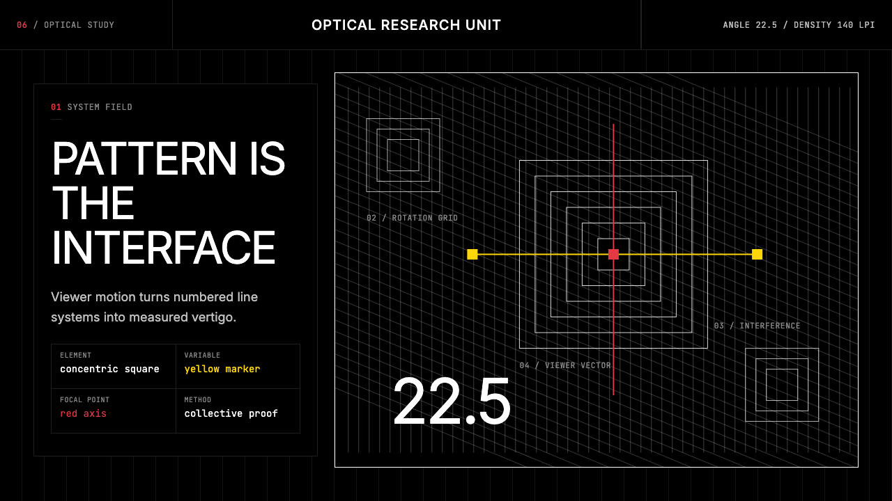 GRAV Op-Kinetic (1960)Vertigo by calculation. White line fields on black, with red and yellow as co…以计算制造眩晕。黑底白线场中,红与黄是受控变量。
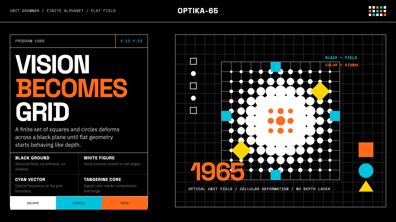 Hungarian Vasarely Op Art (1965)Mathematics makes vision pulse. Black grids, white units, cyan and tangerine…数学让视觉脉动:黑底白格与青橘单元扭曲深度。
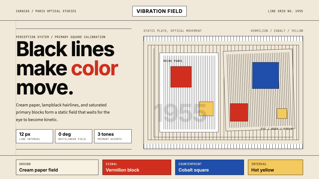 Jesús Soto Kinetic Art (Venezuela)Perception is the medium. Cream ground, black-line grids, and primary squares…观看即媒介。奶白底、黑线栅格与三原色方块制造震颤。
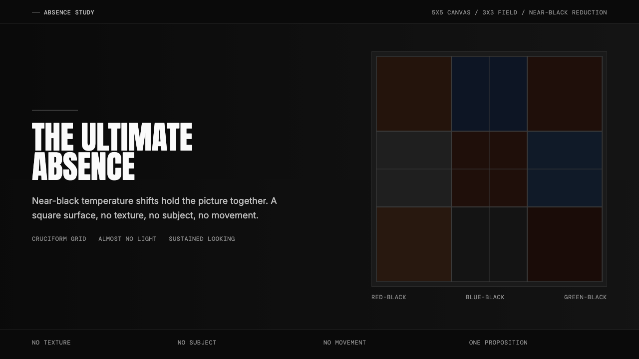 Ad Reinhardt Black Painting (1953)Austere absence. Near-black grid shifts reveal structure on sustained looking.苦行式缺席。近黑网格只在持续凝视中显形。