What is Jesús Soto Kinetic Art (Venezuela)?什么是 Jesús Soto Kinetic Art (Venezuela)?
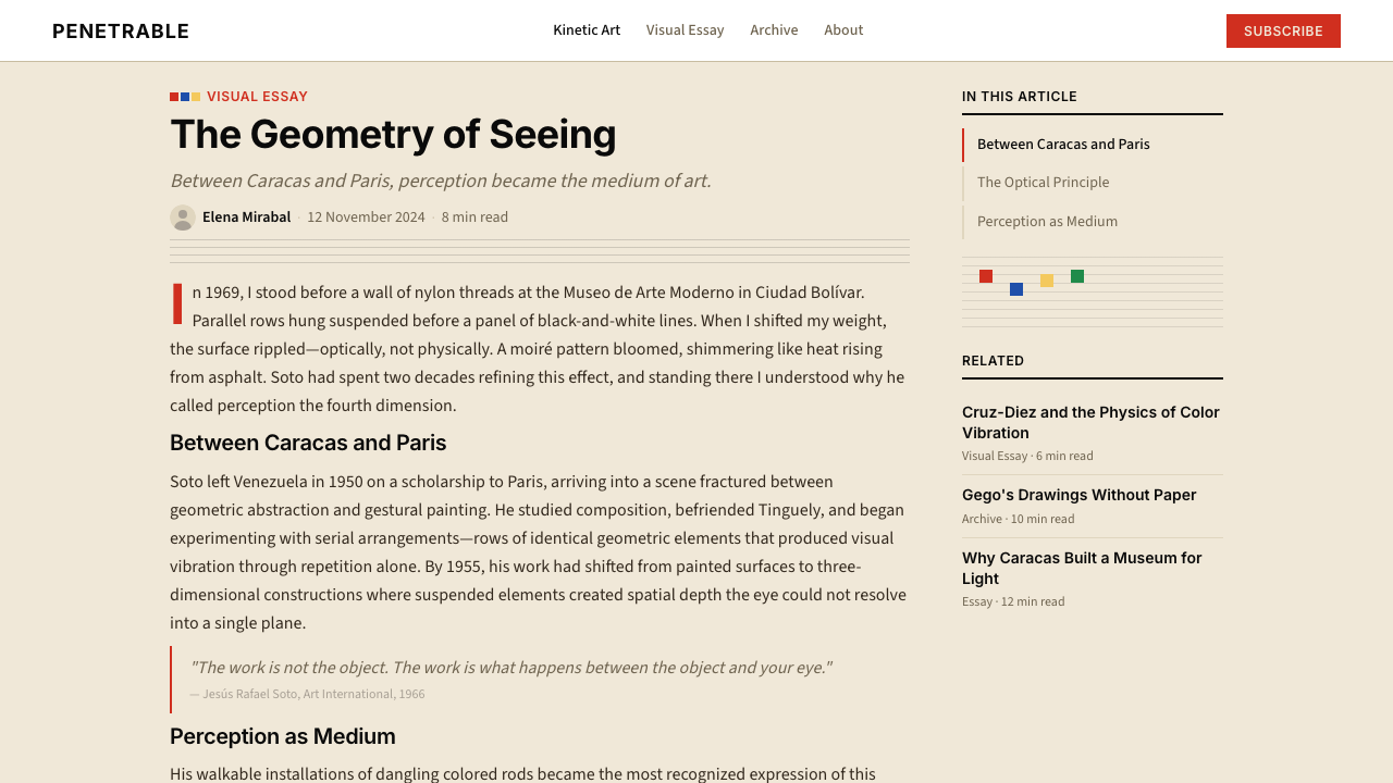
Jesús Rafael Soto discovered that parallel lines and hovering color squares could make a static surface tremble — handing the act of perception itself back to the viewer.胡苏斯·拉斐尔·索托发现,平行线条与悬浮的彩色方块能让静止的表面颤动——他把感知这一行为本身还给了观看者。
Jesús Soto Kinetic Art (Venezuela) in briefJesús Soto Kinetic Art (Venezuela) 速览
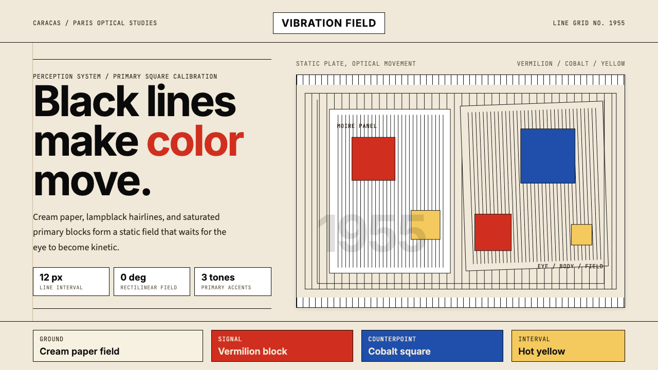
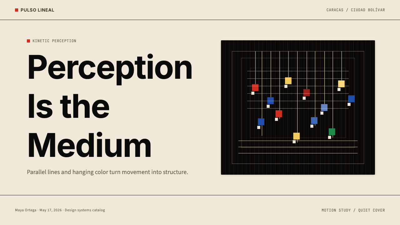
Jesús Soto Kinetic Art is a visual discipline rooted in the work of Venezuelan artist Jesús Rafael Soto (1923–2005), who spent his career exploring how optical phenomena — moiré shimmer, figure-ground ambiguity, perceptual vibration — could be produced through the disciplined arrangement of simple geometric elements. The system rests on a cream or off-white ground, over which crisp parallel black lines are spaced with mathematical regularity. Against this ruled field, saturated squares or rectangles in vermilion, cobalt, and hot yellow are positioned so that the viewer's slightest movement across the surface generates the sensation of motion in the lines themselves.索托动态艺术是一套根植于委内瑞拉艺术家胡苏斯·拉斐尔·索托(1923—2005年)作品的视觉体系。索托毕生探索光学现象——摩尔纹微光、图底模糊、感知震颤——如何能够仅凭简单几何元素的严格排列而产生。这套体系以奶白色或米白色为底,在其上以数学化的规律间距铺陈纯黑细平行线,构成「百叶幕」式的底层肌理;随后,朱红、钴蓝、明黄三种饱和原色的方块或矩形被定点放置,使观看者身体的最细微移动就能在线条中激发运动的感觉。
The aesthetic language is one of extreme economy. There are no representational images, no illustrative flourishes, and no decorative interruptions to the grid. Color is restricted to the three primary saturated hues plus black and the warm neutral of the ground; every element earns its place through perceptual function rather than compositional embellishment. The result is work that feels simultaneously mathematical and alive — governed by strict rules yet genuinely responsive to the body and eye of whoever stands before it.这套视觉语言以极度经济为特征:没有具象图像,没有装饰性点缀,没有打断网格的多余元素。色彩严格限定于三种饱和原色加黑色,以及底面的暖中性色;每个元素都以感知功能而非构图美化作为存在的理由。结果是一种既像数学又像生命的作品——被严格规则所主导,却真实地回应站在其前的观看者的身体与目光。
As a design system, Soto's kinetic vocabulary translates into layouts that pair fine ruled patterns with bold primary-color accents at calibrated intervals. The effect is modernist and rigorous, evoking the Latin American engagement with European abstraction while remaining visually distinct from both mid-century Swiss typography and the decorative surface of folk-influenced design. It is a style that signals intellectual seriousness, perceptual curiosity, and a distinctly Venezuelan strand of international modernism.作为一套设计系统,索托动态词汇转化为将细线规律图案与大胆原色强调以精确间距配对的版面。效果是现代主义式的、严谨的,既唤起拉丁美洲与欧洲抽象主义的对话,又在视觉上有别于中世纪瑞士字体排印和民间装饰风格。这是一种传达智识严肃性、感知好奇心,以及委内瑞拉在国际现代主义中独特位置的设计语言。
See the Jesús Soto Kinetic Art (Venezuela) design system查看 Jesús Soto Kinetic Art (Venezuela) 完整设计系统
Where does Jesús Soto Kinetic Art (Venezuela) come from?Jesús Soto Kinetic Art (Venezuela) 从何而来?
Jesús Rafael Soto was born in 1923 in Ciudad Bolívar, Venezuela — a provincial river city far removed from the artistic centers of Caracas or Paris. He received his early training at the Escuela de Artes Plásticas y Artes Aplicadas de Caracas in the late 1940s, where he encountered both classical instruction and, crucially, reproductions of European modernism: Mondrian's grids, Malevich's geometric reductions, the Constructivist insistence on the social potential of abstract form. In 1950, awarded a government scholarship, he left for Paris — a city in the early 1950s that functioned as a crossroads of kinetic, optical, and concrete art.胡苏斯·拉斐尔·索托1923年生于委内瑞拉玻利瓦尔城——一座远离加拉加斯或巴黎艺术中心的省级河滨城市。他于1940年代末在加拉加斯造型与应用艺术学校接受早期训练,在那里接触到古典教学,以及至关重要的欧洲现代主义复制品:蒙德里安的网格、马列维奇的几何简化、构成主义对抽象形态社会潜能的坚持。1950年,凭借政府奖学金,他启程前往巴黎——1950年代初期,那里正是动态艺术、光学艺术与具体艺术的交汇路口。
In Paris, Soto encountered Victor Vasarely, whose systematic optical research was already generating the visual phenomena that would later be named Op Art. He became part of a loose community that included Julio Le Parc, Jean Tinguely, and Yves Klein, artists committed to dematerializing the art object and implicating the viewer's body in the work's completion. Soto's particular contribution was to investigate the space between a painted or drawn surface and a layer suspended in front of it — wires, rods, or translucent screens — discovering that this gap, when traversed by the eye, produced vivid perceptual oscillation. His early Superpositions (mid-1950s) were among the first works to demonstrate this principle systematically.在巴黎,索托结识了维克多·瓦萨雷利——其系统性光学研究已在产生后来被称为欧普艺术的视觉现象。索托融入了一个松散的艺术家群体,成员包括胡里奥·勒·帕克、让·丁格利和伊夫·克莱因,这些艺术家致力于使艺术对象非物质化,并将观看者的身体纳入作品的完成之中。索托的独特贡献在于探究一个绘制或描绘的表面与其前方悬置层之间的空间——铁丝、悬杆或半透明屏幕——发现当目光穿越这一间隙时,会产生生动的感知震荡。他1950年代中期的早期《叠置》系列(Superpositions)是最早系统性演示这一原理的作品之一。
In 1955, Soto participated in the landmark exhibition Le Mouvement at Galerie Denise René in Paris — a show that brought together Vasarely, Calder, Duchamp, Tinguely, and others under the rubric of kinetic art, and that is now regarded as the founding moment of the international kinetic movement. The exhibition established that motion in art need not be mechanical; perceptual motion — the shimmer activated in the viewer's nervous system by optical means — was equally valid and in some ways more radical, because it relocated the seat of the work's animation from the object to the observer.1955年,索托参加了巴黎丹尼丝·勒内画廊的里程碑式展览《运动》(Le Mouvement)——这场展览将瓦萨雷利、卡尔德、杜尚、丁格利等人汇聚于动态艺术的旗帜下,现被视为国际动态艺术运动的奠基时刻。展览确立了艺术中的运动不必依赖机械装置:感知运动——由光学手段在观看者神经系统中激活的微光震颤——同样有效,在某些方面更为激进,因为它将作品动态的发生地从对象转移到了观察者本身。
Through the 1960s and 1970s, Soto's international reputation grew steadily, while his connection to Venezuela deepened. He exhibited at the Venice Biennale and at major museums across Europe and the Americas. In 1973, the Museo Jesús Soto opened in Ciudad Bolívar — designed by Carlos Raúl Villanueva, the architect responsible for the modernist synthesis of the Universidad Central de Venezuela campus — making Soto's hometown a destination for the study of kinetic and abstract art in Latin America. His large-scale Penetrables — room-sized installations of hanging colored rods through which visitors physically walked — brought his perceptual philosophy to its most democratic conclusion: the artwork as an environment that the public body enters, not an object the educated eye contemplates from a respectful distance.整个1960至1970年代,索托的国际声誉稳步上升,同时他与委内瑞拉的联结也愈发深厚。他在威尼斯双年展以及欧美各大博物馆举办展览。1973年,索托博物馆在玻利瓦尔城落成——由卡洛斯·劳尔·比利亚努埃瓦设计(他也是委内瑞拉中央大学现代主义综合校园的建筑师)——将索托的故乡变为拉丁美洲研究动态与抽象艺术的圣地。他大型的《可穿透》装置(Penetrables)——观众可以在其中行走的悬挂彩色杆件房间——将他的感知哲学推向最民主的结论:艺术作品作为公众身体进入其中的环境,而非受过教育的目光从礼貌距离外凝视的对象。
What defines the Jesús Soto Kinetic Art (Venezuela) look?Jesús Soto Kinetic Art (Venezuela) 的视觉特征是什么?
Ground and Field底面与场域
The foundation is always a warm neutral — cream, off-white, or a pale ivory — never a cold bright white. Against this ground, fine parallel black lines are drawn at mathematically regular intervals, creating what Soto called a vibrating field. The density of the lines determines the intensity of the optical effect: tighter spacing produces a more agitated shimmer, wider spacing a calmer, more architectural quality. The ruled field is not ornament; it is the perceptual substrate from which all other effects arise.底面永远是温暖的中性色——奶油、米白或浅象牙色——绝非冷白。在这个底面上,纤细的黑色平行线以数学化的规则间距排列,形成索托所称的「震颤场域」。线条的密度决定光学效果的强度:间距越紧,微光震颤越激烈;间距越宽,效果越平静、越具建筑质感。这片规则场域不是装饰,而是所有其他效果从中升起的感知基底。
Primary Color Accents原色点彩
Saturated squares or rectangles in three primary hues — a hot vermilion, a deep cobalt blue, and a sharp cadmium yellow — are placed at calibrated intervals across the ruled ground. The placement is not decorative but structural: each color block is positioned so that its edges conflict with the underlying line pattern, generating perceptual tension at the boundary. Color is never gradated, blended, or modulated in saturation; it is flat, decisive, and fully committed.朱红、深钴蓝、锐镉黄三种饱和原色的方块或矩形以精确的间距点布于规则底面之上。放置不是装饰性的,而是结构性的:每个色块的定位使其边缘与下方线条图案形成冲突,在边界处产生感知张力。色彩从不渐变、混合或调节饱和度——它是平整的、果断的、毫无保留的。
Optical Vibration光学震颤
The defining quality of the system is the moiré effect — an apparent shimmer or movement that occurs when two regular patterns interfere with each other, or when a viewer's eye moves across a high-contrast ruled surface. In Soto's original works, this was enhanced by physically layering transparent screens or hanging rods in front of a painted panel. In the design system, it is achieved through the juxtaposition of fine-line patterns with high-contrast color blocks, so that even on a static screen or printed surface, the composition registers as perceptually alive.这套体系最核心的品质是摩尔纹效应——当两种规则图案相互干涉,或当观看者的眼睛在高对比度规则表面上移动时,产生的明显微光或运动感。在索托的原作中,这通过在画面前方物理叠置透明屏幕或悬挂杆件来强化。在设计系统中,这通过细线图案与高对比度色块的并置来实现,使得即便在静止的屏幕或印刷表面上,构图也呈现出感知上的生动感。
Strict Rectilinear Geometry严格直角几何
Every element is orthogonal. Color blocks are squares or rectangles with sharp, unrounded corners. Lines are horizontal or vertical, never diagonal or curved. The compositional language admits no organic forms, no fluid curves, and no softened edges. This absolute commitment to the right angle and the parallel line is not stylistic preference but structural necessity: the optical effects the system produces depend on the regularity and precision of its geometric vocabulary.所有元素都是正交的。色块是角部锐利、毫无圆角的正方形或矩形。线条是水平或垂直的,绝不倾斜或弯曲。构图语言不允许任何有机形态、流动曲线或柔化边缘。对直角和平行线的绝对坚持不是风格偏好,而是结构必要性:这套体系所产生的光学效果依赖于其几何词汇的规律性与精确性。
Modernist Sans-Serif Typography现代主义无衬线字体排印
Text in the system is set in geometric or humanist sans-serif letterforms — typefaces that share the movement's commitment to structural reduction and visual clarity. Type is used with deliberate hierarchy: titles are set at markedly larger scales than body text, with weight and size doing the organizational work rather than decorative rules or ornamental borders. Typographic color — the overall darkness or lightness of a block of text — is kept consistent with the flat, high-contrast visual logic of the rest of the composition.系统中的文字使用几何型或人文主义无衬线字形排版——这类字体与该运动对结构简化和视觉清晰的追求相契合。字体排版以刻意的层级运作:标题比正文大出明显的比例,以字重与尺寸承担组织工作,而非依赖装饰性线条或边框。排版色调——文字块的整体深浅——与构图其余部分平整、高对比度的视觉逻辑保持一致。
Mathematical Spacing数学化间距
Intervals between lines, between color blocks, and between typographic elements are governed by proportional systems rather than intuitive judgment. The spacing is never arbitrary; it is derived from the same underlying module that determines the line density and color block scale. This mathematical regularity is perceptible even when the specific ratios are not consciously analyzed: the composition reads as ordered, disciplined, and internally consistent.线条之间、色块之间、排版元素之间的间距由比例系统而非直觉判断主导。间距从不随意,它源自决定线条密度和色块尺度的同一底层模数。这种数学规律性即便在具体比例未被有意分析时也可被感知:构图呈现出有序、自律、内部一致的气质。
Flatness and Zero Simulation平面性与零模拟
Despite producing vivid perceptual depth and apparent motion, the system's elements are rigorously flat. There are no soft shadows, no gradients, no textured surfaces, and no simulated three-dimensionality beyond the optical effects inherent in the line-and-color interaction. Apparent depth arises from the optical phenomenon, not from rendering conventions. This distinction is important: the system produces real perceptual effects through genuine structural logic, not through decorative imitation of depth.尽管产生了生动的感知深度和明显的运动感,这套体系的元素严格地是平面的。没有柔和阴影,没有渐变,没有纹理表面,除了线条与色彩相互作用所固有的光学效果之外,没有任何模拟的三维感。表面深度来自光学现象,而非渲染惯例。这一区别至关重要:该体系通过真实的结构逻辑产生真实的感知效果,而非通过对深度的装饰性模仿。

See the Jesús Soto Kinetic Art (Venezuela) design system查看 Jesús Soto Kinetic Art (Venezuela) 完整设计系统
Who shaped Jesús Soto Kinetic Art (Venezuela)?谁塑造了 Jesús Soto Kinetic Art (Venezuela)?
Soto is the originating figure of the entire system. Born in Ciudad Bolívar in 1923, he trained in Caracas before moving to Paris in 1950, where he became a central figure in the international kinetic art movement. His Superpositions series of the mid-1950s established the core principle — layering a transparent ruled screen over a painted ground to produce optical shimmer — that would define his practice for five decades. His large-scale Penetrable installations, begun in the 1960s and continued until his death in 2005, invited the public to walk through fields of hanging colored rods, transforming kinetic perception into a fully embodied social experience. The Museo Jesús Soto, opened in his hometown in 1973, remains the definitive institutional repository of his work.索托是这整套体系的奠基人物。他1923年生于玻利瓦尔城,在加拉加斯接受训练后于1950年移居巴黎,成为国际动态艺术运动的核心人物。1950年代中期的《叠置》系列确立了其核心原理——在绘制底面上叠置透明规则屏幕以产生光学微光——这一原理定义了他长达五十年的创作实践。从1960年代开始、延续至2005年辞世的大型《可穿透》装置邀请公众穿行于悬挂彩色杆件的场域之中,将动态感知转化为完全身体化的社会体验。1973年在他故乡落成的索托博物馆至今仍是其作品最权威的机构收藏地。
Cruz-Diez (1923–2019), born in Caracas in the same year as Soto, pursued a parallel investigation into color and perception that became known as Physichromie — the study of how adjacent color strips create autonomous color sensations independent of any fixed pigment. He worked primarily in Paris from the late 1950s onward, and his large-scale public installations — chromatic environments applied to floors, streets, and airport terminals — brought kinetic color principles into everyday civic life. Together with Soto, he established the Latin American kinetic school as a serious international force rather than a regional curiosity.克鲁兹-迭斯(1923—2019年),与索托同年生于加拉加斯,对色彩与感知展开了平行探索,发展出被称为「物理色彩学」(Physichromie)的研究——探究相邻色彩条带如何产生独立于任何固定颜料的自主色彩感知。他从1950年代末起主要在巴黎工作,其大型公共装置——应用于地板、街道和机场航站楼的色彩环境——将动态色彩原则带入日常公民生活。他与索托共同将拉丁美洲动态艺术学派确立为严肃的国际力量,而非地区性的好奇现象。
Gego (1912–1994) was a German-Venezuelan artist who, after fleeing Nazi Germany in 1939, built one of the most distinctive bodies of work in Latin American modernism. Her Reticuláreas — large-scale wire mesh installations suspended from ceilings — created immersive spatial environments whose visual complexity emerged from the interaction of simple repeated elements rather than from decorative intention. Though her vocabulary was more organic than Soto's strict orthogonals, she shared his commitment to the line as a primary constructive element and to the idea that the artwork's meaning is completed in the perceptual encounter between object and viewer.Gego(1912—1994年),德裔委内瑞拉艺术家,1939年逃离纳粹德国后,在拉丁美洲现代主义中建立了最具特色的创作体系之一。她的《网状体》系列——从天花板悬挂的大型金属丝网装置——创造了沉浸式空间环境,其视觉复杂性来自简单重复元素的相互作用,而非装饰意图。尽管她的词汇比索托严格的正交线条更具有机性,她与他共享同一信念:线条是首要的建构元素,而作品的意义在对象与观看者的感知相遇中得以完成。
Alejandro Otero (1921–1990) was a Venezuelan painter and sculptor whose Coloritmos series — vertical canvases divided into bands of alternating colors — investigated the rhythm of color in ways that ran parallel to, and often in dialogue with, Soto's line experiments. A key figure in the Los Disidentes group, which challenged academic art in Venezuela during the late 1940s, Otero subsequently developed monumental polychrome sculptures for Venezuelan public spaces. His career demonstrates the breadth of Venezuelan geometric abstraction beyond kinetic art strictly defined.亚历杭德罗·奥特罗(1921—1990年),委内瑞拉画家与雕塑家,其《色彩节奏》系列——被交替色彩条带分隔的竖向画布——以与索托线条实验平行、且常常构成对话的方式探索色彩的节奏。作为1940年代末挑战委内瑞拉学院派艺术的「异见者」群体(Los Disidentes)的核心人物,奥特罗此后为委内瑞拉公共空间发展出大型多色雕塑。他的职业生涯展示了严格意义上的动态艺术之外委内瑞拉几何抽象的广度。
Though Hungarian-French rather than Venezuelan, Victor Vasarely (1906–1997) was the central figure in the European context into which Soto inserted himself upon arriving in Paris. Vasarely's systematic optical research — creating illusions of depth, curvature, and movement through flat geometric pattern — provided both inspiration and a point of distinction for Soto, who developed the physically layered dimension that Vasarely's purely painted surfaces could not achieve. Vasarely's 1955 Yellow Manifesto, published to coincide with Le Mouvement exhibition, argued for the public and collective character of kinetic art, a democratic ambition that Soto would carry further with his Penetrables.尽管是匈牙利裔法国人而非委内瑞拉人,维克多·瓦萨雷利(1906—1997年)是索托抵达巴黎后所嵌入的欧洲语境中的核心人物。瓦萨雷利系统性的光学研究——通过平面几何图案制造深度、曲率和运动的幻觉——既为索托提供了启发,也成为他的参照点:索托发展出了纯绘制表面所无法达到的物理叠置维度。瓦萨雷利于1955年为配合《运动》展览发表的《黄色宣言》,主张动态艺术的公共性与集体性——这一民主抱负将被索托通过《可穿透》装置推向更远。
How do you use Jesús Soto Kinetic Art (Venezuela) today?今天怎么用 Jesús Soto Kinetic Art (Venezuela)?
Applying the Soto kinetic vocabulary to designed work requires understanding that its power comes from systematic tension — between the regularity of the line field and the interruption of the color accent, between geometric order and perceptual animation. Simply placing primary-color rectangles over a striped background is not the system; the system is the calibrated relationship between those elements, in which spacing, proportion, and color saturation are all working together to produce a specific perceptual effect. Getting this right demands restraint: fewer color accents placed with more deliberate intent will always outperform a layout saturated with competing elements.将索托动态词汇应用于设计作品,需要理解其力量来自系统性张力——线条场域的规律性与色彩点彩的打断之间,几何秩序与感知动态之间的张力。仅仅在条纹背景上放置原色矩形并非这套体系;这套体系是那些元素之间经过精心校准的关系,其中间距、比例和色彩饱和度共同作用,产生特定的感知效果。做到这一点需要克制:以更审慎意图放置的更少色彩强调,永远优于充斥着相互竞争元素的版面。
For presentation slides, the system is particularly effective on cover pages and section dividers. A cover benefits from a single dominant color block — occupying a precise fraction of the composition — set against the ruled neutral ground, with the title in a modernist sans-serif at high contrast. Content slides should strip back to the line field alone as background texture, letting data and text occupy clean zones without competing with the optical complexity of multiple color blocks. Data visualization slides — bar charts, comparative matrices, timeline diagrams — work naturally within this vocabulary: geometric chart elements become extensions of the color system, with one primary hue used for the dominant data series and the ground's ruled pattern providing implicit structure.在演示文稿中,这套体系在封面页和章节分隔页上尤为有效。封面适合采用单一主导色块——占据构图的精确比例——置于规则中性底面上,标题以现代主义无衬线字体高对比度呈现。内容页应将线条场域仅作为背景肌理,让数据和文字占据清晰区域,不与多个色块的光学复杂性相竞争。数据可视化幻灯片——柱状图、对比矩阵、时间线图——天然契合这套词汇:几何图表元素成为色彩系统的延伸,以一种原色用于主要数据系列,底面的规则图案提供隐性结构。
For web interfaces, the style suits contexts where analytical authority and perceptual engagement are both valued: dashboards, digital exhibition catalogs, portfolio sites for design and architecture practices, and pricing or feature comparison pages. Apply the ruled ground as a subtle interface texture — light enough to read clearly beneath content, strong enough to register as a deliberate design decision. Reserve the primary-color blocks for high-signal interface elements: active states, primary calls to action, or tier-differentiating badges. All type should follow the same orthogonal logic as the visual field: flush-left alignment, consistent hierarchy defined by scale and weight, no centered or decorative typographic arrangements.对于网页界面,这种风格适合分析权威性与感知参与性同时被重视的场景:仪表板、数字展览目录、设计与建筑事务所的作品集网站,以及定价或功能对比页面。将规则底面应用为微妙的界面肌理——轻到在内容下方清晰可读,又强到作为刻意设计决策被感知。将原色块保留给高信号界面元素:活跃状态、主要行动号召或等级区分标签。所有文字应遵循与视觉场域相同的正交逻辑:左对齐、以尺度和字重定义的一致层级,没有居中或装饰性的排版安排。
For editorial and marketing contexts, the Soto vocabulary supports strong poster-logic layouts where a bold primary accent and a ruled field do the organizational work that photography or illustration might do in other styles. A single large color block anchors the composition; the title sits either within or in high contrast above it; body copy occupies a disciplined column with generous spacing that echoes the regularity of the line intervals. Marketing pages benefit from alternating full-width blocks — cream-ruled and solid-primary — that create rhythm without requiring visual embellishment. The key discipline is color restraint: each composition should commit to one primary color as dominant and use the other two sparingly, if at all.对于编辑与营销场景,索托词汇支持强烈的海报逻辑版面,其中大胆的原色强调与规则场域承担着其他风格中摄影或插图所承担的组织工作。单一大型色块锚定构图;标题置于其内部或以高对比度置于其上方;正文占据一个有规律间距的严格文字栏,呼应线条间距的规律性。营销页面受益于奶白规则与纯原色全宽区块的交替——这样创造节奏,无需视觉装饰。关键纪律是色彩克制:每个构图应以一种原色为主导,其余两种谨慎使用,或完全不用。
A common mistake is treating the ruled ground as wallpaper — applying the line pattern everywhere at the same density and then layering content on top without regard for the perceptual effects the lines create. Authentic use of this vocabulary requires treating the line field as an active compositional element, not a passive background. Where the ruled pattern is dense, color accents should be few and deliberate; where color blocks dominate, the line pattern can recede to a subtler interval. Similarly, the system breaks down when rounded corners, soft drop shadows, or gradient fills are introduced — these conventions belong to a different visual logic and will neutralize the optical tension that gives the style its character.一个常见错误是将规则底面当作壁纸——在各处以相同密度应用线条图案,然后不考虑线条所产生的感知效果而直接在上方叠加内容。对这套词汇的真实运用要求将线条场域视为主动的构图元素,而非被动的背景。规则图案密集的地方,色彩强调应少而审慎;色块主导的地方,线条图案可以退为更细腻的间距。同样,当圆角、柔和投影或渐变填充被引入时,这套体系就会崩溃——这些惯例属于不同的视觉逻辑,会中和赋予这种风格其特质的光学张力。
See the Jesús Soto Kinetic Art (Venezuela) design system查看 Jesús Soto Kinetic Art (Venezuela) 完整设计系统
Jesús Soto Kinetic Art (Venezuela) — FAQJesús Soto Kinetic Art (Venezuela) · 常见问题
What is the difference between kinetic art and Op Art, and which category does Soto belong to?动态艺术和欧普艺术有什么区别?索托属于哪一类?
Kinetic art refers broadly to art that incorporates actual or apparent movement — this includes both physically moving works (like Calder's mobiles or Tinguely's machines) and works that produce the perceptual sensation of movement through optical means. Op Art (Optical Art) is the latter category specifically: flat, static works that generate apparent movement, depth, or vibration in the viewer's visual system through the systematic use of pattern, contrast, and color. Soto's work belongs to both traditions. His early Superpositions and his Penetrable installations are kinetic in a physical sense — they involve actual spatial layering and viewer movement. His flat painted works, where the shimmer is produced entirely by the optical interaction of lines and colors, are Op Art. The most interesting of his works are those that occupy both categories simultaneously.动态艺术泛指融入真实或表面运动的艺术——包括物理运动作品(如卡尔德的活动雕塑或丁格利的机械装置)和通过光学手段产生运动感知的作品。欧普艺术(光学艺术)专指后一类:平面静止作品,通过系统性地运用图案、对比和色彩,在观看者的视觉系统中产生表面上的运动、深度或震颤。索托的作品同属两个传统。他早期的《叠置》系列和《可穿透》装置在物理意义上是动态的——涉及真实的空间叠置和观看者的身体移动。他的平面绘画作品中,微光完全由线条与色彩的光学相互作用产生,则是欧普艺术。他最有趣的作品是那些同时占据两个类别的作品。
Can this style work on dark backgrounds, or does it require a light ground?这种风格能用在深色背景上吗?还是必须用浅色底面?
The historic Soto palette is fundamentally light-ground — cream and off-white are canonical, and most of his works exploit the warm neutrality of the paper or canvas ground as an active compositional element. A dark-ground inversion is possible but requires significant adjustment. On a black or very dark ground, the optical effects of the ruled line pattern become more aggressive — the shimmer intensifies and can tip into visual discomfort rather than perceptual animation. Primary yellow on black, in particular, creates a contrast so sharp that it dominates all other elements. A successful dark variant usually reduces line density, uses only one primary color as accent, and commits to either a dark-ruled ground or solid dark zones with the ruled pattern appearing only as highlight or border detail.索托的历史色板根本上是浅色底面的——奶油色和米白色是经典形态,他的大多数作品将画纸或画布底面的温暖中性色作为主动构图元素来利用。深色底面的反转是可能的,但需要重大调整。在黑色或非常深的底面上,规则线条图案的光学效果变得更具攻击性——震颤强度上升,可能从感知动态倒向视觉不适。原色黄在黑色上产生的对比度极为尖锐,会主导所有其他元素。成功的深色变体通常会降低线条密度,只使用一种原色作为强调,并专注于深色规则底面,或让规则图案仅作为高光或边框细节出现在实色深色区域中。
How does the Soto style differ from Bauhaus and Swiss International Style?索托风格与包豪斯和瑞士国际主义风格有何不同?
All three share geometric abstraction and a commitment to primary colors, but their logic and purpose differ substantially. Bauhaus is a didactic and ideological system — its visual language emerged from specific pedagogical principles and social ambitions, and its geometry is in service of functionalist arguments about designed objects. Swiss International Style is a typographic and gridding discipline — it systematized geometric principles into a reproducible corporate communication standard with an emphasis on rational information hierarchy. Soto's kinetic vocabulary, by contrast, is perceptual in its primary orientation: the geometry and color are not in service of legibility, communication hierarchy, or ideological argument — they are structured to produce a specific optical and psychological experience in the viewer. This distinction matters practically: Bauhaus and Swiss layouts are primarily about organizing information; a Soto-derived layout is also about creating an experience of visual attention and perceptual aliveness.三者都拥有几何抽象和对原色的承诺,但其逻辑与目的有实质性区别。包豪斯是一套教导性和意识形态性的体系——其视觉语言源自特定的教学原则和社会抱负,几何服务于关于设计对象的功能主义论证。瑞士国际主义风格是一套字体排印与网格规范——它将几何原则系统化为可复制的企业传播标准,强调理性信息层级。索托的动态词汇则以感知为其首要取向:几何与色彩不是为了易读性、传达层级或意识形态论证而服务——它们的结构目的是在观看者身上产生特定的光学与心理体验。这一区别在实践中很重要:包豪斯和瑞士风格的版面首要是组织信息;索托衍生的版面同时还要创造视觉专注和感知生动性的体验。
Is this an appropriate style for technology or software products?这种风格适合科技或软件产品吗?
It is appropriate for specific kinds of technology products, but not universally. The style works well for products that want to signal perceptual intelligence, analytical depth, or a distinctive European-influenced modernist identity — data visualization platforms, computational design tools, digital art infrastructure, or a studio positioning itself at the intersection of art and technology. It is less well suited to general consumer software, mobile applications where the primary interface paradigm is touch and speed, or enterprise software where familiar convention reduces cognitive load. The key test is whether perceptual engagement — the slight friction and fascination that the optical effects produce — is an asset or a liability for the product's use context.它适合特定类型的科技产品,但并非普遍适用。这种风格适合希望传达感知智识、分析深度或独特欧洲影响现代主义身份的产品——数据可视化平台、计算设计工具、数字艺术基础设施,或将自身定位于艺术与科技交汇处的工作室。它不太适合通用消费者软件、触控与速度是主要界面范式的移动应用,或熟悉惯例能减少认知负荷的企业软件。关键测试是:感知参与——光学效果所产生的轻微摩擦感与迷人感——对该产品的使用场景是资产还是负债。
How do I avoid making a Soto-inspired layout look merely like a generic geometric pattern?如何避免让索托风格的版面仅仅看起来像一个普通的几何图案?
The distinction between a Soto-derived composition and a generic geometric background lies in the purposeful calibration of tension. In an authentic application of this vocabulary, the line field and the color accents are in active relationship — the color block is placed where it most effectively disrupts the regularity of the lines, creating a localized zone of intensified optical activity. A generic geometric pattern treats the repeated element as wallpaper; a kinetic composition treats it as a force field whose properties change depending on what is placed within or against it. Practically, this means committing to precise placement decisions, maintaining severe restraint on the number of color accents, and ensuring that every color block earns its position through perceptual effect rather than decorative symmetry.索托衍生构图与普通几何背景之间的区别,在于张力的有目的校准。在对这套词汇的真实应用中,线条场域与色彩强调处于主动关系之中——色块被放置在最有效地打断线条规律性的位置,创造局部化的强化光学活动区域。普通几何图案将重复元素当作壁纸处理;动态构图将其当作一个力场,其属性随放置在其内部或对立面的元素而变化。在实践中,这意味着对精确的位置决策保持承诺,对色彩强调的数量保持严格克制,并确保每个色块通过感知效果而非装饰对称性来赢得其位置。
Related design styles相关设计风格
 Penrose Aperiodic TilingAperiodic rigor, warmed. Cream grid carries cobalt, emerald and hot-yellow ki…非周期理性被暖化:米色网格托起钴蓝、翠绿与热黄风筝飞镖。
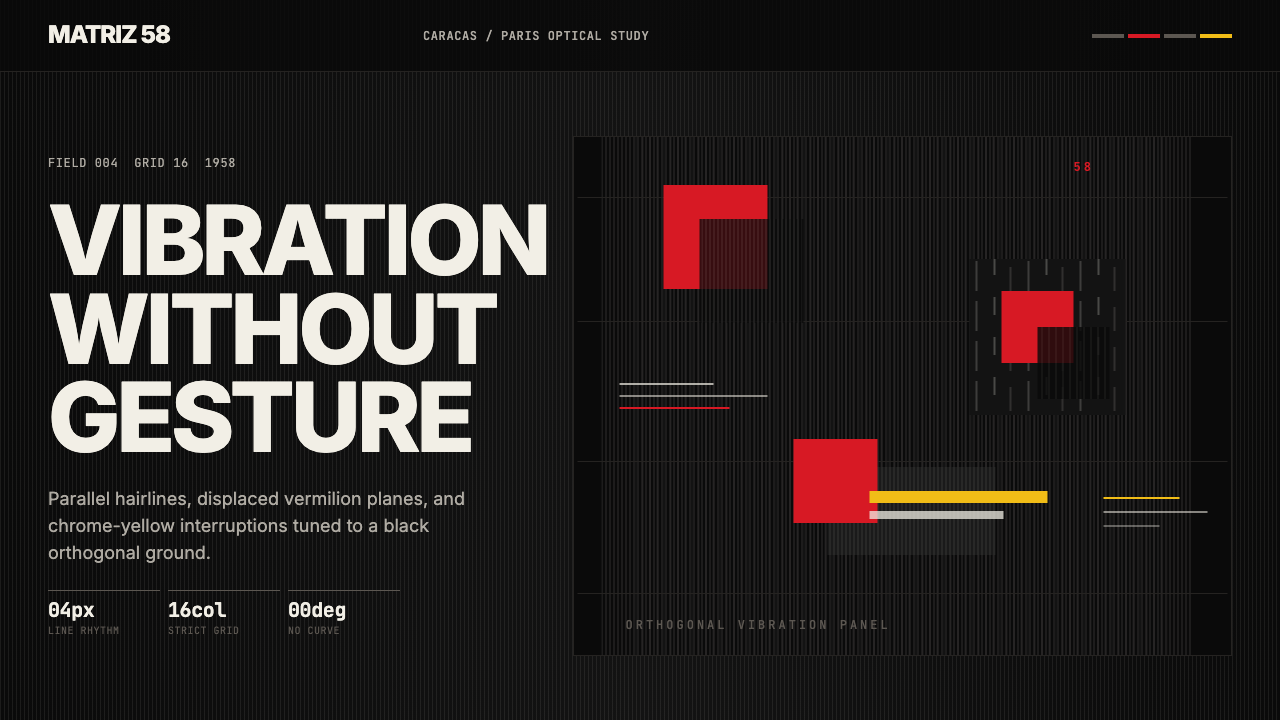 Venezuelan Cinético Soto 1958Optical tension holds still. Matte black, Inter, hairlines, and vermilion off…静止的光学张力:哑黑底、Inter、发丝线与朱红位移共同震颤。
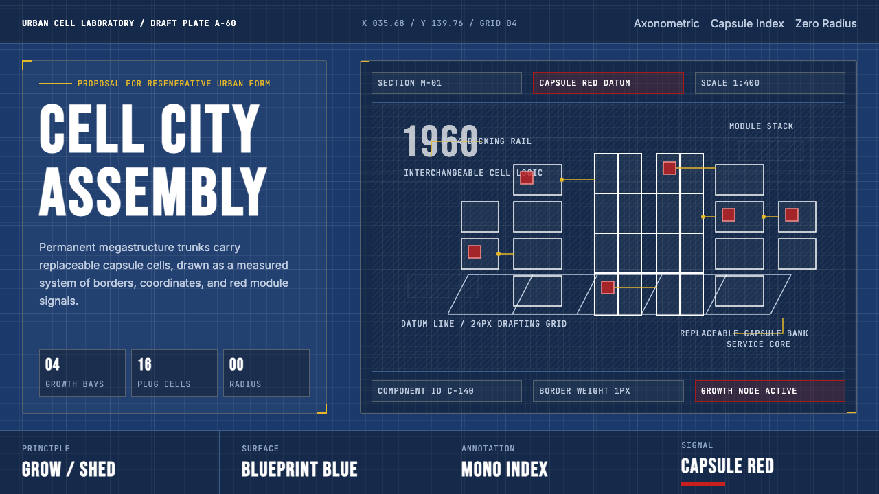 Metabolism Tokyo (1960)Cities become diagrams. Blueprint blue, mono labels, and capsule red mark mod…城市成为图纸:蓝图底、等宽标注与胶囊红,标记模块生长。
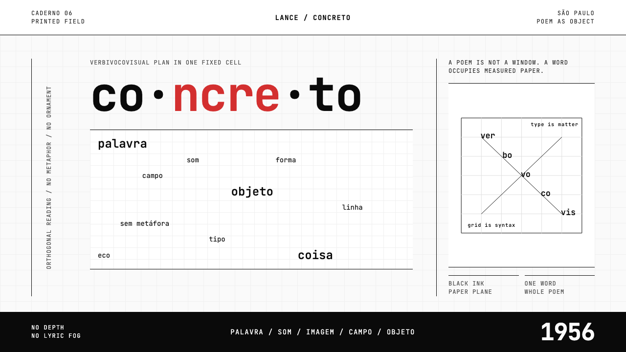 Brazilian Concrete PoetryWords become objects. Monospace cells, black-white paper, one cadmium red rup…字成为物。等宽格、黑白纸面,一处镉红断裂。
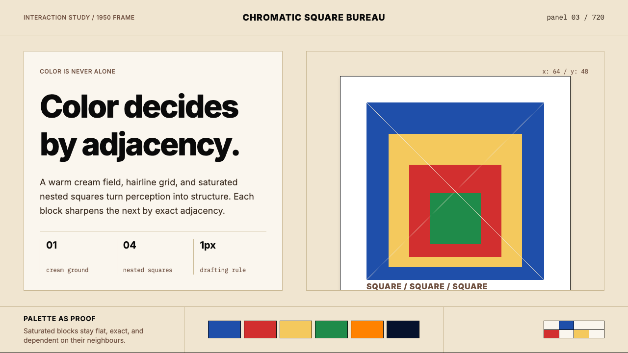 Josef Albers — Homage to the SquareColor becomes event. Warm cream, cobalt-red-yellow nested squares, exact hair…色彩成为事件。暖米底、钴蓝红黄嵌套方块与精确发丝线。
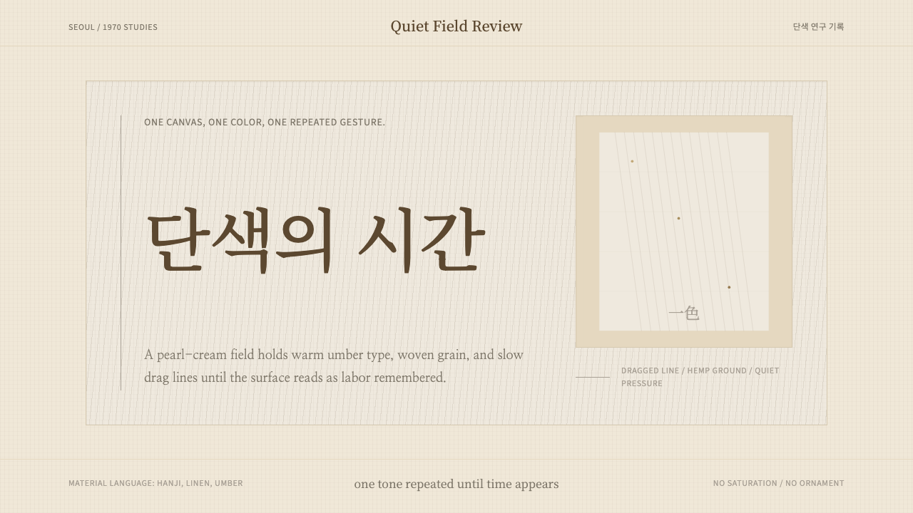 Korean Dansaekhwa MonochromeLabor becomes stillness. Umber serif type and drag lines on pearl cream.劳作化为静默。珍珠米底、褐色衬线和拖痕线条。