What is Penrose Aperiodic Tiling?什么是 Penrose Aperiodic Tiling?
Penrose Tiling is the mathematical proof that infinite variety and perfect order can coexist — a kite-and-dart geometry that covers the plane forever without ever repeating.彭罗斯拼贴是一个数学证明:无限变化与完美秩序可以共存——风筝与飞镖组成的几何系统,无穷铺满平面,却从不重复。
Penrose Aperiodic Tiling in briefPenrose Aperiodic Tiling 速览
Penrose Aperiodic Tiling is a design language rooted in one of mathematics' most celebrated discoveries: a set of tile shapes that can fill an infinite flat plane in five-fold rotational symmetry without ever forming a repeating periodic pattern. The canonical form uses two tile shapes — a broad kite and a slender dart — whose matching rules force quasi-crystalline order across every scale. The result is a surface that looks almost regular but rewards close inspection with endless local novelty.彭罗斯非周期拼贴是一套根植于数学史上最著名发现之一的设计语言:一组能以五重旋转对称无穷铺满平面、却永不形成周期性重复图案的瓷砖形状。其标准形式使用两种瓷砖——宽阔的风筝形与细长的飞镖形——其匹配规则在每一尺度上都强制产生准晶有序性。结果是一个看似接近规律、却在近距离观察时不断呈现局部新奇感的表面。
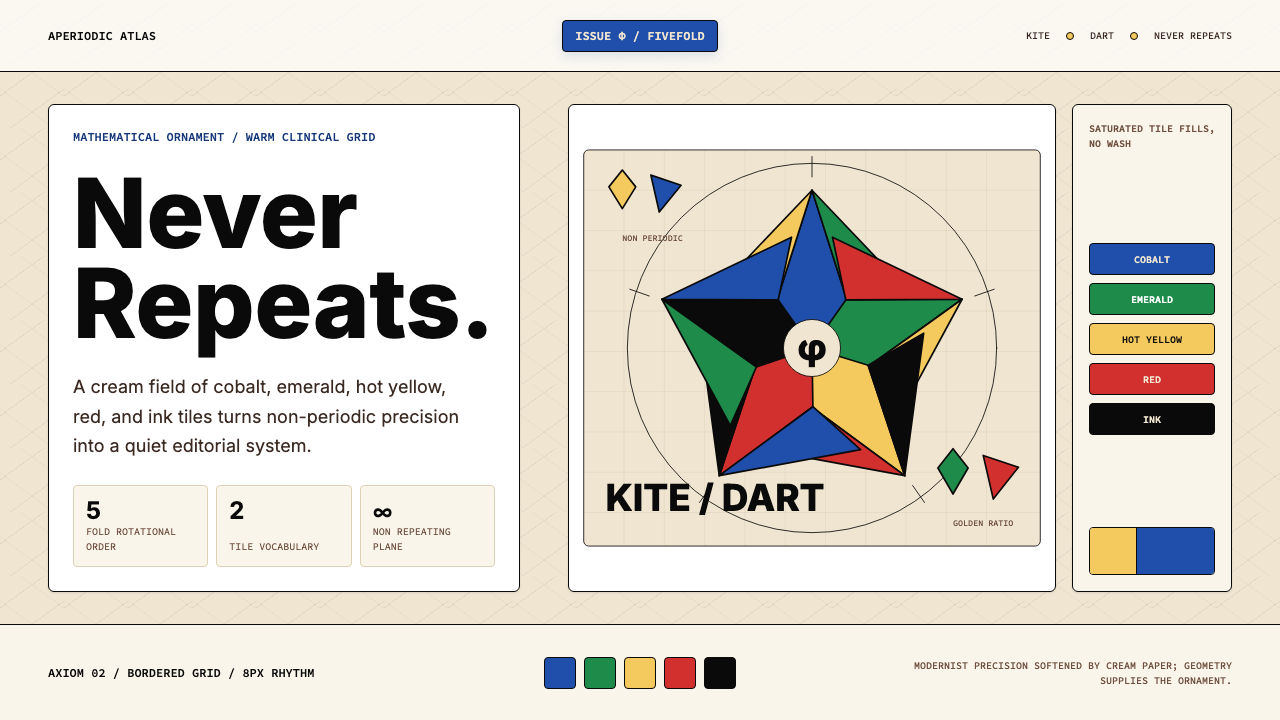
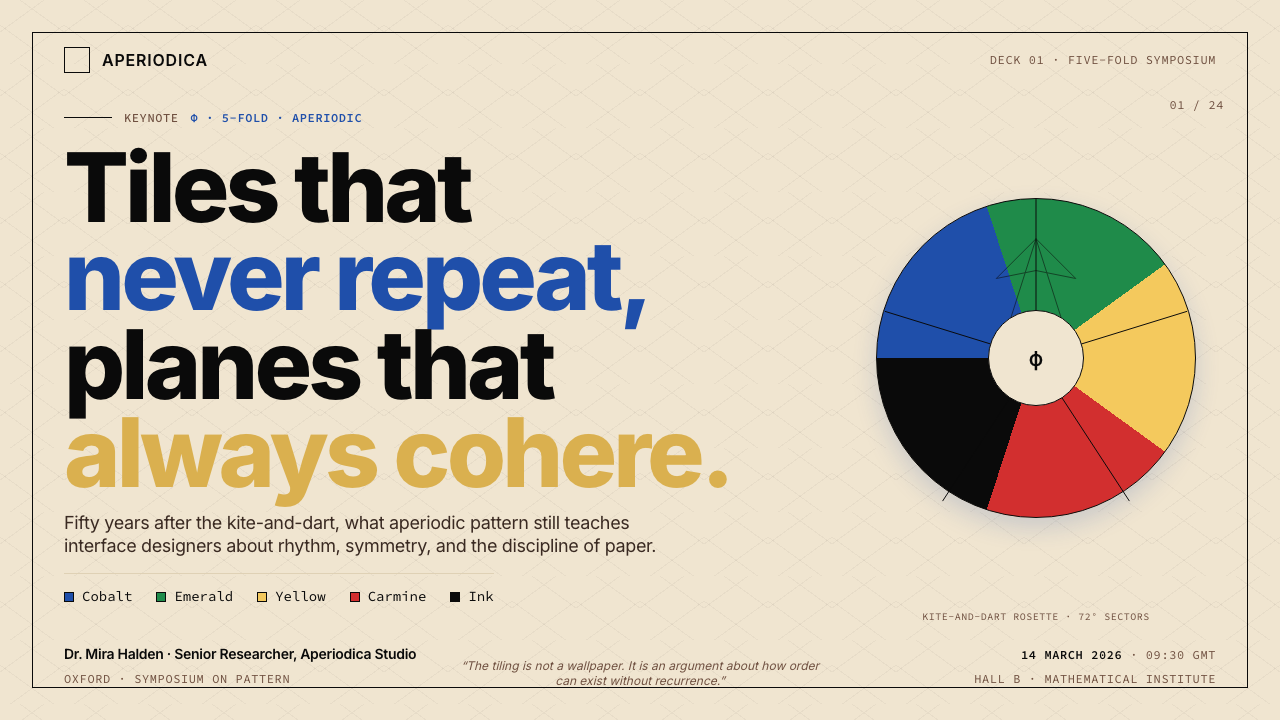
As a visual system, the aesthetic pairs a warm cream canvas with a tight, saturated palette drawn directly from the tile colors: cobalt blue, emerald green, hot yellow, saturated red, and a near-black ink. The ground is never stark white — the warmth of the cream keeps the mathematical rigor from reading as clinical. The saturated fills land like inlaid tiles, each shape distinct in color but governed by the same quiet geometric logic.作为视觉系统,这套美学将温暖的米色画布与直接取自瓷砖色的紧凑饱和色板相结合:钴蓝、翠绿、热黄、饱和红与近黑色墨水。底面从不是生硬的纯白——米色的温暖使数学的严谨不至于显得冰冷。饱和色填充像镶嵌瓷砖一样落地,每个形状在颜色上各自独立,却受同一套安静几何逻辑约束。
Compositions in this language obey the golden ratio and five-fold rotational symmetry, the same constraints that govern the tiling itself. Typography is set with mathematical precision: tight tracking, deliberate scale contrasts, and alignment to the underlying angular geometry. The overall register is modernist and analytical, but the warm ground and jewel-like tile colors ensure it never feels sterile.这套语言的构图遵循黄金比与五重旋转对称——即拼贴本身所受的同一约束。排版以数学精度设定:字距收紧、尺度对比刻意、对齐服从底层的角度几何。整体气质现代主义而富于分析性,但温暖的底面与宝石般的瓷砖色彩确保它从不显得无菌而生硬。
See the Penrose Aperiodic Tiling design system查看 Penrose Aperiodic Tiling 完整设计系统
Where does Penrose Aperiodic Tiling come from?Penrose Aperiodic Tiling 从何而来?
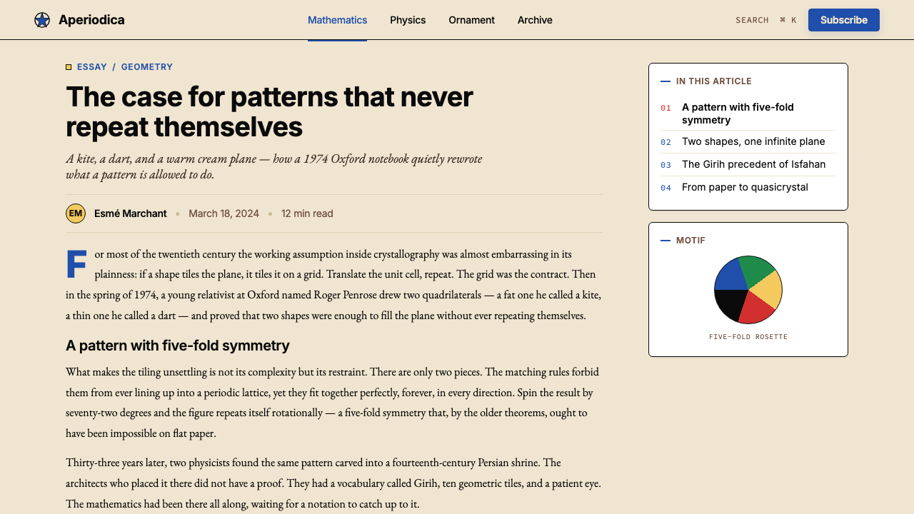
The story of Penrose Tiling begins not with design but with a mathematical question that had occupied geometers for decades: is it possible to construct a finite set of tile shapes that can tile the infinite plane, but only aperiodically — that is, in a way that never produces a repeating, periodic pattern? In 1966, Robert Berger proved that aperiodic tilesets existed, using a set of over 20,000 tile shapes. Subsequent researchers reduced the number, but it was the British mathematician and physicist Sir Roger Penrose who, in 1974, reduced the problem to just two shapes: the kite and the dart, a pair of quadrilaterals whose simple matching rules generate unbounded five-fold symmetric patterns. Penrose published this discovery while working at the University of Oxford, and the tiling that bears his name became one of the most recognizable images in twentieth-century mathematics.彭罗斯拼贴的故事并非始于设计,而是始于一个困扰几何学家数十年的数学问题:是否有可能构造一组有限的瓷砖形状,能够铺满无限平面,但只能以非周期方式——即永不产生重复周期性图案的方式——铺设?1966年,罗伯特·伯杰证明非周期拼贴集确实存在,使用了超过两万种瓷砖形状。后续研究者不断压缩这一数字,但最终将问题化简至仅需两种形状的,是英国数学家兼物理学家罗杰·彭罗斯爵士——他于1974年发现:风筝形与飞镖形这两种四边形,凭借简单的匹配规则,就能生成无界的五重对称图案。彭罗斯在牛津大学工作期间发表了这一发现,以他命名的拼贴成为二十世纪数学史上最具辨识度的图像之一。
What made Penrose's result remarkable beyond its mathematical elegance was an unexpected historical resonance discovered decades later. In 2007, the physicist Peter Lu and cosmologist Paul Steinhardt published a landmark paper demonstrating that the geometric patterns decorating the facades of medieval Persian Islamic architecture — the Girih tile tradition, visible in buildings such as the Darb-i Imam shrine in Isfahan (circa 1453) — were constructed using the same underlying quasi-crystalline geometry as Penrose tiling, more than five centuries before Penrose formalized it. Islamic craftsmen had arrived at aperiodic five-fold geometry through accumulated empirical practice, without the formal mathematical apparatus that would later explain why it worked. This discovery transformed Penrose Tiling from a purely modern mathematical curiosity into a design lineage with deep historical and cultural roots.彭罗斯成果的非凡之处,在于数十年后被发现拥有一段意想不到的历史回响。2007年,物理学家彼得·卢与宇宙学家保罗·斯坦哈特发表了一篇里程碑式论文,证明装饰中世纪波斯伊斯兰建筑立面的几何图案——即在伊斯法罕达尔布伊玛目圣祠(约建于1453年)等建筑上可见的Girih拼花传统——使用的是与彭罗斯拼贴相同的准晶几何底层结构,比彭罗斯将其形式化早了五个多世纪。伊斯兰工匠通过积累的经验实践抵达了非周期五重几何,而无需后来才会出现的解释其原理的形式数学工具。这一发现将彭罗斯拼贴从纯粹的现代数学珍奇,转变为一条拥有深厚历史与文化根基的设计谱系。
The connection to quasicrystals extended the story further. In 1984, materials scientist Dan Shechtman discovered a metal alloy whose atomic structure exhibited the same five-fold symmetry that Penrose patterns display in two dimensions — a finding that earned him the 2011 Nobel Prize in Chemistry and overturned a century of crystallographic orthodoxy. The physical existence of quasicrystalline matter gave Penrose patterns a material reality beyond the page: the geometry that Penrose had described as a mathematical abstraction turned out to describe the atomic architecture of actual substances found in nature, including in certain meteorites.与准晶体的关联进一步延伸了这个故事。1984年,材料科学家丹·谢赫特曼发现了一种金属合金,其原子结构展现出与彭罗斯图案在二维平面上所显示的相同五重对称性——这一发现为他赢得了2011年诺贝尔化学奖,并推翻了一个世纪的晶体学正统。准晶物质的实物存在赋予了彭罗斯图案超越纸面的物质现实:彭罗斯曾将其描述为数学抽象的几何结构,竟然描述了某些自然界实际物质(包括特定陨石)的原子构造。
By the late twentieth century, Penrose Tiling had migrated from academic mathematics into architecture, product design, and visual culture. Notable architectural applications include the floor of the Bradshaw Building at the University of Oxford and several university campus pavements in the United States and Europe. The pattern appeared in textile design, ceramics, and eventually as a recurring motif in computational and generative art, where its combination of local unpredictability and global order made it a natural subject for algorithmic exploration.进入二十世纪末,彭罗斯拼贴从学术数学界迁移至建筑、产品设计与视觉文化。著名建筑应用包括牛津大学布拉德肖楼地面及美国、欧洲多所大学的校园铺地。这一图案出现在纺织设计、陶瓷,并最终成为计算艺术与生成艺术中的常见母题——其局部不可预测性与全局有序性的结合,使它成为算法探索的天然主题。
What defines the Penrose Aperiodic Tiling look?Penrose Aperiodic Tiling 的视觉特征是什么?
Aperiodic Geometry非周期几何
The defining visual property is infinite local variation within globally consistent rules. No two regions of the tiling are identical, yet the eye immediately senses an overarching order. This tension — between unpredictability at the detail level and coherence at the whole — is what gives the pattern its distinctive quality of perpetual discovery. In design application, it means compositions built from this logic resist the deadening effect of repetition while remaining legible as a unified system.定义性视觉特质是:在全局一致规则内的无限局部变化。拼贴的任意两个区域都不相同,但眼睛立即感知到一种统摄性的秩序。这种张力——细节层面的不可预测性与整体的连贯性之间——正是图案呈现出永续发现感的独特品质所在。在设计应用中,这意味着基于此逻辑构建的构图能抵抗重复带来的乏味感,同时依然作为统一系统保持可读性。
Five-fold Symmetry五重对称
Penrose patterns exhibit five-fold rotational symmetry — a rotation of one-fifth of a full turn maps the pattern onto itself in terms of statistical properties, even though no exact translation repeats. Five-fold symmetry is geometrically forbidden in classical periodic tilings, which is precisely what makes it visually arresting. Layouts that echo this symmetry through pentagonal arrangements, radial compositions, or repeated angular increments of seventy-two degrees inherit some of the pattern's tension between the familiar and the surprising.彭罗斯图案展现五重旋转对称——旋转五分之一圈,图案在统计性质上映射至自身,尽管没有任何精确平移重复。五重对称在经典周期拼贴中是几何上被禁止的,正是这一点使其在视觉上令人警醒。通过五边形排列、放射状构图或七十二度角重复增量来呼应这一对称性的版面,得以继承图案那种在熟悉与惊奇之间的张力。
Warm Ground, Saturated Tiles暖底饱和砖色
The canonical color structure places highly saturated tile colors against a warm cream background rather than pure white. This choice is both historical — cream grounds appear throughout Islamic geometric art — and perceptual: warm cream reduces the harshness of the high-saturation fills and gives the overall composition a quality of illuminated manuscript or inlaid tilework rather than a screen graphic. The tile colors themselves — cobalt, emerald, hot yellow, saturated red — are bold enough to read at a distance but held in check by the warmth of the ground.标准色彩结构将高饱和度瓷砖色置于温暖米色背景上,而非纯白底面。这一选择既有历史依据——米色底面贯穿于伊斯兰几何艺术之中——也有感知上的考量:暖米色缓和了高饱和填充的刺目感,使整体构图呈现出一种彩绘手稿或镶嵌瓷砖的品质,而非屏幕图形。瓷砖色本身——钴蓝、翠绿、热黄、饱和红——足够大胆,可在远处辨认,但被底面的温暖所制约。
Mathematical Typography数学排印
Text in this visual language is set with the precision of a mathematical proof: tight tracking, strong scale hierarchies, and alignment to the underlying angular geometry of the tiling rather than to an orthogonal grid. Headlines are set at large scale with reduced weight to echo the broad, open quality of the kite tile; body text is dense and close-set, recalling the dart tile's compactness. The typeface choices favor clean, geometric sans-serif forms with no calligraphic residue — letterforms that read as constructed rather than drawn.这套视觉语言中的文字以数学证明的精确度排印:字距收紧、层级尺度强烈、对齐服从拼贴的底层角度几何而非正交网格。标题以大字号、低字重设定,呼应风筝砖宽阔开放的特质;正文紧密而密集,令人想起飞镖砖的紧凑感。字体选择偏向干净的几何无衬线形式,无任何书法痕迹——字母形态读来像被构造而非被书写。
Golden Ratio Proportion黄金比例
The kite and dart shapes are themselves derived from the golden ratio: their side lengths are in the proportion of the golden ratio to one. This means that any composition structured around golden-ratio proportions — in column widths, in the ratio of headline to body type, in the size of framing shapes — is already in implicit dialogue with the underlying mathematics of the tiling. Page formats, image crops, and layout divisions that approximate golden-ratio relationships feel internally consistent in a way that purely arbitrary proportions do not.风筝形与飞镖形本身就源自黄金比例:其边长之比正是黄金比与一之比。这意味着任何围绕黄金比例结构化的构图——在栏宽、在标题与正文字号之比、在框架形状的大小上——都已与拼贴的底层数学形成隐性对话。大约符合黄金比例关系的页面格式、图像裁切与版面分割,以纯粹任意比例所没有的方式,呈现出内在的一致感。
Depth Through Layering分层深度
Unlike the rigorously flat Bauhaus approach, Penrose-derived compositions frequently employ subtle layering to suggest the depth of inlaid tilework. One tile color sits slightly forward of another not through a gradient or drop shadow but through careful sequencing of opacity and overlap. The effect reads as physical — as if the colored shapes are resting on the cream ground rather than printed on it. This restrained sense of depth distinguishes the style from both pure flatness and from decorative styles that rely on heavy shadow or realistic rendering.与严格平面化的包豪斯方式不同,彭罗斯衍生构图常常采用微妙分层,以暗示镶嵌瓷砖的深度感。一种瓷砖色略微位于另一种之前,不是通过渐变或投影阴影,而是通过对透明度与叠压关系的精心排序。效果读来具有物质感——仿佛彩色形状是放置在米色底面上,而非印刷在其上。这种克制的深度感使该风格区别于纯粹的平面性,也区别于依赖浓重阴影或写实渲染的装饰风格。
Structural Restraint结构克制
The palette is tight by design: five tile colors plus the cream ground, deployed with symbolic purpose rather than decorative freedom. Each color tends to be assigned a consistent role across a composition — one for primary structural shapes, one for secondary accents, one for highlights — so that the color logic reads like a key to the geometry rather than an expressive choice. Mixing all five tile colors simultaneously at equal weight produces visual noise; authentic Penrose-derived work leads with two or three and holds the others in reserve.色板在设计上保持紧凑:五种瓷砖色加米色底面,以象征性目的而非装饰自由来调度。每种颜色倾向于在整个构图中承担一致的角色——一种用于主要结构形状,一种用于次级强调,一种用于点睛——使色彩逻辑读来像几何的注解,而非表达性选择。同时以等量使用全部五种瓷砖色会产生视觉噪音;真正的彭罗斯衍生作品以两到三种为主导,其余保留备用。
See the Penrose Aperiodic Tiling design system查看 Penrose Aperiodic Tiling 完整设计系统
Who shaped Penrose Aperiodic Tiling?谁塑造了 Penrose Aperiodic Tiling?
Penrose is the British mathematician and physicist who, in 1974, reduced the problem of aperiodic tiling to just two shapes — the kite and the dart — while working at the University of Oxford. He had previously contributed to general relativity alongside Stephen Hawking and would later receive the Nobel Prize in Physics in 2020 for his work on black holes. The tiling that bears his name is among the most recognized images in twentieth-century mathematics, appearing in floor pavements, architectural installations, and as a foundational object of study in the mathematics of quasi-crystalline order.彭罗斯是英国数学家兼物理学家,1974年在牛津大学工作期间,将非周期拼贴问题化简至仅需两种形状——风筝形与飞镖形。他此前已与斯蒂芬·霍金共同为广义相对论作出贡献,后于2020年因黑洞研究获诺贝尔物理学奖。以他命名的拼贴是二十世纪数学史上最具辨识度的图像之一,出现于地板铺装、建筑装置,并成为准晶有序性数学研究的基础对象。
In 2007, physicist Peter Lu and cosmologist Paul Steinhardt published the paper that reframed Penrose Tiling as a design lineage rather than a purely modern invention. Analyzing the Girih tile patterns of medieval Persian Islamic architecture, they demonstrated that craftsmen in the thirteenth through fifteenth centuries had independently discovered and applied the same quasi-crystalline five-fold geometry, most likely through a process of empirical refinement guided by aesthetic and structural intuition. Their work gave the pattern a five-hundred-year prehistory and connected mathematical abstraction to a living tradition of material craft.2007年,物理学家彼得·卢与宇宙学家保罗·斯坦哈特发表了一篇将彭罗斯拼贴重新定性为设计谱系而非纯粹现代发明的论文。通过分析中世纪波斯伊斯兰建筑的Girih拼花图案,他们证明:十三至十五世纪的工匠已独立发现并应用了相同的准晶五重几何,很可能通过审美与结构直觉引导下的经验性精炼过程。他们的工作赋予了这一图案五百年的前史,并将数学抽象与活态的物质工艺传统相连接。
The Israeli materials scientist whose 1984 discovery of quasicrystals — metal alloys with the same five-fold symmetry as Penrose patterns, at the atomic scale — transformed the mathematical abstraction into a physical reality. Shechtman's finding was initially rejected by the scientific establishment; he was reportedly asked to leave his research group for proposing what colleagues considered an impossibility. The Nobel Prize in Chemistry he received in 2011 for the discovery represents one of the most dramatic rehabilitations of a heterodox scientific claim in recent memory, and it established Penrose's two-dimensional geometry as a description of genuine three-dimensional matter.以色列材料科学家,他于1984年发现了准晶体——在原子尺度上拥有与彭罗斯图案相同五重对称性的金属合金——将数学抽象转化为物理现实。谢赫特曼的发现最初遭到科学界拒绝;据报道,他因提出同行认为不可能的事物而被要求离开其研究小组。他于2011年因这一发现获得诺贝尔化学奖,是近代记忆中对一个异端科学主张最戏剧性的平反之一,也确立了彭罗斯的二维几何是对真实三维物质的描述。
The collective name for the system of geometric construction used by Islamic craftsmen in Persia from roughly the thirteenth century onward to produce the intricate star-and-polygon decorative patterns that cover the facades and interiors of mosques, shrines, and palaces across Iran, Central Asia, and the wider Islamic world. The Girih system was not fully understood in the West until Lu and Steinhardt's 2007 analysis, which revealed that its most sophisticated examples — particularly the Darb-i Imam shrine in Isfahan — were constructed using the same underlying quasi-crystalline logic as Penrose tiling. In the context of this design language, the Girih tradition represents the style's living historical lineage and its grounding in material craft.这是波斯伊斯兰工匠大约自十三世纪起用来产生装饰清真寺、圣祠与宫殿立面及内部的繁复星形-多边形图案的几何构造系统的统称,遍布伊朗、中亚及更广泛的伊斯兰世界。Girih系统直到卢与斯坦哈特2007年的分析才在西方得到充分理解,该分析揭示:其最精妙的实例——尤其是伊斯法罕的达尔布伊玛目圣祠——是使用与彭罗斯拼贴相同的底层准晶逻辑构造的。在这套设计语言的语境中,Girih传统代表了这一风格鲜活的历史谱系及其在物质工艺中的根基。
How do you use Penrose Aperiodic Tiling today?今天怎么用 Penrose Aperiodic Tiling?
Penrose Aperiodic Tiling is among the more demanding historical design languages to apply correctly, because its aesthetic force depends on understanding what makes the pattern mathematically and visually coherent — not merely reproducing its tile shapes or color palette. The core principle is that infinite local variety arises from a small set of consistent global rules. Design work that succeeds in this language applies the same logic: a tightly constrained palette and geometry generating rich, non-repeating surface interest.彭罗斯非周期拼贴是较难正确应用的历史设计语言之一,因为其美学力量依赖于理解图案在数学与视觉上为何连贯——而非仅仅复制其瓷砖形状或色板。核心原则是:无限的局部变化源自一小套一致的全局规则。在这套语言中成功的设计作品应用了同样的逻辑:被严格约束的色板与几何形,产生丰富的、非重复的表面趣味。
For presentation slides, the language is most powerful on cover pages and divider spreads. A cover built in this aesthetic leads with a large-scale fragment of the tiling as the primary visual, cropped at an unusual angle to emphasize the five-fold geometry rather than centering it predictably. The tile colors — deployed two or three at a time against the cream ground — carry the visual weight, with the title set in clean, mathematically precise type at strong scale contrast to the ground. Content slides should be treated as grid-governed but not rigidly symmetric: allow columns and text blocks to align to angular cues from the tile geometry, using the golden ratio to set proportional relationships between elements. Data slides benefit from the tile color logic applied directly: each data series or category receives one of the five canonical tile colors, assigned consistently and never mixed at equal saturation.在演示文稿中,这套语言在封面页与分隔页上最具力量。以此美学构建的封面以大尺度拼贴片段作为主视觉,以不寻常的角度裁切,强调五重几何而非将其可预测地居中。瓷砖色——每次调用两到三种,置于米色底面上——承载视觉重量,标题以干净、数学精准的字体设定,与底面形成强烈的尺度对比。内容页应当被当作受网格支配但非严格对称的版面处理:允许栏与文字块对齐瓷砖几何的角度线索,用黄金比例设定元素间的比例关系。数据页受益于直接应用的瓷砖色逻辑:每个数据系列或类别获得五种标准瓷砖色之一,一致指定,不以等饱和度混用。
For web interfaces and digital dashboards, the aesthetic supports precision-oriented products where the user is expected to read carefully rather than scan casually. Dashboard layouts work well with a cream or warm off-white ground, near-black body text, and tile colors reserved for status indicators, alerts, and interactive states. Card components can carry subtle layered borders that evoke inlaid tilework without literal tile shapes. Pricing pages benefit from the five-fold color logic to differentiate tiers: each plan receives one tile color as its accent, clearly establishing hierarchy without relying on size alone. Navigation should be typographic and clean — wordmarks and labels with no decorative iconography beyond geometric indicators.对于网页界面与数字仪表板,这套美学支持精确导向的产品,其中用户被期望仔细阅读而非随意浏览。仪表板版面适合采用米色或暖白色底面、近黑色正文,瓷砖色保留给状态指示器、警报与交互状态。卡片组件可以带有微妙的分层边框,唤起镶嵌瓷砖工艺而不使用字面的砖形。定价页面受益于五重色彩逻辑来区分套餐层级:每个方案获得一种瓷砖色作为强调色,清晰建立层级而不仅依赖尺寸。导航应当是字体性的、干净的——文字标识与标签,除几何指示符外无装饰图标。
For editorial and marketing work, the style sustains strong information hierarchy with an unusual combination of warmth and analytical rigor. Feature articles and long-form layouts work well with a golden-ratio column structure: a primary reading column flanked by a narrower annotation margin, with section breaks marked by angular geometric rules rather than horizontal lines. Marketing pages can exploit the poster-like quality of the tile palette: full-width feature blocks that alternate the cream ground with one deep tile color as background, maintaining the constraint of one primary tile color per visual zone. The near-black ink color handles all body text and captions, while the tile colors mark structural divisions and calls to action.对于编辑与营销内容,这种风格以温暖与分析性严谨的不寻常结合,支撑强劲的信息层级。专题文章与长篇版面适合黄金比例栏结构:主阅读栏旁侧以较窄的注释空间为伴,段落分隔用角度几何规线而非水平线标记。营销页面可以利用瓷砖色板的海报式品质:全宽特性区块以米色底面与一种深瓷砖色背景交替,保持每个视觉区域仅用一种主要瓷砖色的约束。近黑色墨水处理所有正文与图注,瓷砖色标记结构分割与行动号召。
A common mistake when applying this language is treating the five tile colors as a license for chromatic abundance — using all five simultaneously across a layout at full saturation. Authentic work in this style is disciplined: a well-executed composition uses two dominant tile colors and at most one accent, holding the others in reserve. A second common error is abandoning the warm cream ground in favor of pure white to appear cleaner; this removes the visual warmth that mediates between the mathematical rigor of the geometry and the viewer, making the result feel clinical rather than crafted. A third mistake is applying the tile shapes literally as decorative motifs without respecting the matching rules that govern their placement — fragments of Penrose tiling that do not respect the underlying geometry look arbitrary rather than ordered.应用这套语言时最常见的错误,是将五种瓷砖色视为色彩充裕的许可——在整个版面上同时以全饱和度使用全部五种。这套风格中的真正作品是有纪律的:执行良好的构图使用两种主导瓷砖色和至多一种强调色,其余备用。第二个常见错误是放弃温暖的米色底面而倾向纯白以显得更干净;这抹去了在几何的数学严谨性与观者之间调节关系的视觉温度,使结果显得冰冷而非工艺精良。第三个错误是将瓷砖形状作为装饰母题字面使用,却不遵守支配其放置的匹配规则——不遵守底层几何的彭罗斯拼贴片段看起来随意而非有序。
See the Penrose Aperiodic Tiling design system查看 Penrose Aperiodic Tiling 完整设计系统
Penrose Aperiodic Tiling — FAQPenrose Aperiodic Tiling · 常见问题
What makes Penrose Tiling different from other geometric or Islamic-inspired patterns?彭罗斯拼贴与其他几何图案或伊斯兰风格图案有何不同?
Most geometric patterns — including the majority of Islamic geometric art — are periodic: they tile by repeating a fixed motif at regular intervals, like wallpaper. Penrose Tiling is aperiodic, meaning the pattern never repeats, no matter how far you extend it. It exhibits five-fold symmetry, which is geometrically impossible in any periodic tiling, and the relationship between the tile shapes is governed by matching rules derived from the golden ratio. The result looks ordered but is provably non-repeating — a quality no periodic pattern can possess. Islamic Girih tiling at its most sophisticated approximates the same geometry, but Penrose Tiling is the formal mathematical statement of that underlying structure.大多数几何图案——包括大多数伊斯兰几何艺术——是周期性的:它们通过以固定间隔重复一个固定母题来铺砌,如同壁纸。彭罗斯拼贴是非周期性的,意味着无论延伸多远,图案都不会重复。它展现五重对称性,这在任何周期性拼贴中几何上是不可能的,且瓷砖形状之间的关系受源自黄金比例的匹配规则支配。结果看起来有序,但可被证明是非重复的——这是任何周期性图案都无法具备的品质。最精妙层次上的伊斯兰Girih拼花近似于相同的几何结构,但彭罗斯拼贴是该底层结构的正式数学表述。
Can this style work on a dark background?这种风格可以用在深色背景上吗?
The canonical form of this aesthetic uses a warm cream ground, and this choice is load-bearing: the cream mediates between the high-saturation tile colors and the viewer's eye, preventing the composition from feeling aggressive or digitally artificial. A dark-background inversion is possible — black grounds with the tile colors brought to high luminosity — but it shifts the register significantly, reading more like digital quasicrystal visualization than inlaid tilework. If a dark variant is used, the palette must be tightened further: hot yellow tends to dominate on dark grounds, and cobalt blue risks disappearing entirely. Reserve the dark inversion for specifically technical or dramatic contexts where the illuminated-gem effect is intentional.这套美学的标准形式使用温暖的米色底面,这一选择承载着结构意义:米色在高饱和瓷砖色与观者眼睛之间充当调节者,防止构图显得攻击性或数字人工感。深色背景反转版本是可能的——黑色底面配以高亮度的瓷砖色——但会显著改变气质,读来更像数字准晶可视化而非镶嵌瓷砖工艺。如果使用深色变体,色板必须进一步收紧:热黄在深色底面上容易主导,钴蓝则有完全消失的风险。将深色反转保留给那些发光宝石效果是有意为之的特定技术性或戏剧性语境。
How do I use the tile shapes themselves in digital layouts without it looking like clip-art?如何在数字版面中使用瓷砖形状本身,而不显得像剪贴画?
The key is context and constraint. Tile shapes read as design rather than clip-art when they serve a structural purpose — as color-carrying zones that organize layout regions, as framing devices for photography, or as large-scale background elements that recede behind foreground content. They fail when used as small decorative accents scattered across a layout, or when the matching rules of the actual tiling are ignored, producing arbitrary kite-and-dart fragments that carry none of the pattern's geometric logic. The shapes should be large enough to read as geometric architecture, and the palette governing them should be the same two or three colors used everywhere else in the composition.关键在于语境与约束。当瓷砖形状服务于结构目的时,它们读来像设计而非剪贴画——作为组织版面区域的色彩承载区、作为摄影的框架装置、或作为在前景内容后方退隐的大尺度背景元素。当它们被用作散布于版面各处的小型装饰点缀,或当实际拼贴的匹配规则被忽视,产生不携带任何图案几何逻辑的随意风筝飞镖碎片时,它们就会失效。形状应当足够大以读作几何建筑,支配它们的色板应与构图中其他地方使用的同样两到三种颜色一致。
Is Penrose Tiling too mathematically niche to resonate with general audiences?彭罗斯拼贴是否太过数学小众,难以引起大众共鸣?
The pattern resonates with general audiences for the same reason it interests mathematicians: the human visual system is highly sensitive to near-regularity and slight deviation from expected order. Viewers do not need to know the mathematical definition of aperiodicity to feel the particular quality of attention the pattern demands — the way it rewards looking closely and yields something new each time. Used well, the aesthetic communicates authority, precision, and a sense that the system it represents is more sophisticated than it initially appears. These qualities are legible across audiences, and the warm cream ground ensures the mathematical severity reads as considered craft rather than cold system.这一图案之所以能引起大众共鸣,原因与它引起数学家兴趣相同:人类视觉系统对接近规律性与对预期秩序的轻微偏离极为敏感。观者无需了解非周期性的数学定义,就能感受到图案所要求的那种特定关注品质——它奖励仔细观察并每次都带来新发现的方式。运用得当,这套美学传达权威、精确,以及它所代表的系统比初看上去更为精妙的感知。这些品质在各类受众中都可辨读,而温暖的米色底面确保数学的严肃感被解读为经过思考的工艺,而非冷漠的系统。
How does Penrose Tiling relate to Bauhaus or Swiss International Style?彭罗斯拼贴与包豪斯或瑞士国际主义风格有何关联?
All three are design languages rooted in geometric order and the conviction that mathematical structure produces aesthetic quality. The differences are significant, however. Bauhaus and Swiss Style are orthogonal — built on the right-angle grid and bilateral symmetry broken by asymmetric composition. Penrose Tiling is radial and five-fold — its organizing geometry is angular, rotational, and explicitly non-orthogonal. Bauhaus uses primary colors symbolically and derives from Western industrial modernism; Penrose Tiling uses saturated inlay colors against a warm ground and derives from both mathematical discovery and Islamic decorative tradition. The three styles share a discipline of restraint and system-thinking, but they produce very different compositional logics and emotional registers.三者都是根植于几何秩序、并坚信数学结构产生美学品质的设计语言。然而差异是显著的。包豪斯与瑞士风格是正交的——建立在直角网格与被非对称构图打破的双边对称之上。彭罗斯拼贴是放射状且五重的——其组织几何是角度化的、旋转性的,并明确非正交。包豪斯以象征性方式使用三原色,源自西方工业现代主义;彭罗斯拼贴在温暖底面上使用饱和镶嵌色,源自数学发现与伊斯兰装饰传统两者。三种风格共享克制与系统思维的纪律,但产生截然不同的构图逻辑与情感气质。
Related design styles相关设计风格
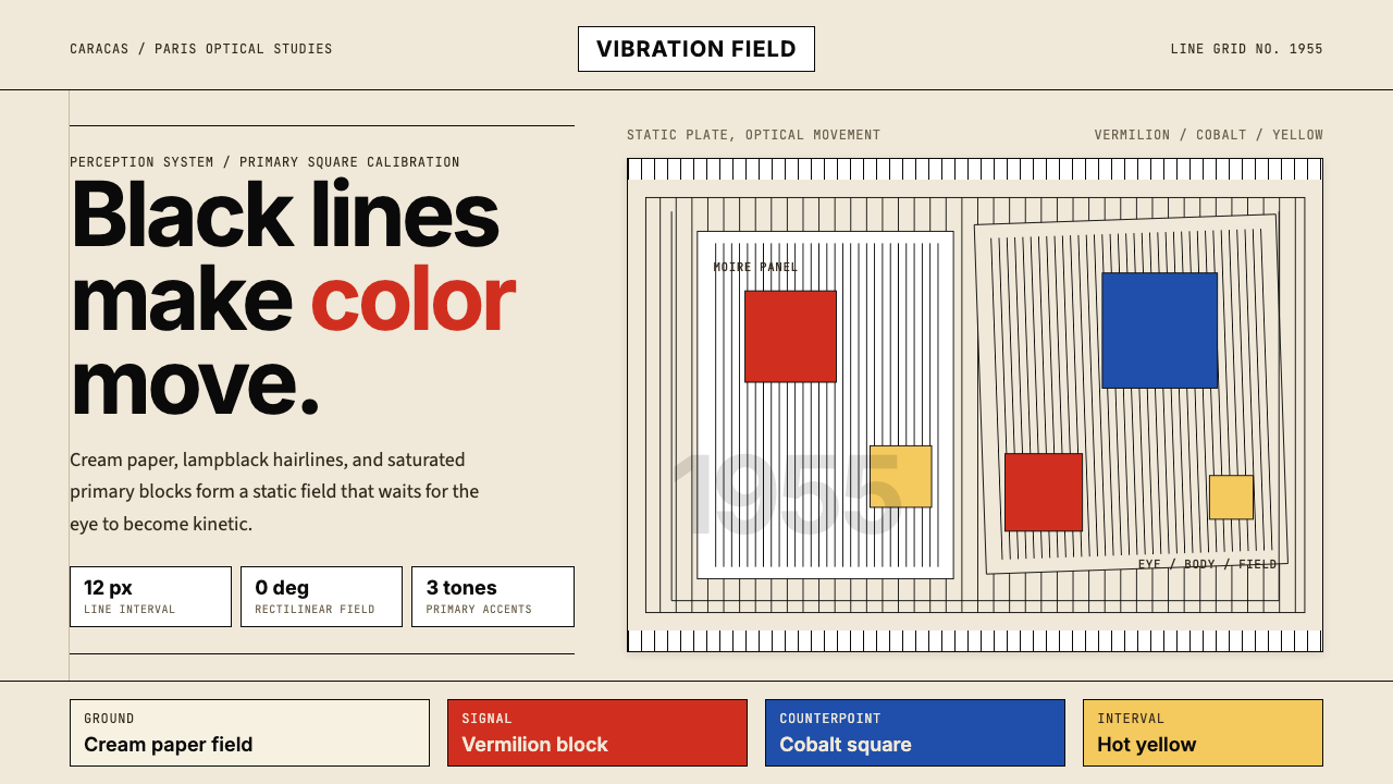 Jesús Soto Kinetic Art (Venezuela)Perception is the medium. Cream ground, black-line grids, and primary squares…观看即媒介。奶白底、黑线栅格与三原色方块制造震颤。
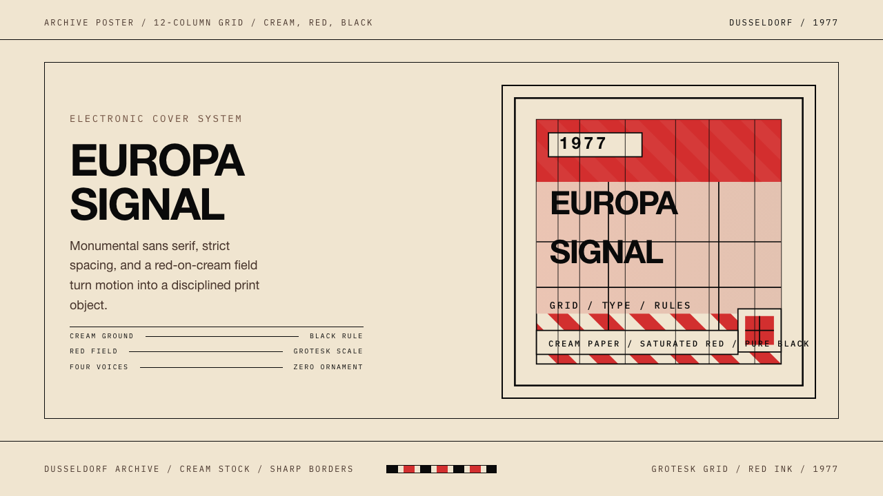 Kraftwerk Trans-Europa ExpressStark precision rules. Cream, red, and black lock the cover into a strict gri…克制而锋利:奶油、红、黑与严格网格锁住整张封面。
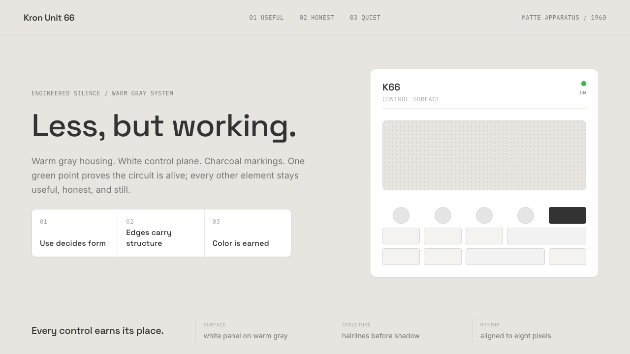 Dieter Rams / BraunQuiet by design. Warm gray, white panels, hairline grids, and one earned gree…安静即设计:暖灰、白面板、细网格,只留一枚绿色指示点。
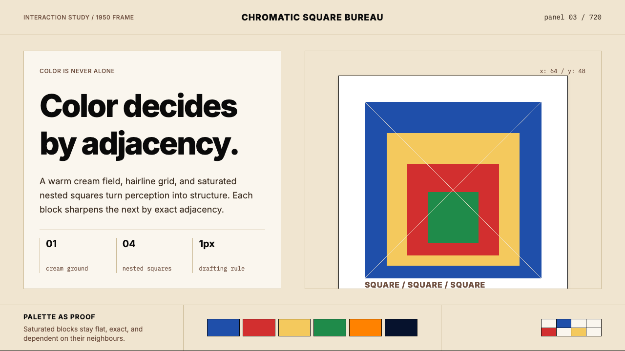 Josef Albers — Homage to the SquareColor becomes event. Warm cream, cobalt-red-yellow nested squares, exact hair…色彩成为事件。暖米底、钴蓝红黄嵌套方块与精确发丝线。
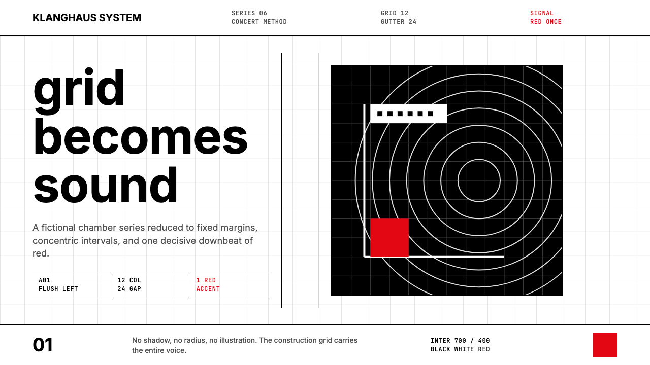 Müller-Brockmann GridOrder becomes force. Black-white 12-column grid, Inter type, one red downbeat.秩序化为力量:黑白十二栏网格、Inter 字体、一记红色重音。
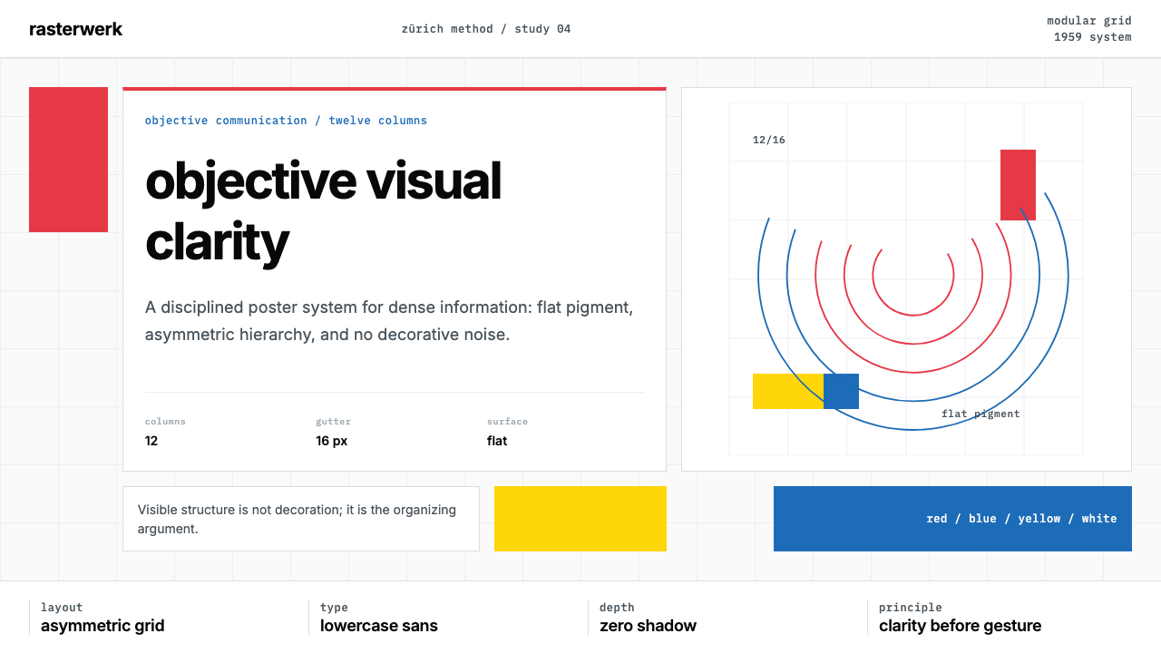 Müller-Brockmann SwissClarity is the system. Inter grids, red-blue blocks, and concentric arcs make…清晰即系统:Inter网格、红蓝色块与同心弧显露结构。