What is Kraftwerk Trans-Europa Express?什么是 Kraftwerk Trans-Europa Express?
Three colors, no ornament, no apology — Kraftwerk's 1977 album cover redefined how electronic music looked for half a century.三种颜色,零装饰,毫不妥协——发电站乐队1977年的专辑封面,重新定义了电子音乐的视觉面貌长达半个世纪。
Kraftwerk Trans-Europa Express in briefKraftwerk Trans-Europa Express 速览
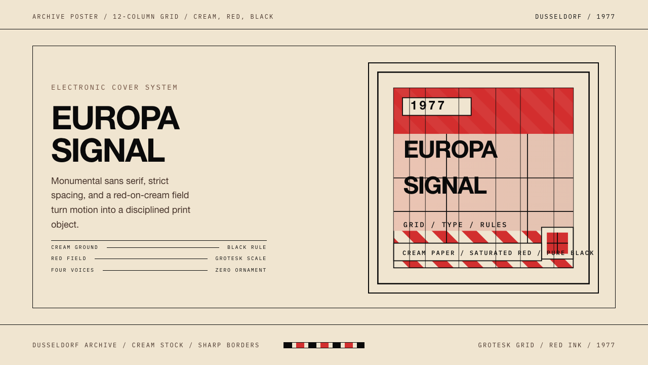
Kraftwerk Trans-Europa Express is a visual design system derived from the cover art of Kraftwerk's 1977 album of the same name, created at the Kling Klang Studio in Düsseldorf under the art direction of Emil Schult, Florian Schneider, and Ralf Hütter. Its visual grammar is built on three colors — cream, saturated red, and pure black — deployed across a strict geometric grid with no ornament and no compromise.Kraftwerk Trans-Europa Express 是一套衍生自发电站乐队1977年同名专辑封面艺术的视觉设计体系。这张封面在杜塞尔多夫的 Kling Klang 录音室中由 Emil Schult、Florian Schneider 与 Ralf Hütter 共同担纲艺术指导。其视觉语法建立在三种颜色之上——奶油色、饱和红与纯黑——在严格的几何网格中展开,没有任何装饰,没有任何妥协。
The system is a variant of Bauhaus modernism filtered through the particular aesthetic demands of electronic music: it shares the parent movement's rejection of surface decoration and its commitment to geometric discipline, but adds a quality of cold monumentality that Bauhaus itself rarely achieved. Where Bauhaus could feel energetic and utopian, Trans-Europa Express feels precise and machine-like — a visual equivalent of the synthesizer sounds on the record itself.这套系统是包豪斯现代主义经由电子音乐特定美学需求过滤后的变体:它与母运动共享对表面装饰的拒绝和对几何纪律的承诺,但增添了一种包豪斯本身鲜少抵达的冰冷纪念碑感。如果说包豪斯可以感觉充满能量与乌托邦式热情,Trans-Europa Express 则显得精密而机械——在视觉上等同于唱片本身的合成器音色。
The defining visual signature is the tension between the warmth of the cream ground and the severity of saturated red and absolute black laid across it. Type is set large, with no softening of edges and no transition between colors. Portrait photographs of the four band members are integrated into the grid with the same geometric rigor applied to every other element, treating the human face as one more shape to be composed. The result is not coldness for its own sake but a kind of radical clarity — everything irrelevant has been removed.最具决定性的视觉特征,是奶油底色的温度感与覆盖其上的饱和红、绝对黑之间形成的张力。文字以大号排印,边缘没有任何柔化,颜色之间没有任何过渡。乐队四位成员的肖像照片以与其他所有元素相同的几何严谨性被整合进网格,将人脸视为又一个有待构图的形状。结果不是为冷漠而冷漠,而是一种彻底的清晰——所有不必要的东西都被移除了。
See the Kraftwerk Trans-Europa Express design system查看 Kraftwerk Trans-Europa Express 完整设计系统
Where does Kraftwerk Trans-Europa Express come from?Kraftwerk Trans-Europa Express 从何而来?
Kraftwerk was founded in Düsseldorf in 1970 by Ralf Hütter and Florian Schneider, emerging from the experimental West German music scene that critics would later call Kosmische Musik or Krautrock. The band established the Kling Klang Studio as their permanent creative base, an environment they controlled entirely — recording, production, and visual identity were all developed in the same space, by the same people, according to the same principles. By the time Trans-Europa Express was released in 1977, Kraftwerk had already developed a distinctive visual language across their previous albums, but this record pushed it to its most distilled and architectural form.发电站乐队由 Ralf Hütter 和 Florian Schneider 于1970年在杜塞尔多夫创立,从实验性的西德音乐场景中浮现——评论界后来将这一场景称为宇宙音乐(Kosmische Musik)或克劳特摇滚(Krautrock)。乐队将 Kling Klang 录音室确立为其永久性创作基地,一个他们完全掌控的环境——录音、制作与视觉识别全部在同一空间、由同一批人、依照同一套原则发展而来。到1977年《Trans-Europa Express》发行时,发电站乐队已在此前的专辑中建立起独特的视觉语言,而这张唱片将其推向了最精炼、最具建筑感的形态。
Emil Schult, a visual artist and longtime collaborator, brought a formal art education background to the project. Schult had studied painting and was familiar with the Bauhaus legacy that permeated German design education of the era. The decision to work with a cream ground rather than white was deliberate — cream carries a quality of aged paper, of historical documents, that pure white does not. Against that ground, the saturated red of the lettering reads not as a brand color but as an assertion, a signal flag planted in precise territory. The diagonal stripe composition — a band of color cutting across the picture plane — references both the graphic traditions of European rail travel posters and the geometric abstraction of Constructivist design.视觉艺术家兼长期合作者 Emil Schult 为这个项目带来了正规艺术教育的背景。Schult 学过绘画,熟悉渗透于那个时代德国设计教育中的包豪斯遗产。选择奶油色而非纯白作为底色是经过深思熟虑的——奶油色携带着纯白所没有的品质:一种历史文献、陈年纸张的质感。在这个底色之上,字体的饱和红不像品牌色,更像一面宣言,一面插入精确领地的信号旗。斜线条纹构图——一道色带切穿画面——既引用了欧洲铁路旅行招贴画的平面传统,也呼应了构成主义设计的几何抽象。
The album's subject matter shaped its aesthetics as much as its personnel did. Trans-Europa Express is conceptually about European modernity: the train as a metaphor for precision, for engineered efficiency, for the erasure of distance through technology. The cover needed to look like that idea felt — not warm, not organic, not handmade, but manufactured and exact. The use of photography for the band portraits, rather than illustration, served this logic: the camera produces facts, and the album's visual system was built around facts rather than impressions.专辑的主题内容塑造了它的美学,其程度不亚于创作人员的影响。《Trans-Europa Express》在概念上关于欧洲现代性:火车作为精密、工程效率与技术消弭距离的隐喻。封面需要看起来就像那个理念所感觉的样子——不温暖,不有机,不手工,而是制造出来的,是精确的。将摄影而非插图用于乐队肖像服务于这一逻辑:相机生产事实,而这张专辑的视觉系统正是建立在事实而非印象之上的。
By 1977, Düsseldorf had become a significant node in the network of European modernist visual culture. The city's art school tradition, its industrial identity, and its proximity to the postwar reconstruction of German design institutions gave the Kling Klang Studio a particular intellectual environment. The influence of Josef Albers — who had taught at the Bauhaus and later at Yale — was felt in German art education in how color relationships were understood as structural rather than expressive. Kraftwerk's visual palette absorbed this understanding: the three colors in the Trans-Europa Express system are not chosen for beauty but for their capacity to define space, signal hierarchy, and create contrast at maximum efficiency.1977年时,杜塞尔多夫已成为欧洲现代主义视觉文化网络中的重要节点。这座城市的艺术学院传统、工业身份,以及与德国战后设计机构重建的地缘接近,给予了 Kling Klang 录音室特定的知识氛围。约瑟夫·阿尔伯斯——曾在包豪斯执教,后任教于耶鲁——在德国艺术教育中的影响,体现在对色彩关系的理解方式上:色彩关系是结构性的,而非表现性的。发电站乐队的视觉色板吸纳了这种理解:Trans-Europa Express 体系中的三种颜色不是为美感而选择的,而是为它们以最高效率定义空间、标示层级、制造对比的能力而选择的。
What defines the Kraftwerk Trans-Europa Express look?Kraftwerk Trans-Europa Express 的视觉特征是什么?
Three-Color Discipline三色纪律
The entire system operates with exactly three colors: cream, saturated red, and pure black. Cream serves as the ground — warm enough to avoid the clinical quality of pure white, neutral enough to let red and black assert themselves without competition. Saturated red carries all naming and headline functions, functioning as a signal rather than a brand color. Black performs structural work: borders, portrait frames, typographic elements that must recede behind the red. No fourth color is permitted; no tone of any of the three is allowed to soften. The discipline is as strict as the Bauhaus three-primary system and produces a similarly immediate visual recognition.整套系统严格以三种颜色运作:奶油色、饱和红与纯黑。奶油色充当底色——温暖到足以避免纯白的临床感,中性到足以让红与黑在不受竞争的情况下表达自己。饱和红承担所有命名与标题功能,作为信号而非品牌色运作。纯黑执行结构性工作:边框、肖像框架、必须退到红色之后的排印元素。不允许引入第四种颜色;不允许对三种颜色中的任何一种做任何柔化处理。这种纪律与包豪斯三原色体系同样严格,产生了同样即时的视觉辨识度。
Grid Precision网格精密性
Every element in the composition is governed by an underlying geometric grid. Portrait photographs, typographic blocks, and diagonal stripe elements all lock to the same structural logic. Nothing floats freely; nothing is positioned by intuition alone. The grid is not visible — no rules or guides appear on the surface — but its presence is felt in the exactness of every alignment and the consistent mathematical relationship between elements. This invisible architecture is what distinguishes the style from superficially similar work that uses the same colors without the underlying structural commitment.构图中的每一个元素都受到底层几何网格的约束。肖像照片、排印块面与对角线条纹元素全部锁定于同一结构逻辑。没有任何东西是自由漂浮的;没有任何定位仅凭直觉完成。网格是不可见的——表面上没有出现任何参考线或导线——但它的存在体现在每一处对齐的精确性以及元素之间一致的数学关系中。这种不可见的建筑结构,正是将这种风格与那些使用相同颜色却缺乏底层结构承诺的表面相似之作区别开来的东西。
Monumental Typography纪念碑式字体排印
Type in this system is set large — assertively, almost aggressively so — in a geometric sans-serif form that carries none of the humanist warmth of older letterforms. The scale creates a poster-like quality where the title or label functions as an image in its own right, not merely as information. Uppercase characters dominate; the absence of lowercase in key display positions reinforces the mechanical, non-conversational quality of the system. Letter-spacing is precise rather than optical — the relationship between characters is engineered, not felt.这套系统中的文字以大号排印——强势地、几乎是咄咄逼人地——采用几何无衬线字体形式,不带任何旧式字体的人文温暖感。这种尺度制造出一种海报式品质,标题或标签自身即作为图像运作,而不仅仅是信息。大写字母占主导;在关键展示位置不使用小写,这强化了系统的机械感与非对话性。字间距是精确的而非视觉性的——字符之间的关系是工程化的,而非凭感觉把握的。
Diagonal Geometry对角线几何
Where most grid-based systems rely on horizontal and vertical axes exclusively, the Trans-Europa Express visual language introduces a diagonal stripe or band as a structural compositional device. This diagonal is not decorative — it serves as a divider, a framing element, and a directional signal simultaneously. It recalls the angular compositions of Russian Constructivism and European rail poster design, and it introduces a sense of movement and speed that purely orthogonal grids cannot achieve. The angle is fixed, not varied — the same geometric decision applied consistently across the system.在大多数基于网格的系统仅依赖水平与垂直轴的情况下,Trans-Europa Express 视觉语言引入了对角线条纹或色带作为结构性构图装置。这条对角线不是装饰性的——它同时作为分隔符、框架元素与方向信号运作。它召唤了俄国构成主义与欧洲铁路招贴画设计的斜角构图,并引入了一种纯正交网格无法实现的运动感与速度感。这个角度是固定的,而非变化的——同一个几何决定被一致地应用于整套系统。
Portrait as Geometric Object肖像作为几何对象
Photography of human subjects enters the system as a geometric element rather than as a documentary or expressive medium. Portraits are cropped to precise geometric proportions, framed within hard-edged rectangles, and positioned within the grid with the same logic applied to abstract shapes. The photographic subjects — rendered in a high-contrast treatment that reduces tonal range — read as flat planes rather than illusionistic representations of depth. The effect is that the human face becomes part of the visual pattern, neither more nor less important than the typographic or stripe elements surrounding it.人物摄影以几何元素而非纪录性或表现性媒介的身份进入这套系统。肖像被裁剪为精确的几何比例,框于硬边矩形之内,并以与处理抽象形状相同的逻辑定位于网格中。摄影主体——以减少色调范围的高对比度处理呈现——读起来像平面色块而非对深度的幻觉性再现。效果是:人脸成为视觉图案的一部分,与环绕它的排印元素或条纹元素相比不多也不少。
Absolute Flatness绝对平面性
The system contains no gradients, no soft shadows, no texture, and no simulation of three-dimensional space. Color areas are flat and bounded by hard edges. Where elements overlap, they are opaque rather than transparent — there is no blending, no luminosity. This flatness is not a production limitation but a principled aesthetic decision: the visual world of Trans-Europa Express is two-dimensional by conviction, and any element that implies depth or lighting belongs to a different visual logic entirely.这套系统不包含任何渐变、柔和阴影、纹理或对三维空间的模拟。色彩区域是平面的,以硬边为界。当元素叠压时,它们是不透明的而非透明的——没有混合,没有发光。这种平面性不是生产上的限制,而是有原则的美学决定:Trans-Europa Express 的视觉世界从信念上是二维的,任何暗示深度或光照的元素都完全属于另一套视觉逻辑。
Restrained Compositional Asymmetry克制的构图非对称
Like its Bauhaus antecedent, the system achieves balance through weight and tension rather than mirror symmetry. A heavy typographic mass on one side of the composition is counterbalanced by a differently-scaled element — a portrait grid, a diagonal band, a block of contrasting color — on the other. The asymmetry is never casual or expressive; it is always calculated, always in service of a clear visual hierarchy that leads the eye through the composition in a specific sequence. Randomness or accident have no place in this aesthetic.与其包豪斯前身一样,这套系统通过重量与张力而非镜像对称实现平衡。构图一侧的重量级排印块面,被另一侧不同尺度的元素所抵衡——肖像网格、对角色带、对比色块。这种非对称从不是随意的或表现性的;它始终是经过计算的,始终服务于一个清晰的视觉层级,引导视线以特定顺序穿越构图。随机性或偶然性在这种美学中没有容身之处。
See the Kraftwerk Trans-Europa Express design system查看 Kraftwerk Trans-Europa Express 完整设计系统
Who shaped Kraftwerk Trans-Europa Express?谁塑造了 Kraftwerk Trans-Europa Express?
Co-founder of Kraftwerk and the project's primary conceptual architect, Hütter was responsible for the philosophical framework that treated music, visual identity, and public presentation as a single unified system. His insistence on controlling every aspect of Kraftwerk's output — from synthesizer design to sleeve artwork to live performance staging — resulted in one of the most coherent artist identity systems in popular music history. The Trans-Europa Express aesthetic cannot be separated from his determination that electronic music deserved its own visual language, distinct from rock and pop conventions.发电站乐队的联合创始人与项目首席概念架构师,Hütter 负责建立将音乐、视觉识别与公开呈现视为单一统一系统的哲学框架。他坚持掌控发电站乐队输出的每一个方面——从合成器设计到唱片封套到现场表演舞台布置——造就了流行音乐史上最为连贯的艺术家身份体系之一。Trans-Europa Express 美学与他的决心不可分割:他确信电子音乐值得拥有自己的视觉语言,有别于摇滚与流行的惯例。
The other founding member of Kraftwerk, Schneider brought a precision and technical sensibility that complemented Hütter's conceptual ambitions. As a trained classical musician who abandoned traditional instruments for electronics, his aesthetic trajectory embodied the Trans-Europa Express principle — the deliberate choice of the manufactured over the natural, the precise over the expressive. His visual instincts, applied to the album's imagery, consistently favored reduction: fewer elements, harder edges, less information.发电站乐队的另一位创始成员,Schneider 带来的精密感与技术感性补充了 Hütter 的概念抱负。作为一位受过正规训练的古典音乐家,他放弃了传统乐器转向电子设备——他的美学轨迹本身就体现了 Trans-Europa Express 的原则:有意识地选择制造物而非自然物,选择精确而非表现。他在专辑视觉意象上运用的本能,始终倾向于化约:更少的元素,更硬的边缘,更少的信息。
As the primary visual collaborator on Trans-Europa Express and several other Kraftwerk albums, Schult brought formal fine-art training to the project that the musicians themselves lacked. His background in painting gave him a fluency with compositional structure, color theory, and the history of European modernist design — including the Bauhaus lineage that underpins the album's visual language. Schult also contributed lyric writing and conceptual framing to the Kraftwerk project, reinforcing the band's insistence that visual and musical ideas arose from the same source.作为《Trans-Europa Express》及发电站乐队其他数张专辑的主要视觉合作者,Schult 为项目带来了乐手们自身所缺乏的正规纯艺术训练。他的绘画背景赋予他对构图结构、色彩理论以及欧洲现代主义设计史的驾驭能力——包括支撑专辑视觉语言的包豪斯谱系。Schult 还为发电站乐队项目贡献了歌词写作与概念框架,强化了乐队对视觉与音乐创意源出同一源泉的坚持。
Joining Kraftwerk in 1975, Bartos was a member during the Trans-Europa Express period and contributed to the ensemble identity that the album's cover so precisely represents. As one of the four figures whose portraits appear in the album artwork, his physical presence in the image — treated with the same geometric discipline as every other visual element — illustrates the system's central premise: that the individuals within an artistic project can themselves become design elements when subjected to sufficient formal rigor.Bartos 于1975年加入发电站乐队,是《Trans-Europa Express》时期的成员,并为专辑封面所精确呈现的集体身份做出了贡献。作为肖像出现在专辑封面上的四位成员之一,他在图像中的物理存在——以与其他所有视觉元素相同的几何纪律处理——例证了这套系统的核心前提:当接受充分的形式严谨性时,艺术项目中的个体本身也可以成为设计元素。
The fourth member whose image appears on the Trans-Europa Express cover, Flür was part of the electronic percussion lineup that defined Kraftwerk's machine-music aesthetic. His presence in the cover system underscores the album's thematic consistency: just as the band replaced conventional drum kits with electronic percussion pads, the cover replaced conventional band photography — loose, informal, personality-driven — with a system that treated the four members as components in a designed ensemble rather than as individual expressive subjects.出现在《Trans-Europa Express》封面上的第四位成员,Flür 是定义发电站乐队机器音乐美学的电子打击乐阵容的一部分。他在封面系统中的存在强调了专辑的主题一致性:正如乐队用电子打击乐板取代了传统鼓组,封面也用一套系统取代了传统的乐队摄影——那种松散的、非正式的、以个性为驱动的摄影——将四位成员视为一个被设计的整体中的组件,而非独立的表达性主体。
How do you use Kraftwerk Trans-Europa Express today?今天怎么用 Kraftwerk Trans-Europa Express?
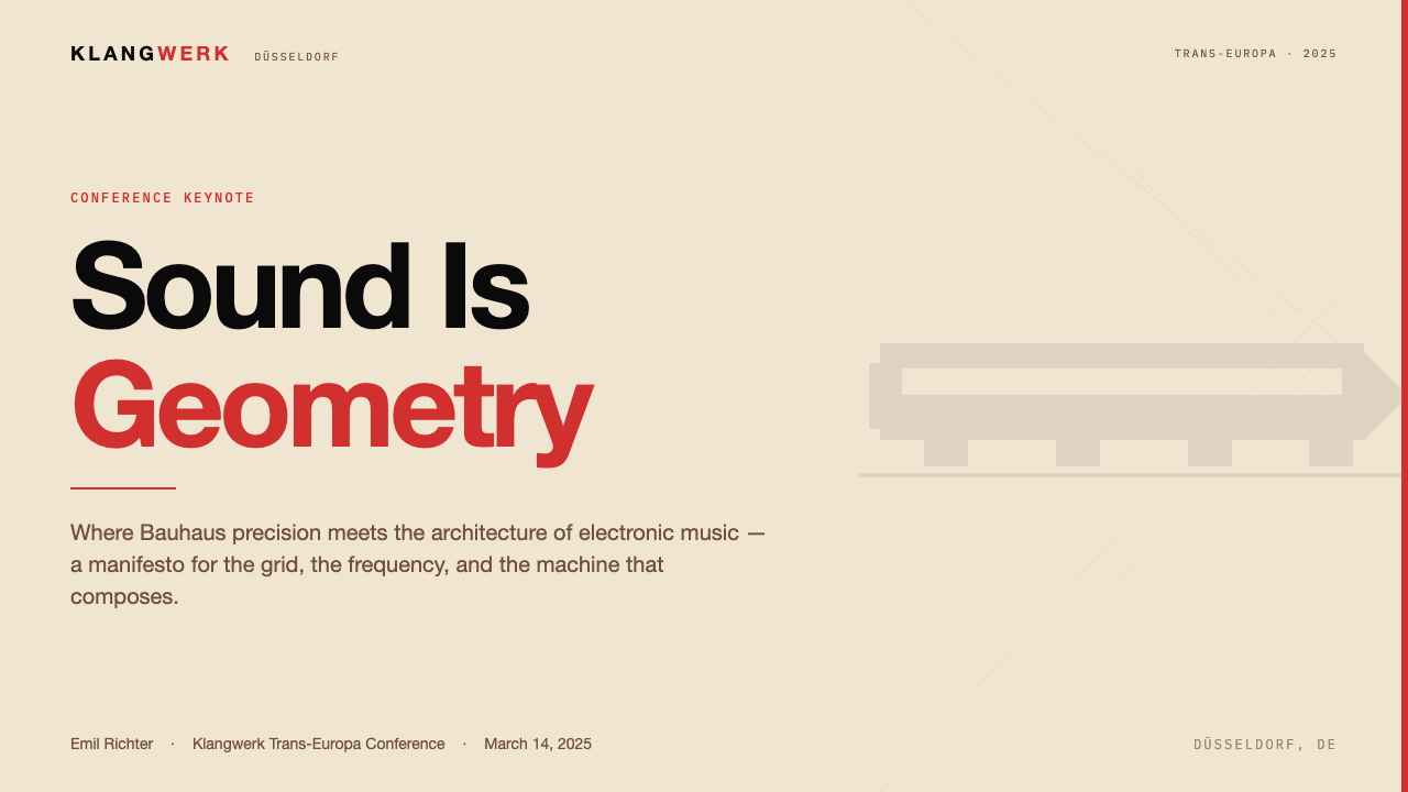
The Trans-Europa Express system is most powerful in contexts where authority, precision, and a deliberate sense of manufactured quality are desired values. The aesthetic communicates machine-era modernism — not the warm craft-inflected modernism of later movements, but the cold, engineered, intentional modernism of a system that has been optimized. It suits products and presentations that want to be perceived as rigorous, technically credible, and unconcerned with approval. For presentation decks, the system works particularly well on cover slides where a diagonal band in saturated red or pure black divides the cream ground, the event or product name sits in large geometric sans-serif above the divide, and a secondary line of information anchors below in smaller scale. The visual logic immediately signals that what follows will be organized and precise.Trans-Europa Express 体系在权威性、精密性与一种刻意的制造品质感是期望价值的场景中最为有力。这种美学传达一种机械时代现代主义——不是后来运动那种带有温暖工艺气息的现代主义,而是冷峻的、工程化的、有意为之的现代主义,一套被优化过的系统的现代主义。它适合希望被感知为严格、技术上可信且不在意讨好的产品与演示。对于演示文稿,这套系统在封面幻灯片上尤其出色——饱和红或纯黑的对角色带分隔奶油色底面,活动或产品名称以大号几何无衬线字体置于分隔线上方,次级信息以较小尺度锚定于分隔线下方。这种视觉逻辑立即发出信号:接下来的内容将是有组织的、精确的。
Content slides in this system should be treated as strict grids — no decorative dividers, no icon embellishments, no background textures. Text hierarchy is established through scale and weight alone: a large heading at the top of the grid, a clearly subordinate body at a smaller scale, and a footer line at the minimum scale. Data visualizations — bar charts, timeline diagrams, comparative tables — should embrace the geometric quality of the style: bars and segments in cream, red, and black only, with no gradient fills, and with data labels set in the same geometric sans-serif as the headline typography. When executed consistently, each slide becomes part of a visual argument rather than a container for information.这套系统中的内容幻灯片应当被当作严格的网格处理——没有装饰性分割线,没有图标点缀,没有背景纹理。文字层级仅通过尺度与字重建立:网格顶部的大号标题,以明显较小尺度呈现的从属正文,以及最小尺度的页脚行。数据可视化——柱状图、时间轴图表、对比表格——应当接纳这种风格的几何品质:仅使用奶油、红与黑的柱条和扇区,无渐变填充,数据标签以与标题排印相同的几何无衬线字体设置。当被一致地执行时,每张幻灯片都成为一个视觉论点的组成部分,而不仅仅是信息的容器。
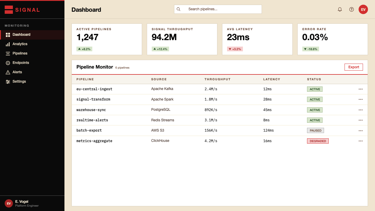
For web interfaces, the system is well-suited to dashboards, technical documentation sites, pricing pages, and any context where hierarchy and scannability outrank warmth. The recommended approach is a strict column grid with a near-cream or pure cream background, black for all body text, and saturated red reserved for active states, primary calls to action, and critical alerts. Card components should use hard borders rather than soft shadows — a thin black rule framing a cream or white surface is more consistent with the system's logic than a diffuse drop shadow. Navigation elements should be typographic: no rounded corners, no icon-only controls, no decorative separators beyond hard rules.对于网页界面,这套系统适合仪表板、技术文档站点、定价页面,以及任何层级与可扫描性优先于温度感的场景。推荐方法是:严格的列网格,接近奶油色或纯奶油色背景,所有正文使用黑色,饱和红保留给活动状态、主要行动号召与关键警示。卡片组件应使用硬边框而非柔和阴影——一条细黑边框围合一个奶油或白色表面,比漫射投影更符合这套系统的逻辑。导航元素应当是字体性的:没有圆角,没有纯图标控件,除硬线外没有装饰性分隔符。
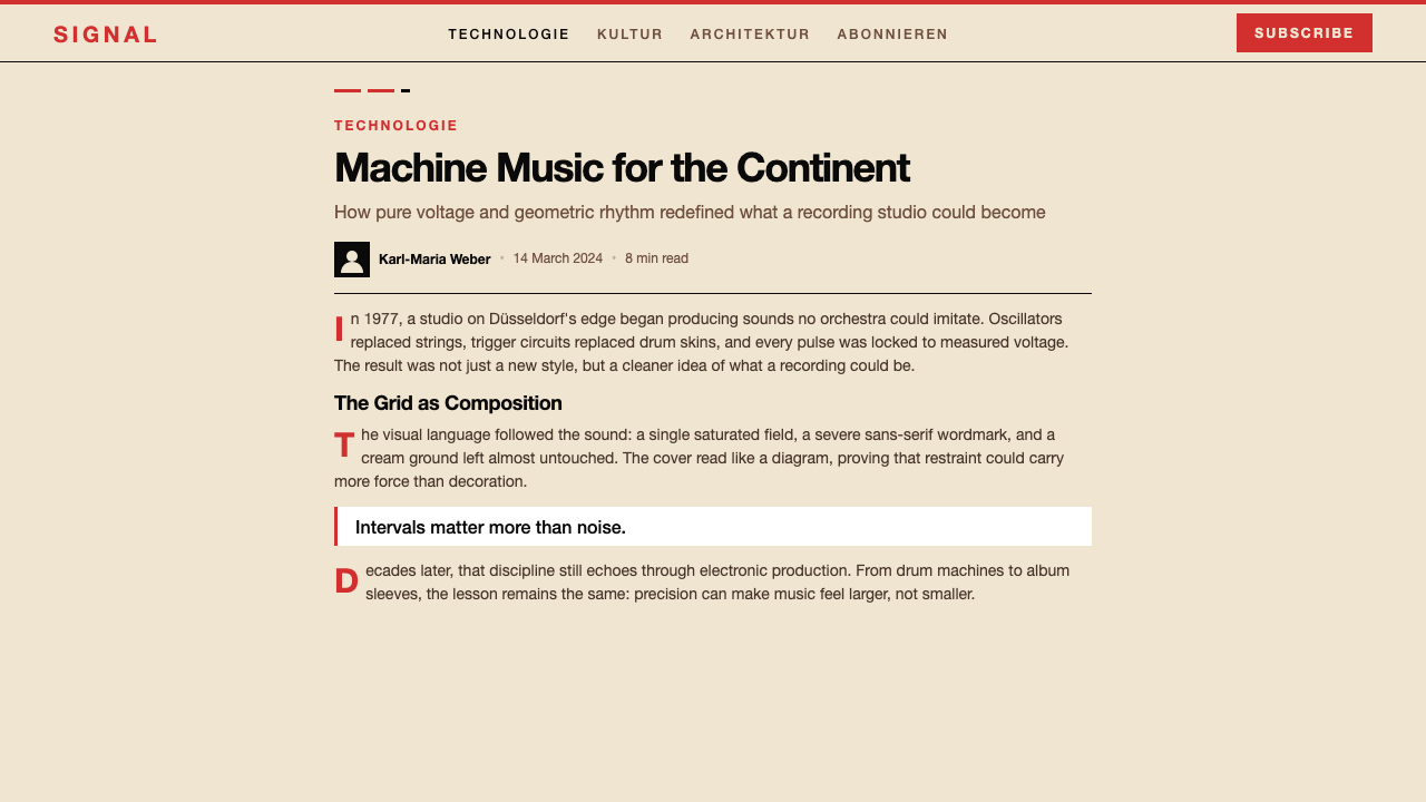
In editorial and marketing contexts, the style supports strong visual hierarchy and sustained attention across long-form content. A Trans-Europa Express-derived editorial layout uses generous left margins for pull quotes or chapter markers, a narrow measure for body text, and section breaks marked by bold horizontal rules or diagonal stripe elements rather than decorative ornaments. Marketing pages benefit from the system's poster-like quality: full-width feature sections alternating between cream grounds with red and black type, and black grounds with cream type, using the diagonal band motif as a transition device between sections. The effect is arresting rather than welcoming, which makes the style appropriate for brands positioning themselves on capability and precision rather than approachability.在编辑与营销场景中,这种风格支持强劲的视觉层级以及在长篇内容中持续的注意力。一套 Trans-Europa Express 衍生的编辑版面为引用语或章节标记使用宽裕的左侧留白,为正文使用窄行宽,以粗水平线或对角线条纹元素而非装饰性点缀标记章节分隔。营销页面受益于这种风格的海报式品质:全宽特性段落在奶油底红黑字与黑底奶油字之间交替,以对角色带母题作为板块之间的过渡装置。这种效果是引人注目的而非令人感到亲切的,这使得这种风格适合将自身定位于能力与精密性而非亲和力的品牌。
The most common mistake when applying this system is treating the three-color palette as an invitation to use all three colors simultaneously at maximum saturation on every surface. The original album cover works because cream is the dominant ground, black is the secondary structural color, and saturated red appears selectively — for the album title, for key labels, for emphasis. In practice this means red should account for a small fraction of any composition's total area; when red and black appear in roughly equal proportion, the visual tension that makes the system dynamic collapses into noise. A second common error is using any softening effect — a gradient in the red, a soft drop shadow on a card, a slightly transparent overlay — which immediately undermines the system's essential flatness and reads as a failure of commitment rather than a refinement.应用这套系统时最常见的错误,是将三色色板理解为在每个表面同时以最大饱和度使用三种颜色的邀请。原版专辑封面之所以有效,是因为奶油色是主导底色,黑色是次级结构色,饱和红是有选择性地出现的——用于专辑标题、关键标签与强调。在实践中,这意味着红色应仅占任何构图总面积的一小部分;当红与黑以大致相等的比例出现时,使这套系统充满活力的视觉张力就会崩溃为噪音。第二种常见错误是使用任何柔化效果——红色中的渐变、卡片上的柔和投影、略带透明度的叠加层——这会立即损害系统的根本平面性,读起来像是一种承诺上的失败而非精炼。
See the Kraftwerk Trans-Europa Express design system查看 Kraftwerk Trans-Europa Express 完整设计系统
Kraftwerk Trans-Europa Express — FAQKraftwerk Trans-Europa Express · 常见问题
How is this style different from Bauhaus itself?这种风格与包豪斯本身有什么区别?
Both share the core commitments: geometric structure, restricted palette, no ornament, grid-based composition. The key differences are in temperature and purpose. Bauhaus was a school and a social project — its visual language was optimistic, even utopian, designed to demonstrate that good design could improve everyday life for ordinary people. Trans-Europa Express inverts this: it is deliberate, cool, and self-aware to the point of irony. Where Bauhaus sought to reach everyone, Trans-Europa Express signals that it is indifferent to whether it reaches you. Bauhaus uses primary red, yellow, and blue; Trans-Europa Express replaces yellow entirely with cream. This is a fundamental shift — cream carries historical weight, a quality of aged documentation, that yellow's energy does not.两者共享核心承诺:几何结构、有限色板、零装饰、基于网格的构图。关键差异在于温度与目的。包豪斯是一所学校,也是一个社会项目——它的视觉语言是乐观的,甚至是乌托邦式的,旨在证明好的设计可以改善普通人的日常生活。Trans-Europa Express 将这一点倒转:它是刻意的、冷静的、自我意识到近乎反讽的程度。包豪斯寻求触达每一个人,Trans-Europa Express 则发出信号:它对是否触达你漠不关心。包豪斯使用三原色红、黄、蓝;Trans-Europa Express 完全用奶油色取代了黄色。这是一个根本性的转变——奶油色携带历史重量、一种陈年文件的质感,这是黄色的能量所不具备的。
Can this system work with imagery beyond photography?这套系统能在摄影之外配合图像运作吗?
Yes, but the imagery must be treated with the same geometric discipline that governs the typographic and color elements. Any photograph should be cropped to hard-edged geometric proportions and reproduced in a high-contrast treatment that reduces tonal complexity. Illustration, if used at all, should be geometric and flat — no hatching, no painterly texture, no representational depth. Diagrams and infographics are naturally compatible with the system and can be constructed entirely within the three-color palette. What does not work: lifestyle photography with ambient light and soft gradients, illustrative styles that imply hand production, or any image that carries more tonal range than the palette allows.可以,但图像必须以与支配排印和色彩元素的相同几何纪律处理。任何照片都应被裁剪为硬边几何比例,并以减少色调复杂性的高对比度处理方式再现。插图(若使用)应当是几何的、平面的——没有排线,没有绘画感纹理,没有具象深度。图表与信息图形与这套系统天然兼容,可以完全在三色色板内构建。不起作用的是:带有环境光与柔和渐变的生活方式摄影、暗示手工制作的插图风格,或任何携带比色板所允许的更多色调范围的图像。
Is a dark-background version possible?深色背景版本可行吗?
A dark inversion is possible but structurally more difficult than a dark Bauhaus variant. The problem is that cream — which defines the system's warmth and historical weight — becomes difficult to read as a background element on a black ground; it tends to look like an unintentional off-white rather than a deliberate material choice. The more workable dark variant replaces cream as the ground with pure black, uses cream and white as primary typographic colors, and reserves saturated red for structural accents rather than headline type. This loses some of the original's documentary quality but maintains the geometric discipline and high-contrast logic. The diagonal stripe element remains effective in dark versions: a cream or red band crossing a black ground retains the speed-and-precision reading of the original.深色反转版本是可行的,但在结构上比深色包豪斯变体更为困难。问题在于,奶油色——定义了这套系统的温度与历史重量——在黑色底面上作为背景元素时难以被正确解读;它往往看起来像是无意为之的偏白,而非刻意的材料选择。更可行的深色变体是:以纯黑取代奶油色作为底色,以奶油色和白色作为主要排印色,将饱和红保留给结构性强调而非标题文字。这会失去原版的一些文献感,但保持了几何纪律与高对比度逻辑。对角线条纹元素在深色版本中仍然有效:一条奶油色或红色色带穿越黑色底面,保留了原版的速度与精密感。
What kinds of brands or products fit this style, and which do not?什么类型的品牌或产品适合这种风格,哪些不适合?
The style is well-matched to any product where manufactured precision, technical authority, and a cool confidence are central values. Developer tools, technical infrastructure products, financial platforms, analytical software, and industrial or hardware brands are natural fits. It also works for cultural institutions — music venues, contemporary art galleries, architecture practices — where the audience expects a sophisticated engagement with design history. It does not work where warmth, accessibility, or sensory richness are essential: food and beverage brands, healthcare applications aimed at general consumers, children's products, travel and hospitality, or any product that needs to feel welcoming to a broad audience. The system's indifference can read as exclusionary in contexts where inclusion is the point.这种风格与任何以制造精密性、技术权威感与冷静自信为核心价值的产品高度匹配。开发者工具、技术基础设施产品、金融平台、分析软件以及工业或硬件品牌都是天然契合的。它也适用于文化机构——音乐场馆、当代艺术画廊、建筑事务所——那些期待与设计史进行精致对话的受众。但在温度感、亲和力或感官丰富性至关重要的场合它不起作用:面向大众消费者的食品饮料品牌、医疗健康应用、儿童产品、旅游与酒店业,或任何需要向广泛受众感觉亲切的产品。在包容性是重点的场景中,这套系统的冷漠感可能被解读为排斥性的。
How should this style handle multiple languages or long translated text?这种风格应如何处理多语言或较长的译文文字?
Long typographic runs — particularly in languages whose script density or line-break behavior differs significantly from Western Latin letterforms — require careful adaptation rather than direct transposition. The system's monumental large-scale headline approach works in most script systems where a geometric sans-serif equivalent exists. Where no close equivalent exists, the structural principle should take priority over the specific letterform: maintain the scale hierarchy, maintain the three-color discipline, and accept that the precise visual weight of the headline will shift. For body text in right-to-left or ideographic scripts, the grid logic remains valid but the diagonal stripe element may need repositioning to respect reading direction. The single non-negotiable rule is that the flatness and hard-edge quality of the system must be maintained regardless of script: no softening of letterforms, no addition of decorative stroke variations that are not intrinsic to the script itself.较长的排印文本——尤其是字符密度或换行行为与西方拉丁字母形式有显著差异的语言——需要仔细调适而非直接移植。这套系统的纪念碑式大号标题方法在大多数存在接近等效几何无衬线字体的文字系统中都能起作用。在没有接近等效字体的情况下,结构原则应优先于具体字母形式:保持尺度层级,保持三色纪律,并接受标题的精确视觉重量将有所偏移这一事实。对于从右到左或表意文字的正文排印,网格逻辑保持有效,但对角线条纹元素可能需要重新定位以尊重阅读方向。唯一不可妥协的规则是:无论使用何种文字,系统的平面性与硬边品质都必须得到保持——不对字母形式做柔化处理,不添加非文字本身固有的装饰性笔画变化。
Related design styles相关设计风格
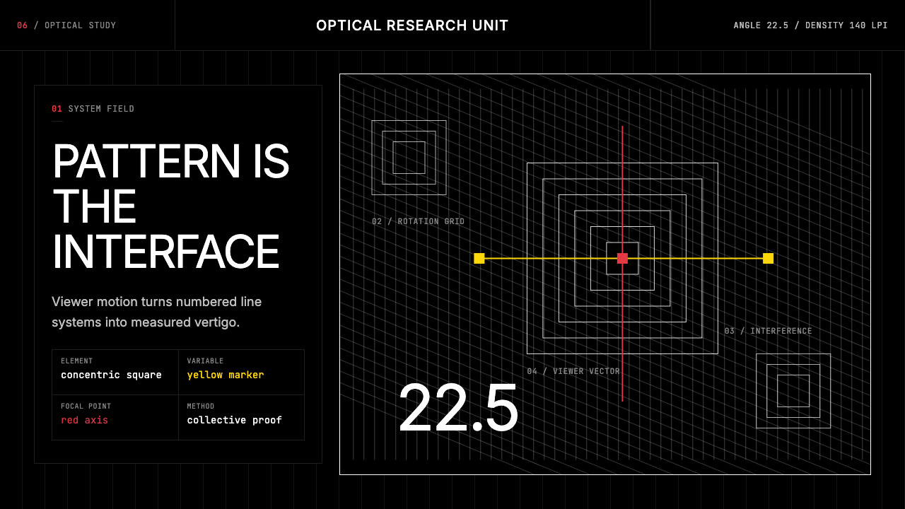 GRAV Op-Kinetic (1960)Vertigo by calculation. White line fields on black, with red and yellow as co…以计算制造眩晕。黑底白线场中,红与黄是受控变量。
 2001 — A Space OdysseyAbsolute restraint. Black void, white monolith geometry, one HAL-red signal.绝对克制:黑色虚空、白色巨石几何、唯一的 HAL 红信号。
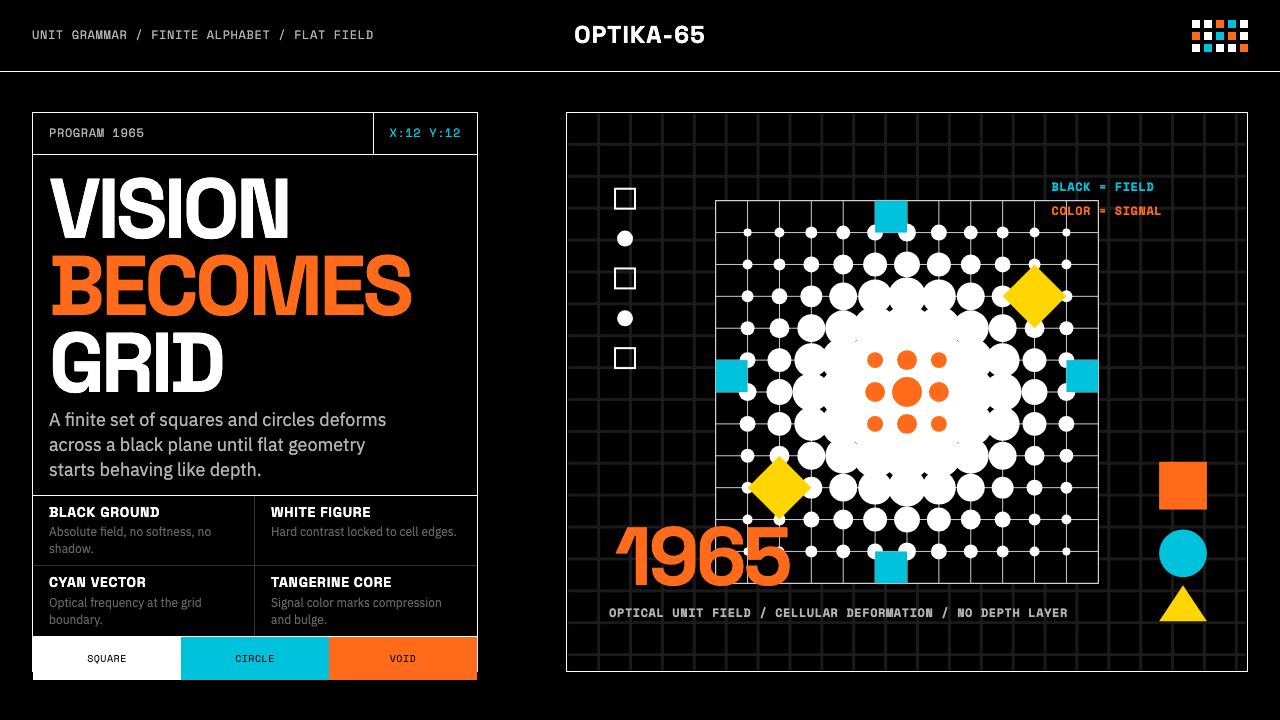 Hungarian Vasarely Op Art (1965)Mathematics makes vision pulse. Black grids, white units, cyan and tangerine…数学让视觉脉动:黑底白格与青橘单元扭曲深度。
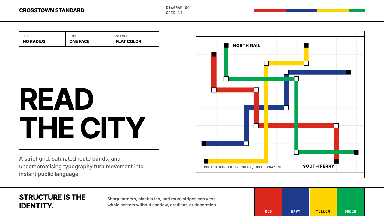 Massimo Vignelli NYCClarity becomes infrastructure. Black rules and route stripes lock the white…清晰即基础设施。白底黑线与路线色带锁定网格。
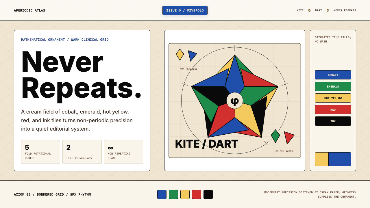 Penrose Aperiodic TilingAperiodic rigor, warmed. Cream grid carries cobalt, emerald and hot-yellow ki…非周期理性被暖化:米色网格托起钴蓝、翠绿与热黄风筝飞镖。
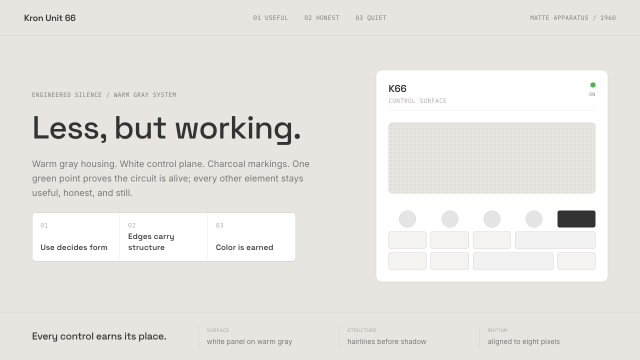 Dieter Rams / BraunQuiet by design. Warm gray, white panels, hairline grids, and one earned gree…安静即设计:暖灰、白面板、细网格,只留一枚绿色指示点。