Design style guide设计风格指南
What is GRAV Op-Kinetic (1960)?什么是 GRAV Op-Kinetic (1960)?
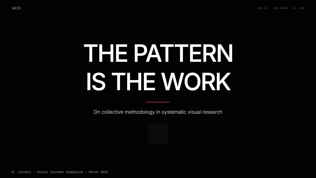
GRAV turned optical vertigo into a collective discipline — six Paris artists who abolished individual authorship and made the viewer's dizziness the medium itself.GRAV把光学眩晕变成一种集体纪律——六位巴黎艺术家废除了个人署名,把观者的晕眩本身变成了作品的媒介。
GRAV Op-Kinetic (1960) in briefGRAV Op-Kinetic (1960) 速览
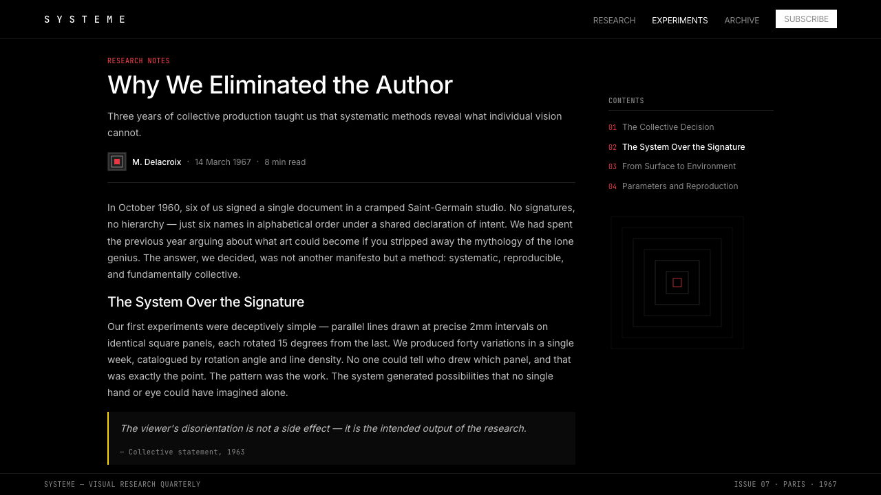
GRAV — Groupe de Recherche d'Art Visuel, or Group for Visual Art Research — was a Paris-based collective active from 1960 to 1968 that treated art-making as systematic scientific inquiry. The six founding members rejected the idea of the solitary genius and instead operated as a research unit, numbering their works, publishing manifestos, and submitting their visual experiments to the same kind of collective critique a laboratory team might apply to data.GRAV(视觉艺术研究小组)是一个1960至1968年间活跃于巴黎的集体,把艺术创作当作系统性的科学研究来实践。六位创始成员拒绝孤独天才的形象,以研究单元的方式运作:给作品编号,发表宣言,对彼此的视觉实验施加实验室团队般的集体批判。
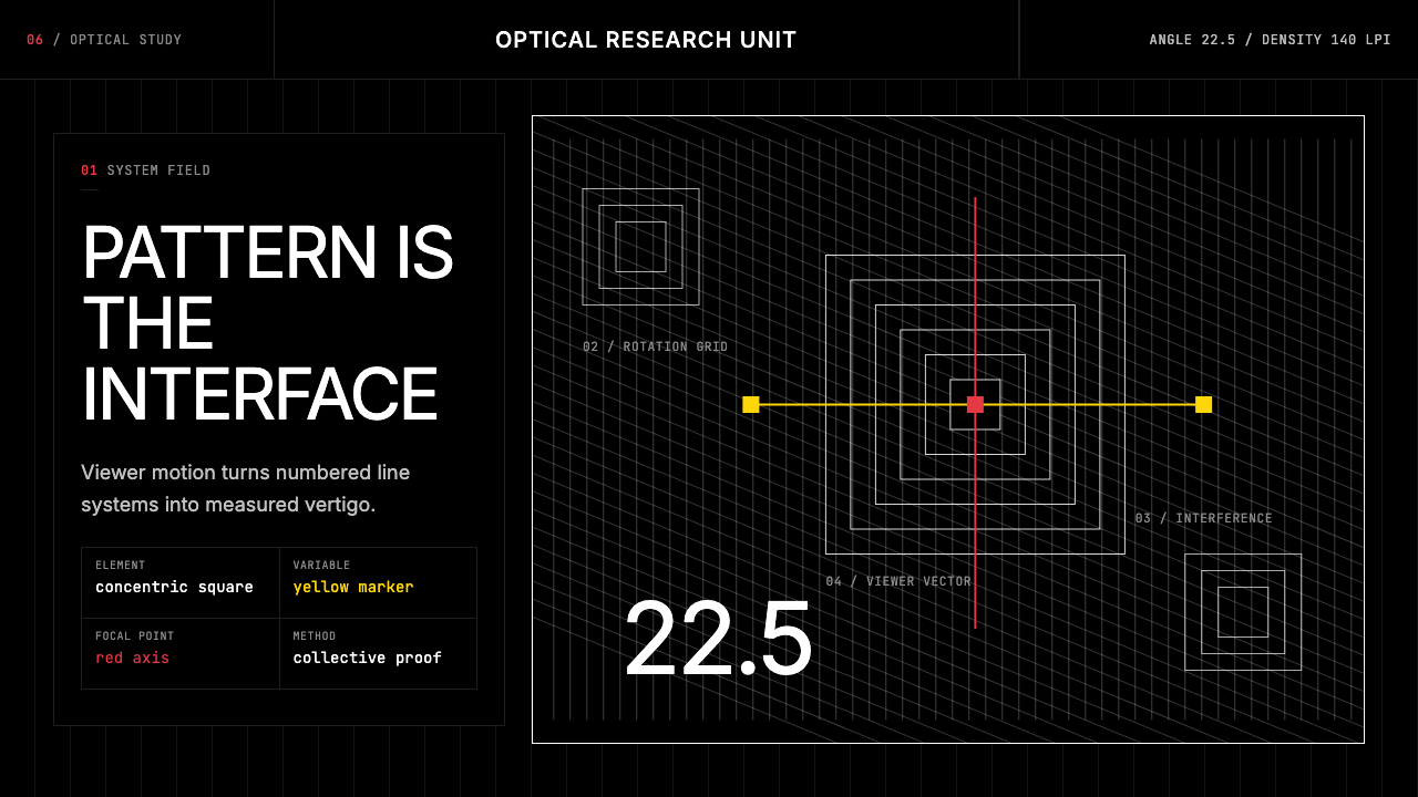
The visual language they produced is defined by pure optical contrast. Dense fields of parallel lines, concentric squares, and mathematically rotated grids occupy black grounds, generating the perceptual instability — apparent motion, pulsation, after-image flicker — that the group called 'visual perturbation.' This is not decoration in any traditional sense; it is a calibrated assault on the eye's tendency to resolve ambiguous information into stable form. The pattern is the content.他们创造的视觉语言以纯粹的光学对比为核心。密集的平行线阵列、同心方阵和数学旋转的栅格占据黑色底面,产生感知上的不稳定——表观运动、脉冲感、余像闪烁——小组称之为「视觉扰动」。这不是任何传统意义上的装饰,而是对视觉系统试图将模糊信息解析为稳定形态这一倾向的精确冲击。图案本身即是内容。
Color in GRAV work appears rarely and precisely. The dominant register is pure black and white: maximum contrast with zero narrative. When color enters — a Le Parc red cutting across a white line field, a Morellet yellow applied to a rotating grid — it functions as a controlled experimental variable, not an expressive choice. The system remains diagrammatic, flat, and rigorously anti-gestural throughout.色彩在GRAV作品中出现得稀少而精确。主要基调是纯黑与纯白:最大对比度,零叙事性。当色彩介入时——勒帕克的红切过白色线场,莫雷莱的黄施加于旋转栅格——它作为受控的实验变量发挥作用,而非表达性的选择。整套系统始终保持示意图式、平整,以及对手势痕迹的严格拒绝。
See the GRAV Op-Kinetic (1960) design system →查看 GRAV Op-Kinetic (1960) 完整设计系统 →
Where does GRAV Op-Kinetic (1960) come from?GRAV Op-Kinetic (1960) 从何而来?
GRAV was founded in Paris in 1960 by six artists: Julio Le Parc (Argentine-born, the group's most internationally recognized figure), François Morellet (French, the most systematically rigorous of the six), Horacio García Rossi (Argentine), Francisco Sobrino (Spanish), Joël Stein (French), and Yvaral (Jean-Pierre Vasarely, French, son of Victor Vasarely). Their center of gravity was Galerie Denise René on the Boulevard Raspail, the Paris gallery that had championed geometric abstraction and kinetic art since the 1940s and had exhibited Vasarely, Calder, and Tinguely.GRAV于1960年在巴黎由六位艺术家共同创立:胡里奥·勒帕克(阿根廷裔,小组中国际知名度最高者)、弗朗索瓦·莫雷莱(法国人,六人中系统性最为严格者)、奥拉西奥·加西亚·罗西(阿根廷)、弗朗西斯科·索布里诺(西班牙)、若埃尔·斯泰因(法国)和伊瓦拉尔(让-皮埃尔·瓦萨雷利,法国人,维克托·瓦萨雷利之子)。他们的重心是位于拉斯派伊大道的德尼斯·勒内画廊——这家画廊自1940年代起便力推几何抽象与动力艺术,曾展出瓦萨雷利、考尔德和廷格利的作品。
The formation of GRAV coincided with a broader ferment in European avant-garde practice. The late 1950s and early 1960s saw the emergence of several artist groups that rejected both the emotional intensity of Abstract Expressionism and the commercial annexation of Pop Art, preferring instead to work with optical phenomena, industrial materials, and audience participation. GRAV's immediate peer networks included Zero in Düsseldorf, N Group in Padua, and the Nouvelle Tendance movement, with which they formally affiliated in 1961. The Nouvelle Tendance held that art should be anonymous, reproducible, and socially functional — positions GRAV embodied completely.GRAV的成立恰逢欧洲先锋艺术实践的广泛发酵期。1950年代末至1960年代初,出现了若干艺术家群体,他们拒绝抽象表现主义的情感强度,也拒绝波普艺术的商业收编,转而以光学现象、工业材料与观众参与为工作方式。GRAV最近的同行网络包括杜塞尔多夫的Zero小组、帕多瓦的N小组以及他们于1961年正式加入的「新倾向」运动。「新倾向」主张艺术应当匿名、可复制且具有社会功能——这些立场被GRAV彻底体现。
GRAV's working method was unusual for fine art: the group held weekly meetings, assigned research problems collectively, and produced joint manifestos with numbered theses. Their most influential public action was the 1966 'A Day in the Street' event in Paris, in which they turned the area around the Palais Royal into a participatory environment of optical games, unstable walkways, and moiré-pattern panels. Passersby became performers without knowing it. The event anticipated the rhetoric — if not always the practice — of later interactive and participatory art.GRAV的工作方式在纯艺术领域颇为罕见:小组每周举行会议,集体布置研究课题,并联合发表带编号论点的宣言。他们最具影响力的公共行动是1966年的「街头一日」活动,在巴黎皇家宫殿周边区域建起光学游戏、不稳定步道和莫尔纹图案板构成的参与式环境。路人在不知情的情况下成为表演者。这一事件预示了后来互动艺术与参与性艺术的话语逻辑——即便未必总能在实践上达到。
The group dissolved in July 1968 in the wake of the May Events that shook Paris that year. The upheaval prompted members to reconsider collective anonymity in favor of individual political commitments; Le Parc, for instance, had already been expelled from France in 1966 for his political activities (a detention that paradoxically boosted his international profile when it became a cause célèbre in the art world). After dissolution, the six members continued as individual artists, but the shared vocabulary they had forged — mathematical precision, optical aggression, the subordination of authorship to system — remained the defining grammar of each one's subsequent career.小组于1968年7月在那年震动巴黎的五月风暴之后宣告解散。这场动荡促使成员们重新考虑集体匿名与个人政治承诺之间的关系——勒帕克早在1966年便因政治活动被驱逐出法国,这一事件反而因在艺术界引发轩然大波而提升了他的国际声望。解散后六人以个人身份继续创作,但他们共同锻造的视觉词汇——数学精确性、光学进攻性、作者身份对系统的服从——仍是各自此后职业生涯的定义语法。
What defines the GRAV Op-Kinetic (1960) look?GRAV Op-Kinetic (1960) 的视觉特征是什么?
Black-and-White Optical Contrast黑白光学对比
The foundational register is pure black against pure white at maximum contrast. This is not a neutral starting point but an active choice: maximum contrast between two achromatic poles forces the visual system to keep resolving edges, generating apparent flicker and instability at boundaries. Gray rarely appears; half-tones never. The binary palette is the engine of the optical effect.基础基调是纯黑与纯白的最大对比。这不是中性的起点,而是一种主动选择:两个非彩色极之间的最大对比迫使视觉系统持续解析边缘,在边界处产生表观闪烁与不稳定感。灰色极少出现,半色调从不出现。这套二元色板是光学效果的引擎。
Mathematical Line Fields数学线场
Dense arrays of parallel lines, concentric circles, and rotating grids are the primary compositional elements. The spacing between lines, the angle of rotation, and the frequency of pattern repetition are all specified numerically — not adjusted by eye. Where two line systems overlap, moiré interference patterns emerge as emergent phenomena, not as planned decoration. The resulting visual turbulence is a consequence of the math, not an artistic addition.密集的平行线阵列、同心圆和旋转栅格是主要的构图元素。线间距、旋转角度和图案重复频率均以数值指定——而非凭眼感调整。当两套线系统叠加时,莫尔纹干涉图案作为涌现现象出现,而非预谋的装饰。由此产生的视觉湍流是数学的结果,不是艺术性的添加。
Controlled Color as Variable作为变量的受控色彩
When color appears, it does so sparingly and with declared purpose. A single strong red or a sharp yellow enters the composition the way a dye enters a chemical solution — its effect on the surrounding black-and-white field is the point of the experiment. Le Parc's saturated reds and Morellet's yellows function as controlled variables in a visual experiment, not as expressive decisions. Using multiple strong colors simultaneously is structurally inconsistent with the system.色彩出现时,总是克制而有明确目的。一抹强烈的红或一道鲜明的黄进入构图,就像染料进入化学溶液——它对周围黑白场的影响才是实验的重点。勒帕克的饱和红与莫雷莱的黄在视觉实验中作为受控变量发挥作用,而非表达性决定。同时使用多种强色在结构上与这套系统不相容。
Absolute Flatness绝对平整
Every element occupies the same visual plane. There is no simulated depth, no shadow to suggest elevation, no atmospheric recession. Where elements overlap, the layering is purely geometric — one shape covers another the way a stencil covers paper — without any suggestion of physical space between them. This radical flatness distinguishes GRAV work from contemporary kinetic sculpture that achieves optical effects through actual three-dimensional movement.每个元素占据同一视觉平面。没有模拟深度,没有暗示高度的阴影,没有大气透视的消退。元素叠加时,分层纯属几何性质——一个形状遮盖另一个,就像模板遮盖纸面——两者之间没有任何实体空间的暗示。这种彻底的平整性将GRAV的平面作品与通过实际三维运动产生光学效果的动力雕塑区别开来。
Anonymous, Numbered, Systematic匿名、编号、系统化
GRAV works were often attributed to the collective rather than to individual members, and were identified by serial numbers rather than poetic titles. This was a deliberate aesthetic as much as a political position: the numbering system signals that each work is an instance in a series, a data point in an ongoing investigation rather than a unique expressive act. The logic is closer to scientific publication than to traditional fine art cataloguing.GRAV的作品通常归属于集体而非个人成员,并以序列编号而非诗意标题加以标识。这既是蓄意的美学立场,也是政治立场:编号体系表明每件作品是一个系列中的实例,是一项持续调查中的数据点,而非独特的表达行为。这套逻辑更接近科学发表,而非传统纯艺术编目。
Viewer Participation as Structure观者参与作为结构
GRAV designed many works specifically to require the viewer's physical movement to complete the optical effect. Unstable walkways, light labyrinths, and interactive optical panels meant that the image was not fixed on the surface but existed in the encounter between the work and a moving body. In two-dimensional applications of the style, this principle translates as layouts that reward scanning and deliberate reading — compositions that reveal structure progressively rather than all at once.GRAV专门设计了许多作品,要求观者的身体移动来完成光学效果。不稳定步道、光迷宫和互动光学板意味着图像不是固定在表面上的,而是存在于作品与运动的身体之间的相遇中。在这种风格的二维应用中,这一原则转化为奖励扫视与刻意阅读的版面——构图逐步揭示结构,而非一次性全部呈现。
Zero Gestural Mark零手势痕迹
No trace of the human hand appears in canonical GRAV work. Lines are ruled, not drawn; edges are crisp, not brushed; spacing is measured, not felt. This anti-gestural commitment is partly ideological — against the cult of artistic personality — and partly the precondition for the optical effects themselves, which depend on the regularity that only mechanical or mathematical precision can guarantee. Any hint of handmade irregularity breaks the perceptual oscillation the system is built to produce.在典型的GRAV作品中,没有人手的痕迹出现。线条是用尺规绘制的,而非徒手画的;边缘是锐利的,而非笔触性的;间距是测量出来的,而非凭感觉决定的。这种反手势的承诺一半是意识形态层面的——反对艺术个人崇拜——一半是光学效果本身的前提条件,而光学效果依赖于只有机械或数学精度才能保证的规律性。任何手工制作的不规则痕迹都会破坏这套系统被设计来产生的感知振荡。
See the GRAV Op-Kinetic (1960) design system →查看 GRAV Op-Kinetic (1960) 完整设计系统 →
Who shaped GRAV Op-Kinetic (1960)?谁塑造了 GRAV Op-Kinetic (1960)?
Argentine-born and Paris-educated, Le Parc was GRAV's most visible figure internationally and arguably its most inventive. His motorized light installations — suspended reflective elements that cast slowly shifting geometric shadows — extended the group's optical principles into actual physical kinetics. He was expelled from France in 1966 for political activities, an event that became a cause célèbre in the international art world and significantly raised his profile. After GRAV dissolved in 1968, he continued producing optical and participatory works into the twenty-first century, with major retrospectives confirming his place as a central figure in the history of kinetic and participatory art.生于阿根廷、受教于巴黎的勒帕克是GRAV国际上最具知名度的人物,也可以说是最富创造力的一位。他的机动光装置——悬挂的反光元件投射出缓慢移动的几何阴影——把小组的光学原则延伸进了真实的物理动力学领域。他于1966年因政治活动被驱逐出法国,此事在国际艺术界引发轩然大波,大幅提升了他的声望。GRAV于1968年解散后,他继续创作光学与参与性作品,直至二十一世纪;多次重要回顾展确立了他作为动力艺术与参与艺术史核心人物的地位。
Morellet was the most systematically rigorous of the six members, and the one most committed to reducing artistic decision-making to explicit rule systems. Many of his works specify the generating rule in their title: a grid rotated by a fixed number of degrees, lines drawn at set intervals across a surface, random arrangements determined by phone-book digit sequences. His approach anticipated the logic of algorithmic and generative art by decades. After GRAV dissolved he continued working in France, gaining wide recognition in the 2000s as a foundational figure in both conceptual and optical art.莫雷莱是六位成员中系统性最为严格的一位,也是最致力于将艺术决策简化为明确规则系统的一位。他的许多作品在标题中就注明了生成规则:栅格旋转固定角度,线条以固定间隔跨越表面,由电话号码数字序列决定的随机排列。他的方式比算法艺术与生成艺术的逻辑早了数十年。GRAV解散后,他在法国继续创作,并于2000年代作为概念艺术与光学艺术的奠基人物获得广泛认可。
The son of Victor Vasarely — the Hungarian-French painter who had effectively invented Op Art's visual vocabulary in the 1950s — Yvaral brought both a direct lineage and a desire to push beyond his father's individual approach. Within GRAV he was responsible for some of the most visually complex works, using superimposed grid systems that generated interference patterns at their intersections. His later career included work in computer-generated imagery, making him an early practitioner of the digital extension of optical art principles.作为维克托·瓦萨雷利(匈牙利裔法国画家,实际上于1950年代发明了欧普艺术视觉词汇)之子,伊瓦拉尔同时带来了直接的传承与突破父亲个人方式的意愿。在GRAV内部,他负责了一些视觉上最为复杂的作品,使用叠加栅格系统在交叉处产生干涉图案。他后来的职业生涯涉及计算机生成图像,使他成为光学艺术原则数字延伸的早期实践者。
García Rossi specialized in works that combined actual physical light with optical pattern — luminous boxes, backlit panels, and configurations in which colored light played across structured surfaces. His contribution expanded GRAV's practice from pure graphic optical effects into environmental light installation, anticipating the immersive light art that would become a prominent form in the late twentieth century. Like Le Parc, he was Argentine-born, and the participation of multiple Latin American artists in GRAV was no coincidence: the Galerie Denise René had actively recruited from Latin American artistic communities in Paris.加西亚·罗西专注于将实际物理光线与光学图案相结合的作品——发光盒、背光板以及彩色光线在结构化表面上游移的装置。他的贡献将GRAV的实践从纯粹的图形光学效果扩展至环境光装置,预示了二十世纪末成为重要形式的沉浸式光艺术。和勒帕克一样,他生于阿根廷;多位拉丁美洲艺术家参与GRAV并非偶然:德尼斯·勒内画廊曾积极从巴黎的拉丁美洲艺术家群体中招募人才。
Spanish-born Sobrino worked primarily with transparent and reflective materials — plexiglass, metal, and structured overlays that produced optical effects through actual physical layering rather than purely graphic means. His works often involved multiple superimposed planes that, when the viewer moved, produced shifting moiré patterns through genuine parallax. He documented his working methods with unusual precision, leaving behind detailed process notes that situate his practice firmly in the group's research-laboratory ethos.生于西班牙的索布里诺主要使用透明与反射材料——有机玻璃、金属以及通过实际物理分层而非纯图形手段产生光学效果的结构化叠层。他的作品常涉及多个叠加平面,当观者移动时,通过真实的视差产生变化的莫尔纹图案。他以不寻常的精确度记录了自己的工作方法,留下了详细的过程笔记,将其实践牢固地置于小组研究实验室的精神氛围中。
How do you use GRAV Op-Kinetic (1960) today?今天怎么用 GRAV Op-Kinetic (1960)?
GRAV Op-Kinetic is a high-commitment style: its optical effects only work when executed with the same mathematical precision the group itself brought to their work. When applied loosely — parallel lines drawn by eye, grid rotations approximated rather than specified — the perceptual oscillation collapses into mere visual noise. The style rewards designers who are comfortable with rule-based systems and who understand that every spacing decision is a parameter, not an aesthetic judgment.GRAV欧普-动力风格是一种高度要求投入的风格:其光学效果只有在以小组自身带入作品中的那种数学精确度执行时才能奏效。如果应用得松散——平行线靠眼感绘制、栅格旋转是近似值而非精确值——感知振荡就会崩溃为单纯的视觉噪声。这种风格奖励熟悉基于规则的系统、并理解每一个间距决定都是参数而非美学判断的设计师。
For presentation slides, the style is most effective on covers and section dividers rather than content pages. A cover built on a white line field against black, with a precise concentric-square pattern centered on a single strong accent color for the title, creates an immediate visual impact that signals technical precision and unconventional thinking. Section dividers can use rotating grid patterns that generate subtle moiré where two layers meet. Content pages should remain clean: black type on white, with a structural line or two in the accent color as the only graphic element. Data slides translate well — bar and scatter plots become optical objects in their own right when rendered in sharp black on white with a single accent color marking the featured data series.在演示文稿中,这种风格在封面和章节分隔页上最为有效,而非内容页。一张建立在黑底白色线场上、以单一强烈强调色作为标题焦点的精确同心方阵封面,能产生立竿见影的视觉冲击,传达技术精确性与非传统思维的信号。章节分隔页可以使用在两层相遇处产生微妙莫尔纹的旋转栅格图案。内容页应保持简洁:白底黑字,以一两条结构线和强调色作为唯一的图形元素。数据幻灯片转化效果良好——当柱状图和散点图以黑底白色锐利呈现,并以单一强调色标记重点数据系列时,它们本身就成为光学对象。
For web interfaces, GRAV works well on landing pages and marketing sites where the goal is to produce a strong immediate impression, and on dashboard or analytics products where the visual language of rigor and precision is a brand asset. A GRAV-inflected dashboard uses a dark background with fine white line grids as structural elements, data plotted in bright white or sharp accent colors, and zero decorative fills or soft shadows. Navigation and labels should be typographically minimal — clean, geometrically rational letterforms — because ornate type actively disrupts the optical field the patterns create.对于网页界面,GRAV适合目标是产生强烈即时印象的落地页和营销网站,以及严谨与精确的视觉语言是品牌资产的仪表板或数据分析产品。受GRAV启发的仪表板使用深色背景配以细白线栅格作为结构元素,数据以亮白色或锐利强调色绘制,无装饰填充,无柔和阴影。导航与标签应在排印上保持极简——字形干净、几何理性——因为华丽的字体会主动破坏图案所创造的光学场域。
For editorial and marketing contexts, the style supports bold, poster-scale compositions where a single optical motif occupies a large field. A marketing page using GRAV principles might open with a full-width concentric-square or parallel-line field in black and white, with the headline reversed out in white and a single accent-colored call-to-action button. The optical pattern then recedes as the user scrolls into body content, functioning as a bold first impression rather than a sustained texture. This approach borrows the group's theatrical event design — the 'Day in the Street' aesthetic of environmental immersion — and translates it into a digital scroll.在编辑与营销语境中,这种风格支持海报尺度的大胆构图,单一光学母题占据大面积画面。采用GRAV原则的营销页面可以用全宽黑白同心方阵或平行线场开篇,标题以白色反白呈现,行动号召按钮以单一强调色标出。当用户向下滚动进入正文内容时,光学图案退居背景,作为大胆的第一印象而非持续的纹理发挥作用。这种方式借鉴了小组的戏剧性事件设计——「街头一日」的环境沉浸美学——并将其转化为数字滚动体验。
The most common mistake when applying this style is treating the optical patterns as decorative backgrounds while keeping the rest of the design conventional. The patterns are not backgrounds; they are the content. A conventional card-grid layout with a moiré texture overlaid is not a GRAV design — it is a mismatch between surface and structure. Equally, introducing soft gradients, warm tones, rounded corners, or hand-drawn elements directly contradicts the system's logic. If the design feels like it needs to be 'warmed up,' the GRAV style is probably wrong for the context.应用这种风格时最常见的错误是把光学图案当作装饰性背景使用,同时保持其余设计的传统风貌。图案不是背景,它们是内容本身。在常规卡片网格布局上叠加莫尔纹纹理,不是GRAV设计——而是表面与结构之间的错配。同样,引入柔和渐变、暖色调、圆角或手绘元素,直接违背了这套系统的逻辑。如果设计感觉需要被「暖化」,那么GRAV风格在这个语境中很可能是错误的选择。
See the GRAV Op-Kinetic (1960) design system →查看 GRAV Op-Kinetic (1960) 完整设计系统 →
GRAV Op-Kinetic (1960) — FAQGRAV Op-Kinetic (1960) · 常见问题
How is GRAV Op-Kinetic different from Victor Vasarely's Op Art?GRAV欧普-动力风格与维克托·瓦萨雷利的欧普艺术有何不同?
Vasarely worked as an individual artist developing a personal visual vocabulary that grew richer and more colorful over time; his later work is full of chromatic complexity and biomorphic geometric shapes. GRAV was collectively committed to the opposite: maximum restraint, minimum color, and the suppression of individual authorship. Vasarely's patterns tend toward the decorative and the optically satisfying; GRAV's tend toward visual perturbation that is deliberately uncomfortable. The styles share mathematical precision and geometric structure but diverge completely in emotional register and purpose.瓦萨雷利作为个人艺术家工作,发展出一套随时间推移愈发丰富多彩的个人视觉词汇;他晚期的作品充满色彩复杂性和生物形态的几何形状。GRAV则集体致力于截然相反的方向:最大克制、最少色彩、压制个人署名。瓦萨雷利的图案倾向于装饰性和光学上令人满足的效果;GRAV的图案倾向于刻意令人不适的视觉扰动。这两种风格共享数学精确性和几何结构,但在情感基调和目的上完全分道扬镳。
Can this style work with color photography or illustration?这种风格能与彩色摄影或插图配合使用吗?
Rarely and carefully. GRAV's visual system depends on the optical oscillation produced by high-contrast black-and-white line work. Color photography introduces organic gradients, tonal complexity, and visual warmth that directly counteract the system's effects. If photographic imagery is used at all, it should be converted to hard-contrast black-and-white and treated as a geometric element — silhouetted or cropped into a structured shape — rather than allowed to function as a naturalistic window. Rich full-color illustration is generally incompatible with the style unless it is itself geometrically structured and restricted to the same controlled palette of black, white, and one accent color.极少,且需谨慎。GRAV的视觉系统依赖于高对比度黑白线条作品产生的光学振荡。彩色摄影引入了有机渐变、色调复杂性和视觉温度,直接与系统效果相抵触。如果确实使用摄影图像,应将其转换为硬对比度黑白,并作为几何元素处理——做成轮廓剪影或裁入结构化形状——而非允许其作为自然主义窗口发挥作用。丰富的全彩插图通常与这种风格不相容,除非插图本身在几何上是结构化的,且被限制在黑、白和一种强调色的同一受控色板内。
Does the dark background version work the same way as the light version?深色背景版本的效果与浅色版本相同吗?
The optical mechanics are similar but the perceptual experience differs significantly. On a black ground, white line fields advance optically — the white lines appear to float or vibrate against the receding black. On a white ground, black lines recede into the surface, producing a denser, more claustrophobic oscillation. Most canonical GRAV works use black grounds because the advancing quality of white lines on black better produces the sensation of motion and spatial instability that the group was after. The dark version is also more demanding on screen — fine white lines on black tend to produce stronger halation on lower-quality displays, which can unintentionally intensify the optical effect.光学机制相似,但感知体验有显著差异。在黑色底面上,白色线场在视觉上向前突出——白色线条显得像在向后退的黑色中漂浮或振动。在白色底面上,黑色线条向表面退缩,产生更密集、更有压迫感的振荡。大多数典型的GRAV作品使用黑色底面,因为白线在黑底上的突出性质更能产生小组追求的运动感和空间不稳定感。深色版本在屏幕上也要求更高——细白线在黑底上往往在低质量显示器上产生更强的光晕,这可能会无意中强化光学效果。
How do I know if my line patterns are dense enough to produce optical effects?我怎么知道我的线条图案是否足够密集,能够产生光学效果?
The optical oscillation that defines this style emerges from line densities and line-to-gap ratios that approach perceptual resolution limits — meaning the gap between lines should be close to the same width as the lines themselves, at the scale the work will actually be viewed. If lines are too widely spaced, the eye reads them as a simple striped pattern; if too closely packed, they merge into a uniform tone. The right density produces the visual tension where the eye cannot decide whether to track the lines or the gaps. This has to be tested empirically: design the pattern at intended display size, then step back to the intended viewing distance and observe whether the surface appears to pulse or oscillate.定义这种风格的光学振荡产生于接近感知分辨率极限的线条密度和线宽与间隙比——即线间距应接近于线条本身的宽度,这一比例要在作品实际观看尺度下成立。如果线条间距过宽,眼睛会将其解读为简单的条纹图案;如果过于密集,它们会融合为均匀的色调。正确的密度会产生视觉张力,让眼睛无法决定是追踪线条还是追踪间隙。这必须通过实证测试:在预定显示尺寸下设计图案,然后退至预定观看距离,观察表面是否呈现出脉冲或振荡感。
Is this style appropriate for accessible design?这种风格适合无障碍设计吗?
With serious caveats. The optical oscillation effects that define GRAV work are specifically designed to overwhelm the visual system's pattern-resolution mechanisms — which means they can trigger migraine auras, vestibular disturbance, and photosensitive epileptic responses in susceptible individuals. Dense high-contrast flickering patterns are among the pattern types flagged by accessibility guidelines as potentially harmful. If using this style in a web or interactive context, the most responsible approach is to use the optical patterns only for static, non-animated large-format graphic elements, avoid placing text over dense oscillating fields, and provide a motion or pattern-reduction setting that substitutes a simplified version for users who need it.需要严肃提醒。定义GRAV作品的光学振荡效果,在设计上就是要压倒视觉系统的图案分辨机制——这意味着对于易感个体,它们可能触发偏头痛先兆、前庭功能障碍和光敏性癫痫反应。密集的高对比度闪烁图案属于无障碍指南标记为潜在有害的图案类型之一。如果在网络或互动语境中使用这种风格,最负责任的做法是:仅将光学图案用于静态、非动态的大尺寸图形元素;避免在密集振荡场上放置文字;并为需要的用户提供动态或图案简化设置,以简化版本替代。
Related design styles相关设计风格
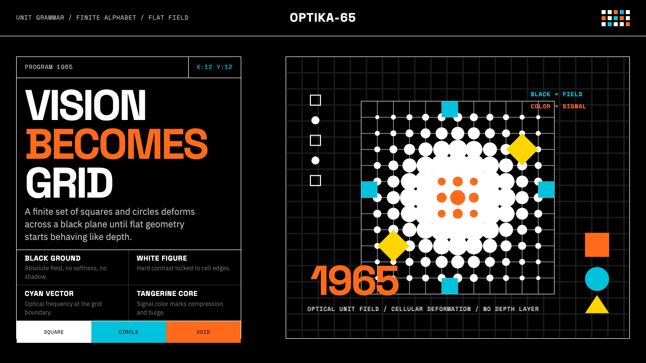 Hungarian Vasarely Op Art (1965)Mathematics makes vision pulse. Black grids, white units, cyan and tangerine…数学让视觉脉动:黑底白格与青橘单元扭曲深度。
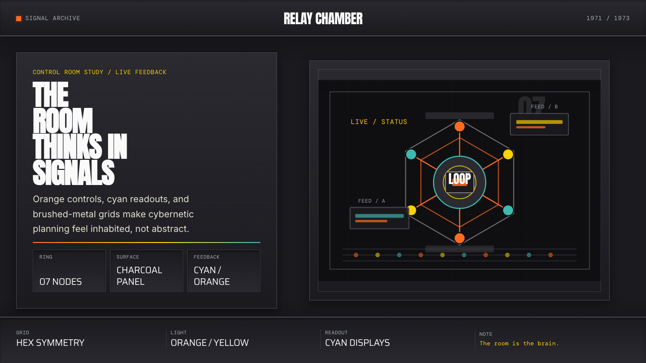 Cybernetic 1968 (Stafford Beer)Mission-control severity. Charcoal panels, orange buttons, cyan readouts, hex…控制室般冷峻。炭黑面板、橙按钮、青读数与六边环形。
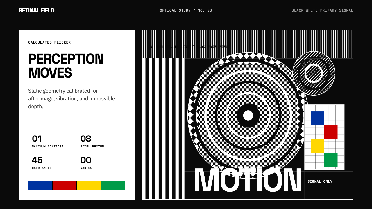 Op Art (Riley / Vasarely)Perception is engineered. Black-white grids and primary signals make static g…感知被工程化:黑白网格与原色信号让静止几何振动。
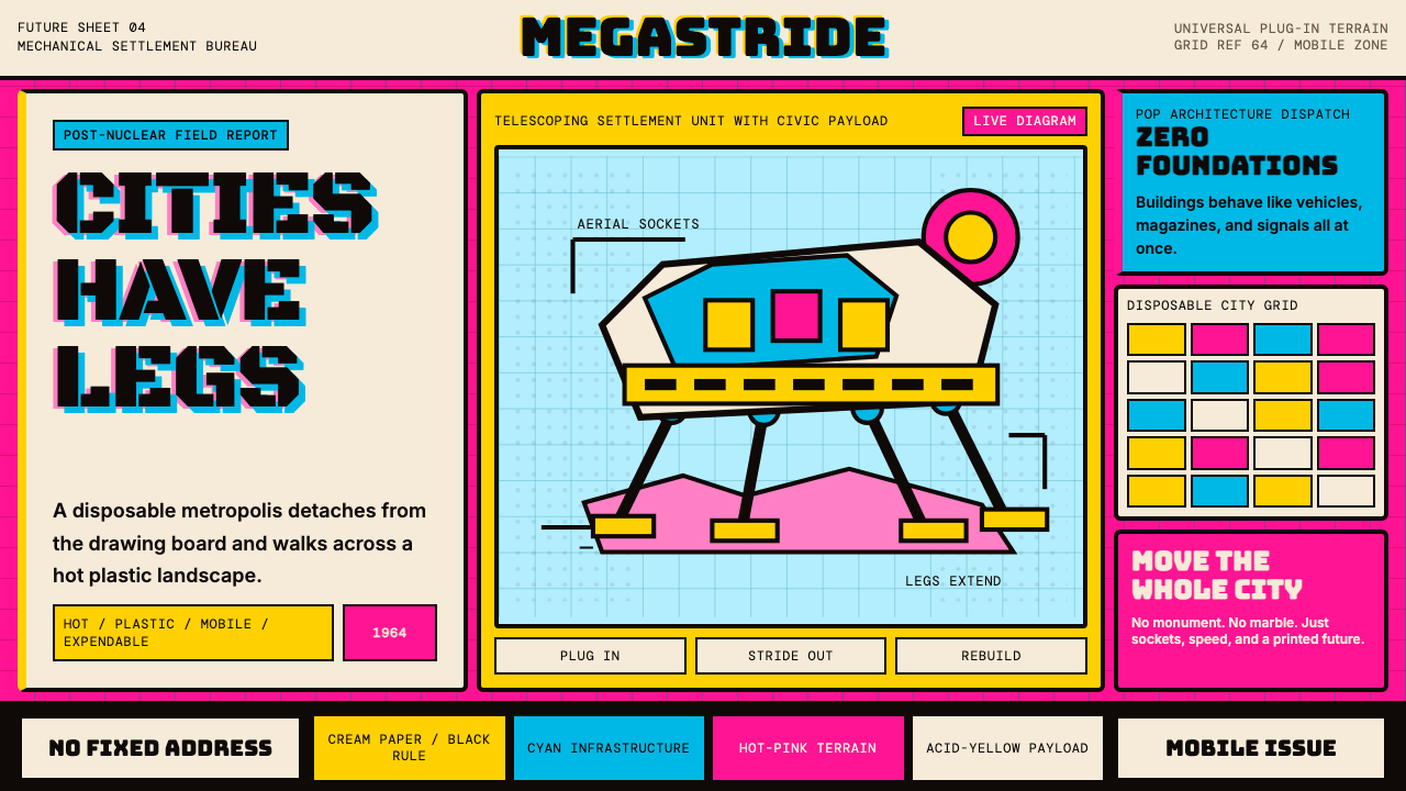 Archigram Walking City (1964)Cities refuse foundations. Hot pink, cyan, and acid yellow lock a bordered co…城市拒绝地基。热粉、青蓝与酸黄压进粗黑漫画格。
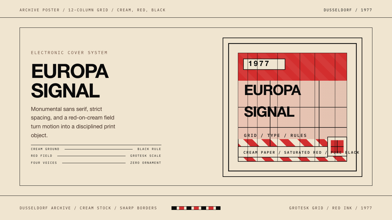 Kraftwerk Trans-Europa ExpressStark precision rules. Cream, red, and black lock the cover into a strict gri…克制而锋利:奶油、红、黑与严格网格锁住整张封面。
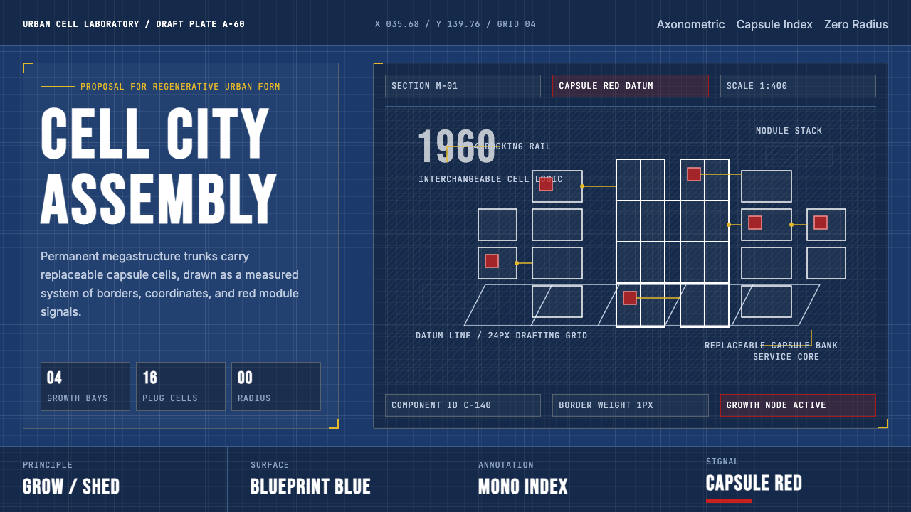 Metabolism Tokyo (1960)Cities become diagrams. Blueprint blue, mono labels, and capsule red mark mod…城市成为图纸:蓝图底、等宽标注与胶囊红,标记模块生长。