What is Op Art (Riley / Vasarely)?什么是 Op Art (Riley / Vasarely)?
Op Art turned perception itself into the medium — black-and-white grids and hard geometric rhythms make static surfaces vibrate, flicker, and seem to move.光效应艺术将感知本身变成了媒介——黑白网格与硬朗几何节奏让静止的平面在你眼前颤动、闪烁、仿佛活了过来。
Op Art (Riley / Vasarely) in briefOp Art (Riley / Vasarely) 速览
Op Art — short for Optical Art — is a movement born in the 1960s that uses precisely calculated geometric patterns to trigger involuntary perceptual responses in the viewer. Unlike styles that depict the world or express emotion, Op Art treats the eye itself as its subject matter. A composition of undulating stripes or concentric squares is not a picture of movement; it is movement, produced inside the nervous system of whoever looks at it.光效应艺术(Op Art)是1960年代兴起的一场运动,它借助精确计算的几何图案,在观看者内心触发非自愿的视觉感知反应。与描绘世界或抒发情感的风格不同,光效应艺术将眼睛本身视为研究对象。一组波浪形条纹或同心正方形并不是对运动的描绘——它本身就是运动,产生于每一位观看者的神经系统之中。
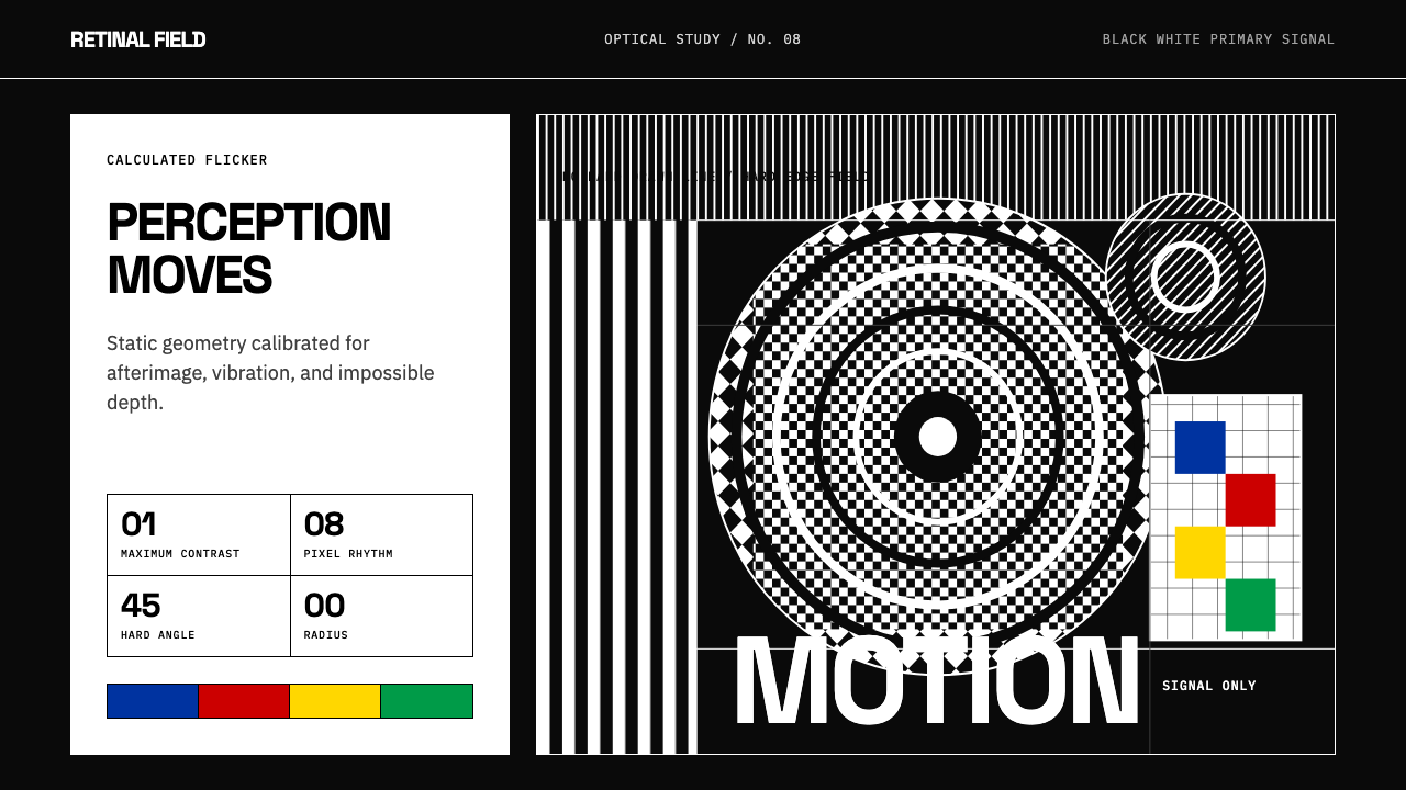
The visual language is among the most disciplined in modern design: maximum contrast between near-black and near-white, hard edges with zero softening, flat surfaces without shadow or texture, and mathematical repetition that produces optical interference — the moiré effect, afterimages, figure-ground reversals. When color enters, it does so as signal, not decoration. Victor Vasarely's primary-hued cubes and spheres demonstrate that a single carefully placed warm or cool hue against a high-contrast ground can produce the sensation of three-dimensional form without any modeling or perspective construction.这套视觉语言是现代设计中最为自律的体系之一:近黑与近白之间的极限对比,零柔化的硬边,无投影无纹理的绝对平整表面,以及产生光学干涉的数学重复——莫尔纹效应、残像、图底反转。当色彩介入时,它以信号而非装饰的身份出现。维克多·瓦萨雷利那些以原色绘成的立方体与球体证明:在高对比度底面上,一个仔细放置的暖色或冷色,无需任何建模或透视构造,便能制造出三维形态的感知幻觉。
The movement draws on a lineage that includes Josef Albers's systematic study of how colors interact at their boundaries, the gestalt psychology research of the early twentieth century, and the hard-edge painting tradition. Its legacy runs in the opposite direction too: Op Art's language of engineered perception has been absorbed into interface design, data visualization, and motion graphics, wherever controlled visual rhythm is used to direct attention, signal change, or create hierarchy.这场运动的渊源包括约瑟夫·阿尔伯斯对色彩边界交互关系的系统研究、二十世纪初的格式塔心理学研究,以及硬边绘画传统。它的遗产也向相反方向延伸:光效应艺术那套经过工程化的感知语言,已被界面设计、数据可视化与动态图形所吸收——凡是以受控视觉节奏引导注意力、标示变化或建立层级的地方,都能看到它的身影。
See the Op Art (Riley / Vasarely) design system查看 Op Art (Riley / Vasarely) 完整设计系统
Where does Op Art (Riley / Vasarely) come from?Op Art (Riley / Vasarely) 从何而来?
The immediate catalyst for Op Art as a named movement was 'The Responsive Eye,' an exhibition organized by William C. Seitz at the Museum of Modern Art in New York in February 1965. The show brought together works by Bridget Riley, Victor Vasarely, Josef Albers, Jesús Rafael Soto, and dozens of other artists who were working independently with perceptual phenomena. The exhibition drew nearly two hundred thousand visitors in six weeks — a remarkable figure for a show of pure abstract art — and provoked intense debate about whether the work was art at all or merely visual trickery. The controversy only accelerated the movement's reach.光效应艺术作为一个命名运动,其直接催化剂是1965年2月威廉·C·塞茨在纽约现代艺术博物馆策划的展览《敏感之眼》。展览汇集了布里奇特·赖利、维克多·瓦萨雷利、约瑟夫·阿尔伯斯、赫苏斯·拉斐尔·索托以及数十位独立探索感知现象的艺术家的作品。展览在六周内吸引了近二十万名观众——对于一场纯抽象艺术的展览而言,这是惊人的数字——并引发了关于这究竟是艺术还是视觉把戏的激烈争论。这场争议只是加速了运动的传播。
Victor Vasarely had been developing the foundational grammar of the style since the late 1940s. Born in Hungary in 1906, he trained under Sándor Bortnyik at the Mühely — a Budapest school modeled explicitly on the Bauhaus — before moving to Paris in 1930, where he worked as a commercial graphic artist. His 'Zebra' drawing of 1938, which uses curved black and white stripes to suggest a three-dimensional form with no shading whatsoever, is often cited as the first canonical Op Art work. Through the 1950s and 1960s he developed his systematic approach: a universal visual language of geometric units — squares, rhomboids, circles — that could be permuted to produce sensations of depth, rotation, and vibration. He believed this system was democratic, reproducible, and scalable to any surface from a canvas to an entire building facade.维克多·瓦萨雷利自1940年代末起便已开始发展这种风格的基础语法。他1906年生于匈牙利,在布达佩斯明确仿照包豪斯模式创办的穆黑利学校(Mühely)师从桑多尔·博尔特尼克,后于1930年移居巴黎,在那里从事商业平面设计工作。他1938年创作的《斑马》以弯曲的黑白条纹在毫无阴影的情况下暗示出三维形态,常被引为第一件经典的光效应艺术作品。1950至60年代,他发展出系统化的方法:以正方形、菱形、圆形等几何单元为基础的通用视觉语言,通过排列组合产生深度、旋转与振动的感知。他相信这套系统是民主的、可复制的,可以缩放到从画布到整栋建筑立面的任何表面。
Bridget Riley arrived at Op Art from a different direction. Born in London in 1931, she studied at Goldsmiths and then the Royal College of Art, where she spent years working through the traditions of Post-Impressionism and pointillism before arriving at pure black-and-white abstraction in the early 1960s. Her early works — 'Movement in Squares' (1961), 'Blaze' (1962), 'Fall' (1963) — explore what happens when regular geometric repetition is interrupted by small, systematic variations. A grid of identical squares that gradually compresses toward the center does not describe compression; it creates a physical sensation of it. Riley's approach was always phenomenological: the work is about what happens to a particular body standing at a particular distance from a particular surface.布里奇特·赖利从另一条路径抵达光效应艺术。1931年生于伦敦的她先后就读于哥德史密斯学院和皇家艺术学院,在经历多年对后印象主义与点彩法传统的深入研习之后,于1960年代初走向纯粹的黑白抽象。她的早期作品——《方块中的运动》(1961年)、《炫光》(1962年)、《坠落》(1963年)——探索规则几何重复被微小、系统性变化打断时所产生的效果。一组向中心逐渐压缩的等大正方形网格,不是对压缩的描绘;它制造的是一种身体上对压缩的感知。赖利的方法始终是现象学式的:作品关乎的是,一个特定的身体站在距离特定表面的特定位置时,所发生的事情。
The intellectual foundations of Op Art reach back to the Bauhaus, where Josef Albers conducted the systematic color interaction experiments that would eventually be published as 'Interaction of Color' in 1963. Albers demonstrated that a color's perceived hue, temperature, and weight are not fixed properties but are entirely determined by their neighbors — an observation that Op Art artists applied to the boundary between black and white, where the contrast is so extreme that the nervous system produces halation, flickering, and apparent motion at the edge. The movement also drew on the work of Gestalt psychologists, who had demonstrated in the early twentieth century that the brain does not passively receive visual data but actively constructs perception, imposing pattern, figure-ground relationships, and apparent motion on any sufficiently ambiguous stimulus.光效应艺术的思想根基可以追溯至包豪斯,在那里,约瑟夫·阿尔伯斯进行的系统性色彩交互实验最终于1963年以《色彩的互动》一书出版。阿尔伯斯证明,一种颜色的感知色相、冷暖与分量并非固定属性,而是完全由其邻近色所决定——这一发现被光效应艺术家应用于黑与白的边界处:在那里,对比如此极端,以至于神经系统会在边缘产生晕光、闪烁与表观运动。这场运动还汲取了格式塔心理学家的研究成果——他们在二十世纪初已经证明,大脑并不是被动地接收视觉数据,而是主动建构感知,对任何足够模糊的刺激强加图案、图底关系与表观运动。
What defines the Op Art (Riley / Vasarely) look?Op Art (Riley / Vasarely) 的视觉特征是什么?
Maximum Contrast极限对比
The foundational principle of Op Art is the deployment of the highest achievable contrast — typically the full opposition of near-black against near-white — as the primary structural material. This is not a stylistic preference but a perceptual necessity: the involuntary visual responses that define the style (flickering, halation, apparent motion) are produced specifically at the boundary between maximally contrasting values. Reducing the contrast reduces or eliminates the optical effect. Every other decision in an Op Art composition — scale, pattern type, direction — is subordinate to maintaining this contrast condition.光效应艺术的基础原则是将可达到的最高对比度——通常是近黑与近白的完全对立——作为主要的结构材料。这不是风格偏好,而是感知上的必要条件:定义这种风格的非自愿视觉反应(闪烁、晕光、表观运动)正是产生于对比度最大的两个值的边界处。降低对比度就会减弱乃至消除光学效果。光效应艺术构图中的其他一切决定——尺度、图案类型、方向——都从属于维持这一对比条件。
Mathematical Repetition and Variation数学重复与变奏
Op Art patterns are never arbitrary. A stripe composition, a grid of circles, or a field of diamonds is constructed according to a strict rule — identical units repeated at identical intervals — and then subjected to a single, precisely controlled deviation: the intervals compress or expand, the units rotate incrementally, the alternating values shift by a fixed amount per row. It is this combination of strict regularity and its single systematic violation that produces the optical instability. Pure repetition without variation produces stable wallpaper; pure variation without repetition produces chaos. The perceptual vibration lives in the exact ratio between the two.光效应艺术的图案从不是任意的。一组条纹构图、一片圆形网格或一个菱形场域,都依照严格规则构建——相同单元以相同间隔重复——然后受到一个精确控制的偏差处理:间隔渐渐压缩或扩张,单元逐步旋转,交替值每行按固定量偏移。正是这种严格规律性与它的单一系统性违规的组合,产生了光学不稳定性。没有变奏的纯重复制造的是稳定的壁纸图案;没有重复的纯变奏制造的是混乱。感知上的振动,恰好存在于两者之间的精确比率中。
Hard Edge and Zero Radius硬边与零圆角
Every boundary in Op Art is a hard cut. There are no blurred edges, no anti-aliased transitions, no gradients softening one value into the next. The perceptual machinery that Op Art exploits operates at boundaries: the nervous system's response to a high-contrast edge is what produces the optical phenomena. Softening the edge dissipates the effect and introduces the kind of atmospheric depth the style deliberately excludes. Hard edges also carry a secondary benefit: they reproduce cleanly at any scale, from a small printed card to a monumental mural, without losing their optical precision.光效应艺术中每一条边界都是硬切。没有模糊的边缘,没有抗锯齿过渡,没有将一个值柔和渐变为另一个值的渐变。光效应艺术所利用的感知机制在边界处运作:神经系统对高对比度边缘的反应,正是产生光学现象的机制。软化边缘会消散效果,并引入这种风格刻意排除的那种大气深度感。硬边还有一个附带好处:无论从小型印刷卡片还是大型壁画,它都能在任何尺寸下清晰复制,不失其光学精确性。
Color as Perceptual Signal色彩作为感知信号
When color appears in Op Art — and it does not always — it functions as an amplifier of perceptual instability, not as emotional or symbolic content. Vasarely demonstrated that placing a warm primary color against a cool one across a high-contrast boundary intensifies the sense of depth and vibration beyond what black and white alone can produce. The palette is kept narrow by design: typically one or two hues drawn from the primary range, used at full saturation, against an achromatic ground. The moment color is used decoratively — mixed, graded, or applied inconsistently — the perceptual coherence of the system collapses.当色彩出现在光效应艺术中时——它并非总是出现——它充当的是感知不稳定性的放大器,而非情感或象征内容的载体。瓦萨雷利证明,在高对比度边界上将暖原色与冷原色并置,能够产生超越黑白所能实现的深度与振动感。色板在设计上被刻意保持窄范围:通常是从原色中选取一到两个色相,以全饱和度施于消色差底面上。一旦色彩被用于装饰目的——混合、渐变或不一致地应用——系统的感知连贯性便会崩溃。
Flat Surface and No Depth Cues平面表面与无深度线索
Op Art works on a strictly flat picture plane. There are no cast shadows, no overlapping forms that suggest spatial recession, no perspective lines, no atmospheric haze. The apparent depth and motion that the viewer experiences are not depicted in the work — they are generated by the viewer's own nervous system in response to the patterns. This is a crucial distinction: the work is not an illusion in the traditional sense (like a trompe-l'oeil painting) but a trigger for genuine perceptual phenomena. Introducing any conventional depth cue — a drop shadow, a gradient suggesting volume — undermines the work's claim to be operating at the level of pure perception.光效应艺术在严格的平面图像平面上运作。没有投射阴影,没有暗示空间后退的重叠形态,没有透视线,没有大气朦胧。观看者体验到的表观深度与运动感,并不是描绘在作品中的——它们是由观看者自己的神经系统在响应图案时所生成的。这是一个关键区别:作品不是传统意义上的幻觉(如虚实画法),而是触发真实感知现象的触发器。引入任何常规深度线索——一个投影、一个暗示体积的渐变——会破坏作品在纯粹感知层面运作的主张。
Structural Geometry结构几何
The vocabulary of Op Art is drawn from elementary geometry: the straight line, the circle, the square, the diagonal, and their transformations — concentric expansion, radial rotation, linear compression. These forms are chosen not for their aesthetic associations but for their regularity, which is what makes systematic variation legible. An irregular shape cannot be subjected to a strict mathematical transformation in a way that produces a coherent optical effect. The geometric constraint is not a stylistic preference — it is a precondition for the perceptual phenomena the style depends on.光效应艺术的词汇来自基础几何:直线、圆形、正方形、对角线及其变换——同心扩张、径向旋转、线性压缩。选择这些形态,不是因为它们的美学联想,而是因为它们的规律性,这种规律性使系统性变奏清晰可辨。一个不规则形状无法以一种产生连贯光学效果的方式被进行严格数学变换。几何约束不是风格偏好——它是这种风格所依赖的感知现象的先决条件。
Viewer as Active Participant观看者作为主动参与者
Unlike styles that produce a complete visual statement for the viewer to receive, Op Art is fundamentally incomplete until someone looks at it. The optical phenomena — the vibration, the shimmer, the sense of depth or rotation — exist only in the perceptual system of the person standing in front of the work. This means that scale, viewing distance, and the physical state of the viewer (how long they have been looking, whether they move) all affect the work's effect. In digital applications, this quality translates to patterns that respond to scroll position, cursor movement, or viewport size — not as a design trick but as a faithful extension of the medium's fundamental logic.与那些为观看者呈现完整视觉陈述的风格不同,光效应艺术在有人观看之前从根本上是不完整的。那些光学现象——振动、闪烁、深度感或旋转感——只存在于站在作品前方的人的感知系统中。这意味着尺度、观看距离以及观看者的身体状态(他们看了多久、是否移动)都会影响作品的效果。在数字应用中,这种品质转化为对滚动位置、光标移动或视口大小做出响应的图案——不是作为设计噱头,而是作为这种媒介基本逻辑的忠实延伸。
See the Op Art (Riley / Vasarely) design system查看 Op Art (Riley / Vasarely) 完整设计系统
Who shaped Op Art (Riley / Vasarely)?谁塑造了 Op Art (Riley / Vasarely)?
Riley is the defining figure of British Op Art and the artist most associated with the style's earliest systematic exploration. Her black-and-white works of the early 1960s — produced in a period of intense research during which she studied Seurat's pointillism and Gestalt perceptual psychology — established the formal vocabulary that the movement would later develop in color. Her 1965 inclusion in 'The Responsive Eye' brought her immediate international attention, and the unauthorized use of her 'Current' pattern by an American textile company in the same year became a landmark case in art and copyright. Riley's later transition to color — first a restricted palette of grays and then a full chromatic range in the 1970s and beyond — demonstrated that the perceptual principles of Op Art were not dependent on black and white but could be extended across the entire spectrum.赖利是英国光效应艺术的代表性人物,也是与这种风格最早期系统性探索关联最深的艺术家。她1960年代初的黑白作品——创作于她深入研习修拉点彩法与格式塔感知心理学的密集研究时期——确立了该运动后来得以发展的形式词汇。1965年入选《敏感之眼》使她立即获得国际关注;同年,一家美国纺织公司未经授权使用她的《暗流》图案,成为艺术与版权领域的里程碑案例。赖利后来向色彩的过渡——先是灰阶的受限色板,然后在1970年代及以后走向完整的色彩范围——证明了光效应艺术的感知原则并不依赖于黑白,而是可以延伸至整个光谱。
Vasarely is the architect of Op Art's systematic theory and the figure most responsible for its international dissemination. His decades-long project — which he called a 'plastic alphabet' — proposed that visual art could be reduced to a finite set of geometric units and transformation rules, and that any artist equipped with this system could produce works of equivalent perceptual power. This democratic, industrializable vision of art was explicit in his practice: he encouraged the reproduction and multiplication of his work across posters, prints, and architectural surfaces, refusing the cult of the unique object. His foundation museums in Aix-en-Provence and Budapest continue to hold the most comprehensive collections of his work.瓦萨雷利是光效应艺术系统性理论的设计师,也是对这场运动国际传播贡献最大的人物。他历时数十年的项目——他称之为「造型字母表」——提出视觉艺术可以被简化为有限的几何单元集合与变换规则,任何掌握这套系统的艺术家都能创作出同等感知力量的作品。这种对艺术民主化、工业化的愿景在他的实践中是明确的:他鼓励将自己的作品以海报、版画和建筑表面的形式复制和传播,拒绝独一无二物件的崇拜。他在普罗旺斯地区艾克斯与布达佩斯建立的基金会博物馆,至今仍藏有最完整的作品收藏。
Albers bridges the Bauhaus and Op Art: he studied and taught at the Bauhaus from 1920 to 1933, then emigrated to the United States and eventually joined the faculty at Yale, where he produced 'Homage to the Square' — a series of hundreds of paintings exploring color interaction — and in 1963 published 'Interaction of Color,' the foundational text of modern perceptual color theory. His demonstration that a single color looks entirely different depending on its surroundings was the theoretical justification for the Op Art investigation of boundary phenomena. Without Albers's methodical proof that perception is constructed and not given, the claims of Op Art would have been difficult to articulate.阿尔伯斯架起了包豪斯与光效应艺术之间的桥梁:他于1920至1933年间在包豪斯求学与执教,后移民美国,最终任教于耶鲁大学,在那里创作了数百幅探索色彩交互关系的《向正方形致敬》系列,并于1963年出版《色彩的互动》——现代感知色彩理论的奠基性文本。他证明了单一颜色会因周围环境而呈现完全不同的面貌,这为光效应艺术对边界现象的探索提供了理论依据。若没有阿尔伯斯系统性地证明感知是被建构的而非既定的,光效应艺术的主张将很难被清晰表达。
Soto, born in Venezuela in 1923, represents the kinetic branch of Op Art — work that incorporates literal physical motion rather than merely implying it through pattern. His 'penetrables' are environments of hanging plastic tubes that viewers walk through, producing optical interference effects in motion. His panel works place thin wires or painted rods in front of patterned backgrounds, so that the viewer's own movement generates the moiré effect. Soto's work demonstrates that Op Art's perceptual principles are not confined to the flat picture plane but extend into three-dimensional space, making him an important figure in the overlap between Op Art and kinetic sculpture.索托1923年生于委内瑞拉,代表着光效应艺术的动力学分支——这类作品结合了真实的物理运动,而不仅仅是通过图案暗示运动。他的「可入环境」是观众可以穿行其中的悬挂塑料管装置,在运动中产生光学干涉效果。他的面板作品将细线或绘制的细杆置于图案化背景前,使观看者自身的移动产生莫尔纹效应。索托的作品证明,光效应艺术的感知原则并不局限于平面图像平面,而是延伸至三维空间,使他成为光效应艺术与动力雕塑交汇处的重要人物。
How do you use Op Art (Riley / Vasarely) today?今天怎么用 Op Art (Riley / Vasarely)?
Op Art is one of the most technically demanding historical styles to apply correctly in contemporary design work, because its effects depend entirely on precise execution. A loosely drawn wavy stripe does not produce optical vibration; a mathematically regular one does. Before treating this as an aesthetic choice, a designer must decide whether they are genuinely working with perceptual phenomena — building compositions whose geometry creates involuntary visual responses — or simply borrowing the visual surface of the style without engaging its logic. The former produces powerful, distinctive work. The latter tends to read as retro decoration, which is a legitimate choice but a different one.光效应艺术是当代设计实践中应用难度最高的历史风格之一,因为它的效果完全依赖于精确执行。随意勾画的波浪形条纹不会产生光学振动;数学上规则的条纹才会。在将其视为美学选择之前,设计师必须先决定自己是否真的在与感知现象打交道——构建那些几何形态能够触发非自愿视觉反应的构图——还是仅仅借用这种风格的视觉表面而不涉及其内在逻辑。前者能产生强大而独特的作品;后者倾向于被解读为复古装饰,这是一种合理的选择,但是一种不同的选择。
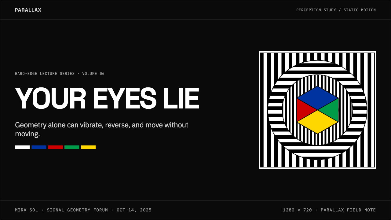
For presentation slides, Op Art works best in high-stakes contexts where distinctiveness and precision are valued: technology launches, data-heavy keynotes, financial reporting, design or architecture portfolios. A cover slide built on Op Art principles uses a single high-contrast geometric pattern — concentric circles, a radially compressed grid — occupying most of the surface, with the title placed in a clean, neutral weight typeface that does not compete with the pattern but sits above it. Content slides should be restrained: the pattern establishes the identity on the cover and then recedes to a structural border, a header background, or an accent element. Deploying the full pattern behind body text makes it unreadable. Data slides use the language of geometric precision — clean axis lines, hard-edged bars and pie segments in near-black and near-white with a single primary accent — rather than Op Art patterns directly, maintaining the system's visual vocabulary without its perceptual interference.在演示文稿中,光效应艺术最适合高风险场景,在那里独特性与精确性备受重视:技术发布会、数据密集型主题演讲、财务报告、设计或建筑作品集。依照光效应艺术原则构建的封面页,将一个单一高对比度几何图案——同心圆、径向压缩的网格——占据大部分表面,标题以清晰、中性字重的字体放置其上,不与图案竞争,而是浮于其上。内容页应保持克制:图案在封面页建立身份认同后,退居为结构边框、页眉背景或强调元素。在正文后面部署完整图案会使其无法阅读。数据页使用几何精确性的语言——干净的轴线、以近黑近白配以单一原色强调的硬边柱状图和扇形图——而不是直接使用光效应艺术图案,在不产生感知干扰的情况下维持系统的视觉词汇。
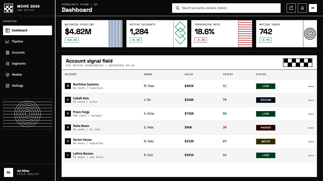
For web interfaces, Op Art is particularly well-suited to dashboards, analytical tools, and developer-facing products where a sense of calculated rigor is appropriate. The pattern should be used at macro scale and low optical density — as a hero background, a loading state, a section divider — not at the level of individual UI components. UI surfaces themselves should be clean and flat: high contrast, no soft shadows, no rounded corners, borders instead of spatial depth. The typography should be set at extreme contrasts of weight and scale, matching the visual system's underlying logic. Color is used sparingly as state indicator — active, warning, success — drawn from a near-primary palette applied at full saturation against an otherwise achromatic layout.对于网页界面,光效应艺术特别适合仪表板、分析工具和面向开发者的产品,在这些地方,一种经过精密计算的严谨感是恰当的。图案应在宏观尺度和低光学密度下使用——作为主视区背景、加载状态、区块分隔符——而非应用于单个界面组件层面。界面表面本身应保持干净平整:高对比度、无柔和阴影、无圆角、以边框代替空间深度。字体排印应在字重与尺度上形成极端对比,与视觉系统的底层逻辑相匹配。色彩被谨慎地用作状态指示——激活、警告、成功——从接近原色的色板中选取,以全饱和度施于其他方面均为消色差的版面之上。
For editorial and marketing work, Op Art provides exceptional stopping power: its patterns attract the eye before the viewer consciously decides to look. This makes the style well-suited to poster work, advertising, and social media assets where the primary challenge is capturing attention in a crowded visual environment. The approach mirrors its fine-art origins: a single dominant geometric pattern treated as the primary visual element, with typography positioned in the negative space rather than competing with the pattern. For long-form editorial, the pattern works as a recurring structural device — section openers, pull-quote backgrounds, chapter headings — rather than as continuous decoration. In motion graphics, the style reaches its natural home: small, controlled variations in timing and direction can produce genuine optical phenomena at video frame rates.对于编辑与营销内容,光效应艺术提供了卓越的视觉停驻力:它的图案在观看者有意识地决定注意之前便已吸引住眼睛。这使这种风格特别适合海报、广告以及社交媒体素材,在这些地方,首要挑战是在视觉拥挤的环境中抓住注意力。方法与它的纯艺术起源一脉相承:将单一主导性几何图案视为主要视觉元素,将排版定位于负空间中,而非与图案竞争。对于长篇编辑内容,图案作为循环出现的结构性装置发挥作用——章节开篇、引用文字背景、章节标题——而非作为连续装饰。在动态图形中,这种风格到达了它的自然归宿:在视频帧率下,时序与方向上的微小受控变化能够产生真实的光学现象。
The most common mistake when applying Op Art is using its visual vocabulary decoratively while abandoning its perceptual logic. This takes several forms: reducing the contrast below the threshold needed to produce the optical effect, mixing the strict geometric patterns with organic or illustrative elements that break the regularity, using too many simultaneous pattern types that compete rather than reinforce, or applying color inconsistently so that the eye cannot settle into the perceptual rhythm. A related error is confusing Op Art with other geometric abstraction styles — it is not the same as Swiss grid design, nor Memphis pattern, nor midcentury atomic motifs. Op Art is specifically about controlled perceptual instability; the geometry is a means to that end, not an end in itself.应用光效应艺术时最常见的错误,是以装饰性的方式使用其视觉词汇,同时抛弃了它的感知逻辑。这以多种形式出现:将对比度降低至低于产生光学效果所需的阈值;将严格的几何图案与破坏规律性的有机或插图元素混合;同时使用过多相互竞争而非相互强化的图案类型;或者不一致地使用色彩,使眼睛无法进入感知节奏。一个相关错误是将光效应艺术与其他几何抽象风格混淆——它与瑞士网格设计不同,与孟菲斯图案不同,与中世纪原子主题母题也不同。光效应艺术专门针对受控的感知不稳定性;几何形态是达到这一目的的手段,而非目的本身。
See the Op Art (Riley / Vasarely) design system查看 Op Art (Riley / Vasarely) 完整设计系统
Op Art (Riley / Vasarely) — FAQOp Art (Riley / Vasarely) · 常见问题
Does Op Art require black and white, or can it work in color?光效应艺术必须是黑白的吗,还是可以用彩色?
Op Art works in both modes, but they function differently. Black-and-white compositions exploit the maximum possible luminance contrast, which is what produces the most intense flickering and halation effects. Vasarely's color works use a different mechanism: placing complementary or near-complementary hues against each other at high saturation, which produces chromatic vibration and simultaneous contrast effects — the boundary between two fully saturated opposing colors seems to shimmer in a way that neither color alone accounts for. The critical requirement in either mode is that the contrast must be extreme and the edges must be hard. A desaturated, soft-edged color composition will produce no Op Art effects regardless of the hues used.光效应艺术在两种模式下都能运作,但机制不同。黑白构图利用的是可能达到的最大亮度对比,这正是产生最强烈闪烁和晕光效果的原因。瓦萨雷利的彩色作品使用的是不同机制:将互补或接近互补的色相以高饱和度相互并置,产生色度振动和同时对比效果——两种全饱和度对立色之间的边界会呈现出一种单独任何一种颜色都无法解释的闪烁感。在任何一种模式下,关键要求都是对比必须极端,边缘必须硬朗。无论使用何种色相,一个低饱和度、柔边的彩色构图都不会产生任何光效应艺术效果。
Is Op Art the same as psychedelic art?光效应艺术和迷幻艺术是同一回事吗?
They overlapped in the mid-1960s and share some visual territory, but they are distinct in their logic and intent. Op Art is rooted in perceptual science: its effects are the product of known physiological mechanisms in the human visual system, and the work is deliberately constructed to trigger specific, predictable responses. It is not random or organic. Psychedelic art, which emerged from the same decade's countercultural context, is typically more fluid, more figurative, more saturated in color, and more interested in mystical or hallucinatory content than in geometric precision. Op Art's severity — its mathematical structure, its restriction to a narrow formal vocabulary — is the opposite of psychedelic art's excess.两者在1960年代中期有所交叠,共享一些视觉领域,但在逻辑与意图上截然不同。光效应艺术植根于感知科学:它的效果是人类视觉系统中已知生理机制的产物,作品被刻意构建以触发特定的、可预测的反应。它不是随机的,也不是有机的。迷幻艺术兴起于同一个十年的反文化语境,通常更为流动、更具象、色彩更为饱和,对神秘主义或幻觉内容的兴趣多过对几何精确性的追求。光效应艺术的严苛——数学结构、对狭窄形式词汇的限制——恰恰与迷幻艺术的过剩相对。
How does Op Art relate to kinetic art?光效应艺术与动力艺术有什么关系?
They are closely related movements that emerged simultaneously and share several key figures, but they differ in their medium. Op Art produces the sensation of movement on a static, flat surface — the motion is entirely inside the viewer's perceptual system. Kinetic art produces actual physical movement, either through mechanical means (motors, pendulums) or through the viewer's movement relative to the work. Artists like Jesús Rafael Soto and Carlos Cruz-Diez worked fluidly across both — their hanging and layered works produce optical interference that changes as the viewer moves, making the distinction between optical and physical movement difficult to maintain. Both movements were grouped together in 'The Responsive Eye' exhibition, which reflected their shared interest in making the viewer's perceptual experience the subject of the work.两者是几乎同时兴起的密切相关运动,共享几位关键人物,但媒介不同。光效应艺术在静态平面表面上产生运动感——运动完全存在于观看者的感知系统内部。动力艺术产生真实的物理运动,或通过机械手段(马达、摆锤),或通过观看者相对于作品的移动。赫苏斯·拉斐尔·索托和卡洛斯·克鲁斯-迭斯等艺术家在两者之间灵活穿行——他们的悬挂式和层叠式作品随观看者移动而产生变化的光学干涉,使光学运动与物理运动之间的区分难以维持。两场运动都被纳入《敏感之眼》展览,这反映了它们共同的兴趣:将观看者的感知体验作为作品的主题。
Why does Op Art feel so contemporary in digital interfaces?为什么光效应艺术在数字界面中感觉如此当代?
Several reasons converge. First, the style was always technically demanding in print — achieving the hard edges and precise pattern registration that Op Art requires was a production challenge on press — but on screen, rendering hard-edged geometric patterns at perfect precision is trivial. The digital medium resolves a tension that existed in the style's physical production. Second, Op Art's underlying concern — the engineered control of perceptual attention — is exactly the problem that interface design deals with every day. Third, the style's flatness, its rejection of shadow and texture, and its use of contrast rather than depth align naturally with the flat design direction that screen interfaces have moved toward since the early 2010s. The visual language was ahead of its technical medium by fifty years.几个原因汇聚在一起。首先,这种风格在印刷中历来在技术上要求极高——达到光效应艺术所要求的硬边和精确图案套准,在印刷机上是一项生产挑战——但在屏幕上,以完美精度渲染硬边几何图案轻而易举。数字媒介解决了这种风格在物理生产中存在的张力。其次,光效应艺术的核心关切——对感知注意力的工程化控制——恰恰是界面设计每天处理的问题。第三,这种风格的平面性、对投影与纹理的排斥,以及使用对比而非深度,与2010年代初以来屏幕界面向扁平化设计方向的演进自然契合。这套视觉语言超前于它的技术媒介整整五十年。
What separates authentic Op Art application from retro pastiche?真正的光效应艺术应用与复古拼贴有什么区别?
The distinction is functional, not stylistic. Authentic Op Art application produces genuine perceptual effects in the viewer — the composition is engineered so that looking at it triggers involuntary visual responses. A pastiche borrows the visual surface — wavy stripes, concentric circles, high-contrast patterns — without achieving the perceptual effect. This usually happens because the contrast is insufficient, the edges are soft, the pattern is too irregular, or too many competing visual elements break the regularity that the effect depends on. The test is simple: does looking at the composition at the intended viewing distance and size produce any involuntary sensation of movement, vibration, or depth? If not, it is surface quotation. Understanding this distinction is what separates designers who use Op Art as a system from those who use it as a texture.区别是功能性的,而非风格性的。真正的光效应艺术应用在观看者中产生真实的感知效果——构图经过工程化设计,使观看它能触发非自愿的视觉反应。复古拼贴借用的是视觉表面——波浪形条纹、同心圆、高对比度图案——而不实现感知效果。这通常发生在以下情况:对比度不足、边缘柔和、图案过于不规则,或者过多相互竞争的视觉元素破坏了效果所依赖的规律性。测试很简单:在预期的观看距离和尺寸下观看这个构图,是否产生任何非自愿的运动感、振动感或深度感?如果没有,那就是表面引用。理解这一区别,是将光效应艺术作为系统使用的设计师与将其作为纹理使用的设计师之间的分水岭。
Related design styles相关设计风格
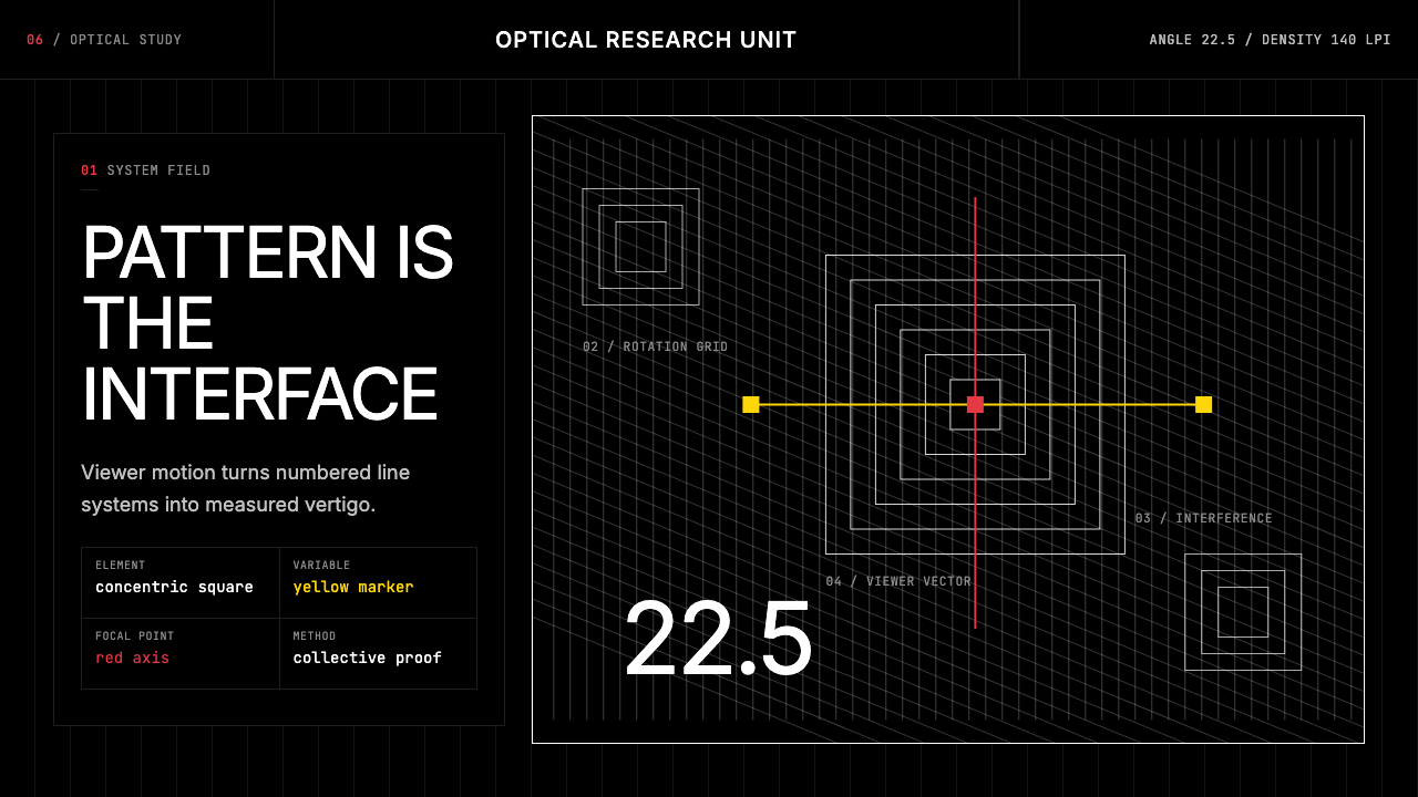 GRAV Op-Kinetic (1960)Vertigo by calculation. White line fields on black, with red and yellow as co…以计算制造眩晕。黑底白线场中,红与黄是受控变量。
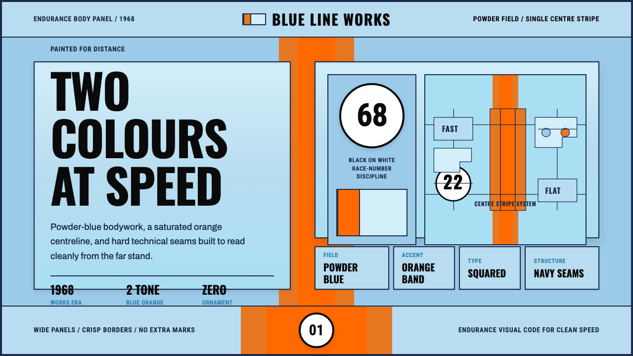 Gulf Racing LiverySpeed made disciplined. Powder blue, orange stripe, black roundel, strict gri…速度被纪律化:粉蓝车身、橙色中线、黑白圆号与硬网格。
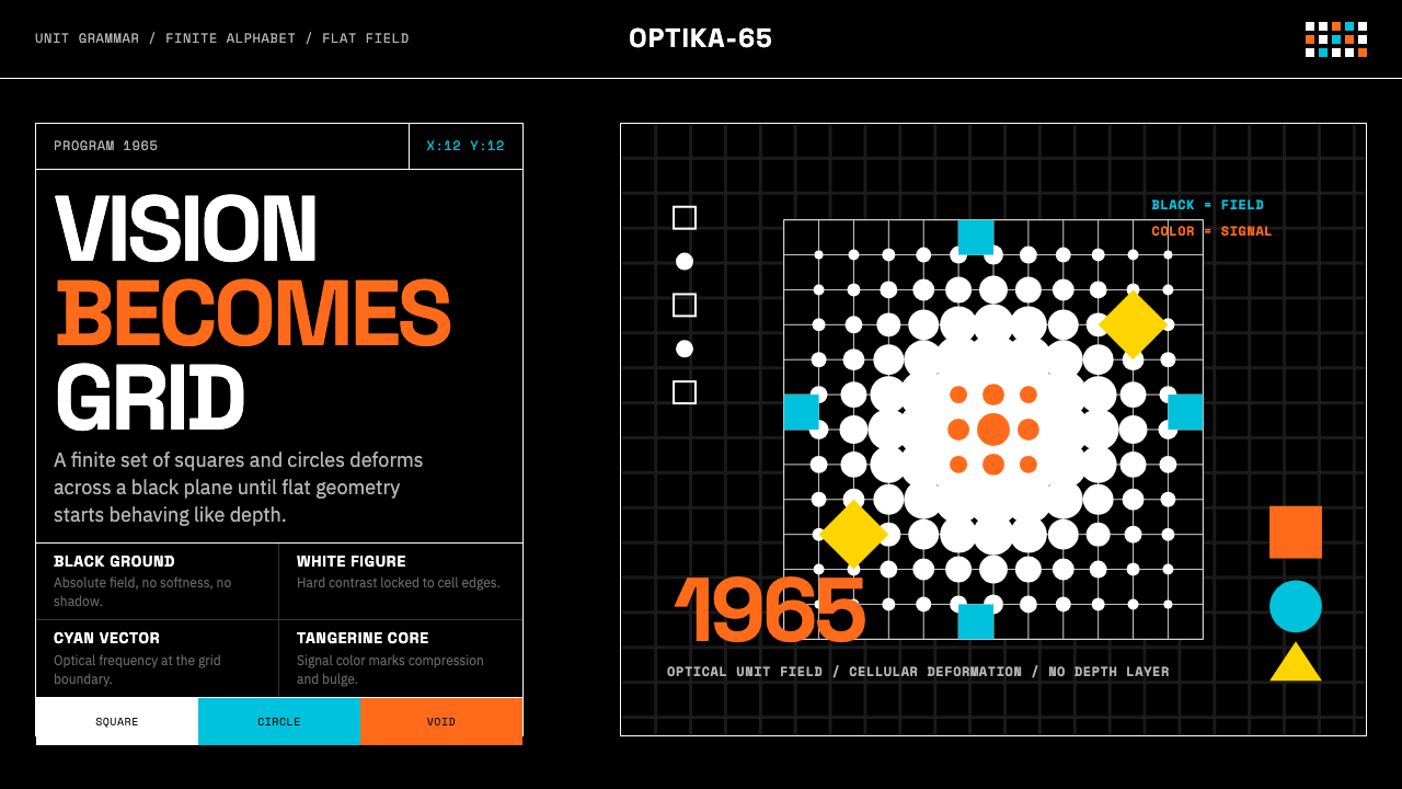 Hungarian Vasarely Op Art (1965)Mathematics makes vision pulse. Black grids, white units, cyan and tangerine…数学让视觉脉动:黑底白格与青橘单元扭曲深度。
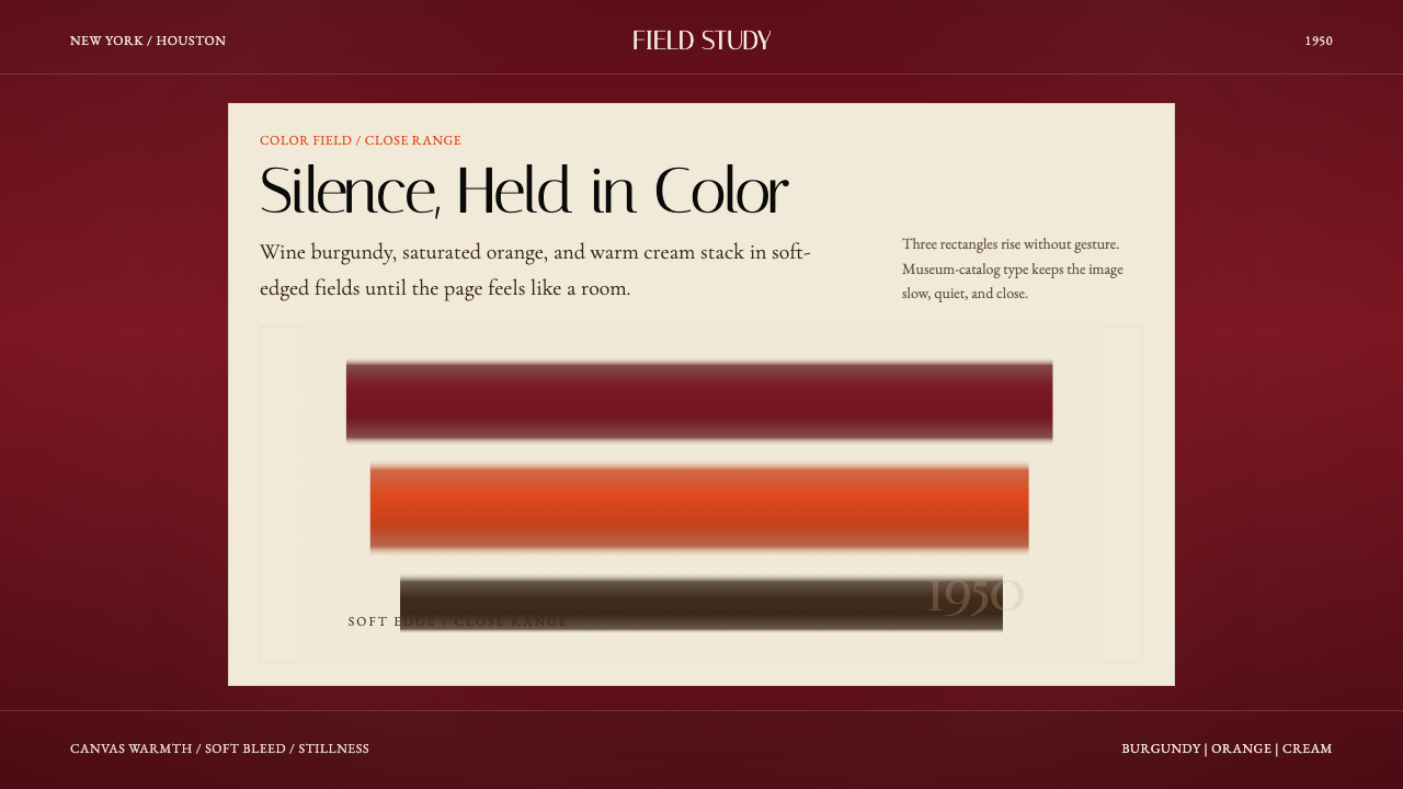 Mark Rothko Color Field (1950)Silence made visible. Burgundy, orange, and cream stack in soft-edged fields.把沉默变成可见。酒红、橙与奶油柔边堆叠成色域。
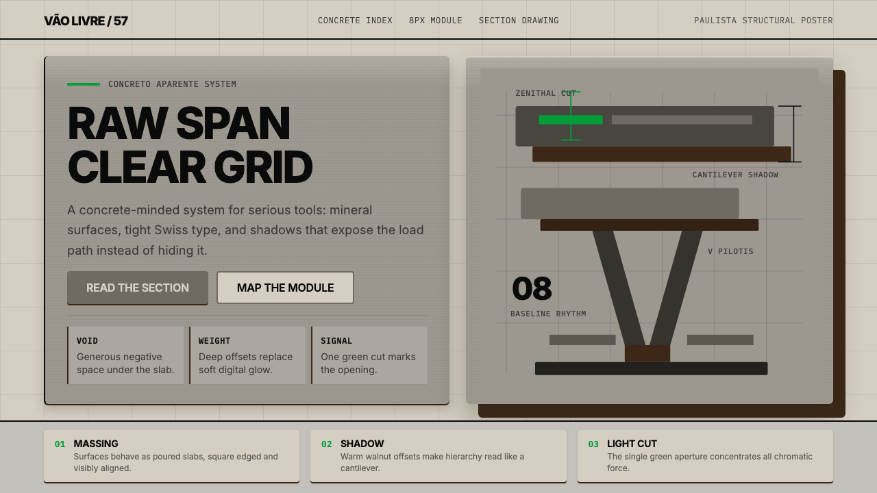 Paulista BrutalismStructural honesty, made heavy. Mineral grays, Inter grids, and walnut cantil…结构诚实而沉重:矿物灰、Inter网格与胡桃色悬挑阴影。
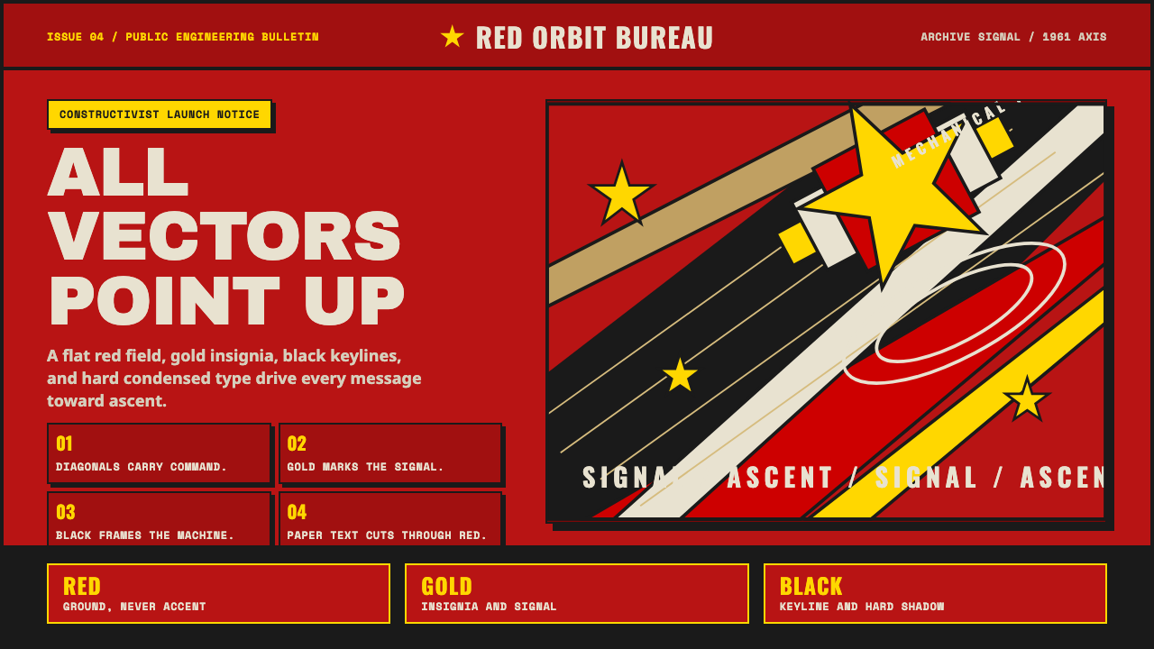 Soviet Space ProgramHeroic by construction. Red fields, gold stars, black keylines, and diagonal…构成即英雄:红底、金星、黑描边与上升斜线。