What is Soviet Space Program?
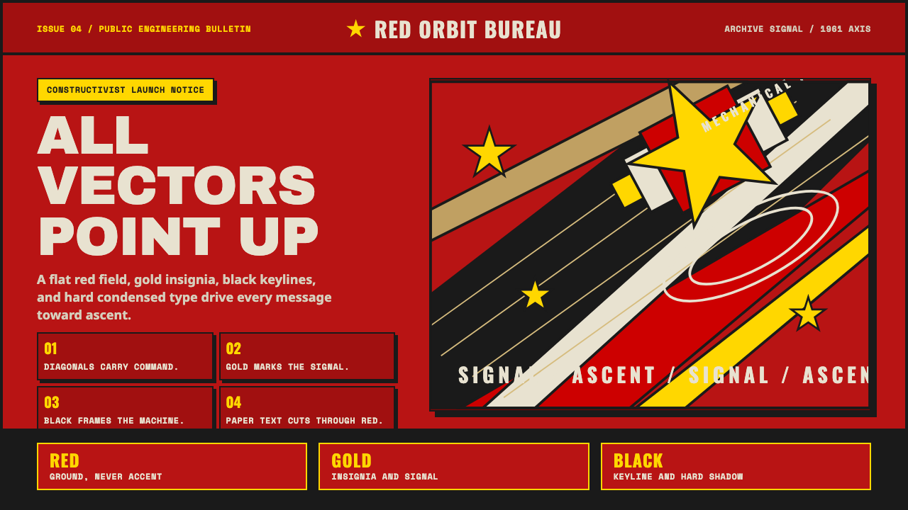
Soviet Space Program rebuilds Gagarin-era propaganda as a working design system — a flat red field, a gold star, and a rocket thrusting on a hard diagonal.
Soviet Space Program in brief
Soviet Space Program is a design system built from the visual machinery of Gagarin-era Soviet propaganda: a flat red field standing in for the ground rather than an accent color, a gold star marking ideological achievement, and a rocket or figure thrusting upward along a hard diagonal axis that dominates the entire composition. It descends directly from the photomontage poster tradition pioneered by artists like Gustav Klutsis and Alexander Rodchenko in the years following the Russian Revolution.
The system is bold, mechanical, and graphically loud by design — every element is angled toward a single heroic upward axis, creating a sense of relentless forward momentum rather than static display. Red functions as the ground of the entire composition, not merely a highlight color layered onto a neutral background; gold and aged, slightly yellowed paper tones supply the only visual relief from that dominant red field.
Framing is handled through hard black keylines and heavy condensed grotesque typefaces set entirely in capitals — a typographic choice that reads as command and declaration rather than conversation. There are no gradients, no soft edges, and no nostalgic softening for its own sake: the system is built for full-punch contrast and rigorous Constructivist geometry, the same visual discipline used to rally a mass audience around the promise of a new socialist, cosmic future.

Where does Soviet Space Program come from?
The visual roots of Soviet Space Program lie in the photomontage poster tradition of Russian Constructivism, an avant-garde artistic movement that flourished in the 1920s in the years immediately following the 1917 revolution. Gustav Klutsis, one of the movement's central figures, pioneered the use of photomontage — cutting and reassembling photographic imagery into dynamic, diagonal compositions — as a propaganda tool, arguing that art should serve direct political communication rather than private aesthetic expression. Alexander Rodchenko developed parallel techniques, combining bold typography with sharply angled photographic elements to create posters that felt urgent and mechanized rather than painted or illustrated.
This visual vocabulary — diagonal thrust, stark red-black-gold contrast, hard keylines, mechanical repetition — was originally developed to rally support for industrialization, collectivization, and the broader Soviet project in the 1920s and 1930s. It proved durable enough to be redeployed decades later for an entirely new propaganda purpose: celebrating Soviet achievements in space exploration during the Cold War space race.
The specific historical anchor for this system is April 12, 1961, when Yuri Gagarin became the first human to journey into outer space, orbiting the Earth aboard Vostok 1. This was among the Soviet Union's most significant propaganda victories of the entire Cold War, and the state apparatus moved immediately to produce posters, publications, and public imagery celebrating the achievement using the established Constructivist visual language — updated with rockets, cosmonauts, and orbital motifs in place of the factory workers and collective farmers of earlier decades.
The style persisted from the 1950s through the 1990s, spanning the entire arc of the Soviet space program from Gagarin's flight through later achievements in space stations and satellite technology. Unlike some Soviet visual traditions that softened or modernized over time, this specific poster-derived aesthetic remained remarkably consistent across four decades, precisely because its core function — rallying public pride around technological and ideological triumph — never changed, even as the specific achievements being celebrated evolved.
What defines the Soviet Space Program look?
Color as Ground
Red functions as the base field of the entire composition, occupying the majority of the visual area rather than appearing as an accent color layered onto a neutral background. This inversion — red as ground rather than highlight — is the single most important color decision distinguishing this system from more conventional propaganda-adjacent palettes.
Gold Accent
Gold, alongside aged paper tones, provides the only relief from the dominant red field. It marks stars, medals, and other symbols of ideological or technological achievement, and its use is deliberately restrained — a small proportion of gold against a large field of red carries far more weight than an evenly balanced palette would.
Diagonal Thrust
A single hard diagonal axis organizes the entire composition, typically running from lower-left to upper-right to suggest ascent and forward momentum. Every major element — rocket, figure, text block — angles toward this axis rather than sitting on a static horizontal or vertical grid, producing a sense of unstoppable upward motion.
Hard Keylines
Every major shape carries a crisp black outline rather than a soft edge or drop shadow, giving the composition a cut-out, assembled quality reminiscent of physical photomontage where elements were literally cut from paper and reassembled. This keyline discipline is what keeps the bold color fields from bleeding into one another.
Condensed Capital Typography
Heavy, condensed grotesque typefaces set entirely in capital letters carry all text, reading as command and proclamation rather than conversation. The condensed width allows dense slogans to fit within tight diagonal or angled text blocks without breaking the composition's geometric discipline.
Photomontage Quality
Figures and rockets should read as if assembled from cut photographic or illustrated elements at deliberately mismatched scales — a technique inherited directly from Klutsis and Rodchenko's original poster work. This gives the composition a constructed, machine-built energy distinct from a single continuous illustration or photograph.
Full-Punch Contrast
There is no gradient anywhere in an authentic composition — every transition between color fields is sharp and immediate. This uncompromising contrast is functional as much as aesthetic: it was designed to remain legible on mass-printed posters and low-quality reproductions, and that legibility-first discipline should carry through to any digital application.

Who shaped Soviet Space Program?
The Soviet cosmonaut whose 1961 orbital spaceflight is the historical anchor for this entire design system. His achievement transformed Constructivist propaganda techniques developed decades earlier into a specifically space-age visual program, and his likeness or an idealized cosmonaut figure remains the central heroic subject of the tradition.
A leading figure of Russian Constructivism who pioneered photomontage as a propaganda medium in the 1920s, cutting and reassembling photographic imagery into dynamic diagonal compositions. His techniques for combining sharp angles, bold color fields, and assembled photographic elements form the direct visual ancestor of this space-program style.
Another central Constructivist artist who combined bold typography with sharply angled photographic composition, helping establish the visual grammar of Soviet propaganda poster design. His parallel work alongside Klutsis cemented the diagonal, high-contrast, typographically bold visual language this system continues to draw on.
How do you use Soviet Space Program today?
Soviet Space Program is a maximalist, high-contrast style built for propaganda impact, and applying it well means committing to its full-punch confidence rather than diluting it into a softer, more generic retro-futurist theme. The diagonal thrust, hard keylines, and red-as-ground color logic are all load-bearing — remove any one and the system loses its specific historical identity.
For presentation slides, a cover page benefits from the full red ground with a single bold diagonal element — a rocket silhouette or star — anchoring the composition, paired with heavy condensed capital title text set along the same diagonal axis. Content slides should keep the red field dominant even in supporting pages, using gold sparingly for key statistics or highlighted achievements, and keeping all shapes hard-keylined rather than softly shadowed.
For web interfaces, the style suits products with a bold, maximalist brand personality — gaming, entertainment, space and science-themed platforms, or brands deliberately playing with Cold War retro-futurist aesthetics. Because the palette is so dominant and high-contrast, it works best for hero sections, landing pages, and brand moments rather than dense data interfaces where the red ground could overwhelm content legibility.
For editorial and marketing work, the style suits features on space history, Cold War culture, or propaganda design as a subject in its own right. Pull quotes and section headers can use the diagonal thrust and condensed capitals as a recurring device, and photography or illustration should favor the photomontage aesthetic — cut, reassembled, mismatched-scale elements — over smooth, continuous imagery.
A common mistake is treating the style as simply "red and gold with a rocket," which loses the diagonal energy and photomontage construction that define the system. Another mistake is softening the palette with muted or pastel reds for approachability — the full-saturation red-as-ground and stark keylines are what give the style its propaganda-poster punch, and diluting them collapses the heroic, urgent mood it depends on.

Soviet Space Program — FAQ
Why is red used as the entire background rather than as an accent?
This inversion comes directly from the original propaganda poster tradition, where red needed to dominate the entire visual field to convey ideological urgency and command attention from a distance. Treating red as an accent on a neutral background would produce a far gentler, more conventional feel that loses the specific full-punch, propaganda-poster intensity this style is built on.
How does this differ from the Soviet Cosmic Mosaic style, given both center on Gagarin-era space achievement?
Soviet Cosmic Mosaic is built from physical faceted glass and ceramic tesserae assembled into monumental architectural murals — its texture comes from individually placed physical chips and its dominant color field is deep cosmic blue. Soviet Space Program is a flat, printed, poster-derived graphic system with red as the dominant field, built from photomontage and Constructivist typography rather than physical material texture. One is architectural and material; the other is print-based and typographic.
What role does photomontage play, and can it be simulated digitally?
Photomontage — cutting and reassembling images at mismatched scales with visible hard edges — gives the composition its constructed, machine-built energy, distinct from a single continuous illustration. Digitally, this can be approximated by deliberately combining image elements at different scales with crisp keylines rather than blending them seamlessly, preserving the visible "cut and pasted" quality the original technique depended on.
Is Constructivism the same thing as Soviet Space Program?
Constructivism is the broader 1920s Russian avant-garde art movement that established the diagonal composition, bold typography, and photomontage techniques this system uses. Soviet Space Program is a specific, later application of those Constructivist techniques to a new subject — Cold War space achievement — decades after the original movement's peak. Think of Constructivism as the grammar and Soviet Space Program as one particular, historically specific sentence written in that grammar.
Related design styles
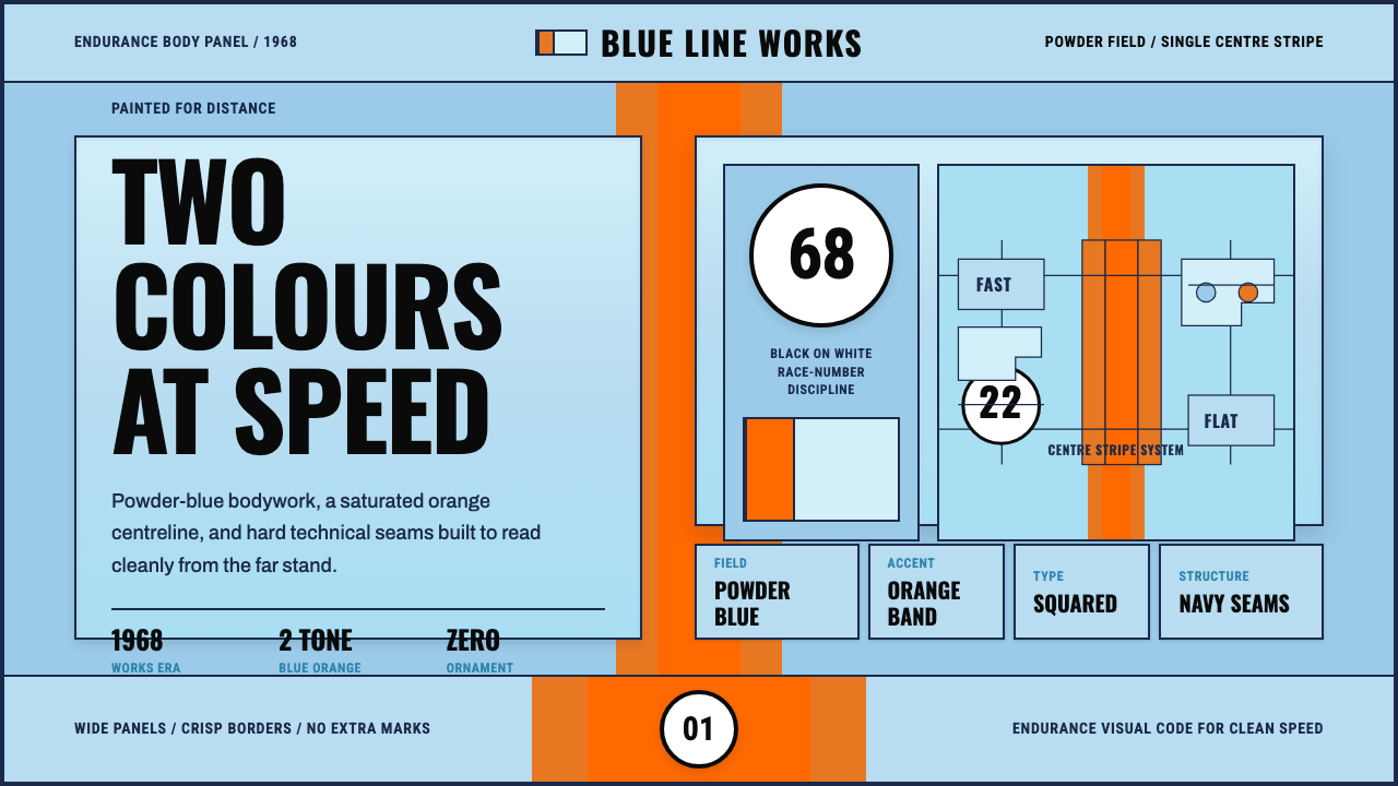 Gulf Racing LiverySpeed made disciplined. Powder blue, orange stripe, black roundel, strict gri…
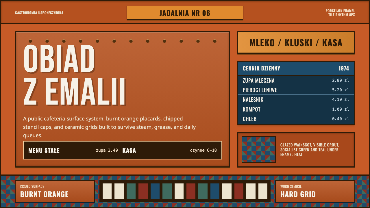 Polish Milk Bar (PRL)State-issued warmth. Burnt orange enamel, stencil caps, and hard tile grids.
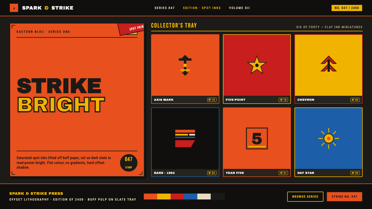 Matchbox LabelPropaganda for the pocket. Flat orange-red-yellow spot inks on dark slate, co…
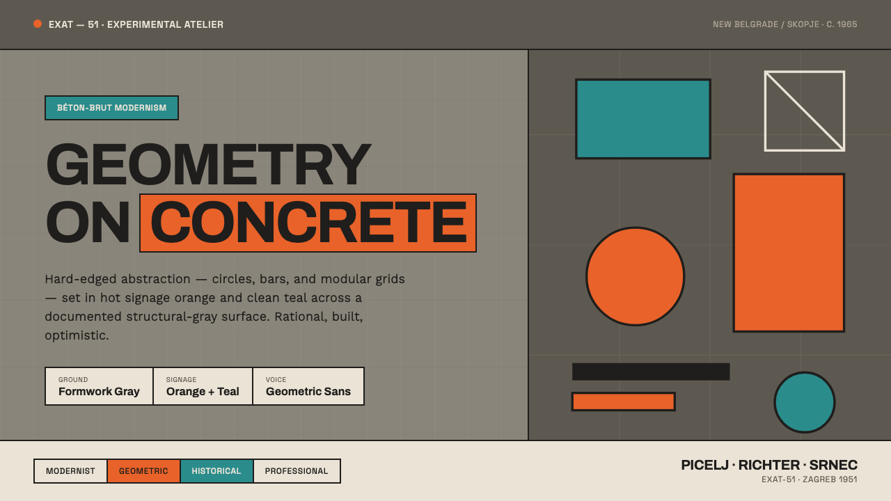 Yugoslav Socialist ModernismGeometry on concrete. EXAT-51 circles and bars in hot orange and clean teal,…
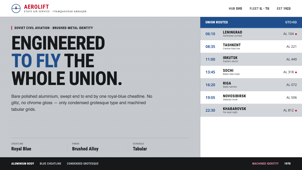 Aeroflot Soviet AirlineEngineered restraint rules. Silver ground, royal-blue cheatlines, and flat gr…
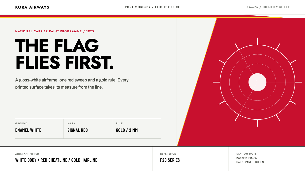 Air Niugini Livery 1975A flag engineered for flight. Signal red sweeps across enamel white, underlin…