What is Aeroflot Soviet Airline?
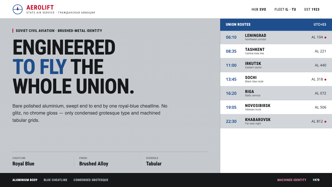
Aeroflot made restraint look powerful — bare silver, a deep-blue flight line, red Cyrillic lettering, and a timetable logic built for movement.
Aeroflot Soviet Airline in brief
Aeroflot was the state flag carrier of the USSR and, at its height, the largest airline in the world. Its identity did not depend on luxury cues or decorative spectacle. Bare-aluminium Ilyushin and Tupolev aircraft carried a deep royal-blue cheatline, a red Cyrillic Аэрофлот logotype, and Alexander Rodchenko’s winged hammer-and-sickle emblem on the tail. The result was instantly legible: state scale expressed through disciplined graphic order.
The visual language belongs to a meeting point between Soviet modernism, mid-century airline corporate identity, and the International Typographic Style. It treats the aircraft as a moving field of information rather than a glossy object. Silver establishes the ground, blue establishes direction, red establishes recognition, and typography turns the whole surface into a system of signs.
Translated to the screen, Aeroflot becomes an interface of engineered restraint. Brushed silver replaces ornamental texture with a quiet industrial surface. Flat grotesque type carries the information. Long horizontal lines suggest routes, runways, and fuselage bands. Tabular timetable grids organize content into departures, arrivals, statuses, and connections. Nothing needs to sparkle; the authority comes from consistency.
Where does Aeroflot Soviet Airline come from?
The identity belongs to the peak period of Soviet civil aviation, from the 1950s through the late twentieth century, with its strongest visual associations formed between the 1950s and the 1980s. Aeroflot was not simply an airline brand in the commercial sense. It was the public face of a state aviation system, so its visual language needed to communicate reach, reliability, technical competence, and collective organization.
Its most important visual decision was the relationship between the aircraft’s bare aluminium body and the deep royal-blue cheatline. The silver ground allowed the airframe to remain visibly industrial and material. The blue band created a continuous horizontal register that could be read from a distance and understood across different aircraft forms. It was a graphic device with the directness of a structural marking.
Recognition came through a restrained accent system. Red Cyrillic lettering made the airline name unmistakable, while the winged hammer-and-sickle emblem associated the tail with Soviet state modernism. These elements were not scattered across the surface as decoration. Each had a defined role: the blue line organized the body, the red logotype named the carrier, and the emblem established institutional identity.
The screen translation draws from the same logic without pretending to reproduce an aircraft literally. A silver-toned field becomes the environmental ground; horizontal blue rules become navigation and grouping devices; red is reserved for decisive labels or moments of recognition; and grotesque typography creates the calm density of a timetable. The style feels strongest when every element appears to have been placed for operational reasons.
What defines the Aeroflot Soviet Airline look?
Silver Ground
Silver is not treated as luxury chrome. It is the quiet industrial ground of the system, recalling bare aluminium and allowing the aircraft’s material honesty to remain visible. On screen, use a muted brushed-silver field with restrained tonal variation. The surface should feel manufactured, durable, and slightly cool, never glossy or theatrical. Content sits on this ground as information applied to equipment.
Royal-Blue Cheatlines
The deep-blue cheatline is the signature horizontal gesture. It gives the composition direction, separates zones, and creates continuity across otherwise different surfaces. In interfaces, it can become a navigation rail, a section rule, a progress path, or a strong band behind a timetable. Keep it long, flat, and confident. Its power comes from uninterrupted movement rather than ornament.
Flat Grotesque Type
Typography should be plain, broad-shouldered, and highly legible, with the practical character of a grotesque sans serif. Avoid expressive display lettering, ornamental terminals, and typographic softness. Use contrast through scale, spacing, and placement rather than decorative effects. Headings can feel like route identifiers; body copy should read like operational information. The type is part of the machinery.
Timetable Grid
The grid is tabular rather than ornamental. Repeated columns, aligned labels, and clear horizontal bands create a sense of departures and arrivals even when the content is not about travel. Every row should support scanning. Dates, names, states, and actions need stable positions, while the blue line can mark the primary reading path. The grid should feel dependable enough to operate under pressure.
Institutional Red
Red is a recognition color, not a second background. Its strongest role is the Cyrillic logotype, where it names the carrier against the silver and blue system. On screen, red should identify the few things that deserve immediate attention: a carrier name, a decisive status, a selected route, or a call to action. When spread everywhere, it loses its institutional force and becomes generic decoration.
Engineered Restraint
The style rejects visual effects that imitate polished metal, atmospheric lighting, or luxury travel. No gradients are needed to imply quality, and no soft glow is needed to imply importance. Depth comes from layering, rules, bands, and the relationship between silver, blue, red, and black. The page should look specified rather than embellished, as though every decision had passed through an operational review.
Who shaped Aeroflot Soviet Airline?
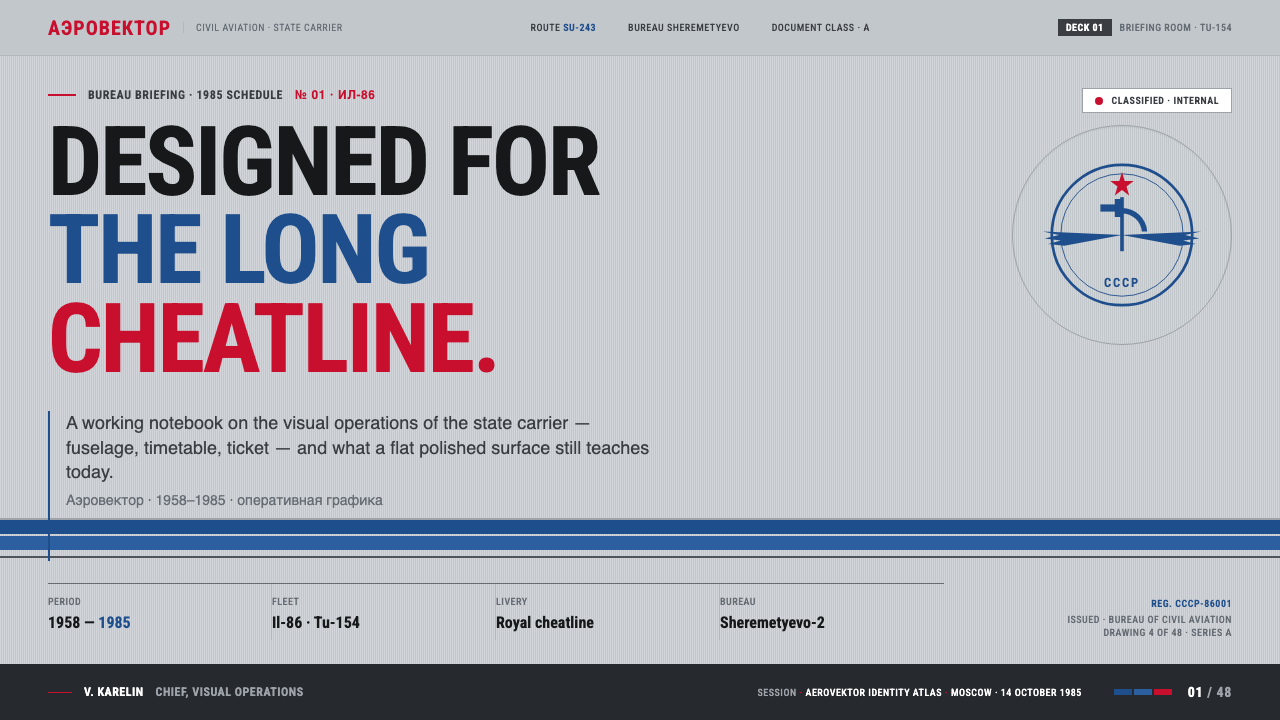
Rodchenko designed the winged hammer-and-sickle emblem associated with Aeroflot’s tail. In this system, the emblem represents the point where Soviet modernism becomes institutional identity: a compact sign with ideological weight, directional energy, and enough graphic force to remain recognizable at a distance. It should be treated as an anchor, not scattered as surface decoration.
Aeroflot is the central institutional figure of the style: the state flag carrier whose scale demanded a visual language that could organize aircraft, information, and public recognition at once. Its identity is strongest when silver, blue, red, and typography work as a coordinated operating system rather than as isolated brand assets.
The Ilyushin and Tupolev jets provide the physical field on which the identity operates. Their bare-aluminium surfaces make the blue cheatline feel structural rather than pictorial. For digital work, this means the interface should retain a sense of equipment and framework: panels, registers, bands, and labels should appear built to carry information.
Soviet modernism supplies the style’s confidence in collective order, legible symbols, and functional mass communication. It explains why the visual language feels public and infrastructural rather than personal or boutique. The design should communicate a system that many people can use, understand, and trust.
How do you use Aeroflot Soviet Airline today?
For presentation slides, use the opening slide as a flight-board statement: a broad silver field, one decisive blue horizontal band, and a red title or institutional mark placed with plenty of breathing room. Content slides should behave like operational panels, with aligned labels, stable reading columns, and black or dark text carrying most of the information. Data slides benefit from timetable logic: repeated rows, strong headers, and blue lines that show sequence or comparison. Red should identify the selected result, the critical status, or the one action that matters.
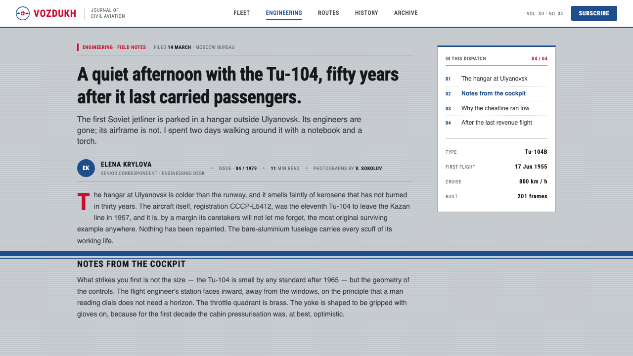
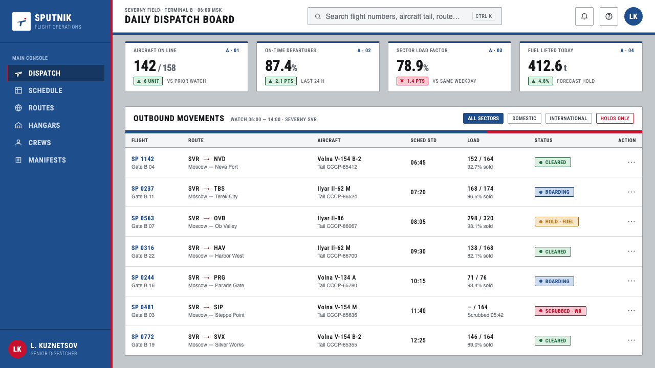
For web interfaces, the style is especially effective for dashboards, scheduling tools, logistics products, and pricing pages that need authority without luxury gloss. Use silver or near-white as the main field, deep blue for navigation and structural grouping, and red for selected states or decisive calls to action. Cards should feel like instrument panels rather than floating glass. Tables, status strips, and horizontal progress paths should be central components, while icons remain sparse and geometric.
For pricing pages, the Aeroflot language can make comparison feel operational and trustworthy. Organize plans as aligned columns with consistent labels, clear inclusions, and a single blue path guiding the eye across the offer. Use red only to mark the recommended or active choice. Avoid theatrical gradients and excessive rounded decoration; the page should feel like a schedule or service board where the user can locate the relevant decision quickly.
For editorial and marketing work, the system supports stories about infrastructure, mobility, technology, public service, and disciplined performance. A feature page can begin with a silver ground and a long blue rule, then place the headline in flat grotesque type beside a compact red identifier. Pull quotes can behave like route labels, while metadata sits in orderly rows. Campaigns should favor repeated horizontal motifs and strong institutional spacing over lifestyle imagery or decorative richness.
The common mistake is confusing restraint with emptiness. Removing gradients and ornament does not mean abandoning hierarchy, texture, or rhythm. Another mistake is using blue, red, and silver as equal decorative colors across every surface. The original logic depends on roles: silver is the ground, blue organizes movement, red identifies, and typography explains. Once every color competes for attention, the engineered confidence collapses into generic retro styling.
Aeroflot Soviet Airline — FAQ
Is this an aviation-only style?
No. Aviation is the source context, but the transferable principle is operational clarity. The same language can support dashboards, scheduling systems, pricing comparisons, logistics products, public-service interfaces, and editorial work about technology or infrastructure. What must carry over is the relationship between ground, line, label, and status — not literal aircraft imagery.
Should silver be rendered with realistic metallic gradients?
No. The source language is based on bare aluminium and engineered restraint, not luxury chrome. A quiet brushed-silver field can suggest the material through a controlled, nearly flat surface. Realistic highlights, glossy reflections, and gradients-as-chrome would turn the industrial ground into spectacle and weaken the informational structure.
How should the red accent be controlled?
Treat red as the recognition signal. It can name the institution, identify a selected route, flag a decisive status, or direct the user toward a primary action. It should not become a general background or a repeated ornament. The stronger the blue structural system is, the more authority the restrained red accent will retain.
Can the emblem be used as a decorative pattern?
It is better treated as an anchor than a pattern. Rodchenko’s emblem carries institutional and ideological weight, so repeating it without a clear role makes the identity feel superficial. Place it where the system needs a point of recognition, such as a masthead, tail-like terminal, or compact brand marker, and let the surrounding grid provide the repetition.
What makes the style feel authentic rather than merely retro?
Authenticity comes from role discipline. Silver must remain the ground, blue must create direction and grouping, red must carry recognition, and grotesque type must do the explanatory work. Tables and horizontal rules should improve scanning, not merely imitate an old airline surface. When the visual decisions make the information easier to operate, the style becomes a living system rather than a historical costume.
Related design styles
 Submarine Control RoomRigged for red. Steel hardware drowned in emergency lamplight, every dial bac…
 Amtrak Arrow (1971)Civic authority at speed. Deep navy, Helvetica lockups, and red-blue arrows.
 Doctor's Clinical Lab CoatSterile by design. Cool clinical white, teal signals, and seam-line grids enf…
 Frutiger CDG AirportLegibility at runway scale. Navy panels, white humanist sans, arrow-led grids.
 Microfiche ArchiveRecords as lit frames in a matrix. Cyan-blue back-lit panel, glowing mono typ…
 NASA Saturn V BlueprintPrecision carries risk. Prussian blue grids and white mono callouts frame a l…