What is Submarine Control Room?
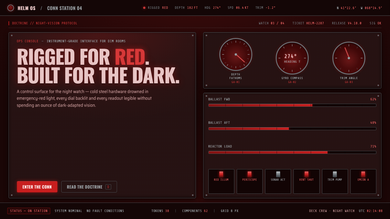
Submarine Control Room turns necessity into atmosphere: cold steel, near-black depth, and emergency red light sharpened into an interface built for vigilance.
Submarine Control Room in brief
Submarine Control Room is a visual language drawn from the cold-war submarine service of 1950–1990, especially the North American and allied naval environments where the control room was treated as an instrument rather than a room. Its defining condition is rigged-for-red lighting: deep emergency red washes over a near-black chamber so the crew can preserve night vision and prevent stray glow from escaping around the periscope. The darkness is not theatrical decoration. It is operational discipline.
The material contrast is deliberately narrow. Steel hardware remains cold gray, with brushed panels, valve manifolds, and mechanical fittings holding their own surface identity beneath the light. Red belongs to illumination, not paint. It arrives through backlit dials and overhead or embedded lamps, turning instruments into isolated crimson witnesses against the hull. The result is a room that feels submerged even when the interface is viewed on a flat screen.
As a design system, the style translates this environment into an analog, instrument-grade interface. Round gauges establish the visual grammar; needles, ticks, rings, and labels imply readings that must be watched rather than merely browsed. Near-black fields create visual depth, steel-gray surfaces provide material truth, and red light is reserved for attention, status, and orientation. Every element should feel mounted, calibrated, and necessary.
Where does Submarine Control Room come from?
The source era is the cold-war submarine service from 1950–1990, with the design language associated with North American and allied cold-war navies. The interior emerges from a setting where visibility had to be controlled as carefully as information. The control room was a steel chamber whose lighting condition could affect both crew adaptation and what light might escape near the periscope. The result was a doctrine that made darkness part of the working environment.
Rigged-for-red lighting is the central origin point. Emergency red light creates a single crimson key across the room while allowing the hardware beneath it to remain materially legible. The color is therefore atmospheric and functional at once. It does not decorate the steel; it changes the conditions under which steel, glass, markings, and instruments are read. Near-black surroundings make every illuminated dial feel local, deliberate, and consequential.
The room’s operational users also shape its visual character. Submarine helmsmen, planesmen, periscope officers, and conn officers work within a shared field of instruments, controls, and readings. Their presence implies a design language organized around attention and coordination rather than personal expression. A control room must make the important signal findable without turning every surface into an alert. Its restraint comes from the need to preserve hierarchy under pressure.
This design system distills the same logic into a contemporary interface without pretending to reproduce a physical submarine. Round backlit dials, valve manifolds, brushed-steel panels, and flat red illumination become the transferable vocabulary. The historical setting supplies the discipline; the interface supplies a new surface for it. What survives is the relationship between near-black space, cold hardware, isolated red light, and the sense that every reading belongs to a larger instrument panel.
What defines the Submarine Control Room look?
Red as Light
Red is never treated as a painted surface or a decorative accent. It behaves as illumination: a deep emergency glow that pools around dials, grazes steel, and establishes the room’s single visual key. Use it where attention must gather, while allowing large areas to remain unlit and near-black. The most convincing result feels lit from within rather than colored from above.
Near-Black Depth
The background should approach hull darkness without becoming a featureless void. Near-black gives the interface its submerged atmosphere and creates a field in which light can be measured. Surfaces, labels, and hardware should emerge by degrees of visibility, with no broad bright wash flattening the composition. Darkness is an active organizing material.
Cold Steel
Steel gray carries the identity of the physical machine. It appears in panels, rims, housings, fittings, and structural hardware, always cooler and quieter than the red light around it. Brushed surfaces can imply use and manufacture, but they should remain restrained. The material should feel engineered, not luxurious; present, not attention-seeking.
Circular Instrumentation
Round dials are the system’s primary visual anchors. Their rings, needles, ticks, and labels create a sense of calibrated observation, even when the underlying content is digital. Circular forms should be treated as instruments with a face and a reading, not as generic decorative badges. Group them into coherent panels so the interface feels installed rather than scattered.
Valve-Manifold Logic
Valve manifolds introduce branching structure and mechanical decision points. They suggest that controls belong to a connected system of routes, states, and consequences. Use clustered controls, linked indicators, and clear directional relationships rather than isolated modern widgets. The interface should reward inspection: a user can follow a line, trace a state, and understand what belongs together.
Instrument-Grade Restraint
The style depends on hierarchy, not abundance. Red illumination, dial faces, steel hardware, and darkness must each have a job. Decorative glow, unnecessary texture, and excessive status noise weaken the premise. A strong composition feels like a working console: dense where coordination is needed, quiet where the eye must recover, and precise everywhere.
Who shaped Submarine Control Room?
Submarine helmsmen represent the direct relationship between a person and the control room’s instrument field. Their presence supports a design language built around readable dials, disciplined illumination, and controls that remain legible without flooding the entire chamber with light. In this system, they stand for focused steering through a dark, information-rich environment.
Planesmen embody the system’s emphasis on connected controls and measured adjustment. The valve-manifold vocabulary, branching relationships, and instrument clusters all suggest work that depends on coordinated readings rather than isolated actions. Their role gives the interface a sense of continuous balancing and mechanical consequence.
Periscope officers connect the red-light doctrine to the protection of night vision and the control of escaping glow. Their presence explains why red must remain a measured illumination rather than a loud decorative color. The interface should therefore treat light as a scarce operational resource, concentrating it where observation matters.
Conn officers represent the shared command perspective of the control room. Their role supports layouts that gather instruments into a coherent field, distinguish states clearly, and make relationships visible across the panel. The design is not a collection of personal screens; it is a common operational surface where attention can be coordinated.
How do you use Submarine Control Room today?
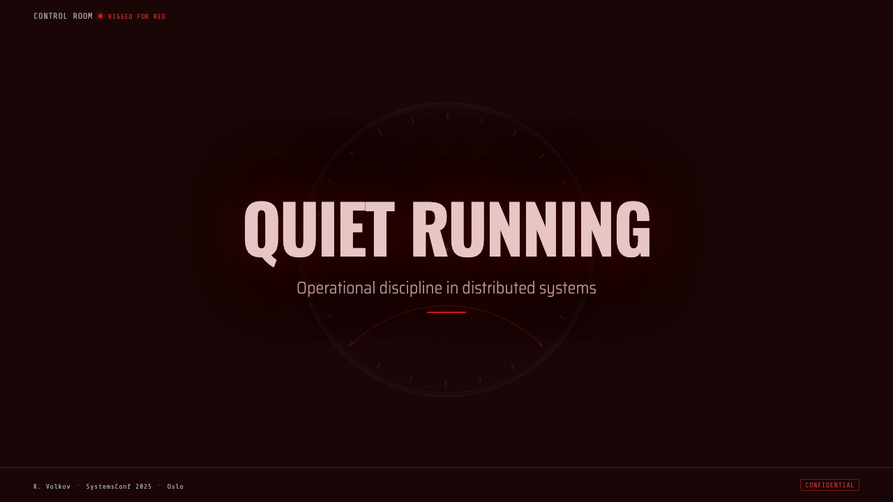
For presentation slides, use Submarine Control Room most strongly on the cover and on instrument-like content pages. A cover can place a sparse title within a near-black field, with a single red-lit dial or ring acting as the visual anchor and a steel-gray structural edge establishing the physical setting. Content slides should behave like control panels: group related information, keep labels concise, and let red illumination identify the active reading. Data slides benefit from circular gauges, linked indicators, and restrained steel framing, but every chart should still read immediately before its atmosphere takes over.
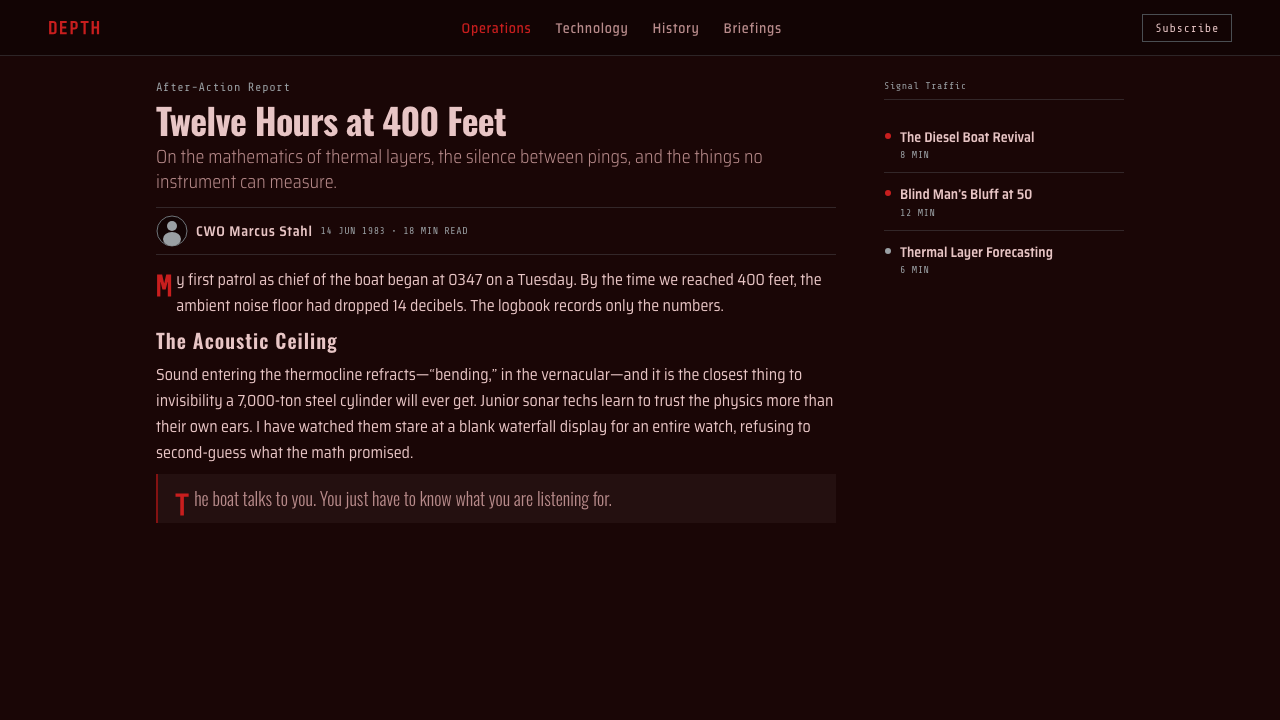
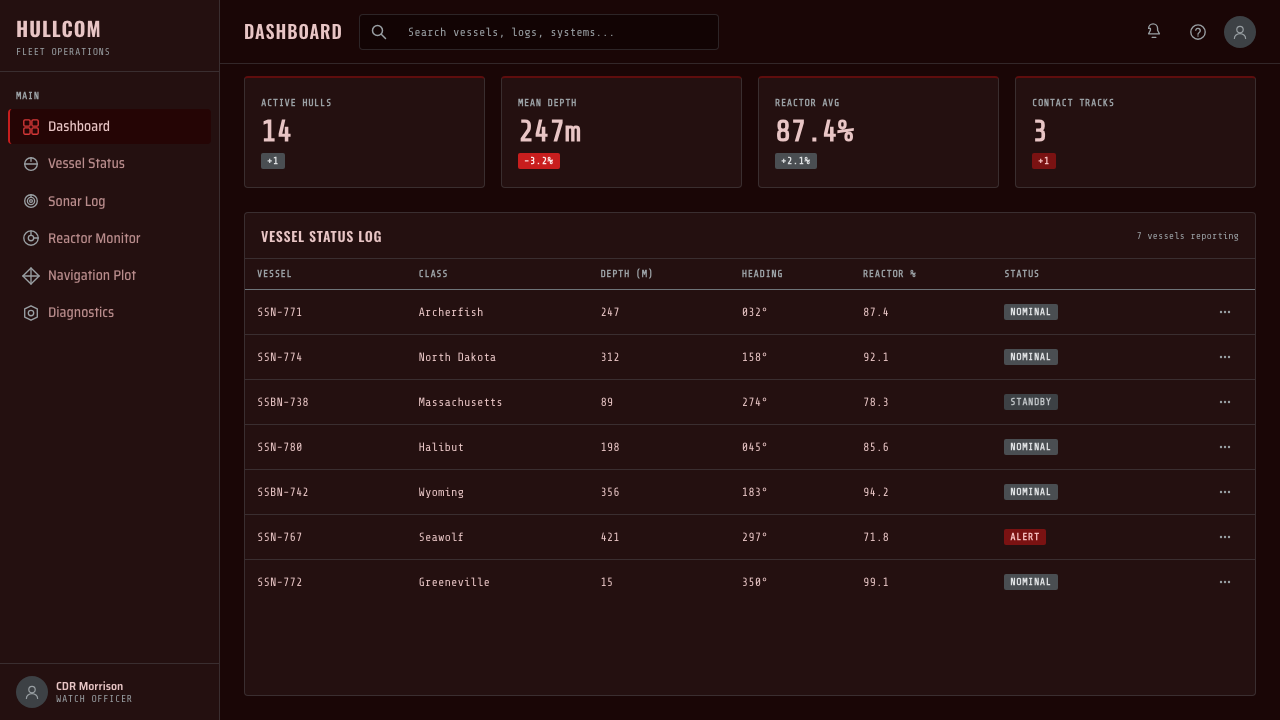
For web interfaces, the style suits dashboards, monitoring views, technical tools, and pricing pages that need a sense of operational seriousness. Use near-black as the spatial ground, cold steel for panel structure, and red only for active states, critical readings, or a selected tier. Cards should feel mounted rather than floating. A dashboard can combine large round instruments with compact status strips; a pricing page can treat each plan as a console bay, using red to identify the recommended or currently engaged option while leaving inactive choices quieter.
For editorial and marketing work, the system is strongest when the page feels like a document recovered from a working instrument room. Use broad dark fields, narrow measures for explanatory text, steel-gray rules, and occasional red-lit diagrams or callouts. Product stories can alternate between dense technical panels and areas of uninterrupted darkness. Marketing copy should emphasize precision, readiness, and controlled attention, while avoiding glossy futurism; the appeal lies in the tension between human vigilance and engineered hardware.
For navigation and interaction, favor labels, readings, and directional relationships over decorative icon collections. A control should look like it belongs to a manifold or panel, with a clear state and a visible connection to surrounding information. Motion, if used, should suggest a live instrument or changing reading rather than spectacle. The interface should remain understandable when the red light is removed conceptually; atmosphere may deepen the system, but hierarchy must carry it.
The common mistake is treating the theme as a red-and-black color scheme. That approach misses the material logic. Red should feel like light falling across cold steel, not a red surface applied everywhere. Another failure is making every dial glow equally, adding excessive texture, or turning the darkness into empty decoration. The system works when the user can distinguish hardware, illumination, reading, and inactive space at a glance.
Submarine Control Room — FAQ
Is Submarine Control Room simply a red-and-black theme?
No. Red and black are only the visible surface of the system. Its deeper logic depends on red behaving as illumination, near-black behaving as spatial depth, and steel gray preserving the identity of hardware. The style also requires round instruments, connected controls, restrained status signals, and a clear distinction between active light and inactive darkness. Without those relationships, the result becomes generic cyberpunk rather than an instrument-grade control room.
Why is the red light so important to the style?
The red light carries both the atmosphere and the reason for the atmosphere. In the source setting, rigged-for-red lighting protects night vision and helps prevent glow from escaping around the periscope. In visual terms, it also creates a single crimson key over cold hardware and near-black surroundings. Remove that logic and red becomes decoration; preserve it and red becomes a controlled operational condition.
Can this style use bright backgrounds?
A bright background works against the defining spatial condition. The system depends on near-black darkness so that red light can appear local, measured, and consequential. A lighter variant can still borrow steel panels and circular instruments, but it will read as industrial instrumentation rather than a submarine control room. If the goal is fidelity to the source, keep the surrounding field dim and let brightness arrive through selected instruments.
How should imagery be handled in a Submarine Control Room layout?
Imagery should reinforce the material and operational setting: steel hardware, round dials, valve manifolds, brushed panels, and controlled red illumination. Avoid imagery that introduces unrelated color, soft glamour, or a bright naturalistic scene. Crops can isolate a dial, a fitting, or a panel edge, allowing the image to function as evidence of an instrument environment. The image should feel observed under emergency light, not staged for decoration.
What products are best suited to this design system?
It is best suited to products that value monitoring, readiness, coordination, and technical authority: operational dashboards, instrument views, analytical tools, technical documentation, and interfaces that need a strong sense of controlled attention. It is less suited to products whose central promise is softness, warmth, celebration, or abundant visual variety. The theme’s strength is disciplined focus. Its severity should align with the product’s actual character, not be added merely to appear dramatic.
Related design styles
 Aeroflot Soviet AirlineEngineered restraint rules. Silver ground, royal-blue cheatlines, and flat gr…
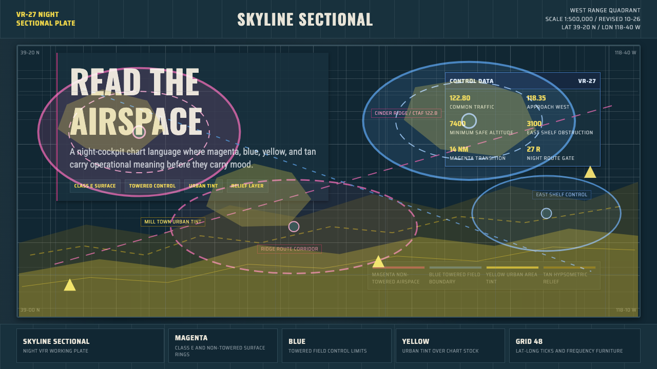 Aeronautical ChartReads like cockpit data. Magenta-blue airspace rings cut through dense dark-c…
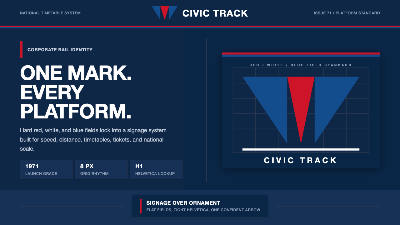 Amtrak Arrow (1971)Civic authority at speed. Deep navy, Helvetica lockups, and red-blue arrows.
 Doctor's Clinical Lab CoatSterile by design. Cool clinical white, teal signals, and seam-line grids enf…
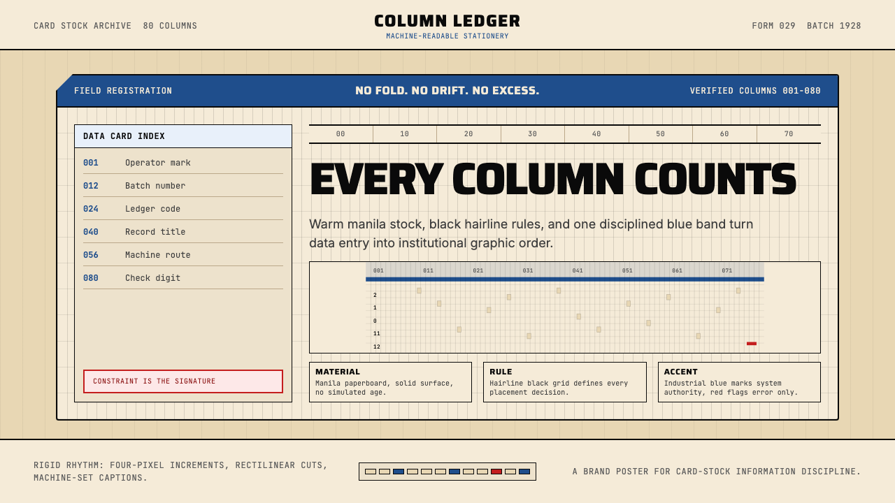 IBM Punchcard 029 (1928)Constraint becomes authority. Manila stock, hairline grid, industrial blue.
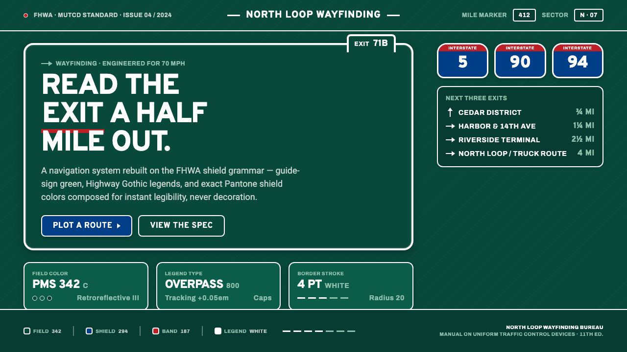 Interstate Highway ShieldEngineered for 70 mph. Guide-sign green, Pantone shield blue and red, Highway…