What is Apollo Flight Plan?
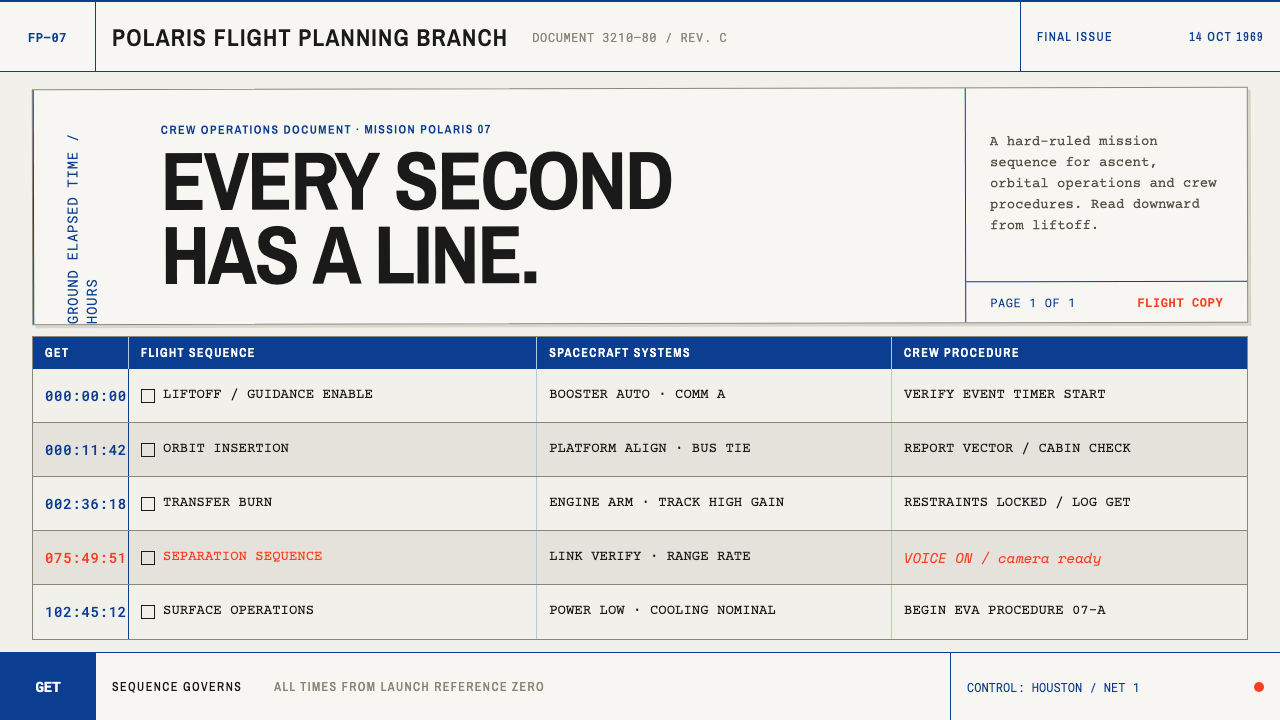
Before mission schedules lived in software, they lived in typed columns, ruled lines and a clock that started at liftoff — and the Apollo flight plan is still the clearest way a page has ever held time.
Apollo Flight Plan in brief
The Apollo Flight Plan style is a document language modelled on the final flight plan for Apollo 11, produced by the Flight Planning Branch of NASA's Manned Spacecraft Center in Houston and dated 1 July 1969. The original was a ring-bound set of ten-and-a-half by eight inch office bond sheets, printed in black on both sides, on which a Ground Elapsed Time axis runs down the page through three hard-ruled columns. It is a visual system for schedules, checklists and procedures — documents whose job is to be followed, not admired.
Its organizing principle is that time is the structure. Every entry hangs from a stamped moment on the Ground Elapsed Time spine, and the columns beside it separate parallel streams of activity so a reader can run a finger down one stream without losing the others. Nothing on the page exists to persuade or to decorate. The rules mark where one thing ends and the next begins, the typeface tells you only that a machine set it, and the empty space is the room left for a crew member's pen.
Visually it is unmistakable once seen. Body copy is monospaced, with the slightly uneven rhythm of a typewriter. Headings are set in stiff, blocky transfer lettering that sits a little off-square against the grid. Colour is limited to the NASA blue and red of the 1969 insignia, used on a very small number of structural elements, while everything else is black ink, paper and the grey of ruled lines. There are no gradients, no soft shadows and no rounded corners. This is a working document, and every mark on it has a job.
Where does Apollo Flight Plan come from?
The Apollo 11 Final Flight Plan carries the part number SKB32100080-350 and the date 1 July 1969. Its authorship is institutional rather than individual: the Flight Planning Branch of the Manned Spacecraft Center in Houston, together with the Flight Crew Support Division, are the names this theme attaches to the material. The era the style draws on stretches from the 1950s into the 1990s, the decades in which technical documentation of this kind was typed, pasted up and printed rather than laid out on a screen, and the 1969 plan is its most celebrated artefact.
The way it was made explains the way it looks. The Flight Planning Branch worked with typewriters, dry-transfer sheets and an X-Acto knife. A typewriter gives you monospaced letters and fixed columns, which is why the body copy is monospaced. Dry-transfer lettering, rubbed off a carrier sheet onto the page, gives you headings in a stiff, utilitarian gothic positioned by eye and therefore slightly off-square. The knife cut the layout into strips that were laid together, waxed down and assembled into finished pages, leaving the small registration offsets between blocks that mark every hand-built sheet. None of these quirks was a stylistic choice. They are the fingerprints of a process, which is exactly why they feel honest.
Colour came from the agency's identity rather than from a designer's palette. The blue and red are those of the NASA insignia as it stood in 1969, the round emblem nicknamed the meatball, and here they appear only as the working accents of a document, never as fields of colour. Around them sit the colours of a stationery cupboard: bond paper, black print, ruler grey. That discipline is part of the document's authority. The page looks as if it was made for people with other things to do, which is accurate.
The last layer was added by the crew. Hands wrote over the printed grid in ink — 'TV ON', 'Neil's first step' — and those notes explain why the page keeps so much empty space and why the typeset layer stays so reticent. The printed plan is the fixed layer; the handwriting is the living one. Buzz Aldrin, who appears among this theme's reference figures, stands for that second layer. The pairing of a rigid printed structure with room for human annotation belongs to the tradition of mission checklist design, and it is what this style carries forward into timelines, operating procedures and technical documentation.
What defines the Apollo Flight Plan look?
Ground Elapsed Time Spine
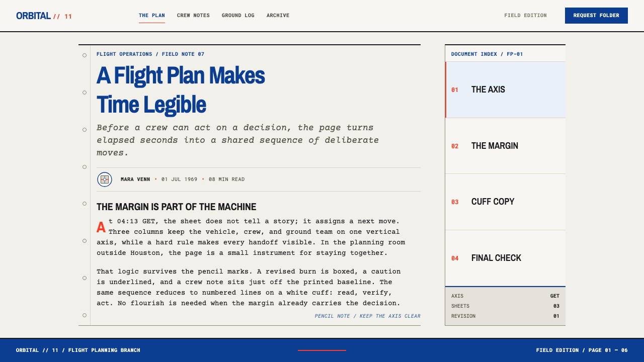
Time is the primary axis. A stamped Ground Elapsed Time marker anchors each entry, and the reading order of the whole page follows it from top to bottom. Entries are short, imperative and ordered by when they happen rather than by who does them or how important they are. The design lesson is that a schedule needs a single, unambiguous direction of travel before it needs anything else.
Hard-Ruled Three-Column Grid
The page is divided into three columns by firm ruled lines, in the manner of a ledger. Rules are the main structural device: they separate parallel streams of activity, mark transitions, and stand in for boxes, cards and background fills. Lines carry the hierarchy, with heavier rules appearing at moments that matter, so that structure is read from the strokes themselves rather than from tinted panels.
Typewriter Body
Body text is monospaced because the machine that made it was. Every character takes the same width, so times, numbers and codes line up in vertical stacks and can be scanned like a table. The texture is dry, even and slightly uneven. Text arrives in short lines and fragments rather than flowing paragraphs, which suits instructions that are read in a hurry and acted on one at a time.
Transfer-Lettered Headings
Headings are set in a heavy, stiff gothic of the kind produced by rub-down transfer sheets. Spacing between letters is irregular in the way hand placement always is, and baselines sit slightly off-square against the grid. The headings are blunt labels — section names, phase names — and should read like stencilled markers on equipment rather than titles in a publication.
Blue and Red as Working Accents
NASA blue and red appear as the colours of the 1969 insignia, kept to a small number of structural uses such as a header rule, a mission label or a flagged line. They sit on paper beside black ink and grey rules. Colour never fills a panel and never carries a gradient, and the page is built to remain legible if it is photocopied in black and white.
Paper, Ring and Bond
The medium is part of the style. The pages were bond paper printed on both sides and held in a ring binder, so the layout has to work as a page that turns, with a reference-friendly density and a margin the thumb will cover. On screen this becomes an insistence on page-like containers: flat sheets with ruled edges, not floating cards or glass panels.
The Annotation Layer
A sparse second layer of handwriting — 'TV ON', 'Neil's first step' — sits over the printed grid. It is written in ink, in the margin and between rules, and it never replaces the typeset text. The aesthetic point is hierarchy: the printed layer is authoritative and fixed, while the handwritten layer is personal, contingent and light. On screen, annotation should look unmistakably different from the content it annotates.
Who shaped Apollo Flight Plan?
The Flight Planning Branch in Houston is the authoring body behind the Apollo 11 Final Flight Plan of 1 July 1969. It built the document with typewriters, dry-transfer sheets and an X-Acto knife, and its working constraints — a clock-driven page, assembled by hand — are the origin of nearly every visual decision in this style. It is best understood less as a design studio than as a drafting office: the aesthetic is a by-product of the job.
The Flight Crew Support Division is the second institutional name attached to this material. Its place among the reference figures ties the document to the people who would actually use it: crews working from a printed sheet with a pen close at hand. That user is the reason for the dense but ruled layout, the ring binding and the generous space left for notes.
Buzz Aldrin, lunar module pilot on Apollo 11, is the human figure in this theme. The crew's handwritten notes over the printed plan — 'TV ON', 'Neil's first step' — are the layer that turns a schedule into a record of an event. For design purposes, Aldrin represents the user of the document: the person who follows the grid and occasionally marks it.
How do you use Apollo Flight Plan today?
Apollo Flight Plan is a specialist style. It excels wherever the content is a sequence — a countdown, a runbook, a release schedule, a procedure — and loses its edge when asked to sell a mood. Its strengths come from the structure underneath: a clear time axis, strong rules, monospaced alignment and a quiet accent colour. Apply those four things faithfully and the result will feel authentic even without a single reference to space.
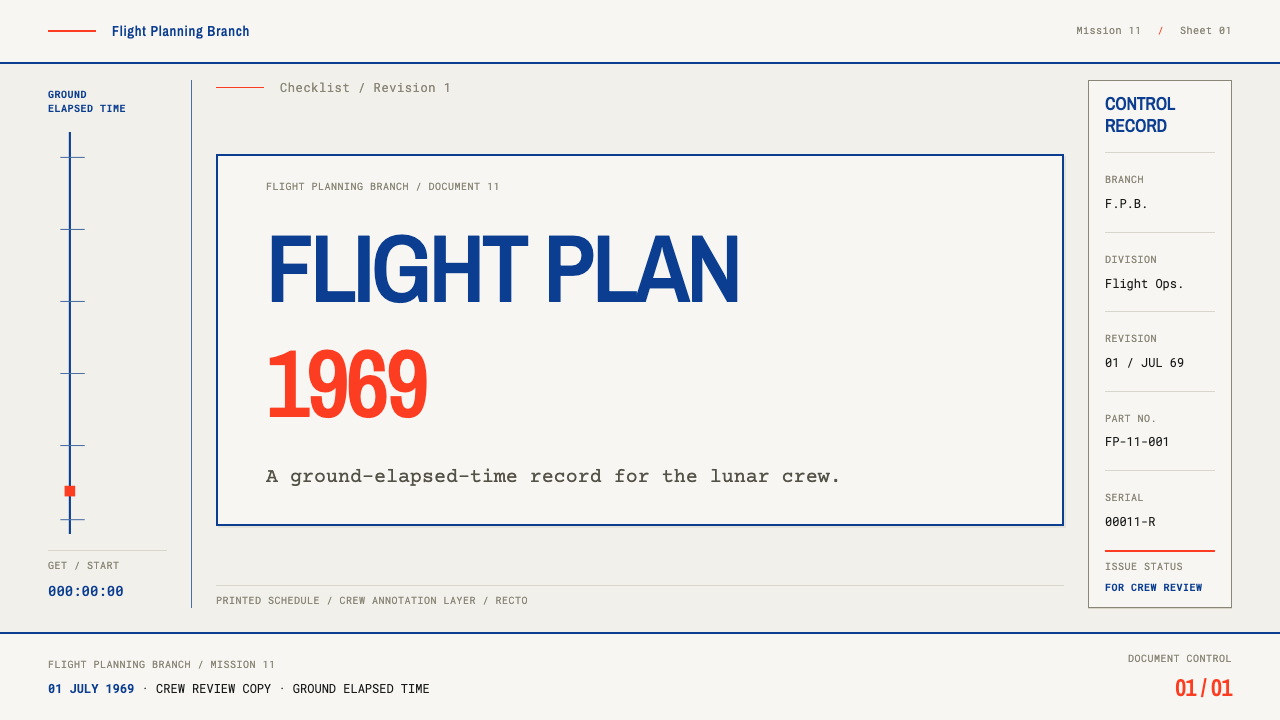
For presentation slides, treat the cover as a document title block: one heavy transfer-style heading, a reference code and a time stamp in monospaced type, separated by a single firm rule, on a paper-white field with a small blue or red mark. Content slides work best as three-column timelines, with the leftmost column carrying time stamps and the other two carrying parallel workstreams. Data slides should prefer ruled tables to decorative charts; where a chart is unavoidable, use blue for the main series and keep red for the one exception the audience must not miss.
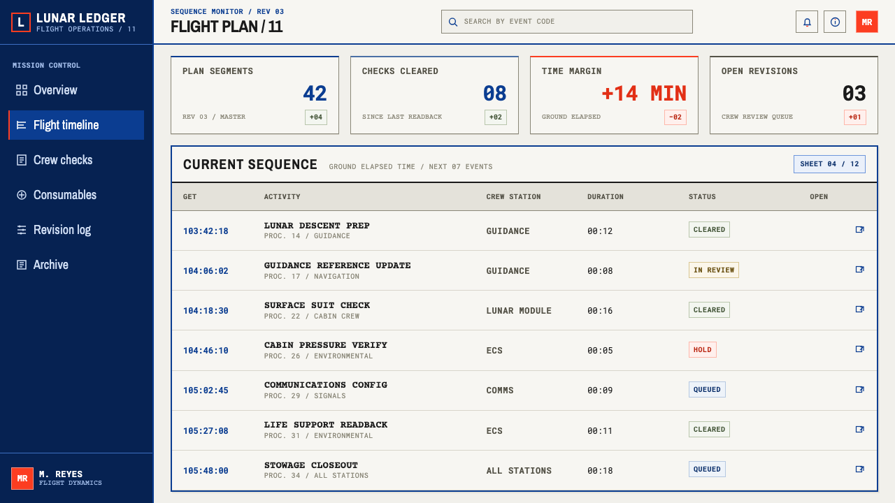
For web interfaces, the style fits incident timelines, deployment logs, changelogs, runbooks and on-call schedules. A monospaced time column on the left with ruled rows reproduces the scanning behaviour of the original sheet. Pricing pages can borrow the ruled column grid for plan comparison, with features listed in monospaced type and a single blue accent marking the recommended tier. Navigation should be plain text and rules, with no icons beyond simple markers.
For editorial and marketing work, think of launch timelines, technical white papers, product documentation, event programmes and how-it-works explainers. A long article can be treated like a flight plan: a step or time stamp in the margin, short blocks, rules between phases. The style suits engineering-led brands that want to be believed because their pages look like they were made to be used. One or two handwritten-looking annotations can add a human voice, provided they stay clearly secondary to the printed text.
The usual mistake is to treat the style as retro space nostalgia: yellowed paper textures, coffee rings, photocopy noise and a rocket illustration in every section. Those are decorations, and decoration is exactly what the original lacks. A second mistake is setting long running text in monospace; the face suits stamps, codes and short entries, not paragraphs. A third is spreading blue and red across every surface. The palette works because it is rationed.
Apollo Flight Plan — FAQ
What does Ground Elapsed Time mean, and how do I use it in an interface?
Ground Elapsed Time counts the time that has passed since the start of the mission, so every entry on the plan is placed relative to liftoff rather than to a calendar. In an interface the equivalent is a relative time stamp: minutes since an incident began, days since a launch, steps since onboarding started. It is most valuable where the interval between events matters more than the date. Set it in a monospaced column at the left, keep it visually separate from the description, and let it carry the sort order of the whole list.
Why is the body text monospaced?
The original was typed, so the letters were monospaced by necessity. The practical benefit survives: in a monospaced column, digits stack neatly and times, codes and part numbers can be compared at a glance. The look also signals a document made by a working office rather than a typographer, which is central to the style's credibility. Keep monospace for entries, stamps and codes, and avoid using it for long paragraphs, where its even rhythm becomes tiring.
Can the style work on a dark background?
The source material is dark ink on light paper, and this theme is a light one. A dark reversal is possible but loses the ink-on-paper logic that gives the style its character, and the blue accent in particular weakens badly against a near-black ground. If a dark mode is required, keep the monospaced type, the ruled grid and the time-stamp spine, lighten the accent colours, and consider keeping the main content in a pale sheet set inside a dark frame rather than inverting the whole surface.
How is this different from Swiss International Style or Bauhaus?
All three are grid-driven and suspicious of ornament, but they come from different places. Swiss and Bauhaus work grew out of design theory and was made by people who thought about typography as a discipline. The Apollo flight plan grew out of a production process: typewriters, dry-transfer lettering and paste-up. Its grid is a ledger, its type is monospaced and slightly rough, and its palette is an agency's insignia rather than a theory of colour. It feels less composed and more used.
Should I add handwritten annotations in a product?
Sparingly, and only where a human voice really adds something. The original annotations were real notes written by real users, and the style loses its honesty when handwriting becomes a decorative font used everywhere. Use it for a few moments that matter, such as a comment on a timeline step or a user's own note on a checklist item. Keep the annotation layer visibly distinct from the printed content, smaller in presence, and never use it to carry information the page cannot do without.
Related design styles
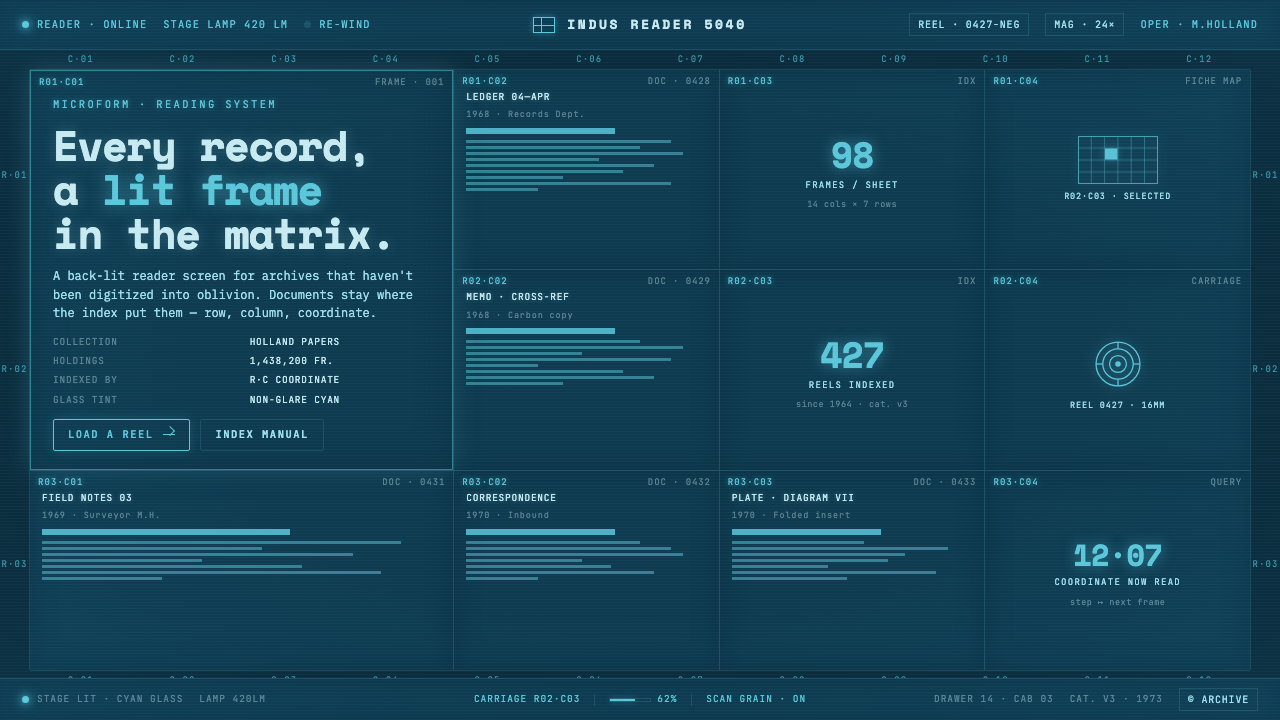 Microfiche ArchiveRecords as lit frames in a matrix. Cyan-blue back-lit panel, glowing mono typ…
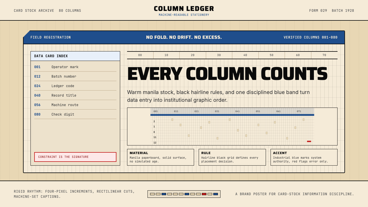 IBM Punchcard 029 (1928)Constraint becomes authority. Manila stock, hairline grid, industrial blue.
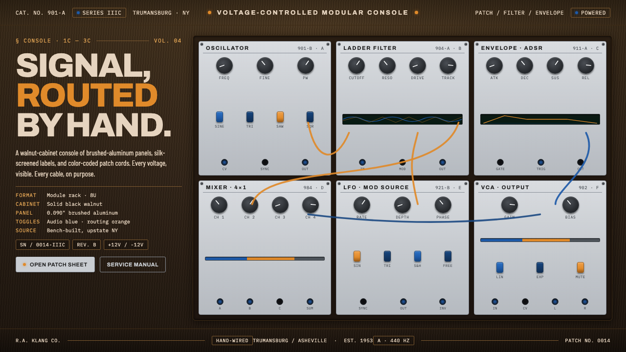 Moog Modular SynthWalnut cabinet, brushed-aluminum panels. Toggle-blue switches, orange patch c…
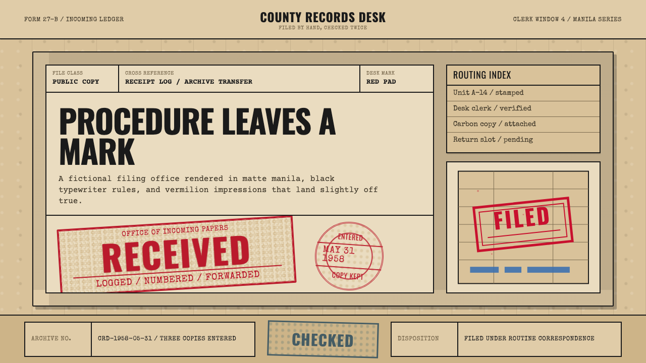 Office Rubber StampsProcedure made visible. Vermilion Oswald stamps strike a manila logbook grid.
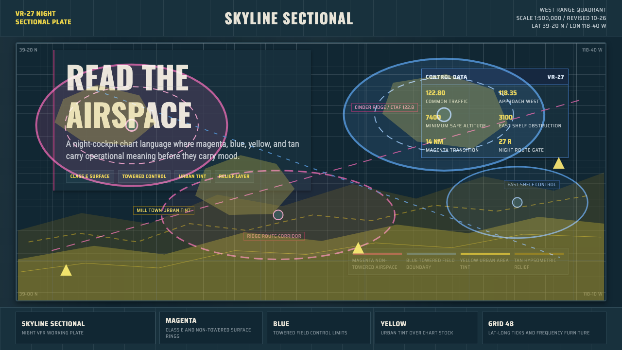 Aeronautical ChartReads like cockpit data. Magenta-blue airspace rings cut through dense dark-c…
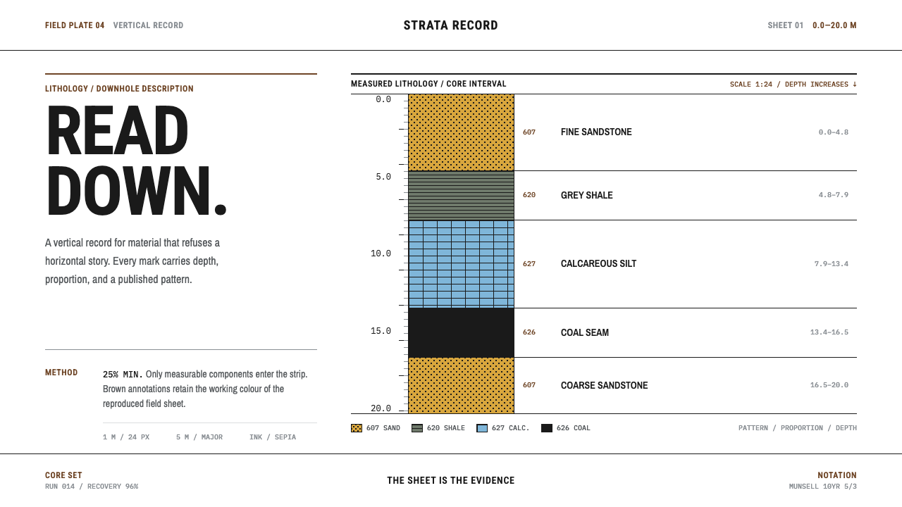 Core Sample LogRead the ground downward. Sepia rules and FGDC black patterns turn depth into…