What is Flight Progress Strips?
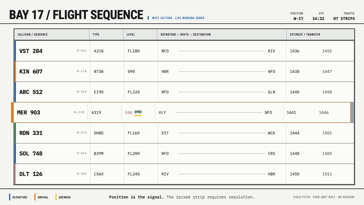
A flight progress strip is a design made for someone who is already talking: pale paper, coloured holders, and a position in the rack that matters more than any word printed on it.
Flight Progress Strips in brief
A flight progress strip is a narrow band of printed paper that an air traffic controller uses to keep track of a single aircraft. It carries the callsign, the ICAO type designator, the assigned level, the departure and destination airfields, and at least one four-figure time. The strip slides into a coloured plastic holder, and the holder sits in a metal bay, where a controller's whole picture of the traffic is laid out as a physical row. As a visual style, the strip bay means pale ruled stock, hard rectangular cells, blue and orange edge signals, and a layout that is meant to be read at a glance and written on in a hurry.
The system rests on a division of labour that is easy to state and very hard to improve. The paper is always the same pale stock, so it never competes for attention. The colour lives in the holder, blue for departures and orange for arrivals, and in the controller's pen. And a strip that has been pulled proud of the rack, deliberately out of line with its neighbours, means a live conflict that needs handling now. Information, state and urgency travel on three different channels: print, colour and position. That separation is the whole idea.
Translated to a screen or a slide, the style is quietly severe. Surfaces are pale and flat. Ruled boxes divide each strip into fields sized for handwriting rather than decoration. Blue and orange appear as narrow edges and markers, never as fills that flood a page. There are no gradients, no soft shadows and no ornament of any kind; every line is a box that something will be written into, and every blank is space reserved for a hand. It is a style that earns attention by being unmistakably practical.

Where does Flight Progress Strips come from?
The strip bay belongs to the era in which air traffic control ran on paper. From the 1950s through the 1990s, the paper strip in its holder was the standard working memory of the controller: each aircraft under control became a physical object that could be picked up, annotated, reordered and handed to a colleague. The rack was not a record of the traffic picture; it was the picture. A controller looking at a bay was reading the sequence, spacing and priority of aircraft the way a typesetter reads a case of type, by position first and by content second.
The form itself was standardised by aviation authorities rather than invented by designers. The reference material for this style points to the FAA Air Traffic Organization in the United States, to NATS in the United Kingdom, and to the ICAO-aligned procedures documented by EUROCONTROL and its SKYbrary knowledge base. Towers and area control centres around the world adopted variations on the same anatomy of callsign, type, level, route and times, because what a controller needs to know about an aircraft does not change much from one country to the next. The FAA's form set is still in print today, which is part of why the visual vocabulary has stayed so stable.
Three overlapping traditions shape the look. Air traffic control procedure design supplied the logic: which fields exist, where they sit, what each colour means, what a displaced strip signals. Tactile human-factors thinking supplied the physicality: a strip is something you hold, slide, flip and cock sideways, and its stiffness, width and holder are tuned for fingers as much as for eyes. Industrial forms printing supplied the surface: ruled boxes, pale stock, one-colour printing, and a layout that has to survive being copied, annotated and filed. None of these traditions was interested in beauty. The beauty is a by-product of fitness for purpose.
In many control rooms, screens have since taken over part of this work, and electronic strip displays commonly echo the paper originals on purpose. That is some of the best evidence of the design's quality: when the medium changed, the metaphor was kept, because controllers still need a row that can be read at a glance, a colour that states a flight's condition, and a way to push a conflict forward into view. As a design reference, the strip bay is less a nostalgic artefact than a proven interface pattern with decades of use behind it.
What defines the Flight Progress Strips look?
Pale Stock
Every strip is printed on the same pale, warm-leaning off-white, and the ground never changes from one strip to the next. That neutrality is deliberate: the paper is the quiet background against which pen marks, printed fields and coloured holders can be read without competition. Translated into a layout, the page is a calm, slightly warm light surface with no tint shifts, no texture simulation and no tonal gradients, so that anything coloured or handwritten-looking stands out immediately.
Colour in the Holder
The strip itself carries data; the holder and the pen carry state. Blue marks departures and orange marks arrivals, and both appear as narrow edges and tabs rather than as large fields. The colours are flat and clearly distinguishable from one another, chosen so that a row of strips can be sorted by eye from across a room. In interface terms this is a strict rule: colour is a status code, never mood, and it sits on the edge of a component rather than flooding its interior.
Hard Ruled Cells
Each strip is divided into a fixed arrangement of ruled boxes, and the same field always sits in the same place on every strip. This is what makes a whole bay readable: the eye learns where the level is, where the destination is, where the time is, and can jump straight to it. The rules are thin, dark and unbroken, the corners are square, and the boxes are generous enough for a pen. A layout in this style is a form first and a composition second.
Position Is the Signal
The most distinctive idea in the system is that a strip pulled proud of the rack, out of alignment with its neighbours, means a live conflict. Urgency is expressed by displacement rather than by an alarm colour or an icon. Adapted to design, this suggests a rule of alignment: everything sits on a shared edge, and the one item that does not is the item that needs attention. The device only works if the rest of the layout is disciplined, because a single offset is meaningful only against a field of perfect order.
Room for the Hand
The blank space on a strip is not leftover whitespace; it is a working area reserved for handwriting. A level that has been crossed out and rewritten is itself a record of what happened, and nobody tidies it away. The visual consequence is a layout that looks used: fields with clear room to be filled, edits that remain visible, and white space that has a job. In a digital interface this translates into editable cells, visible change history and a refusal to present every state as perfectly clean.
Utilitarian Type and Zero Ornament
Type in this style is compact, evenly spaced and built for scanning short strings such as callsigns, type codes and four-figure times. Hierarchy comes from position and weight, not from large display sizes. Beyond the typography, nothing is added for its own sake: no rounded corners, no gradient fills, no soft shadows, no decorative rules. Every edge is hard, and every mark exists because someone needs to read it while talking on frequency. The restraint is a consequence of use, not an aesthetic posture.

Who shaped Flight Progress Strips?
The FAA Air Traffic Organization is the body behind the United States' air traffic services, and its form set is still in print. That continuity matters for the style: the strip is not a revived curiosity but a living piece of procedure, with its field layout and conventions maintained for working controllers. For a designer, the FAA material is the clearest primary reference for how a strip is actually organised and why each field sits where it does.
NATS represents the British tradition of the same practice, and its towers and area control centres worked from the same pale strips in coloured holders. Its place in the reference material shows that the visual system is not a single national standard but a shared international solution: the details differ, while the anatomy, the colour logic and the physical bay remain recognisably the same across borders.
EUROCONTROL and its SKYbrary knowledge base document the ICAO-aligned procedures within which strips are used. SKYbrary is where the conventions are explained in plain terms: what the fields mean, how strips are marked and moved, and why a displaced strip carries weight. It is a useful companion for anyone who wants the style to be more than a look, because it ties the visual language back to the work it was designed to support.
How do you use Flight Progress Strips today?
The strip bay translates well because its principles are about reading under pressure, and plenty of modern interfaces are read under pressure too. Using it properly means keeping the three channels apart: data goes in the ruled fields, status goes in a coloured edge, and priority goes in position. Laying a blue and an orange stripe over an otherwise ordinary layout does not make it a strip bay.
On presentation slides, a cover works best when it looks like a single strip blown up: a pale field, a ruled box holding the title and a narrow coloured edge on one side, with a few small fields for date, author or version. Content slides can be treated as racks, each point set as a ruled row with identical field positions so that the audience learns where to look. Data slides suit tables more than charts: ruled grids with a coloured edge marking the row that matters, and one deliberately offset row where something needs a decision.
For web interfaces, the style fits operational dashboards, queues, schedules, incident boards and booking lists, where a viewer scans many similar items and needs the state of each at a glance. Each row becomes a strip, with a coloured left or top edge as its status and a consistent field order across every row. On a pricing page, tiers can be set as strips of identical structure with a single coloured edge to show which one is recommended. Keep controls flat and boxed, keep inputs ruled rather than ghosted, and let focus or urgency appear as displacement and edge colour, not as glow.
In editorial and marketing work, the strip layout suits timetables, itineraries, checklists, product comparison tables and any content that is really a list of structured records. Long articles can borrow the ruled field for metadata, while body text stays on a pale ground in an even, plain setting. Campaign pages can use the strip as a repeating unit, a stacked row of cards that read as a bay, with the colour edge reserved for one idea such as new, sold out or priority.
The most common mistake is to treat blue and orange as a general brand palette and apply them as large fills, gradients or decorative accents. Once colour is everywhere it stops signalling anything, and the central idea of the system, that colour states a condition, is lost. A second mistake is rounding corners and softening shadows to make the grid friendlier; the hard ruled cell is what makes the row legible. The third is adding display typography or illustration. A strip bay is meant to be read by someone in the middle of another task, so every element should be justifiable on those terms.

Flight Progress Strips — FAQ
Why are blue and orange the signal colours?
In the tower convention that this style draws on, blue marks departures and orange marks arrivals. The pair works because the two colours are far apart in hue and easy to tell apart at a distance, and neither is associated with a warning on its own. That leaves the position of a strip, rather than its colour, to carry the real alarm. For design use, the lesson is to pick two clearly separable status colours, give each a single meaning and use them only on edges and markers.
How is this different from a kanban board or a generic status list?
A kanban board mostly expresses state through which column a card sits in, and a generic status list often uses a coloured dot or pill. The strip bay splits the job into three: ruled fields for data, a coloured edge for the type or state, and displacement for urgency. It also keeps every field in the same place on every item, so the eye learns the layout. The result is denser and more rigid than a kanban board, and better for scanning large numbers of similar records quickly.
Does the style need a handwriting font?
No. The strips leave room for handwriting because controllers write on them, but a digital interface does not have to imitate a pen. What it should keep is the space and the behaviour: fields sized for input, edits that stay visible, and a layout that looks used. If you want a nod to the hand, a restrained annotation layer, such as a struck-through value beside its replacement, carries the idea better than a script typeface, which would clash with the strict ruled structure.
Can the strip bay look work in a dark theme?
The original is a light, paper-based system, and the pale stock is central to how it reads: the neutral ground is what lets colour and handwriting stand out. A dark adaptation is possible, but it changes the character. The ground would have to stay neutral and flat, the rules would need to remain thin and crisp, and the two signal colours would need to be kept distinct and sparing. Treat it as an inversion of the original rather than a faithful rendering, and test that the blue and orange still separate clearly.
When does this style not suit a project?
It struggles where warmth, softness or emotional storytelling is the goal: lifestyle brands, wellness products, children's content and anything that depends on atmosphere. It also asks for real structure; if the content is a few large images and a slogan, there are no fields for the grid to organise. It is strongest when the content is a list of records that people must compare quickly, and when the audience values accuracy and speed over charm.
Related design styles
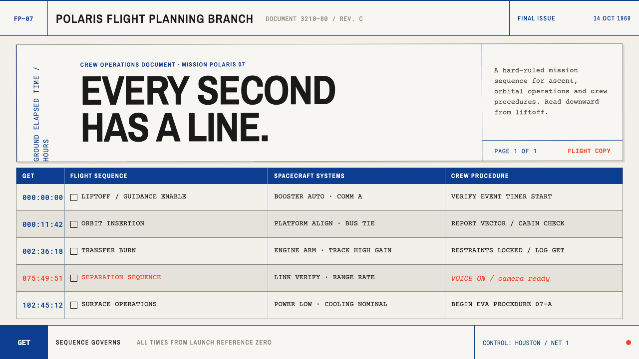 Apollo Flight PlanEvery second has a line. NASA blue rules and monospaced GET stamps discipline…
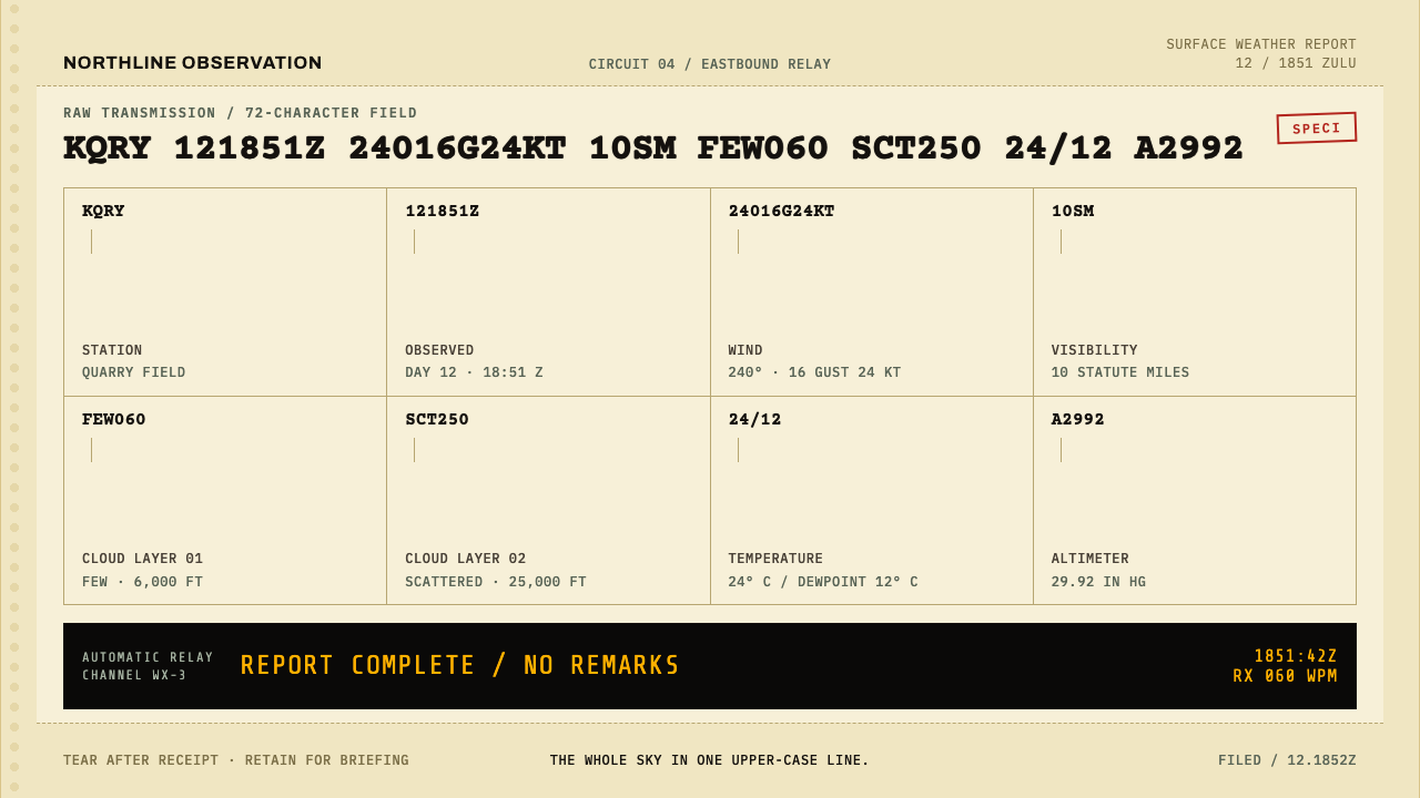 METAR Weather CodeThe whole sky, compressed. Ribbon-black code strikes across canary teleprinte…
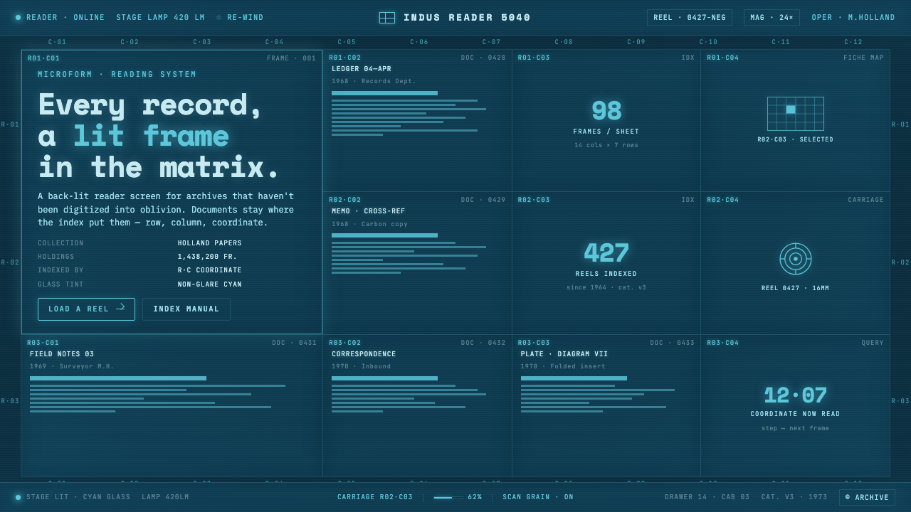 Microfiche ArchiveRecords as lit frames in a matrix. Cyan-blue back-lit panel, glowing mono typ…
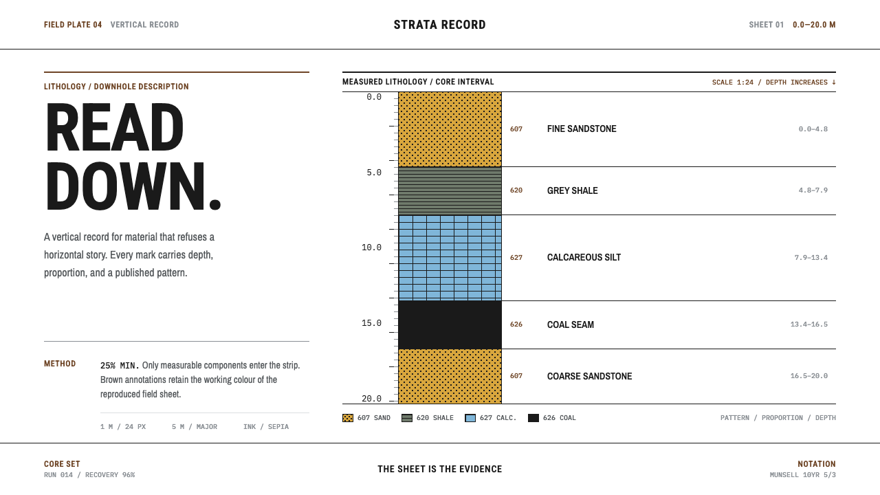 Core Sample LogRead the ground downward. Sepia rules and FGDC black patterns turn depth into…
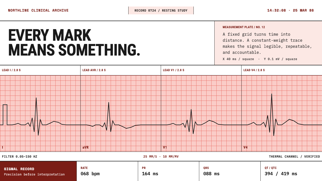 ECG Strip PaperEvery mark is measured. Salmon-red rules hold a constant-weight burned trace.
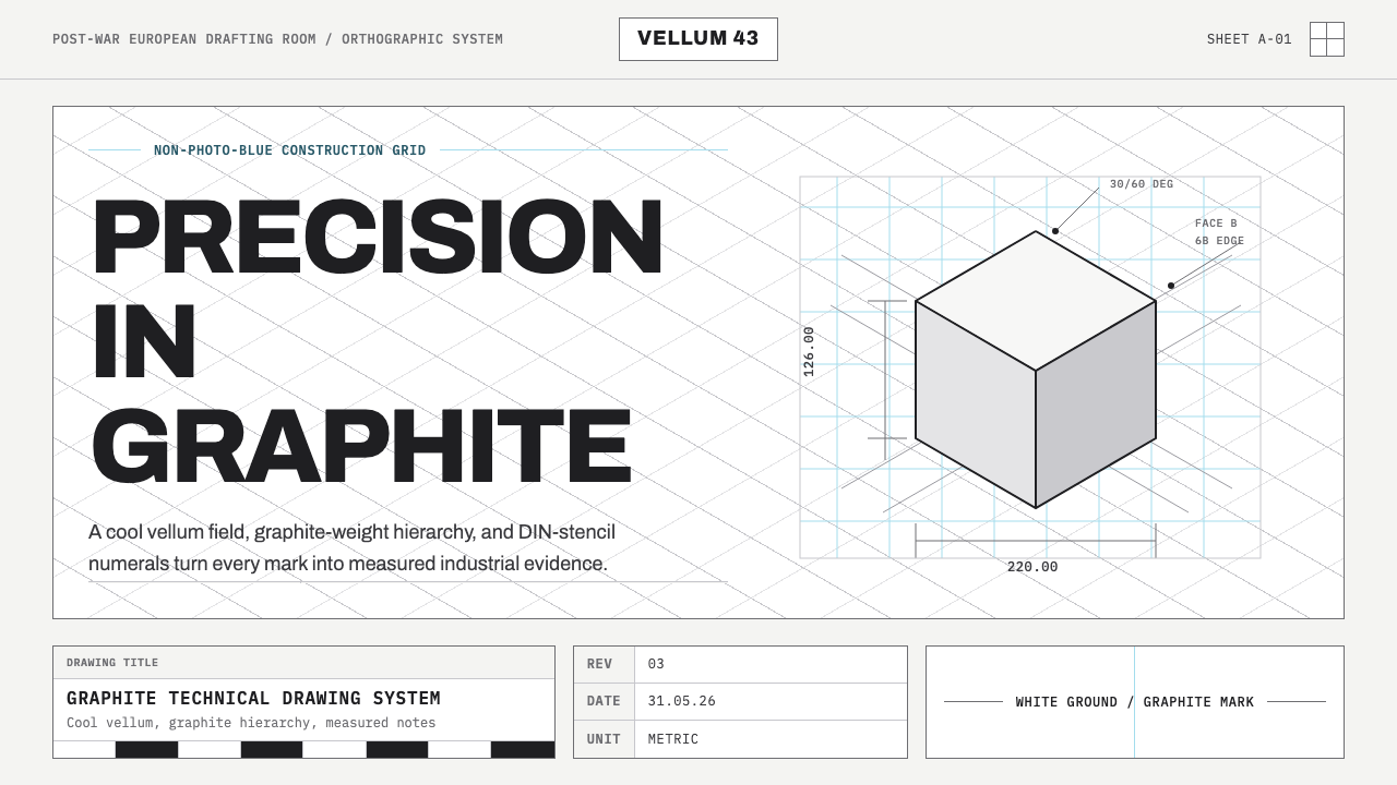 Graphite Technical DrawingDrafting-room precision. Non-photo-blue grid and graphite DIN lettering do th…