What is Core Sample Log?
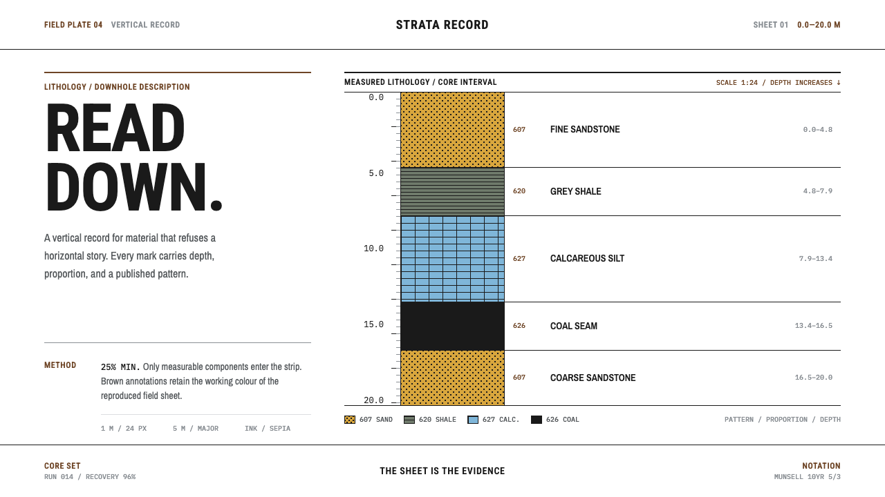
Core Sample Log reads the ground downward — a depth axis, flat black rock patterns on white log stock, and brown working rules that turn every meter of earth into a line of evidence.
Core Sample Log in brief
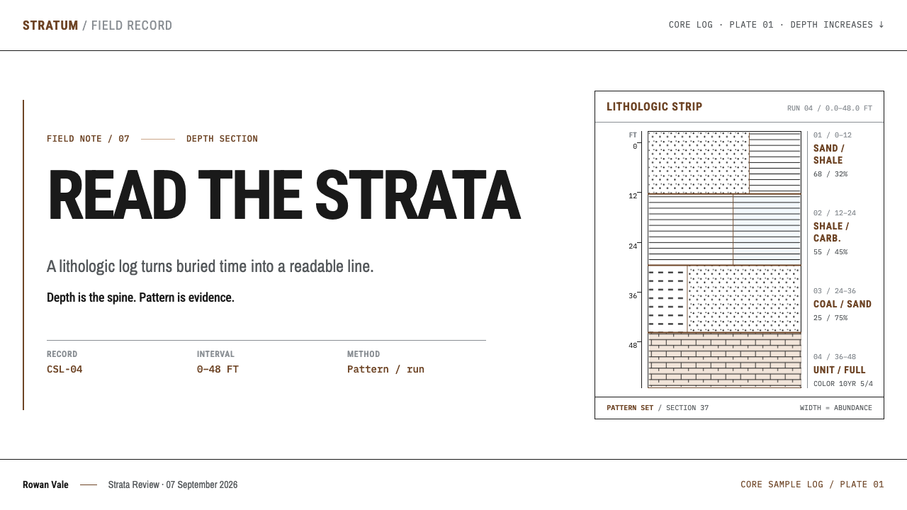
Core Sample Log is a design system built on the lithologic strip log, the drawing geologists make to record what a drill core contains at each depth. The ground is treated as a vertical object. A depth axis runs down one side with the deepest point at the bottom, and beside it a narrow graphic column carries standardized patterns for rock types, inked flat black on white log stock. Brown rules hold the sheet together. The overall effect is part scientific plate, part ledger, and entirely sober.
What makes the style distinctive is that its vocabulary was not invented by designers. Sandstone is drawn as stipple dots, shale as fine horizontal rules, and the patterns follow a public standard, so a trained reader anywhere in the world knows what each one means. The system's job is not to make rock look attractive but to make depth readable. Beauty arrives as a by-product of an exact convention applied consistently.
The page is also organized by a strict economy. Only components that make up at least a quarter of a layer are drawn, and each is given a width proportional to its share. That rule, together with the vertical reading direction, gives the style its recognizable rhythm: a tall strip of repeated, precise marks, read from top to bottom, with every mark answering the question what is here, and how much of it.

Where does Core Sample Log come from?
A lithologic strip log draws the ground as a vertical object. The depth axis runs down one side of the sheet, deepest at the bottom, and a graphic column beside it carries patterns taken from the FGDC standard, Section 37. Sandstone is stipple dots and shale is fine horizontal rules, inked flat black on white log stock. Only components at or above twenty-five percent abundance are drawn, at a width proportional to the percentage. The convention exists so that anyone can read the sheet quickly without a legend and without a debate about what a given texture is meant to represent.
The source places the standardization of log symbology between 1950 and 1990 and credits three institutional worlds: the United States Geological Survey, the American Association of Petroleum Geologists, and the international ocean-drilling programs. Their cartographers and shipboard scientists agreed on a shared set of symbols, and the result was published openly. This matters for design, because it removes the temptation to invent. There is no need for anyone to design a new, more attractive stone texture; the patterns already exist, and the craft is in using them with discipline.
The sheet is meant to be read next to the physical core. The rock sits in trays two to three feet long. Wooden spacer blocks mark the boundaries of each drilled run and the places where core was lost. Run numbers are written three times on every box: inside the lid, outside the lid and along the side. Color is not trusted to memory either; it is compared on the spot against Munsell color charts, because freshly cut rock oxidizes as it sits and its hue changes with time. The drawing therefore has a quiet dual character: it is both a picture of the rock and a set of instructions for checking it against the real thing.
Even the brown has a history. For sixty years these plates were reproduced as sepia diazo prints, a process that has been in use from the 1920s on, and the working line color of the copies became the line color of the tradition itself. Brown rules on white stock are therefore a trace of the reproduction method, kept as a convention after the method changed. The source names three lines of practice behind the look: stratigraphy and sedimentology as the science, scientific ocean drilling from DSDP through ODP to IODP as the major field campaigns, and petroleum well-log cartography as the commercial branch that taught the drawing to be efficient.
What defines the Core Sample Log look?
Depth Axis
Everything hangs from a vertical axis that runs down one side of the sheet, with the deepest point at the bottom. Reading direction is top to bottom, always. The axis is marked with regular ticks and plain numerals, and it never decorates itself. It is the spine of the composition and the reason the style feels so naturally linear.
Pattern Column
Beside the axis stands a narrow graphic column filled with rock patterns: stipple dots for sandstone, fine horizontal rules for shale, and a small family of other standard marks. Each pattern is drawn in flat black with no tint, no texture and no shading. The patterns are borrowed, not invented, which is why they carry authority.
Abundance Rule
A component appears only if it makes up at least a quarter of a layer, and its width is proportional to its share. This is a rule of omission as much as inclusion. It teaches the designer to show what matters at each level and leave out the rest, and it gives the column its irregular but meaningful silhouette.
Sepia Rules
Working lines are brown, the color of sepia diazo copies that dominated reproduction for sixty years. Rules, frames, depth ticks and annotations share this single warm hue, while the rock patterns stay black. The pairing makes a clear hierarchy: black is the evidence, brown is the apparatus around it.
White Log Stock
The ground is plain white log stock. There are no cream tints, no paper-texture effects and no background imagery. The sheet is a working surface for marks that must be read at a glance, and the white lets the black patterns reach maximum clarity. Whatever warmth the page has comes only from the brown rules.
Tray and Spacer Logic
The physical core adds structural habits to the drawing: runs are bounded, lost core is marked as a gap rather than hidden, and identifiers are repeated in several places so that nothing can be misread. In layout terms this means clearly delimited sections, honest blank spaces where data is missing, and redundant labels that favor certainty over elegance.
Color by Comparison
Where color of rock itself is recorded, it is described by reference to a standard chart rather than by impression, because the true color shifts as the sample oxidizes. The design lesson is that color words and swatches in this style are labels tied to a reference, and not freehand decoration. Any added color should have a stated source.
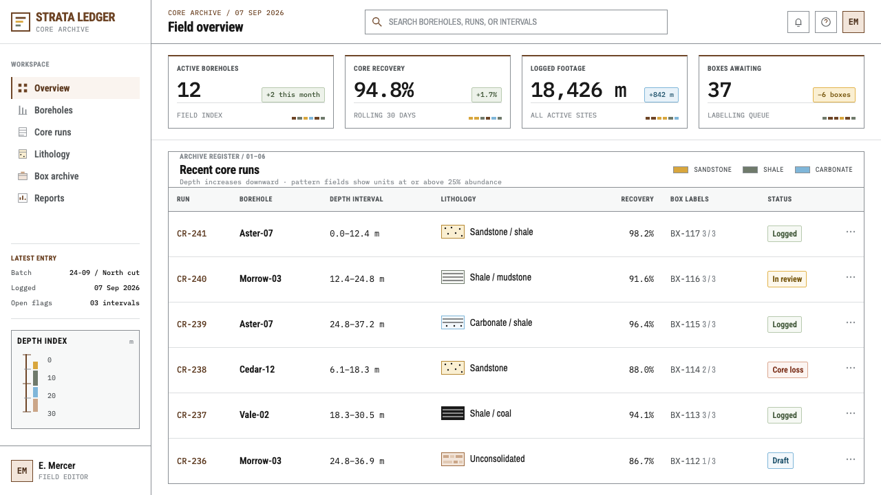
Who shaped Core Sample Log?
The cartographers of the United States Geological Survey are credited, through FGDC Section 37, with the public pattern vocabulary used here. Their contribution was not an aesthetic but a convention: a shared set of fills so that a stipple or a ruled band means the same thing on every map. The design system inherits their restraint along with their symbols.
Sedimentologists aboard ocean-drilling ships describe cores soon after they are recovered. Their sheets show how the strip log behaves under real conditions: fast, repetitive, shared across international teams and designed to be read by people who did not draw them. Their field practice explains why the style prizes legibility over expression.
Munsell devised the notation that describes any color by hue, value and chroma, and his color charts are what geologists hold up against a core to name its color reliably. He stands behind the style's insistence that color be recorded by comparison. In a design context, his legacy is the idea that a color should be specified against a shared reference, not by feeling.
How do you use Core Sample Log today?
Core Sample Log suits content that is layered, sequential or evidential: histories, audits, processes that stack up over time, and any story told from the surface to the bottom. Its strength is clarity of reading order. Before using it, decide what your equivalent of depth is. It might be time, version number, priority or the steps of a method, and the whole composition should then hang from that axis.
For presentation slides, a cover can be a tall column of black patterns beside a brown depth axis, with the title set plainly at the top. Content slides become strip logs: one vertical axis, one column of marks, and annotations aligned to the rules in brown. Data slides are a natural fit for any series that runs downward, such as stratified timelines, funnel stages or cumulative layers. Show only the components that exceed a meaningful threshold, as the log itself does, and let the omission be part of the message.
For web interfaces, the style works for changelogs, audit trails, version histories, file hierarchies, research notebooks and archives. Use white backgrounds, brown hairline rules for structure and black for content that carries information. Keep the main reading direction vertical, and give each entry a clear depth marker so that users know where they are in the sequence. Avoid card shadows and filled color panels; the style gets its authority from lines and patterns, not from surfaces.
For editorial and marketing work, the style gives a field-report voice. An article about geology, archaeology, infrastructure or the history of a company can run beside a long strip log that visualizes its layers. Marketing pages can use a depth axis as a scroll guide, with each section labeled as a layer and the key claim set in black against a plain white field. Keep captions short, cite the source of every number and let the structure carry the credibility.
The most common mistake is to treat the rock patterns as decorative texture and scatter them across backgrounds or buttons, which empties them of meaning. Another is to fill the column with bright color to make it livelier; the style's authority comes from flat black marks and a single brown. Do not invent new patterns that look like rock but follow no convention. If a symbol cannot be explained as a standard, it does not belong on the sheet.
Core Sample Log — FAQ
What is FGDC and why does it matter here?
FGDC refers to the Federal Geographic Data Committee in the United States, whose geologic symbol standard includes Section 37, the set of rock-type patterns this style uses. It matters because it makes the patterns public and consistent. A design built on them inherits an existing visual language, and does not need to ask readers to learn a new one.
Why are the rules brown and not black or grey?
Because these plates were reproduced as sepia diazo prints for about sixty years, and the brown of the copies became the working line color of the tradition. Black is reserved for the rock patterns, which are the evidence. The result is a clean hierarchy in which brown holds the structure and black carries the findings.
Does the style use any color other than brown and black?
Not as decoration. The ground is white, the patterns are flat black and the rules are brown. Where a real color needs to be recorded, such as the hue of a rock, it is tied to a Munsell reference rather than chosen freely. If you add an accent color, do so sparingly and be able to name what it stands for.
Can this style be used outside geology?
Yes. Anything that stacks in layers, runs in sequence or has to be audited suits it: changelogs, timelines, research notes, project histories, financial layers. The key is to pick a meaningful vertical axis and keep to the omission rule, so that every mark on the page earns its place. It is a poor fit for playful or highly emotional products.
Can I use a dark background?
It is not recommended. The tradition is black ink and brown rules on white log stock, and the clarity of the patterns depends on that contrast. Inverting it would also detach the style from its reference to printed field sheets. If a dark mode is unavoidable, keep the structure but treat it as a different, derivative system.
Related design styles
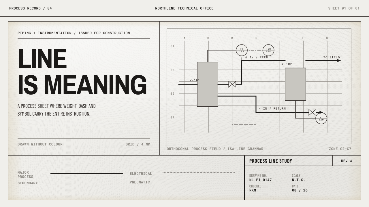 Refinery P&IDMeaning is drafted, not decorated. Monoline type and weighted process paths r…
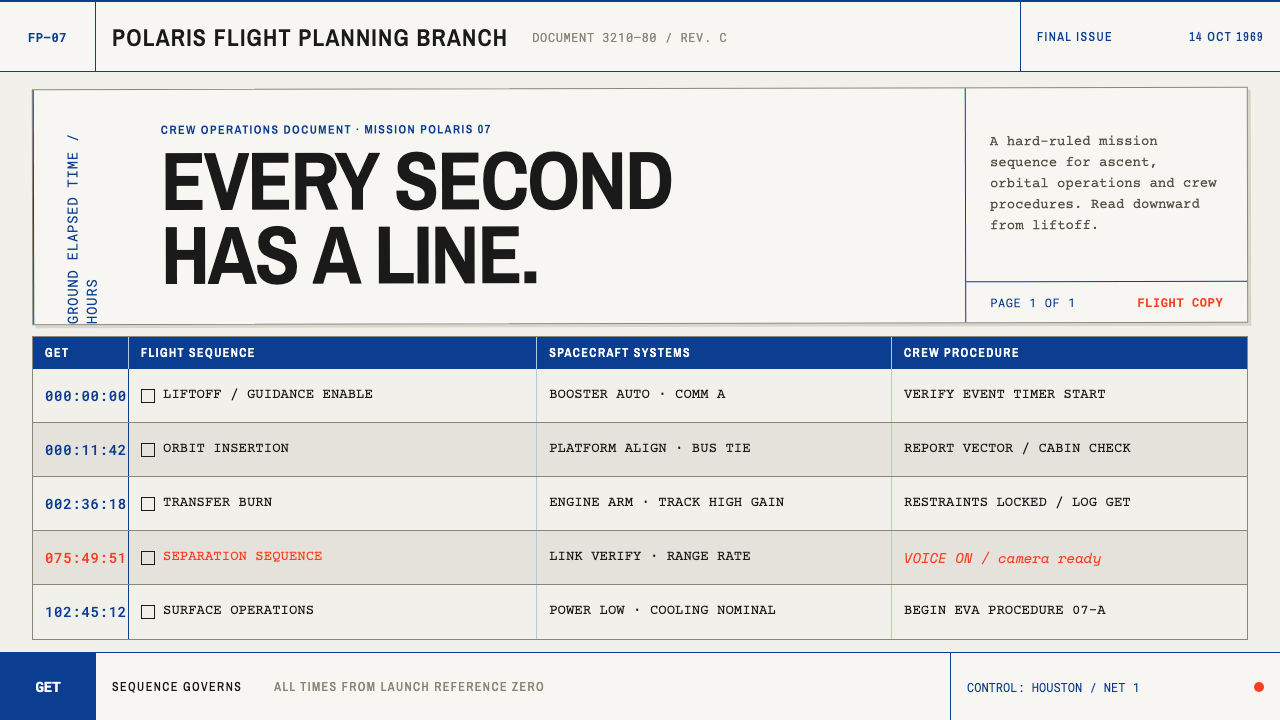 Apollo Flight PlanEvery second has a line. NASA blue rules and monospaced GET stamps discipline…
 Doctor's Clinical Lab CoatSterile by design. Cool clinical white, teal signals, and seam-line grids enf…
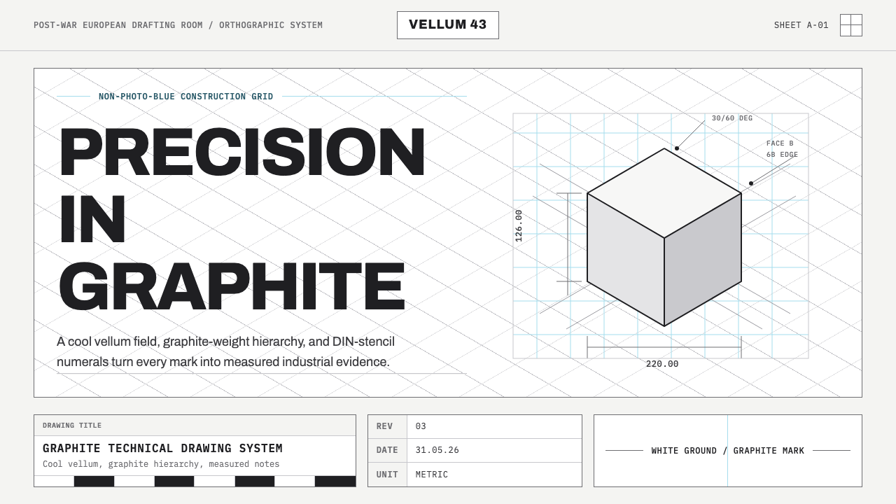 Graphite Technical DrawingDrafting-room precision. Non-photo-blue grid and graphite DIN lettering do th…
 Hilfiker Railway ClockEverything exact, one thing live. Black hands on cool enamel white — one red…
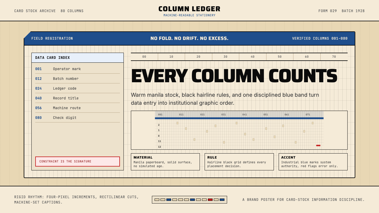 IBM Punchcard 029 (1928)Constraint becomes authority. Manila stock, hairline grid, industrial blue.