What is Refinery P&ID?
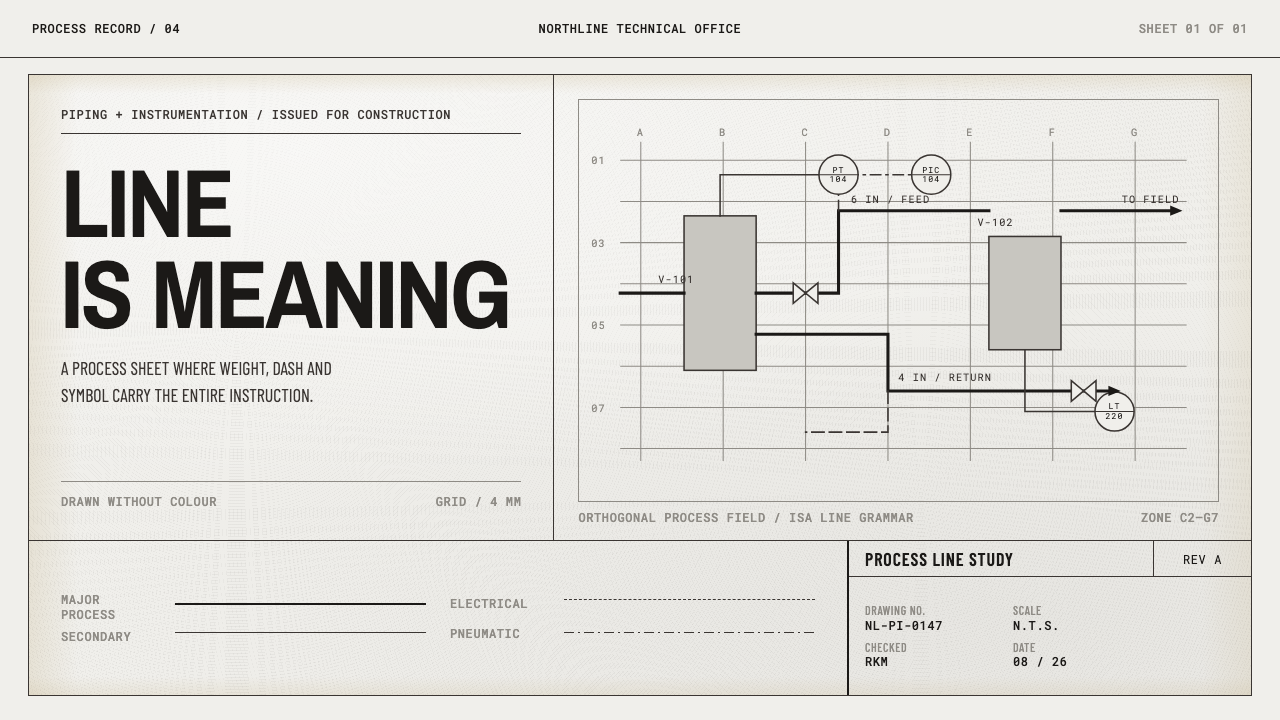
A P&ID refuses to describe anything with colour: line weight, dash pattern and symbol shape carry all the meaning, drafted in single-stroke capitals on a whiteprint sheet.
Refinery P&ID in brief
Refinery P&ID is a design language drawn from the piping and instrumentation diagram, the engineering drawing that shows how a process plant, such as a refinery, a petrochemical unit or a reactor installation, is plumbed and controlled. Its defining rule is that meaning is drafted, not decorated: every piece of information lives in line weight, dash pattern, symbol shape and lettering. Colour is not part of the language.
The line vocabulary is the heart of it. A heavy continuous line is major process piping. A lighter one is secondary service. A long-dash line carries an electrical signal, a dot-dash line a pneumatic signal, and capillary tubing is marked with short crossing ticks. Once colour is permitted, this system of differences stops working, so the design stays in dark line on near-white stock.
The sheet itself is part of the look: a flat, near-white ammonia whiteprint that flecks slightly under light and turns yellow only where it was folded and trimmed. Lettering is single-stroke gothic, uppercase, with no contrast in the stroke. Everything is anchored to a title block in the lower right, and the composition is neither centred nor symmetrical.
Where does Refinery P&ID come from?
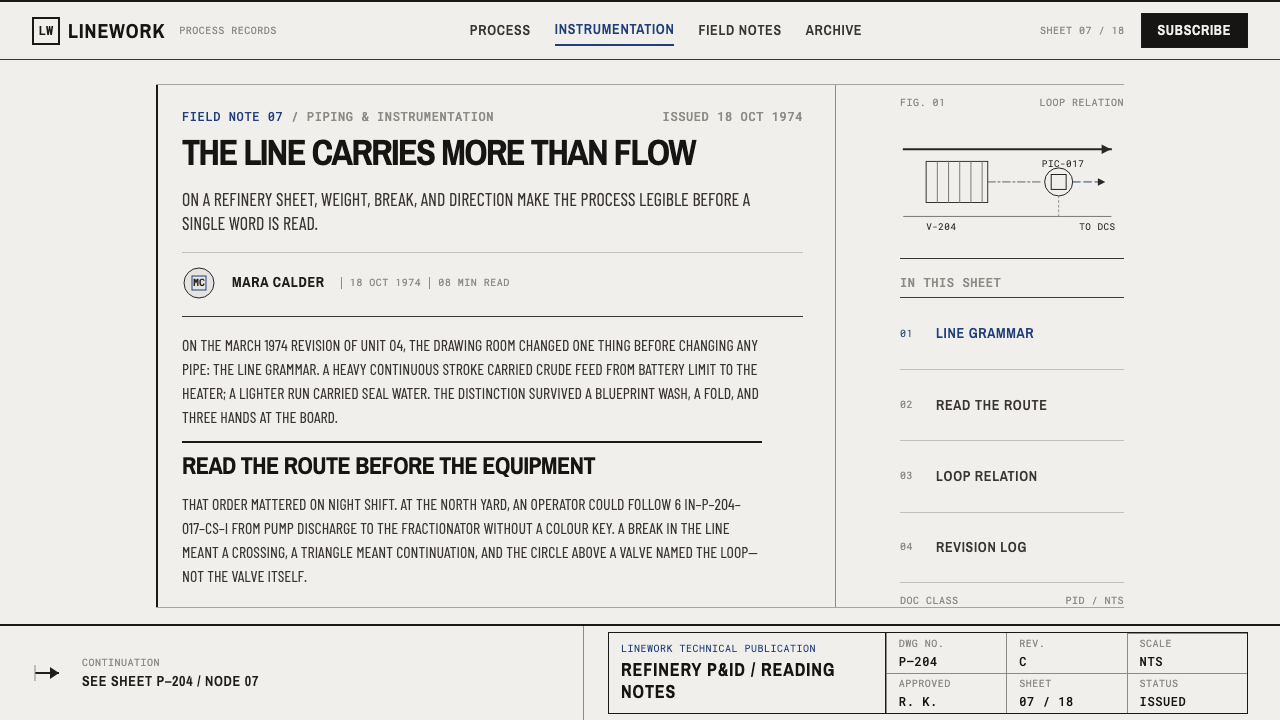
The P&ID belongs to the engineering offices of the American process industries between about 1950 and 1990. In US refinery, petrochemical and reactor design offices, plant drawings were produced by hand in ink and pencil, first on vellum and later on Mylar, and then reproduced for field crews and contractors by the ammonia diazo process, the whiteprint. The look of the sheet is the look of that workflow: dark lines on flat pale stock, copied by the dozen and folded into rolls and cabinets.
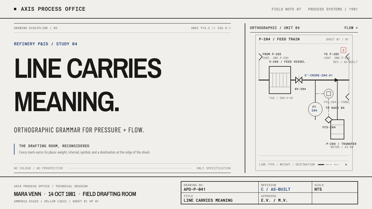
Standardisation made the language. The Instrument Society of America's ISA5 committee wrote the symbology known as ISA 5.1, in which an instrument is drawn as a small circle with letters in the upper half identifying what is measured or controlled and a loop number in the lower half. The ANSI Y14 committee on engineering drawing standardised lettering and drafting conventions, so that a drawing from one company's office could be read in another's. The lettering standards cited in this system are ANSI Y14.2 and ISO 3098.
Keuffel & Esser, the drafting-supplies maker, is named in the source because of the equipment behind the lettering. The single-stroke gothic of these drawings is Leroy lettering, produced with templates and a scribing pen rather than free-hand, which is why every capital has the same stroke and the same even rhythm. A whole drawing culture was designed to be read the same way by many different hands.
Revisions and corrections follow their own conventions. A change is flagged with a number inside a triangular revision pennant, and the red line appears only when an as-built drawing is marked up after rework, so even red has a single, narrow job. The three movements named for this system, engineering-graphics standardisation, ISA 5.1 instrumentation symbology and whiteprint reprography, describe a visual language negotiated by committees to leave as little as possible to interpretation.
What defines the Refinery P&ID look?
Line Weight as Syntax
The hierarchy of the drawing is carried by how heavy a line is. Major process piping is drawn as the heaviest continuous line, secondary service as a lighter one, and everything else sits beneath them. A reader learns to grade a sheet by weight alone, the way one reads headings in a document, and a single stray heavy line is read as a main pipe.
Dash Patterns for Signals
Signal lines are told apart by their dash patterns rather than by colour. A long dash is an electrical signal, a dot-dash is pneumatic, and capillary tubing is marked by short crossing ticks. The effect is a system of difference that works even in a photocopy or a black-and-white print, which was the reason it was built that way.
Instrument Circles
An ISA 5.1 instrument is a small circle of fixed size, with letters in the upper half saying what it measures or controls and a loop number below. The circle is a unit of information rather than an icon, and its repetition across a sheet gives the drawing its rhythm: many identical circles, each carrying different letters and numbers.
Single-Stroke Gothic Lettering
Lettering is uppercase, with a uniform stroke and no contrast between thick and thin. It is the monoline hand of Leroy templates, written to ANSI Y14.2 and ISO 3098. There are no serifs, no italics for emphasis and no lower-case flourishes. The type is part of the line work, and it should look as if it were drawn with the same pen as the pipes.
Whiteprint Sheet
The ground is an ammonia whiteprint: flat, near-white, with faint flecks that show under light. Yellowing appears only along folds and trimmed edges, where handling would have worn it. This is not a decorative aged-paper effect. Patina is confined to the places where a real sheet would show it, and the rest of the surface stays plain and neutral.
Title Block and Asymmetry
Everything on the page is anchored to a title block in the lower right. The composition is not centred and not symmetrical, because a drawing is a working document laid out around its content and its register, not a poster. The reader's eye knows where to look for the sheet number, the revision and the date, and that predictability is the point.
Revision Pennants and Sparing Red
Changes are flagged by a number inside a triangular pennant. Red lines appear only when an as-built drawing is marked up after rework. Because red has this one narrow job, it carries heavy meaning when it shows up: someone changed something after the design was issued. Using it for decoration would erase that meaning.
Who shaped Refinery P&ID?
The ISA5 committee wrote ISA 5.1, the instrumentation symbology in which an instrument is a small circle with letters above and a loop number below. Its work is why a drawing from one plant can be read in another. In design terms it is the origin of the system's most recognisable unit: the lettered circle repeated across the sheet.
The ANSI Y14 committee set the conventions for engineering drawing in the United States, including lettering. Standards such as ANSI Y14.2, together with the international ISO 3098, define why the capitals on these sheets are uppercase, single-stroke and even. Its contribution is the discipline that makes the drawings feel consistent from one office to the next.
Keuffel & Esser was a maker of drafting supplies, named in the source because of the lettering equipment behind the single-stroke gothic. The Leroy templates and scribing pens made it possible for many different draftsmen to produce the same uniform letters. The company stands for the tools, as distinct from the standards, that shaped how these drawings looked.
How do you use Refinery P&ID today?
Refinery P&ID is a system for subjects where precision and trust come from showing how things connect. It suits technical, systematic and infrastructural content, and it gives anything it touches a no-nonsense, engineered seriousness. It works best when the content is genuinely a network of parts, because the style's grammar is built for describing connections.
For presentation slides, a cover can be laid out as a drawing sheet, with the title in single-stroke capitals, a plain title block in the lower right and nothing centred. Content slides can use heavy and light lines to show main and secondary flows, with lettered circles as small labelled nodes. Data slides suit schematic charts in which line weight, dash pattern and symbol shape, rather than colour, tell the series apart.
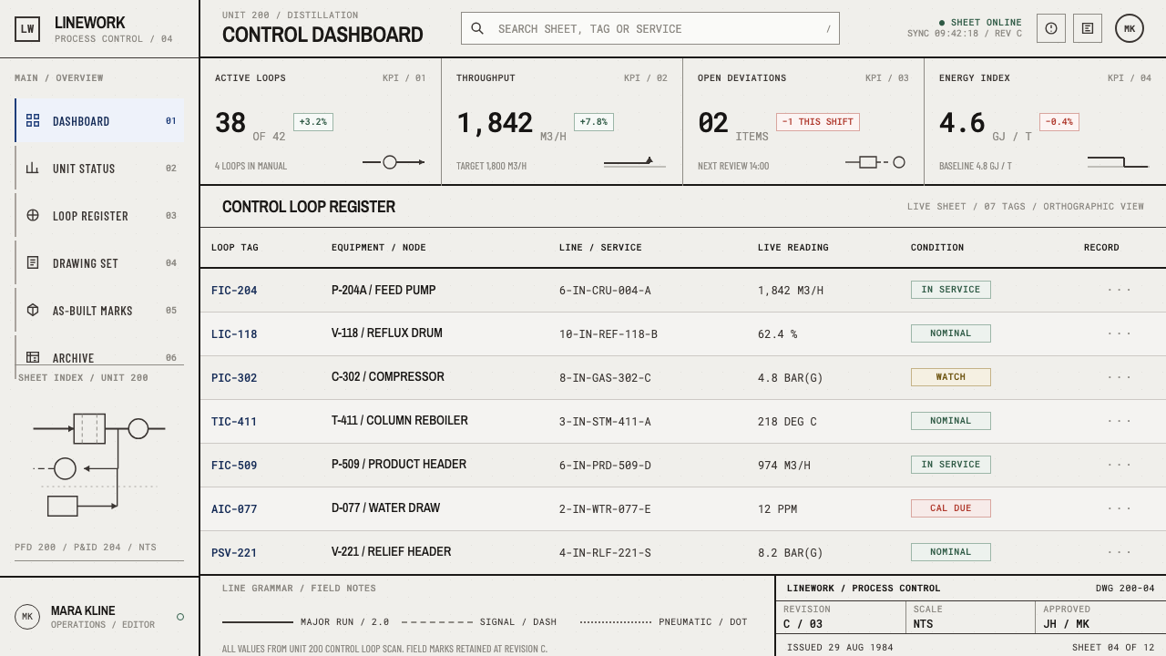
On the web it is a natural fit for dashboards, infrastructure and observability consoles, API and architecture documentation, and technical product pages. Status can be shown by symbol shape and line style, which also makes interfaces accessible without relying on colour. Pricing tables can be treated as a legend. Keep the background a flat, near-white neutral, set labels in uppercase single-stroke type, and anchor key metadata to a lower-right block.
In editorial and marketing work it supports whitepapers, engineering explainers, specification sheets, manuals and the identities of industrial and hardware brands. Diagrams should be drafted with real consistency: the same line weights, the same symbol sizes and one lettering style throughout. Treat the sheet as a document that a trained reader could actually follow, not as an aesthetic wrapper.
The common mistake is to add colour-coded meaning, such as red and green status lights, which breaks the principle that meaning lives in line and symbol. Others include rounded, friendly typefaces, centred layouts, heavy sepia ageing and mixed line weights without a hierarchy. A drawing in this style looks wrong when its lines are inconsistent, because the whole language depends on every weight meaning the same thing every time.
Refinery P&ID — FAQ
What is a P&ID?
A P&ID is a piping and instrumentation diagram, the engineering drawing that shows how a process plant, such as a refinery or petrochemical unit, is piped and controlled. It records major and secondary piping, instruments, control loops and the signals between them. As a design language it is valued for its discipline: every mark has a defined meaning, and decoration has no place in it.
Why does the style avoid colour?
Because the language works by differences in line weight, dash pattern and symbol shape, and colour would compete with them. A drawing that survives a black-and-white photocopy is also more robust and more accessible. For alerts and states, use weight, dash, symbol shape or a flag, and reserve red for the one purpose the tradition gives it, marking changes made after issue.
Do I have to use Leroy-style lettering?
You do not need the exact historical equipment, but you do need its logic: uppercase letters, a uniform stroke, no contrast between thick and thin, and an even rhythm. A monoline sans-serif set in capitals comes close. What matters is that the letters look drawn with the same pen as the lines, rather than set in a lively or decorative typeface.
Is the style only for engineering content?
It is strongest there, but the grammar transfers to anything that is a network of connected parts: software architecture, supply chains, data pipelines, organisational charts. The condition is that the content really does have connections to show. Applied to subjects with no such structure, it becomes a costume rather than a language.
Can I make a dark-mode version?
The system is built on a pale whiteprint ground, so a dark inversion changes its character. It would read more like a blueprint than a whiteprint, which is a different reproduction process with its own history. If dark mode is required, treat it as a separate derived variant, keep line weights and dash patterns exactly as they are, and avoid adding colour to compensate.
Related design styles
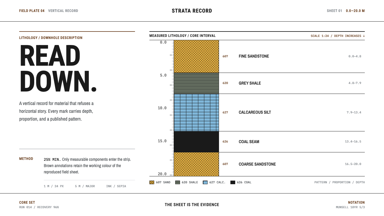 Core Sample LogRead the ground downward. Sepia rules and FGDC black patterns turn depth into…
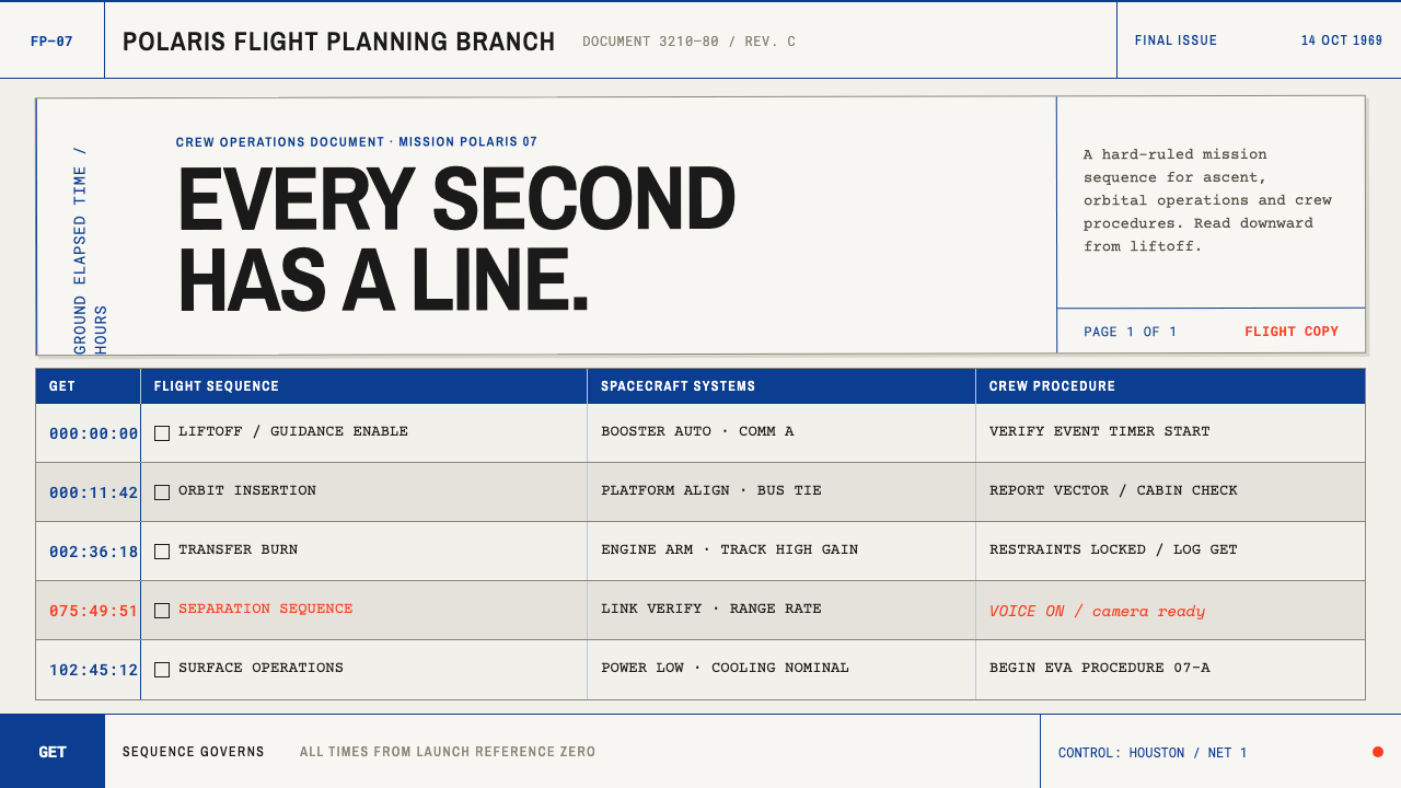 Apollo Flight PlanEvery second has a line. NASA blue rules and monospaced GET stamps discipline…
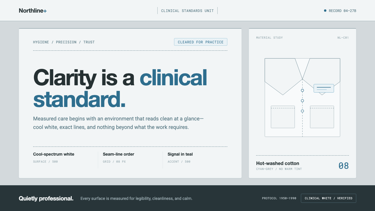 Doctor's Clinical Lab CoatSterile by design. Cool clinical white, teal signals, and seam-line grids enf…
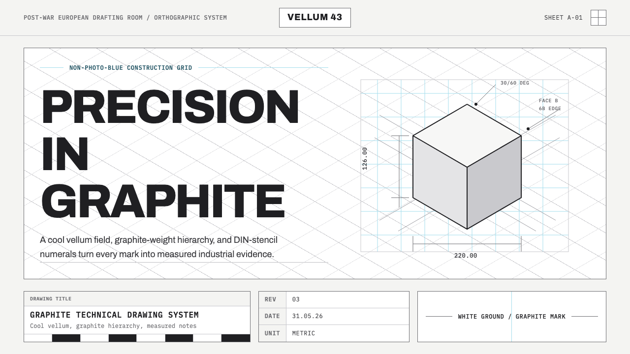 Graphite Technical DrawingDrafting-room precision. Non-photo-blue grid and graphite DIN lettering do th…
 Hilfiker Railway ClockEverything exact, one thing live. Black hands on cool enamel white — one red…
 IBM Punchcard 029 (1928)Constraint becomes authority. Manila stock, hairline grid, industrial blue.