About Refinery P&ID
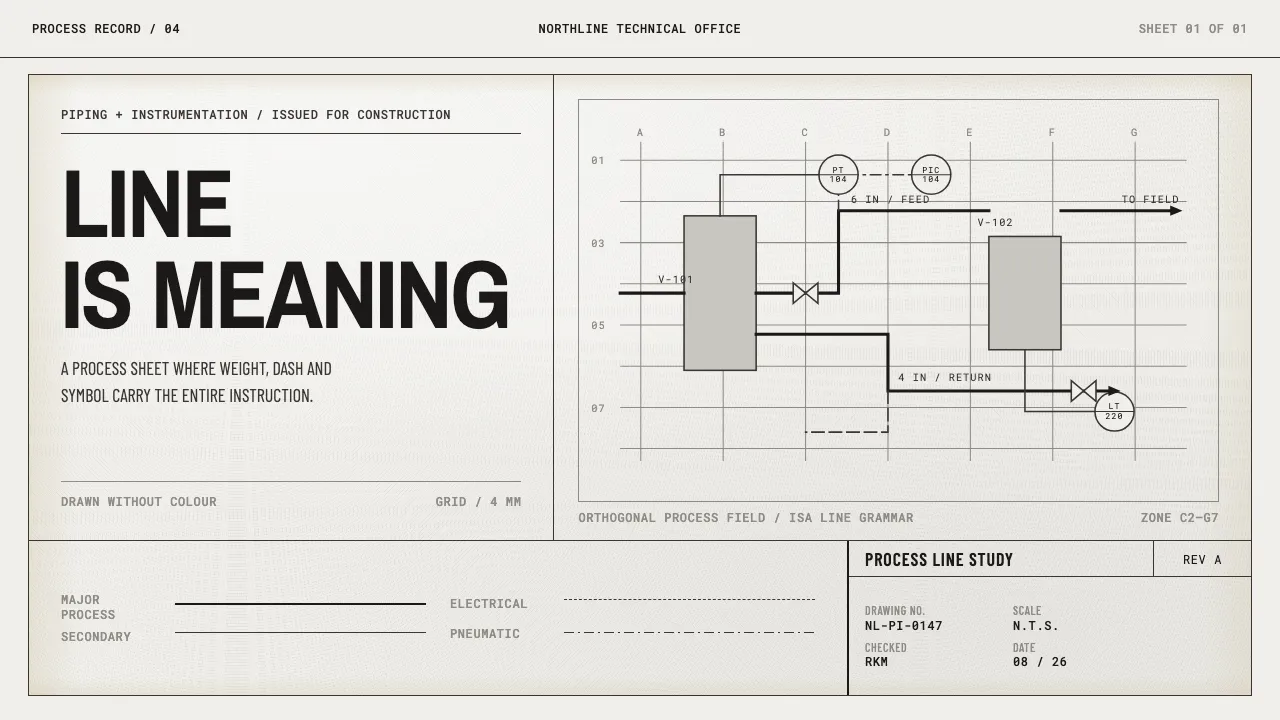
A P&ID is a drawing that refuses to describe anything with colour. A heavy continuous line is major process piping; a light one is secondary service; long-dash is an electrical signal and dot-dash is pneumatic. Meaning lives entirely in weight, dash pattern and symbol shape.
The sheet itself is an ammonia whiteprint: flat near-white stock that flecks under the light and yellows only where it was folded and trimmed. Lettering is Leroy single-stroke gothic — uppercase, uniform stroke, no contrast — and everything on the page is anchored to a title block in the lower right.
- Origin
- North America — US refinery, petrochemical and reactor engineering offices
- Era
- 1950–1990; ink and pencil on vellum then Mylar, reproduced by ammonia diazo
- Key figures
- Instrument Society of America (ISA5 standards committee) · ANSI Y14 engineering drawing committee · Keuffel & Esser
- Movements
- engineering-graphics standardisation · ISA 5.1 instrumentation symbology · whiteprint / diazo reprography
Refinery P&ID design spec
Colors
Typography
The other 11 sections — buttons, cards, spacing, motion, techniques and more — open once you unlock. Download the DESIGN.md or send it to your AI in one click. Unlock once, yours forever.
Sign up nowStyles similar to Refinery P&ID
Also inspired by science & nature, with a close feel.
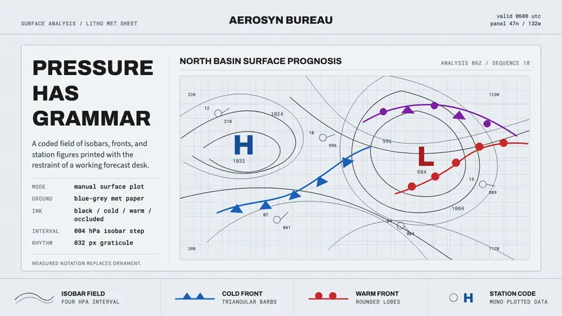 Synoptic Weather ChartPrecision reads as weather. Blue-grey graticule, thin isobars, front symbols.
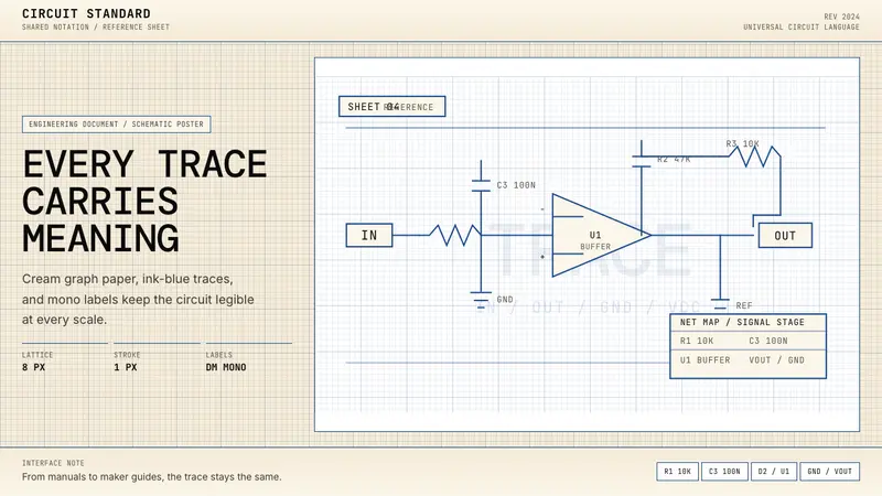 Electrical Schematic WiringAustere and exact. Cream graph paper, ink-blue traces, and mono labels make every label count.
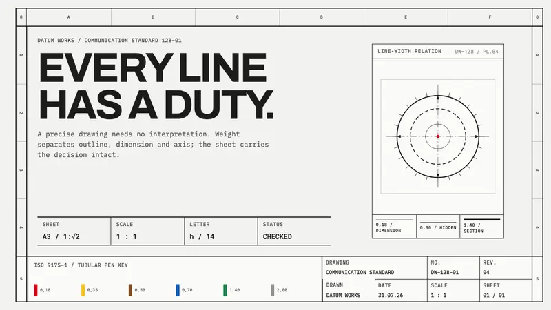 ISO Technical DrawingEvery line carries meaning. Near-black ruled geometry grades weight on cool tracing stock.
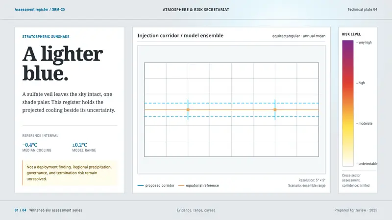 Stratospheric SunshadeUncertainty is the message. Pale sky stock, UN blue corridors, and an IPCC risk ramp hold the record.