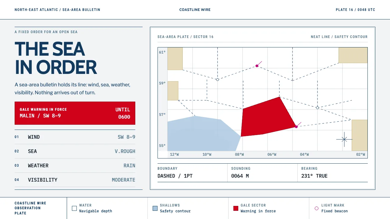
About Shipping Forecast
Thirty-one sea areas, read clockwise from Viking, each in four unvarying parts: wind, sea state, weather, visibility. The Shipping Forecast is a liturgy with a chart behind it — the Admiralty sheet where white is deep navigable water, buff is land, and light blue marks only the shallows inside the safety contour.
This system borrows that chart's discipline. Hairline dashed boundaries, area names set in caps, depth figures in mono, nothing rounded and nothing shadowed. Colour is an event: red fills an area while a gale warning is in force, and magenta belongs to lights and beacons. Everything else is ink on paper.
- Origin
- The British Isles and the North-East Atlantic
- Era
- 1900s–1950s (Met Office marine forecasting; the named-area bulletin and its clockwise order), still broadcast daily
- Key figures
- Robert FitzRoy · Met Office marine forecast desk · BBC Radio 4 continuity announcers
- Movements
- Admiralty hydrographic charting · British public-service broadcasting typography · maritime safety signalling
Shipping Forecast design spec
Colors
Typography
The other 11 sections — buttons, cards, spacing, motion, techniques and more — open once you unlock. Download the DESIGN.md or send it to your AI in one click. Unlock once, yours forever.
Sign up nowStyles similar to Shipping Forecast
Also inspired by science & nature, with a close feel.
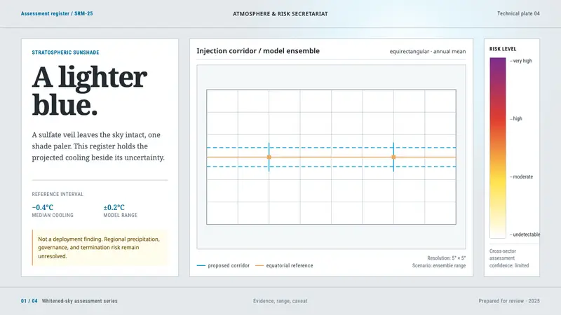 Stratospheric SunshadeUncertainty is the message. Pale sky stock, UN blue corridors, and an IPCC risk ramp hold the record.
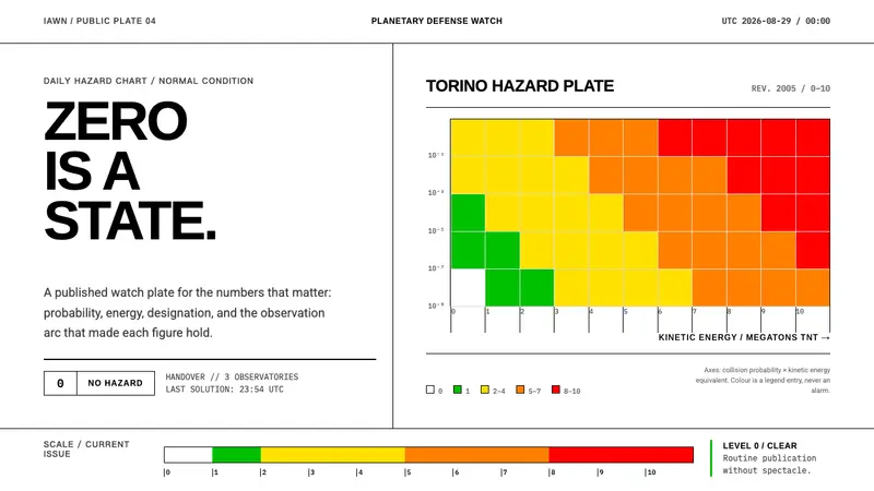 Planetary Defense WatchNothing to report is the point. Torino bands and monospace columns make risk legible.
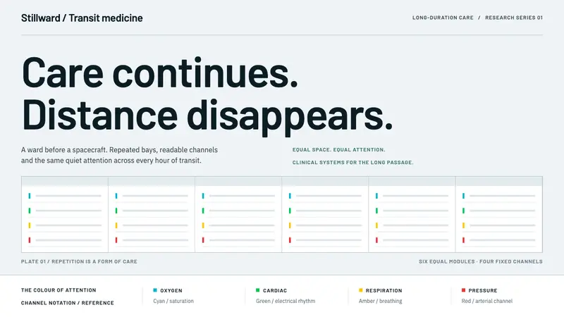 Cryosleep Transit WardCare without spectacle. Clinical white, equal bay grids and the fixed colours of patient monitors.
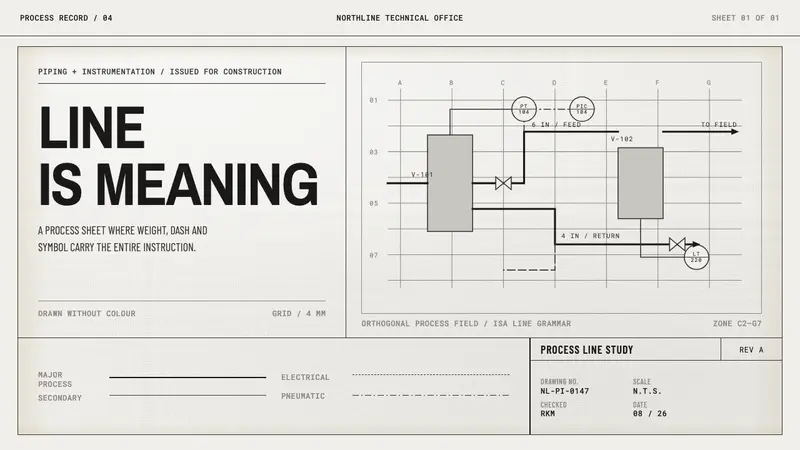 Refinery P&IDMeaning is drafted, not decorated. Monoline type and weighted process paths rule the whiteprint sheet.