What is Hilfiker Railway Clock?
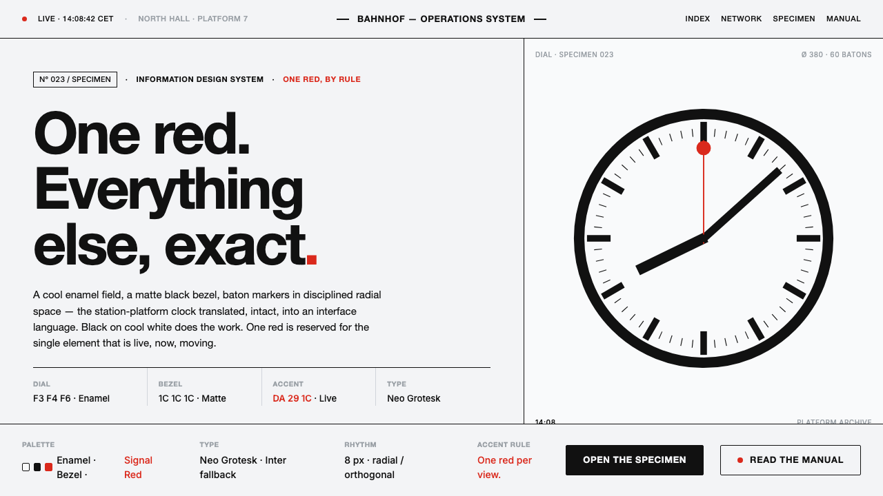
The Swiss Railway Clock turns punctuality into a visual ethic—cool enamel white, black geometry, and one red second hand allowed to move.
Hilfiker Railway Clock in brief
The Swiss Railway Clock is Hans Hilfiker’s 1944 station clock for the Swiss Federal Railways, or SBB. Its visual language is clinical and immediate: a cool enamel-white dial, a matte black bezel, black baton markers and hands, and a single red, disc-tipped second hand added in 1953. Every part is legible at a glance because every part has a job.
As a design system, it distills Swiss-modern information design into an interface grammar. Black carries structure and information; cool white gives that information room to breathe; uppercase Helvetica labels establish an orderly voice; red is reserved for the most important live accent. The system is quiet until something needs attention, then unmistakable.
The defining idea is controlled contrast. Static elements remain dependable and nearly silent, while the moving red accent gives time, status, or change a visible pulse. There is no ornamental layering, decorative texture, or atmospheric softness. The clock feels exact because its omissions are as deliberate as its marks.
Where does Hilfiker Railway Clock come from?
Hilfiker designed the clock for SBB in 1944, placing the needs of the railway station at the center of the object. A station clock must communicate quickly and consistently, so the design relies on a clean dial, strong black forms, and a visual hierarchy that does not depend on explanation. Its authority comes from immediate reading rather than display.
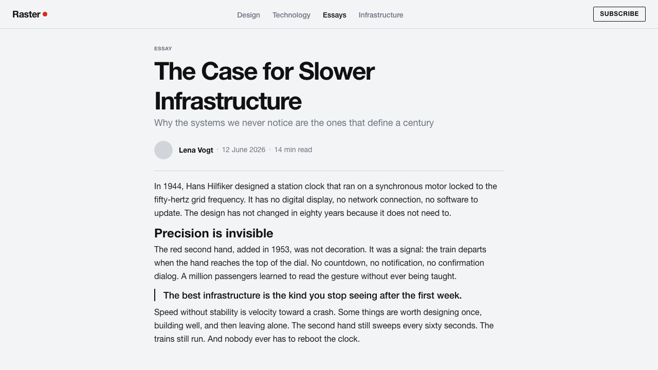
The red disc-tipped second hand was added in 1953. That addition established the system’s most memorable rule: the clock contains one visibly live element against a field of stable black and white. Red is not a general accent color. It is a signal of movement, the part of the clock that marks passage and change.
The reference era for this style runs from 1950 to 1990, within the Swiss-modern, International Typographic Style, and functional clock-design traditions. The object is narrower than a complete graphic movement, but it expresses the same commitment to clarity, restraint, and information arranged according to purpose.
The interface interpretation begins with this separation of roles. The dial becomes a cool white field, the bezel and hands become flat black structure, Helvetica labels become compact navigation and metadata, and the red second hand becomes a disciplined live indicator. The result is not a picture of a clock pasted onto software; it is a transfer of the clock’s logic into screens and communication.
What defines the Hilfiker Railway Clock look?
Cool Enamel Ground
The ground is cool, clinical, and nearly white, recalling enamel rather than paper or illuminated glass. It creates a stable field in which black marks remain crisp and red remains rare. The background should feel clean without becoming warm, textured, or atmospheric.
Matte Black Structure
Black defines the bezel, markers, hands, rules, and primary text. Its presence is flat and matte, never glossy or metallic. Black is not used to create drama; it is the dependable structural voice that makes every other signal easier to read.
Radial Space
The clock organizes attention around a center and a circular field. Space should radiate outward rather than accumulate as decorative padding. Markers, labels, and content blocks need room to remain distinct, so the composition feels measured, open, and ready for instant scanning.
Uppercase Helvetica
Uppercase Helvetica labels give the system its concise operational voice. Type should be clear, compact, and subordinate to information rather than expressive lettering. Contrast comes from scale, placement, and spacing, not from mixing ornamental typefaces.
One Red Signal
Red belongs to one decisive live accent: the second hand in the source object, or the most important moving state in an interface. It should never become a general brand color or a field of scattered highlights. Its power depends entirely on restraint.
Functional Hierarchy
Every mark should explain itself through purpose. Hands tell time, markers divide the dial, labels name information, and the red accent announces movement. If an element cannot clarify structure, orientation, or status, it does not belong in the system.
Flat Restraint
The visual language avoids simulated depth, soft atmosphere, and decorative effects. Flat black on cool white is enough to establish hierarchy. Depth, when needed, should come from placement and overlap, never from embellishment that competes with the information.
Who shaped Hilfiker Railway Clock?
Hans Hilfiker designed the Swiss Railway Clock for SBB in 1944. His contribution is the central act of reduction: a station clock becomes a disciplined arrangement of dial, bezel, markers, hands, and a readable live accent. The interface system inherits his insistence that clarity should be visible in the object itself, without explanatory decoration.
SBB is the institutional setting for the clock and the reason its visual discipline is inseparable from public information. The design is built for a railway environment in which consistency, speed, and immediate reading matter. SBB therefore represents the functional demand that gives the clock its authority.
Mondaine is named in the source material as a key figure in the Swiss Railway Clock story, alongside Hilfiker and SBB. Its place in the system reinforces that the clock is not merely a single object but a recognizable public design language—one whose cool field, black geometry, and singular red motion can be carried into contemporary interfaces.
How do you use Hilfiker Railway Clock today?
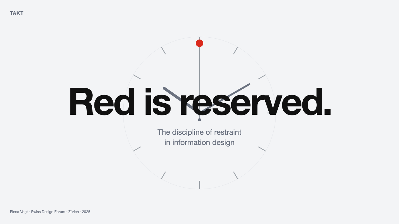
For presentation slides, use the clock logic as a complete narrative system. A cover can establish the field with a cool white ground, a strong black circular form, and a single red moving cue near the title or key message. Content slides should remain quieter: uppercase labels, compact black type, generous radial or circular spacing, and clear alignment. Data slides should let black carry the stable information while red identifies the current, changing, or most consequential reading.
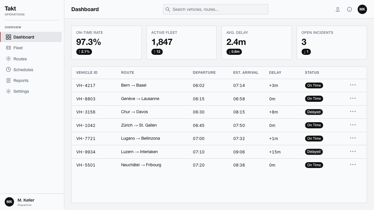
For web dashboards, the style is especially effective when the product must feel dependable and immediately scannable. Keep the main field cool and light, use matte black for navigation, labels, values, and structural divisions, and reserve red for live status or the one action that demands attention. Pricing pages can apply the same rule by keeping all tiers structurally equal and using red only for the currently emphasized choice, rather than decorating every button.
For editorial and marketing work, the system creates authority through calm repetition. Use a strong black headline, uppercase metadata, a broad field of white space, and one red marker to identify the key fact, offer, or change. Articles benefit from clear directional movement across the page, while campaigns can borrow the clock’s recognizability through circular compositions and flat, high-contrast forms without turning the page into a literal clock illustration.
For diagrams and status-heavy communication, separate what is stable from what is live. Black can describe the enduring framework, labels, and completed state; the single red accent can point to the current position, active phase, or urgent transition. This gives the viewer a visual answer before they read every word, which is the deepest functional lesson of the source object.
The common mistake is treating red as a palette color instead of a signal. When red appears in every link, card, badge, and decorative shape, it loses the exceptional status that makes the second hand powerful. Other failures include warming the white into a lifestyle cream, replacing flat black with glossy effects, or adding ornamental type. The system works when the discipline remains visible.
Hilfiker Railway Clock — FAQ
Is the Swiss Railway Clock the same as the International Typographic Style?
No. The clock is a focused functional object, while the International Typographic Style is a broader design tradition. They share a commitment to clarity, disciplined structure, and information arranged according to purpose. The clock compresses those values into a dial, a bezel, markers, hands, and one live red accent, making the principles unusually easy to carry into interface design.
Why is the red accent so restricted?
Its meaning comes from contrast and scarcity. The source clock uses black for stable structure and adds the red disc-tipped second hand as the visibly moving element. If red is spread across the whole interface, it stops distinguishing movement, urgency, or current status. The rule is therefore semantic, not merely decorative.
Can the system work with a dark background?
It can be adapted, but a light ground is closer to the source and better preserves its clinical clarity. A dark version should still keep the roles separate: black-like structural contrast, a limited light field for information, and one controlled red signal. If darkness becomes atmospheric or the red becomes widespread, the design loses the clock’s functional discipline.
Does every interface need a literal clock or circular dial?
No. The transferable part is the logic, not the illustration. Use cool white as a calm field, flat black as dependable structure, uppercase Helvetica labels for operational information, and a single red accent for what is live or most important. Circular composition can reinforce the reference, but it should never become a compulsory motif.
What is the main difference between this style and generic minimalist design?
Generic minimalism often removes elements until a page feels clean. The Swiss Railway Clock system removes elements according to a communication hierarchy. The black marks explain structure, the labels support orientation, the white field protects legibility, and red identifies movement. Its restraint is therefore operational: every absence helps the remaining signals perform their job.
Related design styles
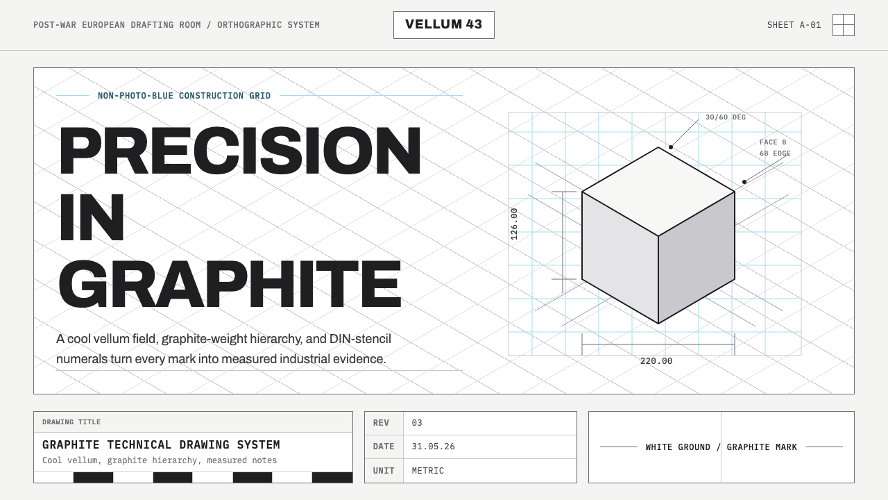 Graphite Technical DrawingDrafting-room precision. Non-photo-blue grid and graphite DIN lettering do th…
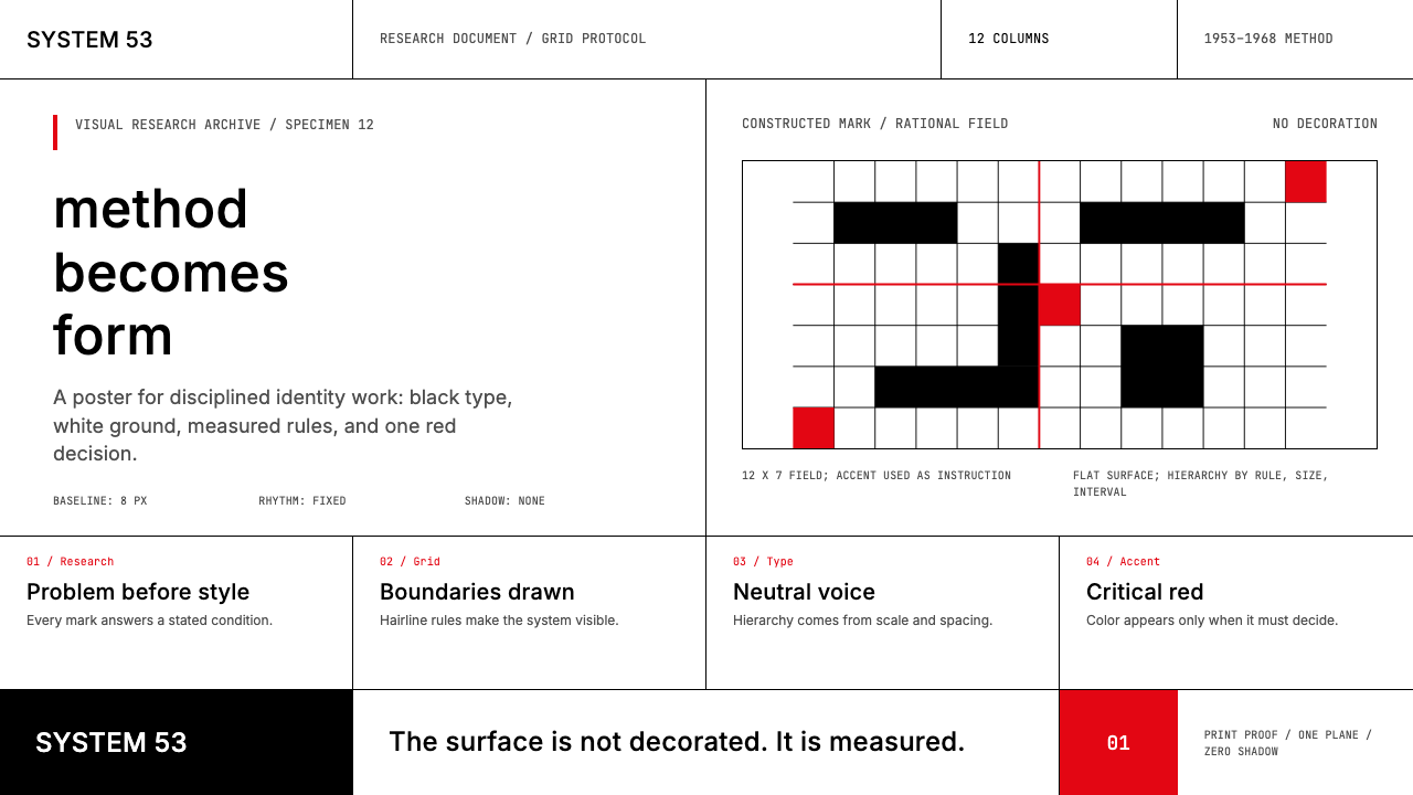 Ulm School (HfG Ulm)Clarity becomes discipline. Black-white grid, Inter grotesk, and one surgical…
 Frutiger CDG AirportLegibility at runway scale. Navy panels, white humanist sans, arrow-led grids.
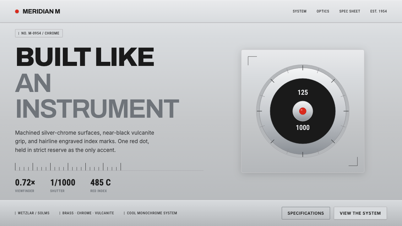 Leica M Silver ChromeBuilt like an instrument. Brushed silver-chrome on near-black vulcanite, one…
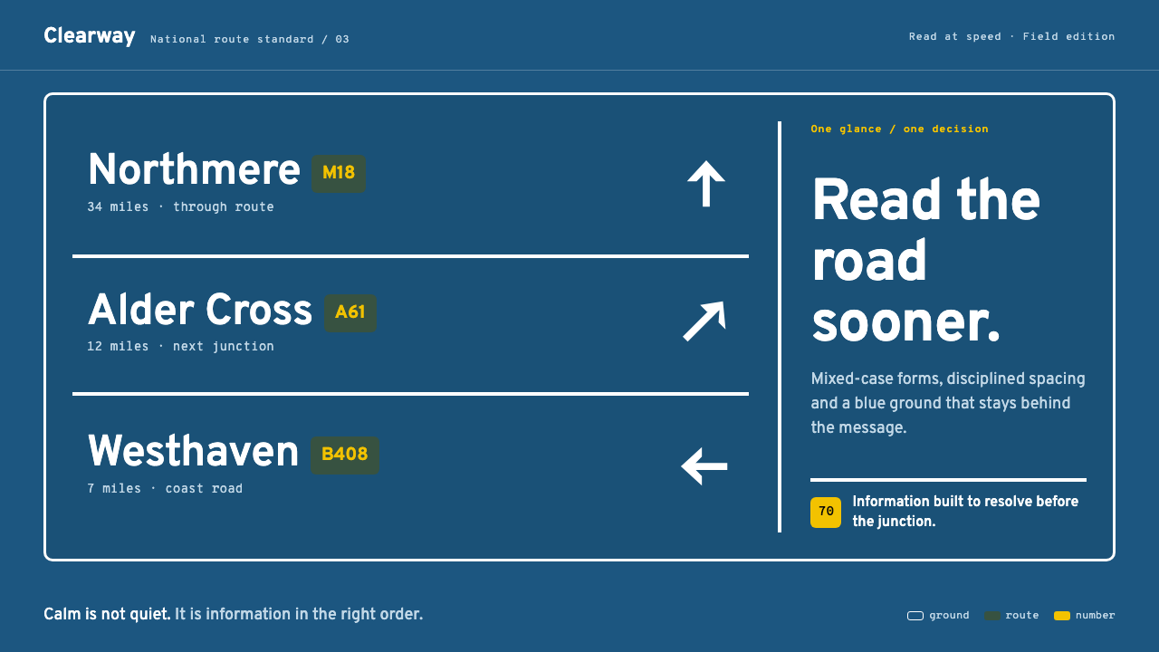 Transport UK Road SignsClarity at seventy. White mixed-case lettering advances across recessive moto…
 Dieter Rams / BraunQuiet by design. Warm gray, white panels, hairline grids, and one earned gree…