What is Leica M Silver Chrome?
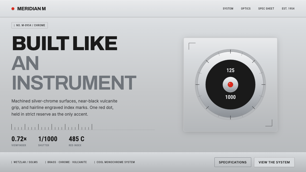
Leica M Silver Chrome makes precision visible: brushed metal, near-black vulcanite, engraved numerals, and one red dot held in reserve.
Leica M Silver Chrome in brief
Leica M Silver Chrome is an industrial design language derived from the silver-chrome Leica M rangefinder lineage associated with Germany and Western Europe from 1950 to 1990. Its central impression is not luxury, nostalgia, or ornament. It is instrumentality: a cool machined surface, a dark grip, and markings that appear to exist because a function requires them.
The visual system is built on material contrast. A brushed silver ground stands against near-black vulcanite, while engraved sans numerals and hairline index marks provide information without becoming decoration. The red dot is the only vivid accent, reserved so carefully that it reads as a signal rather than a brand flourish.
On screen, the style should feel assembled, calibrated, and exact. Surfaces are quiet, edges are deliberate, typography behaves like an instrument panel, and every visible mark suggests measurement or operation. The result is restrained but not anonymous: its identity comes from the tension between cool metal and black grip, with red appearing only where attention must land.
Where does Leica M Silver Chrome come from?
The lineage belongs to the Leica M rangefinder tradition identified in the source material with the period from 1950 to 1990, including the launch of the Leica M3 in 1954. Its regional character is German and Western European, with Wetzlar and Solms named as the locations most closely associated with the system. These places matter less as scenic references than as markers of a manufacturing culture built around precision, continuity, and controlled workmanship.
The physical register is unusually direct. The top plate is cut from solid brass and chrome-plated to a cool silver sheen. The body is wrapped in black vulcanite, and the controls are marked with exacting engraved sans numerals. Nothing imitates warmth or natural texture. The design presents machined metal as machined metal and grip material as grip material, allowing construction to become the primary visual language.
Three forces organize the style's historical identity: German precision engineering, functional industrial design, and rangefinder photography. Together they produce a vocabulary of surfaces, lines, numbers, and restrained signals. The system does not ask the object to look expressive before it looks usable. Expression emerges from the discipline of making every part legible, durable in appearance, and proportionate to its task.
Ernst Leitz GmbH, Oskar Barnack, and the M-system design team are named as the key figures and institution behind this lineage. Their combined presence gives the style both an originating identity and a collective one. The silver-chrome M is therefore best understood not as a decorative period costume, but as the visible outcome of a design culture in which engineering decisions, material choices, and information marks are allowed to speak for themselves.
What defines the Leica M Silver Chrome look?
Material Contrast
The defining contrast is cool brushed silver against near-black vulcanite. Silver should feel machined, directional, and faintly reflective, while black should feel dense, tactile, and protective. The relationship is more important than either surface alone. Avoid warm metallic effects or bright white fields; the visual temperature stays cool and controlled.
Restricted Accent
Red is not a general palette color. It is a precise signal, used for the single red dot or for an equivalent moment that needs immediate recognition. Large red fields weaken the concept by turning the accent into atmosphere. The strongest application lets silver and black carry the composition while red marks one decisive point.
Engraved Typography
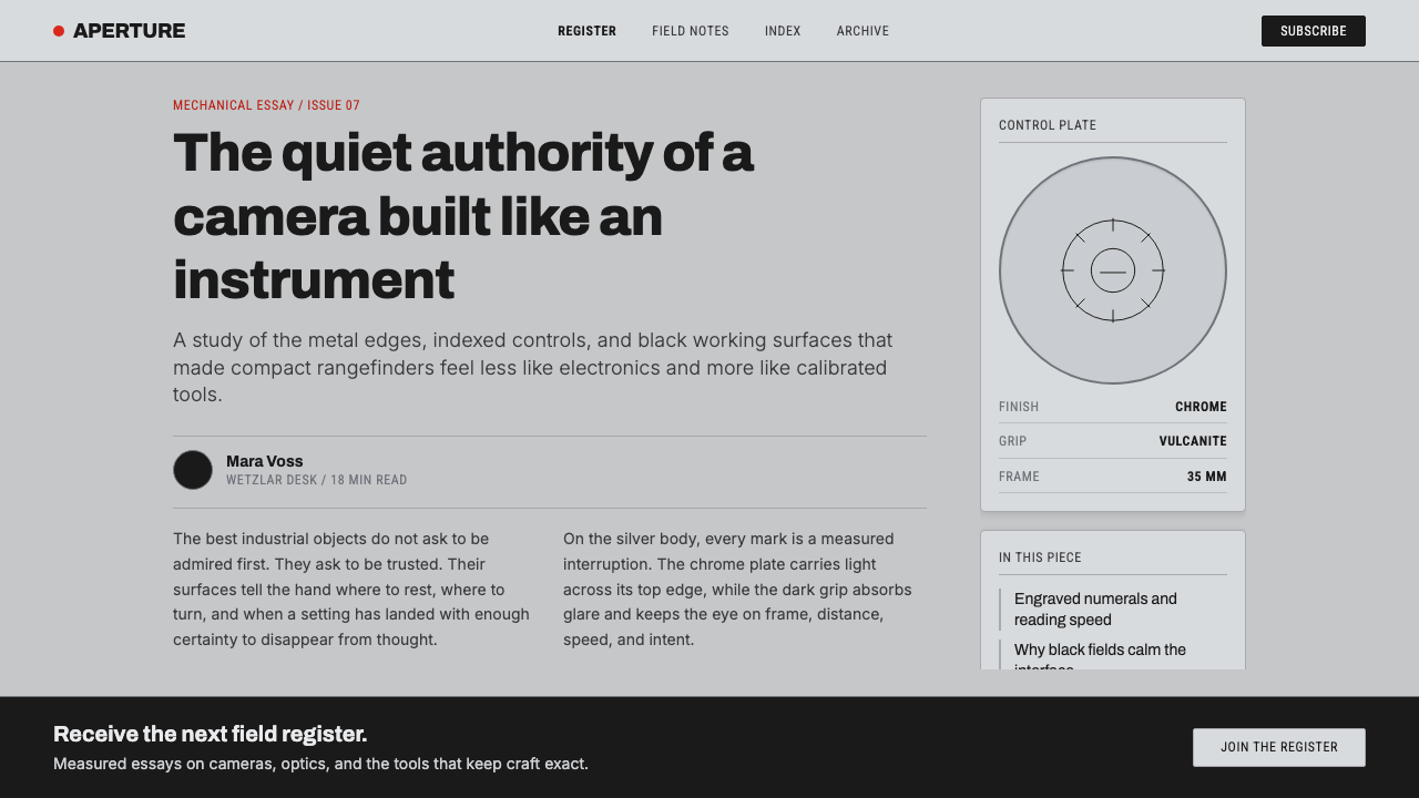
Typography should resemble engraved instrument markings: sans-serif, exact, compact, and free of expressive flourish. Numerals are especially important because they turn text into evidence of calibration. Headlines can be assertive, but they should remain mechanical rather than theatrical. Letterforms need clean spacing and a disciplined relationship to nearby lines and controls.
Hairline Indexing
Thin rules, ticks, and alignment marks provide the system's smallest scale of organization. They should feel incised rather than drawn for decoration. Index lines can separate information, indicate progression, or establish a reading axis. Their restraint is essential: when every surface is ruled, the marks stop functioning as instruments and become pattern.
Controlled Depth
Depth comes from material difference, edge definition, and small shifts between surfaces, not from soft atmospheric effects. Brushed metal may catch light quietly; black grip areas may recede; engraved marks may appear slightly incised. The page should feel constructed in layers, but never glossy, inflated, or artificially illuminated.
Instrumental Hierarchy
Hierarchy is established through contrast, placement, and the difference between primary readouts and secondary markings. The main title behaves like a model designation or control label; supporting copy behaves like a specification. Spacious fields around the information are functional clearance, giving each element the authority of a separate instrument face.
Who shaped Leica M Silver Chrome?
Ernst Leitz GmbH provides the institutional identity behind the Leica M lineage in the approved source material. In the design language, that identity is expressed through continuity and exactness rather than a decorative emblem system. The company name belongs with the broader idea of a manufactured instrument: a product whose authority comes from controlled construction, recognizable materials, and markings that serve a purpose.
Oskar Barnack is named as a key figure within the Leica M origin story provided for this style. His presence anchors the system in the tradition of rangefinder photography and in the idea that a camera can be understood as a carefully resolved tool. The visual consequence is a preference for clarity, compact information, and surfaces that reveal disciplined making.
The M-system design team represents the collective authorship of the silver-chrome lineage. Its significance is visible in the coherence between top plate, grip, engravings, index marks, and accent. No isolated gesture defines the system. Instead, many small decisions agree with one another until the object feels calibrated as a whole.
How do you use Leica M Silver Chrome today?
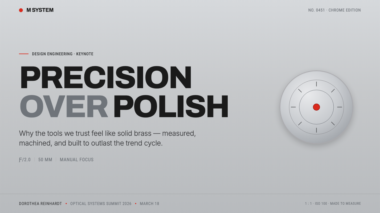
For presentation covers, let the composition behave like a camera body or instrument face: a broad brushed-silver field, a near-black structural block, a compact title, and one red point that establishes the visual focus. The cover should feel quiet before it feels dramatic. On content slides, treat headings as engraved labels and use hairline rules to organize sections. Data slides should resemble readouts, with restrained numerals, clear alignment, and red reserved for the one value or action that deserves immediate attention.
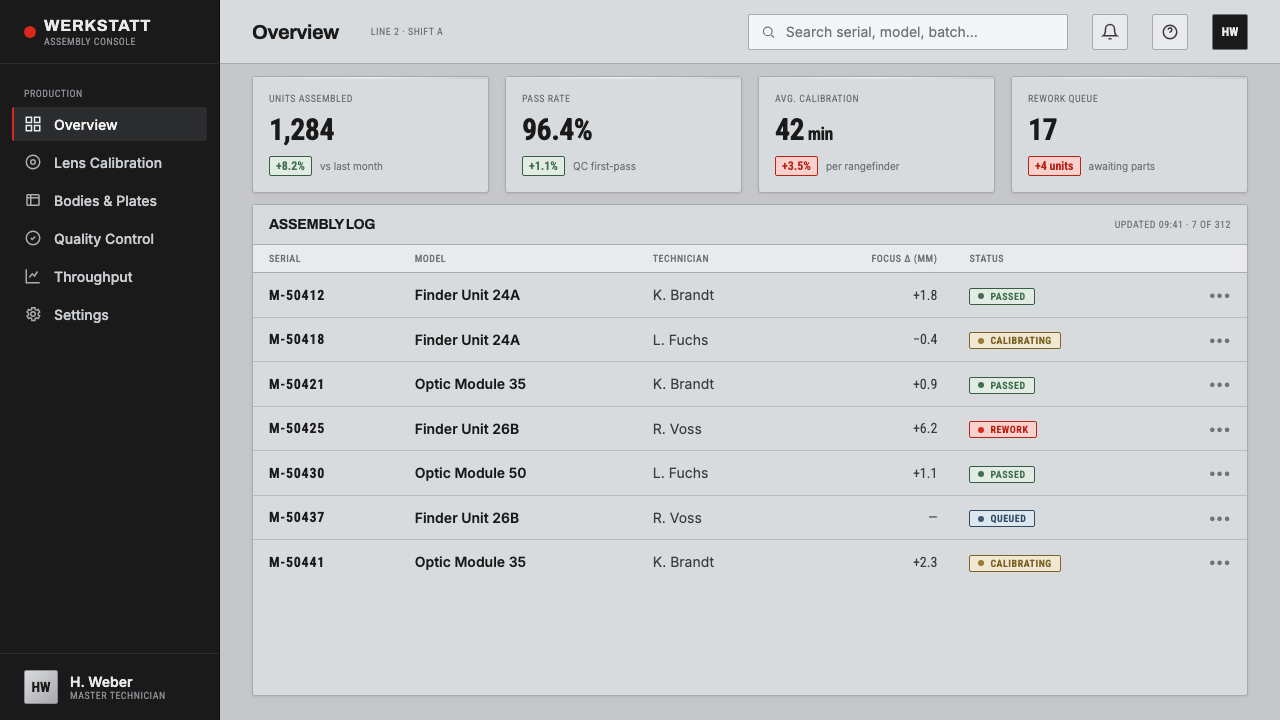
For web dashboards and pricing pages, Leica M Silver Chrome supports a high-trust, technical atmosphere. Use cool silver or pale metallic grounds for primary surfaces, near-black for navigation and dense control areas, and dark text that remains crisp against the field. Cards should feel like panels rather than floating cushions. Pricing tiers can be differentiated through labels, linework, and material contrast; the red accent should identify the recommended action or the most consequential state, not decorate every button.
For editorial and marketing work, the style is strongest when the page feels like a specification sheet with room to breathe. Product stories can pair a large, quiet image or material field with compact captions, engraved-looking numerals, and a narrow column of supporting detail. Marketing language should be direct and assured rather than emotional. Alternating silver and near-black sections can create rhythm, while the red dot becomes a recurring editorial signature that remains meaningful because it is never overused.
For product documentation, settings screens, and technical explainers, the instrument register is especially natural. Use clear labels, stable alignment, thin index marks, and a strong distinction between primary readouts and secondary notes. The system can make complex information feel trustworthy because it turns organization into a visible material quality. Every rule, numeral, and control should appear to have a job, even when the page is primarily digital.
The common mistake is treating the style as a generic luxury look: adding warm champagne metal, glossy black surfaces, multiple red accents, or ornamental type. That shifts the language from precision instrument to premium decoration. Another mistake is making every line equally visible. Authentic restraint depends on hierarchy: silver and black establish the body, typography carries information, hairlines guide reading, and red marks only the decisive point.
Leica M Silver Chrome — FAQ
Is Leica M Silver Chrome simply a monochrome style?
No. Its foundation is restrained, but the system is not colorless. Silver and near-black establish the material contrast, while the single red dot provides a precise visual signal. The important rule is not the absence of color but the restriction of color to meaningful use. If red becomes a broad decorative field, the style loses its instrument-like discipline.
Why does the style avoid warm metal and pure white?
Because the approved visual register depends on cool machined metal against near-black grip. Warm metallic tones introduce a jewelry-like or nostalgic quality, while pure white can make the system feel softer and more neutral than intended. A cool silver ground keeps attention on construction, contrast, and exact marking rather than on decorative richness.
What makes the red dot effective?
Its effectiveness comes from scarcity and precision. Silver, black, and dark text do most of the visual work, so the red dot becomes an immediate point of recognition. It should identify a decisive action, state, or signature detail. Repeating it across every control turns a signal into a pattern and removes the very authority that makes it noticeable.
Can this style use photography or imagery?
Yes, provided imagery behaves as part of the instrument system rather than as decoration. Images should support the cool material register, clear cropping, and strong information hierarchy. A photograph can sit beside engraved-looking captions or within a quiet silver and black frame. Avoid imagery that introduces unnecessary warmth, gloss, or visual noise unrelated to the product's structure.
Where does Leica M Silver Chrome work best?
It works best where precision, authority, and controlled craft are part of the intended experience: dashboards, pricing systems, technical documentation, product pages, and editorial work centered on instruments or materials. It is less suitable when the primary goal is softness, playfulness, or abundant sensory warmth. The style asks the product to earn attention through clarity and construction.
Related design styles
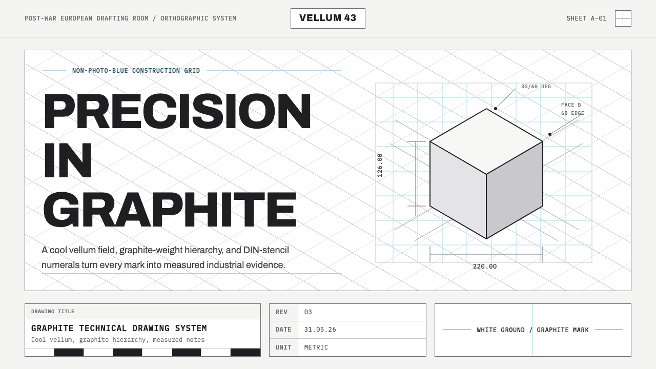 Graphite Technical DrawingDrafting-room precision. Non-photo-blue grid and graphite DIN lettering do th…
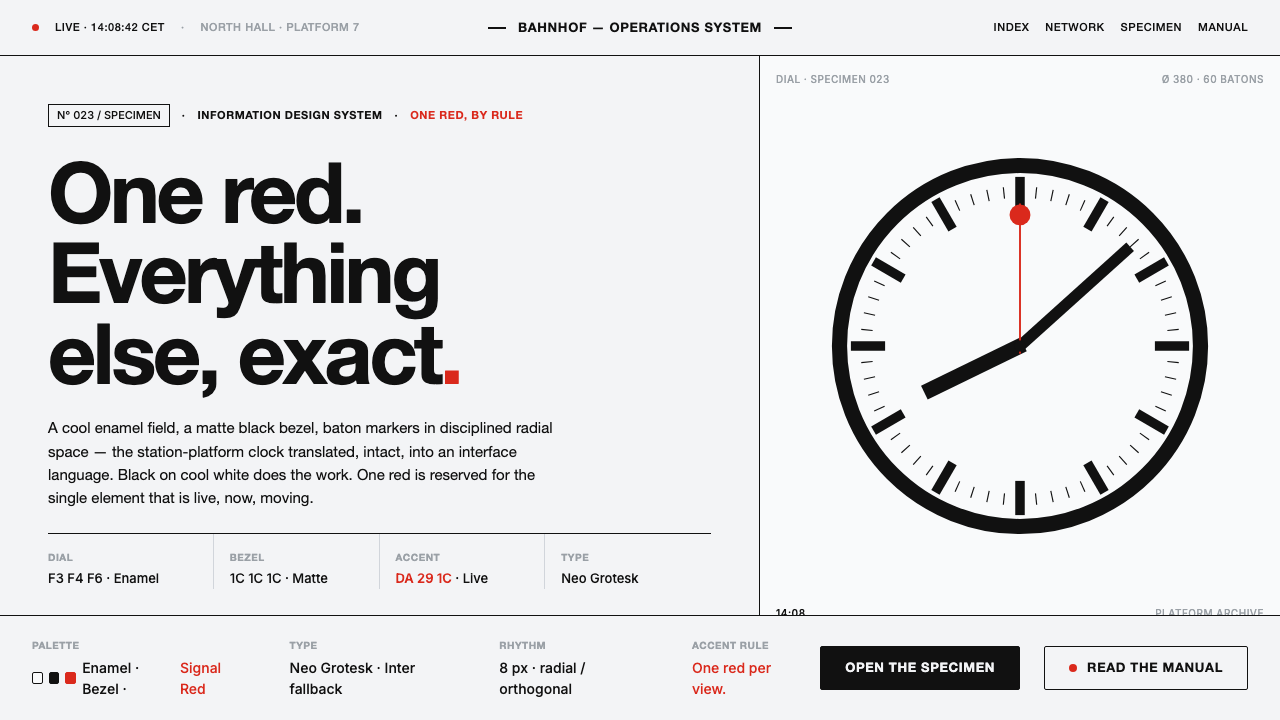 Hilfiker Railway ClockEverything exact, one thing live. Black hands on cool enamel white — one red…
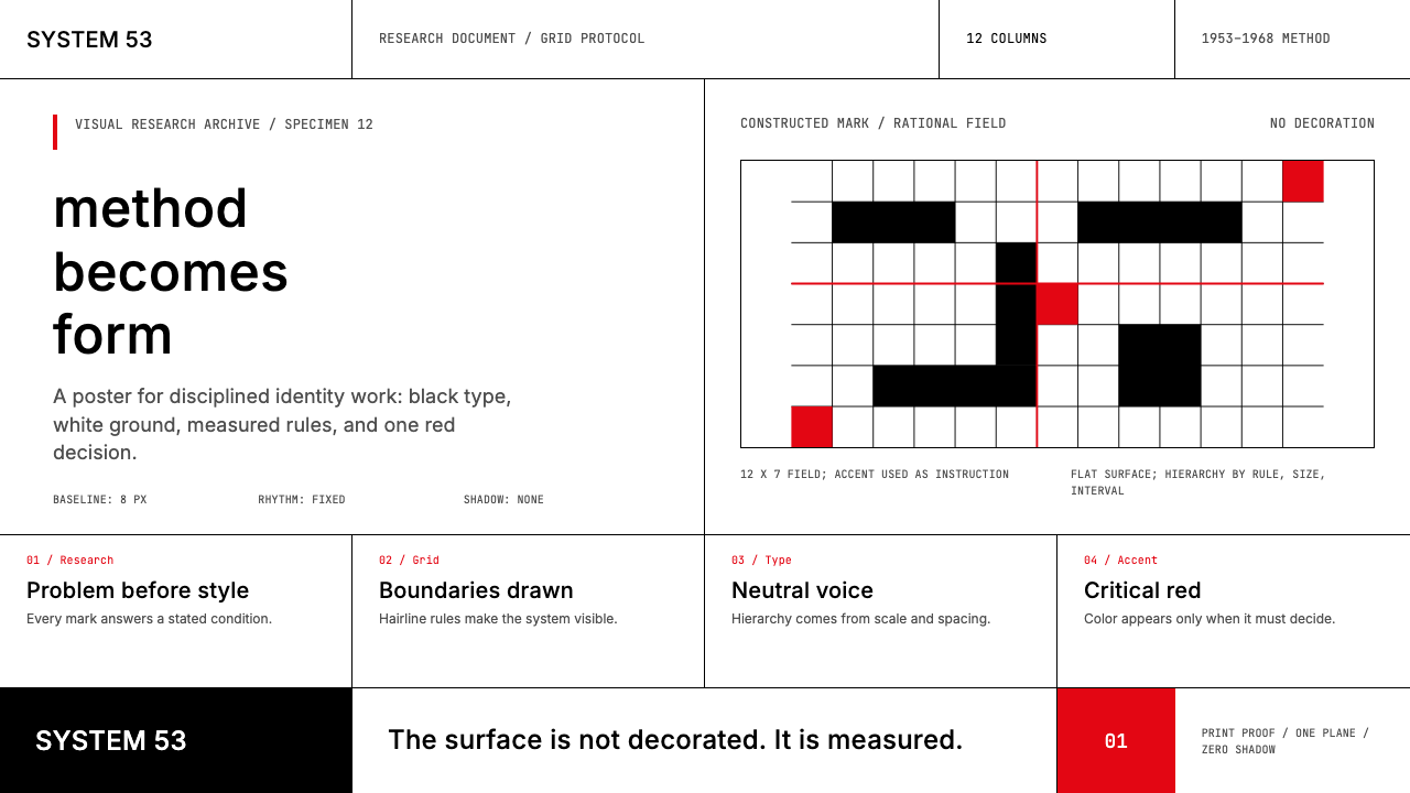 Ulm School (HfG Ulm)Clarity becomes discipline. Black-white grid, Inter grotesk, and one surgical…
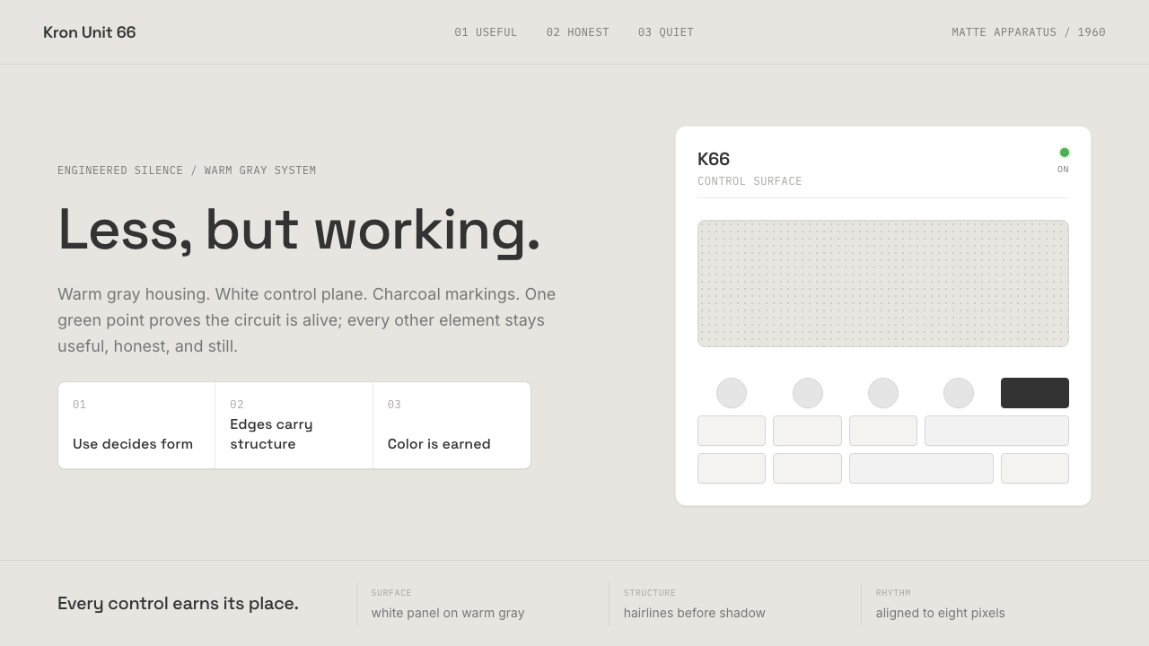 Dieter Rams / BraunQuiet by design. Warm gray, white panels, hairline grids, and one earned gree…
 Frutiger CDG AirportLegibility at runway scale. Navy panels, white humanist sans, arrow-led grids.
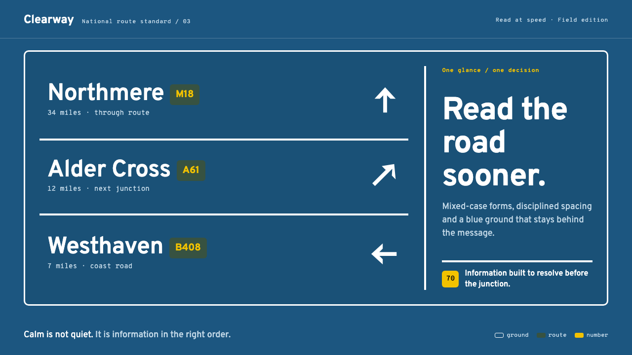 Transport UK Road SignsClarity at seventy. White mixed-case lettering advances across recessive moto…