What is Transport UK Road Signs?
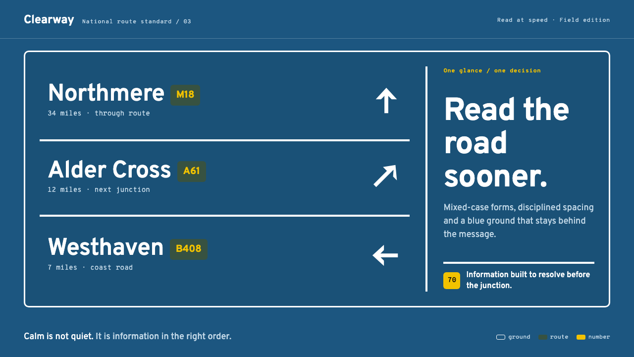
Transport turns road signage into an act of controlled attention: white mixed-case lettering moves forward from a recessive motorway-blue field, carrying meaning at speed.
Transport UK Road Signs in brief
Transport is the lettering and information system of the British road network: a design language rather than a decorative style. Designed by Jock Kinneir and Margaret Calvert between 1957 and 1963, then deployed across the United Kingdom from 1965, it begins with a practical condition that many visual systems avoid: the reader is moving quickly. Road signs cannot ask for contemplation. They must be read once, understood immediately, and left behind.
Its central visual relationship is exceptionally disciplined. White mixed-case place names and directions advance against a deliberately recessive Middle Blue enamel ground. Fine white keylines establish the sign’s boundary; arrows establish movement; route-number patches separate one category of information from another. The background does not compete with the message. It recedes so that lettering, direction, and hierarchy can do their work without theatrical emphasis.
This restraint gives the system its character. Transport does not use visual excitement as a substitute for clarity. Its forms are calm, functional, and load-bearing: each decision helps a driver identify what matters, distinguish it from adjacent information, and continue moving. The result is modernist information design at its most composed, where apparent simplicity is the visible outcome of rigorous prioritization.
Where does Transport UK Road Signs come from?
Transport emerged in the United Kingdom during a period of British modernist information design and post-Worboys signage reform. Its design period, from 1957 to 1963, placed the work before its nationwide deployment from 1965. That sequence matters because the system was not conceived as an isolated typeface specimen or a graphic identity for a single institution. It was built for a national road network, where recurring decisions about names, routes, direction, boundaries, and emphasis needed to remain legible as a unified public language.
Jock Kinneir and Margaret Calvert built the system around a direct question: what can a driver read at seventy miles an hour? The question is both functional and aesthetic. It establishes speed, distance, limited attention, and the physical act of driving as the conditions of the design. A sign must not merely contain correct information; it must arrange that information so the driver can grasp it while motion, traffic, and the road itself compete for attention.
The answer was not an expressive visual signature but a hierarchy of dependable cues. White mixed-case lettering was placed on a subdued blue ground. Keylines made the sign into a clear field. Directional arrows gave information a trajectory rather than leaving it as a list. Route-number patches created categorical distinction. Each component was assigned a role, allowing the sign to read as an ordered instruction rather than a collage of words and symbols.
From 1965 onward, the system became part of the visual experience of travelling through the United Kingdom. Its nationwide use reinforced the value of consistency: drivers encounter the same basic relationship between lettering, ground, border, direction, and route information again and again. This repetition is not monotony. It is the basis of trust. The system’s modernism lies in making public information feel stable, restrained, and immediately usable.
What defines the Transport UK Road Signs look?
Recessive Blue Ground
The motorway-blue field is deliberately recessive. It holds the sign together without demanding the first glance, allowing white lettering and navigational cues to advance. This is not color used for atmosphere or brand drama; it is color used to manage visual depth. The ground creates calm, gives the sign a coherent field, and preserves attention for the information that changes a driver’s next decision.
Mixed-Case Lettering
White mixed-case names are the system’s most visible voice. Their task is not to decorate the blue field but to project place and direction with composure. Mixed case gives names a differentiated silhouette, helping them read as words rather than as undivided blocks. Against the dark ground, the lettering carries the greatest contrast and therefore the greatest responsibility.
Keylines and Boundaries
Crisp white keylines define the sign as a contained information field. They do not behave like ornamental frames; they establish where the message begins and where it ends. This boundary is especially important in a roadside context, where a sign must separate itself from sky, road, vehicles, structures, and adjacent signage without adding visual noise. The line is quiet, but it is structurally essential.
Directional Logic
Arrows are not secondary pictograms added after the words; they are directional patches within the information structure. They make movement visible. A driver does not simply need to know a destination name but needs to understand its relationship to a route and a turn. The arrow turns static text into an instruction, allowing the composition to express progression, divergence, and onward travel without rhetorical language.
Route-Number Patches
Route-number patches provide categorical separation within an otherwise restrained field. They prevent route information from dissolving into place names and directional text, giving it a distinct visual container. Their value is not decorative contrast for its own sake. They create a reliable change in reading mode: the driver can recognize that this piece of information belongs to the route system and should be processed differently from a destination.
Calm Functional Hierarchy
The style’s defining mood is calm, but calmness here is active rather than passive. The system suppresses unnecessary visual competition so that hierarchy can remain legible under pressure. White type advances, blue recedes, borders contain, arrows direct, and patches classify. Nothing is sentimental, ornamental, or incidental. The visual economy makes every component feel load-bearing because every component has a communicative job.
Who shaped Transport UK Road Signs?
Jock Kinneir is one of the two named designers of Transport. His role in the source material is inseparable from the system’s governing problem: making road information readable at speed. The design is therefore best understood not as a display style but as a public-information framework, in which lettering, ground color, keylines, arrows, and route patches work together to guide a moving reader.
Margaret Calvert is the second named designer of Transport. Together with Kinneir, she contributed to a system whose authority comes from coordination rather than visual excess. The white mixed-case lettering, recessive blue field, clear border, directional arrow, and route-number patch are not isolated motifs. They are a linked vocabulary designed to make an urgent public task appear calm and manageable.
Post-Worboys signage reform is the named reform context associated with Transport in the source material. It matters because it frames the system as infrastructure rather than styling. The reform context directs attention to repeatability, public legibility, and network-wide consistency: qualities that explain why the aesthetic relies on stable relationships between information types instead of expressive variation from sign to sign.
How do you use Transport UK Road Signs today?
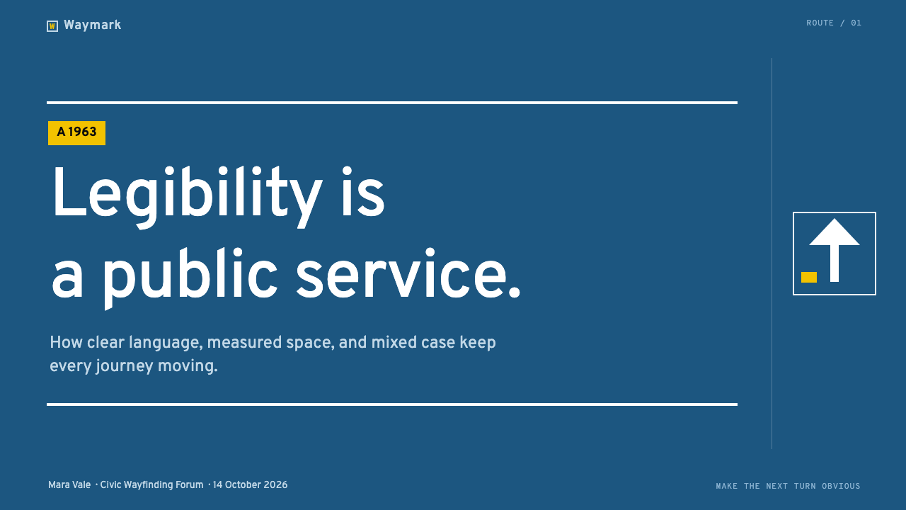
For presentation covers, use Transport as a model for a single decisive message rather than as roadside pastiche. Let a dark, recessive field hold the composition while a short mixed-case title takes the visual foreground in white. Add a fine enclosing line only when it clarifies the page as a sign-like information field. A directional cue can establish momentum, but it should point to the subject or sequence of the presentation, not become a decorative arrow scattered around the page.
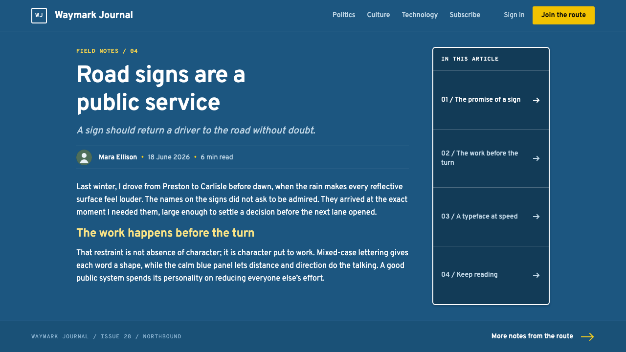
For content slides, treat hierarchy as navigation. Establish a prominent heading, then arrange supporting statements as destinations within a clear reading path. Use dark blue as the quiet structural ground and reserve white for the content that must be read first. Fine dividers can separate groups, while compact category patches can identify sections, workstreams, or agenda states. The system works best when each slide answers a single question and lets the audience move through it without searching.
For data slides, borrow the system’s distinction between a destination name and a route number. Major findings should read as the destination: direct, high-contrast, and visually primary. Supporting categories can behave like route patches, creating discrete labels that help the audience sort data without confusing labels for the data itself. Arrows are useful when they express a genuine direction, dependency, or change; avoid using them as generic symbols of progress when the data does not establish a path.
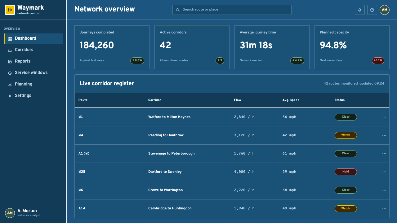
For web interfaces, Transport is particularly useful for dashboards, operational tools, navigation-heavy services, and pricing pages where users need to scan categories quickly. Build the interface around a calm dark ground, clear white text, contained panels, and unmistakable direction between states. Use colored patches only to distinguish functional categories such as routes, plans, statuses, or pathways. The visual system should make an interface feel like a reliable map: information is grouped, boundaries are visible, and the next action is evident without visual persuasion.
For editorial and marketing work, use the style when the message benefits from authority, movement, and public clarity. A campaign page can frame a proposition as a destination, with sections functioning as successive signs along a route. The common mistake is treating Transport as merely blue backgrounds plus arrows. That reduces a coherent information system to surface styling. Do not overload a page with directional symbols, boxed labels, or competing white text. The effect depends on restraint: the background must recede, hierarchy must be explicit, and every sign-like element must carry actual informational weight.
Transport UK Road Signs — FAQ
Is Transport simply a typeface for making road-sign-themed graphics?
No. The source material describes Transport as the lettering and information system of the British road network. Its visual identity depends on the relationship between mixed-case white lettering, a recessive blue ground, keylines, arrows, and route-number patches. Using the lettering alone may suggest the source, but it does not reproduce the system’s central achievement: making several kinds of information readable together at speed.
Why is the blue background described as recessive?
Because the ground is designed to support rather than dominate the message. On the motorway-blue enamel field, white lettering comes forward as the primary reading event. The blue creates a stable visual environment, but the place name, direction, and route information receive the strongest attention. Recessiveness is therefore a hierarchy decision, not a claim that the background is unimportant.
Why does mixed-case lettering matter in this system?
Mixed-case lettering helps names read as differentiated word shapes rather than as uniform blocks. In a system built around the problem of reading while moving, that differentiation supports immediate recognition. It also establishes a composed visual voice: the lettering appears direct and public-facing without turning the sign into a typographic performance.
Can this aesthetic work outside transportation?
Yes, when the product or message needs fast scanning, visible hierarchy, and clear movement between decisions. Dashboards, operational interfaces, navigation systems, structured presentations, and direct public-information campaigns can benefit from its logic. It is less suitable when the intended experience depends on decorative richness, intimacy, or ambiguity, because Transport’s strength is its refusal to make clarity compete with atmosphere.
What is the most common mistake in a Transport-inspired design?
The most common mistake is copying visible motifs without preserving their function. A dark blue field, white text, arrows, and outlined boxes can quickly become cluttered if they do not classify, direct, contain, or prioritize real information. A convincing Transport-inspired composition is not one with the most sign-like features. It is one in which every feature makes the next act of reading easier.
Related design styles
 Frutiger CDG AirportLegibility at runway scale. Navy panels, white humanist sans, arrow-led grids.
 Doctor's Clinical Lab CoatSterile by design. Cool clinical white, teal signals, and seam-line grids enf…
 Graphite Technical DrawingDrafting-room precision. Non-photo-blue grid and graphite DIN lettering do th…
 Swiss Railway ClockEverything exact, one thing live. Black hands on cool enamel white — one red…
 Ulm School (HfG Ulm)Clarity becomes discipline. Black-white grid, Inter grotesk, and one surgical…
 Architect CyanotypePrecision in negative. Prussian blue ground, paper-white grid, mono dimension…