What is Microfiche Archive?
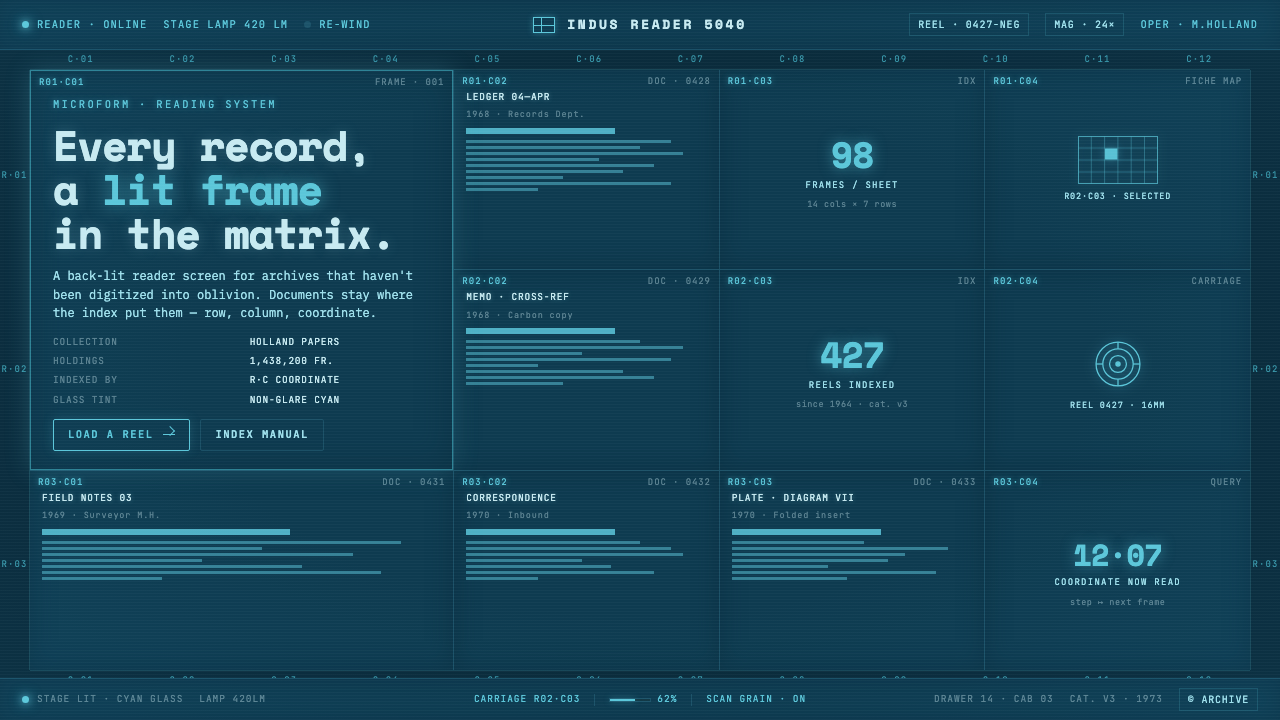
Microfiche Archive turns the record room into a luminous machine surface — every document a cool-lit frame, every frame a coordinate in a patient blue matrix.
Microfiche Archive in brief
Microfiche Archive is a dark archival interface style modeled on the illuminated screen of a fiche reader in a dim records room. Its central image is not the paper document itself, but the moment when a negative document frame is magnified and lit from behind: bright information appears against a deep cyan-blue field, bounded by thin rules and held within a rigid viewing grid. The visual atmosphere is cool, technical, quiet, and deliberately non-glare. It makes information feel stored, inspected, and retrievable rather than casually displayed.
The style treats every piece of content as a record frame in a machine-indexed matrix. Titles, metadata, excerpts, counts, and small fragments of evidence occupy cells rather than floating freely across a page. Coordinate labels such as R·C do more than decorate the layout: they imply position, sequence, and a larger system beyond the visible screen. A panel is never merely a card. It is a captured unit from an archive, waiting to be located again by its row and column.
Visually, Microfiche Archive relies on a deep cyan-blue back-lit panel, glowing monospaced type, faint scan grain, and delicate frame boundaries. It is monochromatic without becoming empty, because brightness, density, and the rhythm of repeated cells create hierarchy. The effect is archival rather than nostalgic: less like a retro computer terminal than a library machine built to hold a large institutional memory. The interface should feel as though it is revealing records through glass, not decorating them for attention.
Where does Microfiche Archive come from?
Microfiche Archive draws from mid-twentieth-century archival microform culture, particularly the library, archive, and records-department environments of North America from the 1950s through the 1990s. In those settings, information was encountered through dedicated viewing equipment as well as through files and shelves. The reader screen became an intermediary surface: documents were not simply read on paper, but inspected as illuminated images inside a machine. That physical relationship between record, viewer, glass, and lamp is the style's primary historical reference.
Microform and micrographics archiving supplied the style's basic logic of reduction and recovery. A document could appear as one image among many, arranged in an ordered field rather than granted the visual sovereignty of a full page. The screen therefore encouraged a different kind of attention: scanning across neighboring frames, recognizing repeated boundaries, and locating an item by its place within a system. Microfiche Archive preserves this logic by making the matrix, not the individual document, the dominant compositional structure.
Machine-indexed records management added a second, equally important influence. Archives depend on naming, placement, and retrieval; the coordinate header is a visible expression of that discipline. Row-and-column notation, compact identifiers, and repeated metadata bands make the page feel operational. They suggest that every visible item belongs to a larger catalog and that the user is entering through a viewing instrument rather than a decorative gallery. The style's order is administrative, but it is not sterile: back-light gives the indexed system a human sense of discovery.
The named figures behind this world are less individual authors than the equipment and professional practices that sustained it: Indus microform readers, World Micrographics, and archival micrographics librarians. Together they represent the reader as a physical interface, the broader micrographics field, and the librarians whose work made image-based records searchable and usable. That distributed authorship matters. Microfiche Archive is not built around a single designer's signature; it is a visual language shaped by infrastructure, cataloging habits, and repeated acts of careful access.
What defines the Microfiche Archive look?
Back-Lit Cyan Field
The background behaves like cool glass under a viewing lamp: dark enough to preserve the sense of a dim archive room, yet internally luminous enough for information to appear projected from behind. Cyan-blue is not used as a decorative accent scattered across a neutral interface. It is the environmental condition of the whole screen. The glow should feel restrained and even, closer to a non-glare viewing surface than a theatrical light effect.
Negative Document Logic
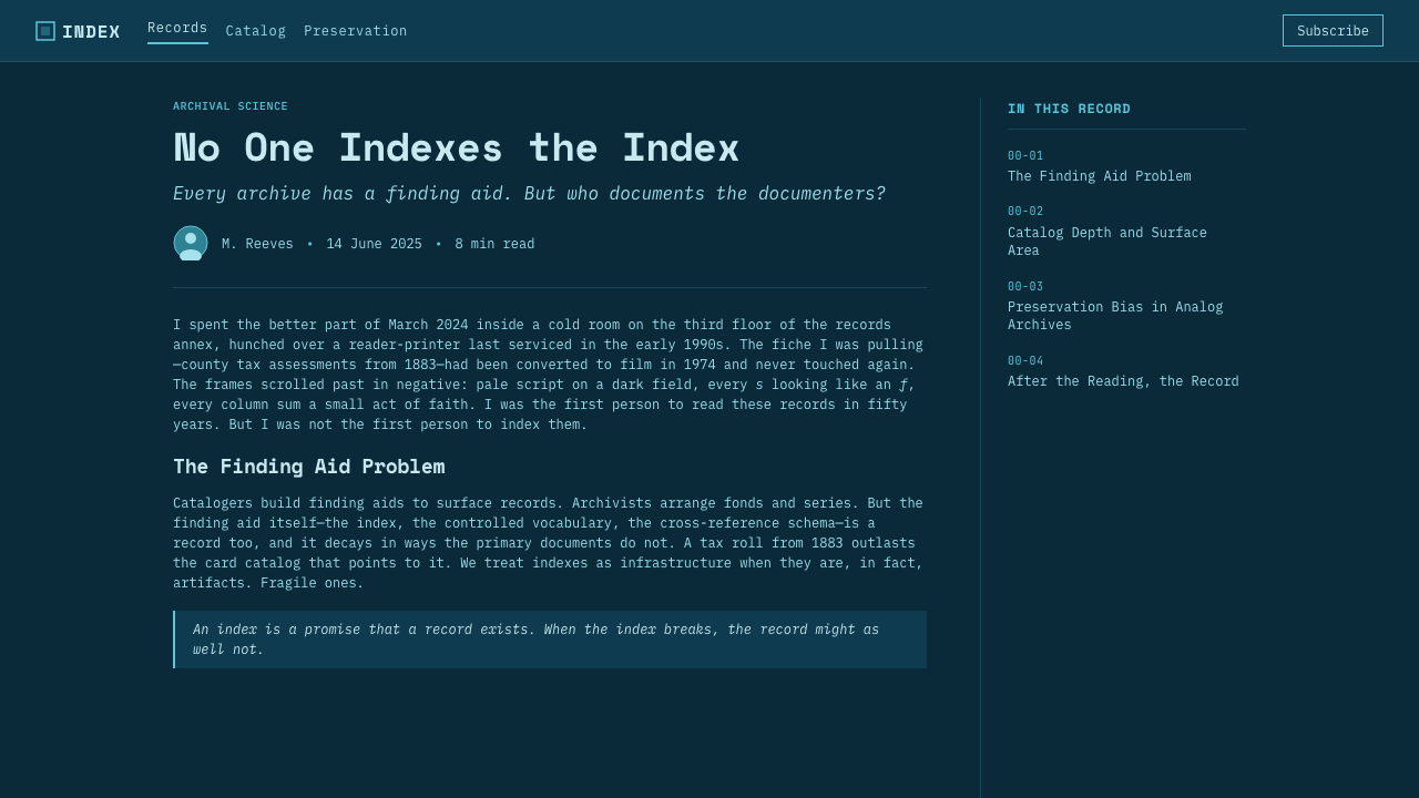
Microfiche Archive inherits the visual reversal of negative fiche: light type and marks emerge from a dark field. This inversion changes the emotional role of text. Instead of ink sitting on paper, information appears activated by illumination. Brightness is therefore meaningful: the most important record labels, active values, and selected frames can feel more exposed to the lamp, while secondary material remains present but quieter within the same field.
Matrix and Coordinates
Every record belongs to a strict matrix. Repeated cells, row markers, column headers, and R·C-style coordinates establish location before decoration. The grid should read as a retrieval system rather than a generic card layout: neighboring frames are related because they share a field, and empty cells are allowed to imply capacity or missing material. Alignment is precise, but the result should still feel like a screen being inspected, not a spreadsheet being filled.
Monospaced Index Type
Monospaced type gives labels and metadata the cadence of machine indexing. It makes sequences, identifiers, dates, and coordinate codes appear measured rather than expressive. The type should glow softly against the panel without becoming fuzzy; clarity remains the governing value. Larger headings can retain the same mechanical family or closely related forms, so hierarchy comes from placement, brightness, spacing, and density rather than from a sudden shift into a decorative display voice.
Frame Rules and Scan Grain
Thin frame rules separate records as if they were magnified document windows on glass. They should remain delicate enough that content is never trapped inside heavy boxes. A faint scan grain can sit across the field to suggest the material surface of a viewed image, but it must remain subordinate to legibility. The grain is evidence of the medium, not a distressed texture applied for atmosphere. It should make the screen feel handled by light, not damaged by age.
Restrained Illumination
Depth comes from illumination and containment, not from glossy surfaces or dramatic dimensional effects. The panel is the light source; frames, type, and rules are the things revealed by it. This produces an unusually calm dark interface, because brightness is organized locally rather than sprayed across the entire composition. A selected frame may become clearer, but it should still remain part of the same archive field rather than breaking into a separate, attention-seeking object.
Who shaped Microfiche Archive?
Indus microform readers represent the physical viewing instrument at the heart of the style. Their significance is the reader-screen relationship itself: a dark room, a lit panel, and a document encountered as an enlarged frame rather than as a sheet of paper. Microfiche Archive translates that encounter into an interface whose primary surface feels illuminated, bounded, and made for deliberate inspection.
World Micrographics stands for the broader micrographics context from which the visual language emerges. The relevant legacy is not branding but a culture of reproducing, organizing, and accessing records as images. It reinforces the style's preference for systematic repetition, compact metadata, and visible indexing: information is valuable because it can be found again, not merely because it can be seen once.
Archival micrographics librarians embody the professional practice that turns stored frames into usable knowledge. Their work depends on cataloging, coordinate systems, and patient retrieval across large collections. In the style, these values appear as calm metadata bands, disciplined labels, and an interface that privileges orientation over spectacle. The librarian's presence is felt through care: each record has a place, each place can be named, and the system remains readable under sustained use.
How do you use Microfiche Archive today?
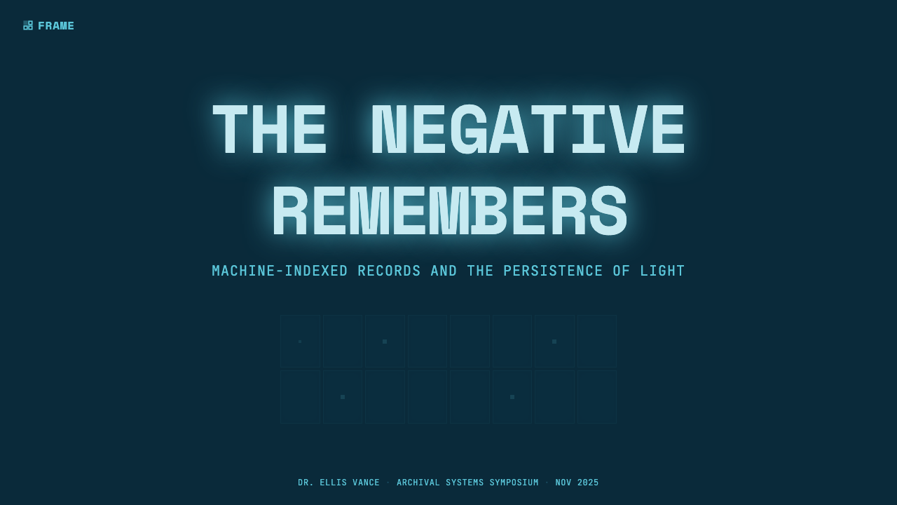
For presentation slides, use Microfiche Archive to make the deck feel like a navigable record set rather than a sequence of oversized posters. A cover slide works best as a single illuminated panel with a concise archive title, an index header, and one or two framed record fragments set within ample darkness. Content slides should preserve the matrix logic: use repeated document windows for sections, maintain a stable coordinate band, and let explanatory text read as an annotation attached to a record. Avoid filling every area; the surrounding dark field is part of the viewing environment.
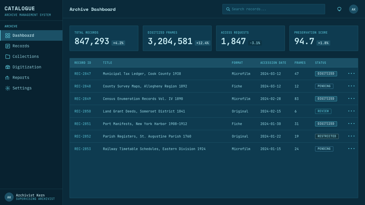
Data slides benefit from the style when metrics can be presented as indexed observations rather than decorative charts. Treat a chart, table, or timeline as a captured frame with a clear label and retrievable position in the grid. Use glow and local contrast to guide attention toward the active reading, while keeping comparison values visibly present around it. Repeated frame rules can organize a collection of related measures, and monospaced labels help sequences remain legible. The goal is not a futuristic control room; it is the calm authority of a well-kept evidence screen.
For web interfaces, Microfiche Archive is especially strong for dashboards, activity logs, knowledge bases, research tools, asset browsers, and records-heavy products. Persistent index headers and coordinate labels can help users retain orientation while scanning dense material. On pricing pages, the style can turn plan comparisons into archive entries: each option occupies a consistent record frame, while included capabilities read as fields in a shared classification system. Interactive emphasis should appear as a clearer illuminated frame or a brighter indexed line, not as a collection of unrelated glowing ornaments.
In editorial and marketing work, the style is useful when the subject involves research, provenance, collections, institutional memory, or technical documentation. An article can begin with a catalog-like header, place quotations or evidence in framed extracts, and use a matrix of related records to create pacing between long passages. Marketing should borrow the discipline rather than the darkness alone: frame a claim as a retrieved record, pair it with concise metadata, and let the illuminated panel imply credibility through order. It is less suitable when a message depends on exuberance, softness, or immediate emotional warmth.
The common mistake is mistaking Microfiche Archive for generic neon terminal design. Excessive glow, bright decorative gradients, dense pseudo-code, and unrelated sci-fi symbols weaken the archive reference because they replace retrieval with spectacle. Another mistake is treating coordinates as fake texture while abandoning consistent alignment and metadata. The style succeeds only when the matrix is functional: labels repeat meaningfully, frames imply a system, light reveals information, and every visual detail helps the user inspect, locate, or compare a record.
Microfiche Archive — FAQ
Is Microfiche Archive just a retro terminal style?
No. It shares a dark field, monospaced type, and luminous information with some terminal-inspired interfaces, but its reference is an illuminated archival viewer rather than a command line. The essential structure is the document matrix: framed negative records, coordinates, scan-like materiality, and a sense of retrieval. A terminal interface prioritizes commands and output; Microfiche Archive prioritizes inspection, cataloging, and the spatial relationship among many stored frames.
Why is the palette so restricted?
The deep cyan-blue panel and light text come from the back-lit negative-viewing premise. A broad decorative palette would compete with that premise and make the screen feel like a conventional dark interface with a visual effect added on top. Restriction lets brightness, grid position, and information density do the work of hierarchy. The result is more archival because the user reads the system through illuminated evidence rather than through many competing visual signals.
Can the style work for long-form reading?
Yes, if the archival framing remains supportive rather than oppressive. Long passages need a calm, stable reading field, clear line rhythm, and enough separation from neighboring records that the eye does not constantly jump across the matrix. Use the grid most strongly for headers, metadata, navigation, pull-outs, and related material. Let the main reading frame become quieter, as though one document has been selected and brought into focus on the same viewing screen.
What makes a coordinate label feel authentic rather than decorative?
It must correspond to a stable system. A coordinate can identify a row and column, a section and record, or a persistent place within an archive view, but the relationship should remain consistent as users move through the interface. Labels become decorative when they are scattered without consequence or change meaning from one panel to another. In this style, coordinates are compact orientation tools: they tell the user where a frame belongs and imply how it could be found again.
Where does Microfiche Archive struggle?
It struggles when a product needs immediate warmth, playful abundance, or a highly expressive lifestyle mood. Its dark field and disciplined indexing can make casual content feel more consequential than intended, and dense framing can become tiring when there is little real structure to reveal. It is strongest when the product genuinely contains records, evidence, history, research, assets, logs, or comparable units. The style should clarify an existing information system, not invent bureaucratic gravity for content that does not need it.
Related design styles
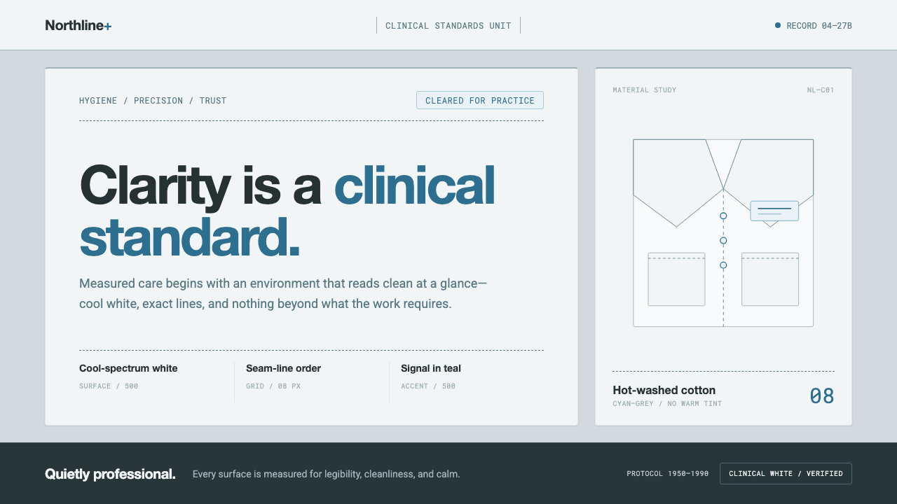 Doctor's Clinical Lab CoatSterile by design. Cool clinical white, teal signals, and seam-line grids enf…
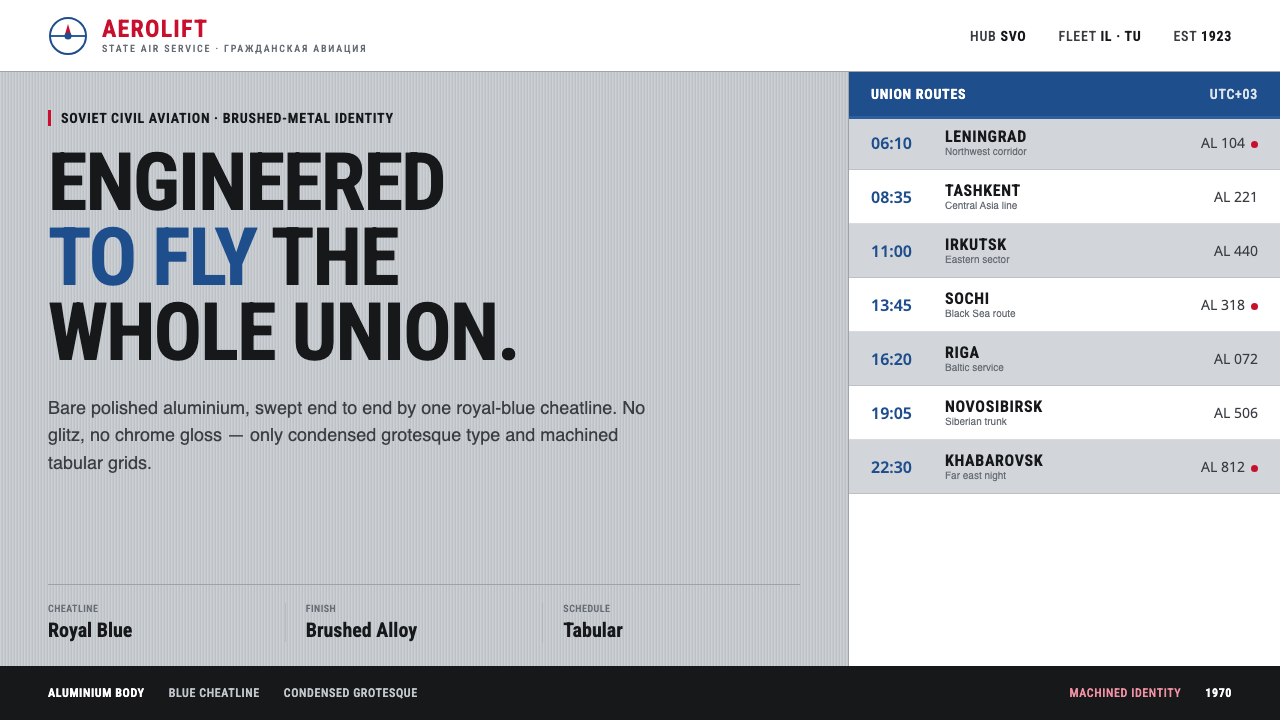 Aeroflot Soviet AirlineEngineered restraint rules. Silver ground, royal-blue cheatlines, and flat gr…
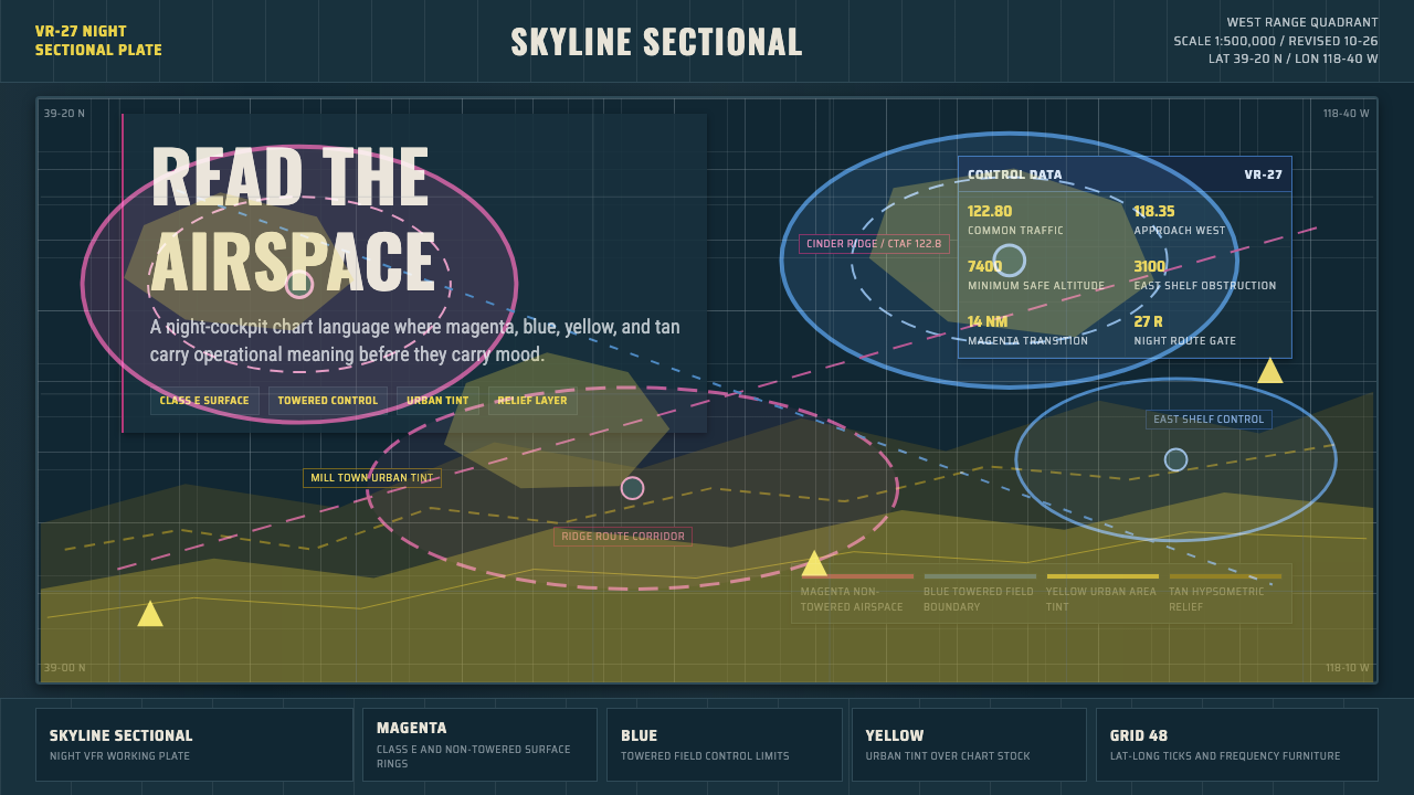 Aeronautical ChartReads like cockpit data. Magenta-blue airspace rings cut through dense dark-c…
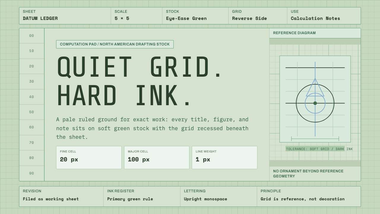 Engineering Graph PadQuiet precision. Eye-ease green, monospace title blocks, and a faint reverse-…
 Frutiger CDG AirportLegibility at runway scale. Navy panels, white humanist sans, arrow-led grids.
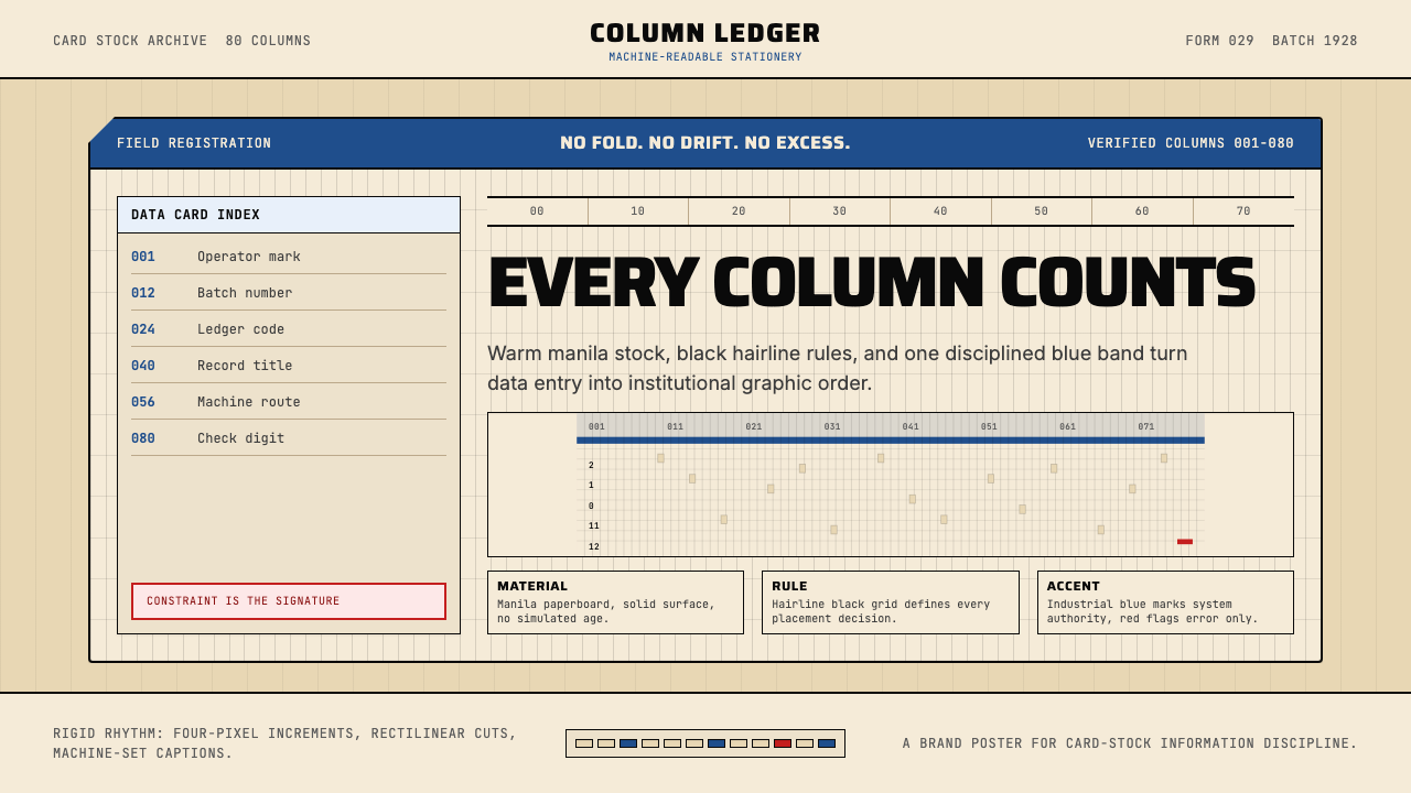 IBM Punchcard 029 (1928)Constraint becomes authority. Manila stock, hairline grid, industrial blue.