What is MICR Cheque Font?
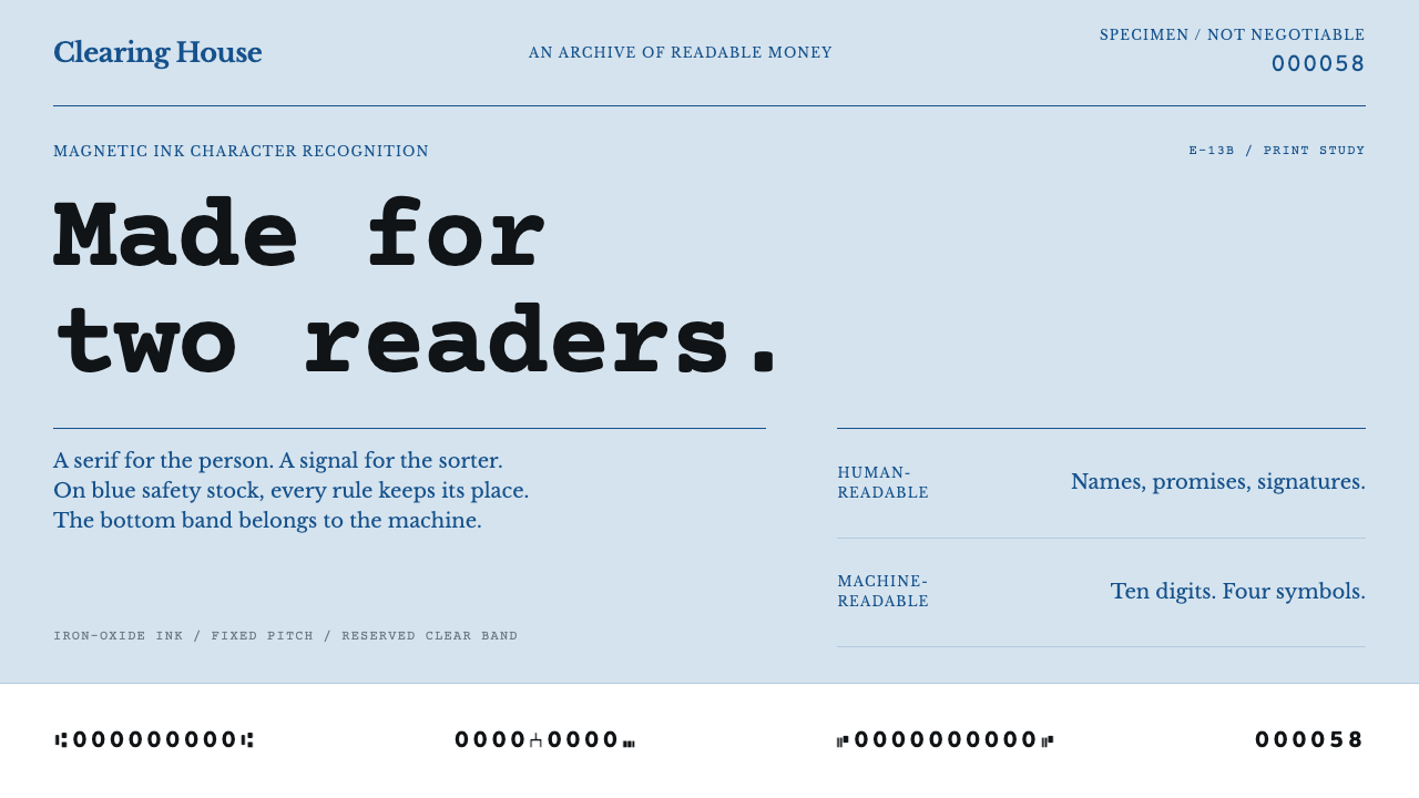
A cheque has two readers, a person above and a magnetic sorter below, and MICR design is the discipline of keeping the machine's band uncompromising while everything else stays quiet.
MICR Cheque Font in brief
MICR, short for Magnetic Ink Character Recognition, is the system of machine-readable characters printed along the bottom edge of a cheque, and E-13B is its best-known alphabet: ten digits and four symbols, printed in ink that contains iron oxide. When a cheque passes through a reader, the ink is magnetised and swept past a read head. Each character produces its own signature waveform, and the sorter identifies it from that signal rather than from its outline. The result is a typeface engineered for a machine's senses, not a person's eyes.
As a visual style, MICR design is the look of a document organised around that single constraint. A personal cheque has two readers. The upper part belongs to people: an engraved bank name in a classical serif, a ruled payee line, a box for the handwritten courtesy amount, a signature line, all printed on pale blue safety paper that carries a nearly invisible pattern. The strip along the bottom, about five-eighths of an inch deep, belongs to the machine and is kept clear of everything else.
What makes the style distinctive is its hierarchy of restraint. The glyphs in the band are lumpy and uneven on purpose, because the thickness of their strokes exists to shape a magnetic signal, not to satisfy a type designer. Everything above the band is deliberately quiet, from the pale tint to the tone-on-tone pantograph to the microprint rules, so that nothing interferes with the one region that has to read perfectly. It is a design language of function and fraud resistance, expressed in blue-grey paper, ruled lines and ink.

Where does MICR Cheque Font come from?
By the 1950s, American banks were handling cheques in volumes that human sorters could no longer keep pace with, and the industry went looking for a way to mechanise the work. The reference record for this style names two institutions in that effort, the Stanford Research Institute and General Electric, which stand for the research and manufacturing sides of the problem. The question they faced was unusual for a design history: how do you print a character that a machine can recognise reliably even when it is smudged, stamped over, folded or handled by hundreds of clerks?
The answer was to read magnetism rather than shape. Characters printed in magnetic ink could be recognised by their signal even when ordinary marks and stains obscured their appearance, which is why the technique suited the rough life of a cheque. Rather than leave each bank to invent its own scheme, the American Bankers Association adopted E-13B in 1958 as the common standard. That decision turned a laboratory solution into national infrastructure: any bank's cheque could be read by any other bank's sorter, so the band, the field positions and the exact form of every character had to be fixed in advance.
The glyphs show the logic of that standardisation. Each character is built from thick and thin vertical strokes at set positions, arranged so that the magnetic signal of one character cannot be mistaken for another. The outlines look blocky and slightly swollen because the waveform, not the silhouette, is what counts. Responsibility for keeping the specification precise, covering dimensions, print quality and placement, later rested with standards work such as that of the ANSI X9 committee, and the format spread across the United States and Canada as the common language of cheque clearing.
Alongside the machine band grew the other half of the cheque, the security layer. Intaglio engraving for the bank name, a pale blue safety tint that reveals tampering, a tone-on-tone pantograph that appears when a document is photocopied, and microprint rules too fine for most copiers to reproduce all belong to the tradition of security printing. The two traditions, bank automation and security printing, meet on a single sheet of paper and explain its look: a sober, bluish, ruled document whose most important line is the least beautiful. Even as cheques have become less common in daily life, that look has survived as a cultural shorthand for banks, ledgers and trust.
What defines the MICR Cheque Font look?
Two-Reader Layout
The page is divided by who is reading. The upper zone speaks to people with a name, a payee line, an amount box and a signature line. The lower strip speaks to a machine and is protected from everything else. This division is the organising idea of the whole style, and it shows up as a clear horizontal break rather than a gradual blend between the two zones.
The Clear Band
The machine band is the most disciplined area of the layout. Nothing is printed over it, nothing decorative is allowed to creep in from above, and the background behind it stays pale so the dark magnetic ink reads with maximum contrast. In design terms it is a reserved zone, a stretch of deliberate emptiness whose single job is to carry one line of characters in fixed positions.
E-13B Glyphs
The alphabet is ten digits and four symbols, built from heavy and light vertical strokes that look swollen, squared and a little crude beside any conventional typeface. These proportions are not a stylistic choice but an engineering one, since the widths and spacing of the strokes produce the waveform that tells characters apart. The shapes carry a distinctive, slightly mechanical charm that designers often borrow for numbers and identifiers.
Safety Blue Tint
The paper itself is a pale, cool blue, never saturated and never warm. The tint serves a practical purpose, because alteration and erasure disturb it, and it also keeps the printed ink legible without shouting. Blue-grey is the colour that tells the eye this is a document of record. Text and rules sit on it in dark, near-black ink with an occasional blue accent.
Engraved Serif
The bank name and key labels are set in a classical serif that imitates the crisp, high-contrast look of intaglio engraving. The letterforms have thin hairlines and firm stems, the spacing is generous, and capitals are often used with wide tracking. This type is the face of institutional authority, conservative on purpose, and it gives the upper half of the document the dignity that the lower band deliberately lacks.
Security Micro-Detail
A tone-on-tone pantograph, microprint that looks like a plain rule to the naked eye, and fine guilloche-style textures form a layer of detail meant to be nearly invisible. They are designed to survive normal use but fail under copying or tampering. As a visual device, they give the page a quiet density, a sense of precision that rewards a closer look without ever competing with the main content.
Ruled Form Fields
Structure comes from thin rules, small labels and boxed areas rather than from fills or shadows. Payee, amount, date, memo and signature each have a ruled home, and the labels beneath them are small and orderly. The effect is flat, procedural and trustworthy, a layout whose every element is there because a transaction needs it.

Who shaped MICR Cheque Font?
The American Bankers Association adopted E-13B in 1958, which is the moment the format stopped being an experiment and became the standard. Its role was to coordinate an industry that would otherwise have built incompatible systems, and its decision is why a cheque written in one city could be sorted by a machine in another. For designers, the ABA stands for the idea that a visual system can be a piece of shared infrastructure, fixed in advance so that everyone can rely on it.
The Stanford Research Institute appears in the reference record as one of the institutions behind the effort to automate banking. It represents the research side of the story, the work of asking what a machine could reliably sense from a printed mark. Its presence in this lineage is a reminder that the look of E-13B was derived from experiment and measurement rather than from a designer's sketch.
General Electric is named in the record alongside the Stanford Research Institute and represents the manufacturing side, the engineering of machines that could read and sort at speed. Its place in the story explains why the characters are shaped around the needs of hardware. The glyphs describe the sensor as much as they describe the alphabet, which is the central lesson of the style.
The ANSI X9 committee is the standards body associated with the formal specification of the format, covering dimensions, print quality and placement. Standards work of this kind is invisible when it succeeds, and it is the reason E-13B has stayed consistent across printers, banks and decades. It stands for the quiet bureaucratic labour behind a design that looks as though it simply exists.
How do you use MICR Cheque Font today?
MICR design is a good fit wherever a product wants to feel precise, official and trustworthy without looking cold or luxurious. Its power comes from contrast between a calm, formal surface and a single strict, machine-like element, so the style works best when you decide which part of your layout is the 'band' and protect it. Treat the rest as a quiet field that exists to support it.
For presentation slides, a cover can use a pale blue ground, an engraved-style serif title in the upper left, a single thin rule, and a line of E-13B-inspired figures running along the bottom edge as a signature device. Content slides work as ruled forms, with small labels, thin dividers and generous alignment. Data slides are a natural home for the style: tables with hairline rules, right-aligned columns of figures, and a strict single-ink palette make numbers feel audited rather than decorated.
For web interfaces, the style suits payment screens, invoicing tools, ledger and reconciliation dashboards, and onboarding forms for financial products. Use ruled inputs with small labels instead of heavy boxed fields, keep the page background a faint cool tint, and set all text in dark ink. A bottom strip carrying reference numbers or order identifiers in a wide, mechanical numeral style can echo the machine band, but it should stay narrow and clean. Pricing tables benefit from the same discipline, with each plan separated by thin rules rather than shadows.
For editorial and marketing work, the style supports stories about banking history, security, audit and the infrastructure behind money. Use the engraved serif for headlines, keep body copy in a calm, readable face, and treat pantograph-like patterns and microprint lines as very faint section textures or dividers. The tone is composed and factual. Campaigns that need warmth or playfulness will fight the material, but those that want credibility will find it ready-made.
A common mistake is to set running text or large headlines in the MICR glyphs themselves. They were built to generate a magnetic signal, not to be read comfortably in sentences, and at scale they become tiring and awkward. Other errors include letting the upper area compete with the band by adding decoration, pushing the blue tint to a saturated tone, or copying a real cheque layout with convincing-looking routing and account numbers. Use this style as an aesthetic reference only, and keep any numbers in a mock-up obviously fictional.

MICR Cheque Font — FAQ
Why do the E-13B digits look so strange?
They were designed for a magnetic read head, not for the human eye. Each character is built from thick and thin vertical strokes at fixed positions, so that it generates a distinct waveform when the ink passes the sensor. The swollen, squared look is a side effect of that requirement. If the shapes were made more elegant, the signals of different characters could blur together and the sorter would misread them.
Is MICR the same thing as OCR?
No. Optical character recognition reads the shape of a character through light, while MICR reads a magnetic signal from the ink. That difference is why E-13B can survive stamps, smudges and rough handling that would confuse an optical reader. It also explains why the band must be printed with magnetic ink of the right quality and kept clear of other marks.
Can I use the MICR typeface for body text or headlines?
It is not recommended. The glyphs cover only ten digits and four symbols, so there are no letters at all, and the shapes were engineered for a sensor rather than for comfortable reading. Use them sparingly for numbers, identifiers or a decorative signature strip, and set everything else in a clear serif or sans-serif face.
Why is the paper pale blue?
Pale blue-grey tints are a long-standing convention of security paper. Alteration, erasure and solvents disturb the tint, which makes tampering easier to see, and the cool, light tone keeps dark ink legible without drawing attention to itself. Visually it also signals officialness: the eye reads a bluish ruled sheet as a document of record before reading a single word.
Is E-13B used everywhere in the world?
No. E-13B originates in the United States and Canada and became the standard there. Other regions use different schemes, notably CMC-7, which is common in parts of Europe and Latin America. If you are designing for a specific country, check which tradition fits its banking culture, though the shared logic of a clear machine band under a quiet human-readable document applies across all of them.
Related design styles
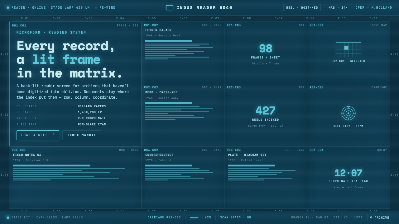 Microfiche ArchiveRecords as lit frames in a matrix. Cyan-blue back-lit panel, glowing mono typ…
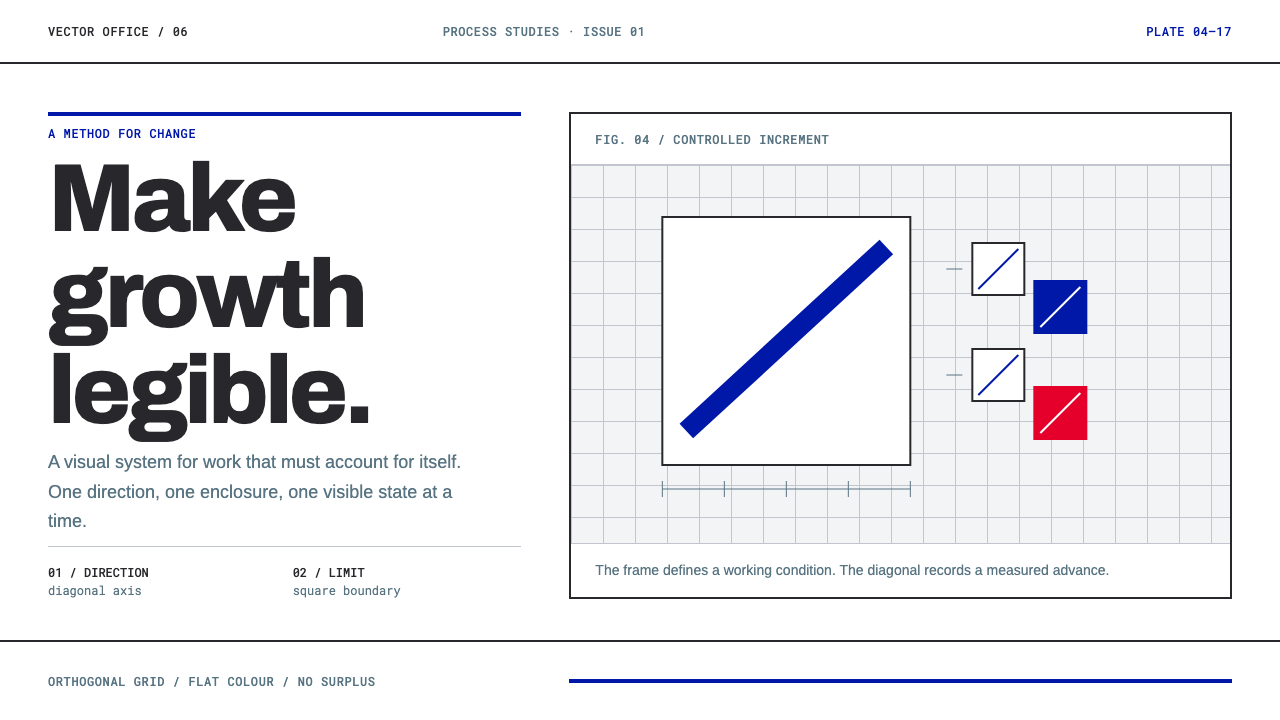 Anton Stankowski ConstructiveProcess becomes visible. Flat blue diagonals and hard square rules make chang…
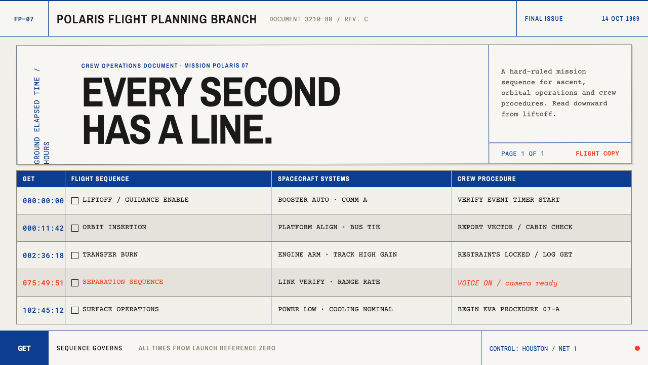 Apollo Flight PlanEvery second has a line. NASA blue rules and monospaced GET stamps discipline…
 Engineering Graph PadQuiet precision. Eye-ease green, monospace title blocks, and a faint reverse-…
 METAR Weather CodeThe whole sky, compressed. Ribbon-black code strikes across canary teleprinte…
 Moog Modular SynthWalnut cabinet, brushed-aluminum panels. Toggle-blue switches, orange patch c…