What is Engineering Graph Pad?
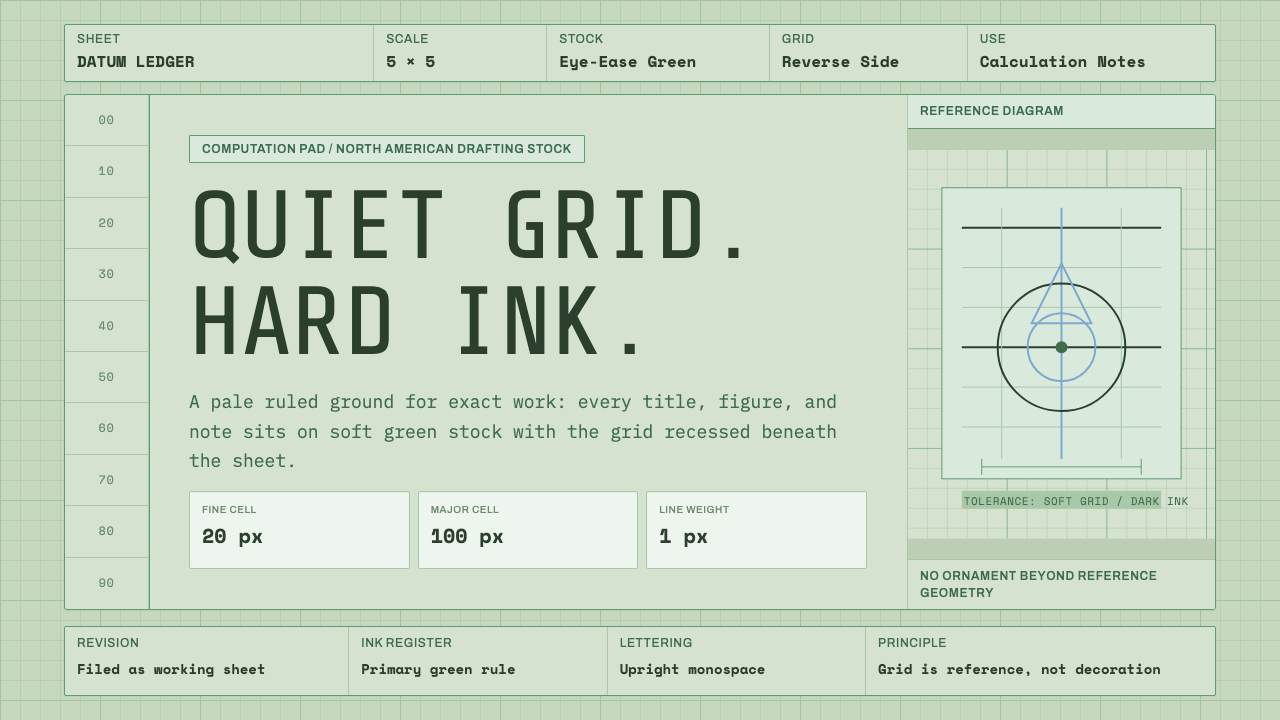
The Engineering Graph Pad turns the humble green computation pad — the quiet workhorse of mid-century drafting desks — into an interface where a faint ruled grid sits under everything, never decorating, only measuring.
Engineering Graph Pad in brief
The Engineering Graph Pad is a style built around one specific, unglamorous object: the pale green computation pad that sat on engineers' desks across North America for roughly forty years. Its defining trick is a printed grid on the back of each sheet — faint enough to read as a soft tint showing through the paper rather than a hard rule drawn on top of it. Everything else about the style follows from that one physical fact.
Where many design systems reach for boldness — saturated color, dramatic type scale, high-contrast shadow — this one reaches for restraint. The tinted ground is quiet rather than neutral-white; the grid is present but recessive; lettering stays monospace, evenly spaced, and workmanlike, the way a draftsman's title block or a hand-lettered calculation looks rather than the way a poster looks. Nothing in the system asks to be noticed first. The grid asks to be trusted.
This makes the style unusually literal among historical design references. It does not abstract a movement's ideology into shapes and colors the way, say, Constructivism or Bauhaus does. It reproduces the exact sensory experience of a specific object — the tint of the paper, the faintness of the underlying structure, the practical lettering used to label a calculation — and asks that experience to carry the same connotations in a digital interface that it carried on a physical desk: precision, patience, and work that has not yet been dressed up for anyone else to see.

Where does Engineering Graph Pad come from?
The engineering graph pad belongs to a category of design history that rarely gets named: workaday stationery, the paper goods that surrounded professional practice without ever being designed to represent anything beyond their own function. Unlike a manifesto-driven movement with founders and exhibitions, this object's history is closer to that of the manila folder or the steno pad — a piece of equipment refined over decades of actual use until its form became inseparable from the work it supported.
Its home was the drafting room and the engineering office of the mid-twentieth-century United States and Canada, roughly the 1950s through the 1990s. Firms such as National Brand and TOPS were the major producers of this class of pad, selling it alongside graph paper, columnar pads, and other structured writing surfaces to engineers, architects, surveyors, and technicians who needed to combine freehand sketching with disciplined measurement on the same sheet.
The choice of a pale green tint — what the trade came to call 'eye-ease' green — was a practical decision before it was an aesthetic one. Office lighting in this era was often harsh fluorescent tubing, and pure white paper under that light produced glare that tired the eyes over long stretches of close calculation work. A muted green ground reduced that glare while still keeping penciled figures and ink legible. Printing the grid on the reverse of the sheet, rather than on the front, kept it from competing visually with whatever the engineer actually wrote — the ruling was there to align a sketch or a column of numbers, not to be read in its own right.
The pad's title block — a printed header for job name, date, and sheet number, usually set in a plain, evenly spaced lettering style — reinforced the object's institutional character. It was a working document meant to be filed, referenced, and audited, not a personal notebook. That combination of quiet color, recessive structure, and administrative lettering is what the design system revives: an artifact whose whole visual identity was a side effect of trying to make hours of technical work easier on the eyes, not an attempt to look like anything in particular.
What defines the Engineering Graph Pad look?
Ground Color
The base surface is a muted, slightly desaturated green — closer to a faded sage than to a bright or cheerful green — chosen historically to ease eye strain under office lighting rather than to make a decorative statement. It reads as paper first and color second: warm enough to feel like a physical sheet, quiet enough that nothing sitting on top of it has to compete with the background for attention.
The Reverse-Side Grid
The grid is the style's signature move: a regular square ruling that appears as a faint, even show-through rather than a crisp printed line. It functions the way a watermark or a very light tint does — visible enough to align content against, invisible enough that it never reads as foreground information. This is the single detail that separates the style from ordinary 'graph paper' treatments, which tend to print the grid at full strength on the front of the sheet.
Monospace, Engineered Lettering
Type throughout favors monospace or near-monospace letterforms — the kind of even, mechanical spacing associated with typewritten title blocks, stamped labels, and hand-ruled technical lettering rather than expressive display type. Hierarchy is built through spacing, alignment, and restrained size changes rather than through weight contrast or flourish, keeping every label feeling like it was entered into a form rather than composed for display.
Rule Lines as Structure
Beyond the grid itself, the style leans on thin, disciplined rule lines to separate sections — the same visual habit as a ledger column or a title-block border. These lines are functional dividers, not decorative flourishes: they exist to keep one block of information from bleeding into the next, echoing the way the original pad separated a job number field from a date field from a sheet-count field.
Low-Key Depth
Where elevation or separation is needed, it is suggested quietly — a thin border, a slightly different tint, a hairline shadow — rather than through the pronounced elevation systems common to more theatrical styles. The paper metaphor discourages heavy drop shadows or glossy surfaces; a computation pad is matte, flat, and physically thin, and the interface follows that lead by keeping depth cues understated throughout.
Restrained Accent Use
Accent color, where it appears at all, is used the way a red pencil mark or a rubber stamp is used on the original object — sparingly, and only to flag something that genuinely needs attention, such as a warning, an error, or a completed status. The system does not introduce a broad decorative palette; the green ground and near-black ink for text remain the dominant relationship throughout.
Working-Document Texture
The overall texture aims to feel like a document mid-use rather than a finished, polished artifact — closer to a page that has been written on, referenced, and filed than to a printed brochure. This comes through in the plainness of the lettering, the muted color relationships, and the willingness to let the grid remain faintly visible under everything, a texture of ongoing work rather than a final presentation.
Who shaped Engineering Graph Pad?
National Brand was one of the principal American manufacturers of the engineer's computation pad and related structured stationery — graph pads, columnar pads, and quadrille-ruled notebooks — during the mid-twentieth century. Its pads were a familiar fixture on drafting tables and in engineering offices, standardizing the pale green 'eye-ease' tint and reverse-printed grid that this design system is built around.
TOPS (a longstanding American stationery and office-products brand) produced its own widely used line of engineering and computation pads alongside National Brand, helping cement the pale-green, reverse-grid pad as a standard office good rather than a niche specialty item. Its continued production of similar pads into recent decades is part of why the object remained recognizable long after the height of hand-drafting practice.
No single named designer authored this style — its true author is the anonymous population of engineers, draftsmen, surveyors, and technicians who used these pads daily across the 1950s through 1990s. Their working habits, not a studio's brief, dictated the object's form: a surface that had to hold both freehand sketches and precise, ruled calculations without either one interfering with the other.
How do you use Engineering Graph Pad today?
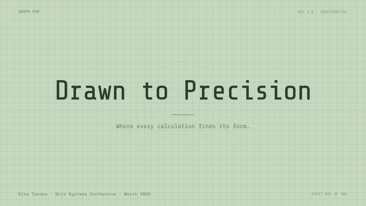
For presentation decks, the Engineering Graph Pad works best on cover and content slides that want to feel like careful, in-progress work rather than a finished sales pitch. A cover slide can use the tinted ground and a faint grid reveal to set an immediate tone of precision — the title set in the system's plain, evenly spaced lettering, sitting quietly rather than announcing itself. This register suits technical proposals, engineering reports, research readouts, or any deck whose credibility depends on looking measured rather than glossy.
Content and data slides are where the style earns its keep. Because the underlying grid is a real structural reference rather than decoration, it is well suited to slides carrying tables, step sequences, or specification lists — content that benefits from a visible sense of alignment. Data visualizations should stay plain and legible: thin rule lines, muted color, and labels set in the same restrained lettering as the rest of the deck, so a chart reads as part of the working document rather than as a separate graphic element bolted onto the page.
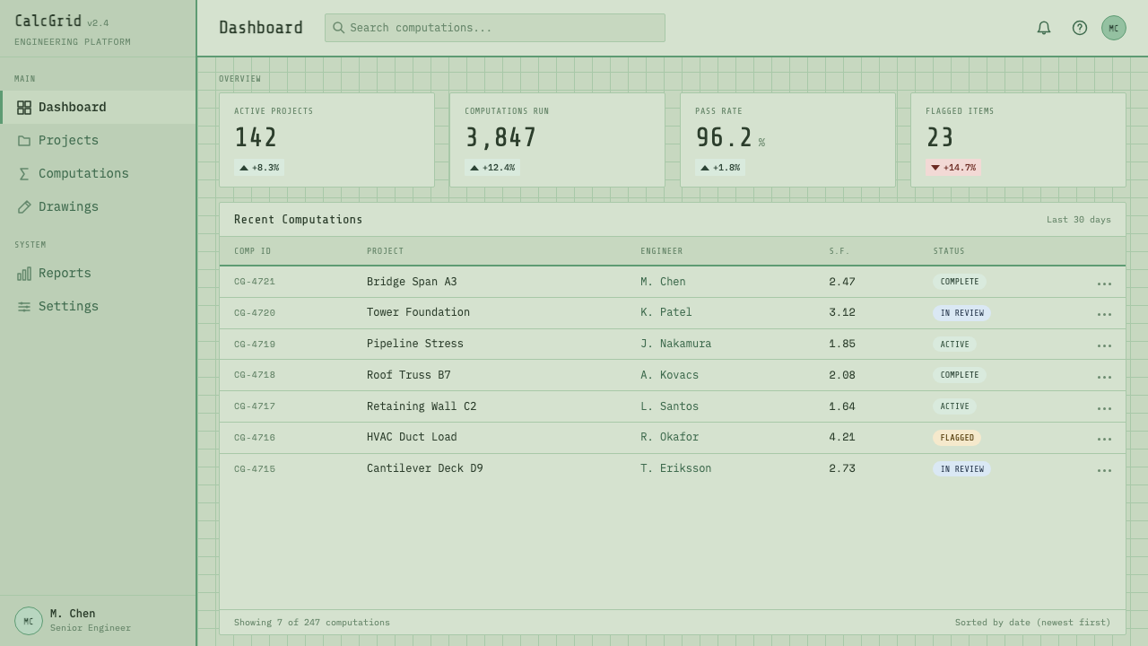
In web UI, this style suits dashboards and pricing pages aimed at technical or professional audiences who respond well to a sense of quiet rigor — developer tools, engineering back-offices, measurement or analytics products, anything positioning itself as precise rather than playful. Dashboards benefit from the faint grid as an actual layout aid: panels and cards can align visibly to the underlying structure, reinforcing the sense that the interface itself is built the way a real technical drawing is built. Pricing pages benefit from the same restraint applied to comparison tables — plain rule lines separating tiers, sparing use of accent color reserved for the recommended plan, and lettering that reads as specification rather than advertisement.
For editorial and marketing use, the style is well suited to content about process, craft, or technical subjects — build logs, product changelogs, engineering blogs, or 'how it's made' feature pieces — where the pale ground and faint grid frame the material as documentation rather than promotion. It is less suited to purely emotional or lifestyle marketing, where the deliberate plainness can read as under-designed rather than restrained; it earns its keep specifically where the subject matter benefits from feeling exact.
The most common mistake is treating the grid as a decorative pattern and printing it at full strength, the way ordinary graph paper does — this collapses the entire point of the style, which depends on the grid staying recessive. A second common mistake is over-styling the lettering with display weights, italics, or flourish; the system's credibility rests on lettering that looks entered rather than designed. When in doubt, the test is whether a given element looks like it belongs in a filed technical document — if it looks like it belongs on a poster instead, it does not belong in this system.
Engineering Graph Pad — FAQ
What makes this different from a generic 'graph paper' or 'grid background' design?
Generic graph-paper treatments usually print the grid at full strength on the front of the page, so the ruling itself becomes a visible pattern the eye has to read around. This style's defining move is the opposite: the grid is printed on the reverse of the sheet in the original object, so it shows through as a faint tint rather than a hard line. That single distinction — recessive grid versus foreground pattern — is what keeps the style feeling like quiet, working paper instead of decorative graph-paper wallpaper.
Is this style only appropriate for engineering-themed products?
No — its subject matter is engineering, but its underlying values (precision, restraint, a document-like sense of trust) transfer to any product that benefits from feeling careful rather than flashy. It reads well for developer tools, research and analytics products, technical documentation, and process-oriented editorial content, even when none of those things are literally about engineering. The test is whether 'quiet precision' is a value the product wants to project.
Can the green ground be swapped for a different color while keeping the style intact?
The tint can shift somewhat and still read as the same family of idea, since the historical color choice was about reducing glare rather than encoding a fixed symbolic meaning. What must stay constant is the relationship between the muted, paper-like ground and the faint, recessive grid sitting under it — if the ground becomes bright, saturated, or high-contrast, the quiet 'working document' feeling collapses regardless of which hue is used.
How restrained should color accents be in this system?
Very restrained. The historical object used color sparingly and functionally — a red pencil mark, a rubber stamp — never as broad decoration. In an interface, this translates to reserving accent color strictly for states that need genuine attention, such as warnings, errors, or a single highlighted action, while the dominant visual relationship stays between the muted ground and near-black text throughout every other part of the layout.
Does this style work for dark-mode interfaces?
It resists a straightforward dark-mode inversion more than most styles, because the whole premise depends on a specific paper-like, light-toned ground — that is the object being referenced. A dark variant risks losing the 'paper' association entirely and turning into a generic dark UI with a faint grid, which is a different thing. If a dark mode is required, it works better to keep the muted, desaturated character (a dark, muted charcoal-green rather than a bright dark theme) than to simply invert the palette.
Related design styles
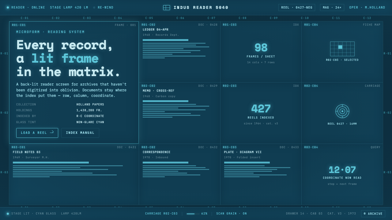 Microfiche ArchiveRecords as lit frames in a matrix. Cyan-blue back-lit panel, glowing mono typ…
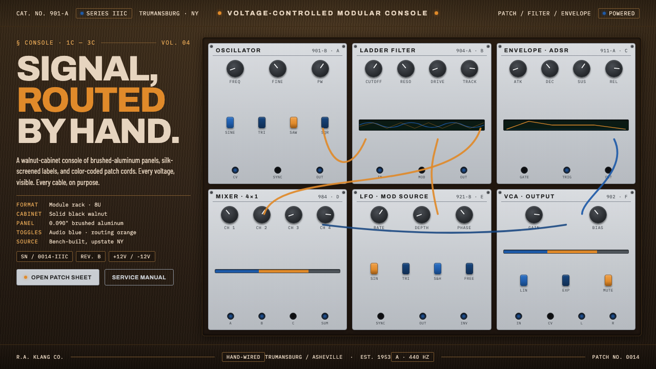 Moog Modular SynthWalnut cabinet, brushed-aluminum panels. Toggle-blue switches, orange patch c…
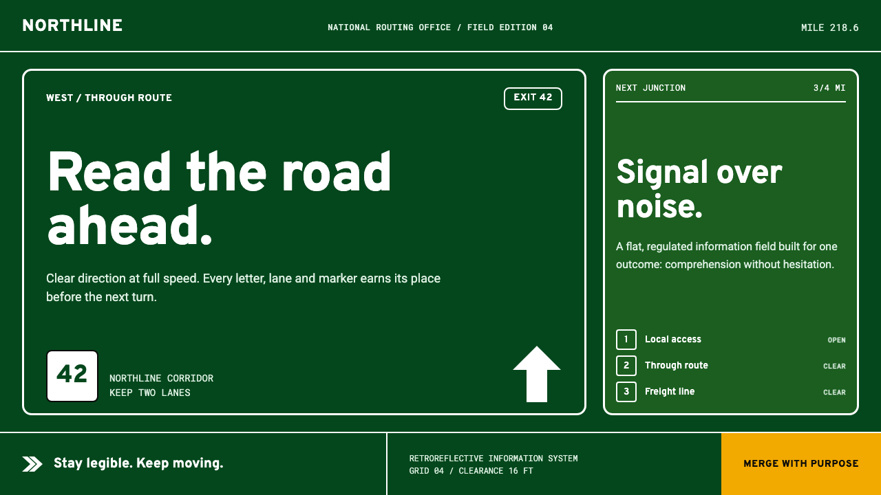 Interstate by Frere-JonesBuilt to be read at speed. Highway green, crisp white legends and strict sign…
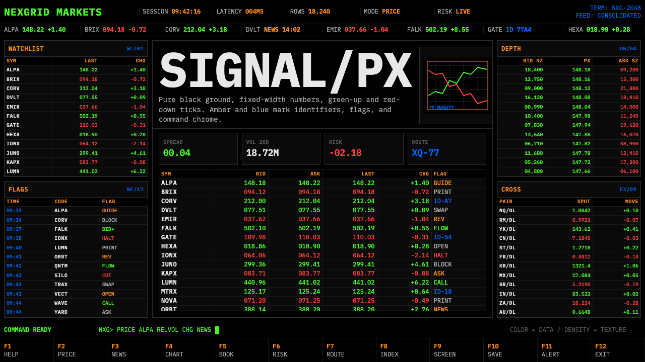 Financial Terminal MonoMaximum signal per pixel. Pure black, IBM Plex Mono, green-red ticks, amber-b…
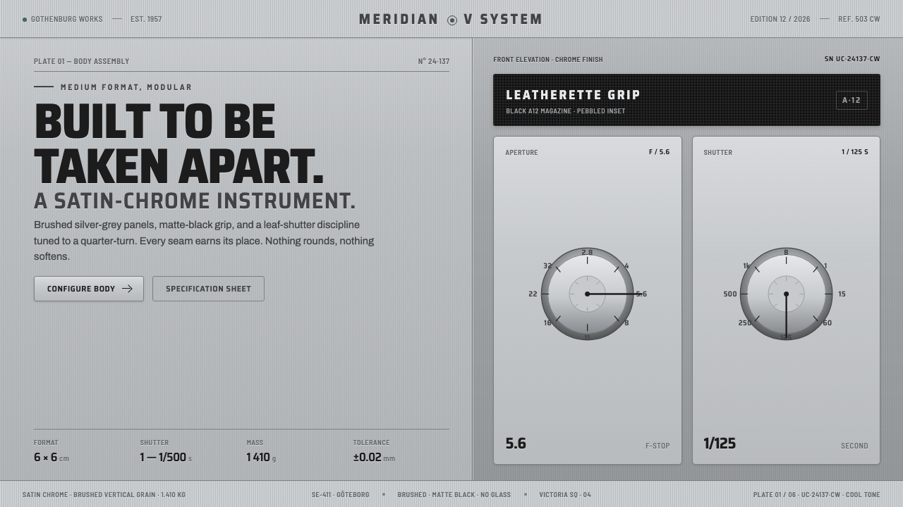 Hasselblad 500C ChromeBuilt to be taken apart. Brushed silver-grey panels, matte-black leatherette,…
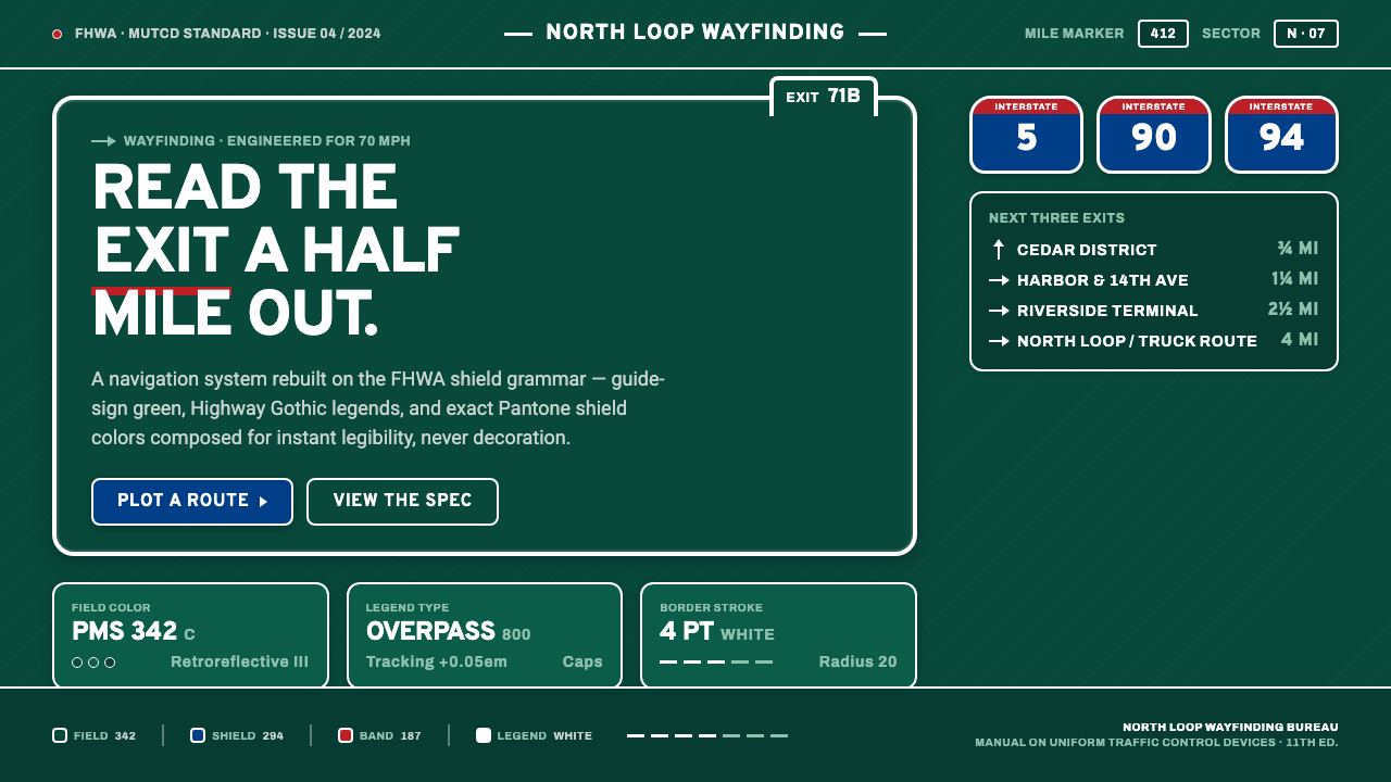 Interstate Highway ShieldEngineered for 70 mph. Guide-sign green, Pantone shield blue and red, Highway…