What is Laboratory Glassware?
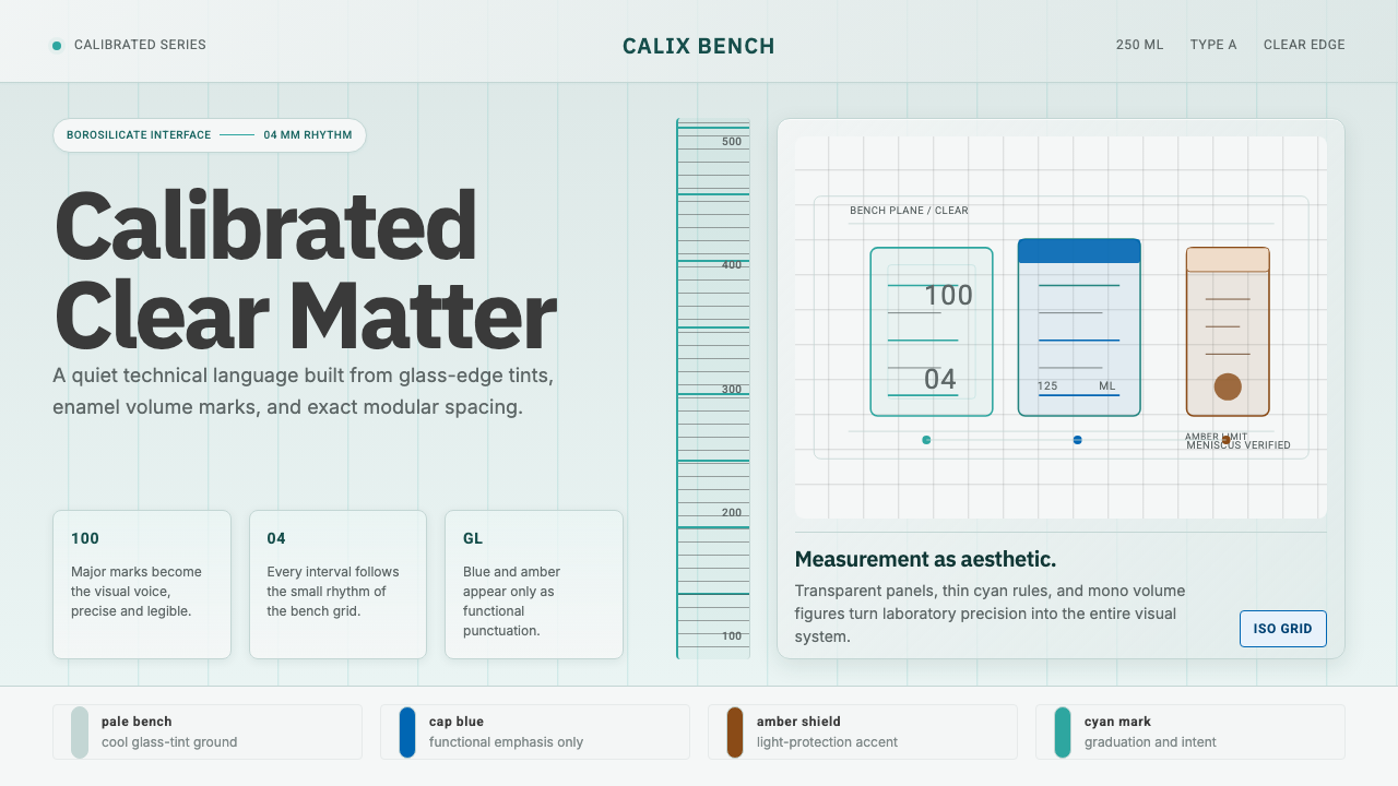
Laboratory Glassware treats a design system like a calibrated instrument — pale glass tones, printed measurement marks, and bench-grid structure standing in for decoration.
Laboratory Glassware in brief
Laboratory Glassware borrows its visual grammar from mid-century borosilicate labware — graduated beakers, Erlenmeyer flasks, ground-glass joints — and renders that grammar as an interface language. The palette reads as clear glass under cool light: a faint cyan-green edge tint sits against a pale, almost colorless bench surface, the way real borosilicate glass shows the faintest color only at its thickest edges. Nothing about the system is applied for effect. Every line reads as a measurement, and every surface reads as a vessel that has been calibrated rather than styled.
The defining move is turning printed calibration marks into a typographic voice. Real laboratory glassware carries fired-on white enamel numerals and gradation lines — the volume markings on a beaker, the fill lines on a graduated cylinder — and this style treats that convention as its type system: clean, legible, slightly technical numerals and labels that behave like instrument markings rather than branding.
The overall mood is calm, exact, and transparent, like the surface of a chemistry bench that has just been wiped down before a procedure. Cool, even light replaces warm accent lighting. Spacing is exact rather than generous or playful. The only chromatic punctuation comes from two borrowed lab accents — a cap blue associated with standard ground-glass-joint closures, and an amber or light-protective brown associated with reagent bottles that shield contents from light. Clarity is treated as the brand itself; measurement is treated as the aesthetic.

Where does Laboratory Glassware come from?
The aesthetic traces back to a specific material and a specific company: Duran borosilicate glass, developed and manufactured by Schott, the German glassmaker founded in Mainz. Schott's history with specialty glass reaches back to the company's founder, the glass chemist and Jena-based innovator Otto Schott, whose late-nineteenth-century research into how chemical composition affects glass properties — thermal resistance, chemical durability, optical clarity — laid the technical foundation for everything the company later produced. Borosilicate glass itself is defined by that research lineage: adding boron trioxide to the silica melt sharply lowers thermal expansion, so the glass can go from a Bunsen burner flame to a cold water bath without shattering.
Duran, Schott's borosilicate glassware brand, became a standard fixture of chemistry labs worldwide during the second half of the twentieth century, roughly the 1950s through the 1990s — the period this style draws its visual cues from. Pyrex, made by Corning in the United States, is the close American parallel and shared the same underlying chemistry and the same cultural role: the clear, faintly green-tinted glass that signaled a serious, well-equipped laboratory rather than a hobbyist's chemistry set.
What made this glassware a design touchstone rather than just functional labware was its total commitment to legibility as a design value. Every beaker, flask, and cylinder needed to communicate an exact quantity to a researcher at a glance, under lab lighting, often through a meniscus of liquid. That requirement produced a visual convention — bold white markings, minimal ornament, joints and fittings sized to precise, standardized diameters — that reads, decades later, as strikingly modern and machine-precise even though it was never designed as a graphic style. It was designed as an instrument, and the instrument's logic became the aesthetic.
This places Laboratory Glassware in the same broader lineage as other design languages this library draws from German industrial precision and modernist functionalism: an insistence that form should be dictated entirely by function, that ornament is a kind of noise, and that trustworthiness is communicated through consistency and exactness rather than through applied decoration. Where Bauhaus expressed that philosophy through primary color and geometric abstraction, Laboratory Glassware expresses it through the specific material honesty of glass, print, and calibrated measurement.
What defines the Laboratory Glassware look?
Color
The base palette stays close to clear glass rather than any bold hue: a cool, pale, almost colorless ground with only the faintest cyan-green edge tint, echoing how real borosilicate glass picks up color at its thickest cross-sections. Chromatic accents are borrowed directly from lab equipment rather than invented — a deep cap blue drawn from standard ground-glass-joint screw closures, and an amber or light-protective brown drawn from reagent storage bottles. These two accents do all the work that a wider palette would do elsewhere: they mark interactive states, alerts, or categorical distinctions, and nothing else is permitted to compete with them.
Typography
Type behaves like fired-on enamel calibration marks rather than editorial or brand type. Numerals carry particular weight — the style treats numeric labels the way a beaker treats its volume gradations, as the single most important piece of information on the surface. Letterforms are clean, geometric, and slightly technical, avoiding anything that reads as decorative or humanist. Labels sit close to the elements they describe, the way a fill line sits directly beside its printed volume, rather than floating in a separate caption zone.
Bench-Grid Structure
Layouts are organized as a bordered grid, evoking the look of instruments and containers lined up on a lab bench: fine hairline borders separate each section the way glass edges separate adjacent vessels. This is not a decorative grid — it functions the way a bench grid functions in an actual lab, keeping every measured thing in its own clearly bounded place so nothing is ambiguous about where one reading ends and the next begins.
Surface and Transparency
Surfaces are treated as if they were glass rather than paper or fabric: cool, faintly reflective, and only ever tinted rather than filled with saturated color. This produces a sense of layered transparency — panels feel like vessels one can, in principle, see into, rather than opaque colored blocks. The effect supports the system's larger claim that everything on the surface is there to be read precisely, not to be looked at decoratively.
Calibration as Ornament
Where other styles would add decorative lines, dividers, or flourishes, this system uses gradation marks — tick marks, scale lines, volume increments — as the only permitted embellishment. A row of evenly spaced ticks along an edge does the visual work that a decorative border would do elsewhere, but it never abandons the pretense of being functional measurement. This is the style's central discipline: decoration is allowed only if it could plausibly also be a unit of measure.
Fittings and Joints
Interactive elements borrow the visual logic of ground-glass joints and standardized screw fittings — precise, interlocking, slightly mechanical in feel. Buttons and controls read as if they click into place the way a joint seats into its matching taper, rather than floating as flat, ungrounded shapes. This lends the interface a sense of physical precision even though nothing about it is literally three-dimensional.
Restraint and Silence
The system's most distinctive trait may be what it withholds: no warm color, no soft or ambient shadow, no decorative flourish that cannot be traced back to an actual laboratory convention. This restraint is not minimalism for its own sake — it is the visual manifestation of a scientific instrument's obligation to be trustworthy, repeatable, and free of anything that could be mistaken for bias or embellishment.
Who shaped Laboratory Glassware?
Otto Schott was the glass chemist whose research in Jena during the late nineteenth century established the systematic study of how chemical composition governs a glass's thermal, optical, and chemical properties. That research program — treating glass as a precisely engineerable material rather than a craft material — is the intellectual root of everything Schott later manufactured, including the borosilicate glass this style is named for. His approach exemplifies the same conviction the visual style embodies: that precision and reliability are themselves a form of design achievement, without needing decorative justification.
Schott, headquartered in Mainz, Germany, is the manufacturer behind the Duran borosilicate glassware brand that gives this style its material vocabulary — graduated cylinders, flasks, and beakers with fired-on white markings. As a company, Schott's identity has long rested on the idea that specialty glass is a precision-engineered product category in its own right, on par with any other advanced industrial material, which is part of why its labware became a visual shorthand for scientific rigor across generations of chemistry education and research.
Pyrex, developed and manufactured by Corning in the United States, is the closest cultural and technical parallel to Duran, sharing the same borosilicate chemistry and the same twentieth-century role as the default glassware of serious laboratories. Its presence alongside Duran underscores that this aesthetic was never a single company's branding exercise — it was an international, mid-century industrial convention that multiple manufacturers converged on because the underlying physics and the underlying communication problem were the same everywhere.
How do you use Laboratory Glassware today?
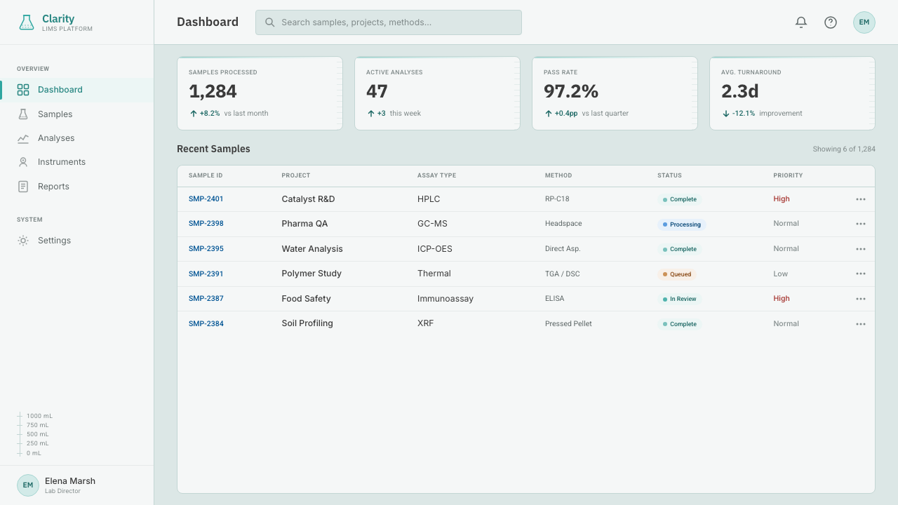
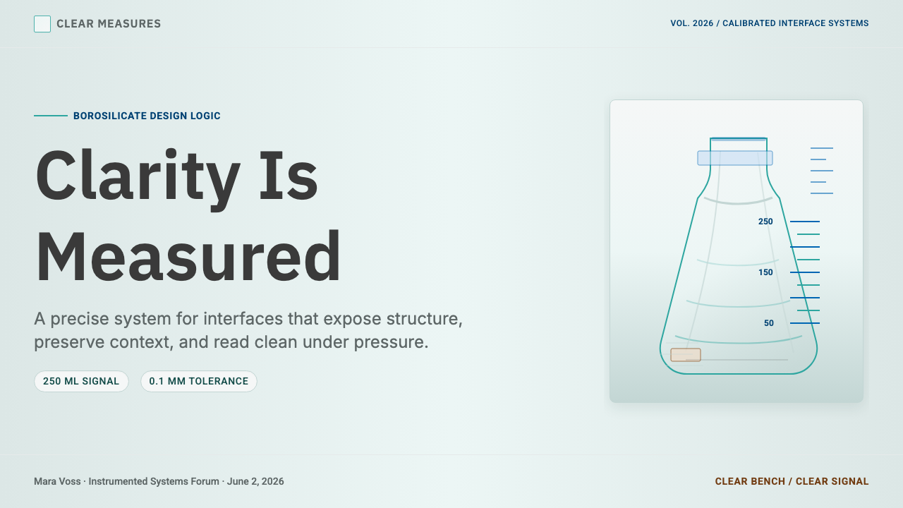
For presentation cover slides, Laboratory Glassware works best when it commits fully to the metaphor of a bench surface: a near-colorless, faintly tinted background with a single bordered panel holding the title, treated like a label affixed to a vessel. The cap blue or light-protective brown accent should appear exactly once — as an underline, a small marker, or a bordered tag — rather than as a background wash. Content and data slides suit this style particularly well, because gradation marks translate directly into chart axes and scale lines: a bar chart or line graph can borrow the same tick-mark logic used elsewhere in the system, so data visualization feels like a natural extension of the aesthetic rather than an addition to it.
For web interfaces, this style is a strong match for dashboards and analytics tools, where the promise of exact, trustworthy measurement is exactly what the visual language communicates. Numeric displays — counts, percentages, statuses — should be treated with the same weight given to calibration marks: prominent, closely paired with their unit or label, and set against the bordered bench grid rather than floating in open space. Pricing pages benefit from the same restraint that governs the rest of the system: plan tiers read like labeled vessels of different sizes, with the cap-blue accent reserved for the recommended or active tier and the rest of the interface staying close to clear glass.
For editorial and long-form content, the style supports a scientific, almost textbook register: pull quotes or key figures can be set inside a bordered panel evoking a specimen label, and section breaks can be marked with a printed-looking rule rather than a decorative divider. This suits explainer content, technical documentation, and educational material especially well, since the aesthetic already signals rigor and precision before a reader processes a single word.
For marketing pages, the style works best in contexts where trust and precision are the actual selling proposition — scientific, technical, health, or measurement-adjacent products. A hero section can use a single large bordered panel as its focal point, echoing a flask or beaker silhouette without depicting one literally, while calls to action borrow the cap-blue accent so they read as the one interactive, actionable element on an otherwise instrument-like surface.
The most common mistake when applying this style is treating the cyan-green tint as a saturated brand color rather than an edge effect. Real borosilicate glass barely shows color except at its thickest points, and pushing the tint too far turns a precise, transparent system into a generically pastel one, losing the sense that the surface is glass at all. A second common mistake is adding decorative dividers or icons that have no plausible connection to a lab bench or piece of glassware — because the system's credibility depends entirely on every mark looking like it could be measuring something.
Laboratory Glassware — FAQ
What's the difference between Laboratory Glassware and a generic 'science' or 'medical' theme?
A generic science theme usually signals its subject through icons — beaker illustrations, DNA helixes, molecule diagrams — layered onto an otherwise ordinary interface. Laboratory Glassware works the opposite way: it never illustrates a beaker, it behaves like one. The bordered grid, the calibration-mark typography, the glass-tinted surfaces, and the two borrowed accent colors are structural choices drawn directly from how real labware communicates measurement, not decorative references to a laboratory setting layered on top of a conventional design.
Can this style work for a product that has nothing to do with science?
Yes, as long as the product benefits from the underlying feeling the style communicates: precision, trustworthiness, and exact measurement. Analytics dashboards, financial or metrics tools, and any interface where a user needs to trust that a number is exact rather than approximate can borrow this language successfully even with no literal connection to chemistry or laboratories. The style struggles, by contrast, in warm, playful, or narrative-driven contexts, where its coolness and exactness will read as sterile rather than trustworthy.
Why does the style rely on only two accent colors instead of a broader palette?
Because both accents are borrowed from a specific real-world source — the cap blue of a standard ground-glass-joint closure, and the light-protective brown of a reagent bottle — and adding a third invented color would break the system's core discipline of never introducing a mark that couldn't plausibly exist on real labware. A narrow, sourced palette is what makes the restraint feel authentic rather than arbitrary; a wider, invented palette would immediately read as a generic light theme with a science-adjacent tint.
How should charts and data visualizations be handled in this style?
Charts should look like an extension of the calibration-mark vocabulary rather than a separate visual system bolted on. Axis lines, tick marks, and scale increments should use the same restrained, printed-label logic as the rest of the interface, and data series should draw only from the two accent colors already established, using variation in tint or line weight rather than introducing new hues. Done well, a chart in this style should feel indistinguishable in spirit from the gradation lines on a graduated cylinder — a precise, unadorned record of a measured quantity.
Does this style require an isDark or inverted variant?
The style is defined as a light-ground system, and that light ground is not incidental — it is what allows the glass metaphor to read correctly, since clear glass against a dark background behaves very differently from clear glass on a lit bench. An inverted variant is possible but requires care: the cyan-green tint would need to shift toward how glass looks under low light rather than simply having its background value flipped, and the borrowed accent colors would need to stay legible against a darker ground without losing the sense that they are precise, sourced hues rather than arbitrary highlights.
Related design styles
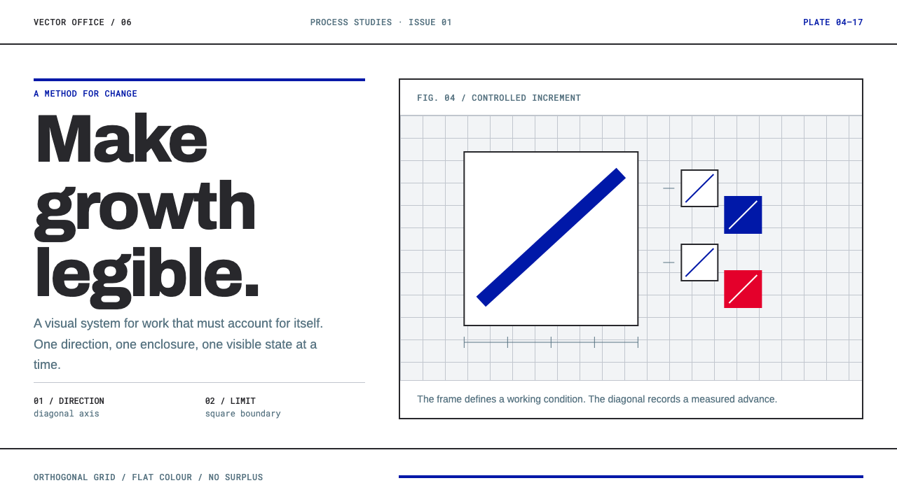 Anton Stankowski ConstructiveProcess becomes visible. Flat blue diagonals and hard square rules make chang…
 Frutiger CDG AirportLegibility at runway scale. Navy panels, white humanist sans, arrow-led grids.
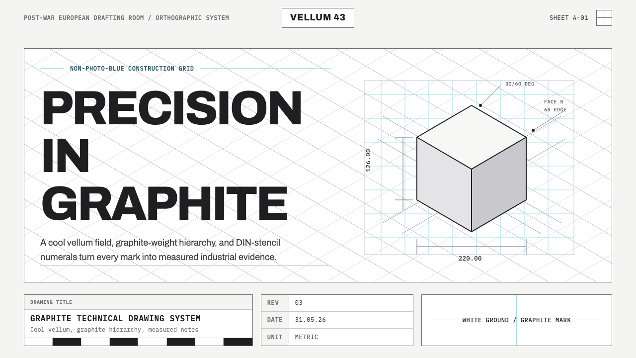 Graphite Technical DrawingDrafting-room precision. Non-photo-blue grid and graphite DIN lettering do th…
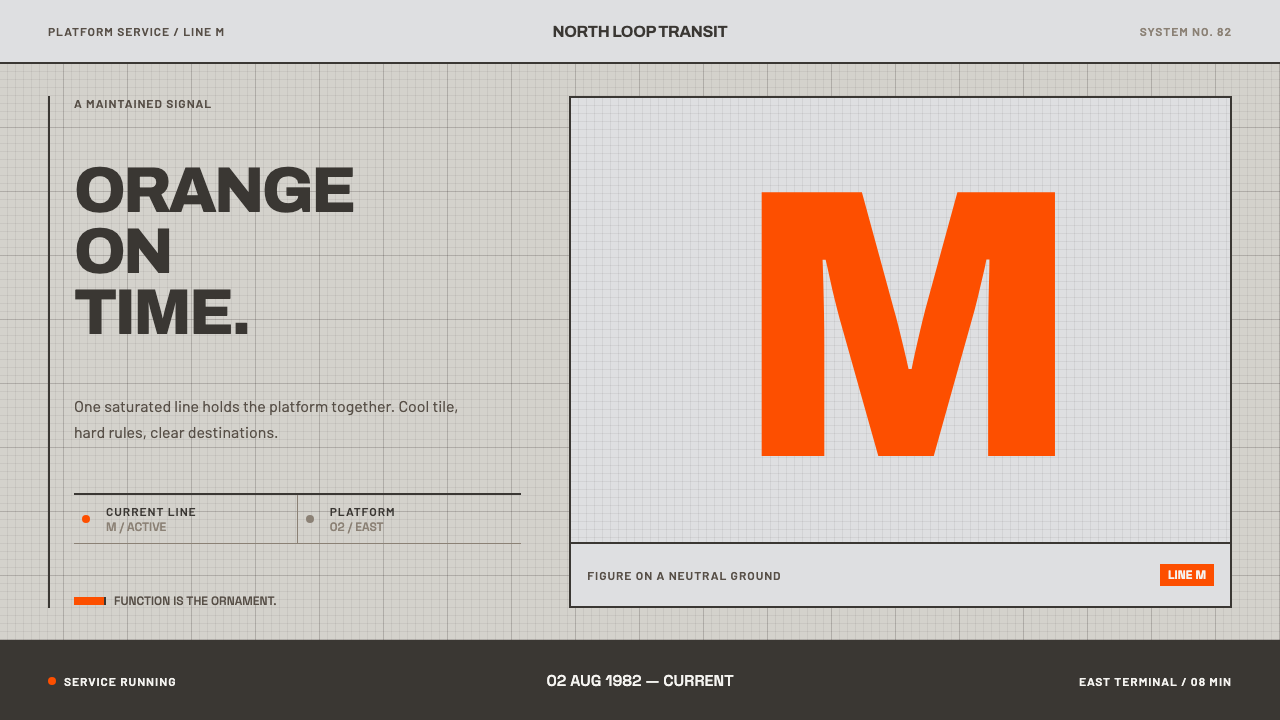 Helsinki Metro OrangeOne orange does the work. Archivo signage cuts across an 8px concrete tile gr…
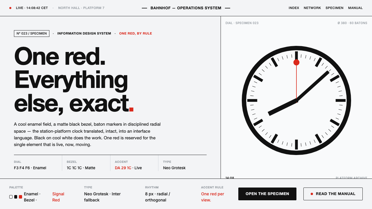 Hilfiker Railway ClockEverything exact, one thing live. Black hands on cool enamel white — one red…
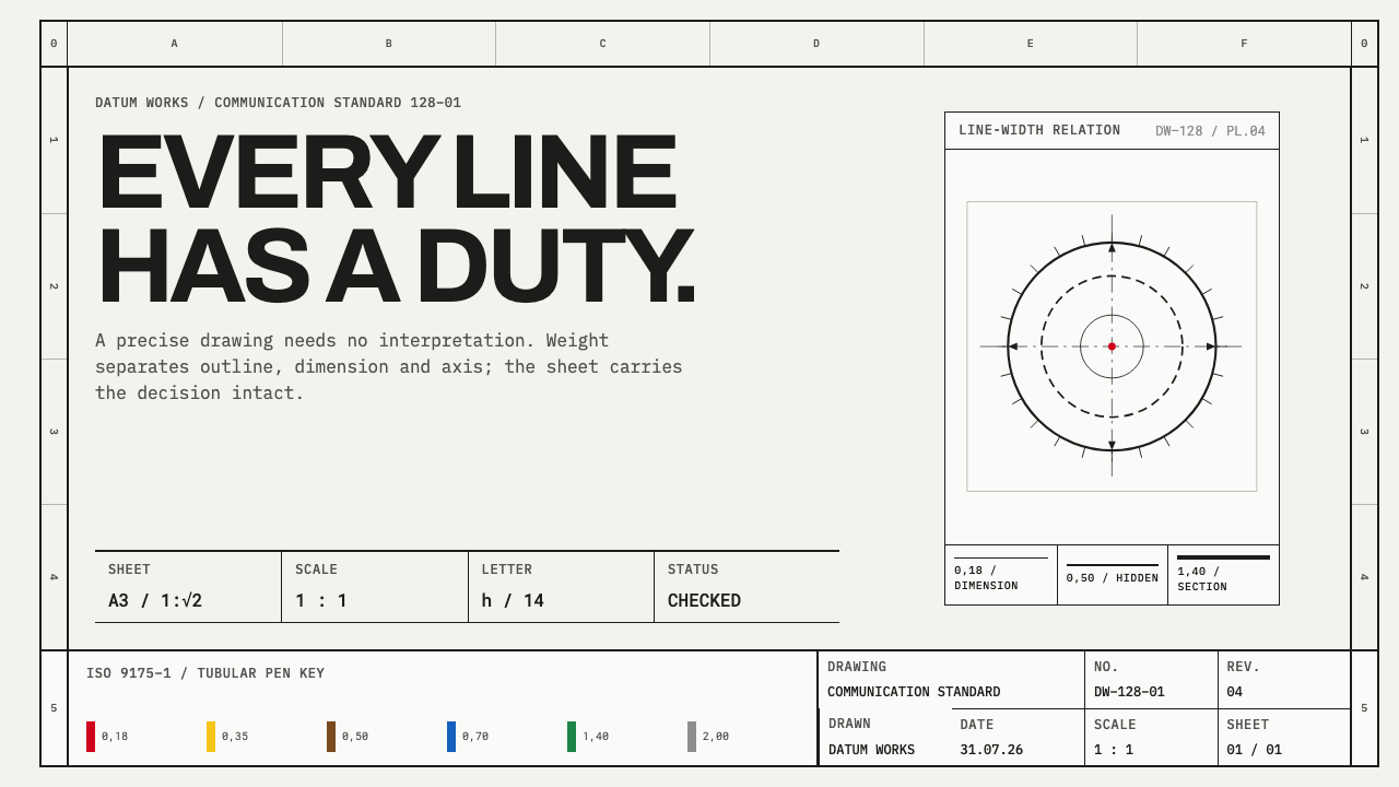 ISO Technical DrawingEvery line carries meaning. Near-black ruled geometry grades weight on cool t…