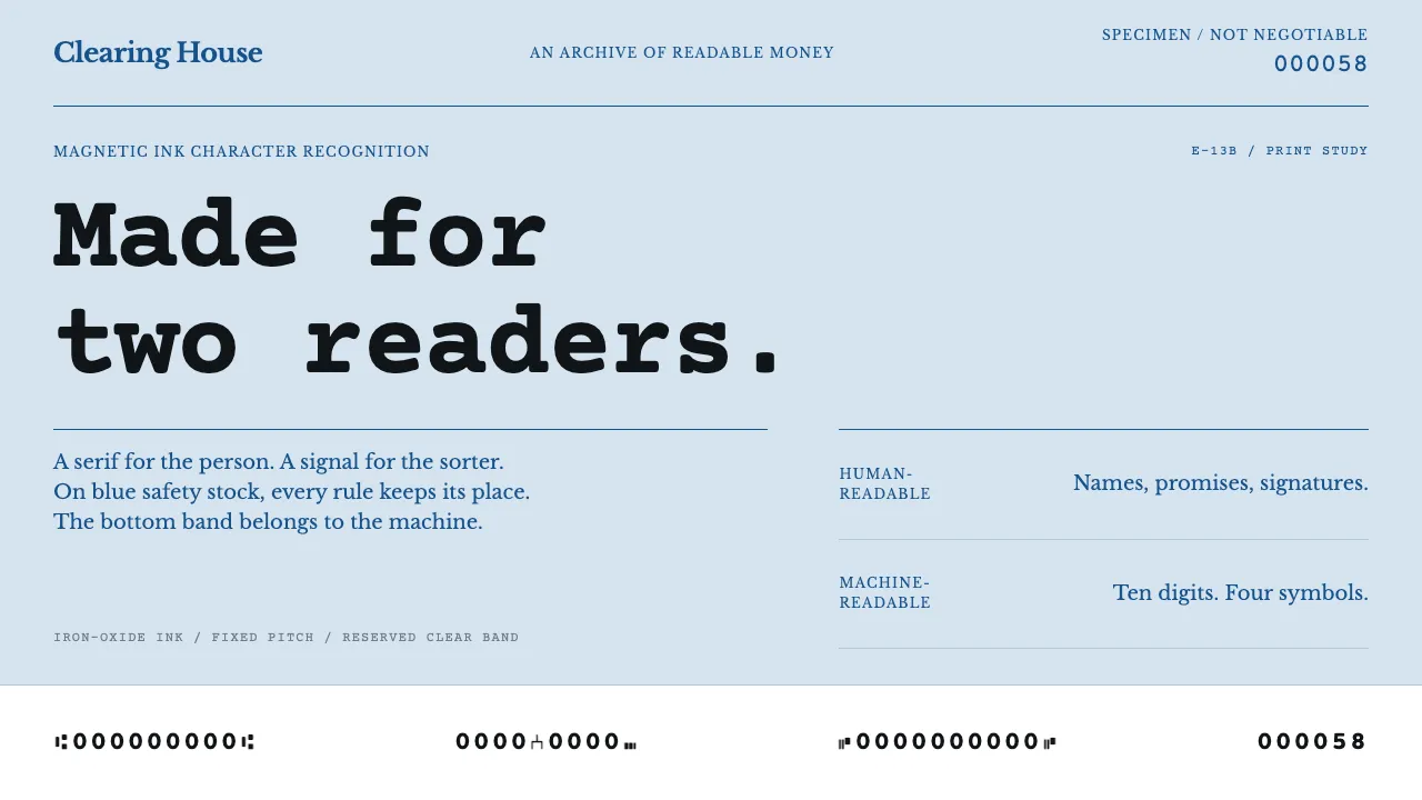
About MICR Cheque Font
A personal cheque is a document with two readers. The engraved bank name, the ruled payee line and the handwritten courtesy amount are for a person; the bottom five-eighths of an inch belongs to a machine. That clear band carries the MICR line set in E-13B — ten digits and four symbols, printed in iron-oxide ink.
The glyphs are lumpy on purpose. Their thick and thin strokes exist to generate a magnetic waveform a sorter can distinguish at speed, not to satisfy a type designer. Everything above the band — the pale blue safety tint, the tone-on-tone pantograph, the microprint rules — is quiet so the band stays legible.
- Origin
- United States and Canada
- Era
- 1950s onward; E-13B adopted by the American Bankers Association in 1958
- Key figures
- American Bankers Association · Stanford Research Institute · General Electric · ANSI X9 committee
- Movements
- Bank automation · Magnetic ink character recognition · Security printing
MICR Cheque Font design spec
Colors
Typography
The other 11 sections — buttons, cards, spacing, motion, techniques and more — open once you unlock. Download the DESIGN.md or send it to your AI in one click. Unlock once, yours forever.
Sign up nowStyles similar to MICR Cheque Font
Also inspired by print & type, with a close feel.
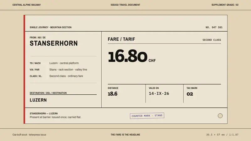 Alpine Funicular TicketIssued, not decorated. Oat-buff stock, slab fares and one longitudinal red stripe.
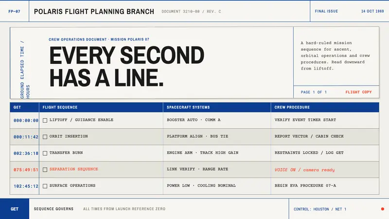 Apollo Flight PlanEvery second has a line. NASA blue rules and monospaced GET stamps discipline office bond.
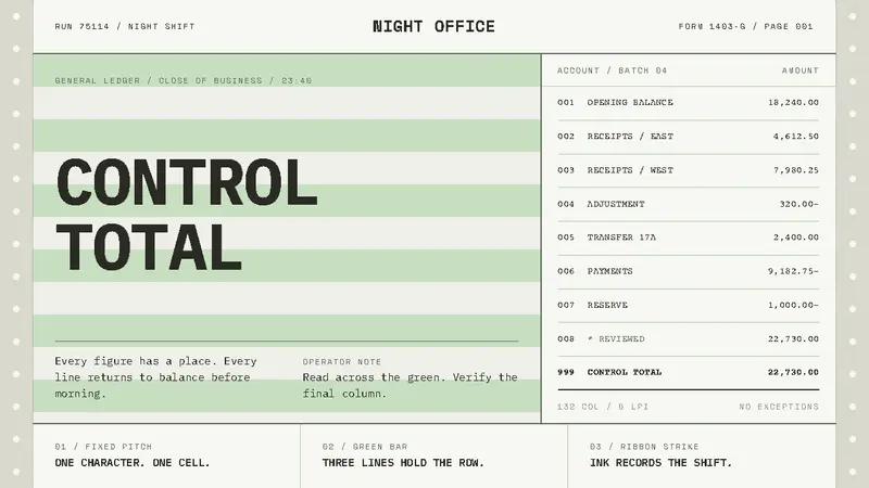 Green Bar PrintoutOrder, struck on paper. Worn mono type locks to fixed columns across pale green bands.
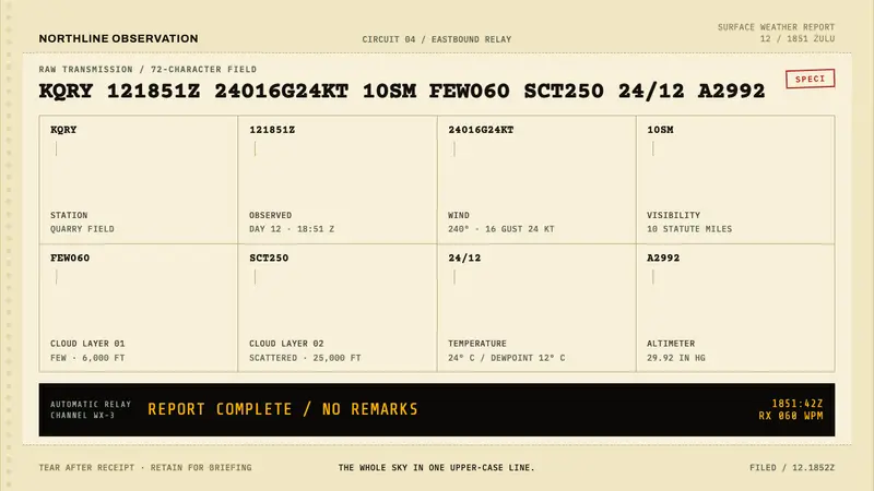 METAR Weather CodeThe whole sky, compressed. Ribbon-black code strikes across canary teleprinter stock.