What is Anton Stankowski Constructive?
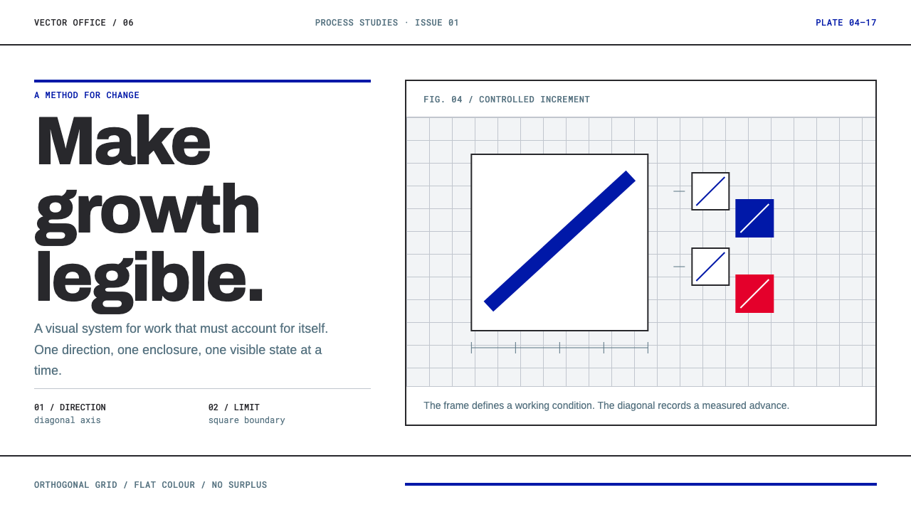
Anton Stankowski drew processes rather than things, and his constructive graphics make change itself visible: one flat blue, square corners and full-strength rules on plain white paper.
Anton Stankowski Constructive in brief
Anton Stankowski Constructive is a design style drawn from the work of the German graphic designer and artist Anton Stankowski, who worked in Stuttgart from the 1950s into the early 1990s. His subject was not objects but processes: growth, overlap, rotation and change of state, rendered as diagrams in tempera, gouache and cut paper on plain white sheets, with nothing spare left in the frame.
The visual language is spare and legible. There is a single flat blue, square corners, rules at full strength, and an asymmetric composition laid on a strict orthogonal grid. The page is white printing paper, not an atmospheric cream. The blue is a flat colour with no gradient. Lines are structure rather than decoration, and compositions are deliberately placed off centre rather than balanced down the middle.
The governing question is an accountable one: what is this shape doing? Every element has to explain which process it illustrates, and anything that cannot be explained is removed. Nothing is added to make a page look designed. That makes the style unusually honest, and unusually useful for subjects in which change over time is the message.
Where does Anton Stankowski Constructive come from?
Stankowski worked in the tradition the source files under Konstruktive Grafik and Konkrete Kunst, constructive graphics and concrete art, the German-speaking branches of modernism in which a picture is built from its own elements rather than representing something outside itself. His work also sits in the orbit of the Swiss International Typographic Style, with its grids, asymmetry and demand for clarity. His base was Stuttgart, in West Germany, and his working life spans the 1950s through the 1990s.
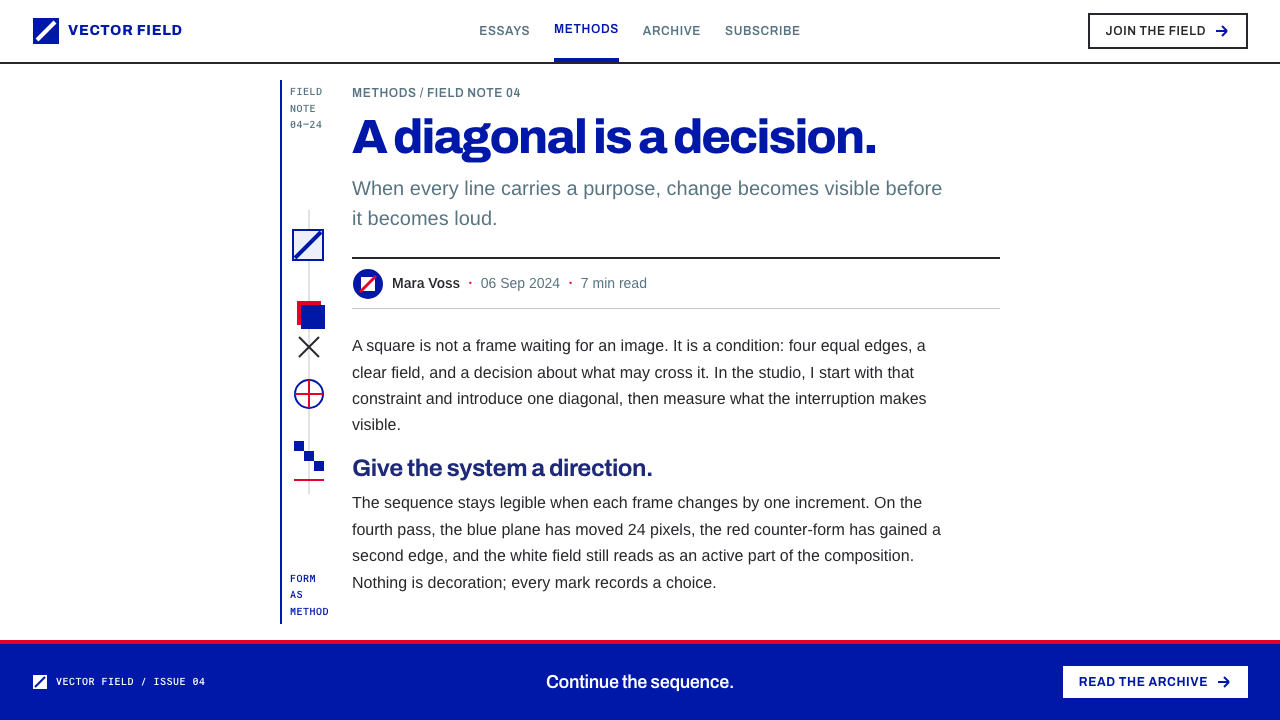
His best-known single work is the Deutsche Bank identity of 1974. The mark is two elements and one sentence: a diagonal line stands for continuous growth, and a square frame around it stands for a secure, controlled environment. That economy is the whole method in miniature. A diagonal and a box carry a business promise without any pictorial illustration, and they can be explained in a single breath.
Alongside identity work ran a body of autonomous pictures. Stankowski's diagrams of process, in tempera, gouache and cut paper, treated change as the legitimate subject of a graphic: a diagonal that grows, shapes that overlap and generate new ones, a rotation shown by its stages. Late prints from the same practice continue into the early 1990s, which is why the source dates the tradition from the 1950s to the 1990s.
Karl Duschek is the second name the source lists as a key figure, associated with the same Stuttgart constructive practice. The style is therefore less a copy of one artist's hand than a distillation of a working discipline: flat colour, right angles, full-strength lines, off-centre placement. It asks of a designer what it asked of its originators, which is to be able to say what each shape does.
What defines the Anton Stankowski Constructive look?
One Flat Blue
The system has a single chromatic colour, a blue applied as a flat area with no gradient, no tint ramp and no glow. Because there is only one, the blue means something every time it appears: this is the part that changes, grows or acts. Colour is treated as a statement of function rather than a mood.
White Printing Paper
The ground is plain white, like a printed sheet, and not a warm cream chosen for atmosphere. White makes the blue and the black read at full strength and leaves the space around each shape available as part of the composition. The page is a working surface for a diagram, not a mood.
Square Corners
Corners are right angles. Rounded corners suggest softness and friendliness, qualities that have no place in a system where every form is a decision. Boxes, frames and rectangles are cut cleanly, and the Deutsche Bank square is the model: a hard frame that stands for a controlled environment.
Full-Strength Rules
Lines are structure. They appear at full strength or not at all, with no faint dividers, no hairline softness and no decorative flourishes at the ends. A rule is there to separate, to connect or to indicate direction, and each one can be asked what it is doing.
Off-Centre Orthogonal Grid
Layouts sit on a strict grid of horizontals and verticals, but the composition is never centred. Weight is placed to one side and balanced by space rather than by mirror symmetry. The asymmetry is deliberate: it directs the eye along the page and makes the empty area as active as the filled one.
The Diagonal as Event
In an orthogonal system, a single diagonal is a strong event. In the Deutsche Bank mark it stands for continuous growth, and in this style the diagonal is reserved for change, growth or direction. Because it is rare, it tells the viewer where to look and what is moving.
Every Shape Accountable
The style's central test is that each shape must say what process it illustrates. If it cannot, it is removed. This is the opposite of decoration. It makes the page quick to read, because no element is there merely to fill space or to look designed.
Who shaped Anton Stankowski Constructive?
The German graphic designer and artist whose work gives the style its name. Based in Stuttgart, he drew processes rather than things, working in tempera, gouache and cut paper, and he brought the same method to corporate identity. His central discipline, that every shape must be able to say what it does, is the one this style inherits.
Named alongside Stankowski as a key figure of the same Stuttgart constructive practice. His presence in the source is a reminder that the style belongs to a working studio discipline rather than a single hand, which is why it can be described as a set of rules for flat colour, right angles, full-strength lines and off-centre composition.
The client of the best-known application of the method, the 1974 identity. Its mark combines a diagonal for continuous growth with a square frame for a secure, controlled environment. It is the clearest demonstration in the source of the style's economy, in which two elements deliver a sentence of meaning, and it is a trademark, so the method should be learned from it, not the mark copied.
How do you use Anton Stankowski Constructive today?
Anton Stankowski Constructive is a style for projects whose content is change: growth, flow, transformation, comparison before and after. It suits finance, research, engineering, consulting, analytics products and any report in which clarity is a form of respect for the reader. It is a poor fit for sentimental, ornamental or highly atmospheric subjects, where its refusal to add anything would feel cold.
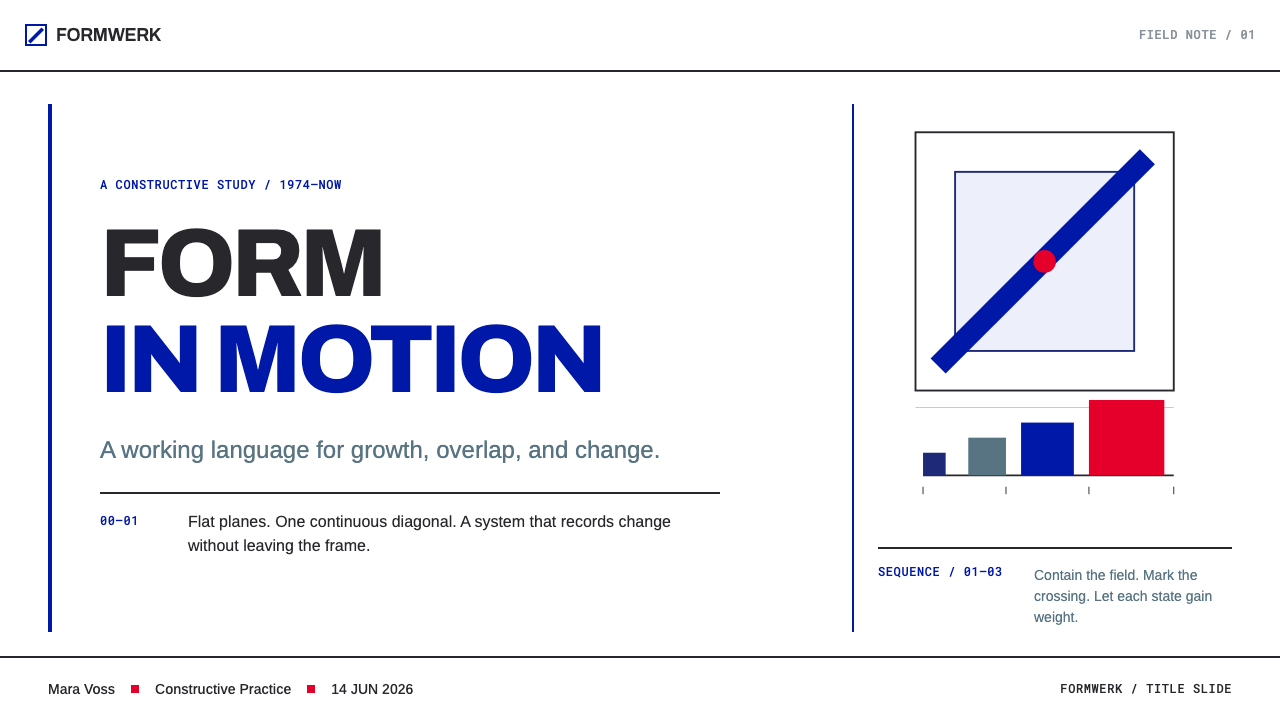
In presentation slides, a cover can be a white sheet with a single blue diagonal or square placed off centre, the title set small and flush to the grid, and nothing else. Content slides work as diagrams: one idea, one shape that illustrates it, and a short label. Data slides are where the style is strongest. Growth curves become single diagonals, comparisons become overlapping flat rectangles, and a change of state is shown by two frames side by side, with blue marking the part that moves.
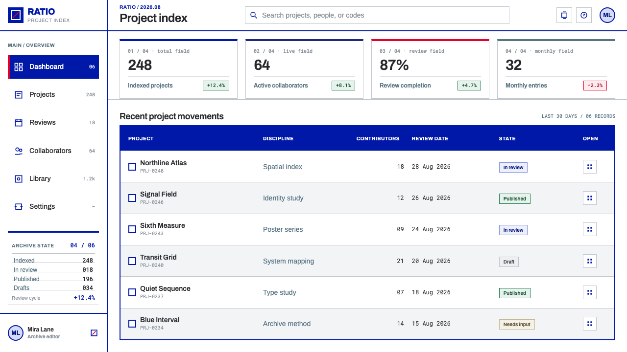
For web interfaces, the style suits analytics dashboards, fintech and operations tools. Use a white ground, full-strength dark text and a single blue for the active, changing or selected element. Cards become hard-edged rectangles divided by rules at full strength, with no soft shadows, and buttons are square-cornered blocks of flat blue. Pricing pages can show tiers as diagrams, with differences in structure and not decorative badges, and with blue marking the recommended plan.
For editorial and marketing work, the style supports annual reports, explanatory graphics, white papers, research publications and identity systems that want to look rigorous without looking cold. Place long text on a clear column inside the grid and leave a large area empty on the other side. A single blue diagonal can act as a recurring signature, so long as every use of it can be explained by what is changing on the page.
A common mistake is to treat the style as a look: adding blue gradients, rounded boxes, soft shadows or a warm paper tint. Each of these breaks a rule the style is built on. Another is to centre the composition, which removes the tension of the off-centre grid. A third is to scatter diagonals as pure ornament; a diagonal that does not represent growth, direction or change is exactly the kind of shape the style says should be deleted.
Anton Stankowski Constructive — FAQ
Is this the same as the Swiss International Typographic Style?
They are close relatives but not identical. The source lists the Swiss International Typographic Style among the movements around Stankowski's work, alongside Konstruktive Grafik and Konkrete Kunst. All of them share a taste for grids, asymmetry and clarity. What is distinctive here is the focus on drawing processes, a single flat blue and the rule that every shape must explain what it does.
Why white paper rather than a softer off-white?
Because the ground is a working surface for diagrams, not an atmosphere. Plain white gives the flat blue and the black rules their full strength and keeps the empty space neutral enough to count as part of the composition. A cream tint would add a mood and soften every contrast, which is the opposite of what this style does.
Can I use more than one colour?
The system is defined by a single flat blue, and that restraint is what lets the blue mean something every time it appears. If you need to distinguish categories, try position, size and line structure first. When a second colour is unavoidable, use it as a clearly subordinate, flat tone and keep the blue as the single signal for what changes or acts. Gradients and tints remain outside the system.
Does the style work as a dark theme?
It is built on white printing paper, and that ground is part of its identity, so light is the natural form. A dark version can still follow the rules: flat colour, right angles, full-strength rules and off-centre composition on a plain dark field. But the blue and the lines will behave differently on dark, so check that the single blue still reads as the one signal on the page.
Can I reproduce the Deutsche Bank mark?
No. The 1974 mark is a corporate identity belonging to its owner. What the style takes from it is the way of thinking: use a minimum of elements, make each one say something specific, and let a diagonal mean growth and a frame mean a controlled setting. Apply that method to your own content and design your own marks with it.
Related design styles
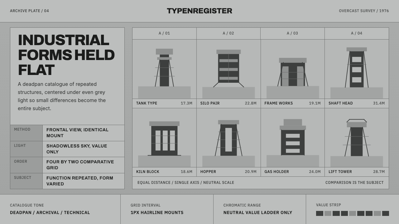 Bechers Industrial TypologyDeadpan order. Mid-grey ground, Archivo labels, and strict hairline grids rev…
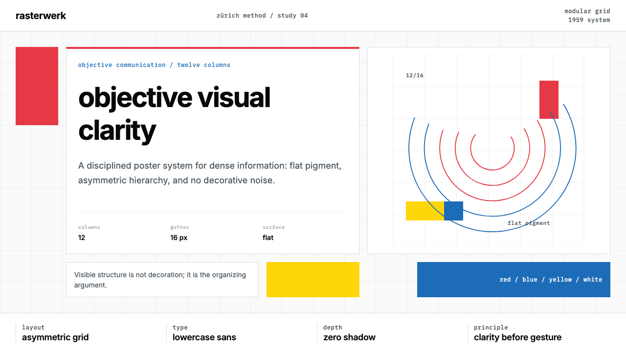 Müller-Brockmann SwissClarity is the system. Inter grids, red-blue blocks, and concentric arcs make…
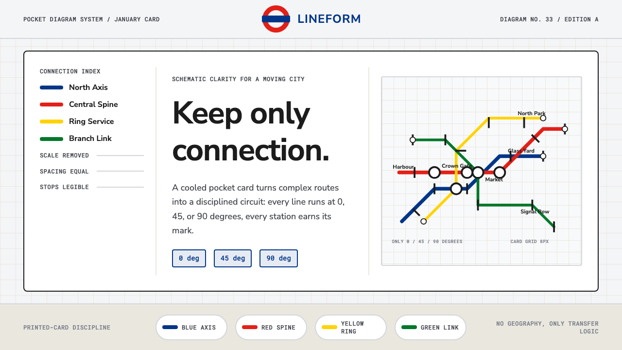 Tube Map (Beck)Connection beats geography. Blue-red-yellow routes snap to a cool card grid.
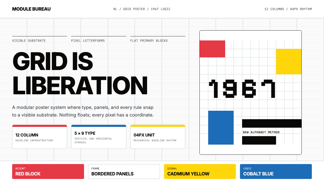 Wim Crouwel GridGrid becomes freedom. Cobalt, red and yellow blocks lock Inter type to a 12-c…
 Frutiger CDG AirportLegibility at runway scale. Navy panels, white humanist sans, arrow-led grids.
 Icelandic Basalt VolcanoCold geology, engineered. Basalt black, Sora type, and one magma fissure hold…