What is Moog Modular Synth?
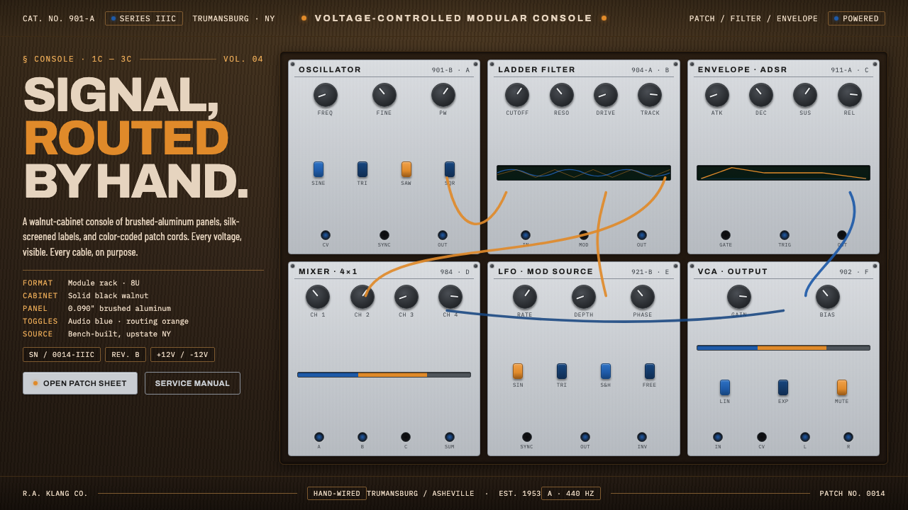
Moog modular synthesis made circuitry visible: walnut, brushed aluminum, blue toggles, and orange patch cords turning every signal into a hand-routed decision.
Moog Modular Synth in brief
The Moog modular synthesizer is a foundational electronic instrument of the mid-twentieth century, defined by brushed-aluminum module panels, silk-screened technical labels, knobs, color-coded toggle switches, and a solid walnut console. Its appearance is not separate from its operation. The cabinet establishes warmth and permanence; the metal panels expose the machine’s working surface; the cords make relationships between modules visible.
The design language built from this hardware is dark, technical, and tactile. A walnut ground supports pale blue-gray panels arranged as rectangular modules. Condensed labels sit close to controls, while toggle-blue switches and orange patch cords introduce precise accents. The result feels like an instrument panel rather than a decorative interface: every mark identifies a function, every color traces a role, and every curve records a connection.
Moog Modular Synth is best understood as a visual system of visible signal flow. The grid supplies order, the controls supply local decisions, and the patch cords carry movement across the whole field. Its character comes from professional restraint: dense but legible, precise but handmade, mechanical without becoming cold, and absolutely unwilling to appear soft or ornamental.
Where does Moog Modular Synth come from?
The Moog modular belongs to the 1950–1990 period, from the 1c, 2c, and 3c systems through the Model 10 era and onward. Its regional identity is North American, specifically Trumansburg and upstate New York. That location matters to the design imagination because the system’s spirit comes from a woodworking workshop: professional, exacting, restrained, and built around material decisions that remain visible.
Robert, or Bob, Moog is the central named figure associated with the instrument, while R.A. Moog Co. represents the company identity carried by the hardware. The visual authority of the system comes from the meeting of those two scales: a personal instrument-making sensibility and a coherent manufactured language. The walnut cabinet, aluminum panels, labels, controls, switches, and cords form a recognizable whole rather than a collection of unrelated parts.
The underlying movement is voltage-controlled modular synthesis. In a modular instrument, the surface is organized around independent rectangular modules and the connections between them. Patch cords do more than decorate the face of the machine: they route voltages and make the logic of the instrument readable from the outside. This is why the interface language privileges visible pathways, local controls, and clear module boundaries.
The broader historical setting is the rise of electronic music. As electronic sound became a distinct field of practice, the modular synthesizer offered a visual identity for experimentation conducted through hardware. Moog’s design system therefore carries both workshop discipline and exploratory energy: stable panels and labels establish control, while colored cords crossing the grid show that the final arrangement is active, contingent, and made by hand.
What defines the Moog Modular Synth look?
Walnut Ground
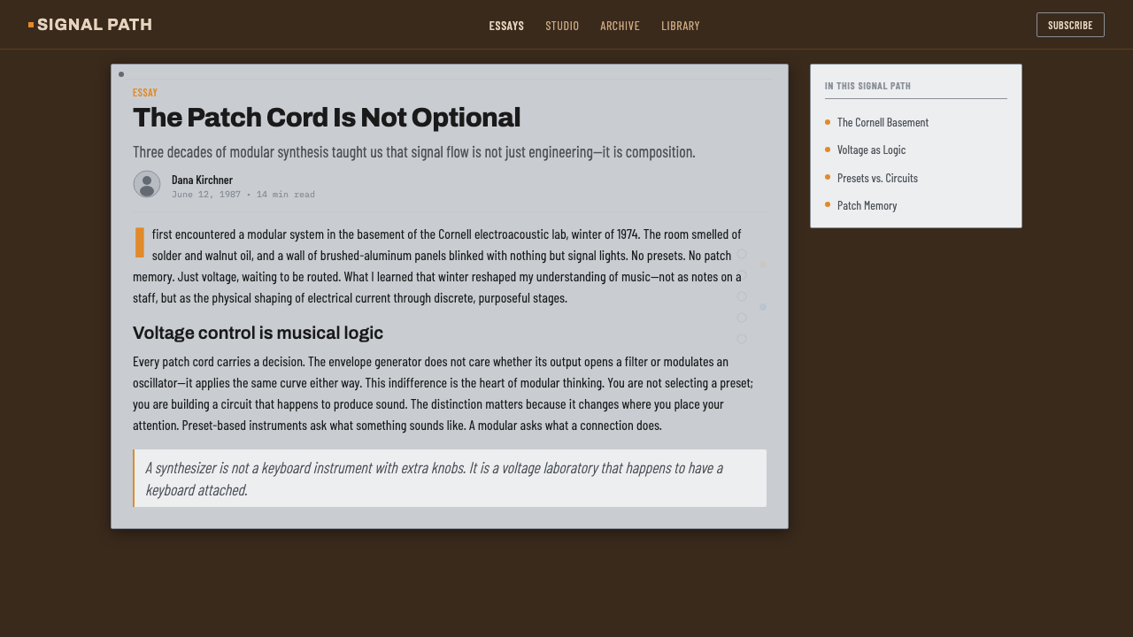
The dark walnut cabinet is the emotional and material ground of the system. It keeps the interface from becoming an anonymous metal instrument and gives the dense controls a sense of enclosure. In digital work, walnut should read as a deep, quiet surface rather than a glossy wood texture. Its job is to establish warmth, weight, and workshop character behind the more active panel elements.
Brushed Aluminum
Pale blue-gray aluminum panels provide the working plane. Their visual texture should be restrained and directional, suggesting brushed metal without becoming photorealistic. Panels are framed as functional territories, each with its own labels and controls. The contrast between dark wood and pale metal is essential: one surrounds the instrument, the other exposes its operational surface.
Technical Labeling
Typography is condensed, compact, and informative. Labels stay close to the control they explain, creating a direct relationship between word and mechanism. The voice is technical without being futuristic: short names, clear grouping, and disciplined alignment matter more than expressive display type. Text should feel screen-printed onto a panel, not floated above it as a separate layer.
Switches and Controls
Knobs, toggle switches, and small control marks create a field of deliberate local decisions. Controls should look reachable and mechanical, with clear resting states and visible changes when activated. Toggle blue is an identifying accent rather than a general decoration. The interface gains credibility when every control appears to belong to a real module with a specific responsibility.
Patch-Cord Flow
Orange patch cords are the most active visual element. They curve across the rectangular module grid, carrying color and attention from one point to another. Their paths should remain legible, with crossings treated as meaningful routing rather than visual noise. A cord can connect, emphasize, divide, or create a reading direction, but it should never be added merely to make an empty surface feel busier.
Rectangular Modularity
The composition is organized by rectangular modules rather than by a single undifferentiated canvas. Each block has a boundary, a purpose, and a relationship to adjacent blocks. Repetition creates the discipline of an instrument rack, while variation in controls and cord routes keeps the surface alive. The system feels modular because structure is consistent even when the content changes.

Who shaped Moog Modular Synth?
Bob Moog is the named individual at the center of this design language. His association with the modular instrument is expressed through the balance between crafted enclosure and exposed technical operation: a solid walnut console holds a working surface of aluminum panels, labels, controls, and cords. In Curio, his presence should be felt as instrument-making discipline rather than as a portrait or personal brand treatment.
R.A. Moog Co. names the company scale of the system. Its relevance is visible in the consistency of the hardware language: related panels, labels, switches, and module boundaries read as parts of one instrument family. The company figure is therefore useful when applying the style to a complete product surface, where coherence across many modules matters more than the novelty of any single component.
Voltage-controlled modular synthesis is the conceptual figure behind the visual system. It explains why the interface is divided into modules and why patch cords are treated as visible paths rather than decoration. The design should communicate that behavior is assembled through relationships between parts. A surface becomes convincing when users can understand what is connected, where a signal travels, and which local control changes its behavior.
The solid walnut console is the physical figure that unifies the system. It turns a collection of technical panels into an instrument with a recognizable body. Its importance lies in enclosure and contrast: dark wood surrounds pale metal, while colored switches and cords punctuate the ordered surface. Any adaptation that loses this relationship may retain the controls but lose the unmistakable Moog character.
How do you use Moog Modular Synth today?
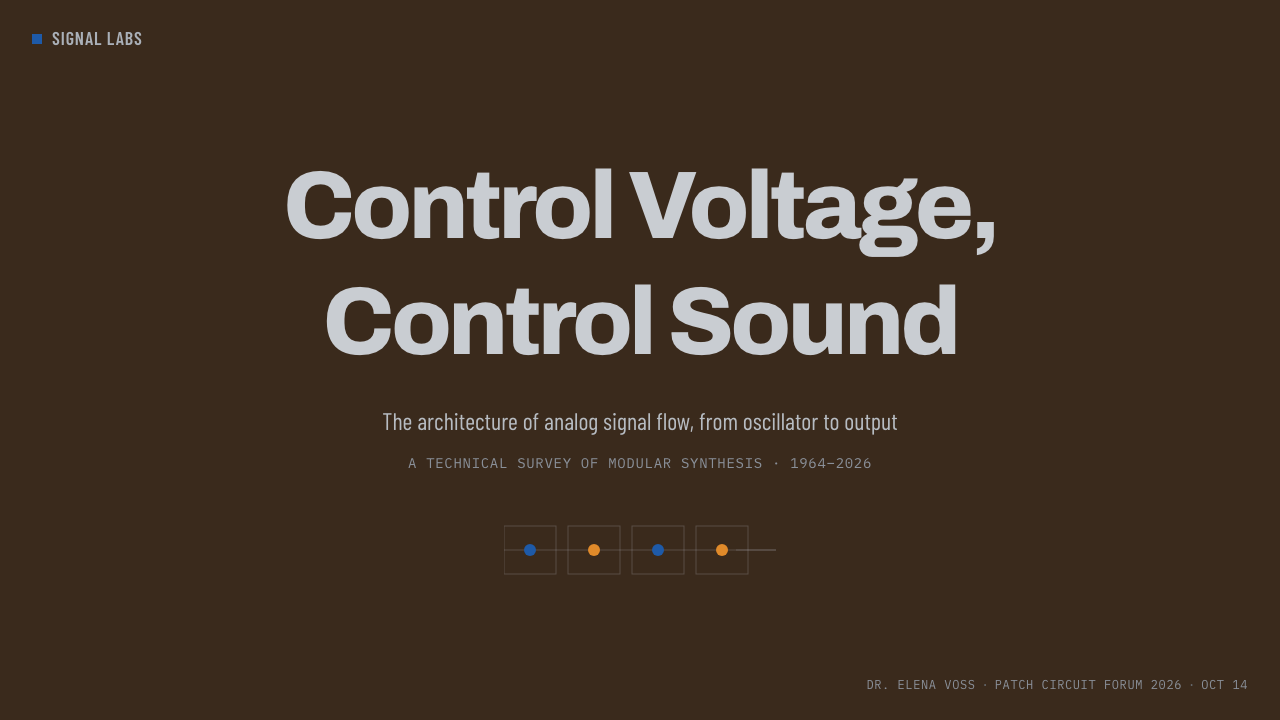
For presentation slides, use the cover as a single instrument face: a dark walnut field, a strong pale module panel, a condensed title, and a small number of blue or orange control accents. Content slides should behave like connected modules, with each section assigned a clear panel and technical label. Data slides can translate charts into signal diagrams: lines become routes, nodes become controls, and orange connections explain movement through the information. The key is to make hierarchy feel operational, as if the audience is reading a machine while reading the story.
For web interfaces, the style is especially effective for dashboards, pricing pages, and tools that need to communicate states, relationships, and active configuration. Use the walnut ground to establish the shell of the product, then place pale blue-gray panels into a disciplined module grid. Reserve toggle blue for active controls and orange for routes, emphasis, or live connections. Cards should feel like instrument modules with clear boundaries and labels. Avoid soft, floating surfaces that detach information from the system around it.
For editorial and marketing work, Moog Modular Synth can turn technical subject matter into a tactile visual argument. Articles benefit from panel-like sectioning, compact metadata, restrained headings, and orange rules or cord-like paths that guide the eye. Marketing pages can frame a product as something assembled and controllable: modules explain capabilities, switches signal choices, and patch paths show how features relate. The walnut ground supplies authority, while the aluminum field keeps the message precise and legible.
The common mistake is treating the style as a dark theme with random neon accents. Moog Modular Synth depends on a specific relationship between materials, function, and routing. If every element glows, if orange cords are used without a connection to meaning, or if labels become futuristic decoration, the system loses its workshop discipline. Keep the surface quiet, let modules carry responsibility, and make every color accent answer a functional question: what is active, what is connected, and what deserves attention?
Moog Modular Synth — FAQ
Is Moog Modular Synth simply a dark interface style?
No. Darkness is only the ground. The identity comes from the relationship between walnut, pale aluminum, technical labels, modular boundaries, blue toggles, and orange patch routes. Remove the material contrast or the visible signal flow and the result becomes a generic dark dashboard. The style works when the interface feels assembled, operated, and connected rather than merely colored dark.
Why are patch cords so important?
Patch cords are the clearest visual expression of modular logic. They show that behavior travels between separate parts and that the arrangement is made through active routing. In an interface, they can guide attention, show dependencies, or mark a live relationship. They should remain readable and purposeful. A cord added only as decoration turns the central idea of visible connection into clutter.
Can the style use a light background?
It can, but the dark walnut ground is a defining part of the supplied system. A lighter interpretation may preserve the aluminum panels, condensed labels, and colored routing, yet it will lose some of the cabinet-like enclosure and material weight. If the background is light, keep the panel structure and signal-flow logic especially strong so the adaptation still reads as an instrument system rather than a general technical interface.
What should the blue and orange accents mean?
Toggle blue should identify active control states or switch-like decisions. Orange should behave like a patch cord: it can indicate routing, movement, emphasis, or a live connection. These meanings are not decorative rules but a way to preserve the source hardware’s logic. If both colors are spread indiscriminately across every label and surface, they stop communicating and the system becomes visually loud.
Which products suit this design language?
It suits products that benefit from visible structure and a sense of controlled complexity: dashboards, configuration tools, pricing systems, technical education, and creative software. It is strongest when users need to understand states, modules, and relationships. It is less suitable when the central promise depends on softness, lightness, or decorative luxury. The right question is whether the product wants to feel operated like an instrument.
Related design styles
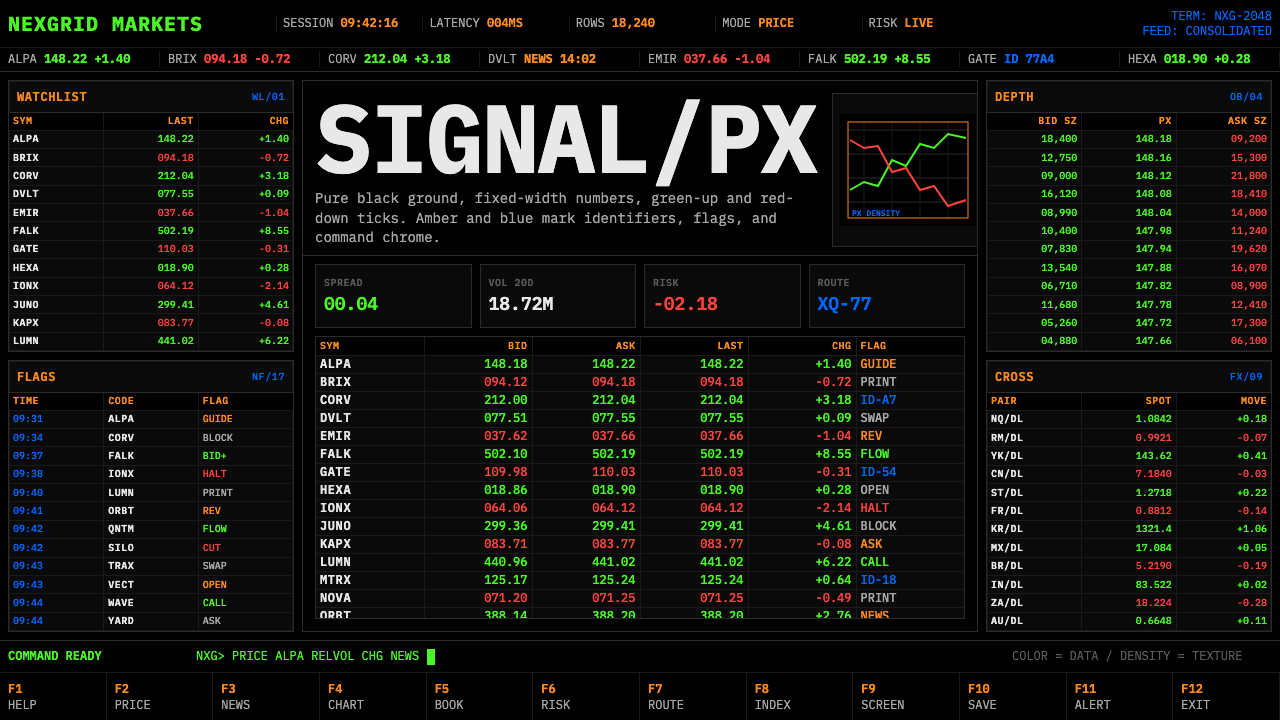 Financial Terminal MonoMaximum signal per pixel. Pure black, IBM Plex Mono, green-red ticks, amber-b…
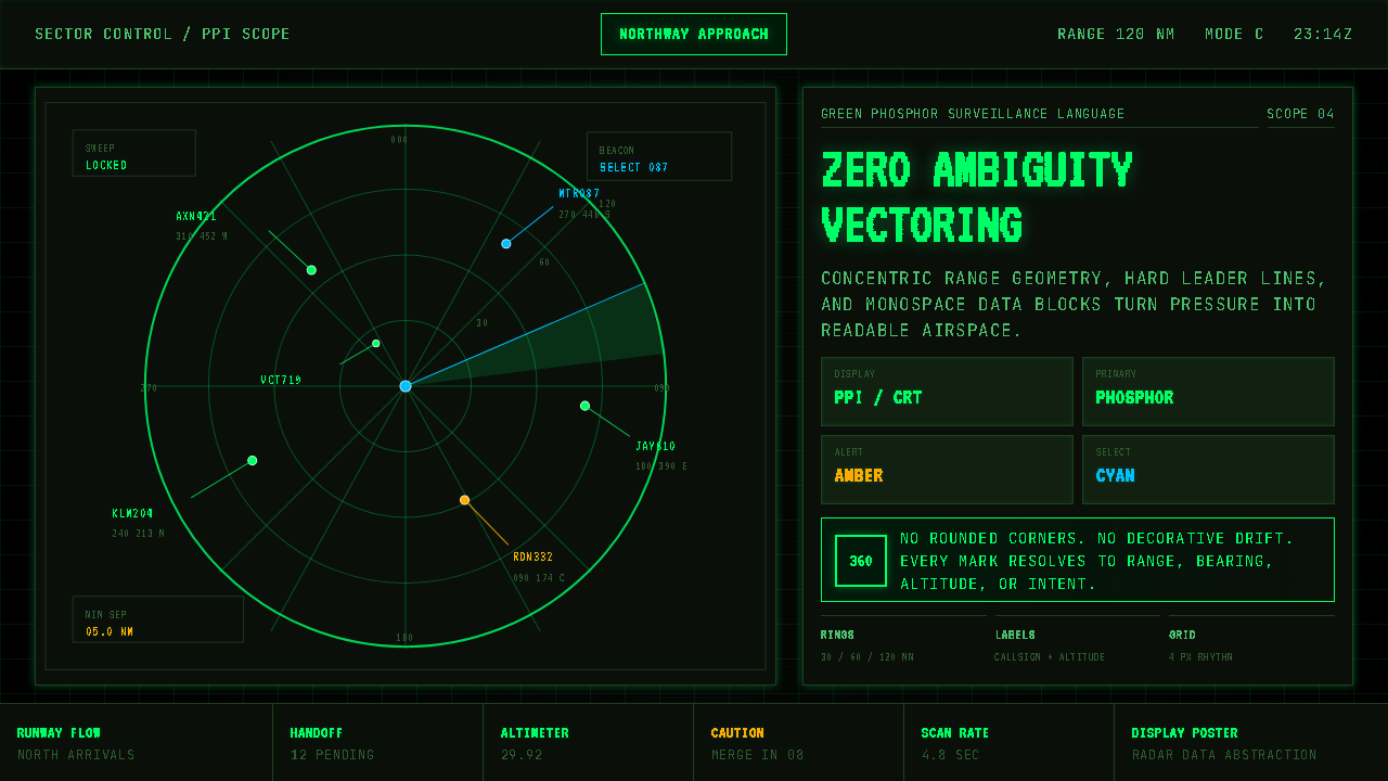 Air Traffic Control RadarOperational gravity. Phosphor green rings, sweep wedges, and monospace blips…
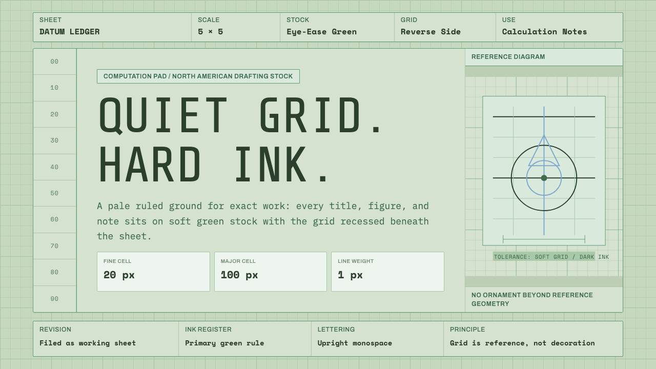 Engineering Graph PadQuiet precision. Eye-ease green, monospace title blocks, and a faint reverse-…
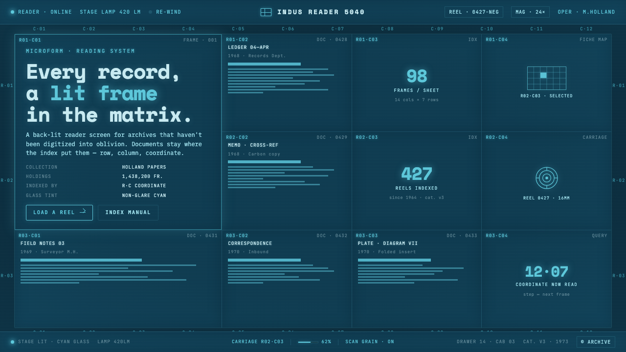 Microfiche ArchiveRecords as lit frames in a matrix. Cyan-blue back-lit panel, glowing mono typ…
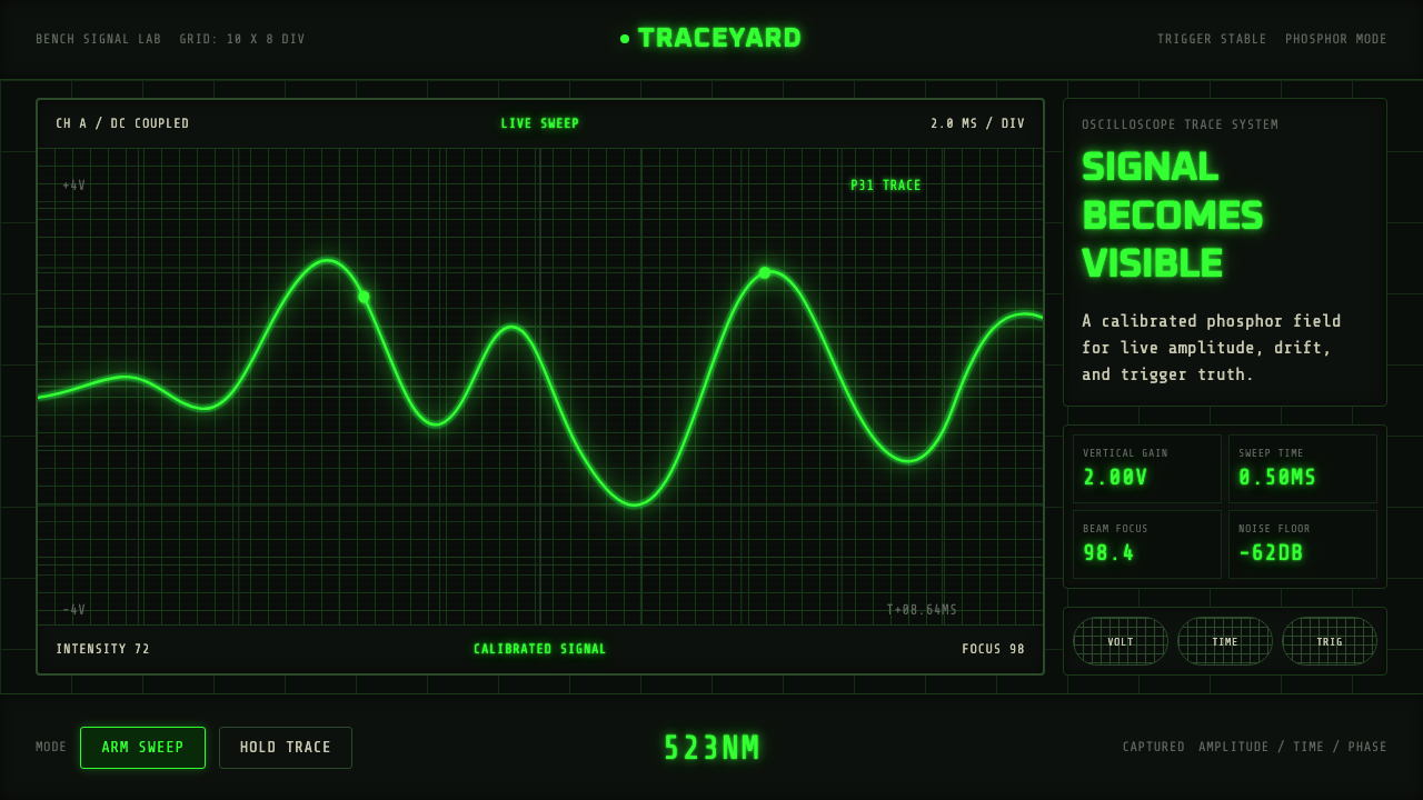 Oscilloscope TraceMeasurement glows. P31 green waveforms burn through a black graticule.
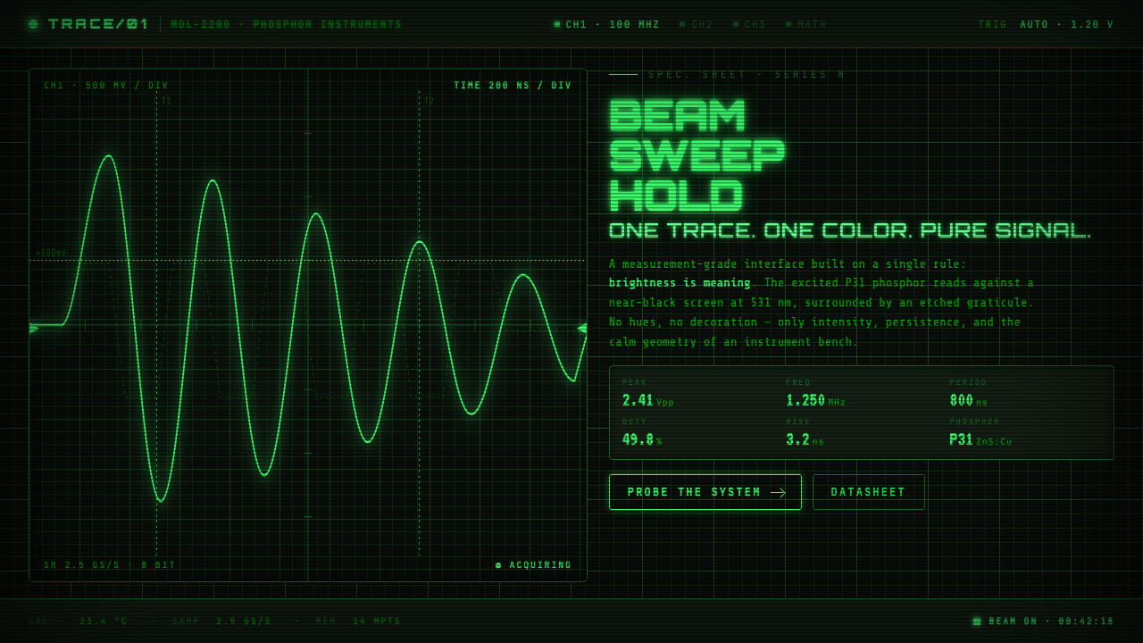 Oscilloscope WaveformBrightness is meaning. One P31 phosphor trace glowing across an etched gratic…