What is Yugoslav Socialist Modernism?
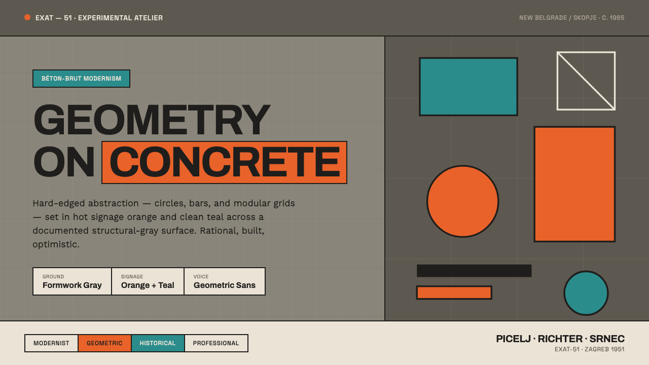
Yugoslav Socialist Modernism turns concrete into an optimistic public language: hard-edged geometry, vivid wayfinding, and the disciplined confidence of construction.
Yugoslav Socialist Modernism in brief
Yugoslav Socialist Modernism is a visual language rooted in the socialist period of the Socialist Federal Republic of Yugoslavia, especially the urban settings associated with New Belgrade, Skopje, and Zagreb. It joins two visible systems that might initially seem opposed: the uncompromising material presence of béton-brut concrete and the ordered, energetic abstraction associated with the EXAT-51 group. The result is neither decorative nostalgia nor neutral institutional minimalism. It is architecture and graphic order speaking in the same voice.
Its surfaces begin with warm structural formwork gray. This is not a substitute for white paper, cream gallery walls, or polished stone. The concrete ground matters because it records construction: seams, mass, casting, and the practical logic of a building made from poured material. Against that dense field, hot orange and clean teal appear as sharply bounded blocks of information. Their role is public and spatial, carrying emphasis, orientation, and optimism without softening the structural ground beneath them.
The style is organized through circles, bars, modular grids, and geometric grotesque lettering. These elements inherit a lineage from Constructivism, Bauhaus, and De Stijl through EXAT-51 geometric abstraction, but they are not presented as a museum exercise. In this setting, geometry becomes wayfinding and civic communication. A circle can establish a visual destination, a bar can direct movement, and a grid can make a large concrete environment feel legible. The overall effect is rational, direct, and constructive rather than luxurious or intimate.
Where does Yugoslav Socialist Modernism come from?
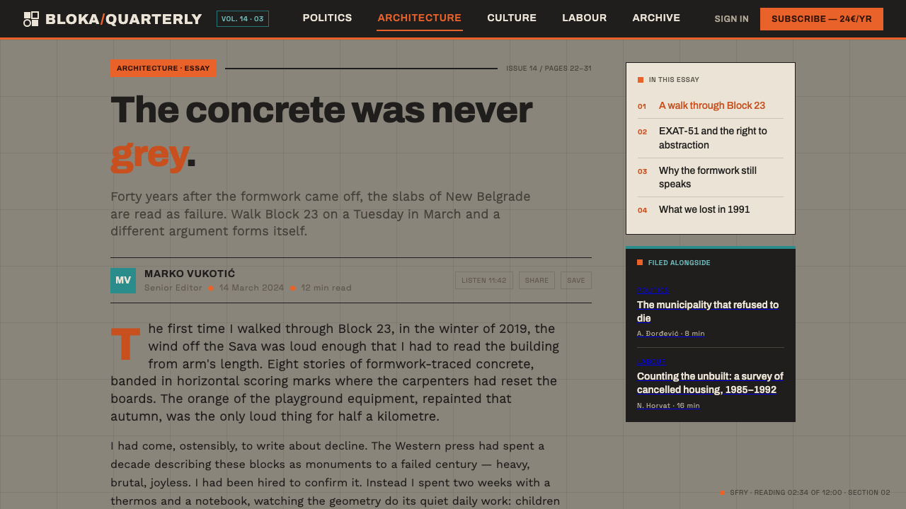
The historical frame is the socialist period of the Socialist Federal Republic of Yugoslavia, spanning 1950 to 1990, with the style’s central moment situated around 1965. Its geography is specific: New Belgrade, Skopje, and Zagreb provide the urban context in which monumental modern building, public circulation, and graphic systems could meet. This is important because the style is inseparable from scale. It was formed for collective environments, where a visual language had to operate across facades, public routes, signs, and broad civic surfaces rather than only within a private room or a small printed object.
EXAT-51, founded in 1951, supplies the style’s hard-edged abstract vocabulary. Its geometric approach belongs to a documented heritage of Constructivism, Bauhaus, and De Stijl. From Constructivism comes the sense that form can organize action; from Bauhaus comes an interest in visual clarity and functional communication; from De Stijl comes the discipline of reduced geometry and deliberate relationships among planes. In Yugoslav Socialist Modernism, this inheritance becomes less like an isolated composition and more like an operating system for public space.
The other essential source is béton-brut Brutalist modernism. Raw concrete is not merely a backdrop behind the graphic layer; it is the visual fact that gives the abstraction its force. Formwork gray establishes weight, permanence, and structural honesty. Orange and teal then read as interventions rather than ambient decoration. Their crispness makes the concrete appear even more concrete, while the concrete makes the color blocks feel purposeful, architectural, and public.
Ivan Picelj, Vjenceslav Richter, and Aleksandar Srnec are the key figures named within this context. Together with the EXAT-51 legacy, they identify the artistic and design-oriented side of a language that is often reduced to its architecture alone. Their presence matters because the style is not simply brutalism with colorful signs. It is a fusion: geometric abstraction provides the syntax, béton-brut provides the ground, and socialist-modern public ambition gives the system its scale and purpose.
What defines the Yugoslav Socialist Modernism look?
Concrete Ground
Warm formwork gray is the governing field. It should feel structural, recorded, and materially present rather than polished into a neutral backdrop. The surface carries the weight of béton-brut modernism: mass comes before embellishment, and the evidence of construction remains part of the composition. Cream and pure white undermine this premise by making the work feel detached from its architectural ground.
Hard-Edged Color
Hot orange and clean teal appear as decisive, unmuddied signage blocks. They do not drift into atmospheric washes or decorative gradients. Their edges should be as certain as the geometry they support, making color read as information, direction, and public energy. The contrast with concrete is fundamental: color is an active intervention on a heavy structural field.
Geometric Abstraction
Circles and bars form the most immediate vocabulary, supported by modular grids and hard planar relationships. Geometry is not added to make a surface look modern; it organizes orientation and visual hierarchy. A repeated form can establish rhythm across a large field, while an isolated circle or bar can concentrate attention. The language should remain abstract, legible, and spatially useful.
Geometric Grotesque Type
Typography functions as wayfinding rather than ornament. Geometric grotesque letterforms should feel clear, civic, and compatible with bars, circles, and ruled structures. The type belongs to the system of orientation: it names, directs, and stabilizes the composition. Its authority comes from clean construction and firm hierarchy, not from expressive flourishes or nostalgic display effects.
Modular Public Order
The grid is a framework for collective scale. It allows graphic elements to move across concrete surfaces without becoming arbitrary, and it gives signage a repeatable public logic. Alignment should feel disciplined but not timid. The modules create a sense that separate signs, panels, and spatial markers belong to one larger civic system.
Constructive Optimism
Despite the weight of raw concrete, the mood is not bleak. The clear teal and hot orange, the ordered geometry, and the direct wayfinding introduce an optimistic socialist-modern tone. This optimism is disciplined rather than cheerful for its own sake. It suggests that public space can be organized, understood, and actively shared through design.

Who shaped Yugoslav Socialist Modernism?
Picelj is named as a key figure in the EXAT-51-related context of Yugoslav Socialist Modernism. His inclusion identifies geometric abstraction as central to the style’s identity, not a secondary graphic treatment added after the architecture is complete. In this visual language, abstract form is part of how public modernism becomes visible and legible.
Richter is one of the key figures attached to the movement’s documented setting. His presence underscores the style’s refusal to separate artistic abstraction from architectural and civic space. Yugoslav Socialist Modernism relies on that connection: geometry must hold its own beside structural concrete and still operate as a shared public language.
Srnec is named among the key figures connected to this geometric modernist lineage. His place in the account reinforces the importance of EXAT-51’s abstract discipline: circles, bars, and modular relationships are not generic retro motifs. They are the formal basis for a visual system that translates optimism and order onto a materially demanding concrete ground.
How do you use Yugoslav Socialist Modernism today?
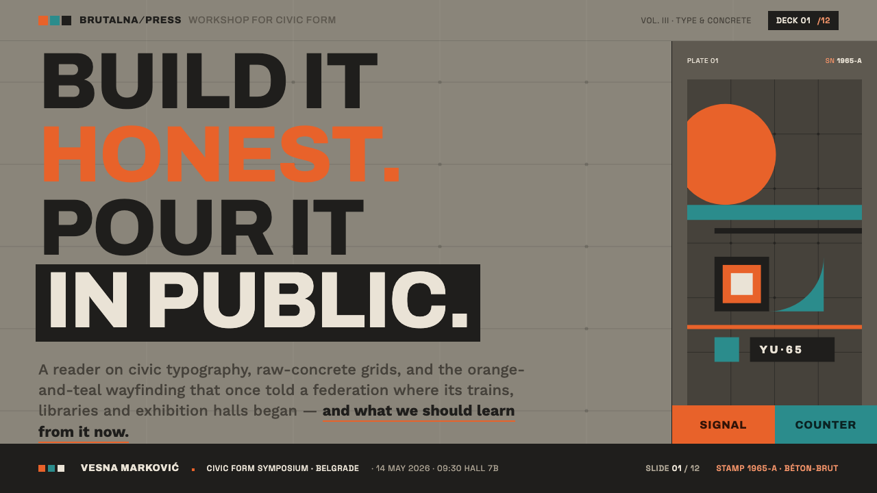
For presentation covers, use the concrete field as the primary statement rather than treating it as texture behind a conventional title block. Let one large circle, a decisive bar, or a small family of aligned modules establish the composition, then place the title in geometric grotesque type with unambiguous hierarchy. Orange or teal should act as a concentrated public signal. The cover should feel like an entrance marker in a civic complex: direct, spatial, and built.
Content slides should work as wayfinding boards. Use a consistent modular structure to distinguish headings, explanatory text, captions, and section markers, with rules and bars doing the organizational work. Data slides benefit especially from the language: charts can become firm geometric constructions against the formwork-gray ground, while orange and teal separate categories or highlight the active reading path. Avoid turning every data element into a colorful accent; hierarchy must remain more important than decoration.
For web interfaces, the style suits dashboards, public-information tools, analytical products, and pricing pages that need a strong sense of orientation. Start with a structural gray ground, clear zones, and a grid that makes navigation feel architectural. Geometric grotesque labels should carry the interface, while circles and bars can mark status, movement, or grouping. Use the bright colors as signals with consequence, such as key actions, changes in state, or plan differentiation, instead of distributing them evenly across every component.
For editorial and marketing work, think in terms of panels, route markers, and large-scale public notices. A feature page can alternate dense concrete fields with quieter open areas, using bars to separate topics and circular forms to create a recurring visual destination. Marketing copy should be compact and declarative, supported by the same visual logic as the navigation. The style works best when the message concerns systems, culture, construction, urban life, or ambitious collective activity; its strength is public conviction rather than domestic softness.
The common mistake is to imitate the look with gray backgrounds and random orange-blue shapes while losing the relationship among material, geometry, and function. A generic dark-gray interface with colorful pills is not Yugoslav Socialist Modernism. The gray must feel like structural concrete, the colors must behave like clear signage, and every circle, bar, grid, and typographic decision must improve orientation. Another frequent error is making the palette muddy or softened; this style depends on clean color against an uncompromising ground.
Yugoslav Socialist Modernism — FAQ
Is Yugoslav Socialist Modernism simply Brutalism with brighter colors?
No. Béton-brut Brutalist modernism supplies the raw concrete ground, but EXAT-51 geometric abstraction supplies an equally essential formal system. The circles, bars, grids, and geometric grotesque wayfinding are not optional accents placed on a brutalist surface. They organize how the surface communicates. The style emerges from the fusion of structural material and hard-edged abstraction, not from adding colorful decoration to concrete.
Why is the gray ground so important?
Because the ground is meant to read as warm structural formwork gray, not as a generic neutral background. It anchors the language in the visual reality of béton-brut concrete and gives the orange and teal blocks their sharp public force. Replacing it with cream, white, or a polished gray changes the premise: geometry starts to feel graphic in isolation instead of embedded in an architectural, constructed environment.
How should orange and teal be balanced?
Treat both as clear signage colors rather than atmospheric palette members. They should appear in compact, hard-edged blocks that establish emphasis or orientation against the concrete field. The important decision is not equal distribution. One color can lead a page or route while the other supports distinction, provided both remain clean, legible, and visibly tied to the geometric system.
Can this style work for a consumer brand?
It can, when the brand benefits from clarity, urban scale, construction, cultural confidence, or a strong public-facing point of view. It is particularly effective where navigation, information hierarchy, or system thinking are central to the experience. It is less natural for brands that depend on softness, ornament, sensory abundance, or a handcrafted domestic mood. The decision should follow the brand’s values, not the visual novelty of concrete alone.
Related design styles
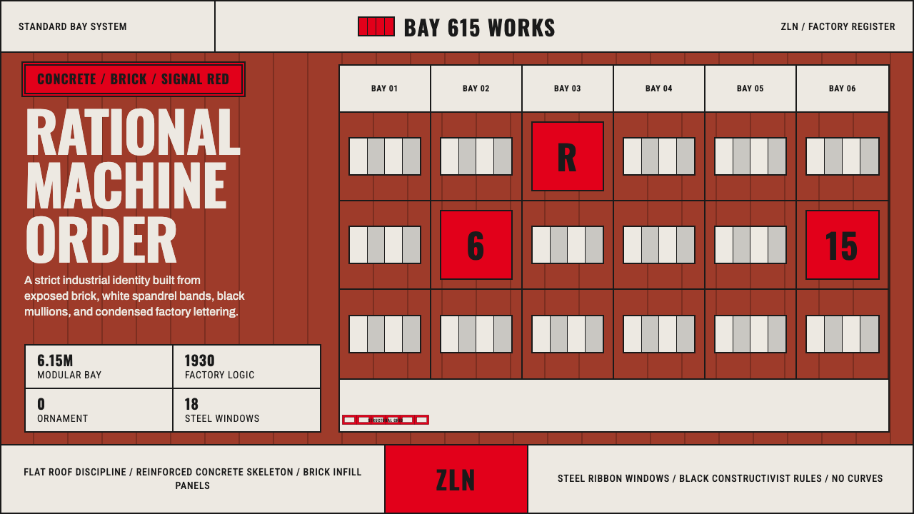 Baťa Zlín Functionalist BrandMachine-age precision. Brick red, concrete bands, and Oswald type lock into a…
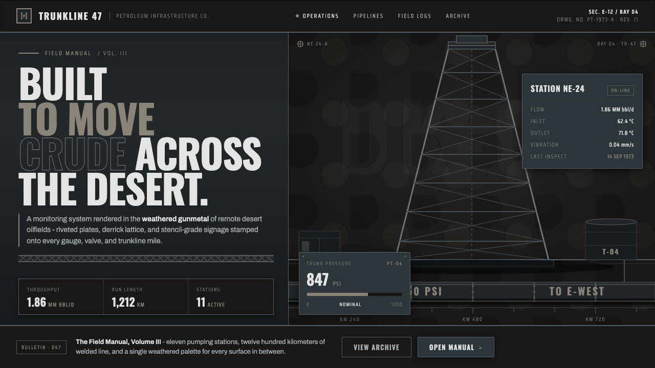 Gulf Oil Derrick IndustrialEngineered, not decorative. Soot-darkened gunmetal, derrick lattice, condense…
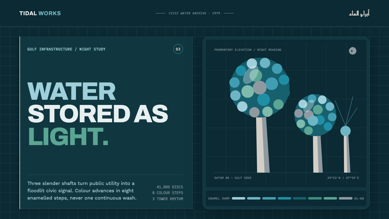 Kuwait Water TowersInfrastructure becomes a night monument. Eight enamel steps spiral across a d…
 Lunar RoverBuilt for the vacuum. Kapton-gold foil and stencil part-numbers against void-…
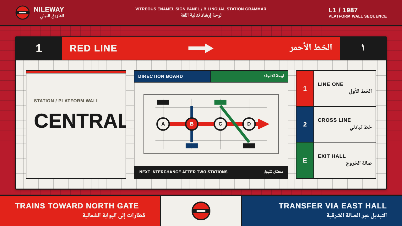 Cairo Metro WayfindingAuthority at speed. Enamel red, Arimo grids, and co-equal Arabic signage.
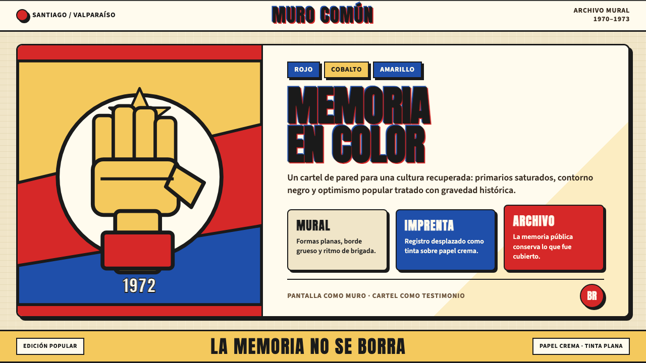 Chilean Allende-Era Propaganda (1972)Solemn revolution. Red, cobalt and yellow lock into thick black mural geometr…