What is Lunar Rover?
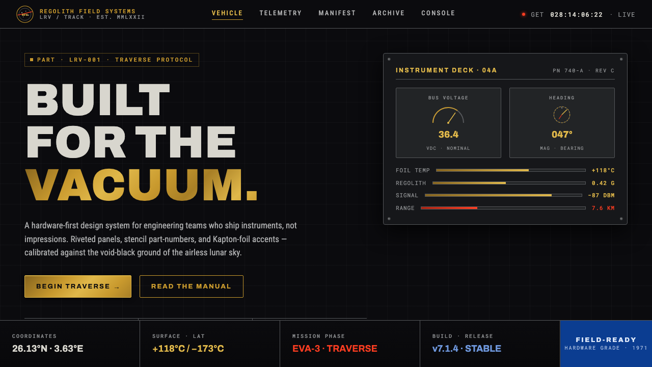
Lunar Rover turns aerospace survival hardware into a visual language: Kapton gold, stencil numerals, riveted geometry, and instrument grids suspended against the blackness of space.
Lunar Rover in brief
Lunar Rover is the visual language distilled from the Apollo Lunar Roving Vehicle and the engineering culture around it. Its defining image is amber-gold aluminized Kapton foil catching light against a pitch-black, airless sky and medium-gray lunar regolith. The result is severe, technical, and unmistakably tied to the space-age engineering aesthetic of North American NASA.
This is hard-edged aerospace functionalism rather than retro nostalgia. Riveted panels, wire-mesh wheels, stencil part-numbers, and instrument-deck grids are treated as visual evidence of purpose. Components are shown in sharp orthographic framing, with surfaces, seams, labels, and structural divisions made legible instead of softened into atmosphere.
The style depends on contrast and restraint. Void-black establishes the field; metallic gold supplies the glint of protective hardware; lunar gray provides a grounded mineral counterweight. Typography behaves like equipment marking, not decoration. NASA’s Worm and Meatball identity systems form the historical roots of its lettering and color logic.
Where does Lunar Rover come from?
The Lunar Rover aesthetic belongs to a broad period from 1950 to 1990, with its strongest Apollo association concentrated between 1969 and 1972. Its region is North America, specifically the United States space program organized through NASA. The style emerged from an environment in which engineering, mission reliability, and visual identification were inseparable.
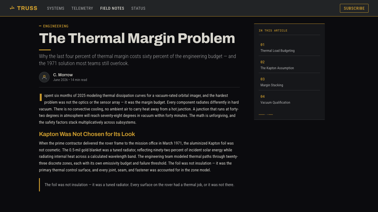
The Apollo Lunar Roving Vehicle crossed the Moon between 1971 and 1972. Its aluminized Kapton thermal foil became the central visual fact of the object: a protective surface that reads as amber-gold under harsh light. Against the airless lunar sky and gray regolith, the material created an image that was both practical hardware and an exceptionally concentrated symbol of space-age design.
The vehicle’s visual lineage is associated with the Boeing and GM Delco LRV team. Their presence matters less as a source of personal authorship than as a reminder that the style belongs to a coordinated engineering system. Panels, wheels, labels, and instrument grids do not appear as isolated motifs; they form a coherent field of parts designed to operate together.
Two NASA identity systems provide the style’s graphic roots: the Worm and the Meatball. Alongside the LRV’s physical vocabulary, these marks establish a tension between streamlined lettering, orbital imagery, and hard technical labeling. Lunar Rover therefore reads as a meeting point between institutional identity and exposed machinery, between a designed sign and the evidence of construction.
What defines the Lunar Rover look?
Void-Black Ground
Black is not merely a background color; it represents the airless lunar sky and gives every reflective or metallic element maximum presence. Large uninterrupted dark fields create visual silence, allowing a gold foil edge, gray wheel, or white label to register with the clarity of a technical diagram.
Kapton Gold
Gold is treated as thermal foil, not luxury ornament. Its amber metallic quality should appear creased, reflective, and slightly irregular, with light catching folds and edges. Used sparingly, it becomes the style’s strongest accent and the clearest signal of engineered protection.
Stencil Typography
Lettering should feel applied to hardware: stenciled, compact, legible, and governed by operational necessity. Part-numbers, labels, and short technical phrases can sit directly on dark panels or beside structural seams. Typography gains authority through placement and repetition rather than expressive flourish.
Riveted Geometry
Rectangular panels, exposed seams, fasteners, and wheel structures create a geometry of assembly. Shapes should look fabricated and connected, not abstractly arranged for decoration. Repetition of joints and panel breaks supplies rhythm while keeping the composition visibly tied to construction.
Instrument-Deck Grid
The grid comes from instruments, controls, and mission information rather than editorial ornament. Lines, compartments, labels, and aligned modules create an interface-like order. The grid can be dense, but every grouping should suggest inspection, navigation, measurement, or system status.
Orthographic Contrast
Objects are framed as if examined from a controlled technical viewpoint. Edges stay sharp, planes remain readable, and depth is communicated through overlap, scale, and material change instead of atmospheric softness. The composition feels observed, catalogued, and ready for inspection.

Who shaped Lunar Rover?
The Boeing and GM Delco LRV team represents the engineering collective associated with the Lunar Roving Vehicle. In the style’s history, the team anchors the visual language in coordinated hardware, where every panel, wheel, label, and grid belongs to a larger operational system.
The Apollo 15 crew is one of the mission crews associated with the LRV’s lunar crossings. Their place in the visual system is operational rather than ornamental: the vehicle is understood through use, movement, and the human presence implied by its mission equipment.
The Apollo 16 crew belongs to the same chain of lunar vehicle imagery. Their association reinforces the style’s central idea that aerospace objects are defined by mission context: tools, markings, and structures gain meaning through the work they are built to support.
The Apollo 17 crew completes the group of crews named in the LRV lineage. Their inclusion keeps the style connected to the sequence of Apollo lunar crossings rather than reducing it to an isolated vehicle silhouette or a generic science-fiction symbol.
How do you use Lunar Rover today?
Lunar Rover works when design needs to communicate technical purpose, controlled risk, and engineered reliability. Build from a dark field, introduce metallic gold as a material accent, use lunar gray for grounded structure, and let labels, seams, and grids carry the hierarchy. The style becomes convincing when every visible decision appears to belong to a system.
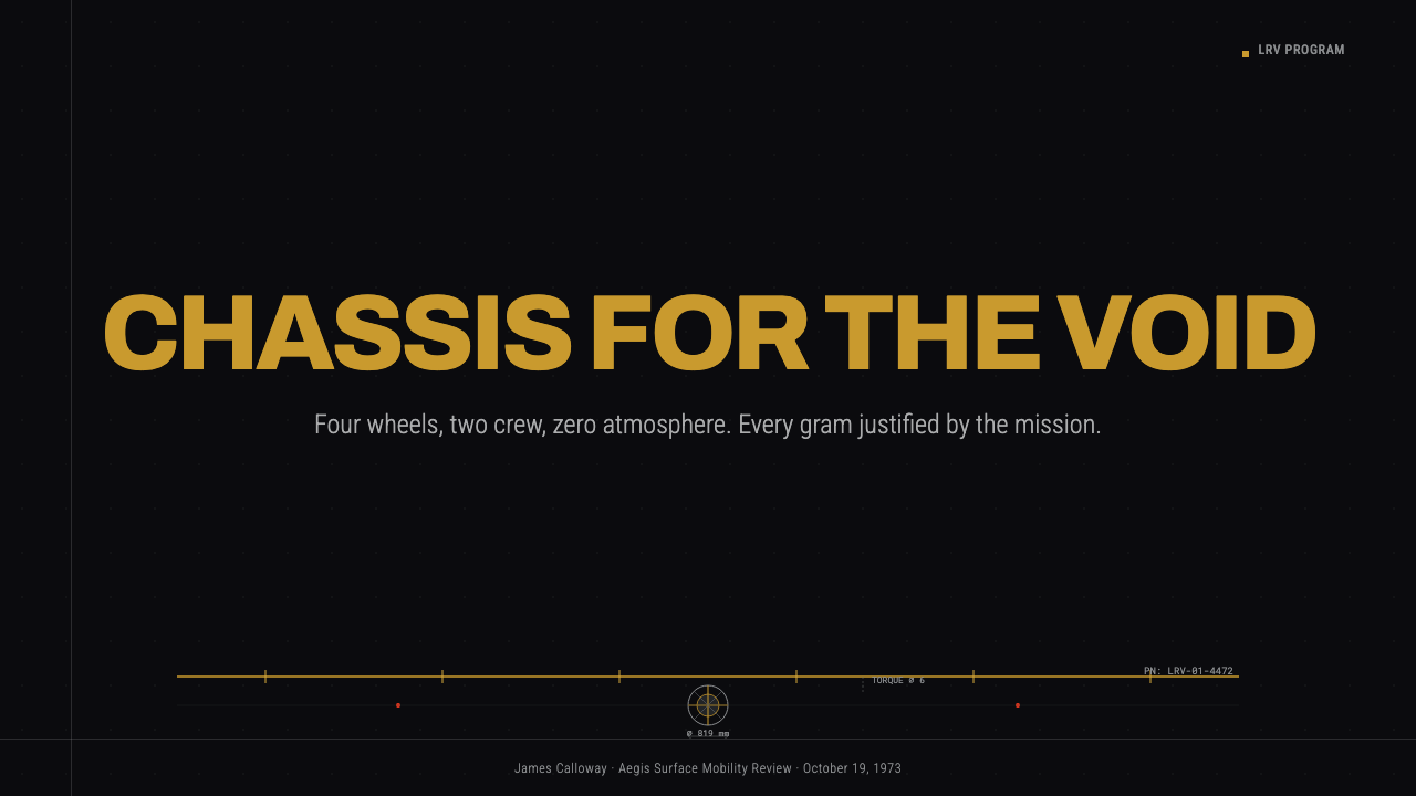
For presentation slides, the cover can use a large void-black field with one gold hardware fragment, a sharply framed lunar vehicle detail, or a compact NASA-rooted identity cue. Content slides should behave like instrument decks: clear panel divisions, stencil-like labels, disciplined alignment, and strong separation between heading, evidence, and annotation. Data slides should make charts feel like mission readouts, with restrained gold and gray accents against the dark field.
For web interfaces, the style suits dashboards, monitoring tools, and pricing pages that need a sense of operational clarity. Panels can resemble instrument modules, with visible borders, compact labels, and a consistent dark hierarchy. Gold should signal active state, priority, or protected capability; gray should carry secondary structure. Avoid making every component metallic, since the power of the palette depends on contrast.
For editorial and marketing work, Lunar Rover supports technical reports, aerospace stories, equipment launches, research platforms, and brands that want to appear exacting rather than luxurious. Use orthographic crops, close views of seams and mesh, large areas of black, and short blocks of stencil-like metadata. Marketing pages can alternate dense information panels with quiet void-black intervals, allowing one gold object or label to carry the visual emphasis.
The common mistake is turning the style into generic science fiction through excessive neon, glowing effects, decorative stars, or polished futuristic surfaces. Lunar Rover is about real hardware under severe conditions. Gold should read as thermal foil, gray as regolith or machinery, and every label should seem to identify something. When the surface becomes too glossy or theatrical, the engineering logic disappears.
Lunar Rover — FAQ
Is Lunar Rover a retro-futurist style?
It can evoke the space age, but its foundation is functional aerospace engineering rather than nostalgia. The decisive cues are Kapton foil, riveted panels, wire-mesh wheels, stencil markings, and instrument grids. If the design becomes theatrical or purely futuristic, it has moved away from the source.
Why is gold central to the palette?
The gold comes from amber-gold aluminized Kapton thermal foil associated with the Lunar Roving Vehicle. It signals protective engineering and reflective material, not wealth or decoration. Its strongest use is selective: a glint, folded panel, or highlighted component against black and gray.
Does every Lunar Rover design need a black background?
A dark ground is structurally important because it represents the void-black lunar sky and creates the style’s defining contrast. Variations can introduce more gray or exposed material, but abandoning the dark field entirely weakens the relationship between gold hardware and the airless lunar environment.
How should NASA Worm and Meatball references be used?
They should be treated as historical roots of the style’s typography and color logic, not as random decoration. Use their institutional, identity-driven quality to guide labels, marks, and visual hierarchy. The surrounding system should still feel like engineered equipment rather than a logo collage.
Where does Lunar Rover work best, and where does it struggle?
It works best for technical dashboards, aerospace communication, equipment launches, analytical products, and information-heavy editorial work. It struggles when the experience depends on softness, organic texture, or decorative warmth. Its severity is a strength only when the product also values precision, structure, and operational clarity.
Related design styles
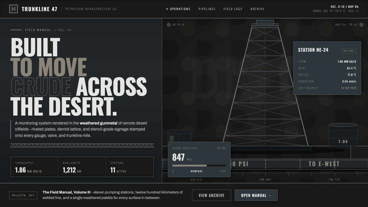 Gulf Oil Derrick IndustrialEngineered, not decorative. Soot-darkened gunmetal, derrick lattice, condense…
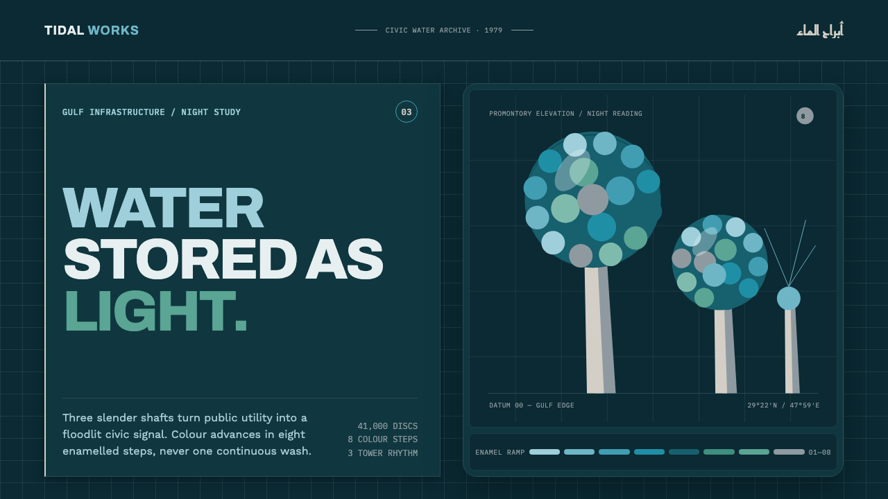 Kuwait Water TowersInfrastructure becomes a night monument. Eight enamel steps spiral across a d…
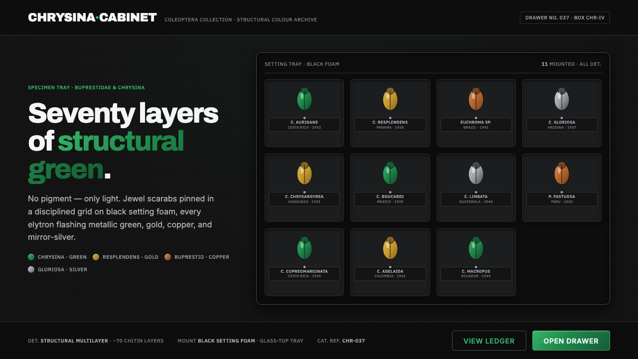 Iridescent Scarab DrawerOrder makes the shimmer read. Jewel scarabs pinned in a grid on black foam, m…
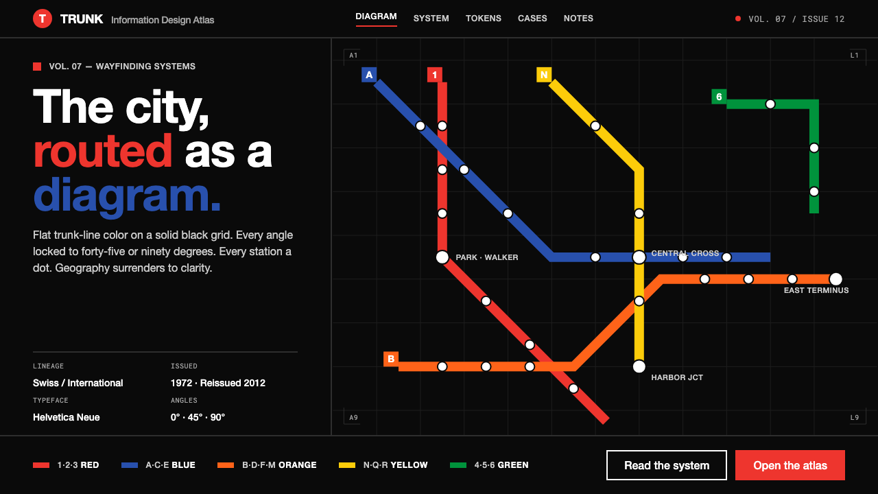 NYC Subway VignelliThe city as a circuit diagram. Flat trunk-line color on black, angles locked…
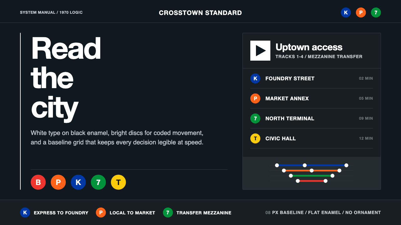 NYC Transit HelveticaOrder made visible. White type, black enamel, route discs, and a grid that ne…
 Yugoslav Socialist ModernismGeometry on concrete. EXAT-51 circles and bars in hot orange and clean teal,…