What is Thorium Molten Salt Reactor?
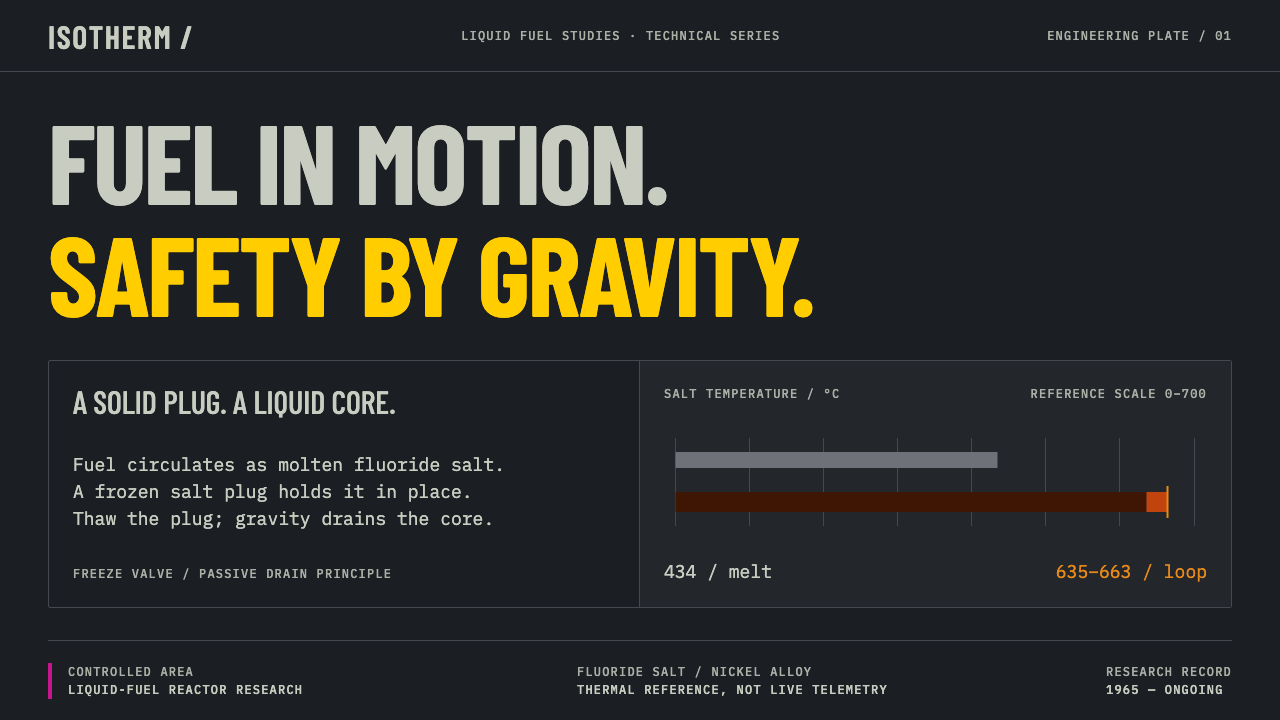
Thorium Molten Salt Reactor dresses a screen like the control cell of a 1960s liquid-fuel reactor — near-black steel, dull heat red, and only two colors bright enough to count as warnings.
Thorium Molten Salt Reactor in brief
Thorium Molten Salt Reactor is a dark, industrial design language drawn from the Molten-Salt Reactor Experiment (MSRE) at Oak Ridge National Laboratory in the United States and from its twenty-first-century successor in Wuwei, China. It treats a nuclear facility not as science fiction but as a working room: steel enclosures, instrument panels, nameplates, and a very short list of colors that signage standards reserve for danger.
The central idea is scarcity of light. Almost everything on the page is a cool, dull, near-black steel grey. Brightness is rationed: caution yellow and the magenta of the radiation trefoil are the only saturated colors allowed to speak, and they speak only when something needs attention. The result is a screen on which a lit element always means something, and a dark element means that nothing is wrong.
Visually, the style is quiet, dense and exact. Condensed lettering keeps labels compact, a pale eggshell tone borrowed from 1960s consoles is kept for readings and nameplates, and a dull red appears only where heat is being signalled. There are no glowing atmospheres, no holographic panels and no decorative aging. It is a design for people who read instruments for a living, and it assumes the reader wants the reading, not the mood.

Where does Thorium Molten Salt Reactor come from?
The Molten-Salt Reactor Experiment ran on liquid fuel. Instead of solid fuel rods, its uranium was dissolved in a fluoride salt of lithium, beryllium and zirconium — a mixture that melts at 434 °C and was pumped around the circuit through Hastelloy-N piping at roughly 635 to 663 °C. It was built at Oak Ridge National Laboratory in Tennessee and began operating in 1965; the period usually attached to it runs from 1965 to 1969. Everything about the plant's appearance follows from that circuit: a hot loop, a heat exchanger, a pump, and the instruments that watch them.
The most famous detail of the design is the freeze valve. Beneath the core sat a plug of the fuel salt that the engineers deliberately froze solid to hold the fuel in place; when the reactor had to be emptied, the plug was thawed and the fuel ran by itself into drain tanks. It is a safety device that is exactly what it sounds like — a valve made of frozen material — and it supplies the visual system with its skeleton: one loop and its switches, with every other element arranged around them.
The colors come straight from photographs of the reactor cell. The metal is a cool, near-black grey. The heat exchanger, at working temperature, shows through as a dull red. Above this restrained palette sit the two saturated hues a nuclear facility is permitted to sign itself with: caution yellow, and the magenta of the trefoil, the radiation symbol codified in ANSI and ISO signage standards. The pale eggshell tone of 1960s control consoles survives for readouts and nameplates. The documentation tradition matters as much as the hardware: the technical-report culture of the laboratory, with its numbered tables, labelled drawings and plain engineering captions, is the visual register the layouts echo.
The lineage runs both backward and forward. Backward, the MSRE descends from the Aircraft Reactor Experiment, the earlier Oak Ridge effort to run a reactor on molten fluoride fuel, and from the wider field of liquid-fuel reactor engineering. Forward, the line is still alive: in China's Gansu province the TMSR-LF1 reactor at Wuwei reached criticality in 2023, and in 2025 its conversion of thorium into uranium was confirmed. That is why 'thorium' sits in the name, and why the design refuses nostalgia. The technology is current rather than historical, so there is no sepia, no scratched film, no retro-futurist glow — only the room as it is.
What defines the Thorium Molten Salt Reactor look?
Steel Ground
The ground is a cool, matte, near-black steel grey, taken from the reactor cell rather than from any idea of a 'dark theme'. It is deliberately not a pure void black; it reads as metal, with enough tonal range between panels, plates and wells that structure can be shown by value alone. Surfaces step slightly lighter or darker to separate regions, never by adding decoration.
Rationed Saturation
Only two saturated colors exist: caution yellow and the trefoil's boundary magenta. Yellow marks cautions and states that need attention; magenta marks radiation boundaries and the most serious conditions. Because nothing else on the page competes, either color registers instantly. Using them for ordinary decoration, links or buttons would spend a signal the whole system depends on.
Heat Red
A dull, dark red stands for heat, echoing the heat exchanger glowing faintly at working temperature. It is not an alarm red. It appears as a tint on a thermal readout, a bar, or a region that is hot but behaving normally, and it keeps a clear distance from the yellow and magenta that signal danger. The distinction between 'hot' and 'wrong' is part of the system's grammar.
Eggshell Readouts
The pale eggshell tone of 1960s control consoles is kept for the information people actually read: numeric readings, nameplates, gauge faces and table cells. Against the dark steel it gives instruments a legible, slightly warm paper-like surface, and it keeps long reading from becoming a contest between glaring white and murky grey. It is used as a surface for reading, not as a highlight.
Condensed Labels
Lettering is condensed and tightly set, the way labels are on a crowded panel where every square of space has a job. Titles and tags read as stamped or engraved nameplates rather than as marketing headlines, and numerals are treated as instrument data that should align cleanly in columns. The tone is that of a technical report: factual captions, no flourish, no cleverness.
One Loop, Its Switches
Layouts organize around a single circuit and the controls that govern it, echoing the reactor's loop and its freeze valve. Information is arranged along the path of the system — source, pump, exchanger, drain — with indicators sitting where the thing they report on would physically be. The page is a schematic first and a composition second.
No Ambient Light
There are no glows, bloom effects, atmospheric gradients or holographic panels. An indicator lamp lights only when it has something to say, and it lights flat and crisp. This refusal is the opposite of the sci-fi interface cliché: the more serious the facility, the less the screen tries to impress, and the more it trusts the operator to read.

Who shaped Thorium Molten Salt Reactor?
Weinberg directed Oak Ridge National Laboratory and is the figure most closely associated with arguing for liquid-fuel reactors as a serious route for civilian nuclear power. His name anchors the conviction behind the experiment: that a reactor whose fuel is a flowing salt could be safer and simpler to reason about. The style inherits that outlook, treating the reactor as a system to be understood plainly rather than a spectacle to be dramatized.
Bettis is listed among the key figures of the Oak Ridge liquid-fuel line, a lineage that runs from the Aircraft Reactor Experiment through to the MSRE. He stands in the theme for the engineering continuity between the two projects: the same laboratory, much of the same thinking about molten fluorides, and the same insistence on writing everything down in reports that colleagues could check.
Haubenreich is another of the named engineers behind the experiment, and with Engel stands for the ORNL technical-report culture that shapes the look of the theme. Reports of this kind are plain, numbered and exhaustively labelled, and they treat honest records of what the reactor actually did, including problems, as more valuable than polished claims. That register of plainness is the visual tone this style borrows.
Engel is the fourth key figure on the list and, like Haubenreich, belongs to the generation of Oak Ridge engineers who ran the machine and documented it. His inclusion points at something the design takes seriously: a reactor is operated by people reading panels in a room, so the interface must be built around the operator's reading, not around the viewer's impression.
How do you use Thorium Molten Salt Reactor today?
Thorium Molten Salt Reactor is a strong fit wherever information is serious, dense and operational, and where a warning must be trusted. Its power comes from discipline: the darkness and the restraint are what make the two bright colors work, so the style rewards teams that are willing to leave most of the screen quiet.
For presentation slides, a cover works best as a near-black steel field with one nameplate-style title, a thin rule, and a single caution-yellow marker for emphasis. Content slides can be built as panels with one reading per cell, using the eggshell tone for the numbers themselves. Data slides are natural territory: gauges, bar readouts and trend tables with a hot-red tint for temperature-like metrics, and yellow reserved for the one threshold the audience should remember.
For web interfaces, the style suits operations dashboards, infrastructure and energy tools, engineering documentation, status pages and incident consoles, where the user scans for what has changed. Keep the ground dark and flat, group related readings in plain panels, show state with small lamps and labels, and let yellow and magenta mean caution and critical respectively, consistently, in every component. A pricing page can work too, if tiers are laid out like a spec sheet, not sold with glow.
For editorial and marketing work, think technical report rather than product launch. Long-form pieces on energy, safety culture or engineering history can use captioned figures, numbered tables and a narrow column of eggshell text on steel, with the trefoil magenta as an occasional section marker. Marketing for deep-tech and industrial products benefits from the same sobriety: let a precise diagram and a short, factual headline carry the page, and resist the urge to add atmosphere.
The most common mistake is to treat the two bright colors as a general accent pair and spread them across buttons, links and illustrations. Once yellow and magenta are everywhere, they stop meaning warning, and the whole premise collapses. The second mistake is to add glow, scanlines or hologram panels to make it feel futuristic, or to add scratches and stains to make it feel historical. Both are decoration, and this style is built on refusing decoration.

Thorium Molten Salt Reactor — FAQ
Is this style only for nuclear or energy subjects?
No. The subject is the source, not the limit. The underlying idea is an operational interface in which most of the screen is quiet and a few signals are bright and trustworthy, and that applies to infrastructure monitoring, industrial software, logistics, security tools and engineering documentation. It is less suited to playful consumer products or lifestyle brands, where a rationed, sober palette can feel withholding.
Why are only yellow and magenta allowed to be bright?
Because they are the two saturated colors a nuclear facility signs itself with: caution yellow, and the magenta of the radiation trefoil defined by signage standards. Keeping to them is what gives the style its logic. When the rest of the screen is dull steel, those two colors become unmistakable signals; if you add a third bright accent, you dilute both and lose the sense that brightness equals warning.
Does it use glow effects or sci-fi HUD elements?
No, and that is a defining trait. The style has no ambient glows, atmospheric lighting or holographic panels. Indicators light flat and only when needed. The thinking is that a real operating room is not designed to impress an observer, and an interface built on the same attitude feels more credible than one dressed in futuristic effects.
How is it different from an ordinary dark mode?
An ordinary dark mode is usually a light design inverted: the same layout and the same range of accent colors on a dark background. This style starts from the dark. Its ground is steel rather than black, brightness is rationed by meaning, red is reserved for heat, and an eggshell tone carries readings. The structure of the layout also follows a system's loop rather than a generic card grid.
Is it a faithful reconstruction of the Oak Ridge reactor?
It is inspired by the Molten-Salt Reactor Experiment and by its recent successor in Wuwei, not a literal replica of any panel or document. The salt, the temperatures, the freeze valve and the color evidence from the reactor cell inform the design, but the result is a working interface language. It deliberately avoids nostalgic aging, because the technology it points to is still in development.
Related design styles
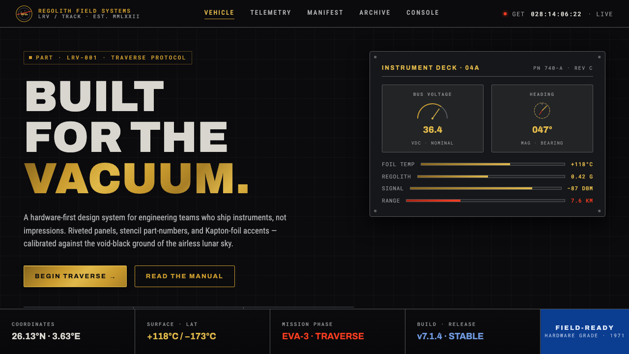 Lunar RoverBuilt for the vacuum. Kapton-gold foil and stencil part-numbers against void-…
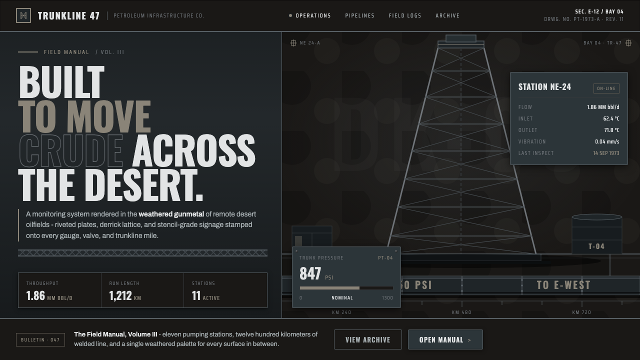 Gulf Oil Derrick IndustrialEngineered, not decorative. Soot-darkened gunmetal, derrick lattice, condense…
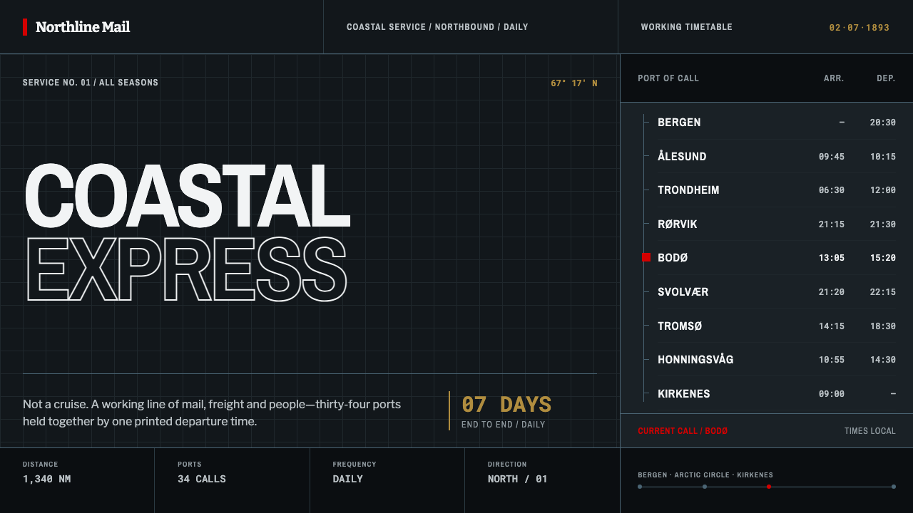 Hurtigruten Coastal ExpressInfrastructure, not romance. Black steel, condensed type and one red mark kee…
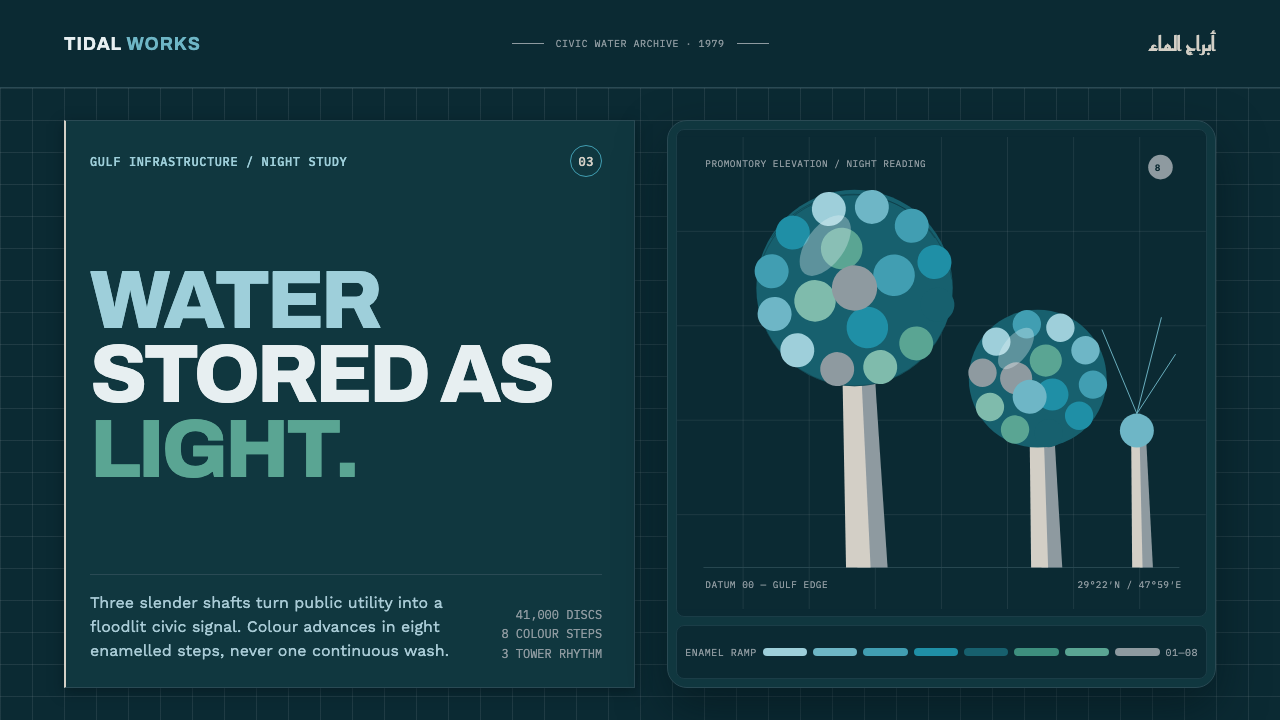 Kuwait Water TowersInfrastructure becomes a night monument. Eight enamel steps spiral across a d…
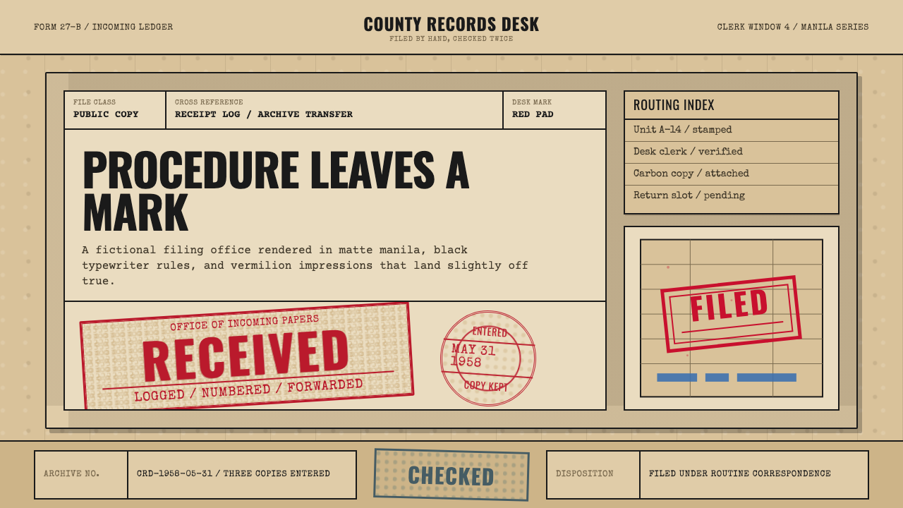 Office Rubber StampsProcedure made visible. Vermilion Oswald stamps strike a manila logbook grid.
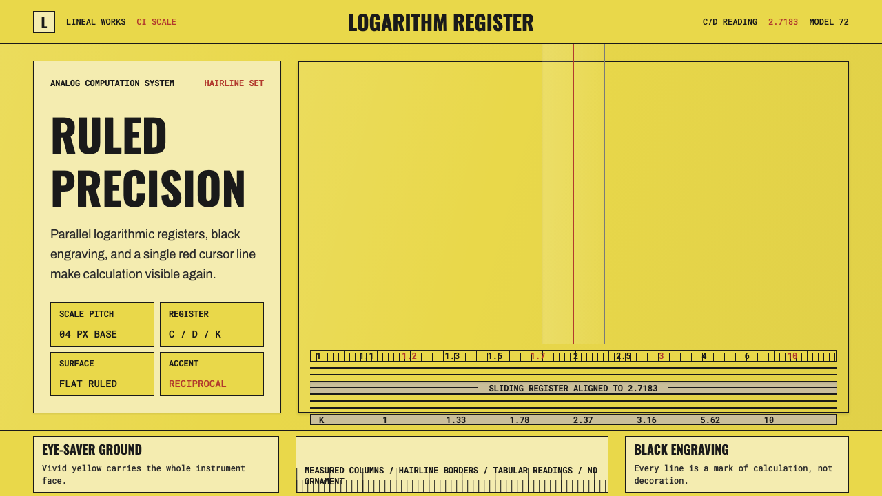 Slide RulePrecision made visible. Eye-saver yellow, black ticks, and one red hairline d…