What is Hurtigruten Coastal Express?
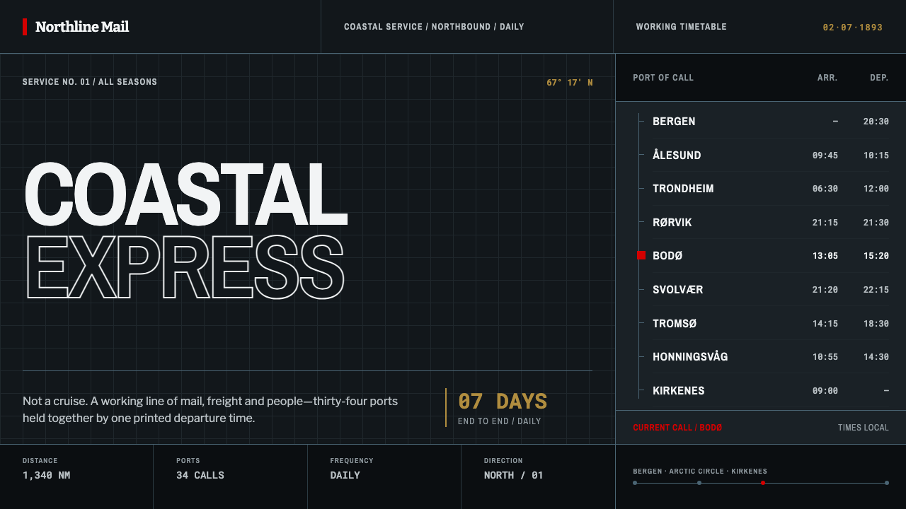
Hurtigruten is infrastructure, not romance: black steel, condensed type and a single red mark that keep a whole coastline on time.
Hurtigruten Coastal Express in brief
The Hurtigruten style takes its look from the Norwegian Coastal Express, the scheduled steamer and mail service that has run along the Norwegian coast from Bergen to Kirkenes since 1893. Its visual signature comes from two things: the ship at the quay, with black painted steel plating, a white superstructure and a single red mark on the funnel; and the printed timetable that made the service possible, with port after port stacked down a narrow column and a hairline rule between each. Translated into a design language, it is a dark, industrial, highly functional piece of Nordic transport graphics.
The governing idea is that this is infrastructure, not romance. The coastal express was never a cruise; it was a public service with a printed departure time, carrying mail, goods and passengers to communities that the rest of the country reached only slowly. The style inherits that sense of duty. It has no interest in sunsets, glowing seas or brochure drama. Credibility comes from punctuality, and punctuality has a look: dense columns of times, condensed letterforms that fit a narrow measure, and colour used so sparingly that every use counts.
Visually, it reads as a dark ground with white text, hairline dividers and one red accent. It has the vertical rhythm of a timetable and the stern profile of a working hull. It is suited to transport and logistics, status and operations dashboards, industrial and B2B products, and any brand that wants to be seen as dependable first and attractive second.

Where does Hurtigruten Coastal Express come from?
On 2 July 1893, Richard With's steamer DS Vesteraalen left Trondheim for Hammerfest and completed the run in about sixty-seven hours. The achievement was less about speed than about reliability. Mail that had needed three weeks in summer and five months in winter now arrived in seven days. The point was not that a ship could reach the far north, but that it could do so on a published schedule, in every season, so that a letter or a cargo could be planned around it.
With's company, Vesteraalens Dampskibsselskab, was a regional steamship firm from the north of the country, and the Aker mechanical works, Aker mek. Verksted, is the shipbuilder named among the key figures of the line's early steamers. Those details matter to the aesthetics. This was a ship built as a tool: steel plating, a plain superstructure, a funnel bearing the company's mark. The look of the coastal express fleet grew out of function, and the design vocabulary that followed is the vocabulary of a machine that arrives.
After the first voyage the service grew. Over the following decades the route was extended, and other companies, Bergen Line among them, joined the arrangement, until the express ran the whole length of the coast from Bergen in the south to Kirkenes in the far north, crossing the Arctic Circle and calling at port after port. It became a recognised institution of coastal life: a timed rhythm of arrivals and departures around which villages and towns organised their days. The Norwegian coastal steamer and mail service had become a network.
The graphic culture of the line is as important as the ships. The printed timetable was the instrument that turned a voyage into a service, and it belongs to the broader tradition of functional Nordic transport graphics: narrow columns, condensed lettering, times aligned for fast reading, and rules in place of ornament. This style inherits that tradition through the whole steamer century and into the present-day coastal service. Its red is used with the economy of a funnel mark seen from a long way across the water: recognised at a glance, never needing more.
What defines the Hurtigruten Coastal Express look?
Black Steel Ground
The base is near-black, the colour of painted steel plating on a ship's hull. It is matte and sober, a working surface rather than a luxury black. Because the ground is the hull, large areas of it feel solid and weighty, and the page reads as a structure to be read rather than a scene to be admired.
White Superstructure
White stands for the ship's upper works and carries the text. Contrast is high and unambiguous: bright figures and words on a dark field, with no tinted or atmospheric in-between greys competing for attention. Where a light panel is needed, it behaves like a superstructure, a clean white block that sits on the hull and holds the information.
One Red Mark
Red appears once in a composition, like the mark on the funnel. It signals the single thing that most needs to be seen: the primary action, a departure that has changed, an alert that matters. Because it is used so rarely, the eye finds it instantly from a distance, which is exactly the function of a funnel mark seen across open water.
Condensed Type
Letterforms are condensed and workmanlike, designed to fit port names, times and numerals into a narrow column without wrapping. Headings may be set in capitals, figures are aligned for quick comparison, and nothing in the type is meant to charm. The look is that of a printed timetable or a nameplate: legible, compact and entirely without sentiment.
Timetable Columns
The signature layout is a narrow, vertical column in which port follows port and time follows time, with a hairline rule between each line. The sequence is the content: a route is an order of stops. Wider layouts keep the same logic, arranging information as lists, ledgers and sequences rather than as cards or mood-driven compositions.
Hairline Rules and Flat Plates
Dividers are hairline-thin, panels are flat and corners are square, as if cut from steel plate and bolted together. There are no gradients, glows or soft shadows. Depth, where it appears, comes from tone, from white against black and from step changes between plates, not from simulated light.

Who shaped Hurtigruten Coastal Express?
With's steamer DS Vesteraalen made the first run from Trondheim to Hammerfest on 2 July 1893, in about sixty-seven hours. The voyage showed that the northern coast could be served by a reliable, scheduled steamer, cutting the time for mail from weeks and months to seven days. His name is attached to the idea that makes this style distinctive: that the real product of a transport line is its timetable.
The steamship company behind the first coastal express voyage was a regional operator in the north rather than a national giant. That origin shapes the aesthetic: practical, workmanlike and uninterested in prestige. The funnel mark that gives the design system its single red accent belongs to this world of company livery, a small, strong signature on a large dark hull.
The Aker mechanical works is the shipbuilder named among the key figures of the line's early steamers. As a name, it stands for the engineering behind the look: black plating, a plain white upper structure and no applied decoration, because the ships were built to run, not to impress. The style's honesty about materials and construction comes from this shipyard tradition.
Bergen Line, another of the shipping companies tied to the coastal service, is part of how one company's northern experiment became a coast-long network from Bergen to Kirkenes. For the design system it stands for continuity and standardisation: many operators, one timetable logic, and a visual language sturdy enough to be shared.
How do you use Hurtigruten Coastal Express today?
Hurtigruten works for any product whose promise is that it runs on time: transport, logistics, shipping, energy, infrastructure, operations tooling and B2B services. Its dark, dense, hairline-ruled approach also suits status pages, monitoring dashboards and booking systems, where the most important feature of the design is that information can be read quickly and trusted completely.
In presentations, covers work as a hull profile: a near-black field, a condensed white title, and a single red mark placed with the economy of a funnel. Content slides should read like timetable lists, with hairline rules between rows and times, stages or milestones aligned in a column. Data slides translate well to monochrome: white lines and bars on the dark ground, with one series or one number picked out in red. A route-style sequence, one stop after another, is a natural structure for roadmaps and process slides.
For web interfaces, the style is a strong fit for dashboards, departure boards and pricing pages for B2B services. Use a dark ground with white text, condensed headings and tabular figures, and make tables the main structure, with hairline row dividers. Keep red for the primary action and the single most urgent alert, so that a warning is not lost among decorative reds. Pricing tiers can be set as timetable rows, with each plan a stop on the line and the features as the columns that follow.
For editorial and marketing work, the style suits operational reports, logistics case studies, infrastructure features and reportage on coastal and working life. Photography should be honest and documentary: vessels at the quay, weather, cargo, people at work. Copy is best in a factual tone that lets punctuality and reliability speak for themselves. Campaign pages can take the structure of a timetable, with a clear sequence of steps and times.
The most frequent mistake is to read the dark ground as an invitation to add glow: aurora gradients, luminous seas, neon accents or atmospheric photography. The system is explicitly the opposite of cruise-brochure romance, and those effects destroy its credibility. The second mistake is spreading red over headings, icons and backgrounds until it no longer marks anything. A third is loosening the layout with generous whitespace and soft cards, which removes the timetable discipline. Keep the steel black, the rules thin, the type condensed and the red singular.

Hurtigruten Coastal Express — FAQ
Is Hurtigruten the same as a cruise line?
In design terms, it is deliberately not. The coastal express began in 1893 as a scheduled steamer and mail service along the Norwegian coast, infrastructure with a printed departure time. The style therefore avoids cruise-brochure tropes such as sunsets, luxury and sweeping scenic imagery in favour of black steel, tables and timetables.
Why is red used so sparingly?
Because it imitates the funnel mark: a single red mark on a large dark vessel, recognisable from far away and needing nothing more. If red appears several times in a view, it stops signalling the one thing that matters most. Reserve it for the primary action or the most urgent status.
Can this style work on a light background?
The style is built around the dark steel hull, so its natural mode is dark. A light variant is possible if it reads as a printed timetable on white paper: black type, hairline rules and the single red mark, with the same condensed type and column logic. The key is to keep the discipline rather than to invert the colours mechanically.
What does functional Nordic transport graphics mean?
It refers to the tradition of clear, unornamented timetables, signs and printed schedules used in Nordic public transport: narrow columns, condensed lettering, aligned times and thin rules. Its priority is that a traveller or operator can find the information instantly; any decoration has to justify itself against that goal.
How is it different from other dark, technical styles?
Many dark technical styles borrow neon, glow or cyber imagery. This one comes from a working ship and a printed timetable, so its darkness is matte steel and its accent is a single red mark. It feels like an operations room rather than a game: the darkness is utilitarian, not atmospheric.
Related design styles
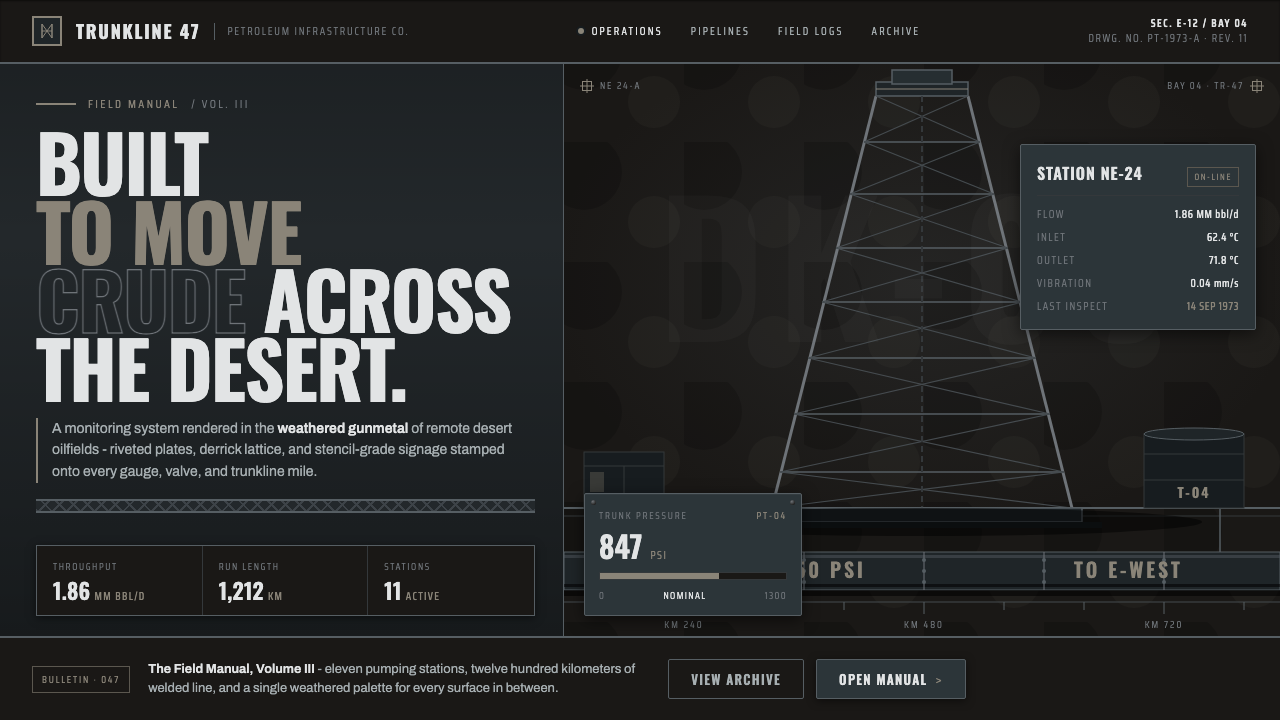 Gulf Oil Derrick IndustrialEngineered, not decorative. Soot-darkened gunmetal, derrick lattice, condense…
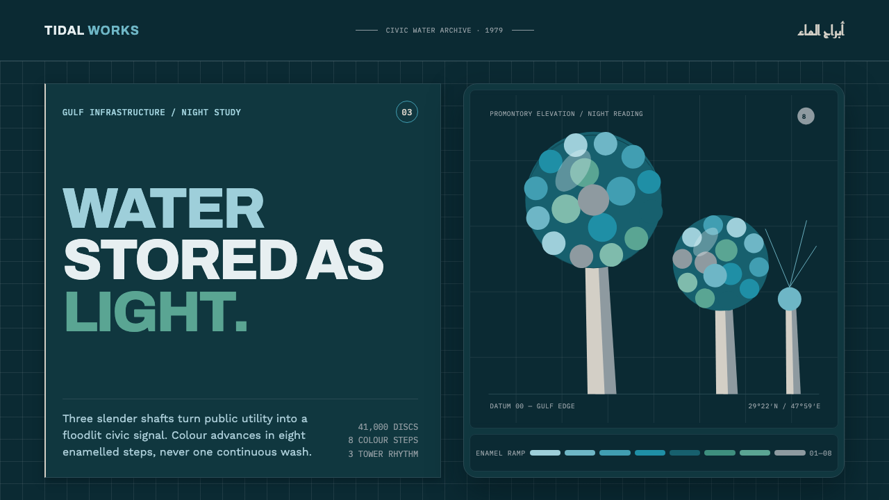 Kuwait Water TowersInfrastructure becomes a night monument. Eight enamel steps spiral across a d…
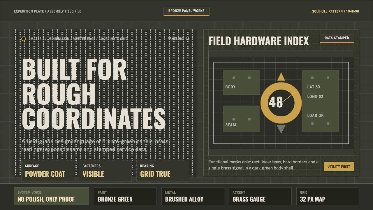 Land Rover DefenderUtility refuses polish. Bronze green panels, rivets and brass grid data do th…
 Lunar RoverBuilt for the vacuum. Kapton-gold foil and stencil part-numbers against void-…
 Iridescent Scarab DrawerOrder makes the shimmer read. Jewel scarabs pinned in a grid on black foam, m…
 Medal Ribbon BarDiscipline worn as color. Crimson, sky-blue and gilt bars lock onto black woo…