What is Gulf Oil Derrick Industrial?
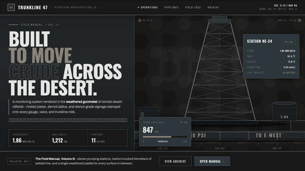
Gulf Oil Derrick Industrial turns the post-war Persian Gulf petroleum economy into a visual language of soot-darkened steel, derrick lattice, trunkline mass, and uncompromising engineering.
Gulf Oil Derrick Industrial in brief
Gulf Oil Derrick Industrial is a dark heavy-industry aesthetic derived from the Persian Gulf oilfields of 1950–1990, when Aramco-era development, Gulf-state petroleum operations, and large crude-oil pipelines reshaped the region. Its imagery comes from the infrastructure of extraction and transport: gunmetal derricks, oil-stained gantries, riveted plates, big-inch trunklines, and the matte black surfaces of crude tankage.
The style is engineered rather than decorative. Its visual elements resemble parts of an operating system whose purpose is to extract, classify, contain, and move material across a desert. Heavy horizontal rules behave like structural beams; stencil labels suggest equipment identification; condensed grotesque lettering carries the authority of industrial signage. Nothing should feel polished for display. The surfaces are darkened, weathered, and marked by use.
Its darkness is not a neutral studio gray. It is the deep gunmetal of exposed derrick steel after heat, soot, oil, and weather have acted upon it. Against that field, galvanized highlights and pale lettering provide functional visibility, while a restrained trace of rust-dust ochre introduces the only warmth. The result is severe but not empty: density comes from lattice, joints, plates, rules, and accumulated industrial wear.
Where does Gulf Oil Derrick Industrial come from?
The style belongs to the post-war Gulf oil boom of 1950–1990. Across Saudi Arabia and the wider Gulf states, petroleum development required an immense physical network: derricks for extraction, gantries and service structures around the fields, tankage for crude, and trunklines capable of moving oil across long desert distances. The economy became visible through infrastructure, and that infrastructure supplied a coherent aesthetic before anyone treated it as a design style.
Aramco-era oilfields established the central material vocabulary. Galvanized steel was exposed to soot, petroleum residue, wind, and harsh outdoor conditions, turning nominally metallic surfaces into layered gunmetal darkness. Oil-stained platforms and gantries communicated labor and continuous operation. Rivets, seams, bracing, and repeated lattice members remained visible because the structures made no attempt to conceal how they carried weight.
The East–West Crude Oil Pipeline and the broader culture of petroleum trunkline construction expanded this language beyond the individual well. Large pipes, long horizontal runs, junctions, identification markings, and service corridors expressed an industry concerned with flow over distance. Where the derrick produced vertical tension, the trunkline produced horizontal force. Together they created the style’s basic compositional opposition: lattice rising through darkness, crossed by heavy rules that imply transfer and direction.
Its graphic character emerged from the practical communication surrounding that infrastructure. Condensed-grotesque signs fitted forceful words into constrained industrial spaces, while stencil forms could remain legible as equipment labels and operational markings. The resulting visual system was neither a formal art movement nor the work of a single named designer. It was a collective product of petroleum operators, Gulf-state oilfield engineers, and trunkline builders responding to machinery, climate, scale, and the need for unambiguous information.
What defines the Gulf Oil Derrick Industrial look?
Gunmetal Darkness
The foundation is a soot-blackened gunmetal field, closer to weathered derrick steel and crude tankage than to clean charcoal. Dark surfaces should retain subtle distinctions between plate, frame, void, and oil stain. Pale galvanized highlights may expose edges or joints, but the composition remains decisively nocturnal and heavy.
Rust-Dust Accent
Warm color appears as a scarce rust-dust ochre, suggesting oxidation, desert residue, or a worn operational mark. It works best when confined to a warning, identifier, small diagrammatic feature, or isolated edge. If warmth spreads across the composition, the austere relationship between blackened steel and functional marking is lost.
Condensed Signage
Typography is tall, condensed, and industrial, with Oswald-like grotesque forms carrying headlines, section codes, and equipment-style labels. Stencil interruptions are purposeful rather than ornamental: they evoke lettering made for fabrication and repeated application. Wide, graceful display faces feel foreign here; words should occupy space with compressed force.
Derrick Lattice
Cross-bracing and repeated steel members form the principal geometric motif. The lattice can frame a title, divide a field, or create a deep industrial silhouette without becoming pictorial illustration. Its rhythm should remain load-bearing in character: diagonals meet uprights and horizontal members as if each connection has a structural task.
Plates, Rivets, and Rules
Riveted plates supply weight, while heavy horizontal rules organize information like beams or trunklines. Borders are not delicate frames; they resemble seams, flanges, or joined steel sections. Repetition creates an impression of assembly and maintenance, making even a flat page feel built from replaceable industrial parts.
Weathered Surface
Wear is evidence of operation. Soot, oil staining, dulled galvanization, and restrained abrasion distinguish the style from a pristine industrial theme. Texture must remain material-specific and subordinate to structure: enough to suggest exposure and labor, never so theatrical that the surface becomes decorative distress.
Engineered Hierarchy
Hierarchy resembles operational documentation: a commanding title, compact identifiers, grouped readings, and clear separation between primary and secondary information. Alignment follows structural axes established by pipes, plates, and lattice members. Ornament has no independent role; every line, label, and accent should appear to identify, divide, support, or direct.
Who shaped Gulf Oil Derrick Industrial?
Aramco-era petroleum operators gave the aesthetic its working environment. Their fields joined derricks, gantries, tankage, equipment labels, and oil-marked surfaces into a single operational landscape. The visual authority of the style comes from this continuity between machinery and information: signs and markings belong to the same system as the steel they identify.
Oilfield engineers across the Gulf states shaped structures around extraction, access, support, containment, and maintenance. The exposed logic of bracing, joints, platforms, and service routes provides the style with its disciplined geometry. Their contribution is represented not by personal authorship but by a shared engineering culture adapted to petroleum work in the desert.
Trunkline builders translated the petroleum economy into long horizontal systems capable of carrying crude across distance. Big-inch pipes, junctions, repeated supports, and route markings introduced a powerful linear vocabulary that complements the vertical derrick. Their work underlies the style’s emphasis on heavy rules, directional flow, modular repetition, and infrastructure understood at territorial scale.
How do you use Gulf Oil Derrick Industrial today?
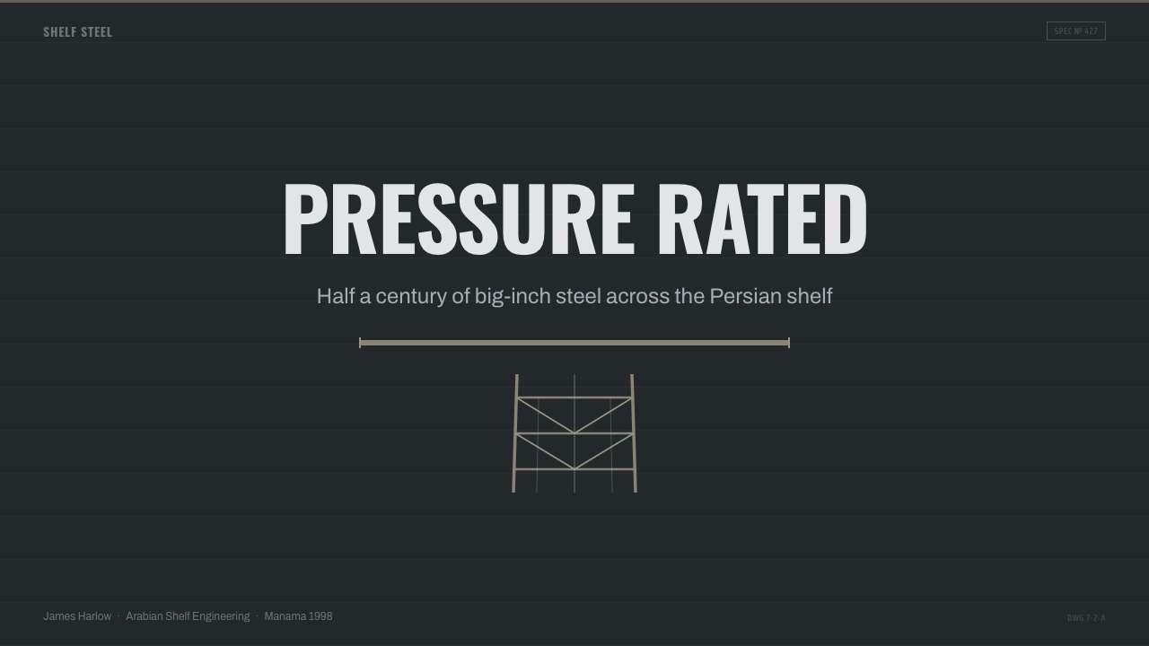
For presentation slides, begin with the cover as an industrial identification plate rather than a cinematic oilfield scene. A dark gunmetal field can be crossed by a derrick lattice or a single trunkline-like rule, with the title set in tall condensed lettering and a small stencil identifier nearby. Content slides should preserve the same structural axes: grouped text behaves like labeled equipment modules, headings resemble section markings, and pale information fields interrupt the darkness only where reading requires them.
Data slides are especially compatible with the style because pipelines and petroleum operations already imply measurement, routing, capacity, and flow. Bars can read as pipe runs, connecting lines as trunkline routes, and category blocks as riveted plates. Use pale tones for most readings and reserve rust-dust ochre for the one value, warning, or transition that demands attention. Avoid turning every chart into literal machinery; the industrial analogy should clarify the data rather than compete with it.
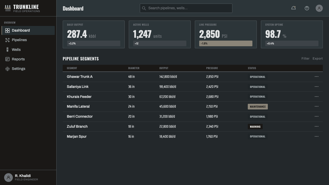
In web interfaces, Gulf Oil Derrick Industrial suits operational dashboards, infrastructure monitoring, logistics tools, and pricing pages that need forceful hierarchy. Cards can resemble joined steel panels, separated by heavy rules and compact equipment labels. Navigation benefits from condensed headings paired with highly readable supporting text. On pricing pages, tiers should be differentiated through position, labeling, and controlled contrast, while the warm accent identifies the preferred action instead of decorating every control.
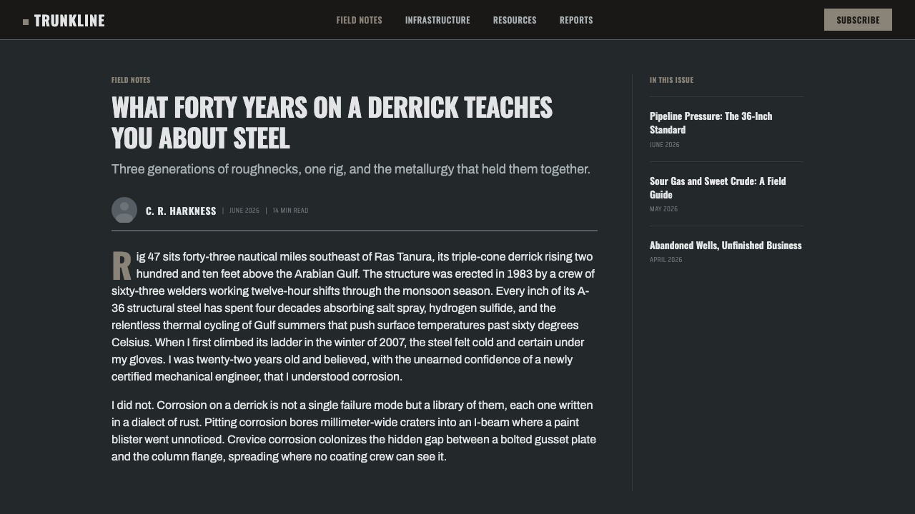
Editorial and marketing layouts can use the style to frame stories about energy, engineering, transport, regional development, or industrial scale. A narrow text column beside a tall lattice motif produces the tension of a derrick against open desert, while broad horizontal breaks evoke pipelines crossing distance. Marketing sections should alternate between dense equipment-like information and quieter dark fields, allowing product claims to feel stamped, classified, and structurally supported rather than theatrically rugged.
The common mistake is to confuse industrial authenticity with indiscriminate distress. Covering every surface in scratches, rust, smoke, warning stripes, bolts, and stencil fragments turns the system into costume. The source aesthetic is powerful because wear remains attached to working materials and information remains legible. Lead with gunmetal mass, derrick structure, condensed signage, and horizontal flow; let oil stain and rust-dust appear as evidence, not spectacle.
Gulf Oil Derrick Industrial — FAQ
Is Gulf Oil Derrick Industrial simply a generic industrial style?
No. Generic industrial design may borrow exposed metal, dark backgrounds, or factory typography from many kinds of manufacturing. This style is specifically rooted in the Persian Gulf petroleum landscape of 1950–1990. Its defining combination is soot-darkened gunmetal, derrick lattice, big-inch trunkline horizontality, matte crude tankage, oil-stained gantries, and condensed operational signage shaped by desert oil infrastructure.
Why must the gunmetal surface look weathered rather than clean?
Because weathering carries the environment and labor of the oilfield. Clean gray metal suggests a studio object or newly fabricated product; soot-blackened steel records exposure, petroleum residue, outdoor operation, and repeated maintenance. The wear should remain controlled, however. Its role is to reveal material history, not to bury the structure beneath decorative grime.
Can photography be used without weakening the graphic system?
Photography can work when it reinforces the approved material vocabulary: derrick steel, gantries, trunklines, tankage, riveted plates, or oil-marked surfaces. Images should be selected for structural mass and material evidence rather than picturesque drama. A photograph becomes strongest when typography and rules align with its lattice, pipe direction, or plate seams, making image and information feel like one engineered assembly.
How should the warm accent be used?
Treat rust-dust ochre as an operational signal, not a secondary background color. It can identify a critical reading, a preferred action, a warning, a route, or a small material edge. Its scarcity gives it authority. Repeating it broadly across headings, panels, charts, and decoration makes the interface warmer but removes the austere petroleum character that distinguishes the style.
Where does this style work poorly?
It struggles where softness, intimacy, playfulness, or domestic comfort is central to the experience. Its dark mass, compressed lettering, and infrastructure-derived severity naturally communicate endurance, capacity, authority, and operational control. Those qualities suit engineering and energy narratives but can overwhelm products that depend on warmth or emotional reassurance. Successful use begins by matching the values of the petroleum aesthetic to the values of the subject.
Related design styles
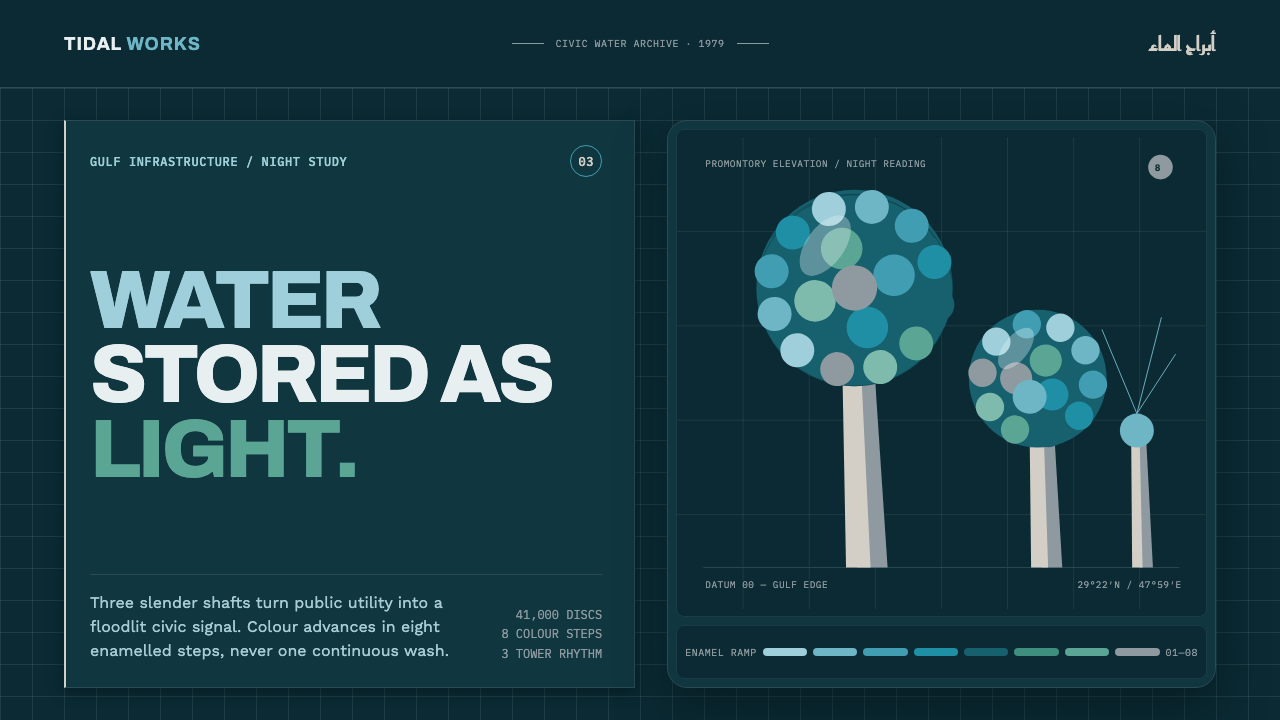 Kuwait Water TowersInfrastructure becomes a night monument. Eight enamel steps spiral across a d…
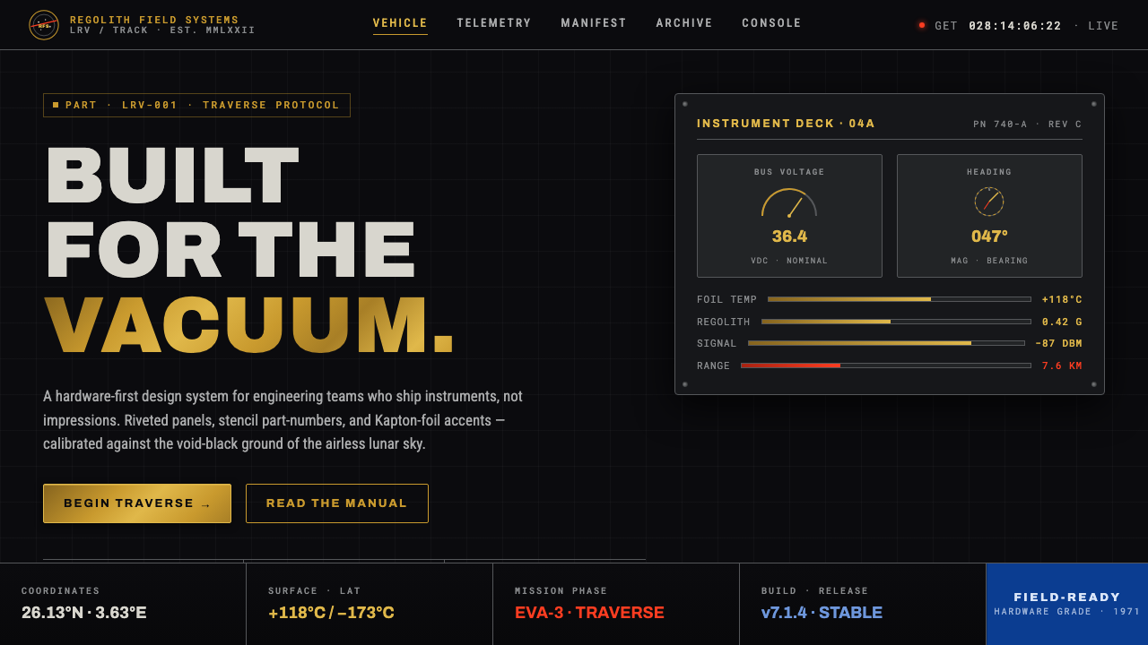 Lunar RoverBuilt for the vacuum. Kapton-gold foil and stencil part-numbers against void-…
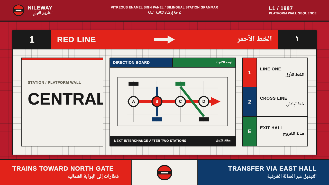 Cairo Metro WayfindingAuthority at speed. Enamel red, Arimo grids, and co-equal Arabic signage.
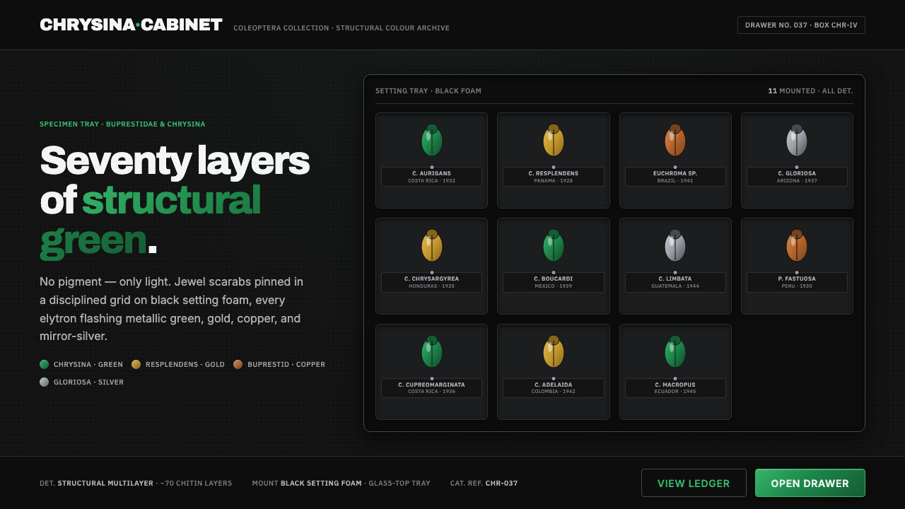 Iridescent Scarab DrawerOrder makes the shimmer read. Jewel scarabs pinned in a grid on black foam, m…
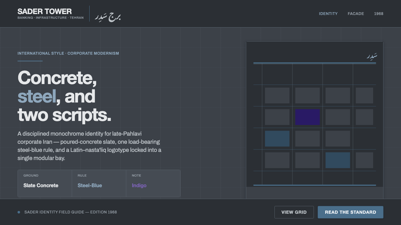 Tehran Bank ModernismLate-Pahlavi corporate cool. Slate concrete ground, one steel-blue rule, a La…
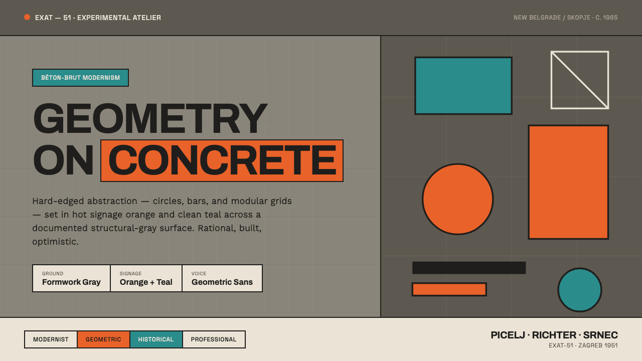 Yugoslav Socialist ModernismGeometry on concrete. EXAT-51 circles and bars in hot orange and clean teal,…