What is Cairo Metro Wayfinding?
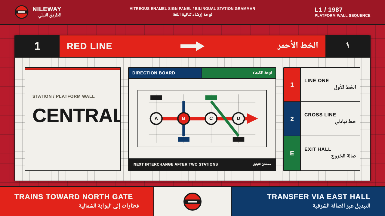
Cairo Metro Wayfinding takes the platform signage of Africa's first metro system — red enamel panels, bilingual tiling, a strict international grid — and turns it into a design language built for speed and authority.
Cairo Metro Wayfinding in brief
Cairo Metro Wayfinding is drawn from the identity system of Cairo Metro Line 1, which opened in 1987 running between Helwan and Ramses and became the first full metro system in Africa and the Arab world. The line's identity — developed with French engineering expertise — used a bold red roundel as its symbol, vitreous-enamel panels for station signage, and station-wall tiling that set Latin lettering beside Arabic naskh script as visual equals rather than one language subordinate to the other.
This design system takes that platform-wall language and treats it as a full visual system rather than a signage detail: a deep, enamel-style signage red serves as the primary field color — never white — matched to Line 1's identity color, with a brighter roundel red reserved for the system's key marker or symbol. Directional arrows, line-color bands, and a strict, ruled grid carry the rest of the structure, echoing how a transit system organizes information for someone moving at speed, not standing still to read.
Everything about the system is built for legibility under motion and at a glance: high-contrast lettering, no decorative flourish, information organized into clear horizontal bands the way a station platform sign is, and bilingual content treated as a structural requirement rather than an afterthought. It reads less like a decorative period style and more like an operating system for wayfinding, repurposed for screens.
Where does Cairo Metro Wayfinding come from?
Cairo Metro Line 1 opened in 1987, connecting Helwan in the south to Ramses Station in central Cairo, and it holds the distinction of being the first complete metro system built in Africa and in the Arab world — a major infrastructure milestone for Egypt and the region. Its construction and engineering drew on French expertise, delivered through RATP, the Régie Autonome des Transports Parisiens, the operator of the Paris Métro, which brought its own long experience in metro engineering and wayfinding to the project.
That French engineering partnership shows most clearly in the line's signage identity: a bold red roundel used as the system mark, a form with clear ancestry in European metro branding, adapted here as Cairo's own line-identity symbol. Physical station signs were made using vitreous enamel — a glass coating fused onto metal — the traditional material for durable, weather-resistant transit signage, chosen for its ability to hold saturated color and withstand decades of underground and platform use without fading or chipping.
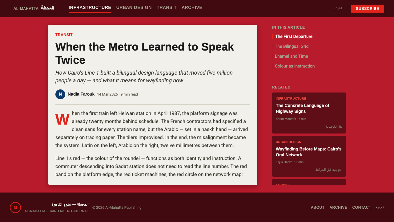
The line's station tiling carried a deliberately bilingual design: station names appeared in Latin lettering next to Arabic naskh script, set at equal size and equal visual weight, so that neither language read as primary or secondary. This bilingual co-equality was a functional necessity in a city and country where both scripts are in daily use, but it also became a defining visual trait of the system — station identity is always two scripts side by side, never one alone, and never one rendered smaller than the other.
Cairo Metro and NAT engineering — the agency responsible for building and running the network — extended this signage language across the growing system in the decades after 1987, and the overall visual approach sits within a broader international tradition: postwar and late-1980s transit systems worldwide converged on a similar toolkit of bold symbol marks, enamel or vitreous signage, strict grid-based information design, and the influence of Swiss-style signage systems that prized clarity above ornament. Cairo's version is distinguished within that tradition by its bilingual Latin-Arabic core and its enamel-red identity color, both of which this design system treats as non-negotiable structural rules rather than optional flourishes.
It is worth situating that date in context: 1987 places Cairo's system among the wave of late-20th-century metro expansions across the developing world, arriving decades after the first-generation European and American systems but drawing directly on their accumulated wayfinding knowledge rather than starting from scratch. That timing is part of why the identity feels so disciplined — by the late 1980s, the international conventions for legible, grid-based transit signage were well established, and Cairo's engineers and designers had a mature toolkit to adapt rather than invent, which they applied to the specific requirement of a genuinely bilingual, bidirectional-script ridership.
What defines the Cairo Metro Wayfinding look?
Color
A deep enamel signage red serves as the primary field color throughout — the ground is never white. A brighter roundel red is reserved for the system's key symbol or marker, and additional line-colour bands carry secondary wayfinding information, following the logic of a real transit map's color-coded lines.
Roundel Symbol
A bold circular mark functions as the system's central identifying shape, in the same family as metro roundels used worldwide, but rendered in Line 1's own red rather than any other transit system's color. It anchors compositions the way a station's roundel sign anchors a platform.
Enamel Signage Texture
Surfaces read as glossy, glass-coated metal panels rather than printed paper or flat screen color — a slight sheen and a hard, clean edge persist even in static digital form, carrying over the physical durability and finish of vitreous enamel station signage.
Bilingual Co-equal Type
Latin lettering and Arabic naskh script are set at matching size and weight and positioned as equal partners rather than primary and secondary, mirroring the real station tiling this system is drawn from. No layout is considered complete with only one script present if bilingual content is called for.
International Grid Structure
A strict, ruled grid organizes every layout, with information banded horizontally the way platform signage is — one register for the destination, one for the line, one for the direction. No ornamental deviation from the grid is permitted; every element sits on a defined line.
Directional Clarity
Arrows and directional markers are treated as first-class visual elements rather than small decorative icons — bold, unambiguous, and legible at a glance and at speed, the way a rider glancing up while walking needs to instantly know which way to turn.
Who shaped Cairo Metro Wayfinding?
RATP, the operator of the Paris Métro, provided the French engineering expertise behind Cairo Metro Line 1's construction, bringing decades of metro-building and wayfinding experience to the project and shaping the line's signage approach in the process.
The local engineering agency responsible for building and operating Cairo's metro network extended Line 1's signage language across the system as it grew in the decades after 1987, maintaining the red enamel identity and bilingual tiling convention as the network expanded.
This is the broader postwar tradition of grid-based, symbol-driven transit signage — prioritizing clarity, bold marks, and strict information hierarchy — that Cairo Metro's identity belongs to, shared with metro systems built across the world in the same decades.
The specific material tradition of vitreous enamel panels — glass fused onto metal — gives transit signage of this era its characteristic durability, saturated color, and slight glossy sheen, distinguishing it from painted or printed signage that fades and chips far more quickly.
How do you use Cairo Metro Wayfinding today?
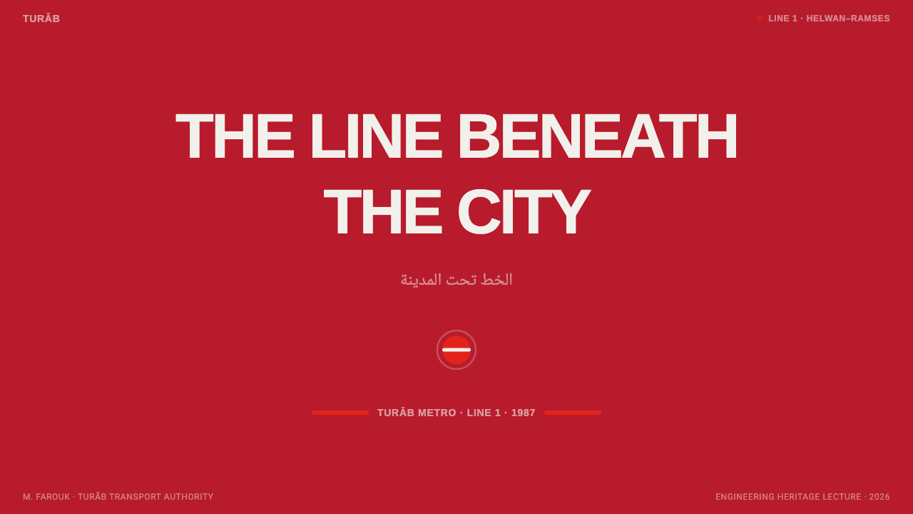
On a presentation cover, this system rewards a full-bleed enamel-red ground with a bold roundel-style mark placed near the title, the title itself set on a strict grid line, and a directional arrow motif used as a graphic accent rather than a literal navigation aid. The effect should feel immediate and authoritative, the way a station entrance sign is meant to be understood in a single glance.
Content and data slides should hold to the strict grid, with line-colour coding used to distinguish categories the way different metro lines are color-coded on a map. Directional arrows work well as a recurring UI motif pointing toward the data point or conclusion the slide wants the audience to land on, and bilingual label pairs — where relevant — should keep both scripts at matching size rather than shrinking one beneath the other.
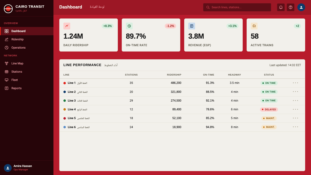
In web interfaces, this transit-inspired language suits logistics, mobility, delivery, and transportation-booking products particularly well, along with any product that wants to communicate speed and dependable authority. Roundel-style badges work for status indicators or account tiers, the enamel red should be reserved for primary actions and alerts rather than spread across the whole interface, and the strict grid discipline keeps dense information — schedules, routes, order statuses — legible under real time pressure.
In editorial and marketing work, enamel red makes a strong, high-contrast section divider, and headline treatments styled after station signage — bold, gridded, unornamented — read as confident and systemized. Arrow and directional graphics can function as a navigational motif guiding a reader through long-form content, mimicking the way arrows guide a rider through a station.
A common mistake is softening the red into a friendlier consumer tone, rounding its corners, or adding gradients and soft shadows — all of which undermine the enamel-panel, hard-edged character the system depends on. An equally common mistake is treating the bilingual pairing as optional rather than structural: rendering one script noticeably larger or bolder than the other breaks the core co-equal logic this system is built around, and once the balance is off, the whole reference collapses back into a generic red-and-grid theme.
Cairo Metro Wayfinding — FAQ
Why is Cairo Metro Line 1 historically significant?
It opened in 1987 as the first complete metro system built in Africa and in the Arab world, connecting Helwan to Ramses Station through central Cairo. Beyond its transportation role, it was a major infrastructure and engineering milestone for Egypt, built with French expertise, and it set the visual template — red identity, enamel signage, bilingual tiling — that the wider network has continued to use as it has grown.
What is the roundel, and why is it red?
The roundel is the bold circular mark used as Cairo Metro's central system symbol, a form that shares clear ancestry with roundel branding used by metro systems worldwide. It is rendered in red to match Line 1's own identity color, the same deep enamel red that appears across the line's station signage and platform surfaces.
What's distinctive about the bilingual signage?
Latin lettering and Arabic naskh script appear together at equal size and equal visual weight, rather than one language being treated as a smaller translation beneath a dominant headline. That co-equal pairing was a functional response to a bilingual ridership, and it became one of the system's defining visual traits.
Does this system require both scripts to work?
No — the enamel red, roundel mark, and strict international grid all function as a standalone system in a single-language layout. But the system is fundamentally designed bilingual-first, and applying it to Latin-only content means deliberately choosing to simplify a system whose full logic assumes two co-equal scripts sharing every layout.
What kinds of products suit this look?
Mobility, transit, logistics, and delivery products are the most natural fit, along with any wayfinding-heavy interface where a user needs to make a fast decision — schedules, route planners, order tracking. More broadly, it suits any product that wants to feel fast, authoritative, and systemized rather than warm, casual, or decorative.
Related design styles
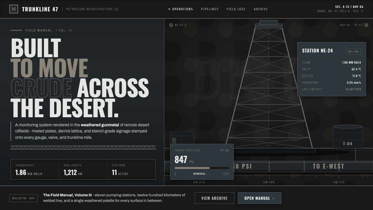 Gulf Oil Derrick IndustrialEngineered, not decorative. Soot-darkened gunmetal, derrick lattice, condense…
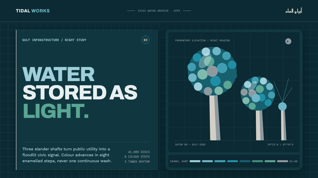 Kuwait Water TowersInfrastructure becomes a night monument. Eight enamel steps spiral across a d…
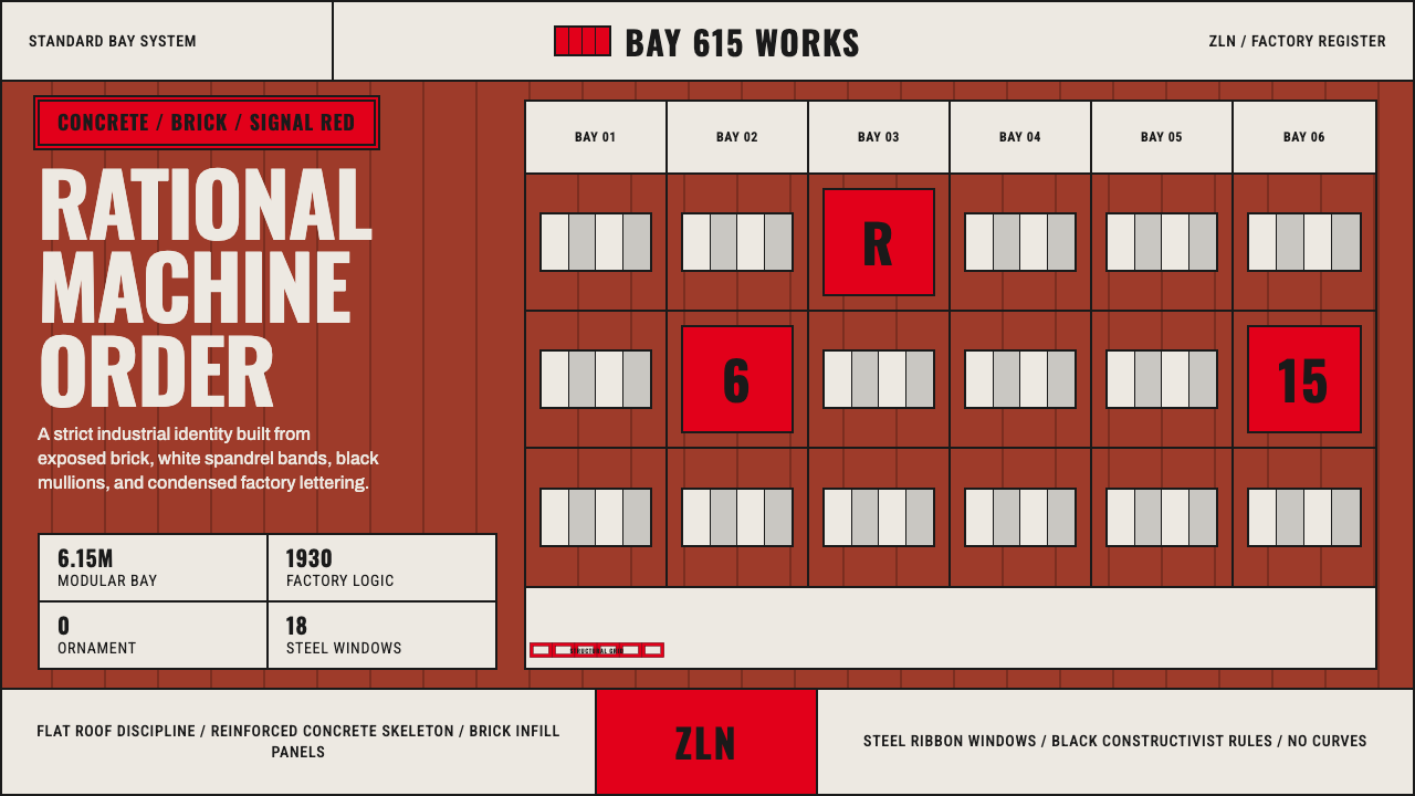 Baťa Zlín Functionalist BrandMachine-age precision. Brick red, concrete bands, and Oswald type lock into a…
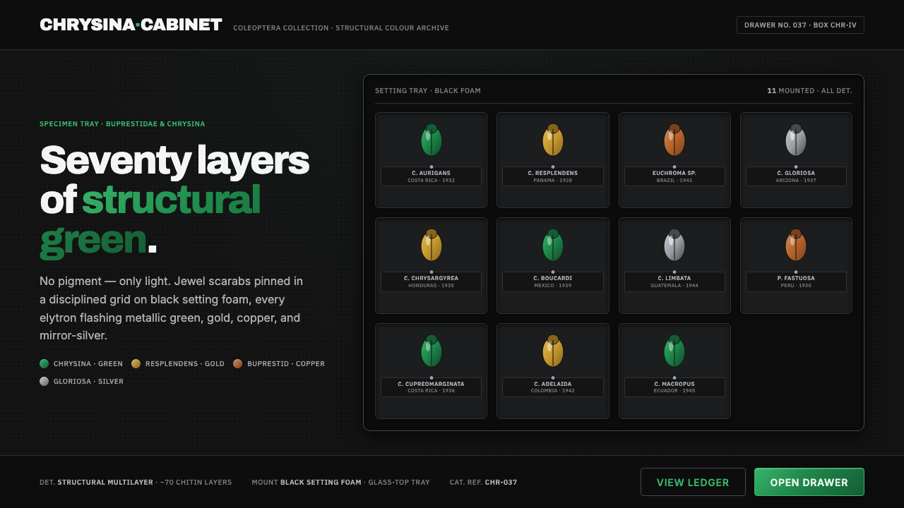 Iridescent Scarab DrawerOrder makes the shimmer read. Jewel scarabs pinned in a grid on black foam, m…
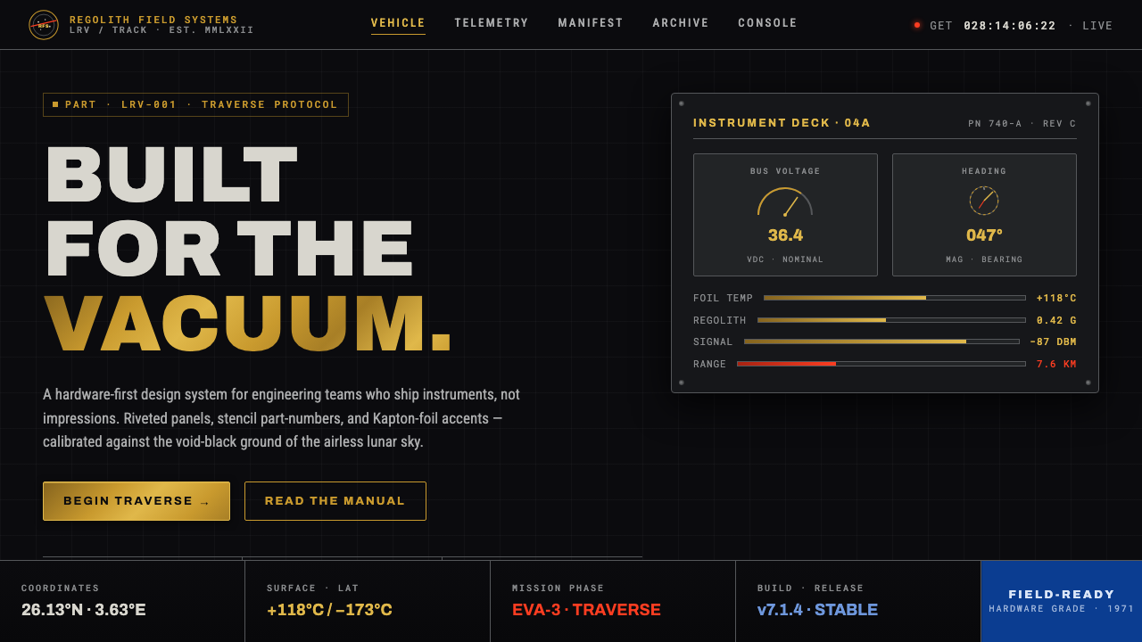 Lunar RoverBuilt for the vacuum. Kapton-gold foil and stencil part-numbers against void-…
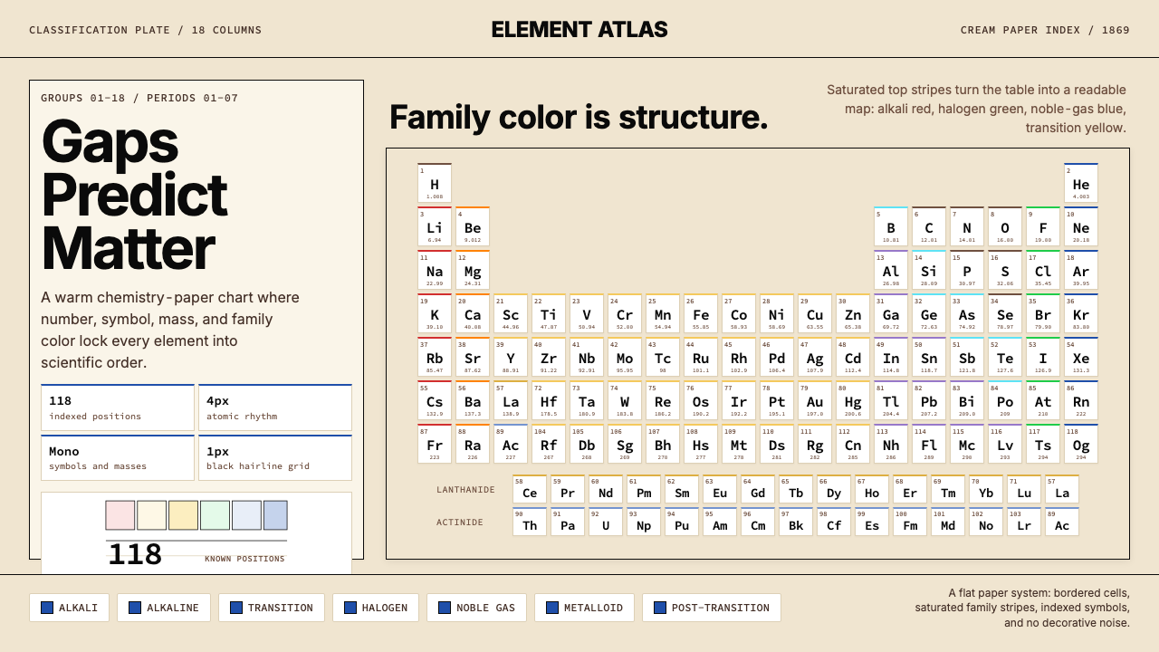 Mendeleev Periodic TableScientific order, saturated. Cream grid, mono symbols, and family color bands.