What is Mendeleev Periodic Table?什么是 Mendeleev Periodic Table?
Mendeleev's 1869 periodic table turned the invisible logic of matter into a color-coded grid so precise it predicted elements the world had not yet found.门捷列夫1869年的元素周期表将物质的隐秘逻辑化为色彩编码的网格,其精准度甚至预言了世界尚未发现的元素。
Mendeleev Periodic Table in briefMendeleev Periodic Table 速览
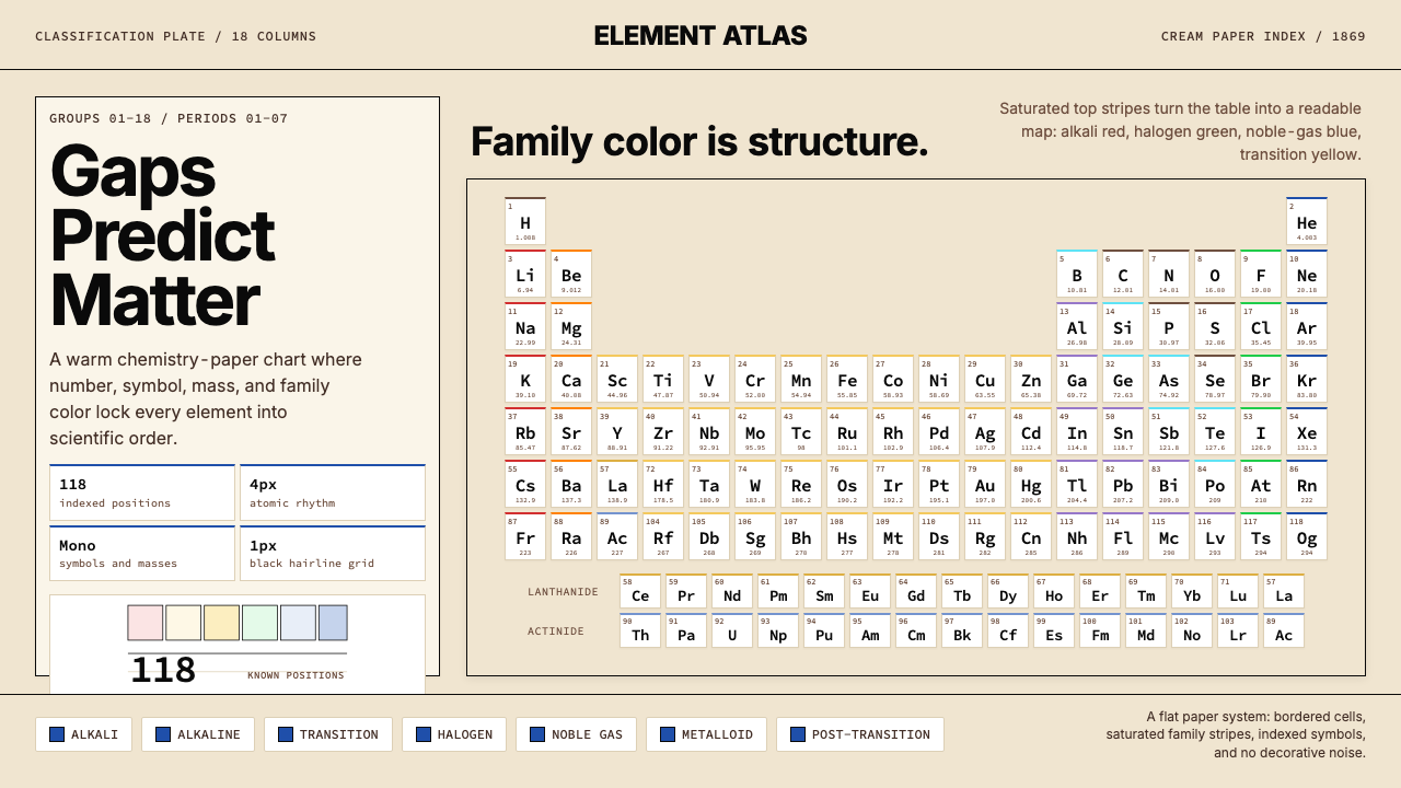
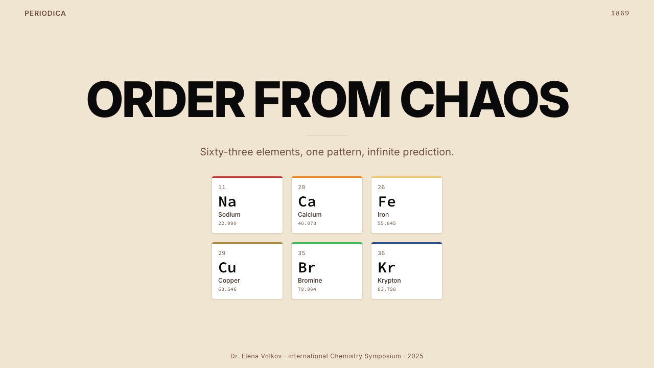
The Mendeleev Periodic Table aesthetic is a design system born not in a studio but in a St. Petersburg lecture hall, where Dmitri Ivanovich Mendeleev arranged 63 known elements into an ordered grid and discovered that periodicity — the recurrence of chemical properties at regular intervals — was a law of nature. The resulting visual artifact is one of the most recognized information designs in history: an 18-column tabular structure where each cell is a small data module containing an atomic symbol, an atomic number, and an atomic mass, organized horizontally by period and vertically by chemical family.门捷列夫元素周期表的美学是一套诞生于课堂而非设计工作室的视觉体系。1869年,德米特里·伊万诺维奇·门捷列夫将63种已知元素排列成一张有序的网格,发现了「周期性」——化学性质以固定间隔重复出现——是自然界的一条规律。这一视觉成果是历史上辨识度最高的信息设计之一:一张18列的表格结构,每个格子都是一个微型数据模块,包含元素符号、原子序数与原子量,横向按周期排列,纵向按化学族归类。
The aesthetic character of the periodic table is defined by structured density and chromatic classification. The warm cream or off-white ground — evoking chemistry paper, lab notebooks, and scientific print — carries deep-black ink in tight, monospaced letterforms. Chemical family groups are distinguished by saturated color bands: alkali metals in bold red, alkaline earths in warm orange, halogens in assertive green, noble gases in deep blue, and transition metals in controlled amber-yellow. The color is not decorative; it is classificatory. Every hue is a category, and every category has meaning.这套美学的特质由结构性的密度与色彩分类共同定义。温润的米黄或米白底面——令人想起化学用纸、实验记录本与科学印刷品——承载着漆黑的等宽字迹。化学族系以饱和色带加以区分:碱金属的浓烈赤红,碱土金属的暖橙,卤素的鲜绿,惰性气体的深蓝,过渡金属的节制琥珀黄。这里的色彩不是装饰,而是分类工具——每一种色相是一个类别,每一个类别都承载意义。
What makes this system visually distinctive is the coexistence of rigorous grid discipline with warm, analogue materiality. The table does not feel cold or digital — it feels like a scholarly artifact, a wall chart in a Victorian laboratory or a university chemistry department. The grid is mathematical in its precision, yet the palette carries warmth and humanity. This tension between scientific exactness and physical warmth gives the Mendeleev aesthetic its unique character: encyclopedic, authoritative, and surprisingly approachable.令这套体系在视觉上独树一帜的,是严格网格纪律与温润模拟质感的并存。周期表不给人冰冷或数字化的感觉,它更像一件学术器物——维多利亚时代实验室或大学化学系走廊里张贴的挂图。网格在精度上是数学的,但配色却携带着温度与人情。这种科学精确与物理温暖之间的张力,赋予了门捷列夫美学其独特气质:博学、权威,却出人意料地亲切。
See the Mendeleev Periodic Table design system查看 Mendeleev Periodic Table 完整设计系统
Where does Mendeleev Periodic Table come from?Mendeleev Periodic Table 从何而来?
In February 1869, Mendeleev was preparing a chemistry textbook — The Principles of Chemistry — and found himself unsatisfied with any existing framework for organizing the elements. Working in St. Petersburg, he spent a single intensive day arranging and rearranging element cards, ordering them first by atomic mass, then cross-checking against valence and chemical behavior. By the end of that day he had a working draft. The paper was read to the Russian Chemical Society on March 6, 1869, by a colleague while Mendeleev was away inspecting cheese cooperatives in the countryside. He had predicted that several gaps in his table corresponded to undiscovered elements, describing their expected properties in detail. When gallium (1875), scandium (1879), and germanium (1886) were subsequently identified and found to match his predictions almost exactly, the scientific world accepted the periodic law as established fact.1869年2月,门捷列夫正在编写化学教材《化学原理》,却对现有的元素组织框架深感不满。在圣彼得堡,他用一整天时间反复排列元素卡片,先按原子量排序,再对照化合价与化学行为加以校验。当天结束时,他已有了一份可用的草稿。1869年3月6日,这篇论文由一位同事代为宣读于俄罗斯化学学会——彼时门捷列夫本人正在乡下视察奶酪合作社。他预言表中若干空格对应着尚未发现的元素,并详细描述了其预期性质。当镓(1875年)、钪(1879年)和锗(1886年)相继被发现,且与他的预测几乎完全吻合时,科学界接受了周期律作为确立事实。
The visual form of the table evolved over the next several decades. Mendeleev's original 1869 arrangement was a horizontal list that read left to right; by 1871 he had reorganized it into the vertical-group format closer to what we recognize today, placing elements with similar chemical properties in the same column. The modern 18-column standard form — often called the long form — was developed through the early twentieth century as more elements were discovered and as Henry Moseley's 1913 work established that atomic number, not atomic mass, is the true ordering principle. Moseley's insight reorganized several anomalous pairs (argon before potassium, cobalt before nickel) and gave the table its definitive logical foundation.元素周期表的视觉形式在此后数十年间持续演化。门捷列夫1869年的原始排列是一张从左至右阅读的横向列表;至1871年,他已将其重组为更接近今日所见的纵向族系格式,将化学性质相似的元素置于同一列。现代18列标准形式——通称「长式周期表」——在二十世纪初随着更多元素的发现而逐步确立,亦得益于亨利·莫斯利于1913年的工作:他证明原子序数而非原子量才是真正的排序原则。莫斯利的洞见重新安置了若干异常配对(如氩在钾之前、钴在镍之前),并赋予周期表其最终的逻辑基础。
The color-coding system that defines the table's contemporary aesthetic developed separately from Mendeleev's original work. Early printed periodic tables were purely typographic, relying on spatial arrangement and notation rather than color to convey classification. As chemistry education expanded through the late nineteenth and early twentieth centuries, wall charts and classroom posters began introducing color to distinguish element families — first in broad, impressionistic bands, later in the precisely defined category colors recognizable on modern tables. The saturated, family-coded palette now considered canonical emerged primarily through mid-twentieth-century chemistry publishing and educational materials.定义当代周期表美学的色彩编码体系,与门捷列夫的原始工作分属两条平行演化路线。早期印刷版周期表是纯文字排印的,依靠空间排列与标注而非色彩来传达分类。随着化学教育在十九世纪末至二十世纪初的大规模普及,挂图与课堂海报开始引入色彩区分元素族系——初时是宽泛、印象式的色带,后来逐渐演变为现代周期表上精确定义的分类色。如今被视为经典的饱和族系配色,主要形成于二十世纪中期的化学出版与教育材料领域。
The table's cultural reach expanded dramatically after World War II, when it became a fixture of secondary school science education worldwide. Printed on enormous wall charts, reproduced in textbooks across dozens of languages, and affixed to laboratory walls from São Paulo to Seoul, the periodic table achieved something rare for a scientific diagram: genuine iconic status. By the time Glenn T. Seaborg's actinide series work in the 1940s and 1950s reshaped the table's lower section — adding the lanthanides and actinides as the two floating rows below the main body — the table's visual grammar was so deeply embedded in global scientific culture that even these additions were assimilated without disrupting the overall aesthetic. The 118th element, oganesson, was confirmed in 2016, completing the seventh period and closing the table's current canonical form.二战之后,周期表的文化影响力急剧扩展,成为全球中学科学教育的标配。印在巨幅挂图上,以数十种语言复制于教科书中,贴于从圣保罗到首尔的实验室墙壁,元素周期表实现了科学图表中罕见的成就:真正的图标级地位。当格伦·T·西博格于1940至50年代的锕系元素研究重塑了周期表下部——将镧系与锕系作为主体下方两行浮动列加入——时,表格的视觉语法已在全球科学文化中根深蒂固,以至于这些新增内容被自然吸收,未曾撼动整体美学。第118号元素氙(Oganesson)于2016年正式确认,完成了第七周期,封存了周期表当前的经典形式。
What defines the Mendeleev Periodic Table look?Mendeleev Periodic Table 的视觉特征是什么?
Grid Structure网格结构
The defining formal element is an 18-column, 7-row grid where every cell is the same size and carries the same information architecture: element symbol at large scale at center, atomic number at the upper corner, atomic mass at the lower edge. This rigid uniformity of cell design creates a visual rhythm that is immediately legible at any scale, from a postage-stamp reproduction to a wall-spanning laboratory chart. The grid is not a decorative choice — it is an argument that all elements are equivalent units in a single classificatory system, regardless of their individual properties.这套体系最核心的形式元素是一张18列、7行的网格,每个格子尺寸相同,信息架构一致:元素符号大字居中,原子序数标于上角,原子量注于下缘。这种格子设计的严格统一创造出一种视觉节奏,无论是缩成邮票还是放大至整面实验室挂图,都能立刻被读懂。网格并非装饰性选择——它是一个论点:无论个体性质如何,所有元素在同一分类体系中都是等价的单元。
Saturated Family Color Bands饱和族系色带
Each chemical family is assigned a distinct, fully saturated color that fills the cell background. Alkali metals read in assertive red, alkaline earth metals in warm amber or orange, halogens in bold green, noble gases in clear blue, and transition metals in controlled yellow or gold. These are not pastel suggestions — they are declarative hues that make classification visible from across a room. The saturated palette is functional: it allows a student or researcher to identify an element's chemical family instantly, without reading text.每个化学族系被指定一种独特的、高饱和度色彩,填充格子背景。碱金属以鲜明的红色呈现,碱土金属用暖琥珀或橙色,卤素用大胆的绿色,惰性气体用清澈的蓝色,过渡金属用节制的黄金色。这些不是淡雅的暗示色——它们是宣示性的色相,隔着整间房间也能被看清。饱和配色是功能性的:它让学生或研究者无需阅读文字便能即时识别元素的化学族系归属。
Monospaced Element Symbols等宽元素符号
Chemical symbols — H, He, Li, Au, Pb — are set in monospaced or near-monospaced letterforms that give every symbol an equal visual footprint within its cell. This typographic choice reflects the scientific convention of fixed-width notation: one or two letters, uppercase first, presented with no stylistic variation between elements. The effect is uniform, systematic, and legible. The symbol is the dominant typographic object in each cell; all other information — atomic number, mass — appears at smaller scale in the corners, maintaining clear visual hierarchy.化学符号——H、He、Li、Au、Pb——以等宽或近等宽字形排印,使每个符号在格子内占据相同的视觉面积。这一排印选择反映了定宽标注的科学惯例:一或两个字母,首字母大写,元素之间无任何风格变化。效果统一、系统化且易读。符号是每个格子中最主导的排印对象;其余信息——原子序数、原子量——以较小字号呈现于角落,维持清晰的视觉层级。
Warm Ground and Dark Ink暖底与深墨
The background of the table — the space between cells and the outer margin — is traditionally a warm cream or off-white, evoking the paper stock of scientific publications, laboratory notebooks, and university wall charts. Against this warm ground, black ink is used for all text and structural grid lines. The contrast is high but not harsh: cream-and-black reads as scholarly and precise rather than stark and clinical. This combination connects the table visually to its origins as a printed scientific artifact rather than a digital display.周期表的背景——格间空隙与外缘留白——传统上是温润的米黄或米白色,令人联想到科学出版物、实验记录本与大学挂图所用的纸张。在这一暖底之上,所有文字与网格线均用黑色墨迹呈现。对比度高而不刺眼:米黄配黑给人以学术性与精确感,而非冰冷的临床感。这一组合在视觉上将周期表与其作为印刷科学器物的起源相连,而非令其显得像数字显示屏。
Floating Rows for Lanthanides and Actinides镧系与锕系的浮动行
A distinctive structural peculiarity of the modern periodic table is the two detached rows at the bottom — the lanthanide and actinide series — which are extracted from their logical position in periods 6 and 7 to keep the main table from becoming unwieldy wide. These floating rows are connected to the main body by implicit position only, typically with a thin line or bracket indicating where they slot in. This compositional decision — sacrificing strict logical continuity for a manageable rectangular format — is one of the most recognized visual conventions in all of scientific visualization.现代周期表最具辨识度的结构特征之一,是位于底部的两行独立行——镧系与锕系——它们被从第六和第七周期的逻辑位置中抽取出来,以避免主表变得过宽而难以使用。这两行通过隐含的位置关系与主体相连,通常以细线或方括号标示其在表中的插入点。这一构图决策——以牺牲严格的逻辑连续性换取可控的矩形格式——是整个科学可视化史上最广为人知的视觉惯例之一。
Dense Information at Small Scale小尺度的高密度信息
Each cell in the periodic table is a compressed information module: typically three or four data points (symbol, atomic number, atomic mass, sometimes oxidation state or electron configuration) packed into a small rectangle. The typographic hierarchy within each cell is precise — large symbol, small superscript number above, small subscript mass below — and is maintained consistently across all 118 cells. This discipline of small-scale information density, where hierarchy is communicated by size and position rather than color or decoration, is one of the most transferable design principles the table offers.周期表中每个格子都是一个压缩的信息模块:通常在一个小矩形中打包三到四个数据点(符号、原子序数、原子量,有时还包括氧化态或电子排布)。每格内的排印层级是精确的——大号符号、上方小号上标数字、下方小号下标原子量——并在全部118个格子中保持一致。这种小尺度信息密度的纪律——以尺寸与位置而非色彩或装饰传达层级——是周期表提供的最具可移植性的设计原则之一。
Scientific Authority Through Systemization系统化带来的科学权威感
The periodic table's visual authority derives not from aesthetics alone but from the demonstrated accuracy of its organizational logic. The table predicted the existence and properties of undiscovered elements; when those elements were found, they fit precisely into the predicted cells. This history of verified prediction is embedded in the visual artifact itself: every gap in early tables was an epistemic claim, and every filled cell a confirmed fact. Designs that draw on this aesthetic inherit — or should acknowledge — this quality of systematic, evidence-based authority, distinct from purely formal confidence.周期表的视觉权威性不单来自美学,更来自其组织逻辑的被证明准确性。该表预言了未发现元素的存在与性质;当这些元素被找到时,它们精确地填入了预测的格子。这段经过验证的预言史被内嵌于视觉器物本身:早期周期表中的每一处空白都是一个认识论主张,每一个填充的格子都是一个确认的事实。借鉴这套美学的设计,继承了——或者说应当意识到——这种系统性、以证据为基础的权威感,有别于纯粹形式上的自信。
See the Mendeleev Periodic Table design system查看 Mendeleev Periodic Table 完整设计系统
Who shaped Mendeleev Periodic Table?谁塑造了 Mendeleev Periodic Table?
Mendeleev (1834–1907) was a Russian chemist who in 1869 published the first version of the periodic table, arranging the 63 then-known elements by atomic mass and demonstrating that their properties recurred at regular intervals. His most consequential act was not merely organizing known elements but leaving deliberate gaps for elements not yet discovered, and specifying their expected atomic masses and chemical behaviors with enough precision that when gallium, scandium, and germanium were subsequently discovered they matched his descriptions almost exactly. This predictive boldness transformed chemistry from an empirical catalog into a science with genuine predictive power.门捷列夫(1834—1907年)是俄罗斯化学家,于1869年发表了周期表的第一版,按原子量排列63种已知元素,并证明其性质以固定间隔重复出现。他最具影响力的举措不仅是整理已知元素,更是为尚未发现的元素留下刻意的空格,并足够精确地描述其预期原子量与化学行为,使得镓、钪和锗被随后发现时,与他的描述几乎完全吻合。这种预言式的大胆将化学从经验目录转变为具有真正预测力的科学。
Moseley (1887–1915) was a British physicist whose 1913 experiments measuring the X-ray spectra of elements demonstrated that atomic number — the number of protons in the nucleus — rather than atomic mass is the true organizing principle of the periodic table. This resolved several anomalous placements in Mendeleev's original arrangement (where argon appeared before potassium, despite being heavier) and provided the definitive physical explanation for why periodicity exists. Moseley was killed at Gallipoli in 1915 at age twenty-seven; the loss of his potential future contributions is frequently cited by historians of science as among the most consequential casualties of the First World War.莫斯利(1887—1915年)是英国物理学家,其1913年测量元素X射线谱的实验证明,原子序数——核内质子数——而非原子量,才是周期表真正的组织原则。这解决了门捷列夫原始排列中的若干异常位置(如氩排在钾之前,尽管氩更重),并为周期性为何存在提供了最终的物理解释。莫斯利于1915年在加里波利战役中牺牲,年仅27岁;科学史学家常将其潜在未来贡献的丧失,列为第一次世界大战最具影响力的损失之一。
Seaborg (1912–1999) was an American nuclear chemist who co-discovered ten transuranium elements, including plutonium, and proposed the actinide concept — the idea that elements heavier than actinium form a series analogous to the lanthanides, and that this series should be extracted from the main body of the table and placed below it as a separate row. This reorganization of the table's lower section in the 1940s resolved a longstanding structural anomaly and produced the modern two-row-at-bottom format now universally recognized. Seaborg is the only person to have had an element named after them during their lifetime: seaborgium, element 106.西博格(1912—1999年)是美国核化学家,共同发现了十种超铀元素(包括钚),并提出锕系元素概念——即重于锕的元素构成类似镧系的系列,应从周期表主体中提取出来,作为独立一行置于表格下方。他在1940年代对周期表下部的这次重组解决了一个长期存在的结构异常,产生了如今被普遍认可的底部两行浮动格式。西博格是唯一一位在世时便有元素以其命名的人:第106号元素鎶(Seaborgium)。
Meyer (1830–1895) was a German chemist who independently developed a periodic arrangement of the elements at roughly the same time as Mendeleev. His 1870 publication of a more detailed atomic volume curve demonstrating the periodicity of physical properties arrived slightly after Mendeleev's 1869 paper, and he is generally regarded as co-discoverer of the periodic law. Meyer's approach was more focused on physical properties, while Mendeleev emphasized chemical behavior and was more willing to make bold predictive claims about missing elements. The difference in approach — empirical-physical versus predictive-chemical — explains why Mendeleev's name became synonymous with the table.洛塔尔·迈耶(1830—1895年)是德国化学家,与门捷列夫几乎同时独立发展出元素的周期性排列。他于1870年发表的更为详细的原子体积曲线——证明物理性质的周期性——略晚于门捷列夫1869年的论文,因此通常被视为周期律的共同发现者。迈耶的方法更侧重物理性质,而门捷列夫强调化学行为,且更愿意对缺失元素作出大胆的预测性主张。这种方法差异——实证-物理式与预测-化学式——解释了为何门捷列夫的名字成为这张表格的代名词。
Bohr (1885–1962) was a Danish physicist whose 1922 atomic model explained, for the first time, why the periodic table has the structure it does. His model of electron shells — with electrons occupying discrete energy levels around the nucleus — provided the quantum mechanical explanation for chemical periodicity: elements in the same column share the same outer-shell electron configuration and therefore exhibit similar chemical behavior. Bohr's work transformed the periodic table from an empirical regularity (these elements behave similarly, arranged thus) into a structural necessity (these elements must be arranged thus, because of how electrons fill orbitals). He was awarded the Nobel Prize in Physics in 1922.玻尔(1885—1962年)是丹麦物理学家,其1922年的原子模型首次解释了周期表为何具有现有结构。他的电子壳层模型——电子占据原子核外的离散能级——为化学周期性提供了量子力学解释:同一列的元素共享相同的最外层电子排布,因而表现出相似的化学行为。玻尔的工作将周期表从经验规律(这些元素行为相似,如此排列)转化为结构必然(这些元素必然如此排列,因为电子填充轨道的方式使然)。他于1922年获得诺贝尔物理学奖。
How do you use Mendeleev Periodic Table today?今天怎么用 Mendeleev Periodic Table?
The Mendeleev Periodic Table aesthetic is among the most directly transferable scientific visual systems to contemporary design, precisely because its underlying logic is about information architecture rather than decoration. The table solves a genuine design problem — how to organize 118 unique entities so that structural relationships, family membership, and individual data are all simultaneously visible — and it solves it with a discipline that translates readily to other dense information contexts. Applying the aesthetic well means understanding what the table is actually doing: using saturated color to encode category, using grid uniformity to signal system, and using typographic hierarchy within each cell to rank information by importance.门捷列夫元素周期表美学是最具直接可移植性的科学视觉体系之一,移植到当代设计中时尤其如此——恰恰因为其底层逻辑关乎信息架构而非装饰。周期表解决了一个真实的设计问题:如何组织118个唯一实体,使得结构关系、族系归属与个体数据同时可见——并以一种极易转移到其他高密度信息场景的纪律解决之。正确应用这套美学,意味着理解周期表实际上在做什么:以饱和色彩编码类别,以网格统一性发出系统信号,以每格内的排印层级按重要性排列信息。
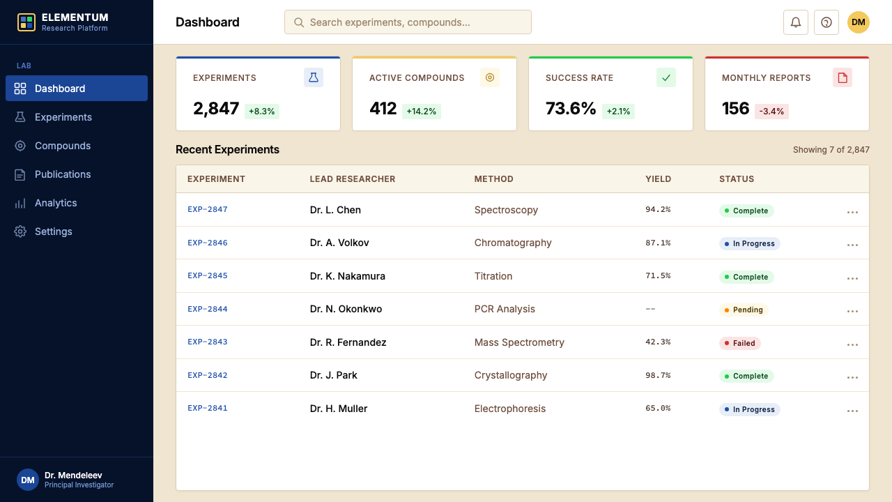
For presentation slides, the periodic table aesthetic works exceptionally well as a structural motif on both cover and content pages. A cover slide can use the grid logic directly: arrange four to nine content blocks in a periodic-table-style layout, each with a bold symbol-style label, a category color, and two lines of descriptive text — creating immediate visual authority and a sense of systematic completeness. Content slides should adopt the cell-level information discipline: one dominant label, one or two supporting data points, and a category color as background. Data slides become genuinely powerful in this system — when each metric or KPI is represented as a periodic-table cell with a color-coded category, a bold symbol, and a numeric value, the comparison between cells is instant and the visual grammar communicates that each data point is part of a larger ordered system.在演示文稿中,元素周期表美学作为结构母题,在封面页与内容页上均表现出色。封面页可以直接运用网格逻辑:将四到九个内容模块排列成周期表式布局,每个模块带有粗体符号式标签、一种分类色与两行描述文字——立即建立视觉权威感与系统完整性的意象。内容页应采用格子级别的信息纪律:一个主导标签,一到两个支撑数据点,以分类色作为背景。数据页在这套体系中尤为强大——当每项指标或关键绩效指数都以周期表格子的形式呈现,带有色彩编码的类别、粗体符号与数值时,格子之间的对比是即时的,视觉语法传达出每个数据点都属于一个更大有序系统的信息。
For web interfaces and dashboards, the aesthetic is particularly well-suited to any context requiring dense, comparative, categorized data display. Pricing pages with multiple tiers translate naturally: each tier becomes a cell with a bold identifier, a tier-color background, and feature attributes listed below. Feature comparison tables borrow the grid uniformity and color-coding directly. Dashboard metric cards can use the cell-module format: a short bold identifier at top center, the primary value at large scale below, and a category-color border or header band indicating which system or team the metric belongs to. Navigation should be typographic and direct — no icon-heavy decoration — with category colors used to orient the user within the broader system.对于网页界面与仪表板,这套美学尤其适合任何需要高密度、比较性、分类型数据展示的场景。多级定价页面自然地转译为周期表格式:每个等级成为一个格子,带有粗体标识符、等级色背景与下方列出的功能属性。功能对比表可以直接借用网格统一性与色彩编码。仪表板指标卡可采用格子模块格式:顶部居中的短粗标识符,下方大号展示的主要数值,以及分类色边框或顶部色带标示该指标所属的系统或团队。导航应当是排印性的、直接的——无图标重装饰——以分类色在更大系统内为用户提供方向感。
For editorial and marketing applications, the table's visual language supports both scientific authority and structural clarity. An article layout inspired by the periodic table uses a strict column grid, reserves color for category markers in the margin rather than for decoration, and uses monospaced or near-monospaced type for data labels and codes while keeping body text in a clean, readable face. Marketing pages can use the bold saturated color band as a section identifier — each section or product category introduced with a full-width color header echoing the table's family-color logic. The warm cream ground works well as the default page background, reserving white for content areas that require maximum contrast.对于编辑与营销应用,周期表的视觉语言同时支持科学权威感与结构清晰度。受元素周期表启发的文章版面采用严格的列网格,将色彩保留给边距中的类别标记而非装饰,对数据标签与代码使用等宽或近等宽字体,正文则保持干净、可读的字面。营销页面可以用粗饱和色带作为板块标识符——每个板块或产品类别以全宽色彩头部引入,呼应周期表的族系色彩逻辑。温润的米黄底面适合作为默认页面背景,将白色保留给需要最大对比度的内容区域。
A common mistake when applying this aesthetic is treating the saturated family colors as a general accent palette and using them freely across unrelated elements. In the periodic table, every color means exactly one thing: membership in a specific chemical family. Designs that use the saturated reds, greens, and blues decoratively — without consistent categorical meaning — lose the system's core visual logic and produce work that looks merely colorful rather than systematically organized. A second common error is over-applying the grid uniformity at the expense of content hierarchy: not all information is equivalent, and the table's cell-uniformity works because every cell contains the same data types. When the underlying data is heterogeneous, the grid should be relaxed rather than forced.应用这套美学时最常见的错误,是将饱和族系色彩当作通用强调色板,自由用于无关联的元素之上。在元素周期表中,每种色彩只意味着一件事:属于某个特定化学族系。那些将饱和红、绿、蓝用作纯装饰——不带一致分类意义——的设计,丧失了这套体系的核心视觉逻辑,产生的效果看起来仅仅是色彩丰富,而非系统性组织。第二个常见错误是过度强调网格统一性,以牺牲内容层级为代价:并非所有信息都是等价的,周期表的格子统一性之所以有效,是因为每个格子包含相同类型的数据。当底层数据是异质的,应当放松网格约束而非强行套用。
See the Mendeleev Periodic Table design system查看 Mendeleev Periodic Table 完整设计系统
Mendeleev Periodic Table — FAQMendeleev Periodic Table · 常见问题
Is the Mendeleev Periodic Table aesthetic the same as general scientific or data-visualization design?门捷列夫元素周期表美学与一般科学或数据可视化设计是同一回事吗?
No — the periodic table has a much more specific visual grammar than general data visualization. Most data visualization prioritizes continuous quantitative relationships: charts, graphs, and maps use position, length, or area to encode magnitude. The periodic table's grammar is categorical and tabular: it encodes group membership through color, uses uniform cell size regardless of any quantitative difference between elements, and organizes by discrete classification rather than by magnitude on a continuous axis. Designs that draw on this aesthetic are making a specific claim about their information: that it is systematically classifiable into a fixed set of families, not just measurable along one or two dimensions.不是——元素周期表的视觉语法比一般数据可视化要具体得多。大多数数据可视化优先处理连续的定量关系:图表与地图用位置、长度或面积编码大小。周期表的语法是分类性与表格性的:它通过色彩编码族系归属,无论元素之间存在何种定量差异均使用统一格子尺寸,并按离散分类而非连续轴上的量级来组织信息。借鉴这套美学的设计,是在对其信息做出一个具体主张:该信息可系统地分类到一组固定的族系中,而不仅仅是沿一两个维度可测量的。
Can the aesthetic work in dark-mode or dark-background designs?这套美学能用于深色模式或深色背景设计吗?
A dark-mode version of the periodic table aesthetic is possible but requires careful adjustment. The historic canonical form uses a warm cream or light ground; dark-mode inversions replace this with a deep neutral or near-black background, which changes the reading of the saturated family colors substantially. On a dark ground, fully saturated cell colors can feel aggressive or distracting rather than classificatory — the visual hierarchy shifts unpredictably. The most effective dark-mode adaptation uses slightly desaturated or muted versions of the family colors as cell fills, with the bold symbol remaining in a near-white or light cream, and reserves the fully saturated color for borders or accent bars only.元素周期表美学的深色模式版本是可行的,但需要仔细调整。经典历史形式采用温润米黄或浅色底面;深色模式反转以深中性色或近黑色替代,这会显著改变饱和族系色的读取方式。在深色底面上,完全饱和的格子色彩可能显得富有攻击性或令人分心,而非起到分类作用——视觉层级会不可预测地偏移。最有效的深色模式改编是:将族系色以略为去饱和或柔和的版本用作格子填充,粗体元素符号保持近白或浅米色,完全饱和的色彩仅保留用于边框或强调色带。
How does this aesthetic handle content that does not fit neatly into categories?这套美学如何处理不能整齐归类的内容?
The periodic table aesthetic assumes that the content it presents is genuinely classifiable into a consistent set of families. When the underlying content is genuinely heterogeneous — a mix of data types, categories that do not have clear membership boundaries, or items that span multiple families — the aesthetic creates visual confusion rather than clarity. In such cases, forcing the grid and color-coding produces work that looks like it is making systematic claims it cannot actually support. The honest approach is to use the grid and cell format for the genuinely classifiable content, and to mark boundary cases explicitly — either with a neutral color, a mixed-category indicator, or by placing them in a distinct section of the layout.元素周期表美学预设了其所呈现的内容能够真正分类为一组一致的族系。当底层内容是真正异质的——数据类型混杂、类别边界不清晰,或条目横跨多个族系——这套美学会制造视觉混乱而非清晰。在这种情况下,强行套用网格与色彩编码产生的作品,看起来像是在做其实无法支撑的系统性主张。诚实的做法是:对真正可分类的内容使用网格与格子格式,对边界案例明确标注——以中性色彩、跨类别指示符,或将其置于版面的独立区域加以处理。
Is the warm cream ground essential, or can the base be pure white?温润的米黄底面是必要的吗,还是可以用纯白色作为基底?
Pure white is a valid alternative and is used in many modern digital implementations of the periodic table aesthetic. The difference is one of tone and reference: warm cream visually anchors the aesthetic in its origins as a printed scientific artifact — chemistry paper, wall charts, reference books — and creates a slightly softer, more scholarly feeling. Pure white pushes the design toward contemporary digital precision and higher contrast. Neither is categorically wrong, but the choice should be consistent with the rest of the design system. Mixing warm cream and pure white within the same layout — using one for the background and the other for card surfaces, for example — can make the design feel unresolved unless the contrast is deliberate and sufficient.纯白色是有效的替代选择,在许多现代数字版周期表美学实现中均有使用。区别在于格调与参照:温润米黄在视觉上将这套美学锚定于其作为印刷科学器物的起源——化学用纸、挂图、参考书——并营造出稍微柔和、更具学术感的氛围。纯白色则将设计推向当代数字精准感与更高对比度。两者在范畴上都没有对错,但选择应当与其余设计系统保持一致。在同一版面中混用温润米黄与纯白色——例如背景用一种,卡片表面用另一种——会让设计显得未被解决,除非这种对比是刻意的且足够明显。
Does this aesthetic suit consumer-facing products, or is it better suited to professional and scientific contexts?这套美学适合面向消费者的产品吗,还是更适合专业与科学场景?
The periodic table aesthetic carries strong connotations of scientific authority, systematic organization, and encyclopedic completeness — qualities that resonate strongly in professional, educational, and analytical contexts. It works well for SaaS tools, developer platforms, analytics dashboards, educational applications, reference products, and any brand that wants to signal precision and systematic thinking. In consumer-facing products that depend on warmth, spontaneity, or sensory pleasure — food, lifestyle, fashion, entertainment — the table's grid discipline and classificatory logic tend to feel clinical or overly regimented. The aesthetic is not impossible in consumer contexts, but it requires softening the grid rigidity and using the color-coding more sparingly, so that the system quality reads as reassuring organization rather than institutional severity.元素周期表美学携带着强烈的科学权威、系统组织与博学全面的联想——这些特质在专业、教育与分析场景中引发强烈共鸣。它适用于SaaS工具、开发者平台、分析仪表板、教育应用、参考类产品,以及任何希望传达精确性与系统思维的品牌。在依赖温暖感、自发性或感官愉悦的消费者产品中——食品、生活方式、时尚、娱乐——周期表的网格纪律与分类逻辑往往显得临床化或过于规整。这套美学在消费者场景中并非不可能,但需要柔化网格刚性,更节制地运用色彩编码,使系统感读起来是令人安心的秩序,而非机构式的严肃。
Related design styles相关设计风格
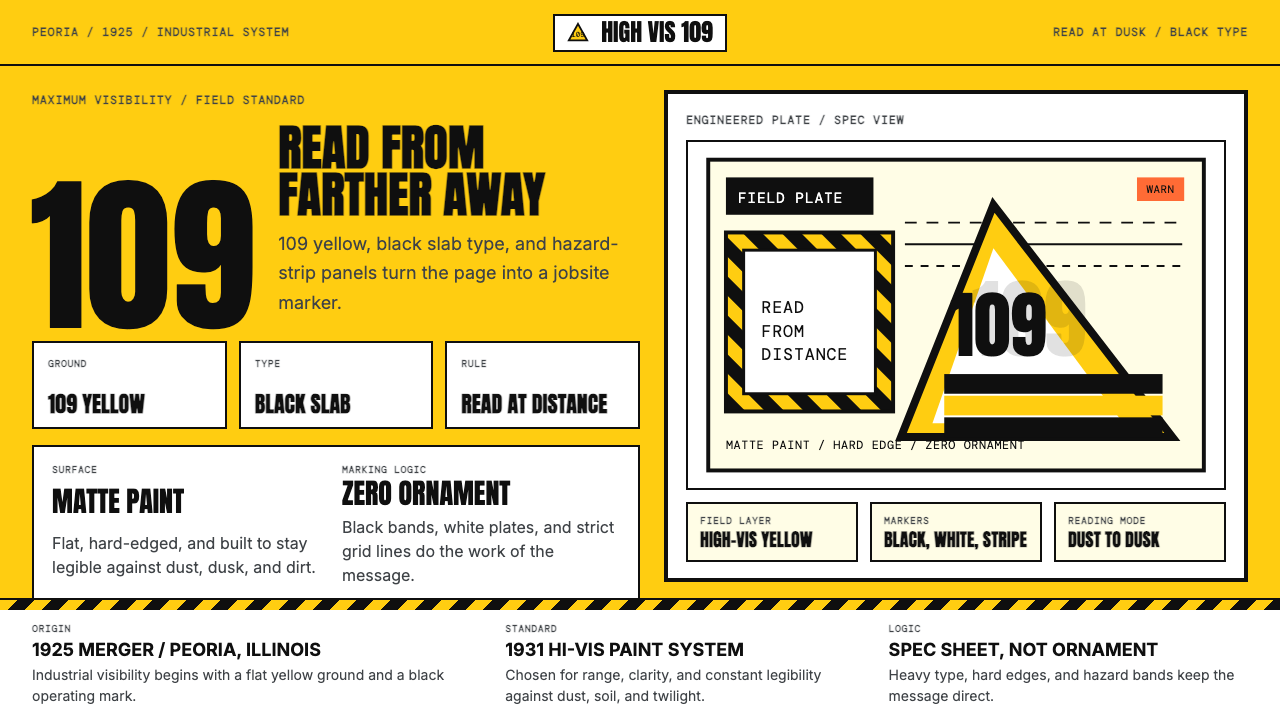 Caterpillar Construction Yellow (1925)Maximum visibility, zero softness. 109 yellow ground and black slab type.高可见度,零柔和。109 黄底配黑色粗体。
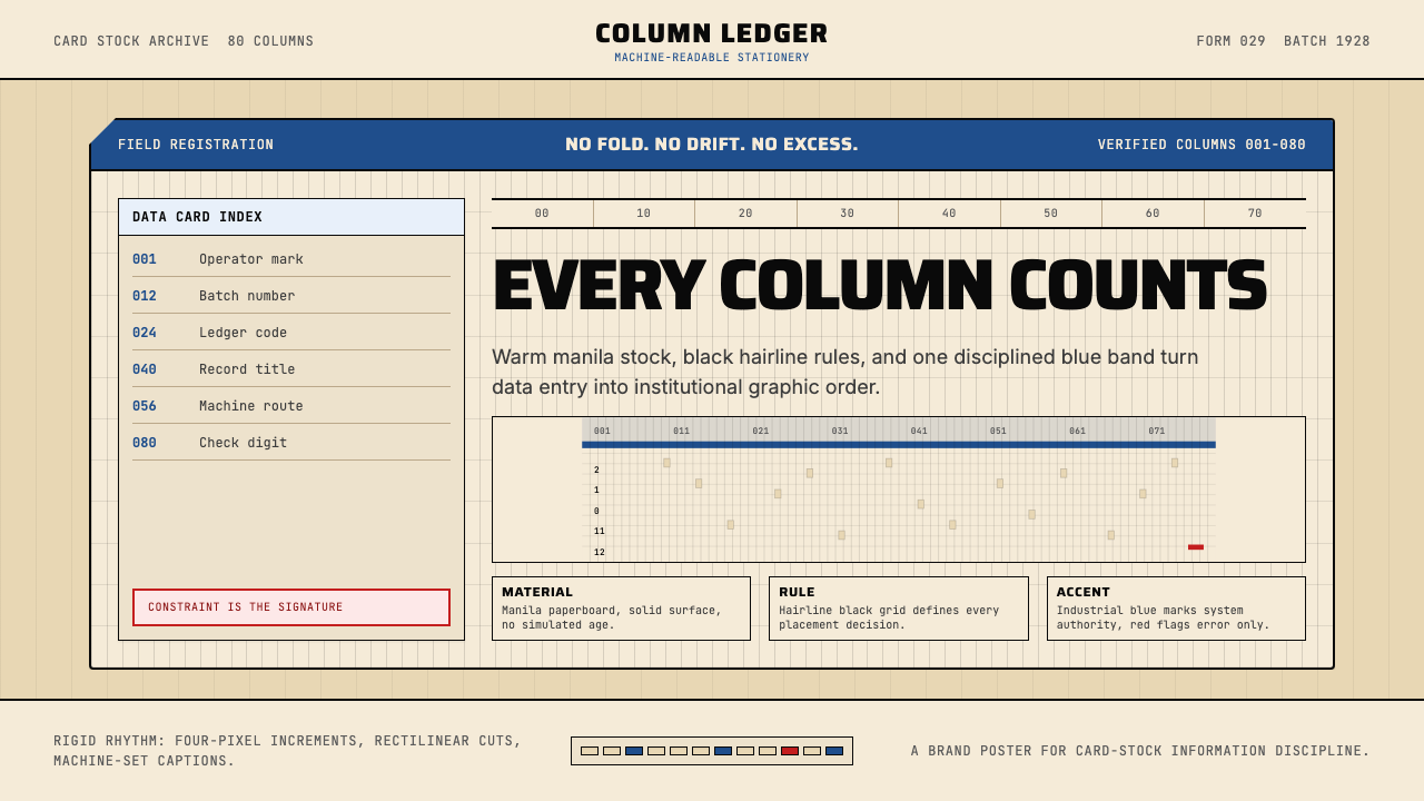 IBM Punchcard 029 (1928)Constraint becomes authority. Manila stock, hairline grid, industrial blue.约束即权威。米黄色卡纸、发丝网格与工业蓝。
 Office Rubber StampsProcedure made visible. Vermilion Oswald stamps strike a manila logbook grid.程序被看见:朱红Oswald印戳砸在马尼拉账册网格上。
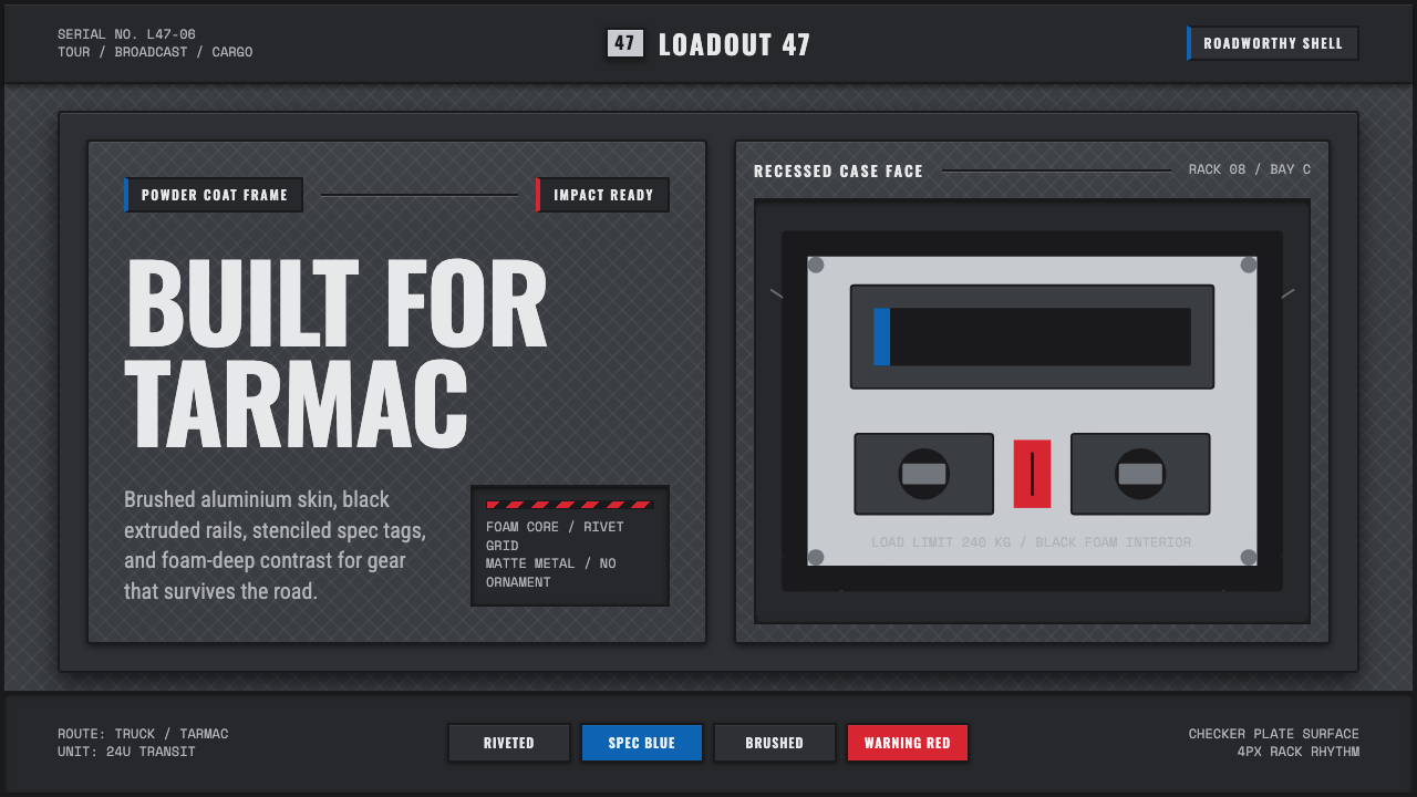 Aluminium Flight CaseRoadproof and exact. Diamond-plate gray, stencil type, black frames, blue-red…坚硬精确:菱形铝纹、模版字、黑框与蓝红规格标签。
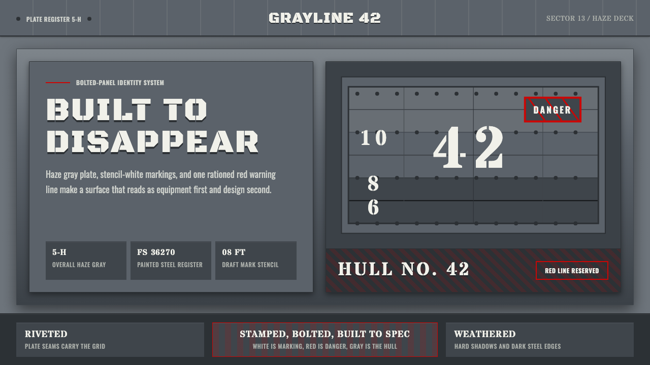 Battleship Naval GrayBuilt to spec. Haze gray steel, rivet grids, stencil white, and one danger-re…严格按规格制造:雾灰钢板、铆钉网格、喷印白字与一道危险红线。