What is Kuwait Water Towers?
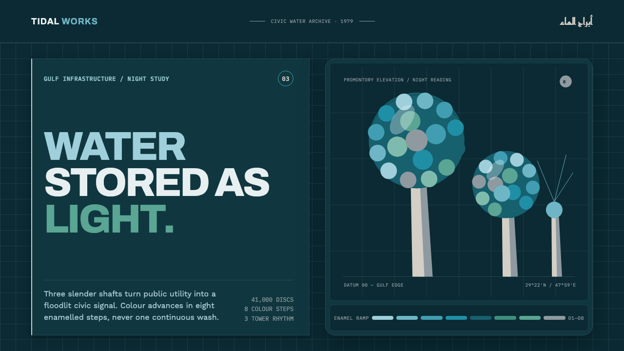
Kuwait built one tower whose only job was to light up the other two — and the night view was the design brief from the very first drawing.
Kuwait Water Towers in brief
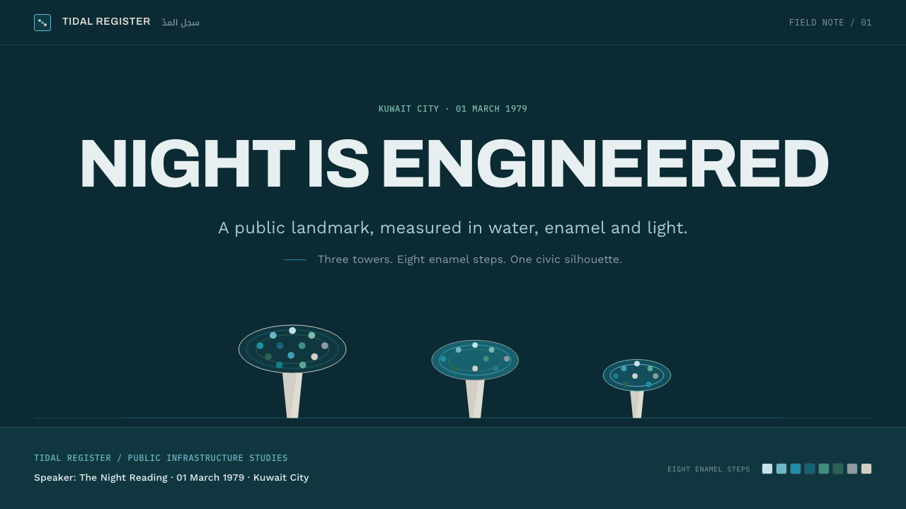
The Kuwait Water Towers stand as three shafts on a promontory over the Gulf, but only two of them actually hold water. The third exists purely to carry floodlights aimed at its companions, which means the towers' dramatic night appearance was never an afterthought bolted onto finished infrastructure — it was engineered into the program from the start, with one structure sacrificed to pure lighting duty so the other two could be seen at their best after dark.
The spheres of the two water-bearing towers are clad in roughly 41,000 enamelled steel discs, arranged in a spiral and finished in eight distinct shades spanning blue, green, and grey. Seen from a distance, the effect reads as something close to a mosque dome reimagined in industrial materials; seen up close, every part of that impression resolves into ordinary cladding panels, steel structure, and enamel finish — a public utility building dressed as a monument rather than a monument disguised as a utility.
This design system treats the night reading of the towers as the default state rather than a special mode, because that reading was deliberately designed rather than simply discovered after construction. Pale concrete functions only as an accent within the system, never as the dominant ground. Color moves through the composition in documented, discrete steps along a ramp rather than as a smooth gradient, and pattern follows a rotational, spiraling path around a curved surface rather than sitting on a flat grid. There is no attempt here at Gulf-luxury signaling — no gold-and-black palette, no glass-curtain skyline silhouette — because the towers were never conceived as a wealth display. They were conceived, and should be treated here, as a rigorously engineered public utility that happens to also function as the city's most recognizable night landmark.
Where does Kuwait Water Towers come from?
The Kuwait Water Towers belong to the Gulf oil-era modernism that reshaped Kuwait City's skyline and infrastructure in the decades following independence, a period in which public utilities were commissioned not merely as functional systems but as architectural statements meant to represent a newly wealthy, newly independent state. The towers were designed between 1969 and 1971, built between 1971 and 1976, and formally opened on 1 March 1979.
The design came from outside the Gulf entirely: Danish designer Malene Bjørn conceived the towers' form and cladding scheme, while the structural engineering was carried out by Sune Lindström of the Swedish firm VBB. This pairing reflects a specific current within Gulf oil-era modernism — Scandinavian structural engineering exported abroad — in which Nordic design and engineering firms took on major infrastructure and civic commissions across the oil-wealthy Gulf states during this period.
The same contract that produced the three-shaft towers also produced roughly thirty white concrete mushroom-shaped water towers elsewhere in the city, giving the Kuwait Water Towers a family of related but visually distinct siblings built from the same engineering logic — one showcase monument on the coastal promontory, and a wider network of simpler, functional structures serving the same basic purpose without the same ornamental ambition.
Taken together, the towers exemplify infrastructure-as-monument: a public water-supply system engineered to also function as a piece of civic identity, achieved not through applied decoration but through the deliberate choice of cladding material, color stepping, and — critically — designed nighttime illumination, all handled by structural engineers and a designer working in a rational, Scandinavian idiom rather than through Gulf regional ornament. The timeline itself tells part of the story: a decade from first design sketches in 1969 to formal opening in 1979 is a long span for a water-supply project, and that duration reflects the scale of ambition involved in treating a utility building as a considered piece of civic architecture rather than a quick engineering fix.
What defines the Kuwait Water Towers look?
Deep Gulf Teal as Default Ground
The system's ground color is a deep, night-toned teal-blue, treated as the default state rather than a special dark mode. This reflects the design's own priority: the towers were built to be read against the night sky, and the system inherits that as its baseline rather than as an occasional variant.
Eight-Step Enamel Ramp
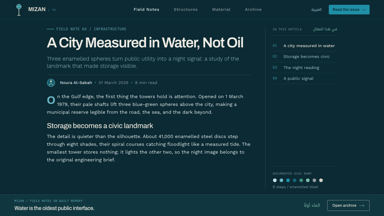
Color across the spherical surfaces moves through eight documented, discrete steps spanning blue, green, and grey, rather than a smooth continuous gradient. Each step should read as a distinct, deliberate stage rather than blending imperceptibly into its neighbor.
Pale Concrete as Accent Only
Pale concrete tones appear only as a secondary accent, echoing the structural base and shaft of the towers rather than the dominant sphere cladding. This tone should never take over as the primary background in the way the deep teal does.
Rotational, Spiral-Path Pattern
Pattern moves along a rotational, spiraling path across a curved surface, mirroring how the enamelled discs wrap around the spheres, rather than sitting on a flat rectangular grid. Any grid-based layout should be treated as a compromise, not the ideal expression of this system.
Industrial Cladding Read as Monument
Individual elements should look, up close, like ordinary industrial cladding — discrete panels, visible seams, structural logic — even as the overall composition reads from a distance as something closer to a domed monument. The tension between these two readings is intentional, not a flaw to smooth over.
No Gulf-Luxury Ornament
The system explicitly avoids gold-and-black luxury cues or glass-tower skyline aesthetics. This is meant to read as public infrastructure engineered by Scandinavian designers and engineers, not as a showcase of regional opulence.
Who shaped Kuwait Water Towers?
The Danish designer conceived the form and enamel-disc cladding scheme of the Kuwait Water Towers, designed between 1969 and 1971 and opened in 1979 — the visual concept that turned a public water-supply structure into a night-lit civic monument.
Lindström, of the Swedish engineering firm VBB, carried out the structural engineering that made the towers' distinctive spherical form and enamel-disc cladding physically buildable, part of a broader current of Scandinavian structural engineering exported to the Gulf during this period.
This broader architectural current, which reshaped Kuwait City's infrastructure and skyline in the decades following independence, provided the context in which a public water-supply system could be commissioned as an architectural statement rather than purely a utility.
How do you use Kuwait Water Towers today?
This system's central lesson is that a night view can be a primary design target rather than a secondary consideration, and that restraint in color-stepping — eight documented steps, not an infinite gradient — produces more monumental results than a continuously blended palette. Applying it well means designing for the dark-mode reading first, not retrofitting a light design with a dark overlay.
For presentation slides, this style suits a cover slide built on the deep teal ground with a curved, spiral-patterned graphic element stepping through the eight-color ramp, title type set in a clean, structural sans-serif that reads as engineered rather than decorative. Data visualizations fit naturally into this system: a stepped color ramp is a legitimate, literal design element here, unlike in styles where gradients are avoided outright.
For web interfaces, the system suits infrastructure, utility, civic, or engineering-adjacent products particularly well, since its entire visual logic is drawn from public infrastructure rather than luxury or consumer branding. A hero section can use the deep teal ground with a spiral-arranged accent graphic stepping through the color ramp, while pale concrete tones are reserved for card backgrounds or secondary panels rather than the primary canvas. Because the source towers separate structural duty from lighting duty across two different elements, an interface built in this style can apply the same split — letting core layout and content sit in stable, muted tones while a distinct accent layer, styled after the floodlight tower, carries all the moments of illumination and emphasis.
In editorial and marketing layouts, the style rewards using the eight-step color ramp as an actual navigational or hierarchical device — for instance, stepping through the ramp to indicate progress, sequence, or category — rather than using it as pure decoration. Section dividers work well as a curved, rotational band rather than a straight horizontal rule, echoing the towers' spherical geometry.
The most common mistake is defaulting to a flat, ungraded dark blue and calling it done, or alternatively smoothing the eight color steps into a continuous gradient. Both approaches lose what makes the source distinctive: a specific, documented, stepped progression of color wrapped around a curved form, engineered as a monument rather than applied as a decorative afterthought.
Kuwait Water Towers — FAQ
Why is the deep teal treated as the default background rather than a dark-mode option?
Because the towers themselves were designed with their night appearance as a primary goal — one of the three shafts exists purely to floodlight the other two — so the nighttime, deep-teal reading is the intended, designed state of the structure, not an alternate mode layered on top of a daytime design.
Why does the color move in eight discrete steps instead of a smooth gradient?
Because the roughly 41,000 enamelled steel discs covering the towers are finished in eight specific documented shades of blue, green, and grey, applied as distinct panels rather than blended continuously. The design system preserves that discrete stepping because it reflects the physical reality of individually finished cladding panels rather than a printed or rendered gradient.
Why does pale concrete stay a minor accent instead of a main color?
Because in the actual towers, pale concrete forms the structural base and shaft rather than the dominant visual surface, which is the enamel-clad spheres in their deep, stepped color ramp. Letting pale concrete dominate a design built on this style would invert the actual visual hierarchy of the towers.
Is this style suited to a luxury or high-end consumer brand?
Not particularly — the source material explicitly frames the towers as public water infrastructure engineered by Scandinavian designers, deliberately avoiding gold-and-black luxury cues or glass-tower skyline aesthetics. It fits infrastructure, civic, and engineering-adjacent products far more naturally than a brand built around opulence.
Why does one of the three towers not hold any water at all?
Because it was purpose-built solely to floodlight the other two towers, making the trio's night silhouette a designed, engineered outcome rather than an incidental effect of ordinary security lighting. This detail matters for the style because it shows how deeply the night reading was built into the original program — an entire structure was dedicated to it rather than treating lighting as a minor addition.
Related design styles
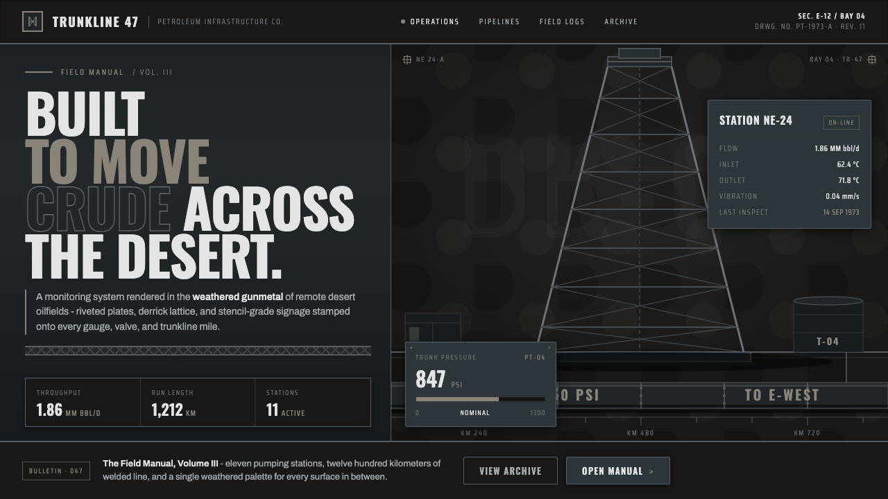 Gulf Oil Derrick IndustrialEngineered, not decorative. Soot-darkened gunmetal, derrick lattice, condense…
 Lunar RoverBuilt for the vacuum. Kapton-gold foil and stencil part-numbers against void-…
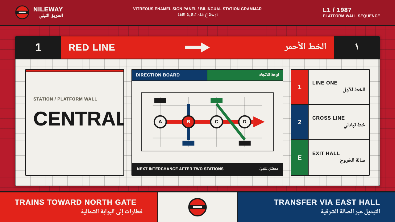 Cairo Metro WayfindingAuthority at speed. Enamel red, Arimo grids, and co-equal Arabic signage.
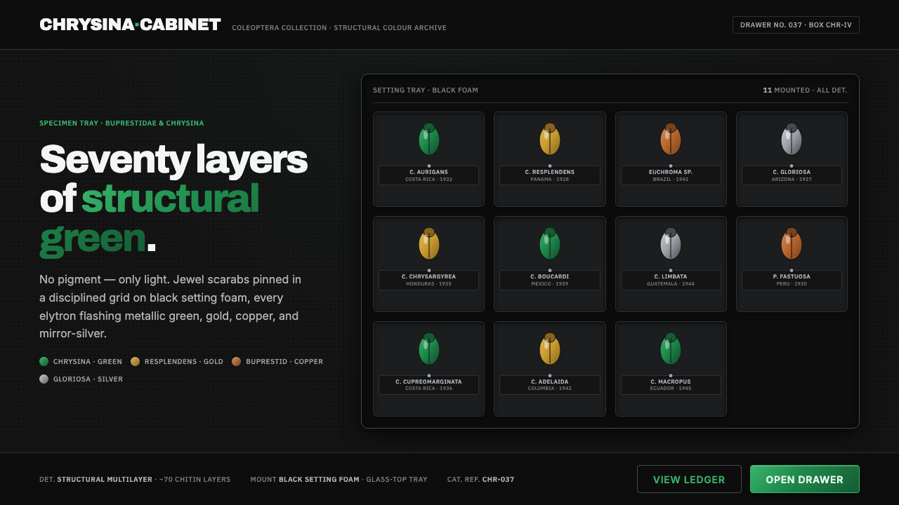 Iridescent Scarab DrawerOrder makes the shimmer read. Jewel scarabs pinned in a grid on black foam, m…
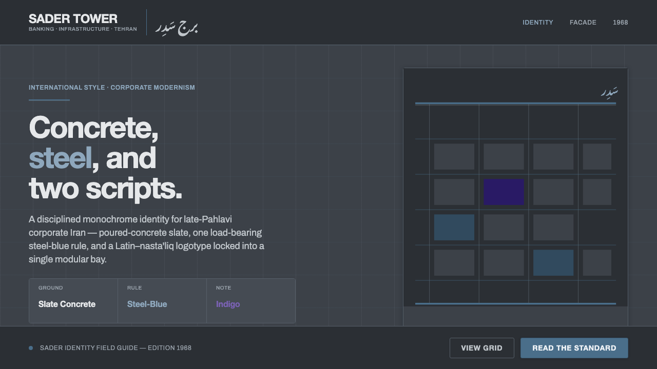 Tehran Bank ModernismLate-Pahlavi corporate cool. Slate concrete ground, one steel-blue rule, a La…
 Yugoslav Socialist ModernismGeometry on concrete. EXAT-51 circles and bars in hot orange and clean teal,…