What is Tehran Bank Modernism?
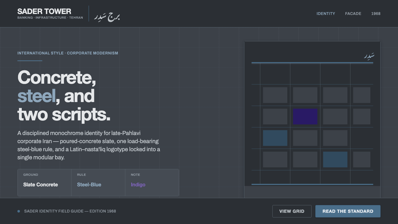
Tehran Bank Modernism made corporate confidence feel architectural: slate concrete, a restrained steel-blue line, and a Latin–nasta'liq identity in one cool voice.
Tehran Bank Modernism in brief
Tehran Bank Modernism is the visual language of late-Pahlavi corporate modernism in Iran, distilled from the identities associated with Bank Saderat and the National Iranian Oil Company. It joins the severe presence of poured-concrete towers to a controlled graphic system: a cool slate-grey ground, steel-blue rules, modernist sans-serif lettering, and flowing nasta'liq script. The result is neither decorative regionalism nor generic corporate minimalism. Its authority comes from the meeting of architectural mass and bilingual typography.
The style communicates confidence through restraint. The dark slate field does the work of a building facade, giving every mark a sense of weight. Steel blue appears as a measured signal rather than a broad wash of color, while the type remains clean, legible, and carefully ordered. Latin and Persian are not treated as competing translations; they form a single lockup whose contrast is both linguistic and visual. The Latin side supplies modernist clarity, and nasta'liq introduces movement, rhythm, and cultural specificity.
In practice, the system feels monochrome even when the blue accent is present. Lines divide, align, and frame; they do not decorate. Concrete suggests permanence, the cool palette suggests institutional distance, and the bilingual mark gives the identity a precise regional voice. Everything is reduced to a small number of coordinated decisions, so the style can travel from a tower sign to stationery, a presentation, a dashboard, or a campaign without losing its character.
Where does Tehran Bank Modernism come from?
The style belongs to the broad period from 1950 to 1990, with Bank Saderat established in 1952 and the defining late-Pahlavi modernist identity forming around 1968. Its historical setting is Tehran, in Pahlavi Iran, where corporate expression could take on the scale and confidence of modern architecture. Tehran Bank Modernism names this convergence: a regional corporate language shaped by concrete construction, International-Style restraint, and the need to speak across Latin and Persian scripts.
Bank Saderat and the National Iranian Oil Company provide the two institutional anchors named in the source material. One belongs to banking and the other to the national oil enterprise, yet the visual system associated with them is remarkably unified. Both are represented through a cool, disciplined modernism rather than through ornamental historicism. The identity does not depend on an elaborate illustration or a dense emblem. It depends on the authority of the ground, the precision of the rule, and the controlled relationship between wordforms.
The architectural reference is essential. Poured-concrete towers establish a visual world of weight, permanence, and rational construction. Their presence is translated into a slate-grey ground that feels structural rather than atmospheric. Thin steel-blue lines provide measured contrast without disrupting the monochrome field. This is the International Style expressed as corporate identity: ordered, confident, and stripped of anything that cannot support recognition or institutional presence.
The bilingual lockup gives the system its most distinctive regional character. Clean Latin modernism is paired with flowing nasta'liq, allowing two writing traditions to occupy the same identity without flattening either one. The result is not a decorative addition of Persian script to a Western mark. It is a designed relationship between contrasting rhythms: the measured clarity of Latin letterforms and the connected movement of nasta'liq. That relationship is what turns an otherwise restrained corporate modernism into a specifically Tehran-centered visual language.
What defines the Tehran Bank Modernism look?
Slate Concrete Ground
The ground is cool, dark, and mineral rather than luminous or decorative. It recalls poured concrete and the mass of a modernist tower, giving the identity an architectural base before any text or line appears. The surface should feel quiet and stable, with the visual authority of a facade rather than the softness of a lifestyle background.
Steel-Blue Rule
Steel blue is a disciplined accent, most powerful when it appears as a lone rule or a carefully limited signal. It separates information, establishes alignment, and gives the dark field a cool point of focus. It should never become a broad decorative color wash; its restraint is what makes it feel institutional and precise.
Latin–Nasta'liq Lockup
The bilingual mark is the defining identity gesture. Latin lettering brings a clean, modernist rhythm, while nasta'liq script supplies connected movement and cultural specificity. The two scripts should be composed as one intentional lockup, not treated as a primary logo followed by a secondary translation. Their contrast creates recognition.
Modernist Sans
The Latin voice is clean, direct, and structurally controlled. A modernist sans-serif should carry headings, institutional labels, and practical information without expressive flourishes. Its role is to make the identity legible and authoritative, leaving the script to provide movement rather than asking every typographic element to perform at once.
Nasta'liq Flow
Nasta'liq introduces a different kind of order: connected, angled, and visibly written rather than assembled from isolated blocks. Its presence should remain deliberate and integrated with the modernist structure. Used well, it prevents the system from becoming culturally anonymous; used casually, it can collapse into ornament. The script needs compositional responsibility.
Monochrome Corporate Discipline
The overall voice is restrained, cool, and nearly monochrome. Concrete, line, and type work together as a small vocabulary of institutional signals. There is little room for visual noise, soft sentiment, or ornamental layering. The style feels confident because each element appears necessary, aligned, and accountable to the identity as a whole.
Who shaped Tehran Bank Modernism?
Bank Saderat is one of the principal institutional references for Tehran Bank Modernism. In this visual account, it represents the banking side of late-Pahlavi corporate identity: a disciplined public-facing presence expressed through concrete modernism, restrained color, and a bilingual mark.
The National Iranian Oil Company supplies the second major institutional reference named in the source. Its place in the style demonstrates how the same corporate language could extend beyond banking: concrete mass, steel-blue restraint, and bilingual typography forming a confident national-enterprise voice.
The designers behind this system are identified collectively rather than by individual names. Their contribution lies in bringing architectural modernism, International-Style restraint, and Latin–nasta'liq bilingual composition into a coherent corporate language around the late-Pahlavi period.
How do you use Tehran Bank Modernism today?
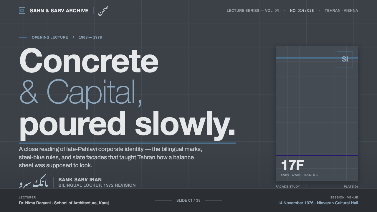
For presentation slides, use the slate-concrete ground as the dominant field and let the cover establish the identity immediately through the bilingual lockup and a restrained steel-blue rule. Content slides should stay quiet and architectural: modernist sans-serif headings, clear alignment, generous unoccupied space, and script used where the bilingual identity genuinely matters. Data slides should treat rules, labels, and divisions as structural parts of the composition rather than decorative framing. Steel blue can mark the key reading path, while the rest of the information remains controlled and nearly monochrome.
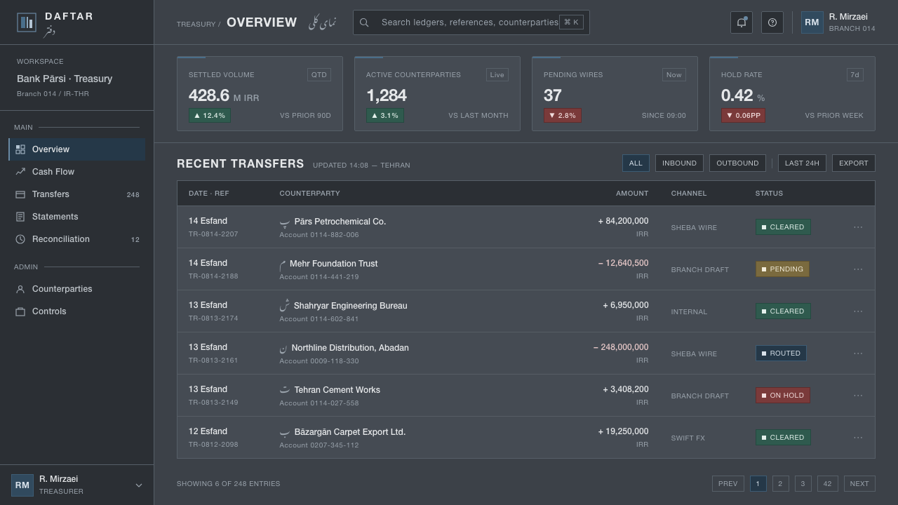
For web interfaces, the style is naturally suited to dashboards, institutional portals, and pricing pages that need authority without visual warmth. Use the dark slate ground to create a stable environment, modernist sans-serif type for navigation and data, and steel blue for selected states, dividers, or a clearly defined action path. Pricing tiers should be separated through alignment and rules before relying on extra color. A bilingual product or service can bring the nasta'liq lockup into the masthead or identity area while keeping operational controls firmly legible.
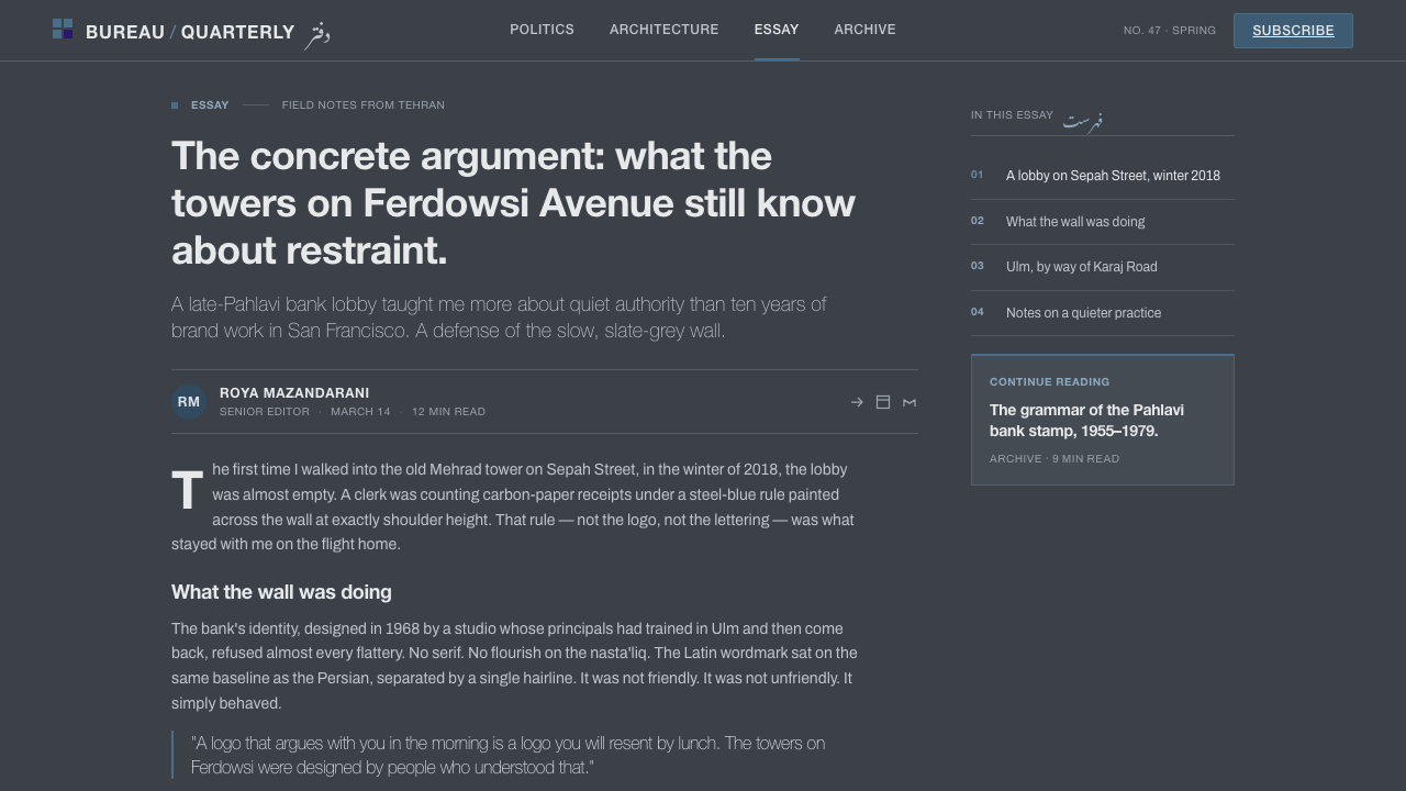
For editorial and marketing work, Tehran Bank Modernism supports a serious, poster-like voice. Articles can open with a strong bilingual title against the concrete field, followed by narrow, orderly text blocks and steel-blue rules that indicate transitions. Marketing pages can use the contrast between architectural darkness and precise typography to position a service as established, rational, and regionally grounded. Photography or illustration should not compete with the identity; the page should feel assembled from institutional structure rather than filled with lifestyle decoration.
For data communication, the system works best when the information itself becomes the visual architecture. Charts, tables, and comparison panels should share the same alignment logic, with the blue accent reserved for the most important distinction. Labels can remain quiet and typographic, while the bilingual lockup anchors the source or institution. This produces a reading experience closer to a corporate information wall than to a colorful analytics application.
The common mistake is to treat the style as permission to add generic futuristic effects. Glossy surfaces, soft atmospheric shadows, excessive accent color, and decorative Persian script all weaken the identity. Another failure is placing Latin and nasta'liq beside each other as unrelated text blocks. The essential discipline is relational: concrete should feel structural, blue should feel measured, Latin should feel clear, and nasta'liq should feel integrated. Remove anything that does not strengthen those relationships.
Tehran Bank Modernism — FAQ
Is Tehran Bank Modernism simply another form of International Style?
It draws directly on International-Style concrete architecture and corporate modernism, but its identity is more specific. The slate concrete ground and restrained rules provide the internationalist structure; the Latin–nasta'liq lockup gives that structure a distinct Tehran and Iranian voice. Without the bilingual relationship, the system risks becoming generic modernist corporate design.
Must every application use a dark slate ground?
The dark slate ground is central to the style because it carries the memory of poured concrete and modernist towers. A lighter adaptation may preserve the rules, typography, and bilingual logic, but it will change the atmosphere from institutional coolness to something more open. If the ground becomes bright and decorative, the defining architectural weight is lost.
Why is the Latin–nasta'liq pairing so important?
It is the feature that turns a disciplined corporate modernism into a regional identity. Latin lettering contributes clarity, alignment, and modernist directness. Nasta'liq contributes connected movement and cultural specificity. Their value comes from being designed as one lockup, not from using script as an ornamental accent added after the main identity is complete.
How prominent should the steel-blue accent be?
It should remain measured and structural. A rule, selected state, key divider, or carefully placed identity signal is more faithful than a field of blue accents. The style depends on the tension between a dark mineral ground and a restrained cool line. Once blue becomes a general decorative palette, it no longer reads as a precise institutional signal.
Can the style be used outside banking and national-enterprise contexts?
Yes, provided the product can support its values of authority, order, restraint, and regional specificity. Dashboards, institutional services, pricing systems, editorial platforms, and serious marketing can all use the language. It is less suitable when the experience depends on softness, playful abundance, or informal warmth. The question is not whether the subject is literally a bank, but whether the identity benefits from architectural confidence and bilingual precision.
Related design styles
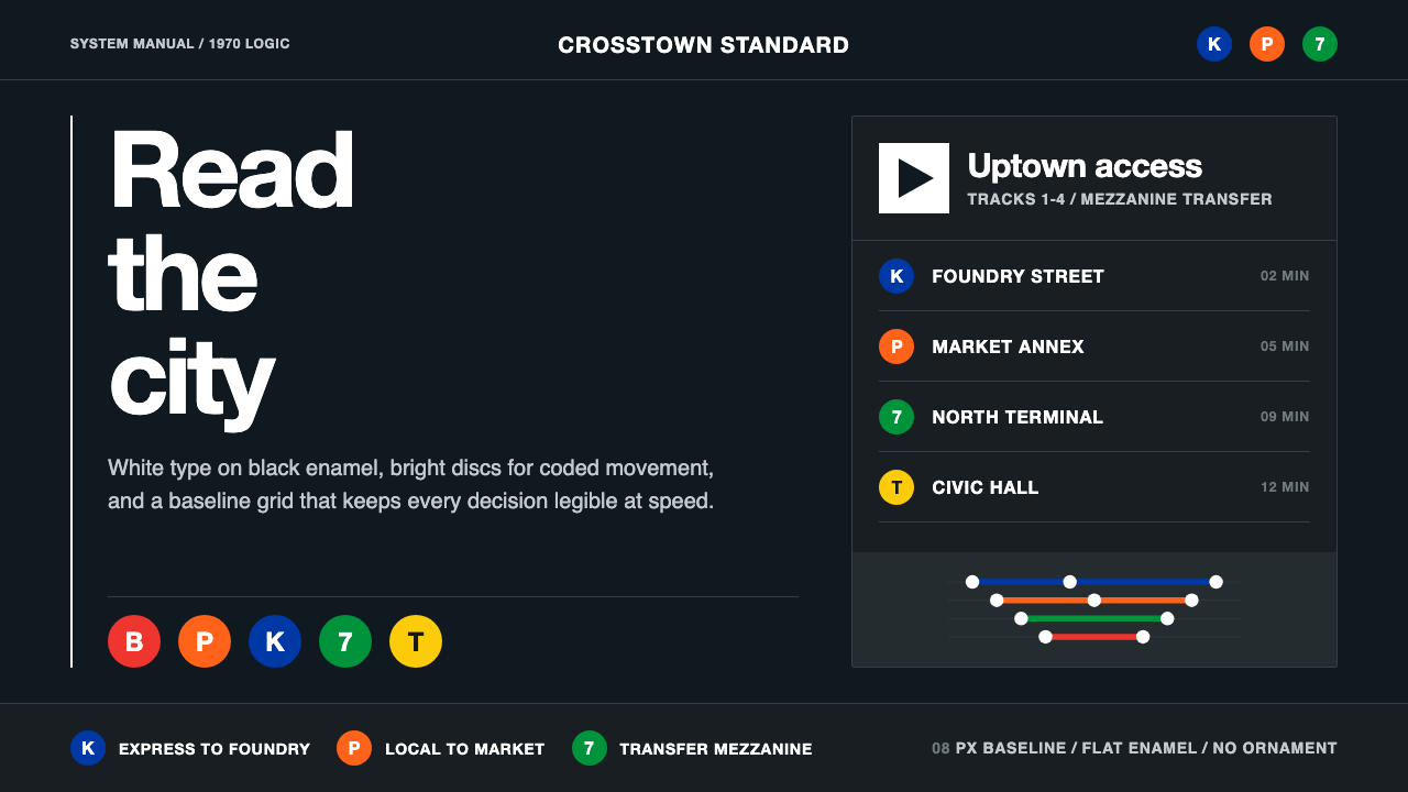 NYC Transit HelveticaOrder made visible. White type, black enamel, route discs, and a grid that ne…
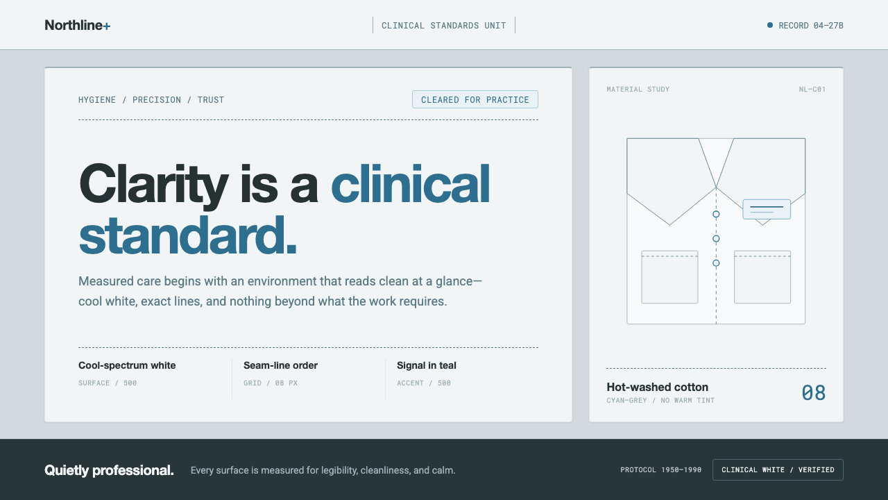 Doctor's Clinical Lab CoatSterile by design. Cool clinical white, teal signals, and seam-line grids enf…
 Frutiger CDG AirportLegibility at runway scale. Navy panels, white humanist sans, arrow-led grids.
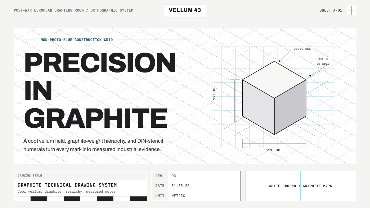 Graphite Technical DrawingDrafting-room precision. Non-photo-blue grid and graphite DIN lettering do th…
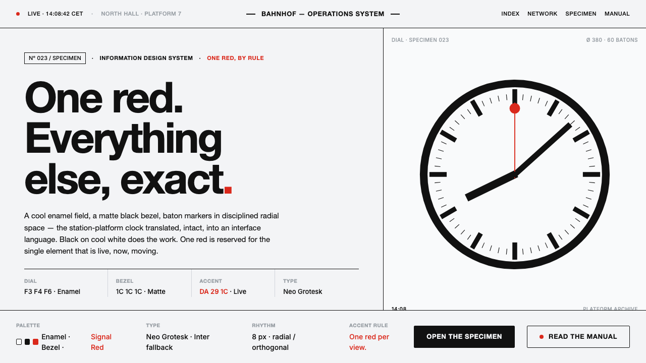 Hilfiker Railway ClockEverything exact, one thing live. Black hands on cool enamel white — one red…
 IBM Punchcard 029 (1928)Constraint becomes authority. Manila stock, hairline grid, industrial blue.