What is NYC Subway Vignelli (1972)?
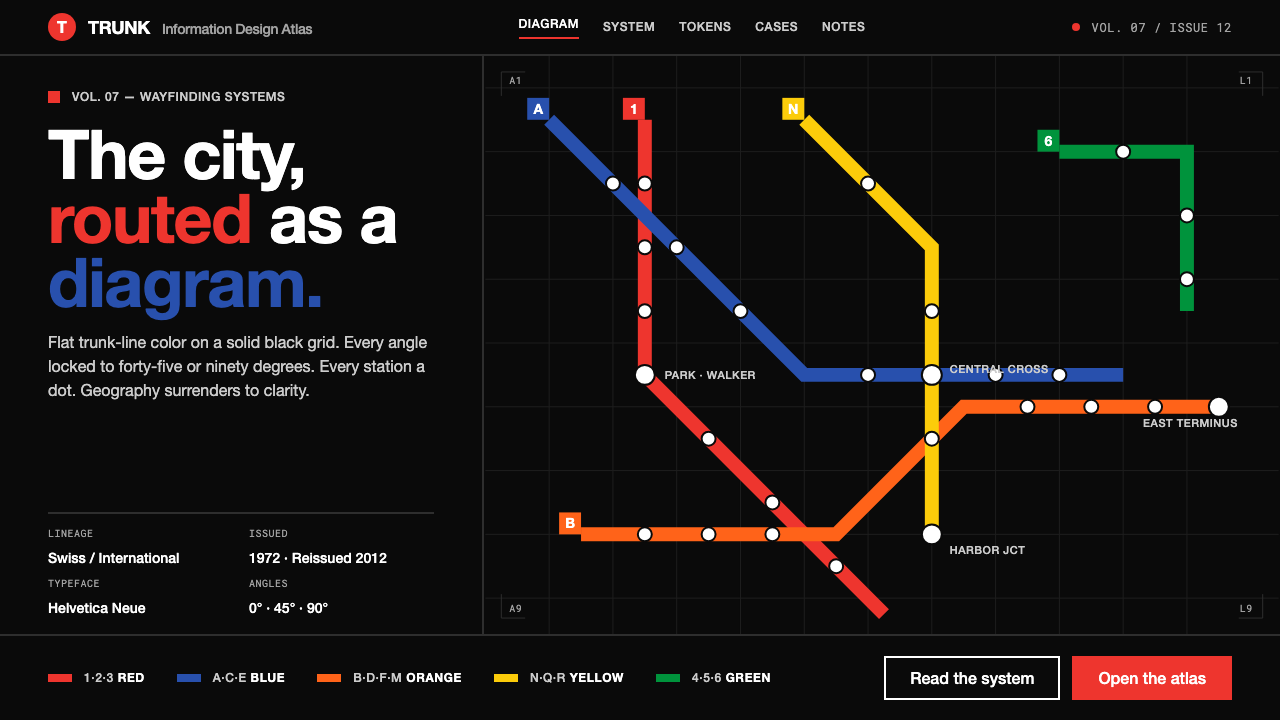
NYC Subway Vignelli turns a sprawling city into a disciplined circuit: colored routes, decisive angles, and typography that makes movement legible at a glance.
NYC Subway Vignelli (1972) in brief
NYC Subway Vignelli refers to the 1972 New York City subway diagram designed by Massimo Vignelli and Unimark International. Rather than describing the city geographically, it redraws the transit network as an abstract information system. Routes become flat, saturated lines; stations become repeated circular marks; interchanges become clear points of connection; and the entire network sits against a solid black field. The result is less a portrait of New York than an instrument for understanding how to move through it.
Its central idea is radical simplification. The diagram does not ask a passenger to interpret streets, parks, coastlines, neighborhood shapes, or the irregular geometry of the actual rail system. It asks a narrower and more useful question: which line should I take, where does it connect, and where do I leave it? By giving every route the same visual discipline, the system turns an intimidating transit network into a readable sequence of choices.
As a visual language, the style brings Swiss and International Typographic Style principles into public wayfinding: modular structure, controlled hierarchy, uniform strokes, restrained geometry, and sans-serif labels with little decorative interruption. Its black ground and brightly colored trunk lines produce immediate contrast, while its uncompromising flatness rejects scenic illustration and atmospheric depth. Every component behaves like part of one coordinated machine.
Where does NYC Subway Vignelli (1972) come from?
The Vignelli diagram belongs to New York City and to a wider modernist approach to information design. Its stated visual inheritance includes Swiss and International Typographic Style, traditions that valued order, typographic clarity, alignment, and systems capable of working consistently across complex public information. In the subway context, those values had to operate under pressure: many routes, many stations, repeated transfers, and an audience that needed to make decisions quickly.
In 1972, Massimo Vignelli and Unimark International redrew the New York City subway as a pure diagram. The governing rules were deliberately visible. Route segments were straightened into a limited vocabulary of diagonal and right-angle movement. Stations were normalized into dots. Labels were rendered in white Helvetica. Colored trunk lines were separated from the black background and from one another through consistent stroke treatment. The map made no attempt to conceal its abstraction; it made abstraction its organizing achievement.
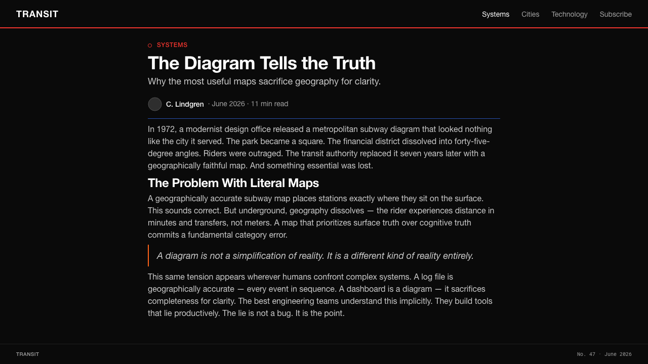
That choice transformed the relation between city and map. A conventional map treats the city as terrain and asks transit to fit within it. The Vignelli diagram reverses the priority: the transit network becomes the primary reality, while geographic likeness becomes secondary. This is why the work is often understood as a landmark of modernist information design. It establishes a visual grammar in which the route, the connection, and the label carry more operational value than a faithful outline of streets or boroughs.
The system has remained a reference point because its palette and formal logic were later revisited through the 2012 MTA reissue, which confirms the trunk-line color approach associated with the diagram. Its endurance is not based on nostalgia alone. The work demonstrates that public information can be memorable without becoming expressive in a personal or ornamental sense. It is memorable because its rules are firm enough to be learned.
What defines the NYC Subway Vignelli (1972) look?
Black Field
The background is a solid black field, not a neutral empty space. It gives the diagram its night-like intensity and makes route colors, station dots, and white labels read as active signals. Black also suppresses incidental visual noise: there is no paper texture, scenic context, or decorative atmosphere competing with the network.
Trunk-Line Color
Each route is carried by a flat, saturated trunk-line color. Color is functional identification rather than mood-setting decoration: it lets riders follow a route through crossings and dense clusters without repeatedly decoding every label. The palette is strongest when each color remains a continuous navigational promise across the diagram.
Locked Angles
Movement is constrained to diagonal and right-angle turns. This limited geometry removes the visual indecision of literal track paths and makes the network feel constructed rather than traced. A turn is never an organic bend; it is a clear instruction. Repeated angles create rhythm, making even a large network appear governed by one intelligible logic.
Station Dots
Stations are reduced to repeated round dots on a strict grid. The mark is deliberately ordinary: it does not illustrate a place or compete with route identity. Its power comes from consistency. A rider learns once that a dot means a stop, then spends attention on the more important question of sequence and interchange.
Helvetica Labels
White Helvetica labels provide a calm typographic counterweight to the colored lines. The type does not imitate the motion of the network or seek a theatrical personality. It names, orders, and clarifies. Against black, the white lettering has the directness of signage, while the sans-serif forms preserve the system's modernist refusal of ornamental detail.
Uniform Stroke Logic
Route strokes hold a consistent visual weight, so hierarchy is created by placement, color, labeling, and connection rather than by making one line theatrically heavier than another. This gives the diagram an equitable, infrastructural character. The system does not dramatize individual routes; it lets their relationships do the explanatory work.
Who shaped NYC Subway Vignelli (1972)?
Vignelli is the central named designer of the 1972 diagram. His contribution was to treat the subway network as an information problem that could be solved through severe geometric reduction, clear typography, and a coherent visual system. The resulting diagram became a defining reference for how modernist discipline can shape public wayfinding.
Unimark International was the design organization associated with the 1972 redraw. Its participation matters because the diagram was not conceived as an isolated illustration but as a system-level exercise in public communication. The work embodies an institutional design approach: rules are established so that a complex network can remain consistent, legible, and reproducible.
Bob Noorda is listed among the key figures connected to the Vignelli subway context. Within the style's broader design lineage, his presence underscores that this was a collaborative modernist environment rather than the expression of a single decorative signature. The visual language depends on shared discipline: type, line, color, and spatial order must reinforce one another.
The MTA is significant both as the transit authority behind the New York City subway context and through the 2012 reissue that confirms the diagram's trunk-line palette. Its role connects the style to operational public infrastructure. This is not merely a museum aesthetic; it is rooted in the practical demand for an identity system that helps people navigate.
How do you use NYC Subway Vignelli (1972) today?
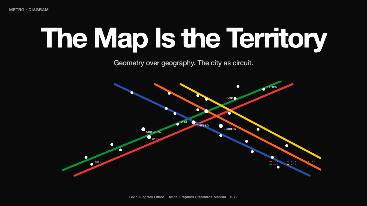
For presentation covers, use the style as a statement of organized complexity. Begin with a black field, then let one or two colored route-like lines establish direction across the composition. A white sans-serif title should sit with the calm authority of a station label, while circular nodes can mark sections, speakers, or themes. The goal is not to decorate a slide with transit motifs; it is to make the presentation feel like a navigable system from its opening frame.
For content and data slides, treat information as a network rather than a stack of boxes. Use consistent connecting strokes to show process, dependencies, or movement between ideas. Repeated dots can identify milestones, categories, or decision points. Data graphics should remain flat and direct: colored segments identify series, white labels carry exact interpretation, and the black field holds the composition together. Avoid rendering charts as glossy objects; the visual value comes from relationships, not simulated material.
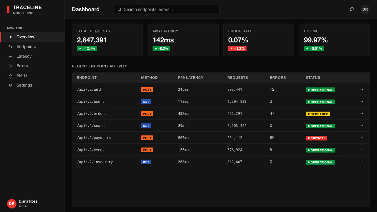
For web interfaces, the style is especially effective in dashboards, operational tools, logistics products, and pricing pages where users need to scan relationships quickly. Navigation can behave like a route diagram, with selected states made distinct through color and position. Panels should feel aligned to a common grid, labels should be typographic rather than icon-heavy, and alerts or statuses should use route color sparingly as meaningful signals. The interface should read as a control surface, not a decorative dark theme.
For editorial and marketing work, this visual language supports subjects involving cities, systems, mobility, technology, and coordination. An article can use a route-like line to carry the reader through sections, with dots functioning as anchors for callouts, quotations, or metadata. Marketing pages can use a black field and a small number of emphatic colored paths to turn features into a connected story. The strongest results maintain enough empty black space for labels and lines to retain their authority.
The common mistake is to copy the obvious surface language while abandoning the diagrammatic logic. Black backgrounds, bright lines, and dots alone do not create Vignelli-like clarity if every component introduces a different angle, line treatment, icon style, or color meaning. Do not turn every route into a rainbow flourish or use color as a general mood effect. First decide what each line, node, label, and connection means; then apply the system consistently enough that users can learn it without explanation.
NYC Subway Vignelli (1972) — FAQ
Is this style a geographic map style?
No. Its defining move is to privilege transit logic over geographic likeness. It is a diagrammatic style: direction, sequence, interchange, and route identity matter more than the exact shape of streets, coastline, or distance. When adapting it, preserve meaningful connections even if the composition becomes more abstract than a conventional map.
Why is the background so consistently black?
The black field creates a stable stage for colored routes and white labels. It makes the network feel signal-based and infrastructural, while removing scenic or decorative context that would weaken contrast. In a digital adaptation, black should function as the shared environment of the system, not as a fashionable dark-mode treatment added after the fact.
Can I use curved lines in a Vignelli-inspired layout?
Curves weaken one of the style's clearest rules. The 1972 diagram locks movement to diagonal and right-angle turns, so the network reads as a deliberate abstraction rather than a literal trace. If a curve is necessary for a product-specific reason, keep it exceptional and ensure that it does not replace the dominant angular grammar.
Does every interface element need a route color?
No. Route color is strongest when it carries a stable distinction: a route, category, status, tier, or active path. If every control receives a bright color, the system loses its ability to guide attention. Let black, white typography, spacing, and alignment handle most of the interface; reserve saturated color for information that benefits from instant recognition.
What makes a design feel authentic rather than merely subway-themed?
Authenticity comes from semantic discipline. A line should connect something real, a dot should mark a meaningful point, a label should clarify rather than decorate, and each color should retain one recognizable role. The style succeeds when users can infer the system's rules through repeated evidence. Transit imagery without that logic becomes costume; a consistent information grammar becomes design.
Related design styles
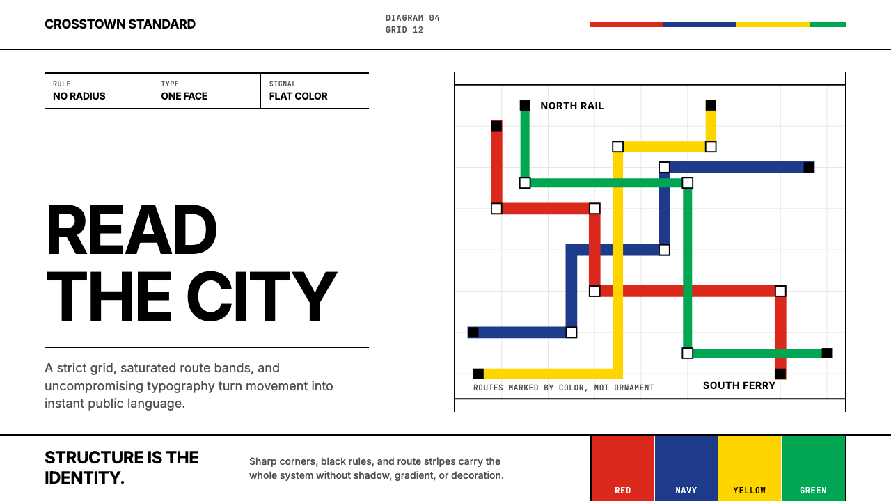 Massimo Vignelli NYCClarity becomes infrastructure. Black rules and route stripes lock the white…
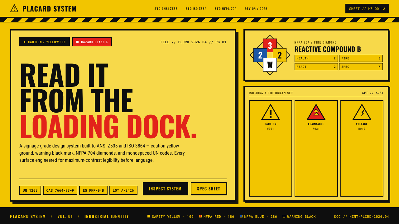 Hazmat SignageRead it from the loading dock. Caution-yellow ground, NFPA diamonds, monospac…
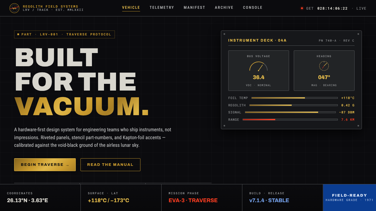 Lunar RoverBuilt for the vacuum. Kapton-gold foil and stencil part-numbers against void-…
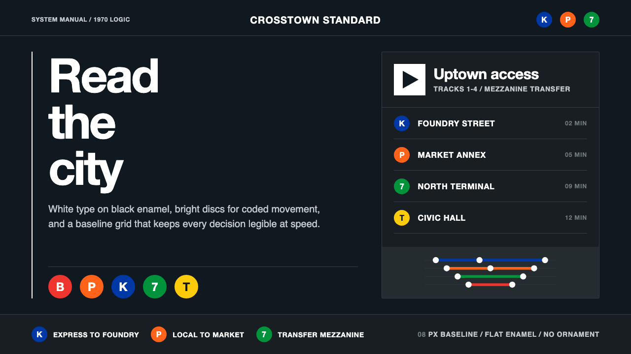 NYC Transit HelveticaOrder made visible. White type, black enamel, route discs, and a grid that ne…
 Wind TunnelMakes darkness feel measurable. Cyan-white streamlines and monospace ticks gl…
 2001 — A Space OdysseyAbsolute restraint. Black void, white monolith geometry, one HAL-red signal.